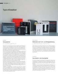
_ spring - Niggli Verlag
_ spring - Niggli Verlag
_ spring - Niggli Verlag

You also want an ePaper? Increase the reach of your titles
YUMPU automatically turns print PDFs into web optimized ePapers that Google loves.
Diese Zeitung ist ein Organ der Niedertracht. Es ist<br />
falsch, sie zu lesen. Jemand, der zu dieser Zeitung beiträgt,<br />
ist gesellschaftlich absolut inakzeptabel. Es wäre<br />
verfehlt, zu einem ihrer Redakteure freundlich oder<br />
auch nur höflich zu sein. Man muss so unfreundlich zu<br />
ihnen sein, wie es das Gesetz gerade noch zulässt. Es<br />
sind schlechte Menschen, die Falsches tun.<br />
Brandon Text Regular — 7pt<br />
Schrift. Typeface. Brandon<br />
Gestalter. Designer. Hannes von Döhren<br />
Label. Foundry. hvdfonts.com<br />
Jahr. Year. 2010—2012<br />
Brandon Groteque ist eine Groteskfamilie mit sechs<br />
Gewichten und passender Kursivschrift. Beeinflusst<br />
von den geometrischen Grotesk-Schriften, die in<br />
den Zwanziger- und Dreißigerjahren des neunzehnten<br />
Jahrhunderts beliebt waren, basieren auch hier<br />
die Fonts auf geometrischen Formen, die zum Zwecke<br />
der besseren Lesbarkeit optisch korrigiert wurden.<br />
Brandon Grotesque hat ein funktionelles, aber<br />
warmes Schriftbild. Während die feinen und die<br />
schwarzen Gewichte sich bestens für Displaygrößen<br />
eignen, sind die leichten, normalen und mittle-<br />
Brandon Grotesque Black — 22pt<br />
Brandon Text Bold — 36pt<br />
Diskurs- und Produktionsprozess hervorgehen.<br />
Brandon Grotesque Light — 10pt<br />
Text Thin, Italic<br />
Text Light, Italic<br />
Text Regular, Italic<br />
Text Medium, Italic<br />
Text Bold, Italic<br />
Text Black, Italic<br />
ren Gewichte für längere Texte geeignet. Die geringe<br />
x-Höhe und die zurückhaltenden Formen cally corrected for better legibility. Brandon Gro-<br />
based on geometric forms that have been opti-<br />
geben der Schrift eine unaufdringliche Eleganz. tesque has a functional look with a warm touch.<br />
Brandon Grotesque ist prädestiniert für anspruchsvolle<br />
professionelle Aufgaben.<br />
performers in display sizes, the light, regular and<br />
While the thin and the black weights are great<br />
Brandon Text hat eine größere x-Höhe als die medium weights are well suited for longer texts.<br />
Grotesque Version und ist optimiert für lange Texte, The small x-height and the restrained forms lend<br />
kleinen Druck und Bildschirme. Die gesamte Brandon<br />
Serie verfügt über alternative Buchstaben, Brü-<br />
well equipped for complex, professional typogra-<br />
it a distinctive elegance. Brandon Grotesque is<br />
che und einen erweiterten Zeichensatz für ost- und phy.<br />
westeuropäische Sprachen.<br />
Brandon Text has a higher x-height than the<br />
Grotesque version and is optimized for long texts,<br />
Brandon Grotesque is a sans-serif type family of small sizes and screens. The whole Brandon series<br />
is equipped with alternate letters, fractions<br />
six weights plus matching italics. Influenced by<br />
the geometric-style sans-serif faces that were and an extended character set to support East<br />
popular during the 1920s and 30s, the fonts are European as well as West European Languages.<br />
Brandon Grotesque Medium<br />
Brandon Grotesque Text Medium Medium<br />
Brandon Text Grotesque Medium Black Italic<br />
Brandon Text Light Italic<br />
Brandon Text Grotesque Black Black Italic<br />
Brandon Grotesque Text Light Italic Regular<br />
Brandon Text Black<br />
Brandon Grotesque Regular<br />
Schrift. Typeface. HM Tilm<br />
Gestalter. Designer. Timm Häneke & Till Wiedeck<br />
Label. Foundry. tillwiedeck.com<br />
Jahr. Year. 2010<br />
Details.<br />
Als ein Kurz-Projekt wurde HM Tilm mit der selbstgesetzten<br />
zeitlichen Vorgabe von 24 Stunden als<br />
komplette Monospace-Schrift entwickelt. Der<br />
Name geht auf die Vornamen Till und Timm zurück.<br />
Die Schrift besteht aus 240 Glyphen. Ihr Hauptcharakter<br />
basiert auf der Kombination einfacher, funktionaler<br />
Formen mit außergewöhnlichen, verspielten<br />
As a short-term project HM Tilm, an entire monospace<br />
typeface, was designed within a selfset<br />
time frame of 24 hours. The name originates<br />
from the first names, Till and Timm. The character<br />
set features 240 glyphs. Its main character is<br />
defined by the combination of simple and functional<br />
shapes and unusual playful details.<br />
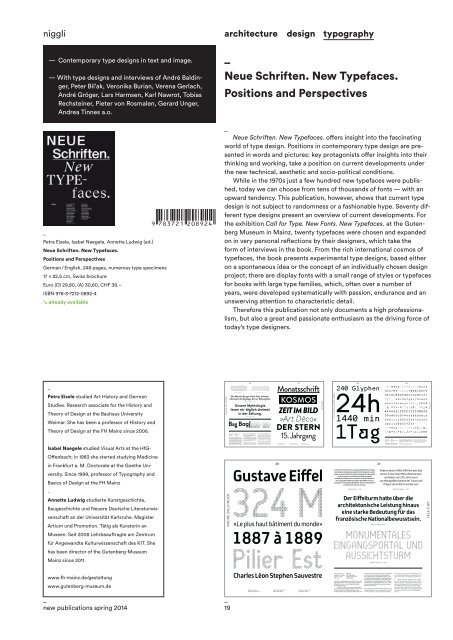
niggli<br />
— Contemporary type designs in text and image.<br />
— With type designs and interviews of André Baldinger,<br />
Peter Bil’ak, Veronika Burian, Verena Gerlach,<br />
André Gröger, Lars Harmsen, Karl Nawrot, Tobias<br />
Rechsteiner, Pieter von Rosmalen, Gerard Unger,<br />
Andrea Tinnes a.o.<br />
_<br />
Petra Eisele, Isabel Naegele, Annette Ludwig (ed.)<br />
Neue Schriften. New Typefaces.<br />
Positions and Perspectives<br />
German / English, 248 pages, numerous type specimens<br />
17 × 22,5 cm, Swiss brochure<br />
Euro (D) 29,80, (A) 30,60, CHF 38.–<br />
ISBN 978-3-7212-0892-4<br />
↘ already available<br />
architecture design typography<br />
_<br />
Neue Schriften. New Typefaces.<br />
Positions and Perspectives<br />
_<br />
Neue Schriften. New Typefaces. offers insight into the fascinating<br />
world of type design. Positions in contemporary type design are presented<br />
in words and pictures: key protagonists offer insights into their<br />
thinking and working, take a position on current developments under<br />
the new technical, aesthetic and socio-political conditions.<br />
While in the 1970s just a few hundred new typefaces were published,<br />
today we can choose from tens of thousands of fonts — with an<br />
upward tendency. This publication, however, shows that current type<br />
design is not subject to randomness or a fashionable hype. Seventy different<br />
type designs present an overview of current developments. For<br />
the exhibition Call for Type. New Fonts. New Typefaces. at the Gutenberg<br />
Museum in Mainz, twenty typefaces were chosen and expanded<br />
on in very personal reflections by their designers, which take the<br />
form of interviews in the book. From the rich international cosmos of<br />
typefaces, the book presents experimental type designs, based either<br />
on a spontaneous idea or the concept of an individually chosen design<br />
project; there are display fonts with a small range of styles or typefaces<br />
for books with large type families, which, often over a number of<br />
years, were developed systematically with passion, endurance and an<br />
unswerving attention to characteristic detail.<br />
Therefore this publication not only documents a high professionalism,<br />
but also a great and passionate enthusiasm as the driving force of<br />
today’s type designers.<br />
_<br />
Petra Eisele studied Art History and German<br />
Studies. Research associate for the History and<br />
Theory of Design at the Bauhaus University<br />
Weimar. She has been a professor of History and<br />
Theory of Design at the FH Mainz since 2006.<br />
Isabel Naegele studied Visual Arts at the HfG-<br />
Offenbach; in 1983 she started studying Medicine<br />
in Frankfurt a. M. Doctorate at the Goethe University.<br />
Since 1999, professor of Typography and<br />
Basics of Design at the FH Mainz<br />
.<br />
Annette Ludwig studierte Kunstgeschichte,<br />
Baugeschichte und Neuere Deutsche Literaturwissenschaft<br />
an der Universität Karlsruhe. Magister<br />
Artium und Promotion. Tätig als Kuratorin an<br />
Museen. Seit 2008 Lehrbeauftragte am Zentrum<br />
für Angewandte Kulturwissenschaft des KIT. She<br />
has been director of the Gutenberg-Museum<br />
Mainz since 2011.<br />
www.fh-mainz.de/gestaltung<br />
www.gutenberg-museum.de<br />
_<br />
new publications <strong>spring</strong> 2014<br />
HANNES VON DÖHREN<br />
ANDRÉ BALDINGER<br />
_<br />
19<br />
Bag Bag<br />
Grotesque<br />
Text<br />
58 59<br />
Journalismus im Internet ist nichts anderes<br />
als eine Dauerkonversation aller Beteiligten<br />
untereinander. Das gedruckte Medium offeriert<br />
Geschichten, die aus einem vielschichtigen<br />
Ein Mensch, der gar nichts liest, ist besser<br />
informiert als derjenige, der nur Zeitung liest.<br />
Unsere Mythologie<br />
lesen wir täglich dreimal<br />
in der Zeitung.<br />
Grotesque Thin, Italic<br />
Grotesque Light, Italic<br />
Grotesque Regular, Italic<br />
Grotesque Medium, Italic<br />
Grotesque Bold, Italic<br />
Grotesque Black, Italic<br />
Gustave Eiffel<br />
AB Eiffel-Bold<br />
AB Eiffel-Bold<br />
Eiffel-Niveau2<br />
AB Eiffel-Niveau2<br />
Eiffel-Regular<br />
Monatsschrift<br />
KOSMOS<br />
ZEIT IM BILD<br />
»Art Déco«<br />
DER STERN<br />
15. Jahrgang<br />
30 31<br />
324 M<br />
«Le plus haut bâtiment du monde»<br />
1887 à 1889<br />
Pilier Est<br />
Charles Léon Stephen Sauvestre<br />
AB Eiffel-Bold<br />
AB Eiffel-Regular<br />
Eiffel-Niveau2<br />
AB Eiffel-Bold<br />
AB Eiffel-Niveau2<br />
AB Eiffel-Bold<br />
BRANDON<br />
124 125<br />
240 Glyphen<br />
24h<br />
! " # $ % & ' ( ) * + , - . / 0 1 2 3<br />
4 5 6 7 8 9 : ; < = > ? @ A B C D E F G<br />
H I J K L M N O P Q R S T U V W X Y Z [<br />
\ ] ^ _ ` a b c d e f g h i j k l m n o<br />
p q r s t u v w x y z { | } ~ ¡ ¢ £ ¤ ¥<br />
¦ § ¨ © ª « ¬ ® ¯ ° ± ´ µ · ¸ º » ¿ À<br />
Á Â Ã Ä Å Æ Ç È É Ê Ë Ì Í Î Ï Ð Ñ Ò Ó Ô<br />
Õ Ö × Ø Ù Ú Û Ü Ý Þ ß à á â ã ä å æ ç è<br />
1440 min<br />
1Tag<br />
é ê ë ì í î ï ð ñ ò ó ô õ ö ÷ ø ù ú û ü<br />
ý þ ÿ ı Ł ł Œ œ Š š Ÿ Ž ž ƒ ˆ ˇ ˘ ˙ ˚ ˛<br />
˜ ˝ ∆ Ω µ π – — ‘ ’ ‚ “ ” „ † ‡ • … ‰ ‹<br />
› ⁄ € Ω ∂ ∆ ∏ ∑ − √ ∞ ∫ ≈ ≠ ≤ ≥ ◊ fi fl<br />
TILL WIEDECK & TIMM HÄNEKE<br />
Hohe Türme haben nicht nur aufgrund der biblischen Vorlage<br />
des Turmbaus zu Babel einen kulturellen Hintergrund, sondern<br />
gelten auch als Sinnbild für die Überwindung der Schwerkraft,<br />
als Zeichen der Herrschaft über den Raum und damit<br />
auch oft über die Menschen im Umkreis. In diesem Kontext ist<br />
der ursprüngliche Widerstand gegen den Eiffelturm als ein<br />
besonders herausragendes Beispiel der beherrschenden Macht<br />
von technischen Türmen zu sehen.<br />
AB Eiffel-Bold — 8pt<br />
Der Eiffelturm hatte über die<br />
architektonische Leistung hinaus<br />
eine starke Bedeutung für das<br />
französische Nationalbewusstsein.<br />
MONUMENTALES<br />
EINGANGSPORTAL UND<br />
AUSSICHTSTURM<br />
Schrift. Typeface. AB Eiffel<br />
Gestalter. Designer. André Baldinger<br />
Label. Foundry. abtypefoundry.com<br />
Jahr. Year. 2005—2009<br />
AB Eiffel-Bold — 30pt<br />
AB Eiffel-Niveau2 — 50pt<br />
Auslöser für die Entwicklung der Schrift war ein Gestaltungswettbewerb<br />
für eine neue Signaletik des<br />
Eiffelturms in Paris, zu dem Intégral Ruedi Baur<br />
Paris eingeladen war.<br />
Die Schrift sollte für zwei sehr unterschiedliche<br />
Einsatzbereiche konzipiert werden. Eine große<br />
Display-Variante für die Beschriftung und eine<br />
Text-Variante für die Drucksachen. Während der Recherchen<br />
wurde schnell klar, dass es nicht die Form<br />
des Turmes, sondern dessen Strukturelemente<br />
sind, welche einen interessanten Ausgangspunkt<br />
für die Schriftgestaltung bilden. Charakteristisch für<br />
die Struktur sind das Quadrat, das Doppelquadrat<br />
und eine Reihe von Verstrebungen mit verschiedenen<br />
Winkeln. Diese geometrische Formensprache<br />
war das Ausgangsmaterial für den Konstruktionsund<br />
Entwurfsprozess.<br />
The trigger for the development of this font was a<br />
design competition for a new Signality of the Eiffel<br />
Tower in Paris, to which Intégral Ruedi Baur<br />
Andererseits erfüllte Eiffel mit dem Bau<br />
seines Turms einen Menschheitstraum,<br />
nachdem rund 100 Jahre zuvor<br />
von Montgolfière bereits der Traum vom<br />
Fliegen verwirklicht worden war.<br />
AB Eiffel-Regular — 14pt<br />
was invited. The typeface was required to serve<br />
two very different purposes: a large display variant<br />
for signs, and a text variant for printed matter.<br />
During research it quickly became evident<br />
that it is less the shape of the tower as such, but<br />
rather its structure elements which offered an interesting<br />
starting point for the type design. The<br />
characteristics of the structure are the square,<br />
the double square and a series of struts at different<br />
angles. This geometric form language was the<br />
starting point for the construction and design<br />
process.<br />
AB EIFFEL<br />
HM TILM24h