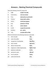
How to Create a Line Graph for Your Egg Drop Project
How to Create a Line Graph for Your Egg Drop Project
How to Create a Line Graph for Your Egg Drop Project

You also want an ePaper? Increase the reach of your titles
YUMPU automatically turns print PDFs into web optimized ePapers that Google loves.
<strong>How</strong> <strong>to</strong> <strong>Create</strong> a <strong>Line</strong> <strong>Graph</strong> <strong>for</strong> <strong>Your</strong> <strong>Egg</strong> <strong>Drop</strong> <strong>Project</strong><br />
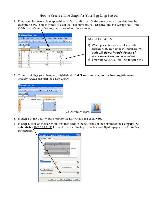
1. Enter your data in<strong>to</strong> a blank spreadsheet in Microsoft Excel. Make sure you enter your data like the<br />
example below. You only need <strong>to</strong> enter the Trial numbers, Fall Distance, and the average Fall Times.<br />
(Make the columns wider so you can see all the in<strong>for</strong>mation.)<br />
IMPORTANT NOTES:<br />
1) When you enter your results in<strong>to</strong> the<br />
spreadsheet, only enter the numbers in<strong>to</strong><br />
each cell (do not include the unit of<br />
measurement next <strong>to</strong> the number).<br />
2) Enter the AVERAGE Fall Time <strong>for</strong> each trial.<br />
2. To start building your chart, only highlight the Fall Time numbers, not the heading (like in the<br />
example below) and start the Chart Wizard.<br />
Chart Wizard Icon:<br />
3. In Step 1 of the Chart Wizard, choose the <strong>Line</strong> <strong>Graph</strong> and click Next.<br />
4. In Step 2, click on the Series tab, and then click in the white box at the bot<strong>to</strong>m <strong>for</strong> the Category (X)<br />
axis labels. IMPORTANT: Leave the cursor blinking in that box and flip this paper over <strong>for</strong> further<br />
instructions.
5. Move the Chart Wizard window off <strong>to</strong> the side and only highlight the Fall Distance numbers (not the<br />
heading), so you can put those numbers along the (X) axis at the bot<strong>to</strong>m of the chart.<br />
6. Click Next <strong>to</strong> go on <strong>to</strong> Step 3.<br />
7. On the Titles tab fill in the ‘Chart title’, ‘Category (X) axis’, and ‘Value (Y) axis’, (as shown below).<br />
For your Chart Title, be as descriptive as possible, so anyone looking at the chart would be able <strong>to</strong> tell<br />
what it’s all about.<br />
8. While still in Step 3, click on <strong>to</strong> the Legend tab, and remove the checkbox <strong>to</strong> not show the legend.<br />
9. In Step 4, choose the <strong>to</strong>p circle, “As new sheet” and then click Finish.