Histogram Pt 1.pdf - Photography Monthly
Histogram Pt 1.pdf - Photography Monthly
Histogram Pt 1.pdf - Photography Monthly

You also want an ePaper? Increase the reach of your titles
YUMPU automatically turns print PDFs into web optimized ePapers that Google loves.
[Technique]<br />
Helpful<br />
histograms<br />
Part one: If your DSLR offers histograms, there’s no excuse for<br />
taking a duff exposure. Ian Farrell explains how they work and<br />
why they’re your greatest ally in the search for perfect pictures<br />
When you shoot a digital<br />
photograph, how do you tell if the<br />
result is properly exposed or not?<br />
You probably look at the image<br />
on your camera’s viewing screen.<br />
While this can tell you if your subject had their<br />
eyes closed, or whether you composed the shot<br />
properly, it’s not actually a very good way of<br />
assessing exposure.<br />
Camera viewing screens are crude devices, of<br />
lower quality than the average computer monitor.<br />
Look at a picture on the screen in bright sunlight<br />
and it can look too dark; look at the same image<br />
in dim light and it can appear too light. Thankfully,<br />
there’s a far more accurate means of assessing<br />
exposure in-camera: using the histogram.<br />
Although it looks a bit complicated, a histogram<br />
is actually a very easy way of telling, at a glance, if<br />
you have a properly exposed picture or not, and –<br />
most importantly – whether there are any blown<br />
highlights or clipped shadows. Almost all cameras<br />
can show one, and it’s good practice to get into<br />
the habit of looking at yours regularly.<br />
Put simply, a histogram is a graph showing how<br />
brightness is distributed within an image. To make<br />
one, your camera looks at the various brightness<br />
levels in a photograph and assigns each one a<br />
numerical value from 0 to 255, with absolute black<br />
being 0 and pure white being 255. It then plots on<br />
a bar chart how many pixels of each brightness<br />
level are in the picture: pure black on the left, pure<br />
white on the right, with all the other values ranged<br />
in between. The shape of this graph can be<br />
likened to the unique ‘fingerprint’ of a scene,<br />
allowing you to tell whether your<br />
picture is well exposed or not.<br />
Let’s consider an average scene<br />
containing a broad range of tones. If<br />
this is photographed with the correct<br />
aperture and shutter speed settings<br />
then the resulting histogram will have<br />
information distributed broadly across it,<br />
perhaps with a peak in the middle. If it’s<br />
underexposed, the peak will shift left<br />
towards the darker end of the scale (towards 0,<br />
pure black), indicating an overall darkening of the<br />
picture. You may also see a bunching up of the<br />
histogram on the exteme left, and a gap on the<br />
right-hand side indicating a lack of light tones.<br />
On the other hand, if the scene is overexposed,<br />
you’ll see a histogram biased towards the right of<br />
the graph, possibly running off the bright end of<br />
the scale (past 255, pure white), with no<br />
information at the dark end.<br />
“<br />
Make a habit of looking at the<br />
histogram, be a better photographer<br />
”<br />
This is, in simple terms, how a histogram can<br />
tell you if a scene is correctly exposed. In reality a<br />
histogram is only useful if it’s viewed in the<br />
context of the photograph you’re taking: you have<br />
to use a bit of common sense.<br />
Instead of an average subject, let’s say we’re<br />
photographing something low-key (dominated by<br />
dark and black tones). A black cat in a coal cellar<br />
would be a good example. The correctly exposed<br />
result here would be any photograph where the<br />
majority of pixels were dark, so you would expect<br />
to see a histogram biased towards the left-hand<br />
side of the scale. If the peak was in the middle<br />
then you’d see a grey cat in a grey coal cellar.<br />
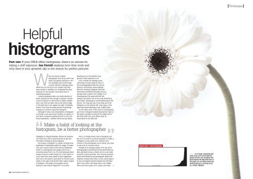
HIGH-KEY HISTOGRAM<br />
ABOVE In an image comprising light,<br />
white tones such as this high-key<br />
gerbera picture, your histogram will<br />
peak towards the right-hand side of<br />
the graph. You can safely expect the<br />
white backdrop to correctly record<br />
as a ‘blown’ highlight.<br />
54 PHOTOGRAPHY MONTHLY
[Technique]<br />
HIGHLIGHTS & SHADOWS<br />
SHADOWS<br />
Darker tones – solid<br />
black and shadows<br />
– are represented in<br />
this area of the<br />
histogram. Absolute<br />
black (brightness<br />
value 0) will show<br />
no detail, whereas<br />
single digital tones<br />
will retain some.<br />
MID-TONES<br />
The majority of the average image will consist of brightness in the<br />
middle part of the histogram, therefore it’s not uncommon for there<br />
to be several peaks in this area.<br />
HIGHLIGHTS<br />
Bright parts of a<br />
photo correspond to<br />
information at this<br />
end of the<br />
histogram. Be<br />
warned that<br />
information beyond<br />
this point (255),<br />
blown highlights,<br />
can’t be recovered.<br />
This can sometimes happen, even with today’s<br />
modern autoexposure systems. Likewise, if you’re<br />
shooting something high-key (ie. an image<br />
dominated by whites and light tones) you’d expect<br />
to see a histogram shifted to the right-hand side<br />
as an indication of correct exposure.<br />
Clipping and dynamic range<br />
As well as telling you about the tones in an<br />
image, a histogram can also provide information<br />
about what’s missing. If you’ve ever shot a<br />
landscape photograph only to find the sky<br />
registering as completely white, then you have<br />
recorded what is usually known as a ‘blown’ or<br />
‘clipped’ highlight – a part of the picture that’s so<br />
bright that its assigned value in the histogram<br />
goes beyond 255.<br />
Highlights of this type lie out of range of the<br />
sensor’s sensitivity, so to record any detail you’d<br />
have to reduce the exposure. If you aren’t sure<br />
whether you’ve clipped a highlight or not, take a<br />
look at the histogram on the camera’s LCD. If you<br />
see the information running off the right end of<br />
the scale then you can rescue these overexposed<br />
areas by dialling in some negative exposure<br />
compensation on your camera and re-shooting.<br />
Similarly, black, featureless areas – ‘clipped<br />
shadows’ – can be identified by the histogram<br />
crashing off the left-hand side of the scale. If you<br />
see this, a spot of positive exposure compensation<br />
will help bring things back into range.<br />
It’s not always this simple though; often<br />
applying negative exposure compensation to<br />
rescue highlights means that shadows then<br />
www.photographymonthly.com PHOTOGRAPHY MONTHLY 57
[Technique]<br />
COMBINED IMAGE<br />
TWO ORIGINAL EXPOSURES<br />
ABOVE Sometimes the range of contrast in a scene is too great for your sensor to record<br />
without clipping shadows or highlights. In this situation, take two pictures – one under-, the<br />
other overexposed, and combine them using High Dynamic Range software.<br />
become underexposed, and vice versa. There’s<br />
also that awful situation, usually found in highcontrast<br />
situations, where both the highlights and<br />
shadows are featureless, and the histogram<br />
information pours off both ends of the scale. In<br />
this case you’re struggling with a dynamic-range<br />
problem where the contrast in the scene is<br />
greater than the number of brightness levels your<br />
camera can record in one go. In photographic<br />
terms this is about five or six stops; if a scene has<br />
more contrast than this, then you’re in trouble.<br />
Incidentally, the human eye can see around 20<br />
stops of dynamic range, which is why it’s hard to<br />
spot this problem before you take the shot.<br />
Solving this dynamic-range problem is not easy.<br />
If the amount of shadow and highlight clipping is<br />
relatively small, engage your camera’s dynamicrange<br />
expansion feature, if it has it. (Nikon call this<br />
feature D-Lighting; Canon, Highlight Priority; Sony,<br />
Dynamic Range Optimisation). Here the camera<br />
will compress brightness levels outside the 0-255<br />
range so they fit within the range of the<br />
histogram. If this doesn’t work, try taking the shot<br />
three times, at exposure compensations of -2, 0<br />
and +2. You can then combine these frames using<br />
High Dynamic Range software, such as<br />
Photomatix or Adobe Photoshop.<br />
So: reviewing your histograms in-camera can<br />
help detect exposure problems, such as under- or<br />
overexposure, highlight or shadow clipping or<br />
dynamic range issues. Sadly, it won’t correct these<br />
problems for you, but it will alert you to them,<br />
which is half the battle. Find out how to show the<br />
histogram display on your camera (consult your<br />
DSLR’s user manual) and make sure that looking<br />
at it becomes habit. You’ll become a better<br />
photographer as a result. ■<br />
NEXT MONTH: Fixing exposures and using<br />
histograms in Photoshop while editing your images.<br />
KNOW-HOW<br />
<strong>Histogram</strong>s<br />
for RGB<br />
So far we’ve only encountered<br />
histograms that show ‘brightness<br />
levels’, which are really an<br />
amalgamation of all three colour<br />
channels: red, green and blue (RGB).<br />
In black & white images these levels<br />
equate to shades of grey. In colour<br />
photography, though, many cameras<br />
now give the option of showing<br />
histograms for the individual red,<br />
green and blue channels.<br />
Individual colour channel<br />
histograms can be useful for showing<br />
which colour is responsible for a<br />
blown highlight or clipped shadow, as<br />
ABOVE The red, green and blue graphs here show highlights and shadows in a colour image.<br />
well as for confirming that colour<br />
balance is accurate. Take a picture of<br />
a grey card and you’ll see a sharp<br />
peak in the normal histogram<br />
corresponding to this one brightness<br />
level. Switch over to the three-colour<br />
RGB histogram and you should see<br />
the three graphs aligned neatly over<br />
the top of each other exactly – if<br />
your camera’s white-balance is OK.<br />
For coloured areas (such as the<br />
sky) one colour may be separated<br />
from the other two (the blue<br />
histogram, in this example).<br />
LOW-KEY HISTOGRAM<br />
ABOVE In a low-key image you might expect the histogram to look like<br />
this – with shadow details lost off the left-hand side of the graph. This is<br />
correct for an exposure where the mood is supposed to be dark.<br />
ALAN CAMPBELL<br />
58 PHOTOGRAPHY MONTHLY www.photographymonthly.com<br />
www.photographymonthly.com<br />
PHOTOGRAPHY MONTHLY 59