Sample Download - Classic Toy Trains Magazine
Sample Download - Classic Toy Trains Magazine
Sample Download - Classic Toy Trains Magazine
- No tags were found...

Create successful ePaper yourself
Turn your PDF publications into a flip-book with our unique Google optimized e-Paper software.
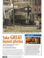
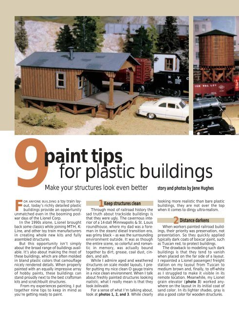
9paint tipsfor plastic buildingsMake your structures look even betterstory and photos by Jene HughesFOR ANYONE BUILDING a toy train layout,today’s richly detailed plasticbuildings provide an opportunityunmatched even in the booming postwardays of the Lionel Corp.In the 1990s alone, Lionel broughtback some classics while joining MTH, K-Line, and other toy train manufacturersin creating whole new kits and fullyassembled structures.But this opportunity isn’t simplyabout the broad range of buildings available.It’s also about making the most ofthese buildings, which are often moldedin bland plastic colors that camouflagenicely rendered details. When properlypainted with an equally impressive arrayof hobby paints, these buildings canstand proudly next to the best craftsmankits and scratchbuilt structures.From my experiences painting, I puttogether nine tips to keep in mind asyou’re getting ready to paint.1Keep structures cleanThrough most of railroad history thesad truth about trackside buildings isthat they were ugly. The cavernous interiorof a 14-stall Minneapolis & St. Louisroundhouse, where my dad was a foremanin the steam/diesel transition era,was grimy black – as was the surroundingenvironment outside. It was as thoughthe entire scene, so colorful and romanticin memory, was actually boundtogether by dirt, grease, coal dust, cinders,and ash.While I admire aged and weatheredstructures on scale model layouts, I preferputting my nice clean O gauge trainsin a nice clean environment. When I talkabout freshly painted structures lookingrealistic, what I really mean is that theylook believable.For a sense of what I’m talking about,look at photos 1, 2, and 3. While clearlylooking more realistic than bare plasticbuildings, they are not over the topwhen it comes to dingy ultra-realism.2 Distance darkensWhen workers painted railroad buildings,their priority was preservation, notpresentation. So they quickly appliedtypically dark coats of boxcar paint, suchas Tuscan red, to protect buildings.The drawback to modeling such darkbuildings is that they tend to vanishwhen placed on the far side of a layout.I repainted a Lionel passenger/freightstation on my layout from Tuscan tomedium brown and, finally, to off-whiteas I struggled to make it visible in itsremote location. Meanwhile, my Lionelgrain elevator (photo 3) worked anywhereon the layout in its initial coat ofsand color. In its lighter shades, gray isalso a good color for wooden structures.
Photo 1 – Earth-tone paint colors likeRed Earth, Yellow Sand, and Dirt makethis Lionel freight platform believablewithout obscuring its cast-in details.3 Highlight doors, windows, & trimAnother problem with excessivelydark colors is that they swallow thedetails, large and small.Before painting, study the plasticpieces and identify interesting areas.Choose colors darker than the walls (butnot too dark) for trim parts that wouldtypically be trimmed on a house.Doors and windows provide much ofthe interest in buildings, and time spentpainting them a different color payshigh dividends in realism. Paint thedividers between the window panes withyour lightest color, and paint the restwith one of your darker trim colors.4 Lighter colors draw attentionA common composition rule used byartists and photographers is: “The eyefollows light.” As you look at layouts andphotographs of layouts, notice whereyour attention falls. A strong scene willlead your eye to the subject not only withstrong lines, like the curve of the track,but also with the use of light.Notice too that some “bright” colors(like red) are actually dark, while a smallwhite shed can draw attention from anylarger, darker buildings around it.Photo 2 – Brick mortar, highlightedboard-and-batten siding, and flipfloppedbrown and dark green colorsenhance this Lionel coaling station.Thinking along these lines will helpyou balance large scenes and focusattention on structural features.5 Shades of colorWhen location and other factors dowarrant using dark colors on a building,you can emphasize the details by usingtwo different, but equally dark colors, orby using slightly lighter and darkershades of one color.The photo of the coaling station(photo 2) shows one of my favoritetricks. The “wood” construction of theupper story is “board-and-batten” siding,in which narrow battens are nailed overthe joints where vertical siding boardsmeet. To highlight this area, I paintedthe main section with Milwaukee RoadBrown (a railroad color) and went backwith a smaller brush to add Tuscan“stripes” down the raised battens. Thecontrast is just enough to emphasize thethree-dimensional character of thenearly flat wall. I didn’t try to paint thebattens precisely; I simply attempted tokeep the lines reasonably straight.Photo 4 shows this technique beingapplied to the parts of a Lionel freightplatform using Red Earth for the wallsand Yellow Sand for the battens.Photo 3 – This sand-colored Lionelgrain elevator, with white windowframes and doors surrounded by browntrim, stands out anywhere on a layout.6 Flip-flopped colorsAlso on the upper story of the coalingstation is a related trick I like: using thewall color from one section as trim onan adjacent section, and vice versa.In the photo you can see that Ipainted the smaller room (extendingoutward over the building’s door) inGreat Northern Green with MilwaukeeRoad Brown window trim, while themain room uses the brown for walls andthe green for window trim. The resultingcontrast accentuates the presence of twodistinct rooms, yet there is coherencefrom using the same two colors.You can see, too, that the battens onthe green section were highlighted inthe same brown as the larger section’swalls. This degree of contrast would beoverly conspicuous were the colors notso dark.7 Mortar is a mustMany of the buildings have brickfoundations or are made entirely ofbrick. The red color of the plastic isacceptable, but without mortar it isimpossible to see the individual bricksfrom more than a foot away (photo 5).Mortar is easy. Many modelers just
A primer on paintingPhoto 4 – Pieces from a Lionelfreight platform, with walls paintedRed Earth and battens painted aYellow Sand, look much betterthan the original brown plastic wallshown on the top left.Photo 5 – Inexpensive spacklingcompound can be used to highlightmortar lines on brick surfaces.IF YOU ARE A LITTLE UNSURE when it comes to applying paint to buildings, here’sa quick summary and some suggestions. You’ll need some brushes, paint,and a few common household items before you begin any project.For most painting, I use round-point brushes (or “rounds”) in sizes 1, 2,and 3. For smaller details, such as hinges and door knobs, I use sizes 0 and1/0 or even smaller brushes, all available in hobby and art supply shops.Paints are available in water-based and lacquer formulas. The advantageof water-based paints is that they can be thinned with water or alcohol, andyou can clean the brushes with soap and water. Also, water-based paintsare safer than their petroleum-distillate counterparts.When you’re in a hobby shop, study various color combinations. Shakethe paint bottles thoroughly to mix the paint, and remember that the colorwill look slightly darker when it’s dry. For brush-painting, the paint in afreshly opened bottle is usually the right consistency, but you may need tothin it with water as it thickens during use.For unassembled kits, the painting process takes place before you gluetogether the buildings. Instruction sheets enclosed in each kit seldom referencepainting at all. One important step before you start painting is to washthe pieces with a little soapy water, rinse them, and then allow them to dry.This process removes any residual chemical that is typically used to allowthe plastic pieces to be properly ejected from their molds. This chemicalcan affect your paint finish.To preserve the details molded into the parts, apply the least amount ofpaint that will cover the plastic smoothly. You can use short, quick strokeswith a relatively “dry” brush, or begin with a “loaded” brush and spread thepaint as far as it will go. Work under good light to be sure you aren’t fillingin cracks or smothering hinges and hardware. You can also use a pin toclean paint out of cracks between boards.I usually paint large, lighter areas first and paint trim afterward, but thereare no set rules.Photo 6 – A dirt-color paint onthe cross braces and the metalplates on the front doors of thisLionel freight building really bringsout the cast-in details.Photo 7 – Grimy Black-coloredpaint gives a dirty and faded lookto roof panels.brush on white paint and then wipe itoff, leaving as much as possible betweenthe bricks. Others use thick acrylic paintstraight from the paint tube.But thanks to the advice of a friend ata hobby shop, I’ve found that the easiestand cheapest mortar material is spacklingcompound from a hardware store.Buy it premixed in a little tub; the“lightweight” type costs more and is nobetter. Smear on a little with your indexfinger, and wipe it off with a soft rag.And keep in mind that not all brickwalls are red with white mortar. Realbricks come in countless colors, and tanbricks with a brown mortar make anattractive and believable variation.8 Metal and concreteNote where metal and concrete areimplied and paint accordingly. You’llreadily find hobby paints labeled “rust”and “concrete.” However, if the concretecolor is so light it draws attention whereyou don’t want it, try colors called“grimy black” or “dark gray.”Use your own judgment on smallermetal parts, such as the guide and crossbraces on sliding doors. On the freightplatform (photo 6), I used dirt color onthe cross braces and the metal plates onthe front doors. The closer the structureis to the viewer, the more benefit you getout of painting small details.9 Up on the roofRoofs are highly visible. Paintingthem dark colors can help direct attentionto the rest of the building.Notice whether the roofing materialis supposed to represent shingles, rolledroofing, or the wavy sheet metal wethink of as a “tin” roof. Aside from sheetmetalroofs, such as on the Lionel grainelevator (for which I used a silver-colorpaint), I use a dark color like GrimyBlack for roofs (photo 7). Dark red anddark green are also legitimate colors forshingles or rolled roofing.It might help your layout to coordinateroof paints. Two small groups ofbuildings could be identified as two different,distinct villages by painting theroofs different colors.Accentuate roof detail. On the rolledroofing on the coaling station (photo 2),I used two brands of Grimy Black, paintingthe roof with the lighter shade andimmediately going back over the raisedseams with the darker shade. T