MOVIE/ MINISERIES & REALITY ISSUE
MOVIE/ MINISERIES & REALITY ISSUE
MOVIE/ MINISERIES & REALITY ISSUE

Create successful ePaper yourself
Turn your PDF publications into a flip-book with our unique Google optimized e-Paper software.
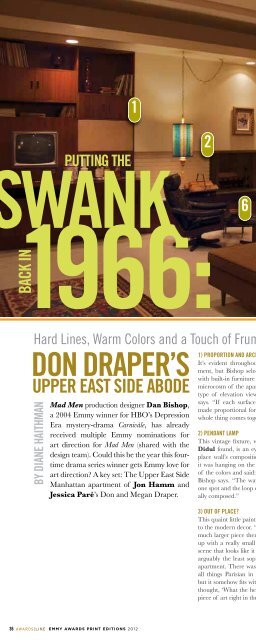
2Putting thewank1966:Back in16345Hard Lines, Warm Colors and a Touch of Frump Mark ‘Mad Men’ Production Designer’s StyleDon Draper’sUpper east Side AbodeBy Diane HaithmanMad Men production designer Dan Bishop,a 2004 Emmy winner for HBO’s DepressionEra mystery-drama Carnivàle, has alreadyreceived multiple Emmy nominations forart direction for Mad Men (shared with thedesign team). Could this be the year this fourtimedrama series winner gets Emmy love forart direction? A key set: The Upper East SideManhattan apartment of Jon Hamm andJessica Paré’s Don and Megan Draper.1) Proportion and architectural compositionIt’s evident throughout the Drapers’ modern apartment,but Bishop selects the fireplace wall, completewith built-in furniture and a vintage console TV, as amicrocosm of the apartment’s linear geometry. “Thattype of elevation view is very important to me,” hesays. “If each surface within a room is studied andmade proportional for the rest of the space, then thewhole thing comes together in a stronger fashion.”2) Pendant lampThis vintage fixture, which set decorator ClaudetteDidul found, is an eye-catching element of the fireplacewall’s composition. “We didn’t light it up untilit was hanging on the set; we discovered the intensityof the colors and said: ‘Oh my God, that’s fantastic!’”Bishop says. “The way it’s hung, with the canopy inone spot and the loop of chain – that is very intentionallycomposed.”3) Out of place?This quaint little painting stands in deliberate contrastto the modern decor. “In my initial sketch there was amuch larger piece there,” Bishop says. “But we endedup with a really small painting, a little Parisian streetscene that looks like it was done by a street artist. It isarguably the least sophisticated bit of artwork in theapartment. There was still a remnant love affair withall things Parisian in the 1960s. It’s strangely small,but it somehow fits with the whole composition, so wethought, ‘What the hell, we’ll put the least interestingpiece of art right in the bull’s eye.’”4) Color PaletteSTo soften the hard lines of the architecture, Bishop andhis team chose warm colors, softer textures and naturalwoods. Included are grasscloth wallpaper, brightpillows and draperies featuring a pattern selectedbecause it resembles tiny television sets. The uninterruptedsight lines are deliberate and lead to a surprise:The metal sculpture on the bedroom wall. “Those havesort of faded away, I guess,” Bishop says.5) Shedding more lightThe wall of windows. In this after-dark photo, the“practicals” (“lamps” in designer-speak) are on so youcan’t see daylight pouring in, but when it does, lightcomes in from one direction, and “that tends to throwsculptural elements into relief, with strong highlightsand shadows,” Bishop says.6) Don’s chairMuch of the furniture was built, but the period chairwas carefully chosen – and conveniently placed nearthe bar – to reflect Draper’s character. “It’s masculine,it’s high contrast to the room, it’s comfortable enoughto reflect his age; he’s a middle-aged guy,” Bishopobserves. “He’s a little bit of a dinosaur, but he’s also acreative director at an advertising firm, so it’s a modernshape but a little bit frumpy.” This chair can also swivelas the scene requires. Jokes Bishop: “Throughout theshow, we’ve always said: ‘What chair is Don going tosit in next?’”36EMMY AWARDS PRINT EDITIONS 2012