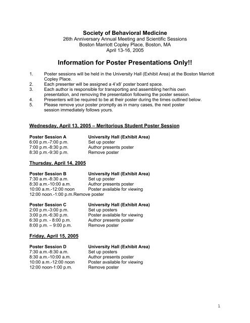
Poster Presentation Instructions - Society of Behavioral Medicine
Poster Presentation Instructions - Society of Behavioral Medicine
Poster Presentation Instructions - Society of Behavioral Medicine

Create successful ePaper yourself
Turn your PDF publications into a flip-book with our unique Google optimized e-Paper software.
The <strong>Poster</strong> Session: A Guide for PreparationThe <strong>Poster</strong>The poster format has become an increasingly popular form <strong>of</strong> communication at SBMmeetings. New and exciting research ideas can gain recognition through a well-written abstractand an eye-catching poster. Presenters must recognize that participants at the meetingprobably have not had the opportunity to read all abstracts before they walk into the displayarea. Attention will invariably be drawn to posters with a crisp, clean design and asnappy title. The title must have this strolling audience in mind. Think <strong>of</strong> a title as a newspaperheadline. Once the viewer has come to take a closer look at an interesting-looking display, allaspects <strong>of</strong> the design and the science work together to keep, or lose, the viewer’s attention.ScienceObviously, the story to be told should be interesting and the research sound. However, theideas need not be uncontroversial. Work which encompasses or might interest other disciplines,or has broad application and/or implications, is the type likely to have the most impact.A common criticism <strong>of</strong> poster sessions is that the author attempts to tell the entire researchhistory. Present only enough data to support your conclusions. However, modesty here isnot an important virtue; you should make the significance and originality <strong>of</strong> the work very clearto assist viewers from other specialties.DesignThe subject <strong>of</strong> design is complex, and any rule can be broken creatively and pleasingly by onewith an artistic flair. Here are some general guidelines to make a poster more accessible,attractive, and interesting:1. The most important principle is simplicity. At first glance from 10-15 feet away the viewershould see an easy-to-read title and an uncluttered, neat arrangement <strong>of</strong> graphic illustrationsand text. It should be obvious where to start inspecting the poster and where to go from there(generally left to right, top to bottom). The parts should either be numbered to facilitate this orhave arrows which graphically lead the viewer.2. Leave some open space in the design. The same rule applies as in packing a suitcase: whenyou’re finished, take out half. Tightly packed space tires the eye and the mind.3. Use elements <strong>of</strong> different sizes and proportions. Same-size and same-proportionedcomponents result in a boring design. For areas <strong>of</strong> particular emphasis try different shapes.4. A large and/or bright center <strong>of</strong> interest can draw the eye to the most important aspect <strong>of</strong> theposter.5. Enlarge all photos enough for pertinent details to be clearly evident.6. Make all illustrations simple and bold. Leave out any unnecessary detail in the story beingpresented.7. Convert tabular materials to a graphic display if possible. Try scatter plots, bar graphs, ortriangular diagrams.3
8. Make a scale drawing <strong>of</strong> your layout. Have a few colleagues comment on the overall designbefore final drafting. If you have access to pr<strong>of</strong>essional drafting personnel, ask theirsuggestions.LetteringAll lettering should be legible from 5 feet away. Title lettering should be the largest, about 2”-3”,with subheadings 1/2-1” high.For material other than titles and subheadings, capitals and lower-case letters in combinationare much easier to read than all capitals. Text materials can be sized as large as 24 points.Readability is the key.ColorColor is as complex a subject as design, and is generally a matter <strong>of</strong> taste. Some authorsprefer s<strong>of</strong>t muted colors; others like deep or very bright ones. The temptation is to use coloreverywhere - don’t. The viewer’s eye will jump erratically around the poster instead <strong>of</strong> trackingthrough it to the crucial points. The less important parts <strong>of</strong> the poster - necessary backgroundinformation and supporting data - will recede into the background if done in cool-neutral colors(blues, greens, and some grays). The featured parts can be highlighted by using warm colors(reds and yellow) or black if the background colors are s<strong>of</strong>t, or white if the background colorsare bright and deep.TextThe text material included on a poster should be extremely brief or most <strong>of</strong> the audience willwalk away. Some authors like to include the full abstract as part <strong>of</strong> the poster, but they shouldnot rely on its being read. More successful is placement <strong>of</strong> a succinct statement <strong>of</strong> majorconclusions at the beginning <strong>of</strong> the poster - perhaps as an expanded subtitle. The supportingtext is then presented in brief segments along with appropriate illustrations, and the significance<strong>of</strong> the findings is made forcefully and concisely clear at the end. Aim for “Wow!” from theviewer. Handouts <strong>of</strong> the abstract should be made available for interested viewers.Packing<strong>Poster</strong>s <strong>of</strong>ten have to be taken to distant meetings. If you know you may be flying, make theposter elements small enough to fall within acceptable carry-on dimensions (generally17”x22”; call the airline to be sure) to avoid the panic <strong>of</strong> lost luggage.DisplayingYou may have only a short time to set up your display, so prepare in advance. Have theseitems in a poster emergency kit: tape measure, 9’ length <strong>of</strong> string, box <strong>of</strong> clear push-pins (getlonger than standard ones if mounted illustrations are thicker than 1/8”), ordinary thumb tacks,roll <strong>of</strong> double-stick tape, scissors, glue. Have a sketch/photograph <strong>of</strong> the poster layout, withpositions <strong>of</strong> a few key components measured <strong>of</strong>f so you know where to place them. Set up alevel line, if needed, by tying the string between two push-pins set a measured distance abovethe bottom <strong>of</strong> the display board.If you have any questions about the audio/visual aspect <strong>of</strong> your presentation, feel free toe-mail Crystal Jackson at the SBM National Office (cjackson@ahint.com).4