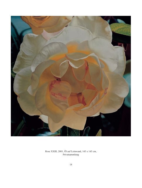
Rose XXIII, 2001, Öl auf Leinwand, 145 x 145 cm, Privatsammlung 18
Regina Böker When you look at <strong>Stefan</strong> <strong>Bräuniger</strong>’s paintings, naturally what first draws you to them is the fruit and flowers they depict. They have an ethereal quality yet at the same time they are such exact, inyour-face reproductions of nature as to seem literally ‘alive’. Gazing at them, you are captivated by the beauty of a rose, the delicate charm of a sweet pea, the perfect ro<strong>und</strong>ness of a blackcurrant – and you are almost overcome with awe as you stand before these marvels of nature. Only when you think a little harder about how the paintings work do you realise there is more to them than the subjects themselves. Much more than the fruits and flowers it is the choice of what is placed within the frame, the choice of perspective, the combination of colours – i.e. the elements of their composition – that give tension and feeling to the works. <strong>Bräuniger</strong>’s still-lifes testify to his fine sense of proportion and structure but beyond all their formal qualities they show he is a painter with real passion. The themes he chooses do not really indicate that he is a fanatic for flowers and fruit but that he is an artist who has fo<strong>und</strong> the ideal subjects for displaying his genius. The chief characteristic of the square, the format that <strong>Bräuniger</strong> often uses for his pictures, is its equilibrium, and that makes it the natural fo<strong>und</strong>ation for his creativity. With great virtuosity he turns this basic shape into something with its own special dynamism, conjuring it into being with left and right-sloping diagonals, receding formations, the employment of opposing colours, the creation of patterns and the clever use of shape and line. If you examine Citron V, for example, you can see all these elements in play. The three separate fields of Between Abstraction and Reality Reflections on the art of <strong>Stefan</strong> <strong>Bräuniger</strong> 19 the backgro<strong>und</strong> correspond to those of the three lemons in the foregro<strong>und</strong> and the way the lemons are arranged, each closer (or further away) than the next, gives an impression of depth and volume. Yet at the same time, seen as just two-dimensional shapes the lemons form a rough diagonal that is opposed by the diagonal of leaves running from bottom left to top right. The triangular-shaped area of backgro<strong>und</strong> colour is matched by the similarly-shaped area formed by the leaves near the top edge of the frame, as is the large leaf in the bottom corner by the shape on the upper right. In juxtaposition with the concave triangle on the left hand edge of the painting, the leaf in the top left corner forms a convex triangle whose shape is echoed by a stem on the lower right. Meanwhile panicles, stalks and shadows weave a mesh of lines that contrasts with the spherical forms of the lemons. The way these corresponding, contrasting and balancing elements are handled – for instance, the way the bottom right triangle contains the heavy shape of the front lemon while the triangle on the upper left contains the counterbalancing mass of the bright green leaves – is quite masterly. Even the shamfer of the lemon at the right-hand edge plays a part in this composition. It prevents the right of the picture from becoming too heavy and thus enhances the construction of the painting as a whole, pointing up its almost abstract qualities. Whichever way your eye turns there is tension and movement between the different lines, shapes, weights and volumes. The manner in which colour is used helps to emphasise these geometric elements of the painting. The dominant hue is the yellow of the lemons whose three-dimensional quality is further brought out by white-ish highlights. The warm, earthy-brown backgro<strong>und</strong> contains a mixture of yellow, red and blue
- Page 1 and 2: Stefan Bräuniger Die Sinnlichkeit
- Page 3 and 4: Inhalt 5 Regina Böker ZWISCHEN ABS
- Page 5 and 6: Regina Böker Zwischen Abstraktion
- Page 7 and 8: Zitronen V (146), 2003, Öl auf Lei
- Page 9 and 10: und Blätter noch präsenter ersche
- Page 11 and 12: tung zu belegen. Trotzdem weckt ihr
- Page 13: Wicken II (139), 2003, Öl auf Lein
- Page 17: Tulpe III (154), 2003, Öl auf Lein
- Page 21 and 22: metaphoric or symbolic meaning. Nev
- Page 23 and 24: Trauben IX (142) 2003, Öl auf Lein
- Page 25 and 26: Kumquats V (132), 2002, Öl auf Alu
- Page 27: Kirschen II (131), 2002, Öl auf Al
- Page 30 and 31: Orange II (147) 2003, Öl auf Leinw
- Page 32 and 33: Kürbisse I (126), 2001, Öl auf Le
- Page 34 and 35: Tulpe II (149), 2003, Öl auf Leinw
- Page 36 and 37: etwas Optimistisches aus, das die M
- Page 38 and 39: Johannisbeeren III (143), 2003, Öl
- Page 40 and 41: den Perlmuttglanz ihres Inneren. Di
- Page 42 and 43: Pfingstrose (84), 1999, Öl auf Lei
- Page 44 and 45: fotografischen Vorlage gearbeitet s
- Page 46 and 47: als bei Film oder Video, neue Ansch
- Page 48 and 49: Rose XXXVIII (140) 2003, Öl auf Le
- Page 50 and 51: Rose XIX (91), 2000, Öl auf Leinwa
- Page 52 and 53: Rose XXXVII (153), 2003, Öl auf Le
- Page 54 and 55: music will emphasise a particular m
- Page 56 and 57: Tulpen I (100), 2000, Öl auf Leinw
- Page 58 and 59: How does Stefan Bräuniger manage t
- Page 60 and 61: Türkischer Mohn I (110), 2001, Öl
- Page 62 and 63: Narzisse II, 1998, Öl auf Leinwand
- Page 64 and 65: Früchte V (113) 2001, Öl auf Lein
- Page 66 and 67: Schlehen II (12) 1999, Öl auf Lein
- Page 68 and 69:
Rose XXXIV (124), 2001, Öl auf Lei
- Page 70 and 71:
Rose XXX (117) 2001, Öl auf Leinwa
- Page 72 and 73:
Trauben III (123) 2001, Öl auf Lei
- Page 74 and 75:
Heidelbeeren II (104), 2001, Öl au
- Page 76:
Kleine Blumen (96), 2000, Öl auf L
- Page 80:
Impressum © Galerie von Braunbehre