November 2003 - Eitzen group
November 2003 - Eitzen group
November 2003 - Eitzen group
- No tags were found...

Create successful ePaper yourself
Turn your PDF publications into a flip-book with our unique Google optimized e-Paper software.
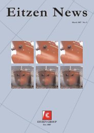
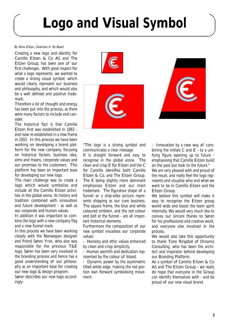
Logo and Visual SymbolBy Nina <strong>Eitzen</strong>, Chairman of the BoardCreating a new logo and identity forCamillo <strong>Eitzen</strong> & Co AS and The<strong>Eitzen</strong> Group, has been one of ourfirst challenges. With great respect forwhat a logo represents, we wanted tocreate a strong visual symbol, whichwould clearly represent our businessand philosophy, and which would alsobe a well defined and positive trademark.Therefore a lot of thought and energyhas been put into the process, as therewere many factors to include and consider.The historical fact is that Camillo<strong>Eitzen</strong> first was established in 1883 -and now re-established in a new framein <strong>2003</strong>. In this process we have beenworking on developing a brand platformfor the new company, focusingon historical factors, business idea,aims and means, corporate values andour promises to the customers. Thisplatform has been an important basefor developing our new logo.The main challenge was to create alogo which would symbolise andinclude all the Camillo <strong>Eitzen</strong> activitiesin the global arena, its history andtradition combined with innovationand future development - as well asour corporate and human values.In addition it was important to combinethe logo with a new company flagand a new funnel mark.In this process we have been workingclosely with the Norwegian designerand friend Søren Yran, who also wasresponsible for the previous T&Elogo. Søren has been very involved inthe branding process and hence has agood understanding of our philosophyas an important base for creatingour new logo & design program.Søren describes our new logo accordingly:"The logo is a strong symbol andcommunicates a clear message.It is straight forward and easy torecognise in the global arena. Theclean and crisp E for <strong>Eitzen</strong> and the Cfor Camillo identifies both Camillo<strong>Eitzen</strong> & Co, and The <strong>Eitzen</strong> Group.The E being slightly more dominantemphasises <strong>Eitzen</strong> and our maintrademark. The figurative shape of afunnel or a ship-alike picture representsshipping as our core business.The square frame, the blue and whitecoloured emblem, and the red colourand belt at the funnel - are all importanthistorical elements.Furthermore the composition of ournew symbol visualises our corporatevalues:- Honesty and ethic values enhancedby clean and crisp simplicity.- Human warmth and dedication representedby the colour of blood.- Dynamic power by the asymmetrictilted white edge, making the red portionlean forward symbolising movement.- Innovation by a new way of combiningthe initials C and E - to a unifyingfigure opening up to future -emphasising that Camillo <strong>Eitzen</strong> buildon the past but look to the future."We are very pleased with and proud ofthe result, and really feel the logo representsand visualise who and what wewant to be in Camillo <strong>Eitzen</strong> and the<strong>Eitzen</strong> Group.We believe this symbol will make iteasy to recognize the <strong>Eitzen</strong> <strong>group</strong>world wide and boost the team spiritinternally. We would very much like toconvey our sincere thanks to Sørenfor his professional and creative work,and everyone else involved in theprocess.We would also take this opportunityto thank Tone Ringstad of DinamoConsulting, who has been the architectand inspirator behind developingour Branding Platform.As a symbol of Camillo <strong>Eitzen</strong> & CoAS and The <strong>Eitzen</strong> Group - we reallydo hope that everyone in the Groupcan identify themselves with - and beproud of our new visual brand.3