Colour booklet
Colour booklet
Colour booklet

Create successful ePaper yourself
Turn your PDF publications into a flip-book with our unique Google optimized e-Paper software.
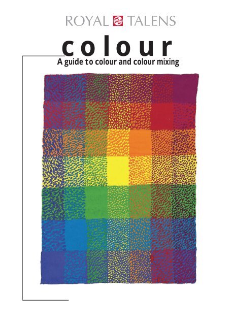
colourA guide to colour and colour mixing
colourContents2 Introduction3 The Origin of <strong>Colour</strong>Light as the source of colourReflection and absorptionDyes and pigmentsDyesPigmentsLightfastnessOpacity and transparencyTinting strength9 Properties of <strong>Colour</strong>s<strong>Colour</strong> temperature<strong>Colour</strong> hueBrightnessSaturation13 Mixing coloursThree-colour mixing systemPrimary coloursPrimary colours with black and whitePrimary colours with white, without blackLimitations of the three-colour mixing systemSix-colour mixing systemOptical mixing of coloursPointillistic mixingGlazing mixing24 Painting with colourSuggesting space on a flat surfaceAnalyzing a landscapeFormal perspective and colour perspective<strong>Colour</strong> temperature and suggesting spaceBrightness and suggesting spaceSaturation and suggesting spaceSuggesting space through a combination of colour properties34 List of mixing colours in Talens paints36 Index
colourIntroductionThe world around us is a constantly changing spectacle of colour. In order to capture this ina painting, one needs a knowledge of the theory of colour. The first three sections of this<strong>booklet</strong> outline the principles of colour theory:The origin of colourProperties of coloursMixing coloursThe usual view is that all colours can be mixed from the three primary colours red, yellowand blue. In theory this is correct. However, in practice this three-colour system of mixingturns out to have its limitations. Fortunately we are not dependent on the three primarycolours alone. The system can be expanded in such a way that every conceivable colourcan be mixed with others without restriction.The mixing of colours is not the aim of painting. A painting is a flat surface. On it we canpaint a representation suggesting a three-dimensional space, or one in which every hint ofspace is avoided. Simply by using the colours correctly this suggestion can be convincinglymade. Therefore with the aid of examples we shall discuss the possibilities of achieving thedesired result. We do this in the last section:Painting with colourWe wish you much enjoyment on this voyage of discovery!Note: The colours illustrated should be seen only as a guide, because the four-colour printing process imposes restrictionson the accurate reproduction of colours. This applies particularly to the orange colour band.pagen 2
colourThe origin of colour<strong>Colour</strong> is created by the interplay of light, colour-giving substances and the human eye. In this sectionwe shall look more closely at the role of light and colour-giving substances.Light as the source of colourThanks to light we are able to perceive colours. In the dark we see nothing. White lightis made up of all the colours of the rainbow. A triangular piece of glass, a prism,demonstrates this. If a beam of light passes through a prism, the different coloursbecome visible. We call this series of colours the spectrum. In addition at either end ofthe spectrum there are invisible rays - at the red end infrared, at the blue end ultraviolet(ill. 1).Reflection and absorptionMost colours do not originate directly from a light source. They are created by an interplayof light, the human eye and colour-giving substances. Trees, flowers and fruits,human beings and animals, stones and even earth allow us to see countless colourswithout themselves generating light. They exhibit colours through colour-givingsubstances.pagen 3
colour[2]These substances have the property of absorbinga particular part of the spectrum and reflectinganother. If we see a red object under whitelight, then this item contains a colour-givingsubstances which absorbs the yellow, orange,purple, blue and green components of the light.Only the red component is reflected back to oureyes. (ill. 2).And what about white, black and grey? In theory these are not colours. A white object contains a substancewhich does not absorb any colour in the spectrum. The whole spectrum is reflected. With blackwe see the opposite. No colour is reflected, all the colours in the spectrum are absorbed. Grey is somewherebetween white and black. Anequal quantity of each colour is reflected,the rest is absorbed. The reflectedcolours mix to become grey. The lighterthe grey (the further in the direction ofwhite), the more of each colour is reflected.And vice versa. (ills. 3, 4, 5).[3][4] [5]pagein 4
colourDyes and pigmentsWe can subdivide colour-giving substances into two types: dyes and pigments. For thepainter an important difference between the two is their lightfastness. Blended withpaint or ink all dyes have poor to moderate lightfastness. The lightfastness of pigmentsvaries from poor to excellent. The degree of lightfastness indicates the degree to whicha colour-giving substance is affected by ultraviolet light. Ultraviolet is a constituent ofboth natural daylight and artificial light. It has the property of breaking down colourgivingsubstances: the colour 'fades'. The speed at which this happens depends on thelightfastness in combination with the quantity of ultraviolet light. Some colours fadeafter just a few weeks, others only after years or not all. A second difference concernstheir solubility. Dyes dissolve in a liquid, pigments are insoluble.Dyes*)The lightfastness of dyes in paint or ink is poor to moderate. For this reason they are not used in artists'products. For educational uses or illustrative work lightfastness is of less importance. An original illustrationhas a temporary function and after publication can be stored in the dark. In the absence of light thecolour does not fade.PigmentsPigments can be distinguished not only by their degree of lightfastnessbut also by other properties such as opacity, transparency andintensity of colour.*)Dyes are used in only two products in the Talens range: Ecoline(except for white and metallic colours) and Waterproof Drawing Ink(except for white and black). All other Talens products are pigment-based.pagen 6
colourLightfastnessLightfastness varies from pigment to pigment. Thanks to modern techniques we areconstantly able to improve the quality of pigments. At present we have thousands ofpigments to choose from. This enables us to replace traditional pigments with onlymoderate light-fastness by superior synthetically produced pigments.The lightfastness of Talens products is indicated on tubes, labels and colour charts bymeans of the following symbols:+++ = at least 100 years lightfast under museum conditions++ = 25 – 100 years lightfast under museum conditions+ = 10 – 25 years lightfast under museum conditionso = 0 – 10 years lightfast under museum conditionsOpacity and transparencyAnother property of pigments is opacity or transparency. Paint with an opaque pigment will hide the groundfrom view when applied in a certain thickness. Paint with a transparent pigment is transparent at the samethickness. Not every opaque pigment is equally opaque; not every transparent pigment is equallytransparant. Many variations are possible, from very transparent to very opaque.Talens uses the following symbols for this:transparent;semi-transparent;semi-opaque;opaque;very transparentslightly less transparentthe ground is not completely hiddennone of the ground is visiblepagen 7
colourOpacity and transparency as properties of pigments are only visible if no opaque filler is added to thepaint. However, one example of an opaque paint is Poster <strong>Colour</strong> (Gouache) which is based on an opaquefiller, every colour of this type of paint becomes opaque, irrespective of what pigment has beenused.Tinting strengthThe intensity of a colour determines how much ofthat pigment is necessary to achieve a certain concentrationof colour. We shall take as an exampletwo equal quantities of blue paint, each made withthe same quantity of pigment. The difference is inthe type of pigment: pigment A and pigment B. Wethen take equal quantities of the same white colour.When mixed with an equal quantity of white paint,the mixture containing the blue with pigment A ismuch more concentrated (darker) than that containingpigment B. Pigment A is therefore has a highertinting strength (ill. 8).In addition to the type of pigment the quantity ofpigment also determines the tinting strength of acolour. Again we shall take as an example two equalquantities of blue paint. However, both are nowmade with the same pigment. The only difference isthat more of this pigment has been include in blue Cthan in blue D. When mixed with the samequantities of the same white paint, blue C gives amore intense result than blue D (ill. 9).ABCD++++====[9] The illustration gives a schematicrepresentation of the quantity andsize of the pigment particles in thecolour.In addition the grinding of a pigment affects the tinting strength of the paint. Pigments are ground in amedium. The finer the grinding the higher the tinting strength.pagen 8
colourProperties of coloursThere are differences between colours. <strong>Colour</strong> names such as yellow, orange, red and violet indicate thefirst clear differences. In addition we distinguish dark and light colours, bright and soft colours and alsowarm and cool colours. In the existing literature different words are used for these properties or the sameword is used for different properties. In this <strong>booklet</strong> we use the following terms to designate properties ofcolours: colour temperature, colour hue, brightness and saturation.<strong>Colour</strong> temperatureWe intuitively estimate the temperature in a yellow space as higher than that of a blueone. We call yellow a warm colour and blue a cool one. We see how relative this iswhen we mix yellow with blue. We then get green, i.e. colour made up of a warm and acool colour. Compared to blue green is a warm colour, compared to yellow a coolcolour (ill. 10).Red is also felt to be a warm colour. If we mix blueand red, the mixture is violet. Compared to blue,violet is experienced as warm, compared to red it'scool.pagen 9
colour[ 11]It can be even more subtle. Let us place two yellowsnext to each other. One of the yellows hastraces of blue in it and the other traces of red. Weexperience one of the yellows as warmer comparedwith the other. Although yellow is a warm colour parexcellence (ill. 11).We cannot simply separate the whole spectrum into warm and cool colours. We can,however, state that blue is at the center of a cool area and orange yellow the center of awarm area.<strong>Colour</strong> hueThe proportion in which the colours of the spectrum are reflected determines the colour hue.In the section on The Origin of <strong>Colour</strong> we saw that no colour is completely pure:every colour contains traces of the other colours in the spectrum.The largest reflected portion of the spectrum determines the principal colour, for example red.The second largest reflected portion, for example yellow, affects the principal colour.Together they determine the colour hue. In thiscase we speak of a red with traces of yellow. Ared with blue traces and a red with yellow tracesare both red, but each have their own colourhue. The further apart the trace colours are, thegreater the difference in colour hue (ill. 12).[ 12]pagen 10
BrightnesscolourThe brightness of a colour indicates how light or dark that colour is. Every colour has acertain degree of brightness. No colour is as light (bright) as white, all colours arelighter (brighter) than black.If we mix yellow with ever-increasing quantities of blue, we create a series from yellowto green to blue (ill. 13). We see that not only the colour hue and temperature change,but also the brightness. Thecolour becomes darker anddarker (the brightness graduallydecreases).We can illustrate this by making a black-andwhitephotograph of this series. The colours are eliminated and weare left with a series of greys. This shows the differences in brightness.The same grey series can be mixed with white and black. Sothat for every colour a grey can be mixed with the same brightnessas that colour.[ 13]SaturationA colour is saturated ('pure') when the reflected portions of the spectrum which together determine thecolour hue strongly predominate. This means that few traces of other colours are present in the reflection.If the reflection contains many traces of other colours the colour is said to be unsaturated ('dirty').If we mix a saturated colour with increasingquantities of grey with the same brightness asthat colour, the saturation decreases. The brightnessremains the same, the colour hue remainsthe same (ill. 14).[ 14]pagen 11
colourWhite and black are in theory completelyunsaturated. If we mix a saturatedcolour with increasing quantities ofwhite, the saturation decreases, whilethe colour hue remains the same. Inaddition the colour becomes lighterand lighter: brightness increases. Byadding increasing quantities of blackthe brightness decreases as well asthe saturation. The colour hue remainsthe same (ill. 15).[ 15 ]Saturated colours mixed with:white grey*) blacksaturation➙brightness ~➙➙colour hue ~ ~ ~ ~ ~ ~➙➙*) A grey that has the same clarity as the colour it is mixed with.pagen 12
colourMixing coloursWe can mix colours in two ways: with light and with colour. Mixing with coloured light iscalled additive mixing. The more colours that are added, the lighter the result. All thecolours together form white light.Mixing with paint is called subtractive mixing, which in this context means that light istaken away. The mixed colour is always darker than the lightest of the colours withwhich it has been mixed.Every colour-giving substance absorbs a certain section of the spectrum. If we mix twocolours, different sections of the spectrum are absorbed. Only the jointly reflectedsection is left.We shall mix colours with paint, i.e. subtractively. We shall do this according to thethree-colour mixing system and the six-colour mixing system. We shall also look atthe phenomenon of optical mixing of colours.Three-colour mixing systemPrimary coloursWith the three primary colours lemon yellow, cyan (blue) and magenta(red) we can mix any colour hue we wish. These colours are calledprimary because they cannot be mixed from other colours. The principlesof mixing can be learned using primary colours. Talens suppliesa special gouache mixing set. In addition to the primary colours thiscontains white and black. The Ecoline range also contains the primarycolours.pagen 13
colour[ 16]To begin with, we mix yellow with blue, blue with red and red with yellow. That gives usgreen, violet and orange respectively (ill. 16). The proportion in which the colours aremixed depends on the tinting strength of the paint. It is a good idea to begin by mixingsmall quantities to avoid wasting paint.pagen 14
colour[ 17 ]If we mix the colours next to each other in the six-colour circle, we obtain six newcolours (ill. 17). By doing the same with the colours in the 12-colour circle we obtaintwelve new colours.pagen 15
colour[ 18]The 24-colour circle contains various yellows, greens, blues, etc. (ill. 18). There areyellows with red traces and yellows with blue traces, bluish violets and reddish violets.By constantly mixing adjacent colours the circle can in principle be expanded intoinfinity. The colour areas merge into each other like the colours of the spectrum.pagen 16
colourPrimary colours with white and blackCountless colour hues can be mixed with the three primary colours. With white andblack we can mix countless greys. By combining these two possibilities we can inprinciple mix any colour we like.Primary colours with white, without blackThe colours that we need to paint all the objects that surround us can also be mixed without black. Blackand grey objects have more colour than is apparent at first sight.[ 19]If we mix primary colours in the right proportion we create agrey which is almost black. This is because in the mixingonly the jointly reflected section of the spectrum remains.When the primary colours are mixed that section is verysmall. Almost no light is reflected. This dark grey is darkenough to create the impression of black in a painting.Instead of black, dark-grey can also be mixed instead ofblack with white and a colour hue into any colour required(ill. 19).<strong>Colour</strong>s opposite each other in the circle are called complementary colours. Two complementarycolours together contain the three primary colours. Mixed in the right proportion these also create blackcolours, and of course greys as well with the addition of white (ill. 20).[ 20]pagen 17
colourOrange, green and violet are called secondary colours. Two secondary colours combinedalso contain the three primary colours. However, they do not cancel each otherout as completely and we do not obtain a black colour. Whatever proportion they aremixed in, the common primary colour is always dominant and hence determines thecolour. A colour mixed from two secondary colours is called a tertiary colour (ill. 21).[ 21]Three secondary colours combined in turn contain equal quantities of the three primary colours so that ablack colour can also be mixed from them, as well as greys in combination with white.Limitations of the three-colour mixing systemLemon yellow, cyan blue and magenta are saturated colours. Nevertheless the three-colour mixing systemhas the limitation that the saturation of intermediate colours may be greatly reduced. The followingexamples illustrate this:Lemon yellow is a yellow with blue traces.Cyan is a blue with yellow traces. Magenta is a redwith blue traces (ill. 22).Lemon yellowCyan[ 22]Magentapagen 18
colourThe violets mixed from cyan blue and magenta contain,in addition to blue and pink, the yellow tracesof the blue. Yellow and violet are complementarycolours. Equal parts of yellow and violet make greywhen mixed, so that the violets are less saturated(ill. 23).The saturation of the oranges is sharply reduced as a result of thecomplementary traces of both pink and yellow (ill. 24).[ 23][ 24]Only the greens are saturated. The colour hue ofboth lemon yellow and cyan blue have no traceswhich do notbelong to thegreen part of thespectrum(ill. 25).Six-colour mixing system[ 25]In order to be able to make a colour circle with onlysaturated colours, we add three new colours: ultramarine(a blue with red traces), a yellow with redtraces and vermilion (a red with yellow traces).Orange and violet are now also saturated (ill. 26).[ 26]pagen 19
colour[ 27]By mixing adjacent colours the circle can be further expanded (ill. 27).By adding white, grey or black the brightness and saturation of each colour hue can of course bechanged, just as in the three-colour mixing system.The six-colour mixing system also offers more opportunities for approximating black. The yellows, redsand blues can be mixed in different combinations. The proportion in which they are mixed determines thecolour hue of the dark grey. If we want to mix a grey without a colour hue, a neutral colour, those proportionsmust be very precise. The darkest neutral grey is obtained by mixing all six colours. This grey is soclose to black that the difference can only be seen when compared with pure black paint.pagen 20
Optical mixing of colourscolourOptical mixing of colour means that a mixed colour is suggested without actually mixing colourstogether. We distinguish pointillistic and glazing colour mixing.Pointillistic mixingPointillism means painting with dots. To obtain agreen colour we do not mix yellow and blue paint,but paint yellow and blue dots close together on asurface. The surface will then give the impression ofbeing green. The smaller the dots the morecomplete the mixture will appear (ill. 28).Here too complementary colours make the mixedcolour unsaturated (dirty).[ 28]If we combine coloured dots with white, black orgrey ones, brightness and saturation are affectedin the same way as in ordinary mixing (ill. 29).[ 29]Even without black dark grey colours can besuggested through pointillism, although the resultwill never be as dark and unsaturated as incomplete mixing (ill. 30).pagen 21[ 30]
colour[ 31]In the preceding pointillistic illustrations the white of the paper also forms part of the optical mixture. Thismakes the colours brighter and less saturated. In the following example different colours have beenapplied to a ground which has been painted a uniform colour, so that greater saturation is achieved(ill. 31).In the second example vertical strips from left toright have been painted in uniform colours. Thesame colours have been applied pointillistically inthe same order in horizontal strips (ill. 32).[ 32]pagen 22
colourGlazing mixingIn painting glazing means the application of transparent layers of paint. A transparentblue applied over yellow mixes optically to green. Transparent red over yellow mixesoptically to orange. Transparent blue over red mixes optically to violet. If we apply threecolours on top of each other they cancel each other out and mix optically to producean unsaturated grey colour (ill. 33). The best results are achieved with glazing mixingwhen increasingly dark colours are applied over each other.[ 33]This technique cannot be used with poster colour, since poster paint is opaque. With allother types of paint the rule is that only colours based on (semi-)transparent pigmentsare suitable for this technique (see under pigments).pagen 23
colourPainting with colourSuggesting space on a flat surfaceThe ground on which we paint is flat. Nevertheless depth can be suggested in paintings.This suggestion can be created, for example, by a correct use of colour temperature,brightness and saturation.Analysis of a landscapeWe are looking out over a mountain landscape full of trees (ill. 34).Despite the fact that the photograph is a 'flat picture' the impression is that we can see infinitely far intothe distance. From foreground to background the landscape can be roughly divided into four stages:1. The trees in the foreground2. The trees on the far side of the water3. The mountain with trees behind it4. The mountains in the distance.Formal perspective and colour perspectiveSuggestion of space is created in the first placeby the fact that shapes which in reality are thesame size appear smaller and smaller 'the furtheraway from us they are'. The trees in the foregroundare almost as big as the photograph,while the trees on the other side of the lake aredepicted many times smaller. The trees on themountain are even smaller and on the mountainsbeyond no trees at all can be distinguished. Onlythe dark patches suggest that there are treesthere too. Yet we know that in reality the trees donot get smaller and smaller.pagen 24
colour12If we next look at the colours in each of those fourstages, we also see great differences. Exactly whathappens to the colours becomes clear if we copy adark and a light colour for each stage approximatelyusing paint (ill. 35).[ 35]34In the foreground the greens are warm. They containa lot of yellow, and even orange. The furtheraway the trees are the bluer they become. Thecolour temperature falls as the distance from acolour increases. The colour becomes cooler.In the foreground the contrast in brightness is great. The further away we move, the smaller the distancebetween light and dark becomes. A dark colour becomes increasingly light as the distance from thecolour increases.<strong>Colour</strong> saturation follows a comparable pattern. The further away, the greyer the colours. The saturationof a colour decreases as the distance from the colour increases. Form perspective and colourperspective are inextricably bound together.<strong>Colour</strong> temperature andthe suggestion of spaceWarm colours stand out compared with cool colours (ill. 36). By reversing the use of colour in two illustrationswith the same shapes, the effect of the various colours on the suggestion of space is clearly shown.[ 36]pagen 25
colourIn the landscape on the left our attention is drawn by the warm-coloured mountains in the foreground.From there our eye is led into the space. In the right-hand illustration our attention is immediately drawnby the warm-coloured mountains in the background. If we then look downwards the blue mountains inthe foreground seem to be trying to hide under the warm colours. They do not stand out.Brightness and suggesting spaceObjects which are contrasted with a lighter background stand out (ill. 37). In the first example we have nodifficulty in imagining a spatial mountain landscape. In the second example this is much more difficult.The world seems to be standing on its head. Objects which have great contrasts in brightness stand outcompared to objects with small contrasts in brightness (ill. 38).[ 37]In the first illustration space is suggested by the marked form perspective of the posts (ill. 38).This space is emphasized in the second example by increasing the contrast between light and dark inthe foreground and decreasing it in the background.[ 38]pagen 26
Saturation and suggesting spacecolourSaturated colours stand out in relation to unsaturated colours (ill. 39). In the first illustration we experiencedepth because the shapes become smaller and smaller. By then decreasing the saturation fromforeground to background the suggestion of space is heightened.[ 39]Suggesting space through a combination ofcolour propertiesIn painting from life space is suggested, as well as through form perspective, through a combination ofcolour temperature, brightness and saturation. Of course the artist has the freedom to keep to reality,depart from it, or to paint from his imagination. He can opt to emphasize the suggestion of space orprecisely avoid it. In all cases the required result can only be achieved by a correct use of colour properties.Using the following examples various options are described.Ill. 40In this illustration form perspective is totallyabsent: the grass-like shapes are as large in theforeground as in the background. Depth is createdsolely by combining the possibilities of the propertiesof colours. At the bottom saturated and warmcolours have been used and the contrast inpagen 27[ 40]
colourbrightness is great. Towards the top of the picturesaturation and contrast in brightness graduallydecrease, and the colours become predominantlycool. At the very top the shapes disappear in a lightgrey colour.Ill. 41In each of the six rectangles the top left-handcorner stands out and the bottom right-handcorner recedes. This is because of the diagonalprogression of colours: at top left saturation, colourtemperature and/or contrast in brightness arestrongly present, at bottom right much less so.Where the rectangles border each other mutuallycomparable differences can be seen through whichthe suggestion of space is emphasized.[ 41]In the following examples the suggestion of spaceis linked to form perspective through combination of colour properties.Ill. 42The surroundings of the blue block are very saturatedand in addition are made up of warm colours.Despite the saturation of the blue itself and thecontrast in brightness between the blue areas theblock appears to be trying to disappear into thebackground; we do not experience any spacebehind the shape.[ 42]pagen 28
colourIll. 43The saturation of the foreground and background is increasingly reduced from front toback. The corner behind the subject is furthest away and hence the most unsaturated.At the same time the angle at which the light falls has also be taken into account. Thelight comes from top right and apart from on the subject, falls mainly on the area to theleft of it. This causes a greater contrast in brightness between the cast shadow and theground. The cast shadow is the link between form and the ground. The use of the propertiesof colours helps to determine the space for the object casting the shadow. Thecolour of the cast shadow has been made slightly lighter and unsaturated towards theback so that the shadow follows the spatialprogression of the ground.The saturation of the blue areas has been reducedsomewhat towards the back and the colour of thelighter areas at the front has been made more yellow,and the blue of the dark area at the front darker.The foremost point now has a great contrast inbrightness and more warmth, and hence stands outmore. The block itself is now more spatial andstands out from the background.[ 43]Ill. 44The suggestion of space through properties ofcolours always works. If the properties are used in away that runs precisely counter to form perspectiveevery spatial drawing can be turned into arepresentation without the suggestion of space.In the illustration all the steps described above havebeen used in reverse.[ 44]pagen 29
colourIll. 45The landscape can be divided into four parts: themountain on the left, the mountain on the right, theview through to the landscape beyond and the sky.The representation is not very spatial. Both thecolour temperature and the saturation and thecontrast in brightness are more or less the sameeverywhere. Only the sky recedes because of thelow contrast in brightness.[ 45]Ill. 46The mountain in the foreground stands out morebecause of the warm saturated colours. The mountainon the right now seems further away, the darkcolours have been made lighter and the lightestcolours somewhat darker. The contrast in brightnesscompared with the foreground is now considerablyless. The shadows at the foot of the mountainhave been painted in with cooler colours so that thevalley seems deeper and distance from the foregroundgreater. In the view through the mountains[ 46]the dark colours have been made lighter and cooler so that space is emphasized.We can see changes in the sky too. Before we deal with these let us reflect for a moment on how a skyshould be seen in spatial terms. Skies are unpredictable. Depending on the weather conditions and thetime of day dark and light sections may alternate and saturated, warm or cool colours can appear anywhere.Nevertheless the laws of the properties of colours in relation to the suggestion of space applyhere too. No sky is so red that a dark shape will not stand out against it. We should see the sky like theceiling of a room. If we look straight up the distance to the ceiling is small. If we look further away at theceiling the distance is greater. In other words if we look straight up at a clear blue sky the blue is darkpagen 30
colourand saturated. The further towards the horizon we focus our gaze, the lighter and moreunsaturated the blue will be. The contrast in brightness in clouds immediately above usas a result of the effect of light and shadow will consequently be greater than thecontrast of similar clouds further away. Accordingly in the illustration we see thecontrast in brightness, saturation and the colour temperature of the sky reducingtowards the horizon.In the last examples the colours in a still-life are constructed step by step in such a waythat each object is given its place in space. We do this in three stages.Ill. 47The painting lacks any suggestionof space. The red backgrounddominates all other forms and theground seems to be upright. Thecolourless grey bottle disappearsinto the background and the greenfruit cannot compete with the riotof colour around them.[ 47]pagen 31
colourIll. 48The saturation of the backgroundhas been toned down, as has thesaturation of the yellow groundtowards the back. This defines thespace in which the various objectsmust be located. The colours ofthe cast shadows follow this saturationprogression and in additionhave been made a little lightertowards the back. Next, use hasbeen made of the angle at whichthe light falls to give the shapescontrast in brightness. It is importantthat the subjects shouldretain sufficient colour.[ 48]It is not sufficient to make a colour lighter or darker with white or black respectively. The brightness willchange, but so will the saturation. Unsaturated colours will recede in relation to the starting colour andwill cancel out the spatial location of the object.Depending on the colour of the light and the colours of the surroundings the shadow colours and thelight colours of an object become cooler or warmer as well as darker or lighter. The dark dish is givenmore colour by repeating the yellow of the ground on the outside. Depending on the material of whichthe objects are made colours can be reflected back and forth in varying degrees.pagen 32
colourIll. 49The red ground has been made somewhat cooler and darker on the right, towards the bottom left-handcorner somewhat lighter and more unsaturated. As a result the grey bottle and the blue jug particularlystand out more. The bottle has become considerably more colourful by echoing various colours from thesurroundings on it. The lightest areas of each object have been reinforced with warm colours. Compare,for example, the little blue jug inthe previous illustration with jugnow. Thanks to the warm, lightcolours the jug itself has becomemore spatial and detaches itselfmore from the background. As alast step attention was paid to thesmall details in the foreground.[ 49]pagen 33
List of mixing colours in Talens paintscolourThe primary colours of the three-colour mixing system and the additional colours from the six-colourmixing system may have different names and colour codes according to type of paint. Below is a table ofthe principal mixed colours in various types of paint.Product Primary colours Additional coloursOil coloursRembrandt 254 (207), 366, 576 283 (208), 311 (303), 506Van Gogh 267, 366, 570 268 (208), 311 (393), 504Amsterdam 267, 366, 570 268, 312, 504Cobra 275, 369, 572 254 (207), 311 (303), 504ArtCreation 205, 357, 570 200, 311, 504Acrylic coloursRembrandt 267 (207), 366, 570 268 (208), 398 (303), 504Van Gogh 267, 366, 570 268, 311, 504Amsterdam Expert Series 254 (207), 366, 570 284 (208), 311 (303), 504Amsterdam Standard Series 275, 369, 572 267, 396, 504ArtCreation 275, 369, 572 267, 398, 504Water coloursRembrandt 254 (207), 366, 576 268 (208), 311 (303), 506Van Gogh 254, 366, 570 268, 311, 506Poster coloursDesigners’ gouache 205, 397, 501 200, 311, 506Ecola 205, 359, 501 200, 334, 502School colours 200, 302, 501ArtCreation 205, 362, 501 201, 311, 504pagen 34
colourProduct Primary colours Additional coloursEcoline 205, 337, 578 201, 311, 506DecorfinUniversal satin 287, 350, 588Textile 206, 350, 527Glass 200, 350, 501Porcelain 287/288, 341, 527/541<strong>Colour</strong> numbers mentioned between ( ) are colours based on real cadmium pigments.pagen 35
IndexcolourSubjectAbsorptionBrightnessTinting strength<strong>Colour</strong> reflection<strong>Colour</strong>scomplementaryorigin ofprimarysecondarytertiarysix-colour circletwelve-colour circletwenty-four-colour circle<strong>Colour</strong> temperature<strong>Colour</strong> hue<strong>Colour</strong>-giving substancesdyespigmentsFormal perspectiveLightLightfastnessMixingadditiveglazinglightopticalpaintpointillisticsubtractive3-colour system6-colour systemOpacityReflectionSaturationSpectrumTransparencyPage311, 2683171318181415169, 251062436, 71323132113211313197311, 2737page 36
P.O. Box 4, 7300 AA Apeldoorn, NLPrinted in the Netherlands 88800154 2012 www.royaltalens.com