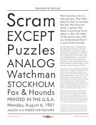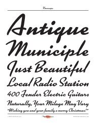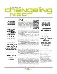
Bookmania Specimen. - Mark Simonson
Bookmania Specimen. - Mark Simonson
Bookmania Specimen. - Mark Simonson

You also want an ePaper? Increase the reach of your titles
YUMPU automatically turns print PDFs into web optimized ePapers that Google loves.
hy?One might wonder: Why bother? Bookman hashad its day. It’s a has-been. Some might argue thatit’s no great loss. But I believe it’s a typographicalgem that’s never been properly revived.ITC’s redesign in the Seventies took it so far fromits roots that it should have been called somethingelse. But that’s the “Bookman” we’ve been stuckwith—like it or not—for a long time. The original,for the most part, has been lost to us. My aim wasto go back to the earlier Bookmans and make atypeface that would restore the dignity (as well asfrivolity) that was lost.As with any revival, it’s an interpretation. I’veleaned heavily toward the more refined look of thedisplay sizes of the older Bookmans. Nevertheless,it also works well for text, although the effect isdifferent than the old Bookmans at smaller sizes.(I hope to do a <strong>Bookmania</strong> Text someday that hasthe look and feel of the old text sizes.)I tried to picture what ATF’s Morris Fuller Bentonwould have done if he had developed BookmanOldstyle the way he did Cheltenham Oldstyle.Bookman Oldstyle (and most later Bookmans) hada certain unpolished look. There is some charm tothis, but I wanted to see the same fit and finish thatBenton gave to his Cheltenham and Century faces.Like traditional Bookmans, the italic is a slantedroman. But it’s not just slanted. It’s opticallycorrected to eliminate the unavoidable distortionthat comes from simply slanting the characters.I considered giving it a “cursive” italic, but itwouldn’t look like Bookman if I did, so I kept theslanted roman. It does have the advantage of beingeasier to read than cursive italics.What would a Bookman revival be without theswashes? I looked at all the different ones thatwere added over the years and decided to do ananthology of the best. I added a few of my ownideas, but tried to keep them as much in the spiritof Bookman swashes as I could.One thing that has been lacking in previousBookmans is typographic “niceties.” With this inmind, I added small caps, old style figures, tabularand proportional figures, swash ligatures, and—why not?—swash small caps.The range of weights in the earlier Bookmansvaried a lot. The earliest ones had just a “regular”weight. Sometimes a boldface was added. Some inthe film font era had more weights. The ITC versionhad four. <strong>Bookmania</strong> is similarly weighted, but withone more on the light end for a total of five weights:Light, Regular, Semibold, Bold, and Black.Some characters differ between roman anditalic: g, g, &, &, $, $. I’ve included the counterpartvariation as an option in each style. There are alsoa few lowercase alternates to give <strong>Bookmania</strong>a more contemporary-looking italic. Finally,I added coMMoNcAsE cAps, which are seenin some type revivals in the Sixties, inspired byBradbury Thompson’s AlphAbEt 26.All features (even the swashes) are included inall weights and styles.