Appendix C Sign Design Guidelines Sign Types ... - Schoharie County
Appendix C Sign Design Guidelines Sign Types ... - Schoharie County
Appendix C Sign Design Guidelines Sign Types ... - Schoharie County

You also want an ePaper? Increase the reach of your titles
YUMPU automatically turns print PDFs into web optimized ePapers that Google loves.
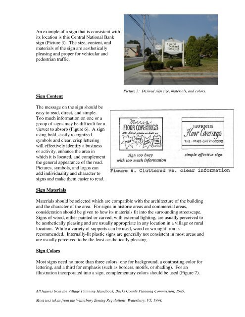
An example of a sign that is consistent withits location is this Central National Banksign (Picture 3). The size, content, andmaterials of the sign are aestheticallypleasing and proper for vehicular andpedestrian traffic.<strong>Sign</strong> ContentPicture 3: Desired sign size, materials, and colors.The message on the sign should beeasy to read, direct, and simple.Too much information on one or agroup of signs may be difficult for aviewer to absorb (Figure 6). A signusing bold, easily recognizedsymbols and clear, crisp letteringwill effectively identify a businessor activity, enhance the area inwhich it is located, and complementthe general appearance of the road.Pictures, symbols, and logos canadd individuality and character tosigns and make them easier to read.<strong>Sign</strong> MaterialsMaterials should be selected which are compatible with the architecture of the buildingand the character of the area. For signs in historic areas and commercial areas,consideration should be given to how its materials fit into the surrounding streetscape.<strong>Sign</strong>s of wood, either painted or carved, with external lighting, are usually perceived tobe aesthetically pleasing and are usually appropriate in any location in a village or rurallocation. While a variety of supports can be used, wood or wrought iron isrecommended. Internally-lit plastic signs are generally not consistent in most areas andare usually perceived to be the least aesthetically pleasing.<strong>Sign</strong> ColorsMost signs need no more than three colors: one for background, a contrasting color forlettering, and a third for emphasis (such as borders, motifs, or shading). For anillustration incorporated into a sign, complementary colors should be used (Figure 7).All figures from the Village Planning Handbook, Bucks <strong>County</strong> Planning Commission, 1989.Most text taken from the Waterbury Zoning Regulations, Waterbury, VT, 1994.