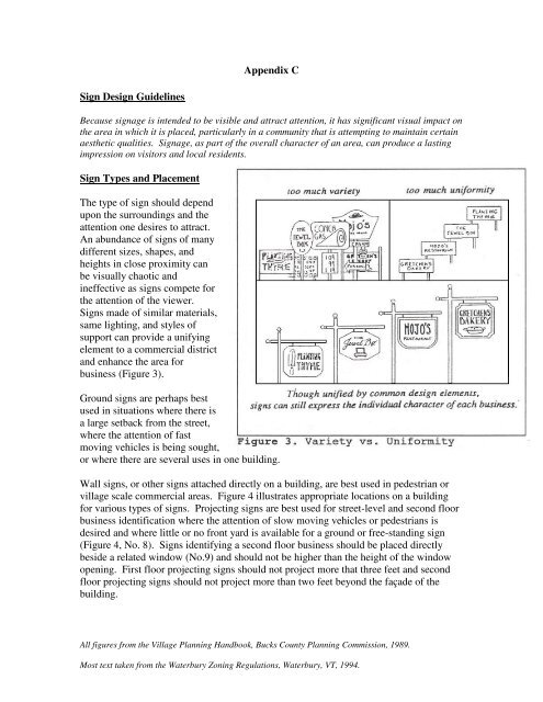
Appendix C Sign Design Guidelines Sign Types ... - Schoharie County
Appendix C Sign Design Guidelines Sign Types ... - Schoharie County
Appendix C Sign Design Guidelines Sign Types ... - Schoharie County

Create successful ePaper yourself
Turn your PDF publications into a flip-book with our unique Google optimized e-Paper software.
Windows provide an excellentarea for signs that will notinterfere with the architecturaldetails or overall appearance ofthe building. Such signs shouldsimply state the name and functionof the business. Covering thewindow with long lists ofproducts, prices, and otherinformation can create a clutteredand unattractive appearance.Freestanding signs are perhapsbest used in areas of slow movingvehicles or pedestrian activity.Freestanding signs work well inintimate settings, such ascourtyards.If two businesses share a commonstorefront (Figure 4 No. 1), bothshould use the same basic signformat. <strong>Sign</strong>s relating to streetlevel establishments should be placed within an information band (No. 3) immediatelyabove the storefront or should be applied directly to the display window (No. 2). Theinformation band should not be longer than the overall length of the storefront. If itcannot be confined to the width of an existing band defined by the building, its heightshould not exceed two feet, six inches.Second floor businesses should be identified by a street level directory or sign that isplaced directly beside (No. 4), immediately above (No. 5), or directly on a relatedwindow (No. 6). A sign placed beside the window should be no higher than the height ofthe window opening. A sign placed immediately above a window should be no longerthan the overall width of the window.Third floor businesses should be identified either by a street level directory or sign that isapplied directly to a related window (No. 7). No signs should be placed on the façade ofthe building above the second floor.All figures from the Village Planning Handbook, Bucks <strong>County</strong> Planning Commission, 1989.Most text taken from the Waterbury Zoning Regulations, Waterbury, VT, 1994.
<strong>Sign</strong> SizeThe size of words and theoverall sign should be keptin scale with the viewer’sexpected location andspeed. The sign shouldalso be in scale with thebuilding it is associatedwith. Larger, autoorientedsigns may bemore appropriate alonghigh-speed roads but arenot generally consistentwith the scale and pedestrian-orientation of village areas.The size of the sign should depend upon its expected location on the façade of thebuilding so it does not conceal significant architectural details (Figure 5).An example of a sign that is notconsistent with its building orlocation is shown in Picture 1.This sign is too large. Noticethat the speed of traffic in thisarea is regulated by a signal andis relatively slow moving. Also,the size of the sign in relation topedestrians on the sidewalk isout of scale. This signdominates the area in which it islocated and negatively effectssurrounding businesses.Picture 1: Existing sign out of scale with building.It is not hard to visualize thatrecognition of the businesswould not be lost with alowering and reduction of theexisting large sign sinceadditional small signs exist andthe architecture and color of thebuilding itself serves as asymbol that is readilyidentifiable to the general public(Picture 2).Picture 2: <strong>Sign</strong> alterations with improved scaleAll figures from the Village Planning Handbook, Bucks <strong>County</strong> Planning Commission, 1989.Most text taken from the Waterbury Zoning Regulations, Waterbury, VT, 1994.
An example of a sign that is consistent withits location is this Central National Banksign (Picture 3). The size, content, andmaterials of the sign are aestheticallypleasing and proper for vehicular andpedestrian traffic.<strong>Sign</strong> ContentPicture 3: Desired sign size, materials, and colors.The message on the sign should beeasy to read, direct, and simple.Too much information on one or agroup of signs may be difficult for aviewer to absorb (Figure 6). A signusing bold, easily recognizedsymbols and clear, crisp letteringwill effectively identify a businessor activity, enhance the area inwhich it is located, and complementthe general appearance of the road.Pictures, symbols, and logos canadd individuality and character tosigns and make them easier to read.<strong>Sign</strong> MaterialsMaterials should be selected which are compatible with the architecture of the buildingand the character of the area. For signs in historic areas and commercial areas,consideration should be given to how its materials fit into the surrounding streetscape.<strong>Sign</strong>s of wood, either painted or carved, with external lighting, are usually perceived tobe aesthetically pleasing and are usually appropriate in any location in a village or rurallocation. While a variety of supports can be used, wood or wrought iron isrecommended. Internally-lit plastic signs are generally not consistent in most areas andare usually perceived to be the least aesthetically pleasing.<strong>Sign</strong> ColorsMost signs need no more than three colors: one for background, a contrasting color forlettering, and a third for emphasis (such as borders, motifs, or shading). For anillustration incorporated into a sign, complementary colors should be used (Figure 7).All figures from the Village Planning Handbook, Bucks <strong>County</strong> Planning Commission, 1989.Most text taken from the Waterbury Zoning Regulations, Waterbury, VT, 1994.
Colors used for a signshould complement thegeneral tone of thestructure it serves.When more than onesign is used, the colorsof the signs should becoordinated to presenta unified image.All figures from the Village Planning Handbook, Bucks <strong>County</strong> Planning Commission, 1989.Most text taken from the Waterbury Zoning Regulations, Waterbury, VT, 1994.