Lesson 4 Scatter Plots and Lines of Best Fit (330.0K)
Lesson 4 Scatter Plots and Lines of Best Fit (330.0K)
Lesson 4 Scatter Plots and Lines of Best Fit (330.0K)

Create successful ePaper yourself
Turn your PDF publications into a flip-book with our unique Google optimized e-Paper software.
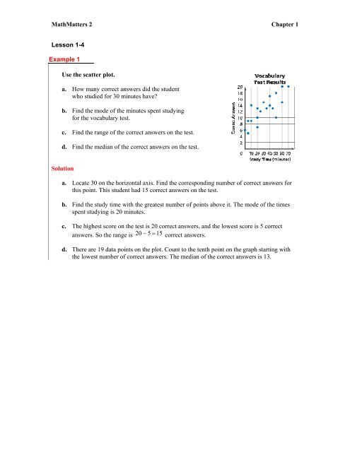
MathMatters 2 Chapter 1<strong>Lesson</strong> 1-4Example 1Use the scatter plot.a. How many correct answers did the studentwho studied for 30 minutes have?b. Find the mode <strong>of</strong> the minutes spent studyingfor the vocabulary test.c. Find the range <strong>of</strong> the correct answers on the test.d. Find the median <strong>of</strong> the correct answers on the test.Solutiona. Locate 30 on the horizontal axis. Find the corresponding number <strong>of</strong> correct answers forthis point. This student had 15 correct answers on the test.b. Find the study time with the greatest number <strong>of</strong> points above it. The mode <strong>of</strong> the timesspent studying is 20 minutes.c. The highest score on the test is 20 correct answers, <strong>and</strong> the lowest score is 5 correctanswers. So the range is 20 − 5 = 15 correct answers.d. There are 19 data points on the plot. Count to the tenth point on the graph starting withthe lowest number <strong>of</strong> correct answers. The median <strong>of</strong> the correct answers is 13.
MathMatters 2 Chapter 1Example 2HEALTH Mrs. Clements had her students measure their heart rates, in beats per minute,after running different numbers <strong>of</strong> laps around the gym. The results are shown in the tablebelow.Use a graphing utility to display a scatter plot <strong>of</strong> the data.Laps Heart Rate Laps Heart Rate2 90 7 1265 99 5 951 83 2 773 92 6 1026 114 1 772 80 10 1248 118 4 96SolutionEnter the laps data into a list, L1, <strong>and</strong> the heart rate thatcorresponds to each number <strong>of</strong> laps into another list, L2.Turn on Plot 1. Select scatter plot as the type <strong>of</strong> plot todisplay. Set the viewing window as follows.x min = 0 x max = 12 x scale = 1y min = 0 y max = 140 y scale = 10
MathMatters 2 Chapter 1Example 3Graph a line <strong>of</strong> best fit for the scatter plot in Example 2.SolutionThe line <strong>of</strong> best fit is called linear regression on mostgraphing utilities. You can display the linear regressionon the home screen by choosing it under the Calculatemenu <strong>of</strong> the Statistics menu.To graph the line <strong>and</strong> the scatter plot, enter the linearregression equation. Be sure that equation <strong>and</strong> Plot 1are turned on (just as you set for Example 2).Follow the sequence <strong>of</strong> calculator screens to graph the scatter plot <strong>and</strong> line <strong>of</strong> best fitsimultaneously.Equation screenSelect regression equation from theStatistical Equations in the Variables menu.Equation screen after linear regressionequation in placeA graph <strong>of</strong> the scatter plot <strong>and</strong> line <strong>of</strong> best fit