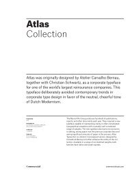
Collection overview - Commercial Type
Collection overview - Commercial Type
Collection overview - Commercial Type
- No tags were found...

You also want an ePaper? Increase the reach of your titles
YUMPU automatically turns print PDFs into web optimized ePapers that Google loves.
Giorgio <strong>Collection</strong>Giorgio and its matching sans serif were originallydesigned in 2007 and 2008 for Chris Martinez, the artdirector at T, the New York Times Style Magazine, withthe idea of bringing runway proportions to the page.PUBLISHED2009DESIGNED BYCHRISTIAN SCHWARTZ20 STYLES2 FAMILIESFAMILIESGIORGIOGIORGIO SANSSharing an overall proportion and x-height, Giorgio and GiorgioSans take their formal cues from very different ends of thefashion spectrum. The aggressive beauty of the serif evokes theimaginative glamour of couture, where fashion is fantasy. Thesans, on the other hand, is inspired by the clean, simple beautyseen in a well-tailored suit.<strong>Commercial</strong>commercialtype.com
Giorgio 2 of 21GiorgioInspired by the tall skinny proportions of the catwalkand the graphic style of the 1920s and 1930s, Giorgiowas originally designed for T, the New York TimesStyle Magazine, and provided a unique typographicpersonality for a year’s worth of cutting-edge fashion.PUBLISHED2009DESIGNED BYCHRISTIAN SCHWARTZ8 STYLES1 WEIGHT, 4 OPTICAL SIZES W/ ITALICSFEATURESPROPORTIONAL LINING FIGURESFRACTIONSGiorgio has been drawn in 4 optical sizes, to avoid the compromisesdemanded by its extreme contrast between thick andthin. With a single optical size, it would have been necessary toreduce the contrast or limit its use to above 150 point. The widevariety of alternate characters make Giorgio an inspired choiceboth for headlines and logotypes.<strong>Commercial</strong>commercialtype.com
Giorgio 3 of 21RECOMMENDED MINIMUM & MAXIMUM SIZESSMALL, 24 PTSMALL, 48 PTMEDIUM, 48 PTMEDIUM, 72 PTLARGE, 72 PTLARGE, 90 PTXLARGE, 90 PTXLARGE, 132 PT +Moments choisis des histoire(s) du cinémaLes Pennes-MirabeauMichelangelo AntonioniCharacteristicsElsa SchiaparelliFashionablesErnst Lubitsch<strong>Collection</strong><strong>Commercial</strong>commercialtype.com
Giorgio 4 of 21FLORENCEAnthologyGIORGIO XLARGE REGULAR, 160 PT [ALTERNATE n, h]SHANGHAICréateursGIORGIO XLARGE ITALIC, 160 PT<strong>Commercial</strong>commercialtype.com
Giorgio 5 of 21KOMERČNÍLørenskogGIORGIO XLARGE REGULAR, 160 PT [ALTERNATE k]PORTUGALOriginatedGIORGIO XLARGE ITALIC, 160 PT<strong>Commercial</strong>commercialtype.com
Giorgio 6 of 21PhysiopathologicUZUNLUĞUNDAKİŢara FăgărașuluiGIORGIO LARGE REGULAR, 90 PT [ALTERNATE g]HistoriographersBLÁSKÓGABYGGÐRangárvallasýslaGIORGIO LARGE ITALIC, 90 PT [ALTERNATE g]<strong>Commercial</strong>commercialtype.com
Giorgio 7 of 21MachiavellianismGÄVLEBORGS LÄNUnconventionallyGIORGIO LARGE REGULAR, 90 PTÖnkormányzatokEERSTGENOEMDEArchitektonischeGIORGIO LARGE ITALIC, 90 PT [ALTERNATE G k]<strong>Commercial</strong>commercialtype.com
Giorgio 8 of 21NIKOLAY BOGOLYUBOVQuantum Field TheoryPSEUDOINTELLECTUALMetabolist MovementsGIORGIO MEDIUM REGULAR, 90 PTNONPHYSIOLOGICALLYTálknafjarðarhreppurCOLONIAL REVIVALISMNorður-ÞingeyjarsýslaGIORGIO MEDIUM ITALIC, 90 PT [ALTERNATE h m n g]<strong>Commercial</strong>commercialtype.com
Giorgio 9 of 21CARACTÉRISTIQUES DES SITCOMSAnti-heroic and pro-consumeristRonald George Wreyford NorrishTHE MUSEUMS AND ART GALLERYPotrivit unei statistici anterioareSnæfellsnes-og HnappadalssýslaGIORGIO SMALL REGULAR, 40 PTNEWFOUNDLAND AND LABRADORVan Oudheid naar MiddeleeuwenA Harmadik Magyar KöztársaságSKEIÐA- OG GNÚPVERJAHREPPURBurgerlijk-verzuilde samenlevingKoripalloa on Helsingissä pelattuGIORGIO SMALL ITALIC, 40 PT [ALTERNATE g k]<strong>Commercial</strong>commercialtype.com
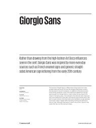
Giorgio Sans 10 of 21Giorgio SansRather than drawing from the high-fashion Art Deco influencesseen in the serif, Giorgio Sans was inspired by more everydaysources such as French enamel signs and generic straightsidedAmerican sign lettering from the early 20th century.PUBLISHED2009DESIGNED BYCHRISTIAN SCHWARTZ12 STYLES6 WEIGHTS W/ ITALICSFEATURESTABULAR LINING FIGURESTITLING CAPITALSPREBUILT FRACTIONSThe extreme x-height helps to differentiate Giorgio Sans from otherstraight-sided sans serifs; this and the straight-sided bowls connectthe sans back to its serif companion. In addition to the structural andproportional similarities, some of the distinctive details from Giorgiowere brought into Giorgio Sans in order to allow the two faces to bemixed in interesting ways. One example is the alternate italic lowercasewith more traditional cursive tails, echoing the more extreme tails in theserif. An early version of the face had a set of perfectly circular alternateround caps, which created really interesting rhythms and textures inlines of copy. Although these weren’t used in any of the T layouts, theymade their way into the eventual release.<strong>Commercial</strong>commercialtype.com
Giorgio Sans 11 of 21Giorgio Sans ThinGiorgio Sans Thin ItalicGiorgio Sans ExtralightGiorgio Sans Extralight ItalicGiorgio Sans LightGiorgio Sans Light ItalicGiorgio Sans RegularGiorgio Sans Regular ItalicGiorgio Sans MediumGiorgio Sans Medium ItalicGiorgio Sans BoldGiorgio Sans Bold ItalicEXIT CDGOQXEXIT CDGOQXGIORGIO SANS TITLING ALTERNATES, 16 PTLike Giorgio, Giorgio Sans was designed in part to echo prevailingtrends in fashion. The sans was drawn at a time when many fashiondesigners were sending strange experiments with proportion andsilhouette down the runway, which inspired this set of circular titlingcaps that dramatically change the texture of words, breaking the strictseries of verticals with a dramatic interplay between wide and narrowand between flat and round. The wide X is an homage to the quirky“EXIT” signs common in the New York City Subway before the signageprogram by Massimo Vignelli was implemented in the 1960s.<strong>Commercial</strong>commercialtype.com
Giorgio Sans 12 of 21PreconsiderationsKYRKSÆTERØRAOversophisticatedGIORGIO SANS THIN, THIN ITALIC, 90 PT [TITLING ALTERNATE Ø]StereographicallyMINIATURIZATIONSParancsnokságátGIORGIO SANS EXTRALIGHT, EXTRALIGHT ITALIC, 90 PT<strong>Commercial</strong>commercialtype.com
Giorgio Sans 13 of 21ParallélogrammeBLÁSKÓGABYGGÐRangárvallasýslaGIORGIO LARGE REGULAR, 90 PTJohn BaskervillePRIPOVIJEDANJAIncompatibilitiesGIORGIO LARGE ITALIC, 90 PT [ALTERNATE g]<strong>Commercial</strong>commercialtype.com
Giorgio Sans 14 of 21HerausgebildetKNIGHTSBRIDGEBeaubassin-EstGIORGIO LARGE REGULAR, 90 PTContemporarySØRUMSAND!GießmaschineGIORGIO LARGE ITALIC, 90 PT [TITLING CAPITALS, ALTERNATE ITALIC a h i m n ß]<strong>Commercial</strong>commercialtype.com
Giorgio Sans 15 of 21EUSKALTZAINDIKO LEHENMyndighetsuppgifterna?GIORGIO SANS THIN, 75 PTUNCOMPARTMENTALIZESAnthropologists in denialGIORGIO SANS THIN ITALIC, 75 PTPOLITIKAI INDÍTTATÁSBÓLGebietskörperschaftenGIORGIO SANS EXTRALIGHT, 75 PTDEPARTMENT OF LABORThe NoninterventionistsGIORGIO SANS EXTRALIGHT ITALIC, 75 PT<strong>Commercial</strong>commercialtype.com
Giorgio Sans 16 of 21MITTELHOCHDEUTSCHEBibliothéque Nationale!GIORGIO SANS LIGHT, 75 PTVORGÄNGERSPRACHENBorsod-Abaúj-ZemplénGIORGIO SANS LIGHT ITALIC, 75 PT [ALTERNATE R G a d l m n u]CACOPHONIOUSZvláště vypravovánímGIORGIO SANS REGULAR, 75 PTUNCONSTITUTIONALITYInternal InfrastructureGIORGIO SANS REGULAR ITALIC, 75 PT [ALTERNATE a f l n u]<strong>Commercial</strong>commercialtype.com
Giorgio Sans 17 of 21TRENTINO-ALTO ADIGEAdministrative areasGIORGIO SANS MEDIUM, 75 PT [ALTERNATE G & R]NORD-PAS-DE-CALAISIn the late fall of 1958GIORGIO SANS MEDIUM ITALIC, 75 PTSIXTY QUESTIONSChatrného príbytkuGIORGIO SANS BOLD, 75 PTBYZANTINE EMPERORMunicipal EngineersGIORGIO SANS BOLD ITALIC, 75 PT<strong>Commercial</strong>commercialtype.com
Giorgio Sans 18 of 21There are 16,470 households in the areaAZ ERDŐ FELŐL ÉLES SZÉL CSAPOTT ALÁThe spectacle’s estrangement from theGIORGIO SANS THIN, 45 PTAbout 5.4 million people reside in FinlandWIE, KIEDY ZZA KTÓREGO WĘGŁA WYJRZYHis work represents a transitional periodGIORGIO SANS THIN ITALIC, 45 PTThe Zwanenburgwal is a famous canalADMINISTRATIVE DIVISIONS OF BULGARIAJeffersonian architecture, 1790s-1830sGIORGIO SANS EXTRALIGHT, 45 PTEn este pueblo no hay ladrones (1965)ZACHODNIOSŁOWIAŃSKICH WYODRĘBNIŁA magyar nyelv hatása más nyelvekreGIORGIO SANS EXTRALIGHT ITALIC, 45 PT [ALTERNATE a h k l m n]<strong>Commercial</strong>commercialtype.com
Giorgio Sans 19 of 21The general separation of worker andNIJMEGEN, RIJSWIJK, ACHTKARSPELENSte-Marie-St-Raphael, New BrunswickGIORGIO SANS LIGHT, 45 PTParc de la Tête d'Or, Cité InternationaleEXTRACTING OF SOLUBLE SUBSTANCESStandardized method for brewing teaGIORGIO SANS LIGHT ITALIC, 45 PTDue to the very success of this workZMIANY UKSZTAŁTOWANIA DIALEKTÓWÈ una frase soltanto, che tuttavia perGIORGIO SANS REGULAR, 45 PTMaintains consistent test procedurePOSTMODERNIST ARCHITECTUREThough separated from productionsGIORGIO SANS REGULAR ITALIC, 45 PT<strong>Commercial</strong>commercialtype.com
Giorgio Sans 20 of 21Regions are led by directly electedINTERNATIONAL ORGANIZATIONSA magyar nyelvjárási különbségekGIORGIO SANS MEDIUM, 45 PTEn Buenos Aires existen alrededorYHTEISKUNNALLINEN LEVOTTOMUUSPerpendicular Period architectureGIORGIO SANS MEDIUM ITALIC, 45 PTTra i numerosi tratti che l'italianoWYSOCZYZNA BIAŁOSTOCKACategories such as public healthGIORGIO SANS BOLD, 45 PTStudy of Linguistic AnthropologyRESTAURANT EQUIPMENT DISTRICTPoitou-Charentes, Midi-PyrénéesGIORGIO SANS BOLD ITALIC, 45 PT<strong>Commercial</strong>commercialtype.com
Giorgio <strong>Collection</strong> 21 of 21INCLUDED FAMILIESABOUT THE DESIGNERGiorgioGiorgio SansSUPPORTED LANGUAGESAfrikaans, Albanian, Asturian, Basque, Breton, Bosnian, Catalan,Cornish, Croatian, Czech, Danish, Dutch, English, Esperanto,Estonian, Faroese, Finnish, French, Galician, German, Greenlandic,Guarani, Hawaiian, Hungarian, Ibo, Icelandic, Indonesian, Irish,Gaelic, Italian, Kurdish, Latin, Latvian, Lithuanian, Livonian,Malagasy, Maltese, Maori, Moldavian, Norwegian, Occitan, Polish,Portuguese, Romanian, Romansch, Saami, Samoan, Scots, ScottishGaelic, Slovak, Slovenian, Spanish (Castillian), Swahili, Swedish,Tagalog, Turkish, Walloon, Welsh, WolofCONTACT<strong>Commercial</strong> <strong>Type</strong>110 Lafayette Street, Room 203New York, New York 10013office 212 604-0955fax 212 925-2701www.commercialtype.comCOPYRIGHT© 2013 <strong>Commercial</strong> <strong>Type</strong>.All rights reserved.<strong>Commercial</strong>® is a registered trademark and Giorgiois a trademark of Schwartzco Inc., dba <strong>Commercial</strong> <strong>Type</strong>.This file may be used for evaluation purposes only.Christian Schwartz (born 1977), is a type designer and typographyconsultant based in New York City and with Paul Barnes is apartner in <strong>Commercial</strong> <strong>Type</strong>. A graduate of the CommunicationDesign program at Carnegie Mellon University, Schwartz firstworked at MetaDesign Berlin, developing typefaces for Volkswagenand logos for a number of corporations. He then returned tothe US and joined the design staff at The Font Bureau, Inc., workingfor a wide range of corporate and publication clients.Schwartz set out on his own in 2001, first forming OrangeItalic with product designer Dino Sanchez and Schwartzco Inc.in 2006. He has released fonts with Village, FontFont, HouseIndustries, and digital type pioneers Emigre. Many of Schwartz’stypefaces have been proprietary designs for publications, includingthe The New York Times, the US edition of Esquire, RogerBlack’s redesign of the Houston Chronicle, and the extensiveGuardian Egyptian family, with Paul Barnes, for The Guardian’scelebrated new look in 2005. Schwartz has also designed typefacesfor corporations including Bosch and Deutsche Bahn, bothwith design luminary Erik Spiekermann, reinsurance giant MunichRe, with Kai Bernau and Susana Carvalho of Atelier CarvalhoBernau, and the Empire State Building, also with Barnes.Schwartz was awarded the prestigious Prix Charles Peignotin 2007, given every four or five years to a designer under 35who has made “an outstanding contribution to the field oftype design” by the Association Typographique Internationale.As part of the redesign team for The Guardian, Schwartz andBarnes were shortlisted for the Designer of the Year prize bythe Design Museum in London. The pair were named two of the40 most influential designers under 40 by Wallpaper* in 2006,and Schwartz was included in Time magazine’s 2007 “Design100”. Also in 2007, Schwartz and Spiekermann received a goldmedal from the German Design Council (Rat für Formgebung)for their Deutsche Bahn typeface system. Schwartz’s typefaceshave been honored by the Smithsonian’s Cooper Hewitt NationalDesign Museum, the New York <strong>Type</strong> Director’s Club, and the InternationalSociety of Typographic Designers, and his work withBarnes has been honored by D&AD.<strong>Commercial</strong>commercialtype.com