Summer - Autism Ontario
Summer - Autism Ontario
Summer - Autism Ontario

Create successful ePaper yourself
Turn your PDF publications into a flip-book with our unique Google optimized e-Paper software.
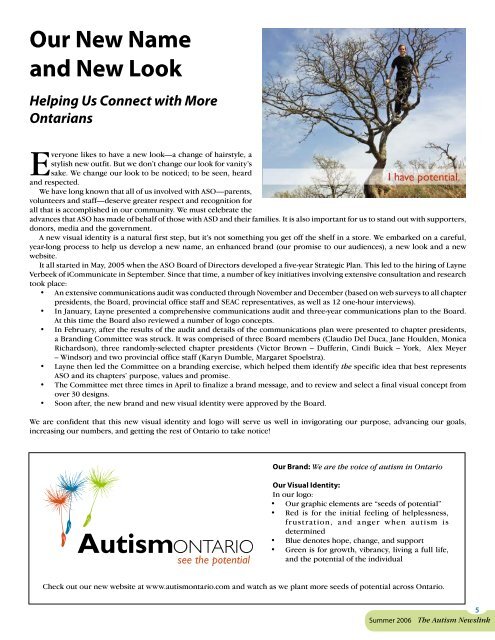
Our New Nameand New LookHelping Us Connect with MoreOntariansEveryone likes to have a new look—a change of hairstyle, astylish new outfit. But we don’t change our look for vanity’ssake. We change our look to be noticed; to be seen, heardand respected.We have long known that all of us involved with ASO—parents,volunteers and staff—deserve greater respect and recognition forall that is accomplished in our community. We must celebrate theadvances that ASO has made of behalf of those with ASD and their families. It is also important for us to stand out with supporters,donors, media and the government.A new visual identity is a natural first step, but it’s not something you get off the shelf in a store. We embarked on a careful,year-long process to help us develop a new name, an enhanced brand (our promise to our audiences), a new look and a newwebsite.It all started in May, 2005 when the ASO Board of Directors developed a five-year Strategic Plan. This led to the hiring of LayneVerbeek of iCommunicate in September. Since that time, a number of key initiatives involving extensive consultation and researchtook place:• An extensive communications audit was conducted through November and December (based on web surveys to all chapterpresidents, the Board, provincial office staff and SEAC representatives, as well as 12 one-hour interviews).• In January, Layne presented a comprehensive communications audit and three-year communications plan to the Board.At this time the Board also reviewed a number of logo concepts.• In February, after the results of the audit and details of the communications plan were presented to chapter presidents,a Branding Committee was struck. It was comprised of three Board members (Claudio Del Duca, Jane Houlden, MonicaRichardson), three randomly-selected chapter presidents (Victor Brown – Dufferin, Cindi Buick – York, Alex Meyer– Windsor) and two provincial office staff (Karyn Dumble, Margaret Spoelstra).• Layne then led the Committee on a branding exercise, which helped them identify the specific idea that best representsASO and its chapters’ purpose, values and promise.• The Committee met three times in April to finalize a brand message, and to review and select a final visual concept fromover 30 designs.• Soon after, the new brand and new visual identity were approved by the Board.We are confident that this new visual identity and logo will serve us well in invigorating our purpose, advancing our goals,increasing our numbers, and getting the rest of <strong>Ontario</strong> to take notice!Our Brand: We are the voice of autism in <strong>Ontario</strong>Our Visual Identity:In our logo:• Our graphic elements are “seeds of potential”• Red is for the initial feeling of helplessness,frustration, and anger when autism isdetermined• Blue denotes hope, change, and support• Green is for growth, vibrancy, living a full life,and the potential of the individualCheck out our new website at www.autismontario.com and watch as we plant more seeds of potential across <strong>Ontario</strong>.<strong>Summer</strong> 2006The <strong>Autism</strong> Newslink