Tilia Help Manual - Illinois State Museum
Tilia Help Manual - Illinois State Museum
Tilia Help Manual - Illinois State Museum

Create successful ePaper yourself
Turn your PDF publications into a flip-book with our unique Google optimized e-Paper software.
Be sure the enter the primary investigator (PI) of the study, any secondary or assistant investigators, and the person involved in creating the age model. 2. Preparing the Spreadsheet First, return to the ‘Data’ tab in the upper left corner of the <strong>Tilia</strong> window. When opening a new spreadsheet, several different columns will appear on the left hand side of the blank spreadsheet: Code, Name, and Group. However, several columns are hidden. Go to “Tools” in the menu, and select Elements and Units in addition to the Codes and Groups (Fig. 2) Figure 2. Menu for setting up Elements and Units 3. Sample information The next step is beginning to enter data, beginning with the chronology of your system. This is one of the lines of data entered that the code MUST be defined as per the normal dictionary, but the other lines are a little more variable (Fig. 3):
• Code: #Chron • Name: Whatever the name of your Chronology is • Element: (leave blank) • Units: cal yr BP • Group: (leave blank) This data should be entered in row 3 (Fig 3). Fig 3. How the Chronology line should appear. Screenshot from data used in Locatelli, 2011. After setting up the row for the chronology, there are a few more things that must be entered before pollen data can be recorded. The next few rows concern data about the processing of the samples, specifically the analyst’s identity and the spike added to the sample during processing. First, set up the analyst’s identity in row 4 (Fig 4): • Code: #Analyst • Name: Analyst • Element: (leave blank) • Units: (leave blank) • Group: (leave blank) Fig. 4. The Chronology and Analyst rows from Locatelli, 2011. Next, enter data about the sample and spike (Fig. 5):
Row 5: • Code: mic.susp • Name: Microsphere suspension • Element: concentration • Units: number/mL • Group: LABO Row 6: • Code: mic.susp • Name: Microsphere suspension • Element: quantity added • Units: mL • Group: LABO Row 7: • Code: mic • Name: Microspheres • Element: counted • Units: number • Group: LABO Row 8: • Code: samp.quant • Name: Sample quantity • Element: (leave blank) • Units: mL • Group: LABO Fig. 5. The set up for all of the background information: chronology, analyst, and sample information.
Now that all of the back ground information has been set up, it is time to prepare the pollen set up. This part will vary considerably depending on the types of pollen you have collected. However, there are certain guidelines that will apply regardless. For each type of pollen, you must designate a code, assign a name, indicate the type (pollen or spore), and identify the type of plant (tree or shrub, upland herb, etc.). Figure 6 shows an example of the taxa from Locatelli, 2011. Fig. 6. An example of the different pollen taxa When deciding which taxa to include in the spreadsheet, chose those taxa which contribute at least 1% of the total number of grains counted in at least one sample. For example, if you counted at least 3 grains (1% of 300) of a rare taxa in one sample, but did not find that pollen taxa in any other slide, go ahead and give that taxa an individual line. However, if only one or two grains were found in any one sample, lump that into either “Other Arboreal” or “Other Herbaceous”. Any grains that were not identified should also be included in the “Other” categories.
4. Entering Data The spreadsheet is now ready to have data entered. The columns A through G contain all of the information that was entered from the previous sections. As data is entered in the other columns (h and onward), these columns will remain visible on the left had side of the spread sheet. Foreword: Each column from H and onward should be treated as a single sample. When counting the pollen, grains were counted per traverse. In the Excel spreadsheet that this data was entered, the total number of grains per taxa should have been calculated. For example, if for a sample, 10 traverses were needed to reach the goal of 300 grains of pollen and for a given species the counts per traverse were 1, 3, 4, 2, 3, 1, 0, 1, 2, 1, the number entered into the column would be 18. Starting in column H, enter the depth of your sample in row one. Because samples are normally a cm thick, either enter the top value or chose the middle depth. For example, if a sample was taken from 2 -‐3 cm in a core, either enter ‘2’ or ‘2.5’. For the row marked as #Chron (row 3), the number in each column should be the age of that sample (Fig. 7). Refer to your age model for these values. Fig. 7. In columns H and I, two numbers are entered. The numbers in row 1 are the depths of the samples taken. The numbers in row 3 are the corresponding ages for each sample. The data for the rows 4, 5, 6, and 8 should be the same, as long as the processing for each sample was the same. Figure 7 shows an example for three samples from Locatelli, 2011. Row 7 will differ for each column/sample, as it reflects the number of microspheres counted per sample along with the pollen grains.
Fig. 7. Data from Locatelli, 2011. Row 4 (Analyst) is Locatelli, Emma R for each of the samples. Rows 5 and 6, which refer to the microspheres added to the sample during processing, reflect the concentration of microspheres/mL (40000) and the amount added to each sample (1 mL). Row 8 reflects the amount of sediment taken for the sample (1 mL or cc). The rest of the data comes from your counted pollen. As mentioned previously, enter the total number of grains per sample in each column. Figure 8 shows the completed spreadsheet for three samples from Locatelli, 2011. Fig. 8. Data from Locatelli, 2011. Completed spreadsheet for three samples.
5. Creating the Age Model One of the more time consuming aspects of <strong>Tilia</strong> is entering the age model information in the ‘MetaData’ tab, found in the upper left corner of the file. When plotted with the above data, the age model will provide a Y-‐axis of age, not only depth. The first line of the age model spreadsheet asks for general information about the age model: the name of the model, the age units, the type of age model (linear regression, Bacon, etc.), the older and younger bounds of the model, the preparer of the model, and the date the model was prepared. Fill in this information, and then press enter. This will create the spreadsheet for the model. A small plus sign will appear the left of the line (Fig. 9). Fig. 9. How the form will appear after creating the new age model. Click on the plus sign, and a smaller entry form will appear. Each line in this form represents one date in the age model. Enter the data from the age model of the study, filling in as much information as possible (Fig. 10). Fig. 10. From Locatelli, 2011. An example of entered age model information.
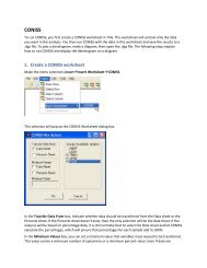
5.Creating the basic diagram Once the pollen and age model data are entered, a pollen diagram can be made. Because most diagrams in the industry are created using percentages, not raw counts, the data must first be converted to percentages. First, go to ‘Insert’ in the menu, go to ‘Worksheet’ and select ‘CONISS’. A small window will appear. For the basic pollen diagram, select TRSH, UPHE, and VACR for the “Groups included in analysis”. Leave the Minimum values area blank (Fig. 11). When you press OK, a new worksheet named “CONISS” will appear at the bottom of the window. In this spreadsheet, only the pollen taxa will remain, along with the age and depths from the “Data” sheet. Fig. 11. The window for the CONISS worksheet. After the CONISS spreadsheet appears, go back to the original ‘Data’ tab, found in the lower left corner and copy the Chronology line (Row 3). Paste this at the bottom of the CONISS spreadsheet (Fig. 12).
Fig. 12. How the data should appear in the CONISS tab, with the added Chron line. From Locatelli, 2011. Once you have the CONISS spreadsheet set up, go the ‘Tool” menu and select Cluster Analysis. A window will pop up – do not change any settings, and press the button that reads ‘Run Analysis’ (Fig. 13). Fig. 13. The table which appears when ‘Cluster Analysis is selected from the tool menu.
A new window with lines of numbers will appear – go ahead and close this window by selecting the x in the upper right hand corner (Fig. 14) Fig. 14. The window that shows some of the results of the cluster analysis. The x in the upper right corner will be red instead of clear. After you have closed this window, a third window will pop up. This window will ask if the data should be converted to percentages – click yes. 6. Ready to Plot! Now that the data is in percentage form, a diagram can be made. Click on the button on the far right of the button toolbar . A window will appear asking for various diagram variable options. Select pollen and spore from the left ‘Elements’ column (Fig. 15). As you are making your diagram, be sure to save the figure as a .tgx (<strong>Tilia</strong> graphing file) often. The diagram can be exported, but only a tgx can be edited.
Fig. 15. The diagram variable option window. Select pollen and spore from the elements column. A basic pollen diagram will then appear in a new window (Fig. 16).
Fig. 16. The unedited pollen diagram. Based on data from Locatelli, 2011. The diagram that appears is based off of certain default settings. First, the pollen data is plotted as percents (one taxa per column) agains the given sample depth (y-‐axis). The x axis of each column is read as a separate entity. Second. Each x-‐axis is created in increments of 20%, with minor tick mards every 5%. As seen in Figure 15, certain taxa do not have any marked increments, as they do not consist of any more than 10% of any sample (for example, Artemisia, and Poaceae). Additionally, each of the tickmarks are the same witdth. Third, no exaggeration is given to any taxa, regardless of whether or not the variation is visible when set to increments mentioned above. Finally, the name of each column is printed exactly as it appeared in the original spreadsheet with either ‘pollen’ or ‘spore’ added as per desigation. Because the original spreadsheet did not permit text editing, the genus and species names do not appear properly italicized. There are several different ways to manipulate the diagram, and all of the pathways are found on the row of buttons that appears above the spreadsheet (Fig. 17).
Fig. 17. The row of icons that will appear when a diagram is created. Changing the Y axis First, the Y-‐axis should be changed to reflect age, not only depth. To do this, click on the button. A window will pop-‐up. Select plot for both the default depth y axis, and the age model entered for the data. Use the arrows to the right of the listed age models to place the age model above the depth model (Fig. 18) Fig. 18. The Y-‐axis dialogue box This will add a second axis to the left of the graph that reflects the age model for the data (Fig. 19).
Fig. 20. The X-‐axis dialogue box. Note that only one species has been selected and nothing has been entered into the axis label space. The next step in making the graph more legible is making the x-‐axis of individual taxa more suited to the data. For example, in the data from Locatelli, 2011, the default setting of increments of 20% are only applicable to five of the different pollen taxa. Examine the data and determine what increments are more appropriate for the data. Click ‘Select Variables’ and click on the taxa for which the x-‐axis should be altered. On the ‘Axis’ tab, increase the scale factor if the data as plotted now is difficult to read. Normally, values between 2% and 10% only need a scale factor of .05 -‐ .1 to be more clearly seen. Taxa that contribute less than 2% may need a scale factor of up to .25. On the ‘Tic Marks’ tab, change the increments in which the data is displayed (Fig. 21). The automatic setting has minor tic marks every 5%, major tic marks every 10%, and labels every 20%. Adjust the tic marks to fit your data. For example, if the maximum percentage a given taxa contributes to the total is 7%, a good tic mark system would have minor tic marks every 1.5%, major tic marks every 3%, and a label at 6%. A good rule of thumb is to have the numbers entered for the tic marks be related to one another. Whatever the minor tic mark number is, have the major tic marks and labels be multiples of that number. This produces the most even appearance.
Remember to click the ‘Apply’ button, or changes will not be implanted. Fig 21. The dialogue box for changing the axis tic marks. Stacking Variables Certain taxa are related, and stacking the variables can help to portray the relationships. For example, if in two types of pine (diploxylon and haploxylon) are in the sample, but are indistinguishable for a good portion of the time, then much of the pine that is counted will be ‘undifferentiated’. In order to show the total contribution of pine – of any type – to the record as a whole, the variables should be stacked. Go to the variable button. A window will pop up with the list of all of the taxa and different options. For any variables that should be combined, mark ‘base’ for one of them – normally the taxa that contributes the most – and then ‘stack’ for the other variables. Figure 22 shows this for a group of pine taxa.
Figure 22. The dialogue box for stacking variables. Be sure to check one taxa for base, and the others on stack. Once the taxa have been stacked, two things must be done. First, the different taxa should be changed as to distinguish them from one another. Initially, each of the graphs are made with a solid black silhouette, and thus blend into one another. Go to the “Graph style” button and then select one of the variables that should be altered. On the left hand side of the window, there is a small box labeled “Fill Style” (Fig. 23). Of the four options, three are ideal for this type of diagram. The simplest way to distinguish one of the variables is to either select ‘Hollow’ or ‘Pattern’. If you want the curves silhouette of each of the stacked variables to be solid, do not change the fill style. Instead, look at the box marked ‘Colors’ and change the silhouette in that manner. Remember to click ‘Apply’ before either switching variables or closing the window!
Fig. 23. The graph style dialogue box. After stacking the variables, the names of the different taxa will be illegible – they too have been stacked (Fig. 24) Fig. 24. Overlapping names. In order to correct for this error , return to the X axis button and this time go to the ‘Name’ tab. The bottom box, labeled ‘Offset from top of Y-‐axis’, has two fields that can be edited (Fig. 25).
Chose ‘Above Line’ in the ‘Text Position” box. This will situate the grouping cluster above the taxa. Be sure to click ‘Apply to all groups’ in the dialogue box so that this does not have to be repeated. Dendrogram One of the most helpful aspects of <strong>Tilia</strong> is the cluster analysis function. Cluster Analysis was touched on briefly in the fifth section. The analysis run previously will now come into play. Click on the dendrogram symbol in the menu bar. A window will appear (Fig. 29). Fig. 29. The dialogue box for the Cluster Analysis option and dendrogram creation. For the dendrogram to be plotted, the program must read a file that was saved when the cluster analysis. Click the button that reads “Open .dgx File”. <strong>Tilia</strong> will have saved a file with
the same name as the original title of the data file, only as a .dgx. The file should be the first thing that appears in the ‘Open’ window. Once the .dgx file is chosen, click ‘OK’. A dendrogram will then be added to the pollen diagram (Fig. 30). Fig 30. A polished pollen diagram with a dendrogram created using CONISS. Adding Zones Once CONISS has been run and the dendrogram has been added to the diagram, zones can be added to visually delineate the difference clusters that CONISS has created. Click on the zones button filled (Fig. 31). . A dialogue box will appear with various fields that should be
Figure 31. The Zones dialogue box Determine at what level a zone should be placed based on the delineation from the CONISS dendrogram. Enter the pertinent information, along with the style of zone (line or screen). Labels can be added for each zone using the ‘labels’ tab in the dialogue box. After a line of information is entered, the plus sign at the bottom of the box must be pressed, or the zone will not be recorded. Click “Apply” to view the zone. If the zone is not in the exact position it should be, the level can be altered. Click “Apply” a second time to view the changes. Important note: the level entered should reflect the Y-‐axis closest to the diagram. Figure 31 refers to the depth of the zone, not the age, and which can be seen in Figure 32.
Figure 32. An example of how a zone delineation looks. Although the two partial axes are not labeled they are the age model (left) and the depth (right). Adding Specific Dates to the Graph If there are specific events, such as a historic fire, that should be added to the graph to enlighten particular changes in the data, dates can be added to the left of the graph and y-axes. Click on the button. A new dialogue box will appear (Fig. 33). Figure 33. The Dates dialogue box. The information entered refers to the depth that the point should be placed based on the depth Y-‐axis, while the date refers to the label of the date (1200 cal yr BP).
Similar to the Zone information, the top depth and bottom depth should refer to the y-‐axis point that is closest to the diagram itself. Once the information has been entered, press the plus sign in the bottom left, and hit OK. The dates will be added to the left of the diagram (Fig. 34). 00Abies lasiocarpaAlnus viridis-typePicea engelmanniiPinus, undifferentiatedPinus contortaPinus flexilisPseudotsuga menziesiiOther ArborealArtemisiaAsteraceae-typeChenopodiaceaePoaceaeOther HerbaceousMonolete sporesPteridium aquilinum-typeCONISS12001000Fire Event501002000DatesMacGregor et al. Regression3000Depth150200250400030050003506000400%20%20%20 40 60 80%%2%24 8%%2%24 8%%2%2%20.2 0.4 0.6Total sum of squaresFigure 34. A complete pollen diagram with the date added to the left from Figure 33 (1200). See the next section for adding additional text to the date line (seen here as “Fire Event”). Adding new text to the diagram For certain labels and texts, each line has to be added manually. Click on the add text button , and your cursor will turn into a small cross sign. Click where you want to enter the text. A new dialogue box will appear (Fig. 35). In the field labeled ‘Text”, enter what you want the text to read. The text can be edited using the buttons above (Bold, italicized, superscript, subscript, or symbol). When the text is edited, press okay to enter have the text appear on the graph.
Figure 35. The dialogue box that appears when clicking the diagram using the Add Text tool. Occasionally, the text will not appear in the exact location that was specified. To fix this problem, click on the text button . The dialogue box that appears will have two tabs. Select the ‘Random text’ tab (Fig. 36). Figure 36. The dialogue box for the Text option. Note that the tab “Random Text” is selected.
Editing the ‘x’ and ‘y’ fields will move the text entered. For reference, a value of 0 for x will place the text at the inner y-‐axis. Smaller (negative values) will move the text to the left of y-‐axis, while larger (positive) numbers will move the text to the right of the y-‐axis. A value of 0 for y will place the text at the very bottom of the y-‐axis. Smaller (negative values) will move the text below the y axis, while larger values (positive numbers) will move the text upward. Entering a number in the ‘Angle’ field will tilt the text. Saving as a PDF Normal <strong>Tilia</strong> Graph files cannot be opened in other programs. Once a diagram is complete, it should be saved as another type of file. The most universal format <strong>Tilia</strong> is capable of exporting is a PDF. To do this, go to the ‘File;’ menu and select ‘Print’. Instead of printing to the normal printer, print to Adobe PDF (Fig. 37). Figure 37. The Print dialogue box. Select the location to where the document should be saved. Press okay. <strong>Tilia</strong> will then export the image in PDF form to that location.
Sources: Grimm, E.C. 1987. CONISS: a FORTRAN 77 program for stratigraphically constrainedcluster analysis by the method of incremental sum of squares. Computers andGeosciences 13, 13 – 55.Locatelli, E. R., "Vegetation History of the Late Holocene in East Glacier National Park,Montana: A Paleoenvironmental Study" (2011). Honors Projects. Paper 9.http://digitalcommons.macalester.edu/geology_honors/9