design typography architecture - Niggli Verlag
design typography architecture - Niggli Verlag
design typography architecture - Niggli Verlag
You also want an ePaper? Increase the reach of your titles
YUMPU automatically turns print PDFs into web optimized ePapers that Google loves.
niggli<strong>Verlag</strong>Foreign Rights Catalogue2013/2014<strong>architecture</strong><strong>design</strong><strong>typography</strong>
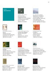
2 ArchitectureForeign Rights CatalogueMarc Angélil, Jørg Himmelreich,Departement für Architektur derETH Zürich (ed.)Architecture DialoguesPositions – Concepts – Visions628 pagesmore than 180 illustrations14 × 22 cmLay-flat softcoverEnglishEuro (D) 62.–, (A) 63.70, CHF 78.–ISBN 978-3-7212-0802-3Licenses sold:GermanChineseFor decades, Swiss <strong>architecture</strong> has enjoyed international acclaim. Yet how are Helveticarchitects positioning themselves in Switzerland’s drastically changing workingenvironment? What impact are they having at present? In Architecture Dialogues, nineinterviewers talk with 30 leading Swiss architects about guiding themes, directions andperspectives in their theoretical explorations and building projects. Over the course ofconversation, these architects present not only their positions on the constructive, conceptualand aesthetic dimensions of <strong>architecture</strong>, but also their projections for the futureof this discipline against the backdrop of the emerging 21st century and its challenges.The viewpoints offer insight into the possibilities and limitations encountered by architectsin their complex roles and responsibilities. It serves both as a snapshot as well asan important contribution to the international discourse on <strong>architecture</strong>.Among the interviewed architects and offices are Herzog & de Meuron, Peter Zumthor,Valerio Olgiati, Mario Botta, Luigi Snozzi and many others.Jörg Kurt GrütterArchitektur + WahrnehmungArchitecture + PerceptionExperiencing <strong>architecture</strong>means seeing <strong>architecture</strong>280 pagesabout 400 images28 × 28 cmHardcoverGerman / EnglishEuro (D) 62.–, (A) 63.70, CHF 78.–ISBN 978-3-7212-0831-3Certain aspects and contexts of the perception of <strong>architecture</strong> can best be explained bymeans of images. – That is the idea upon which this book is based.Jörg Kurt Grütter has divided selected structural details into individual chapters, includingsuch subjects as space, color, dynamics and surface. The reader can discover analogiesas well as contradictions and view the photos completely independent of the texts.In the back of the book all the information about the structures depicted in the front canbe found – location, architects, year of construction, etc. – as well as a complete view ofthe building and texts about <strong>architecture</strong> and perception.All photographs were taken by Grütter traveling and living in foreign countries on everycontinent. They depict a great number of famous and representative structures from differentages and cultures.
3 ArchitectureForeign Rights CatalogueMario Rinke, Joseph Schwartz (eds.)Before SteelThe introduction of structural ironand its consequences236 pagesabout 200 illustrations16 × 24 cmHardcoverEnglishEuro (D) 46.–, (A) 47.30, CHF 58.–ISBN 978-3-7212-0756-9Steel is one of the most important building materials of our time and is closely relatedto notions of “modern” construction or modern <strong>architecture</strong> in general. This book aimsnot only to illustrate the beginnings of steel’s usage as a building material; it also endeavoursto show the theoretical, practical, formal, and cultural consequences of thesebeginnings 200 years ago.The 19th century marks the phase of final separation for the disciplines of structuralengineering and <strong>architecture</strong>. Iron may not be the sole impetus, but it is at least a catalyst– even today – and is, therefore, a significant factor in the development of theengineering-<strong>architecture</strong> relationship. Before Steel looks critically at the many-layeredconnections between <strong>architecture</strong> and engineering, and at the dramatically changingway in which the disciplines understand themselves. Many notable authors from variousdisciplines contribute their view.The book was awarded the DAM Architecture Book Prize 2011 in the category “HistorischeMaterialkunde” (historic material).Rahel Lämmler, Michael WagnerUlrich Müther. Shell Structuresin Mecklenburg-WesternPomeraniaThe <strong>architecture</strong> of shell structuresin the former GDR120 pagesabout 80 illustrations13.5 × 17 cmPaperback with leavesEnglishEuro (D) 25.50, (A) 26.20, CHF 32.–ISBN 978-3-7212-0747-7Licenses sold:GermanThe East German engineer Ulrich Müther contributed an important chapter to the Europeanhistory of shell construction. In 1963 he created the first concrete shell as therealization of his diploma project in the former GDR. His career of more than 30 yearssaw many milestones. Ulrich Müther realized his pioneering shell constructions in hishomeland on the island of Rügen, in and around Rostock and in other parts of Mecklenburg-WesternPomerania.The book alternates between a classical <strong>architecture</strong> guide and an almost archaeologicalinventory. It furnishes a well founded insight into the euphoric belief in progressthat attended the building boom of the sixties and seventies. All the relevant objects inMecklenburg-Western Pomerania have been assembled in one publication for the firsttime. The buildings are portrayed with the aid of current photographs, plans, texts andproject information. Survey maps and addresses facilitate on-site visits.With articles by Michael Wagner And Rahel Lämmler, Prof. Arch. Georg Giebeler andProf. Dr. Massimo Laffranchi.The German edition was awarded the DAM Architecture Book Prize.
4 ArchitectureForeign Rights CatalogueHolzer Kobler Architekturen (ed.)Holzer Kobler ArchitekturenMise en scèneThe first monograph on Holzer KoblerArchitects – pioneers in exhibition <strong>design</strong>296 pagesmore than 300 illustrations23.5 × 29.5 cmClothbound with banderoleEnglish/GermanEuro (D) 62.–, (A) 63.70, CHF 78.–ISBN 978-3-7212-0755-2Licenses sold:ChineseHolzer Kobler Architekturen was founded in 2004 by Barbara Holzer and Tristan Kobler.Both are known as pioneers in the area of exhibition <strong>design</strong>. A multitude of projects hasbeen created since they founded the firm. Their first large joint project was the <strong>design</strong> ofthe Arteplage Yverdon for the Expo 02, as well as the exhibition concept for Swish andthe Heimatfabrik.Holzer and Kobler works are distinguished by atmospheric, memorable images. Playful andprovocative at once, they elicit an emotional response from the viewer. Scenography and<strong>architecture</strong> confront one another in an inspiring interplay. While the architectural <strong>design</strong>sserve the narrative elements, the exhibition projects are like architectural experiments.Mise en scène is the first comprehensive monograph about Holzer Kobler Architekturen.25 projects are presented with many illustrations. One series shows the work method ofthe office. Essays by Angelika Fitz and Stefan Trüby as well as an encompassing interview,moderated by Martin Heller and Christoph Bürkle, shed light on the work of thesetwo extraordinary architects.Annette SpiroPaulo Mendes da RochaWorks and ProjectsThe works of an outstandingBrazilian architect2nd edition272 pages367 illustrations28 × 22.4 cmClothbound with dust jacketEnglish/GermanEuro (D) 78.–, (A) 80.20, CHF 98.–ISBN 978-3-7212-0413-1Licenses sold:ChineseIn 1957, set against the background of the Brazilian modernity, Paulo Mendes da Rocha,born in 1928, starts his career with his sensational debut Clube Atlético Paulistanoand in the following years develops a unique and distinctive architectural language thatmakes his work outstanding in its creative force. Paulo Mendes da Rocha’s buildingsstay engraved in one’s mind and he, like no one else before him, manages to show aglimpse of the deeper essence of <strong>architecture</strong> in his works.The present publication is the first monograph on Mendes in the German-speakingworld. A complete index of his works is complemented by a selection of his most distinctivebuildings and projects including plans, sketches and photographs. Luigi Snozzispeaks about the architect in his foreword and author Annette Spiro, herself architect inZurich, analyzes some aspects of the work in later parts of the book.
5 ArchitectureForeign Rights CatalogueDolf Schnebli1956: Photosketches of a SlowJourney – One Year from Veniceto India by the Land RouteAn architectural journeythrough Europe and Asia2nd edition272 pagesabout 400 illustrations25 × 17 cmHardcoverEnglish/GermanEuro (D) 46.–, (A) 47.30, CHF 58.–ISBN 978-3-7212-0700-2In 1955 Dolf Schnebli was awarded a Harvard travel scholarship which enabled himto travel overland for one year from Venice to India and back. With him were his wifeClarissa and a VW beetle. The purpose of his journey was to study architectural historyat close hand, especially the urban development of old cities, ruins and excavations. Inthe process he not only learned a great deal about the founding of cities and history,he also got to know many different people. In his short statements he therefore notonly describes what kind of <strong>architecture</strong> he saw, but also whom he met: Peasants, forexample, who in spite of their extreme poverty, warmly welcomed Schnebli and his wifeand helped them on their journey with advice and concrete assistance.More than fifty years after his trip, after gathering dust as contact prints in his sketchbooks,Schnebli’s black and white pictures are being published for the first time, attentively<strong>design</strong>ed by the Zurich-based WBG AG for visual communication. Many of theobservations he recorded in the travel notes are still valid today.With an introduction by Jacques Herzog. Text and photos by Dolf Schnebli.edition archithese 4The Significance of the Ideain the Architecture ofValerio OlgiatiAn interview with one of the mostimportant exponents of Swiss<strong>architecture</strong> today4th edition88 pages13 illustrations16.5 × 22.5 cmPaperbackEnglish/GermanEuro (D) 25.50, (A) 26.20, CHF 32.–ISBN 978-3-7212-0676-0Valerio Olgiati is known as one of the most important exponents of Swiss contemporary<strong>architecture</strong> ever since he realized the school in Paspels. In the present fourth volumeof the series edition archithese, Olgiati answers questions posed to him in an interviewabout the social responsibility of the architect, the difference between the earlier generationof architects and that of today, the influence of post-modernity and the difficultiesthat confront an architect in the realization of projects. Markus Breit- 95 schmid roundsoff the volume with an essay.
6 DesignForeign Rights CatalogueAndré Vladimir HeizGrundlagen der GestaltungFundamentals of Design4 volumes in a slipcaseGerman edition: 1436 pagesFrench edition: 1408 pagesBook dimensions: 16.3 × 23 cmSlipcase: 17 × 25.5 × 13 cmSoftcoverEuro (D) 133.–, (A) 136.70, CHF 168.–German editionISBN 978-3-7212-0805-4French editionISBN 978-3-7212-0839-9Grundlagen der Gestaltung (Fundamentals of Design) points out the many differentpaths which creative processes take by describing and communicating graphically thetools needed. It begins by presenting the decisive perspectives from which processes,projects and products can be analyzed and thematized. Whether it is a matter of developinga font, an urban concept, a logo, public art, product <strong>design</strong>, communication orresearch – precise perception defines the way the problem is framed. Possible solutionsdevelop from the problem statement through different methods: object-based, realistic,sensual, creative, useful.What possibilities are there? What conditions must be taken into account?Grundlagen der Gestaltung is made for architects, <strong>design</strong>ers of all types, informationtechnology <strong>design</strong>ers, photographers, graphic <strong>design</strong>ers and typographers, art directors,copywriters, communications <strong>design</strong>ers, decision-makers in culture management,students and professors, project managers and artists – in short: for creative people.Ulrich BachmannColour and lightTaking a sensory aproach totheories of color and light160 pagesabout 400 illustrations21.5 × 28.5 cmHardcover with DVDEnglish/GermanEuro (D) 70.–, (A) 72.–, CHF 88.–ISBN 978-3-7212-0779-8The second multi-media publication by renowned Swiss professor Ulrich Bachmann,founder of the Color-Light Center (FLZ) in 2009 at Zurich University of Arts. This book-DVD combination lets the user take an involving, ultra-interactive approach to the complexissues of the interdependence between color and light. Practical examples andtheoretical explanations demonstrate the interactions between material colors and light,as well as between dynamic light situations in spatial and virtual contexts. The DVD iscleverly <strong>design</strong>ed to allow the direct creative and experimental handling of color andlight phenomena. Extensive photo and video documentations from experiments donewith spatial installations or models plus an unprecendented color-light compendium offera wealth of suggestions for teachers, students and all those interested in the truenature of color.The project and book was awarded the Swiss Design Price 2011.
7 DesignForeign Rights CatalogueEgon Chemaitis, Karen Donndorf,<strong>design</strong>transfer, University of theArts Berlin (ed.)Warum dieser Stuhl?Why this chair? Designprofessionals talk about<strong>design</strong>272 pagesabout 400 illustrations16.3 × 24 cmPaperbackGermanEuro (D) 38.–, (A) 39.10, CHF 48.–ISBN 978-3-7212-0645-6Licenses sold:KoreanWarum dieser Stuhl? (Why this chair?) is based on freitagsforum, a series of discussionpanels organized by <strong>design</strong>transfer at the University of the Arts Berlin. Every Friday twohosts invited two guests who brought their own two chairs along. This brought togethermedia <strong>design</strong>ers with graphic <strong>design</strong>ers, graphic <strong>design</strong>ers with architects; architectswith <strong>design</strong> entrepeneurs, publishers with film makers …The question was always the same: “Why this chair?” This intro led to discussions aboutdifferent aspects of <strong>design</strong>.Interesting topics, unexpected turns of the conversation and the discovery of unanticipatedsimilarities came from this. The book tries to capture the essence of these eventspresenting the carefully edited conversations.Moritz ZwimpferLicht und FarbeLight and color – physics,appearance, perception160 pagesmore than 400 illustrations30.5 × 25.5 cmHardcover with clothbound spineand attached coversGermanEuro (D) 70.–, (A) 72.–, CHF 88.–ISBN 978-3-7212-0804-7Licht und Farbe (Light and Color) takes the reader on an interdisciplinary journey throughthe world of color and color perception. In eight chapters, the author Moritz Zwimpferexplores the physical, physiological and psychological prerequisites that influence ourperception of light and color. Comprehensive and with many illustrations the book offersan easy-to-follow introduction to the complex matter. More than 400 images and graphicsillustrate specific phenomena.Licht und Farbe includes info on: light sources, light diffusion, the color spectrum, lightcolor, color mixing, pigments and colorants, anatomy, optics and the human retina, light/dark, seeing colors, afterimages, color systems, the symbolic significance of colors, colorreproduction, print, photography, digital technology and much more.
8 TypographyForeign Rights CataloguePetra Eisele, Isabel NaegeleTexte zur TypografiePositionen zur SchriftTexts on <strong>typography</strong> –a compilation244 pages23.5 × 31 cmSoftcover with flapsGermanEuro (D) 42.–, (A) 43.20, CHF 52.–ISBN 978-3-7212-0821-4Typography is omnipresent although people are seldom aware of it. Still – type lovers,philosophers, typographers and <strong>design</strong>ers have written, argued and theorized far moreabout it than is commonly known. Texte zur Typografie (Texts on Typography) presentstheories, manifestos and positions on <strong>typography</strong> in the German-speaking world of the20th and 21st century. Important protagonists and discourses are introduced and thereader can follow heated discussions on topics such as the “German font”, the “modernman”, readability, the use of small letters or the effects of digitalization. The book offersan index of bibliographical information, selected excerpts and even photographic reproductionsfrom books and magazines in original scale, which makes it a visual compilationof book <strong>design</strong> as well.Texte zur Typografie is a book for bibliophiles, know-alls, bloggers, type collectors,<strong>design</strong> critics, teachers, scholars, <strong>design</strong>ers, art historians, font enthusiasts, students,readers, beginners and nerds and for anyone interested in setting foot into the world of<strong>typography</strong>.Emil RuderTypographyA manual of <strong>design</strong>9th editionNew edition of the original of 1967274 pagesmore than 500 examples22.4 × 23.3 cmClothbound with dust jacketEnglish/German/FrenchEuro (D) 78.–, (A) 80.20, CHF 98.–ISBN 978-3-7212-0043-0Licenses sold:KoreanPortuguesePolishSpanishThis book is the legacy of a great typographer for the cultural heritage of our day. In thepost-war years, when in nearly every field of applied art there were still no signs whatsoeverof a shift to a new, more contemporary form of expression, Emil Ruder was one ofthe first to abandon the conventional rules of traditional <strong>typography</strong> and create new lawsthat satisfied the requirements of a new <strong>typography</strong>.This book, which has seen six editions to date and is now available again in a new edition,is a fundamental textbook upon which generations of typographers and graphic<strong>design</strong>ers have built and can continue to build on. This book can clearly be seen as anexcellent “manual”. Beyond that, it is a comprehensive masterpiece seen in its overallstructure, in the themes presented, in the comparison of similarities and contrasts, inthe richness of the illustrations and the harmoniously inserted types. Behind the purelypedagogic examples of exact proportions, a rich, philosophical thinking shines through,which – moving far beyond the tasks of everyday existence – attempts to expound uponthe lessons of life’s wisdom.
9 TypographyForeign Rights CatalogueSebastian EmmelMonologEntscheidungsfindungen zurBuchgestaltungMonologue – a book <strong>design</strong>er’sdecisionmaking process266 pages21.5 × 29 cmLay-flat handbound hardcover with15 different paper formatsGermanEuro (D) 105.–, (A) 107.90, CHF 148.–ISBN 978-3-7212-0766-8This extraordinary book illustrates the <strong>design</strong> process focusing on its multitude of options,alternatives and decisions that have to be made along the way. Most of the timethis process is not a straight path the <strong>design</strong>er travels along as many handbooks describeit, but is shaped by numerous errors, dead ends, rules and regulations, drawbacksand many, many alternative approaches. This long and winding road, however, remainscompletely hidden from the view of the customers buying the final product. This bookabout a book is not a compendium or handbook explaining how to create “the” perfectproduct. The topic of book <strong>design</strong> is rather a means of describing a typical and extensive<strong>design</strong> process from the conceptualization stage up to the final printed product. By followingthe evolving book <strong>design</strong> from page to page, the readers become a live audience,observing first-hand how a book is made.Hendrik WeberKursivThe history and significanceof italics128 pagesmore than 100 illustrations16 × 23.5 cm,Lay-flat softcover with flapsGermanEuro (D) 34.–, (A) 35.–, CHF 42.–ISBN 978-3-7212-0736-1In times of computerization and digitalization italics have become an everyday tool for asociety that is adept in the use of a variety of word processors. Italics are used, read andunderstood widely. Next to the erect, formal letterform of standard type, italics introducea more dynamic, personalized and sensuous flow into the reading experience. This original,deeper sense, however, is more and more lost when words can be deformed by asimple click of the mouse.Interested in the change of italics from hand writing to digital type, the author compileddifferent templates and <strong>design</strong>s of italic fonts and researched the respective properties,characteristics and functions of italics. Another part of the book traces the evolution ofitalics through history.This publication is the first comprehensive work on a topic that, due to its popularity, historyand tradition, allows even non-professionals interested in <strong>typography</strong> to gain insightinto this discipline – from the passionate perspective of modern type <strong>design</strong>.
10 TypographyForeign Rights CatalogueHans Rudolf BosshardThe Typographic GridImpulses for type <strong>design</strong>ers2nd edition200 pagesmore than 300 illustrations and gridschemes29.5 × 23.6 cmClothbound with dust jacketEnglish/GermanEuro (D) 78.–, (A) 80.20, CHF 98.–ISBN 978-3-7212-0340-0Licenses sold:ChineseThe typograhic grid is a child of constructive art. This book offers a collection of abouttwo dozen typographic works of the author including books, brochures and art catalogues.The works, documented in schematic drawings and many individual illustrations,are not meant to be recipes; instead, they should provide the reader with impulses ofhow he himself can set <strong>design</strong> processes in motion from the outset. The many-sidednessof <strong>design</strong> with grid systems should be made manifest.Hans Rudolf BosshardDer Typografiestreit der ModerneMax Bill kontra Jan TschicholdMax Bill vs. Jan Tschichold – Controversiesover the “New Typography”120 pagesmore than 60 illustrations15 × 22 cmClothbound with dust jacketGermanEuro (D) 29.80, (A) 30.60, CHF 38.–ISBN 978-3-7212-0833-7Licenses sold:FrenchAs soon as aesthetics are concerned – or, in general, aspects that cannot be weighedand measured – differing opinions and controversies are unavoidable. Significant exponentsof <strong>typography</strong> have again and again stated their opinions on the applicability offonts, the use of ornamentation or the ideal type area. The author Hans Rudolf Bosshardoffers some historic examples for this – from Bodoni and Bertuch to Morris and Morison– before focusing on the so-called “modern <strong>typography</strong> debate” between Max Billand Jan Tschichold, which took place in 1946. This controversy created a significant stiramong typographers back then and is still a matter of interest today.What triggered the dispute was a lecture held by Tschichold in which he renouncedhis former commitment to the “new <strong>typography</strong>” and advocated a return to traditional<strong>design</strong>. Max Bill was disappointed by this change of mind of one of the pioneers of the“new <strong>typography</strong>” and saw in it an attack on modernity as such. Each of the two subsequentlyblamed the other of endorsing Nazi aesthetics. This heated dispute, which inthis book is looked at in detail for the first time, took place in the publication SchweizerTypographische Mitteilungen.With numerous illustrations and an epilog by Jost Hochuli.
11 TypographyForeign Rights CatalogueJosef Müller-BrockmannGrid Systems in Graphic DesignA visual communication manual forgraphic <strong>design</strong>ers, typographersand 3D <strong>design</strong>ers8th, revised edition176 pages357 illustrations21 × 29.7 cm, hardcoverEnglish/GermanEuro (D) 62.–, (A) 63.70, CHF 78.–ISBN 978-3-7212-0145-1Licenses sold:FrenchItalianPolishRussianSpanishThis book is for those who work with automated text and image <strong>design</strong>. It shows examplesof working correctly on a conceptual level. Exact directions for using all of thegrid systems presented (8 to 32 grid fields) are given to the user. These can be used forthe most varied of projects. The three-dimensional grid is treated as well. Put simply: aguidebook by professionals for professionals.The development of organizational systems in visual communication is the service andthe accomplishment of the representatives of simple and functional <strong>typography</strong> andgraphic <strong>design</strong>. In1920s Europe, works already arose in the areas of <strong>typography</strong>, graphic<strong>design</strong> and photography with objectified conception and rigid composition. In 1961a brief presentation of the grid with text and illustrations appeared for the first time inan earlier book by the author. Articles, published mainly in trade journals, followed. Thisbook now attempts to close a gap by giving examples and exact directions to professionalsconcerning all grid problems that can occur. The author, a renowned professional,thus offers his colleagues the tools to solve problems more easily.Josef Müller-BrockmannThe Graphic Artist and hisDesign ProblemsMüller-Brockmann’s seminal workin a new, unabbreviated edition200 pages735 illustrations26 × 22.5 cmClothbound with dust jacketEnglish/German/FrenchEuro (D) 62.–, (A) 63.70, CHF 78.–ISBN 978-3-7212-0466-7Josef Müller-Brockmann’s book aimed to solve the graphic <strong>design</strong>er’s problem of findingthe appropriate contemporary form. It became a standard work that still serves as a historicpractical guide well beyond the boundaries of Switzerland. This edition is an unabbreviatedreconstruction of the original edition of 1961, as a hardcover with dust jacket.It includes the additions made by Josef Müller-Brockmann himself for the paperbackedition of 1983. In the first part, the path from illustrative to functional graphic <strong>design</strong>is traced, as well as the meaning of <strong>design</strong> elements, their use and effect in every areaof advertising: business printed matter, advertisements, brochures, books, posters, andexhibitions. The middle section of the book contains fundamental thoughts concerningthe work of the graphic <strong>design</strong>er. The chapter “Science and Visual Communication” coversthe area of semiotics and communications research. In the last part, the systematiceducation of the graphic <strong>design</strong>er is presented by means of a comprehensive documentation.Thus, the book offers graphic <strong>design</strong>ers a valuable survey of the fundamentaltasks of <strong>design</strong>.
12 TypographyForeign Rights CatalogueTino GraßschriftgestaltenOn type and type <strong>design</strong>260 pagesmore than 200 illustrations20.5 × 24 cmPaperback with flapsGermanEuro (D) 62.–, (A) 63.70, CHF 78.–ISBN 978-3-7212-0653-1How are fonts created? And why are fonts created after all? Why are some fonts goodand others bad? How do you use fonts? What are the basic elements of good font<strong>design</strong>?These are just some of the questions the book schriftgestalten sets out to answer, presentingworks, sketches and experiments by leading typographers and type <strong>design</strong>ers.The multitude of letters and the variety of approaches in their work are illustrated, andsome professionals comment on their own work, describing the process from drawingfirst sketches to seeing their work in use. The book offers impulses, ideas and insightsand invites the reader to explore the world of <strong>typography</strong>. With texts by PhilippeApeloig, Johannes Bergerhausen, Hans Rudolf Bosshard, Luc(as) de Groot, Hans-JürgHunziker, Paul van der Laan, Uwe Loesch, Georg Salden, Eckehart Schumacher-Gebler,Fred Smeijers, Andreas Uebele and Kurt Weidemann.Awarded wih the certificate of exellence at istd – international typographic awards 2009Indra KupferschmidBuchstabenkommenseltenallei nA typographic compendium2nd, revised edition144 pagesnumerous illustrations15 × 21 cmRingboundGermanEuro (D) 34.–, (A) 35.–, CHF 42.–ISBN 978-3-7212-0501-5Buchstabenkommenseltenallei n (Lettersseldomcomesingl y) is a typographic compendiumcontaining the basic rules for good typesetting and <strong>design</strong> as well as their professionaluses. The chapters build on one another and offer a comprehensive overview forprofessionals as well as beginners, starting from letters, correct spacing and leading tochoosing the appropriate font and layout for a specific purpose.The first, small print-run of this beautifully <strong>design</strong>ed and thought through publication wasawarded the title of “most beautiful German books”.
13 TypographyForeign Rights CatalogueAndreas KoopDie Macht der SchriftAn applied study of the relation oftype <strong>design</strong> and political power304 pagesnumerous illustrations19.5 × 25.5 cmHardcoverEuro (D) 46.–, (A) 47.30, CHF 58.–ISBN 978-3-7212-0780-4Type is more than an aesthetic phenomena. Whenever or wherever it is used, it makes adeliberate statement – a fact that can be observed by looking at the way political rulersfrom different times and around the world used <strong>typography</strong>: Charlemagne, MaximilianI., Louis XIV., Napoleon I., Kemal Atatürk, Benito Mussolini and Adolf Hitler. Type is programmatic,revolutionary, restorative and, after all, often a sign of power. Die Macht derSchrift (The Power of Type) offers a comprehensive study of these relations between rulersand <strong>typography</strong>, taking us from the past to the present. How do states present themselvesnowadays? Fascinating and unexpected at once is how much impact differenttraditions can have on the present. An analytical part looks at the traditions of differentstate publications and reveals a distinct relation between type and rhetoric, <strong>typography</strong>and ceremony. Comprehensive and easy to follow, this book presents methods and approachesof <strong>design</strong> theory that reveal new potentials and chances.With an introduction by Ruedi Baur.For more info please contact:Kerstin ForsterProgram DirectorSteinackerstrasse 88583 SulgenSwitzerlandkerstin.forster@bspublish.ch


