- Page 1 and 2:
[ 1 ] www.allitebooks.com
- Page 3 and 4:
Learning Data Mining with Python Co
- Page 5 and 6:
About the Author Robert Layton has
- Page 7 and 8:
Christophe Van Gysel is pursuing a
- Page 9 and 10:
www.allitebooks.com
- Page 11 and 12:
Table of Contents Preprocessing usi
- Page 13 and 14:
Table of Contents Chapter 7: Discov
- Page 15 and 16:
Table of Contents GPU optimization
- Page 18 and 19:
Preface If you have ever wanted to
- Page 20 and 21:
What you need for this book It shou
- Page 22 and 23:
Preface Reader feedback Feedback fr
- Page 24 and 25:
Getting Started with Data Mining We
- Page 26 and 27:
Chapter 1 In the preceding dataset,
- Page 28 and 29:
After you have the above "Hello, wo
- Page 30 and 31:
Chapter 1 Windows users may need to
- Page 32 and 33:
Chapter 1 The dataset we are going
- Page 34 and 35:
Chapter 1 As an example, we will co
- Page 36 and 37:
We get the names of the features fo
- Page 38 and 39:
Chapter 1 Two rules are near the to
- Page 40 and 41:
Chapter 1 The scikit-learn library
- Page 42 and 43:
We then iterate over all the sample
- Page 44 and 45:
Chapter 1 Overfitting is the proble
- Page 46:
Chapter 1 Summary In this chapter,
- Page 49 and 50:
Classifying with scikit-learn Estim
- Page 51 and 52:
Classifying with scikit-learn Estim
- Page 53 and 54:
Classifying with scikit-learn Estim
- Page 55 and 56:
Classifying with scikit-learn Estim
- Page 57 and 58:
Classifying with scikit-learn Estim
- Page 59 and 60:
Classifying with scikit-learn Estim
- Page 61 and 62:
Classifying with scikit-learn Estim
- Page 63 and 64:
Classifying with scikit-learn Estim
- Page 65 and 66:
Predicting Sports Winners with Deci
- Page 67 and 68:
Predicting Sports Winners with Deci
- Page 69 and 70:
Predicting Sports Winners with Deci
- Page 71 and 72:
Predicting Sports Winners with Deci
- Page 73 and 74:
Predicting Sports Winners with Deci
- Page 75 and 76:
Predicting Sports Winners with Deci
- Page 77 and 78:
Predicting Sports Winners with Deci
- Page 79 and 80:
Predicting Sports Winners with Deci
- Page 81 and 82:
Predicting Sports Winners with Deci
- Page 84 and 85:
Recommending Movies Using Affinity
- Page 86 and 87:
Chapter 4 The classic algorithm for
- Page 88 and 89:
Chapter 4 When loading the file, we
- Page 90 and 91:
Chapter 4 We will sample our datase
- Page 92 and 93:
Chapter 4 Implementation On the fir
- Page 94 and 95:
Chapter 4 We want to break out the
- Page 96 and 97:
The process starts by creating dict
- Page 98 and 99:
movie_name_data.columns = ["MovieID
- Page 100 and 101:
To do this, we will compute the tes
- Page 102 and 103:
Chapter 4 - Train Confidence: 1.000
- Page 104 and 105:
Extracting Features with Transforme
- Page 106 and 107:
Chapter 5 Thought should always be
- Page 108 and 109:
Chapter 5 Other features describe a
- Page 110 and 111:
Chapter 5 Similarly, we can convert
- Page 112 and 113:
Chapter 5 [18, 19, 20], [21, 22, 23
- Page 114 and 115:
Chapter 5 Next, we create our trans
- Page 116 and 117:
Chapter 5 This returns a different
- Page 118 and 119: Also, we want to set the final colu
- Page 120 and 121: Chapter 5 The downside to transform
- Page 122 and 123: Chapter 5 A transformer is akin to
- Page 124 and 125: We can then create an instance of t
- Page 126: Chapter 5 Putting it all together N
- Page 129 and 130: Social Media Insight Using Naive Ba
- Page 131 and 132: Social Media Insight Using Naive Ba
- Page 133 and 134: Social Media Insight Using Naive Ba
- Page 135 and 136: Social Media Insight Using Naive Ba
- Page 137 and 138: Social Media Insight Using Naive Ba
- Page 139 and 140: Social Media Insight Using Naive Ba
- Page 141 and 142: Social Media Insight Using Naive Ba
- Page 143 and 144: Social Media Insight Using Naive Ba
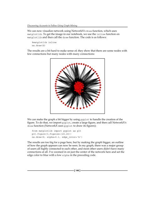
- Page 145 and 146: Social Media Insight Using Naive Ba
- Page 147 and 148: Social Media Insight Using Naive Ba
- Page 149 and 150: Social Media Insight Using Naive Ba
- Page 151 and 152: Social Media Insight Using Naive Ba
- Page 153 and 154: Social Media Insight Using Naive Ba
- Page 155 and 156: Social Media Insight Using Naive Ba
- Page 158 and 159: Discovering Accounts to Follow Usin
- Page 160 and 161: Chapter 7 Next, we will need a list
- Page 162 and 163: Chapter 7 Make sure the filename is
- Page 164 and 165: Chapter 7 cursor = results['next_cu
- Page 166 and 167: Chapter 7 Next, we are going to rem
- Page 170 and 171: Chapter 7 As you can see, it is ver
- Page 172 and 173: Chapter 7 Next, we will only add th
- Page 174 and 175: Chapter 7 The difference in this gr
- Page 176 and 177: Chapter 7 We can graph the entire s
- Page 178 and 179: Chapter 7 Optimizing criteria Our a
- Page 180 and 181: Chapter 7 Next, we need to get the
- Page 182 and 183: • method='nelder-mead': This is u
- Page 184 and 185: Beating CAPTCHAs with Neural Networ
- Page 186 and 187: Chapter 8 The red lines indicate th
- Page 188 and 189: Chapter 8 The combination of an app
- Page 190 and 191: Chapter 8 Next we set the font of t
- Page 192 and 193: Chapter 8 We can then extract the s
- Page 194 and 195: Chapter 8 Our targets are integer v
- Page 196 and 197: Chapter 8 Then we iterate over our
- Page 198 and 199: Chapter 8 From these predictions, w
- Page 200 and 201: Chapter 8 This code correctly predi
- Page 202 and 203: The result is shown in the next gra
- Page 204 and 205: Chapter 8 However, it isn't very go
- Page 206: Chapter 8 Summary In this chapter,
- Page 209 and 210: Authorship Attribution Attributing
- Page 211 and 212: Authorship Attribution If we cannot
- Page 213 and 214: Authorship Attribution After taking
- Page 215 and 216: Authorship Attribution This dataset
- Page 217 and 218: Authorship Attribution "instead", "
- Page 219 and 220:
Authorship Attribution Support vect
- Page 221 and 222:
Authorship Attribution Kernels When
- Page 223 and 224:
Authorship Attribution We can reuse
- Page 225 and 226:
Authorship Attribution With our dat
- Page 227 and 228:
Authorship Attribution We then reco
- Page 229 and 230:
Authorship Attribution If it doesn'
- Page 231 and 232:
Authorship Attribution Finally, we
- Page 234 and 235:
Clustering News Articles In most of
- Page 236 and 237:
Chapter 10 API Endpoints are the ac
- Page 238 and 239:
The token object is just a dictiona
- Page 240 and 241:
Chapter 10 We then create a list to
- Page 242 and 243:
Chapter 10 We are going to use MD5
- Page 244 and 245:
Chapter 10 Next, we develop the cod
- Page 246 and 247:
Chapter 10 We use clustering techni
- Page 248 and 249:
Chapter 10 The k-means algorithm is
- Page 250 and 251:
Chapter 10 We only fit the X matrix
- Page 252 and 253:
Chapter 10 We then print out the mo
- Page 254 and 255:
Chapter 10 Our function definition
- Page 256 and 257:
Chapter 10 The result from the prec
- Page 258 and 259:
Chapter 10 Implementation Putting a
- Page 260 and 261:
Chapter 10 Neural networks can also
- Page 262 and 263:
We then call the partial_fit functi
- Page 264 and 265:
Classifying Objects in Images Using
- Page 266 and 267:
Chapter 11 This dataset comes from
- Page 268 and 269:
You can change the image index to s
- Page 270 and 271:
Chapter 11 Each of these issues has
- Page 272 and 273:
Chapter 11 Using Theano, we can def
- Page 274 and 275:
Chapter 11 Building a neural networ
- Page 276 and 277:
Chapter 11 Finally, we create Thean
- Page 278 and 279:
Chapter 11 return [image,] return s
- Page 280 and 281:
Chapter 11 Next, we define how the
- Page 282 and 283:
Chapter 11 Getting your code to run
- Page 284 and 285:
Chapter 11 Setting up the environme
- Page 286 and 287:
This will unzip only one Coval.otf
- Page 288 and 289:
Chapter 11 First we create the laye
- Page 290 and 291:
Chapter 11 Finally, we set the verb
- Page 292:
Chapter 11 Summary In this chapter,
- Page 295 and 296:
Working with Big Data Big data What
- Page 297 and 298:
Working with Big Data Governments a
- Page 299 and 300:
Working with Big Data We start by c
- Page 301 and 302:
Working with Big Data The final ste
- Page 303 and 304:
Working with Big Data Getting the d
- Page 305 and 306:
Working with Big Data If we aren't
- Page 307 and 308:
Working with Big Data Before we sta
- Page 309 and 310:
Working with Big Data The first val
- Page 311 and 312:
Working with Big Data This gives us
- Page 313 and 314:
Working with Big Data Next, we crea
- Page 315 and 316:
Working with Big Data Then, make a
- Page 317 and 318:
Working with Big Data Left-click th
- Page 319 and 320:
Working with Big Data The result is
- Page 321 and 322:
Next Steps… Extending the IPython
- Page 323 and 324:
Next Steps… Chapter 3: Predicting
- Page 325 and 326:
Next Steps… Vowpal Wabbit http://
- Page 327 and 328:
Next Steps… Deeper networks These
- Page 329 and 330:
Next Steps… Real-time clusterings
- Page 331 and 332:
Next Steps… More resources Kaggle
- Page 333 and 334:
authorship, attributing 185-188 AWS
- Page 335 and 336:
feature extraction about 82 common
- Page 337 and 338:
NetworkX about 145 defining 303 URL
- Page 339 and 340:
scikit-learn package references 305
- Page 342 and 343:
Thank you for buying Learning Data
- Page 344:
Learning Python Data Visualization