

Katlyn Knuver's Digital Porfolio March 2017

You also want an ePaper? Increase the reach of your titles
YUMPU automatically turns print PDFs into web optimized ePapers that Google loves.
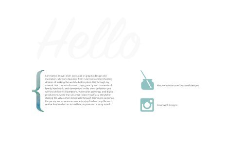
I am <strong>Katlyn</strong> Knuver and I specialize in graphic design and<br />
illustration. My work develops from rural roots and enchanting<br />
dreams of making the world a better place. It is through my<br />
artwork that I hope to focus on days gone by and moments of<br />
family, hard work, and connection. In this short collection you<br />
will find children’s illustrations, watercolor paintings, and digital<br />
productions. More than an artist, I view myself as a storyteller<br />
sharing the value of all individuals through their mere existence.<br />
I hope my work causes someone to stop his/her busy life and<br />
realize that he/she has incredible purpose and a story to tell.
TABLE OF CONTENTS<br />
fine art and illustration.....................................1-5<br />
publication design...........................................6-8<br />
branding..........................................................9-11<br />
3d production and installation...................12-13<br />
visual communication design.....................14-20
THROUGH THEIR EYES<br />
DESCRIPTION<br />
Through Their Eyes is a piece that was created to celebrate cultures and<br />
perspectives. This piece, inspired by my journey to Africa, features two<br />
children who gave generously and let me partake in their culture.<br />
Medium: watercolor<br />
Size: 24x36 inches<br />
Personal reference photo taken in Togo, Africa<br />
Date: Fall 2016<br />
DEVELOPMENT<br />
1
HARVEST DAYS<br />
DESCRIPTION<br />
Harvest Days is a watercolor piece created to show the light and color of fall<br />
moments in a rural location. Typical animals appearing black and white really<br />
have an array of color that is best seen in the light.<br />
Medium: watercolor<br />
Size: 18x24 inches<br />
Personal reference photo<br />
Date: Fall 2016<br />
2
HOMEGROWN<br />
DESCRIPTION<br />
This illustration was designed to utilize my skill in both watercolor and ink. Homegrown features<br />
illustrative techniques to show the ideal rural life of harvest bounty during the spring.<br />
Medium: watercolor and ink on watercolor paper<br />
Size: 18x24 inches<br />
Personal illustrations and photo references<br />
Date: Fall 2016<br />
SKETCHES<br />
3
Checker Cab's Adventure.indd 3<br />
6/5/16 5:21 PM<br />
Checker Cab's Adventure.indd 5<br />
6/5/16 5:21 PM<br />
Checker Cab's Adventure.indd 21<br />
6/5/16 5:21 PM<br />
CHECKER CAB’S ADVENTURE<br />
DESCRIPTION<br />
Have you ever ridden in a Checker taxi cab? Have<br />
you ever been to a college football game? What do<br />
you do on a Saturday afternoon?<br />
Look for other Checker Adventure Books wherever better books are sold.<br />
Checker Cab’s Adventure<br />
Fall Football Fun<br />
Written by Zandra and Timothy Bower<br />
Illustrated by <strong>Katlyn</strong> Knuver<br />
Checker Cab’s Adventure was a commissioned piece based off of the client’s<br />
family and interest. The story revolves around a taxi cab driver and his helper,<br />
Bunwacky, a pet bunny. Throughout the day they pick up several passengers<br />
on the way to a football game.<br />
Medium: digital, watercolor, and watercolor pencils on bristol<br />
Size: 5.5x8.5 inches<br />
Personal design and resources<br />
Date: Spring 2016<br />
Checker Cab enjoys his job as a taxi, because he meets interesting<br />
Checker people. While Cab's doing his job Adventure.indd he also sees mountains, alleys, colleges, 1<br />
neighborhoods, and other various spots.<br />
As Cab Driver is vacuuming the front seat and floor, he opens the<br />
glove box to make sure his maps, tire gauge, and driving gloves are<br />
where they belong. As he opens the glove box he sees Bunwacky, his<br />
favorite stuffed animal and good luck charm.<br />
Cab Driver whistles a merry tune as he heads back to the garage.<br />
Bunwacky and Checker Cab review the day’s adventures.<br />
6/5/16 5:21 PM<br />
“Wasn’t today fun?” asks Bunwacky. “We’ll remember our riders for<br />
months.”<br />
“Good morning, Bunwacky! Are you ready for another busy day?”<br />
Checker Cab agrees, “That was an assorted group of customers we<br />
helped today. We learned how much fun a Saturday in September can<br />
be!”<br />
Back at the garage, Cab Driver parks the taxi. He unbuckles<br />
Bunwacky from his seat belt and gently places him in the glove box for<br />
a safe night’s sleep.<br />
As he exits the garage, Cab Driver pats Checker Cab on the fender<br />
and says, “Good Night!”<br />
2<br />
3<br />
6<br />
7<br />
38<br />
39<br />
4
THE LUMBERJACK’S SON<br />
DESCRIPTION<br />
The Lumberjack’s Son was a piece I personally wrote and illustrated. Each<br />
picture breaks the border and creates an interactive environment for<br />
the reader. Additionally, each of the spreads features an animal hidden<br />
in the opposite side of the spread. The storyline follows the journey of a<br />
lumberjack father who is on a quest to build a meaningful gift for his son.<br />
Medium: watercolor and digital<br />
Size: 11x14 inches<br />
Personal illustrations and resources<br />
Date: Spring 2015<br />
124<br />
122<br />
A mighty tree perhaps. One that<br />
was sturdy and trustworthy would<br />
be great for a gift? But the<br />
lumberjack walked on.<br />
Perhaps a straight tree that reached<br />
to the sky with great ease and valor?<br />
But the lumberjack walked on.<br />
9<br />
10 1<br />
11<br />
12<br />
5
FROM THE FARM TO THE TABLE<br />
DESCRIPTION<br />
From the Farm to the Table was an exploration of organic produce<br />
consumption and farming. Natural and bright colors were used to create<br />
visual connection between the subject matter and feel of growth, and a<br />
natural organic atmosphere. The application of this 12 page booklet would<br />
be as a resource for the farming industry to inform consumers.<br />
Medium: digital<br />
Size: 5.5x8.5 inches<br />
Personal reference photo and illustrations.<br />
Date: Fall 2015<br />
6
ROOTS MAGAZINE: fall edition<br />
DESCRIPTION<br />
Roots Magazine is Grace College’s yearbook alternative to capture and<br />
document campus life, culture, and ideals. As illustrator and graphic<br />
designer for two years, I designed covers, layouts, and illustrations as<br />
featured. This cover was designed for fall 2015.<br />
Medium: watercolor and ink<br />
Size: 8.5x11 inches<br />
Personal illustrations<br />
Date: Fall 2015<br />
FULL COVER<br />
7
ROOTS MAGAZINE: Spring edition<br />
DESCRIPTION<br />
Roots Magazine is Grace College’s yearbook alternative to capture and<br />
document campus life, culture, and ideals. As illustrator and graphic<br />
designer for two years, I designed covers, layouts, and illustrations as<br />
featured. This design was for the fall 2016 edition. This cover features<br />
building and landmarks of Grace College that would be understood to the<br />
student body.<br />
Medium: watercolor and ink<br />
Size: 8.5x11 inches<br />
Personal illustrations<br />
Date: Fall 2016<br />
COLOR DEVELOPMENT<br />
8
BRUSHWELL BRANDING<br />
LOGO DEVELOPMENT<br />
BRUSHWELL LOGO<br />
DESIGNS<br />
DESIGNS<br />
COLORS<br />
FONTS<br />
Avenir Next:<br />
a b c d e f g h i j k l m<br />
n o p q r s t u v w x y z<br />
Handlettered:<br />
9
CYNTHIA NORRIS PHOTOGRAPHY<br />
CYNTHIA NORRIS PHOTOGRAPHY BRANDING<br />
LOGO<br />
DESCRIPTION<br />
Cynthia Norris Photography Branding was a commissioned piece for a<br />
freelance photographer. This assignment looked at watermarks, stationary<br />
branding, logos, and business cards.<br />
P H O T O G R APHY<br />
Medium: digital and print<br />
Size: varies<br />
Personal design photo copyright Cynthia Norris Photography<br />
Date: January <strong>2017</strong><br />
FONTS<br />
Myriad Pro<br />
Handwritten<br />
COLOR PALLET<br />
P<br />
R<br />
O<br />
P<br />
E<br />
R<br />
T<br />
Y<br />
O<br />
F<br />
P<br />
H<br />
O<br />
T<br />
O<br />
G<br />
R<br />
A<br />
P<br />
H<br />
Y<br />
P H O T O G R APHY<br />
10
SHOOTING SPORTS CLUB<br />
DESCRIPTION<br />
SPORTS CLUB<br />
Grace College’s Shooting Sports Club is an club sport group that meets<br />
bimonthly to shoot trap, skeet, and sporting clay. With current gun violence,<br />
this group wanted to be mindful and receptive to concerns with firearms.<br />
To correlate with the objectives of this group, I created this logo that<br />
depicts no guns or shooters but still gives a clear idea of the group. The<br />
bullet is going away from the viewer and is easily applicable for any further<br />
branding development.<br />
STATIONARY AND PROMOTION<br />
Medium: digital<br />
Size: dependent on application<br />
Personal design and resources<br />
Date: Winter 2016<br />
11
POTTERY<br />
DESCRIPTION<br />
These two mugs were created with stoneware clay on a pottery wheel. Once<br />
fired they were glazed and painted to bring an illustrative and unique piece.<br />
Every mug features a one-of-a-kind surprise on the bottom.<br />
Medium: clay<br />
Size: roughly 6 and 5 inches height<br />
Personal illustrations and saying based off of hymn<br />
Come Thou Fount Of Every Blessing<br />
Date: Fall 2016<br />
12
FISH OF NEWAYGO<br />
DESCRIPTION<br />
The city of Newaygo, Michigan is surrounded by many rivers and known<br />
for its Rainbow Trout and Salmon. For this assignment, I created illustrations<br />
of both types of fish to fit an existing steel frame. Through this process, I<br />
was responsible for working with the city as we printed, cut, laminated, and<br />
applied the fish to Newaygo’s arch.<br />
Medium: Arlon printed vinyl laminated and applied to existing steel frames<br />
Size: NA<br />
Personal illustrations based of researched fish<br />
Date: Summer 2016<br />
13
TYPOGRAPHY POSTER<br />
DESCRIPTION<br />
Typography Poster was a design meant to be a resource for graphic design<br />
instructors to teach students the accurate ways to use type. This step by step<br />
process looks at the common mistakes and informative goals when working<br />
with type.<br />
Families<br />
Medium: digital and print<br />
Size: 11x17 inches<br />
Personal design and photos<br />
Date: Spring 2016<br />
Sans Serif<br />
These fonts are known<br />
for their lack of serifs<br />
and a boxy exterior.<br />
Sans serif fonts have<br />
a tendency to be<br />
modern.<br />
Ex: Helvetica<br />
Storytelling<br />
Serif<br />
Serif Fonts are<br />
recognizable by their<br />
serif feet. These fonts<br />
have a tendency to be<br />
old style and vintage in<br />
appearance.<br />
Ex: American Typewriter<br />
Script<br />
Script fonts are loopy<br />
can look like cursive or<br />
hand lettering. Similarly<br />
to decorative, they may<br />
be harder to read and<br />
should not be used for<br />
the body copy.<br />
Ex: Sign Painter<br />
Decorative<br />
Decorative fonts do<br />
not follow the rules<br />
and have aspects<br />
of other font types.<br />
Decorative fonts<br />
may have legibility<br />
problems and should<br />
never be used<br />
for the text body.<br />
Ex: Rosewood<br />
SKETCHES & DEVELOPMENT<br />
Mood<br />
Choose a font that<br />
are trying to convey<br />
in your piece. Don’t<br />
use fonts that mix<br />
moods and themes of<br />
your story. One font<br />
may be happy and<br />
another feeling sad.<br />
Avoid clique fonts<br />
and be unique.<br />
Fun Facts<br />
Contrast<br />
Use more than one<br />
type of font in a piece<br />
but no more than<br />
three. Be consistent<br />
and make a statement.<br />
Use contrast whether<br />
is be size, color, or<br />
styles. For example do<br />
not use two serif type<br />
fonts but make your<br />
font story unique.<br />
Kern/ing<br />
Kerning and tracking<br />
are the spacing<br />
between letters.<br />
Sometimes automatic<br />
spacing seems<br />
unnatural and not<br />
this to make a piece<br />
that really impacts and<br />
tells a cohesive story.<br />
Phoenicians<br />
to invent an<br />
alphabet.<br />
Johann<br />
Gutenberg<br />
invented the<br />
press system.<br />
Helvetica, the<br />
most popular<br />
font today<br />
designed by<br />
Max Meidinger .<br />
14
CHRISTMAS EXTRAVAGANZA<br />
DESCRIPTION<br />
Christmas Extravaganza was a piece designed for a Christmas party event<br />
through Grace College. This poster was my responsibility as head of Grace<br />
Student Organization graphic designer and it was designed to bring a fun<br />
and home-style feel to the event.<br />
Medium: digital and print<br />
Size: 11x17 inches<br />
Personal design and resources<br />
Date: Winter 2016<br />
DEC<br />
03<br />
7-11pm<br />
GREC<br />
cookie decorating<br />
food & cocoa<br />
christmas dodgeball<br />
christmas races<br />
SKETCHES<br />
15
GROW LOGO<br />
DESCRIPTION<br />
G.R.O.W, or Grace Refuge Outreach Worldwide, is an organization founded<br />
to rescue endangered children in Thailand from human trafficking. This<br />
project incorporated their logo as well as their values in a shirt created to<br />
bring awareness. The barcode is a reminder of the price of life as well as<br />
the value of individuals while the flowers incorporate the G.R.O.W logo. This<br />
design was produced on a variety of shirts that were purchased.<br />
Medium: digital<br />
Size: basic t-shirt application<br />
Personal design and resources<br />
Date: Spring 2016<br />
G.R.O.W<br />
SKETCHES<br />
BOUGHT WITH A PRICE Wiang Pa Pao, Thailand<br />
BOUGHT WITH A PRICE<br />
16
ROCK CLIMBING TRIP<br />
DESCRIPTION<br />
This Rock Climbing Trip was a Grace Intramural-sponsored event. Due<br />
to the nature of this event, this graphic was designed for a college-age<br />
audience. Natural and earthy colors were used to bring an adventurous and<br />
mountainous feel.<br />
Feb. 18<br />
9am-7pm<br />
Medium: digital<br />
Size: 8.5x11 inches<br />
Personal design and resources<br />
Date: Spring <strong>2017</strong><br />
GIP<br />
ROCK CLIMBING<br />
SKETCHES<br />
Hoosier Heights in Indianapolis<br />
$20/20 spots<br />
sign ups: Grace Intramural FB page<br />
17
RECIPE CARDS<br />
DESCRIPTION<br />
Recipe Cards was a practical design challenge. I illustrated common kitchen<br />
supplies and used a neutral color pallet to be adaptable to most styles and<br />
preferences.<br />
Prep Time:<br />
Total Time:<br />
Ingredients:<br />
Directions:<br />
Medium: digital<br />
Size: 4x6 inches<br />
Personal design and resources<br />
Date: Winter 2016<br />
SKETCHES<br />
18
PACKAGING PROBLEM SOLVER<br />
DESCRIPTION<br />
This packaging exploration was a discovery of educating consumers<br />
about what they are eating. In a highly processed world, it is easy to<br />
forget what we are consuming. To combat this growing problem, I<br />
produced a series of packaging that both emphasized that origin of<br />
the food as well as the process. In a subtle and interesting way, these<br />
packages remind consumers to buy grown foods and know what they<br />
are buying.<br />
Additionally, these packages were designed to be useful to the<br />
consumer. Honey, in its natural consistency is sticky and often the<br />
product has to be upside down to have the contents drip. So, the honey<br />
label is both legible right side up and up side down. Similarly, the jam<br />
jar is simple and clear so even a young consumer can recognize the<br />
product when making a peanut butter and jelly sandwich.<br />
Medium: digital<br />
Size: NA<br />
Personal illustrations and watercolors<br />
Date: Spring <strong>2017</strong><br />
NET. 5.6 oz.<br />
NET. 5.6 oz.<br />
FRESH<br />
NET. 5.6 oz.<br />
NET. 5.6 oz.<br />
Preserved not Packaged<br />
NET. 5.6 oz.<br />
19
PB & J TO GO<br />
Coloring Page and crayons are inside!<br />
FARM FRESH PRODUCE PRESENTS<br />
Pull Here<br />
DESCRIPTION<br />
PB & J To Go is a prepared lunch kit that not only emphasizes homemade<br />
lunches but also stresses the importance of knowing where your food was<br />
made. This kit, designed for milk, apples, and a sandwich is also equipped<br />
with crayons and activities. The top portion of the kit is removable to reveal<br />
both the contents and a coloring page. The sides give farm facts and offers<br />
education to the child. This lunch alternative gives both a homemade feel<br />
and educational qualities while fulfilling a real need to the consumer.<br />
Peanut Butter<br />
Jelly Lunch<br />
Betsy<br />
Hi! My name<br />
is Betsy. I live<br />
on a farm in the<br />
country. One of my<br />
important jobs is to<br />
give you milk to drink. I eat a lot<br />
of hay and grains to make sure<br />
you get the vitamins you need to<br />
stay healthy when<br />
you drink<br />
my milk.<br />
P<br />
FA R M<br />
F R E S H<br />
E<br />
R O D U C<br />
Just Plain Facts<br />
Lunch Kit includes:<br />
• Milk carton with a straw<br />
• Peanut butter spreader<br />
• Two slices of white bread<br />
• Peanut butter<br />
• Jelly<br />
• Apple slices<br />
• Napkin<br />
• Coloring page<br />
• 4 Crayons<br />
Farm Fresh Produce presents a healthy lunch for you and your family.<br />
Apples<br />
Nutrition Facts<br />
Serving Size 1 bag 7oz<br />
Amount Per Serving<br />
Calories 130 Calories from Fat 0<br />
% Daily Value*<br />
Total Fat 0g 0%<br />
Saturated Fat 0g 0%<br />
Trans Fat 0g 0%<br />
Cholesterol 0mg 0%<br />
Sodium 0mg 0%<br />
Total Carbohydrate 34g 11%<br />
Dietary Fiber 5g 20%<br />
Sugars 25g<br />
Protein 1g<br />
Vitamin A 2% Vitamin C 8%<br />
Calcium 2% Iron 2%<br />
* Percent Daily Values are based on a<br />
2,000 calorie diet. Your daily values may<br />
be higher or lower depending on your<br />
calorie needs:<br />
Peanut Butter and Jelly<br />
Nutrition Facts<br />
Serving Size 1 Sandwich<br />
Amount Per Serving<br />
Calories 430 Calories from Fat 110<br />
% Daily Value*<br />
Total Fat 12g 18%<br />
Saturated Fat 6g 30%<br />
Trans Fat 0g 0%<br />
Cholesterol 25mg 8%<br />
Sodium 930mg 39%<br />
Total Carbohydrate 65g 22%<br />
Dietary Fiber 11g 44%<br />
Sugars 16g<br />
Protein 19g<br />
Vitamin A 70% Vitamin C 50%<br />
Calcium 25% Iron 20%<br />
* Percent Daily Values are based on a<br />
2,000 calorie diet. Your daily values may<br />
be higher or lower depending on your<br />
calorie needs:<br />
Milk<br />
Nutrition Facts<br />
Serving Size 8 fl oz<br />
Amount Per Serving<br />
Help me color my home<br />
Calories 80 Calories from Fat 0<br />
% Daily Value*<br />
Total Fat 0g 0%<br />
Saturated Fat 0g 0%<br />
Trans Fat 0g 0%<br />
Cholesterol 5mg 1%<br />
Sodium 130mg 5%<br />
Total Carbohydrate 12g 4%<br />
Dietary Fiber 0g 0%<br />
Sugars 11g<br />
Protein 8g<br />
Vitamin A 8% Vitamin C 4%<br />
Calcium 30% Iron 0%<br />
* Percent Daily Values are based on a<br />
2,000 calorie diet. Your daily values may<br />
be higher or lower depending on your<br />
calorie needs:<br />
Help get Betsy to<br />
her home!<br />
Medium: digital<br />
Size: 8x10 inches<br />
Personal design, concept, and resources<br />
Date: concept 2014, development Spring 2016<br />
Help me color my home<br />
DEVELOPMENT<br />
20
VISIT MY WEBSITE BELOW TO SEE MORE<br />
KATLYN KNUVER<br />
graphic design & Illustration<br />
brushwell_design<br />
brushwelldesign@gmail.com<br />
231-519-1323<br />
All work property of <strong>Katlyn</strong> Knuver and shall not be<br />
replicated or reproduced without permission.<br />
Mock Up templates derived from:<br />
“Paperback Psd Book Mockup Vol2.” Paperback Psd Book Mockup Vol2<br />
| Psd Mock Up Templates | Pixeden. N.p., n.d. Web. 19 Jan. <strong>2017</strong>.<br />
“Mockups - 16/77.” PSD Mockups. N.p.,n.d. Web. 26 Jan. <strong>2017</strong>.<br />
“Psd, premium icons & free web design resources for designers- latest<br />
freebies by PixelBuddha.” Psd, premium icons & free web design<br />
resources for designers- latest freebies by PixelBuddha N.P.,n.d. Web.<br />
06 Feb. <strong>2017</strong>.