Original Comic Book Art And The Collectors - TwoMorrows
Original Comic Book Art And The Collectors - TwoMorrows
Original Comic Book Art And The Collectors - TwoMorrows

You also want an ePaper? Increase the reach of your titles
YUMPU automatically turns print PDFs into web optimized ePapers that Google loves.
COPY AREA<br />
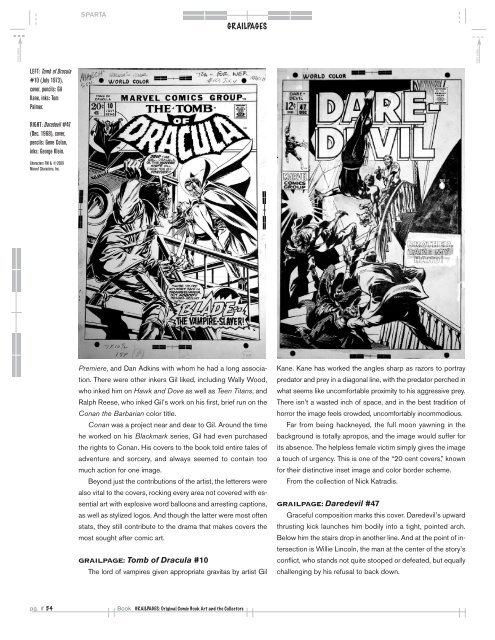
LEFT: Tomb of Dracula<br />
#10 (July 1973),<br />
cover, pencils: Gil<br />
Kane, inks: Tom<br />
Palmer.<br />
RIGHT: Daredevil #47<br />
(Dec. 1968), cover,<br />
pencils: Gene Colan,<br />
inks: George Klein.<br />
Characters TM & ©2009<br />
Marvel Characters, Inc.<br />
SPARTA<br />
pg. # 54 <strong>Book</strong> GRAILPAGES: <strong>Original</strong> <strong>Comic</strong> <strong>Book</strong> <strong>Art</strong> and the <strong>Collectors</strong><br />
GRAILPAGES<br />
Premiere, and Dan Adkins with whom he had a long associa-<br />
tion. <strong>The</strong>re were other inkers Gil liked, including Wally Wood,<br />
who inked him on Hawk and Dove as well as Teen Titans, and<br />
Ralph Reese, who inked Gil’s work on his first, brief run on the<br />
Conan the Barbarian color title.<br />
Conan was a project near and dear to Gil. Around the time<br />
he worked on his Blackmark series, Gil had even purchased<br />
the rights to Conan. His covers to the book told entire tales of<br />
adventure and sorcery, and always seemed to contain too<br />
much action for one image.<br />
Beyond just the contributions of the artist, the letterers were<br />
also vital to the covers, rocking every area not covered with essential<br />
art with explosive word balloons and arresting captions,<br />
as well as stylized logos. <strong>And</strong> though the latter were most often<br />
stats, they still contribute to the drama that makes covers the<br />
most sought after comic art.<br />
GRAILPAGE: Tomb of Dracula #10<br />
<strong>The</strong> lord of vampires given appropriate gravitas by artist Gil<br />
Kane. Kane has worked the angles sharp as razors to portray<br />
predator and prey in a diagonal line, with the predator perched in<br />
what seems like uncomfortable proximity to his aggressive prey.<br />
<strong>The</strong>re isn’t a wasted inch of space, and in the best tradition of<br />
horror the image feels crowded, uncomfortably incommodious.<br />
Far from being hackneyed, the full moon yawning in the<br />
background is totally apropos, and the image would suffer for<br />
its absence. <strong>The</strong> helpless female victim simply gives the image<br />
a touch of urgency. This is one of the “20 cent covers,” known<br />
for their distinctive inset image and color border scheme.<br />
From the collection of Nick Katradis.<br />
GRAILPAGE: Daredevil #47<br />
Graceful composition marks this cover. Daredevil’s upward<br />
thrusting kick launches him bodily into a tight, pointed arch.<br />
Below him the stairs drop in another line. <strong>And</strong> at the point of intersection<br />
is Willie Lincoln, the man at the center of the story’s<br />
conflict, who stands not quite stooped or defeated, but equally<br />
challenging by his refusal to back down.<br />
COPY AREA