

Type Specimen

You also want an ePaper? Increase the reach of your titles
YUMPU automatically turns print PDFs into web optimized ePapers that Google loves.
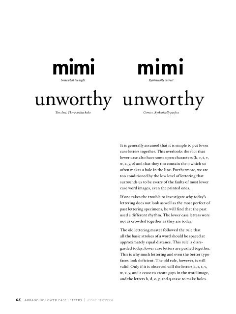
mimi mimi<br />
Somewhat too tight<br />
Rythmically correct<br />
unworthy unworthy<br />
Too close. The w makes holes<br />
Correct. Rythmically perfect<br />
It is generally assumed that it is simple to put lower<br />
case letters together. This overlooks the fact that<br />
lower case also have some open characters (k, r, t, v,<br />
w, x, y, z) and that they too contain the o which so<br />
often makes a hole in the line. Furthermore, we are<br />
too conditioned by the low level of lettering that<br />
surrounds us to be aware of the faults of most lower<br />
case word images, even the printed ones.<br />
If one takes the trouble to investigate why today’s<br />
lettering does not look as well as the most perfect of<br />
past lettering specimens, he will find that the past<br />
used a different rhythm. The lower case letters were<br />
not as crowded together as they are today.<br />
The old lettering master followed the rule that<br />
all the basic strokes of a word should be spaced at<br />
approximately equal distance. This rule is disregarded<br />
today; lower case letters are pushed together.<br />
This is why much lettering and even the better typefaces<br />
look deficient. The old rule, however, is still<br />
valid. Only if it is observed will the letters k, r, t, v,<br />
w, x, y, and z cease to create gaps in the word image,<br />
and the letters b, d, o, p and q cease to make holes.<br />
T<br />
L<br />
M<br />
F<br />
R<br />
A<br />
S<br />
W<br />
B<br />
A<br />
E<br />
—<br />
D<br />
03 ARRANGING LOWER CASE LETTERS | ILENE STRIZVER