

Atlas_IdentityGuide

You also want an ePaper? Increase the reach of your titles
YUMPU automatically turns print PDFs into web optimized ePapers that Google loves.
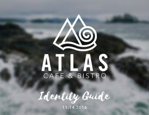
Identity Guide<br />
11.14.2016
The logo and full brand<br />
identity for <strong>Atlas</strong> Cafe &<br />
Bistro was designed by<br />
Kathryn Kubasta, a freelance<br />
graphic artist from Oshkosh,<br />
Wisconsin.
Contents<br />
1 Position and Voice<br />
2 Logo<br />
5 Brand Colors<br />
6 Typography<br />
7 Imagery<br />
8 Collateral<br />
Importance<br />
Consistency<br />
These guidelines have been created to help<br />
<strong>Atlas</strong> Cafe & Bistro grow and benefit from a<br />
clear and strong identity. A strong brand identity<br />
gives customers an immediately recognizeable,<br />
distinctive, and professional image that<br />
positions us for success. A strong identity will<br />
enable us to have a positive association with our<br />
audience, gain better awareness, and build our<br />
reputation for the quality of the coffee and food<br />
we provide.<br />
The <strong>Atlas</strong> Cafe & Bistro identity can only make<br />
a positive impact if it is used consistently and<br />
correctly. There are many studies that prove<br />
that consistency increases awareness and helps<br />
solidify an emotional connection with a brand.<br />
The more consistent we are, the more powerful<br />
the <strong>Atlas</strong> brand will be.
Position & Voice<br />
position<br />
<strong>Atlas</strong> Cafe & Bistro provides young<br />
adventurers with high quality coffee<br />
and food from Seattle. We do this by<br />
using only fresh, local ingredients,<br />
hand crafting all drinks and food, and<br />
creating an atmosphere that reflects the<br />
outdoors.<br />
voice<br />
<strong>Atlas</strong> Cafe & Bistro’s audience is<br />
younger people who enjoy exploring<br />
and spending time outside. The voice of<br />
all advertising, collateral, and branding<br />
should be relaxed, casual, and simple.<br />
1
Logo | Clearspace & Variations<br />
clearspace<br />
Proper area allowed around<br />
the logo is an essential factor<br />
in giving the logo its space so<br />
it can stand proudly among<br />
its surroundings and not be<br />
imposed on.<br />
The border dimension is the<br />
width of the “S” in <strong>Atlas</strong>.<br />
logo variations<br />
Only specific logo variations<br />
are allowed to keep consistency<br />
within the brand. The logo can<br />
be shown vertically, horizontally,<br />
as just the logomark, as just the<br />
logotype, or as the logomark<br />
within a circle. Logotype should<br />
only be used when the full<br />
logo has been used in another<br />
section of the same piece of<br />
collateral.<br />
Horizontal Logo<br />
Vertical Logo<br />
Logomark<br />
Logomark in Circle<br />
Logotype<br />
2
Logo | Size Requirements & Colors<br />
minimum size<br />
To make sure the <strong>Atlas</strong> Cafe &<br />
Bistro logo is always legible and<br />
has clarity, there is a minimum<br />
size. The logomark should<br />
never be presented smaller than<br />
shown.<br />
colors<br />
From the full logomark, the logo<br />
has the ability to be represented<br />
in a number of fashions in order<br />
to allow some flexibility. For<br />
correct brand recognition, only<br />
allow the logo to be represented<br />
in the options shown here.<br />
1.5” Wide<br />
Minimum Size<br />
2.5” Wide<br />
Minimum Size<br />
Logo on Dark Image<br />
White on Blue<br />
3<br />
Logo on Light Image<br />
Blue on Light Color
Logo | Restrictions<br />
distortion / color<br />
Do not stretch, rotate, or distort<br />
the logo in any way. Always<br />
make sure proper spacing is<br />
given to the logo.<br />
Always make sure the color<br />
of the logo is the correct and<br />
appropriate choice that offers<br />
best contrast for visibility.<br />
Distorted Logo<br />
Incorrect Spacing<br />
Incorrect Angle<br />
Incorrect Color Choice<br />
4
Brand Colors<br />
Colors for <strong>Atlas</strong> Cafe & Bistro<br />
have been chosen carefully and<br />
need to be adhered to in order<br />
to keep the mood and style of<br />
the brand consistent. Specific<br />
tones will represent the<br />
company in a natural, earthy,<br />
and clean manner.<br />
PRIMARY<br />
#236378<br />
R: 35<br />
G: 99<br />
B: 121<br />
C: 88%<br />
M: 52%<br />
Y: 38%<br />
K: 14%<br />
ACCENT<br />
#1E3F20<br />
R: 30<br />
G: 63<br />
B: 32<br />
C: 80%<br />
M: 47%<br />
Y: 92%<br />
K: 57%<br />
NEUTRAL<br />
#BCBCBC<br />
R: 188<br />
G: 188<br />
B: 188<br />
C: 27%<br />
M: 21%<br />
Y: 21%<br />
K: 0%<br />
5
Typography<br />
fonts and usages<br />
Typography helps to center<br />
the <strong>Atlas</strong> Cafe & Bistro brand<br />
identity and should be used<br />
consistently across all marketing<br />
materials and brand pieces.<br />
To help ensure that all of our<br />
communications are consistent,<br />
a select group of preferred<br />
typefaces has been selected.<br />
tracking<br />
To keep a consistent typography<br />
look and feel, all of the print<br />
body text throughout every<br />
piece of collateral should have<br />
spacing of 100.<br />
Selima<br />
ABCDEFGHIJKLMNOPQRSTUVWXYZ<br />
abcdefghijklmnopqrstuvwxyz<br />
Selima is to be used for headlines and pulled quotations. This<br />
font is heavy, prominent, and stands out in order to deliver a<br />
message that is necessary to communicate. Selima is only to<br />
be used for one sentence or a few words.<br />
Steelfish Regular<br />
A B C D E F G H I J K L M N O P Q R S T U V W X Y Z<br />
a b c d e f g h i j k l m n o p q r s t u v w x y z<br />
Steelfish is to be used for secondary headlines within a body<br />
of text or when an emphasis is needed within a piece of<br />
marketing material. This font is used to stand out from the<br />
copy font while not being as bold and noticeable as Selima.<br />
All uses of Steelfish Regular should have spacing of 100.<br />
Avenir - Book<br />
ABCDEFGHIJKLMNOPQRSTUVWXYZ<br />
abcdefghijklmnopqrstuvwxyz<br />
Avenir - Book is to be used for print body copy in any and<br />
all publication uses. All uses of Avenir - Book should have<br />
spacing of 100.<br />
6
Imagery<br />
textures/images<br />
All imagery must be high<br />
quality, and no pixelation may<br />
be visible. To be used at as a<br />
texture, close up detail images<br />
are preferred to give the sense<br />
of pattern that will not be<br />
distracting to the text. Images<br />
should be able to capture the<br />
detailed essence of one of <strong>Atlas</strong><br />
Cafe & Bistro’s products: coffee,<br />
smoothies, fresh produce, etc.<br />
other images<br />
All other images should be able<br />
to capture the adventurous and<br />
natural feel of the cafe.<br />
7
Collateral | Business Card<br />
spacing<br />
All text must be at least .25”<br />
away from the edge of the<br />
business card.<br />
8
Collateral | Shirts<br />
9
Collateral | Mug<br />
10
Collateral | “To Go” Food Packaging<br />
11
Collateral | “To Go” Salad Packaging<br />
12
Collateral | “To Go” Paper Bag<br />
13
Collateral | Coffee Cup<br />
14
Collateral | Menu (Outside)<br />
15
Collateral | Menu (Inside)<br />
16
Collateral | Coffee Bean Packaging<br />
17
Collateral | Gift Certificate<br />
18