NikoletaHristovaProcessReport

You also want an ePaper? Increase the reach of your titles
YUMPU automatically turns print PDFs into web optimized ePapers that Google loves.
PROCESS<br />
REPORT
As an Art and Technology<br />
student I had the opportunity<br />
to work for the non-profit<br />
organization Eventeers. The<br />
task was to create a new<br />
brand identity for the Ruhr<br />
Expedition – Treasure hunt.
It all started with a meeting with the client who introduced the project.<br />
He provided us with information about the company, their goals<br />
and brand values. As a final solution, we had to deliver three products<br />
– a lookbook, audiovisual and a mobile website. During the briefing, I<br />
made a list of the wishes of the client. The first thing I wrote down was<br />
the target group. The aim of the expedition is to attract young adults between<br />
20 and 35 years.<br />
After a long session of brainstorming I concluded that people from<br />
this target group, willing to participate in this kind of a game should be<br />
adventurous, physically fit and thirsty for knowledge. As the client told<br />
us we had the freedom to use our creativity and redesign the brand<br />
identity and the game as we wish.
I felt very inspired and came up with many ideas but I had to choose<br />
the one that would best fit the task. I made a research about the place and<br />
decided to create a horror game in which you are being followed and you<br />
have to find the exit as fast as possible as your time is limited. The game fits<br />
the target group perfectly and is aimed especially for those who are adventurous,<br />
seeking new challenges and adrenaline.<br />
I was very enthusiastic for the shooting day to come. As soon as we got<br />
to Essen and I saw the place I got very excited and many new ideas came to<br />
my mind. We worked in a team in order to help each other. We got a camera<br />
and started exploring the place. The day went even better than I expected<br />
and by the end of it I had a great number of photos and videos.
After the shooting day, I changed my idea a hundred times. I decided<br />
to keep the horror theme but evolve the concept to make it more attractive.<br />
Apart from escaping, the player learns about the Ruhr area. By entering<br />
the game you receive a piece from a map leading to a special destination.<br />
You have limited time to get there and find the next piece. There are<br />
many obstacles on the way and you are constantly being followed. Using<br />
many effects, we will make sure that you get the feeling that someone is<br />
actually chasing you. For even bigger adrenaline boost as the time passes<br />
you will feel it getting closer and closer, until you feel its breath right behind<br />
you. Finding the last piece from the map will expose your final destination.<br />
A secret way which leads you to a place where you will discover all<br />
the hidden truths behind what you already know about the Ruhr area.
I had the opportunity to send my concept ideas to the client for<br />
evaluation. The feedback I received was rather good. He liked my ideas<br />
and the whole concept for a horror game sounded very appealing to<br />
him. He told me to rethink some parts and gave me very useful advice.<br />
Later when I made the final decision about the concept I started<br />
thinking of a way to change the logo. I spend a few days sketching, trying<br />
out different fonts, frames and symbols. I decided on keeping the<br />
frame of the logo similar to the original one. I thought about the symbols<br />
and the word “hunt” attracted my attention. I made arrows and<br />
placed the letters between them. Choosing the typography was a challenge.<br />
I tried out many different fonts until I found the one I liked the<br />
most. To keep it simple I used white color.
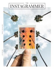
Designing the lookbook was my favorite part of<br />
the project. I edited the photos by making them in<br />
greyscale and simulating fog to create the atmosphere<br />
I wanted. The main colors I chose were black<br />
and red as they represent mystery and danger. To<br />
make it recognizable I used illustrator and drew a<br />
graphic element that has the shape of the famous<br />
building in Zeche Zollverein and used it as a guide<br />
line. The lookbooks’ intention is to enhance the feeling<br />
and bring even more curiosity to the viewer.
With the video I wanted to make the people feel the excitement of the<br />
game and leave them wanting to know more. I chose a scary upbeat song<br />
that rises the feeling of horror and suspense. The scenes change quickly with<br />
the rhythm to enhance the emotion even more. At the end I added a drone<br />
shot which I reversed in order to make look complete.<br />
The biggest struggle I had during my work for the project was creating<br />
the mobile website. Using many tutorials and explanation I managed to<br />
succeed. I wanted to recreate the mysterious feeling from the video and at<br />
the same time keep it simple with clear design. I used black color with a few<br />
shades of gray for the interface. I explained the main concept and included<br />
the photos and the video that I already made. I added a contact form for<br />
those looking for more information about how to join the expedition.
While working on the project I developed very<br />
useful skills and also learned what it is like to work<br />
for someone according to their wishes and preferences.<br />
It was challenging at first as I didn’t have<br />
any experience in that area but once I started I<br />
figured everything rather fast and discovered that<br />
this is something I am very passionate about.
ADDRESS: 1356 Donec ut euismod nibh. Maecenas<br />
bibendum adipiscing, 1500 Nullam nec.<br />
NIKOLETA HRISTOVA<br />
EAT1B<br />
PROJECT CUSTOMER RULES