

primephonic: classical music in the digital age
Amplify your life with our 2017 e- magazine, featuring interviews with Philip Glass, insights on classical music in New York City and more!
Amplify your life with our 2017 e- magazine, featuring interviews with Philip Glass, insights on classical music in New York City and more!

You also want an ePaper? Increase the reach of your titles
YUMPU automatically turns print PDFs into web optimized ePapers that Google loves.
<strong>primephonic</strong><br />
It was a spr<strong>in</strong>g day, <strong>the</strong> sun was sh<strong>in</strong><strong>in</strong>g <strong>in</strong> a prov<strong>in</strong>cial wooded neighbourhood <strong>in</strong><br />
<strong>the</strong> Ne<strong>the</strong>rlands and I had someth<strong>in</strong>g important to talk about – <strong>the</strong> colour brown<br />
– with Joost De Boo, PENTATONE’s art director. He shed some light on album<br />
artwork <strong>in</strong> <strong>classical</strong> <strong>music</strong>, voic<strong>in</strong>g his frustration with <strong>the</strong> colour brown as <strong>the</strong><br />
norm, and his drive to brea<strong>the</strong> fresh air <strong>in</strong>to <strong>the</strong> creation of album art.<br />
Album art <strong>in</strong> <strong>classical</strong> <strong>music</strong> has tended towards safe colours and soft tones. If a<br />
picture speaks a thousand words, <strong>the</strong>n it’s up to designers of album art to help<br />
disrupt <strong>the</strong> general standards <strong>in</strong> <strong>the</strong> <strong>classical</strong> <strong>music</strong> <strong>in</strong>dustry. There has been a renaissance<br />
<strong>in</strong> opera, set design and costume design. Album art can have one too!<br />
WORDS RACHEL DELOUGHRY<br />
<strong>the</strong><br />
brown<br />
album<br />
Classical <strong>music</strong> has been try<strong>in</strong>g to<br />
shake off its old, dusty and antiquated<br />
vibe and Joost voiced what<br />
many people have been th<strong>in</strong>k<strong>in</strong>g.<br />
Although this stuffy, old-fashioned<br />
reputation <strong>in</strong>terest<strong>in</strong>gly impacts visual<br />
arts and public op<strong>in</strong>ion of <strong>classical</strong><br />
<strong>music</strong>, <strong>the</strong> <strong>music</strong> itself is often<br />
unrecognisable from its packag<strong>in</strong>g.<br />
“The cover of a particular Liszt<br />
album was brown and olive green. I<br />
listened to <strong>the</strong> album and it was very<br />
energetic. But on a basic emotional<br />
level, <strong>the</strong>re was no connection<br />
between <strong>the</strong> <strong>music</strong> and <strong>the</strong> colours<br />
brown and olive green. In <strong>the</strong> bigger<br />
picture of what <strong>the</strong> graphic designer<br />
has done, though, it all comes down<br />
to brown.”<br />
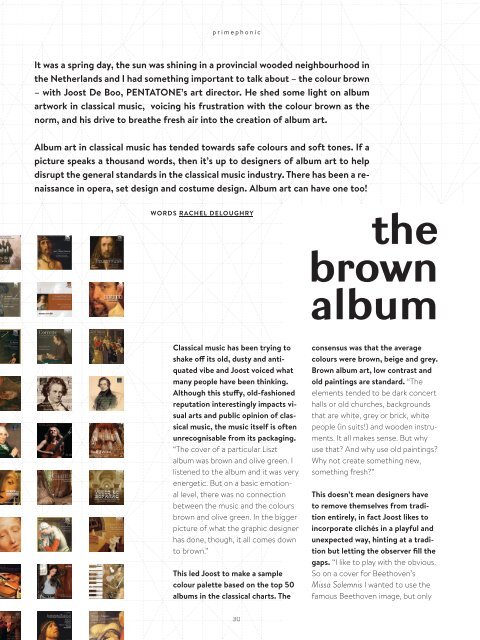
This led Joost to make a sample<br />
colour palette based on <strong>the</strong> top 50<br />
albums <strong>in</strong> <strong>the</strong> <strong>classical</strong> charts. The<br />
consensus was that <strong>the</strong> aver<strong>age</strong><br />
colours were brown, beige and grey.<br />
Brown album art, low contrast and<br />
old pa<strong>in</strong>t<strong>in</strong>gs are standard. “The<br />
elements tended to be dark concert<br />
halls or old churches, backgrounds<br />
that are white, grey or brick, white<br />
people (<strong>in</strong> suits!) and wooden <strong>in</strong>struments.<br />
It all makes sense. But why<br />
use that? And why use old pa<strong>in</strong>t<strong>in</strong>gs?<br />
Why not create someth<strong>in</strong>g new,<br />
someth<strong>in</strong>g fresh?”<br />
This doesn’t mean designers have<br />
to remove <strong>the</strong>mselves from tradition<br />
entirely, <strong>in</strong> fact Joost likes to<br />
<strong>in</strong>corporate clichés <strong>in</strong> a playful and<br />
unexpected way, h<strong>in</strong>t<strong>in</strong>g at a tradition<br />
but lett<strong>in</strong>g <strong>the</strong> observer fill <strong>the</strong><br />
gaps. “I like to play with <strong>the</strong> obvious.<br />
So on a cover for Beethoven’s<br />
Missa Solemnis I wanted to use <strong>the</strong><br />
famous Beethoven im<strong>age</strong>, but only