

primephonic: classical music in the digital age
Amplify your life with our 2017 e- magazine, featuring interviews with Philip Glass, insights on classical music in New York City and more!
Amplify your life with our 2017 e- magazine, featuring interviews with Philip Glass, insights on classical music in New York City and more!

Create successful ePaper yourself
Turn your PDF publications into a flip-book with our unique Google optimized e-Paper software.
<strong>primephonic</strong><br />
There is fur<strong>the</strong>r room for change <strong>in</strong><br />
<strong>classical</strong> album art, not just conceptually<br />
but even <strong>in</strong> terms of <strong>the</strong><br />
basics: typography and dimensions.<br />
“There are very specific titles <strong>in</strong><br />
<strong>classical</strong> <strong>music</strong>, compared with any<br />
o<strong>the</strong>r genre. Opus numbers, full<br />
titles, conductor, soloist, sometimes<br />
multiple composers, and all opus<br />
numbers for each work listed. For<br />
<strong>digital</strong> we should just cut it out. In<br />
a thumbnail you don’t see anyth<strong>in</strong>g<br />
anyway – text can just look like a<br />
white l<strong>in</strong>e. I create two versions of<br />
every album cover – one for <strong>digital</strong>,<br />
one for physical. When you buy it <strong>in</strong><br />
hard copy you have more text on<br />
<strong>the</strong> cover, but <strong>in</strong> <strong>digital</strong>, this is not<br />
necessary.”<br />
“For stream<strong>in</strong>g and download<strong>in</strong>g it<br />
doesn’t even have to be a square<br />
anymore. Your screen is a rectangle,<br />
not a square. It can be changeable<br />
so that when you download an<br />
album, <strong>the</strong>re can be a cover that<br />
becomes <strong>in</strong>teractive depend<strong>in</strong>g on<br />
screen size. In <strong>the</strong> not-too-distant<br />
future, album art could even have<br />
mov<strong>in</strong>g im<strong>age</strong>s or exist <strong>in</strong> a virtual<br />
reality. Square CD-size will still work<br />
when it’s advertised <strong>in</strong> a magaz<strong>in</strong>e<br />
or <strong>in</strong> thumbnail size, but it’s not <strong>the</strong><br />
only dimension we need to work<br />
with. V<strong>in</strong>yl on <strong>the</strong> o<strong>the</strong>r hand, is a<br />
fixed size and is sold on a merchandise<br />
level, so from a design po<strong>in</strong>t<br />
of view, v<strong>in</strong>yl should be treated<br />
separately, as a work of art, as with<br />
posters and so on.”<br />
So why is <strong>the</strong>re so much brown <strong>in</strong> <strong>classical</strong>? This conversation confirmed<br />
some of my suspicions of how sepia tones and ‘play<strong>in</strong>g it safe’ can h<strong>in</strong>der<br />
<strong>the</strong> perception of what is an extraord<strong>in</strong>ary, excit<strong>in</strong>g and vibrant genre. We<br />
can rest assured though that <strong>the</strong> genre is already be<strong>in</strong>g shaken up and we<br />
have lots more <strong>in</strong>novation to look forward to, not just <strong>in</strong> design but on multiple<br />
levels of creativity.<br />
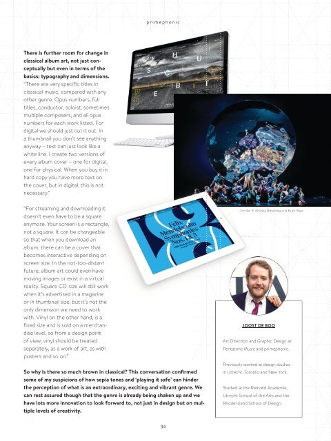
Parsifal © Monika Rittershaus & Ruth Walz<br />
JOOST DE BOO<br />
Art Direction and Graphic Design at<br />
Pentatone Music and <strong>primephonic</strong>.<br />
Previously worked at design studios<br />
<strong>in</strong> Utrecht, Toronto and New York.<br />
Studied at <strong>the</strong> Rietveld Academie,<br />
Utrecht School of <strong>the</strong> Arts and <strong>the</strong><br />
Rhode Island School of Design.<br />
34