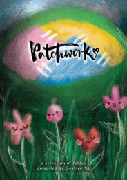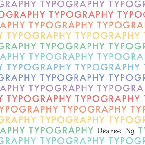
SquareTypography_ProcessBook

Create successful ePaper yourself
Turn your PDF publications into a flip-book with our unique Google optimized e-Paper software.
RAPHY TYPOGRAPHY TYPOGR<br />
GRAPHY TYPOGRAPHY TYPOG<br />
PHY TYPOGRAPHY TYPOGRAP<br />
TYPOGRAPHY TYPOGRAPHY T<br />
RAPHY TYPOGRAPHY TYPOGR<br />
PHY TYPOGRAPHY TYPOGRAP<br />
TYPOGRAPHY TYPOGRAPHY T<br />
RAPHY TYPOGRAPHY TYPOGR<br />
PHY TYPOGRAPHY TYPOGRAP<br />
TYPOGRAPHY TYPOGRAPHY T<br />
POGRAPHY TYPOGRAPHY TYP<br />
RAPHY TYPOGRAPHY TYPOGR<br />
PHY TYPOGRAPHY<br />
Desiree Ng<br />
TY<br />
RAPHY TYPOGRAPHY TYPOGR
Design by Desiree Ng<br />
Typography I | Astrid Kesinger<br />
Process book | 2016<br />
School of Art, Design and Media<br />
Nanyang Technological University<br />
Singapore<br />
Printed in Singapore<br />
Futura, Souvenir
CONTENT<br />
a compilation of a semester’s worth of work<br />
1/ Anatomy of Type<br />
2/ Presentation of a Typeface<br />
3/ Ephemera<br />
4/ Grey<br />
5/ Type in Location<br />
6/ Paint a face<br />
7/ The Letter<br />
8/ Haiku<br />
9/ The Letter Journal<br />
10/ Typesetting workshop<br />
11/ And so my mother said I keep a lot of rubbish
1/ anatomy of type
A sketch of Garamond W, using charcoal on large paper.
What it is<br />
An introduction to typography, page layout, terminology<br />
for typefaces, the history of a typeface as well as an<br />
exercise to get used to Adobe Illustrator.<br />
What I did<br />
Sketched the Garamond W on a large sheet of paper,<br />
had it scanned and edited in Adobe Illustrator, then<br />
printed on A3 paper, in black and white.
LEFT: Experiment with colour.<br />
RIGHT: Black and white draft, which had some readjustments to be<br />
made and is to be supplemented with more information.
The process<br />
Being ambitious, I began by eyeballing the W that i picked out<br />
(from Garamond), which I was drawn to due to the fact that I<br />
thought it was interesting how it looks like two ‘V’s overlapping<br />
one another. I worked with charcoal, and started to observe the<br />
details of typography that I haven’t noticed before -- the care and<br />
consideration for each stroke and how they interact. Afterwards,<br />
I put everything into illustrator and started laying out. Designing<br />
the type poster introduced me to laying out text on a page, with<br />
more attention paid to the sizes, margins, angles at which bodies<br />
of text are placed, indents, outdents, rags and rivers, etc.<br />
Thoughts on project<br />
In general this project was an interesting introduction to the<br />
course, and I thought that it was useful in warming me up for the<br />
other projects, as it got me to consciously notice typography more.
The hardest part<br />
The hardest part of this project (or rather, the most time<br />
consuming part) was getting the Garamond W accurately on<br />
paper and then tweaking it in illustrator, as I am not adept with<br />
large scale drawing and illustrator. Also, it required me to stare<br />
at the minute details of the letter that I may not have noticed<br />
before -- how lines cross one another, or the angles at which<br />
one part goes.<br />
The most fun part<br />
Definitely doing the layout -- it’s my first time trying something<br />
clean and minimalist.<br />
Reflections<br />
I think I did not bad on drawing the letter, but if I were to do<br />
this project again, I would like to try out different page layouts,<br />
as there was room for further exploration.
The final poster was printed in A3.
2/ presentation of<br />
a typeface
What it is<br />
Presenting all about Garamond, including its history, uses<br />
and unique anatomy.<br />
What I did<br />
I worked with Jie Lin and Joy on this presentation -- we<br />
compiled all the research and split up the work. I focused<br />
on designing the handout (which we wanted to use as the<br />
presentation slides as well, so that it is easier to follow<br />
the presentation), while Jie Lin and Joy focused on piecing<br />
together the content.
The final handout that was made. We made stickers that resembled wax seals.
The inside of the handout. We used 250gsm Kaschmir paper.
The process<br />
Jie Lin, Joy and I got together to discuss what we wanted to<br />
do. We started off with various ambitious ideas, e.g. making<br />
the handouts look like brochures, and also decided on the<br />
framework of content so that we can split up the work to<br />
research and still cover all the required areas. Putting together<br />
everything on Google docs, we finalised the content and put<br />
everything into the design.<br />
Thoughts on project<br />
Quite fun, but it was quite a rush as we had very little time to<br />
put together everything, since we were swarmed with many other<br />
projects. I learnt quite a bit too, especially about Garamond. I<br />
never knew of its rich history before researching. It’s like every<br />
typeface has its own character and special attributes, including<br />
Garamond.
Read below regarding this error.
The hardest part<br />
Designing the handout took quite awhile. We had to also get<br />
them printed, cut and assembled (with the “wax seal” sticker).<br />
The most fun part<br />
Also designing the handout, because it was incredibly satisfying.<br />
Learning all the fun facts about the typeface was also interesting.<br />
Reflections<br />
I think we did well as a group, working well together. But after<br />
printing, we actually realised that there were some errors made<br />
(didn’t triple check before printing, so we made it a mini pop<br />
quiz during the presentation) — that was something we could<br />
have been more careful with.
Joy, Jie Lin and I (right to left)
3/ ephemera
What it is<br />
We chose found objects of passing interest (with<br />
typography on them) and explored how text becomes an<br />
image, through cropping and framing.<br />
What I did<br />
I collected items, sorted them into different themes and<br />
played around with compositions. Our drafts were reviewed,<br />
and then we made changes before printing and mounting<br />
the works.
The process<br />
To make the collages, I simply scanned the items together<br />
in the composition I picked out. For some others, I<br />
scanned the items and then overlaid them in photoshop<br />
(which gave me the freedom to resize certain items).<br />
Thoughts on project<br />
I enjoy collecting items (see section 11) and so this<br />
project was particularly exciting to me. The project has<br />
also helped me to understand how to better create visual<br />
interest, sometimes by simply pushing the way of framing.
1/3 of initial explorations
2/3 of initial explorations
3/3 of initial explorations
The hardest part<br />
Matching the objects, because some level of visual consistency had<br />
to be maintained.<br />
The most fun part<br />
It was most fun to play with the textures and different colours, and<br />
typefaces of the different items. I threw the items on the ground<br />
and started looking for interesting compositions, by framing them.<br />
Reflections<br />
Quite an enjoyable project, and I’ve learnt a lot through explorations<br />
of visuals! Also quite pleased with the results.
Final work was printed and mounted.
4/ grey
LEFT: Illuminated manuscript<br />
The illuminated manuscript is<br />
distinctively rigid and orderly.<br />
Pay attention to the margins.<br />
Examples of illuminated manuscripts<br />
include the Book of Hours,<br />
The Marriage of Girart to Bertha,<br />
Incunabula and La Croix de Pardieu.<br />
LEFT: Futurist/Dada<br />
The Futurist piece usually features<br />
high scale contrast (having big letters<br />
and really small letters). It breaks<br />
away from the grid and often<br />
includes oblique angles.
What it is<br />
Grey is a project that allows us to study how kerning and<br />
leading affects the shade of grey that a block of text appears to<br />
be. On top of that, it is also an introduction to the history of<br />
typography, exploring different formats and movements from the<br />
past, such as the illuminated manuscript and the Dada movement.<br />
What I did<br />
We are supposed to make 5 layouts based on the following: the<br />
illuminated manuscript, Futurism, Constructivism, chance operation<br />
and one that you choose. I studied layouts, tried to identify the<br />
key features, and attempted at coming up with something inspired<br />
by the movements.
LEFT: Constructivism/Bauhaus<br />
Distinct features include clear margins<br />
and structure, with a lot of 45 degree<br />
angles, lots of empty space. Design is<br />
made to be rational.<br />
LEFT: Constructivism/Bauhaus<br />
I did this for the choice piece<br />
because I enjoy working with this<br />
style of layout. It seems to merge<br />
both structure and play.
The process<br />
At the beginning, we made swatches of greys using a stamp. I<br />
tried the stamp on different papers and materials just to see how<br />
the ink reacts.<br />
When it came to laying out, I studied the layouts and took<br />
a stab at creating something that is not an exact replica of<br />
what has been done. This is so for all except for the chance<br />
operation, in which I tore paper at random and shuffled them<br />
around on the floor until I found overlaps that I thought were<br />
interesting.<br />
I printed the final works on slightly grey, 250 gsm paper.<br />
Thoughts on project<br />
I found this project incredibly tedious to do, but it was quite<br />
interesting to research on the different styles. What also interested<br />
me was the type style of the stamp that I picked out. It was<br />
slightly grungy, as though its ink was splotched. So when I laid<br />
them out as swatches, you could see different patterns being<br />
formed.
LEFT: Chance<br />
I tore up pieces (of swatches printed<br />
at different sizes) at random and<br />
shuffled them around on the floor. I<br />
like this one the most because it has<br />
a lot of overlap, but I think there<br />
could have been more play.<br />
BELOW: Swatches used
The hardest part<br />
Everything felt hard. Figuring out how to make something inspired<br />
by the movement was difficult, and copying it exactly felt boring.<br />
The most fun part<br />
Didn’t really have much fun with this project, except for maybe<br />
the making of the swatches, because there was a lot of room to<br />
explore materials and the stamp that we got.<br />
Reflections<br />
I am not pleased with the results. Perhaps I should have studied the<br />
references a little more, as my works have some hint of their styles<br />
but are not very closely referenced, or reminiscent of any popular<br />
works from the movement.<br />
In the process, I found that I had two focuses - shades of grey<br />
and layout, which made me struggle a bit. I should have been<br />
more focused in tackling the project, by approaching it in a more<br />
systematic manner.
In a clockwise fashion starting from the top left: 300 gsm cotton paper, 250 gsm matte<br />
paper, 350 gsm watercolour paper, 120 gsm unbleached paper, craft paper, fabric
5/ type in location
Friends and I at Arab Street. (Image from Joy)
What it is<br />
Studying the typefaces found at a location, and then doing<br />
up a visual response to the place by making collages.<br />
What I did<br />
We went down to Arab Street, took a walk around<br />
and snapped pictures of typography. I took photos of<br />
typography on different objects, in different angles, then<br />
made collages out of them.
The process<br />
Upon returning home from the fieldtrip, I made edits to the images<br />
to push the contrast (as we were doing it in B&W) and printed them<br />
out in a smaller size. I wanted to play with tearing up paper to<br />
make collages for a more gritty look.<br />
I tried noticing patterns but ended up amazed at how different many<br />
things are. And so I decided to classify them by the places I found<br />
them on, e.g. shop signboards, on the walls, etc.<br />
My intention was to show arab street as some sort of mystery you<br />
have to navigate through - you can be a local tourist, coming here<br />
to experience beauty that you may not understand. So I made a<br />
pop-up book, to give the viewer a glance into my little adventure at<br />
Arab Street.<br />
Thoughts on project<br />
This was extremely enjoyable for me, because I’ve been to Arab<br />
Street a couple of times trying to learn about the place through<br />
observation, but this time I’m trying it by observing the typography.<br />
It’s interesting because the variety of typography in and around Arab<br />
Street is incredibly eclectic.
ABOVE: Initial drafts of collages, done in A3 size, portrait format.<br />
BELOW: Small snippet from a scan of the torn paper for collaging
Friends being type tourists, taking photos of obscrue things like a fire hydrant.
Typography can reflect the space that they exist in.
The hardest part<br />
Deciding on what to put together and what to leave out, because<br />
I took a total of more than 200 images at Arab Street.<br />
The most fun part<br />
Making the book was extremely satisfying, even though it was<br />
tedious. I printed the images on a slightly grey paper to make it<br />
resemble the pavements of arab street and to give it a more gritty<br />
look. I liked that it worked well with the format.<br />
Reflections<br />
I think this is the first time my craft is up to standard for a book.<br />
The 3 hours that I took to put the whole thing together was very<br />
worth it, as many classmates could understand the concept behind<br />
it. It’s also interesting because after this project, I start to notice<br />
typography in spaces and how it reflects the place they exist in.<br />
Also because I had so much fun doing this project, I feel this is<br />
(arguably) the most enjoyable project this semester.
Final work. Things on the walls, street things, storefronts and<br />
an amalgamation of them all.
ABOVE: This image shows you<br />
how the book opens up.<br />
The book opens up to create 4 little ‘rooms’<br />
RIGHT: Happy with the neat<br />
craftmanship.
6/ paint a face
Final work, and my face full of frustration.
What it is<br />
Painting a typeface and trying to understand the level of skill that<br />
was required to make the perfect typeface.<br />
What I did<br />
I painted. For 3 hours. Black gouache on white paper, white<br />
gouache on black gouache, then repeat that more than 10 times.
LEFT: I used my phone’s flashlight as a makeshift lightbox<br />
so that I can trace the words out on the watercolour paper.<br />
RIGHT: After tracing, I touched up on the parts that were<br />
not very accurate by eyeballing.
LEFT: I used a small round brush to paint, because I don’t have<br />
any angled or square brushes that might have been easier to use.<br />
RIGHT: I layered with white gouache where I made mistakes,<br />
but I’m not too pleased with the look of multiple coats of paint.
The process<br />
I met Jie Lin to do this together. What we did was<br />
to blow up the original font to A3 size, then used our<br />
phone flashlights as ‘lightboxes’ to trace. After tracing, we<br />
painted, using black gouache and white gouache over the<br />
black when we make a mistake.<br />
Thoughts on project<br />
Halfway through, we were saying, “we get it now.”<br />
Actually it really takes a lot of skill and practice to be<br />
able to perfect the typeface, because there are so many<br />
minute details. I got really frustrated trying to perfect it<br />
but I guess I learnt from this project by putting myself in<br />
those shoes.
The hardest part<br />
Painting. But more of the part where you’re trying to perfect it.<br />
The most fun part<br />
Actually also painting. It is actually quite cathartic.<br />
Reflections<br />
I think this is quite meaningful, in the digital age. I actually enjoy<br />
using brush pens to do write things (script style), so to be working<br />
on something more rigid and structured is quite interesting.
7/ the letter
What it is<br />
In this two-week project, we push the legibility of the<br />
letter by cropping the frame such that the viewer takes a<br />
second look at it before recognising the letter. In order to<br />
do this, we also have to examine the form of the letter.<br />
What I did<br />
I used W, and created 20 compositions for each of the<br />
following 5 typefaces: Rockwell, Garamond, Baskerville,<br />
Helvetica and Didot.<br />
The process<br />
I created boxes and did the layout on Adobe Illustrator,<br />
then played around with the transformation tools to see<br />
how I can get an interesting composition. I wanted to<br />
use mostly serif typefaces as W is tricky, and might be<br />
confused with M.
Thoughts on project<br />
Quite a quick and enjoyable project, except that it was<br />
tedious to have to search for different compositions for W,<br />
as it is a very symmetrical letter.<br />
The hardest part<br />
Figuring out ways to create something that people will<br />
look twice at, before figuring out that it’s a W. Being<br />
symmetrical, W created a restriction when composing.<br />
The most fun part<br />
The most fun part was actually observing the counterforms,<br />
especially for Rockwell, which has a very interesting<br />
counterform for W (which looks like an arrow/tree).
Reflections<br />
Also another interesting and enjoyable project, that has got me to<br />
be more conscious of forms and counterforms of typography. Just<br />
like the ephemera project, I’ve also learn about how cropping can<br />
do so much to create visual interest -- sometimes it’s about teasing<br />
the viewer into figuring out what it is.<br />
Drafts. In clockwise order from above:<br />
Rockwell, Garamond, Baskerville,<br />
Helvetica, Didot
Final work -- using Rockwell
8/ haiku
Overnight Vigil, by Faith Christine Lai
What it is<br />
A project to demonstrate all explorations from the semester in a<br />
book format.<br />
What I did<br />
I made a book bound using coptic stitch and accordion bind, for<br />
the poem “Overnight Vigil”, that goes like this:<br />
i wear an old prom dress<br />
to your wake and find<br />
that the hemline you<br />
altered to fit<br />
has come<br />
undone
The process<br />
This project is a really long one. I started off by choosing<br />
a poem with strong imagery, which I’ve picked out from<br />
the SingPoWriMo 2015 Anthology.<br />
I, then, went on to identify the key things we’ve learnt<br />
this semester: study of form and counterforms, using text<br />
as image, using type as image to create a visual response,<br />
shades of grey from density of text, introduction of<br />
typography and different kinds of layouts.<br />
Then I did thumbnail sketches of what I wanted to do. I<br />
decided on using accordion bind (initially).<br />
I did my first draft and got feedback that some of the<br />
pages work better than others, in terms of interpreting the<br />
poem’s emotions.<br />
At this point, I went to take a look at the paper that I<br />
can use, and bought a few to try. I decided on handmade<br />
paper because it was delicate and could show fragility.
I continued working on the compositions, and interpreting<br />
the poem. I focused on using motifs, spacing and<br />
differences in weight to bring across ideas.<br />
While working on the compositions, I thought it would fall<br />
in line with the meaning of poem if I used coptic stitch,<br />
then let the last few pages be bound by accordion bind,<br />
so the book actually comes undone, like the hemline.<br />
I did a test print on handmade paper, and almost ruined<br />
my printer. The solution to printing on handmade paper<br />
was to use double-sided tape to tape it to copy paper,<br />
then inserting it through the manual feed. Unfortunately<br />
I can only print on one side, as I cannot ensure good<br />
double-sided printing.<br />
After printing everything, I bound everything using coptic<br />
stitch and accordion bind. The alignment was difficult to<br />
do, and so was binding on the thin paper. I had to tape<br />
the pages together to prevent them from tearing.
Initial drafts of the work. Explorations of compositions.
RIGHT: The first<br />
attempt at printing.<br />
I had to open<br />
up the printer to<br />
remove the jammed<br />
paper, and these<br />
were the remains.<br />
RIGHT: The second<br />
time was slightly<br />
more successful but<br />
the paper came<br />
out very crumpled<br />
because I put it in<br />
the paper tray. The<br />
next time I did it,<br />
I used the manual<br />
feed and it came<br />
out nicely (except<br />
for the edges, which<br />
were a bit crumpled<br />
due to very slight<br />
misalignment)
ABOVE: I painted the cover with<br />
golden specks to differentiate it from<br />
the back. I’ve once burned so much<br />
incense paper at a wake that when I<br />
look away, I still see the flame and<br />
golden specks appearing.<br />
ABOVE: The colophon for the book<br />
BELOW: A photo of the printed<br />
handmade paper, to show its delicate<br />
texture of the paper and how thin it is.
Thoughts on project<br />
I find this project to be very challenging actually, because there<br />
was a lot of wondering and thinking while working on it --<br />
whether I am showcasing what I’ve learnt over the semester,<br />
but in the end, I went with being more experimental.<br />
The hardest part<br />
This one is definitely the printing and binding, because it<br />
is something that I have never done before. It’s my first<br />
time doing coptic stitch and accordion bind. Also, I had<br />
to bring to mind sad feelings I’ve experienced before, to<br />
help in interpreting the poem.<br />
The most fun part<br />
Completing it and playing around with the book. I get<br />
so much thrill from watching people freak out when the<br />
accordion-bound parts come undone.
ABOVE: Coptic stitch<br />
LEFT: Process of stitching<br />
together the book<br />
BELOW: Accordion bind
Reflections<br />
This project was a very challenging one to do, because there were<br />
many things that I tried that I have not done before. For example,<br />
the format is different -- I usually don’t work with long formats,<br />
so it took awhile to get used to working with it, i.e. by using<br />
movements across the spread. If there was more time, I would also<br />
like to have the compositions reviewed and refined further as I think<br />
that they are not graphically very strong at this point of time.<br />
The craftmanship was a big issue, especially so since there was no<br />
option for reprint, considering the lack of time. Printing took very<br />
long to do because of the weight of the paper. This could also be<br />
the reason for its flimsiness, which ties in with the concept, but<br />
does not look good.<br />
If I were to do this again, I would choose a sturdier, bigger cover<br />
that can enclose all the paper inside (with nothing peeking out),<br />
and I would use surgical tape instead of clear, glossy tape to piece<br />
together the pages. This is because the glossy tape is very stark in<br />
contrast to the soft, delicate paper.<br />
I feel like I’ve learnt quite a bit from all the challenges that I’ve<br />
faced in this project, by going for a more experimental idea rather<br />
than something that I’m more comfortable with. So while I think I<br />
could have done better, I’m more or less pleased with the outcome.
1/ colophon & cover page<br />
2/ you taught me the world & now i miss u<br />
3/ needle, thread and dress<br />
4/ an old prom dress that’s torn and everywhere<br />
5/ everything crumbles. i’ve come to wake you
6/ and, end, find, fine<br />
7/ hemlines and a heavy heart<br />
8/ nothing else but<br />
9/ a confused rage<br />
10/ let this be a joke, come home, don’t just fade away
9/ the letter journal
1/ Where did it come from?<br />
In the middle ages, each language had its own alphabet<br />
and every scribe had his own writing style. Many<br />
letters were hard to tell apart, i.e. I and L, U and<br />
V. But in Old English, V was never really used.<br />
But then due to the Norman invasion of England<br />
in the 11th century, the French brought in the ‘V’,<br />
which became often confused with ‘U’. Two ‘U’s<br />
were joined for clarity, so the vowel can be set apart<br />
from the consonant V.<br />
When the printing press began, it eventually evolved<br />
from UU to W.<br />
2/ Who came up with it?<br />
A scribe from the south of Kent by the name of<br />
Samuel got tired of this situation and started joining<br />
his ‘U’s, and over time it became more popular.
3/ Why is it pronounced as<br />
“double-u”?<br />
Read question 1, as its orgins explains why it’s<br />
pronounced as such.<br />
There are at least four ways to say the letter<br />
“w” in Spanish: doble ve, doble u, doble uve, or<br />
uve doble. The “w” is extremely rare in Spanish,<br />
as words beginning with w tend to be borrowed<br />
words from other languages. Usually W is not<br />
considered part of the Spanish alphabet.<br />
4/ What are some of the<br />
meanings and uses for<br />
‘W’ today?<br />
W stands for Watt, which is unit of measurement<br />
for power, in the International System of Units.<br />
W happens to be a fashion and lifestyle<br />
magazine, managed by Conde-Nast publications.<br />
An addition of a stroke or two can have other<br />
meanings. The Korean currency is the Won,<br />
which is W with two strokes across it. With a<br />
slash, “w/” means with, and is commonly used.<br />
WWW (World Wide Web) is a popular acronym<br />
with the most number of syllables replacing the<br />
initial phrase.
Interesting ‘W’s<br />
ABOVE: Old english (insular miniscule script). The W was written like a P and<br />
due to its similarity, it was changed out for UU.<br />
LEFT: A popular Japanese novel, W no<br />
Higeki, has been adapted multiple times. W is<br />
used to represent duality.<br />
ABOVE: Its origins could be the reason why<br />
old style typefaces usually feature W as two<br />
‘V’s crossing one another.
LEFT: This image shows how<br />
versatile and interesting W is, as<br />
a letter. Here we see that W is<br />
formed using two ‘T’s and their<br />
shadows.<br />
We have observed previously that<br />
W can be formed with two ‘U’s<br />
or two ‘V’s, showing us that<br />
working with W actually gives us<br />
plenty of room to explore.<br />
ABOVE: Interesting calligraphic ‘W’s<br />
ABOVE: Logos with ‘W’s
10/ typesetting workshop
Typesetting workshop<br />
We had a very interesting typesetting workshop where<br />
we learnt more about the traditional letterpress, and<br />
tried printing something on our own.<br />
LEFT: There was a<br />
DIY printing press<br />
that was made<br />
and brought to the<br />
workshop. It was<br />
quite interesting to<br />
see it as it seems<br />
to be something<br />
that anyone can<br />
make at home, and<br />
so anyone can try<br />
printing.<br />
BELOW: Letters that<br />
I used to print
There were many<br />
options for the<br />
typefaces -- I can<br />
only imagine how<br />
much time was<br />
needed to make<br />
them in the past!
11/ and so my mother said<br />
that I keep a lot of rubbish
What this section is about<br />
My mother says I keep a lot of “rubbish”, but she knows<br />
that they are treasures to me. In fact, I have many boxes<br />
of such treasures.<br />
In this section, I’ve included pictures of some of the things<br />
that I’ve collected, with typography on them -- something<br />
like ephemera, so things that I’m drawn to.<br />
This is to serve as some sort of moodboard of things that<br />
have inspired me this semester.
“Type is a beautiful group of letters,<br />
not a group of beautiful letters.”<br />
Matthew Carter