

Web_Designer_UK__May_2018

Create successful ePaper yourself
Turn your PDF publications into a flip-book with our unique Google optimized e-Paper software.
LightBox<br />
Open Wear<br />
Create an animated<br />
slant box border effect<br />
Create an effect for images and other types of content components that responds to user interaction<br />
1. HTML initiation<br />
The first step is to create the page document architecture<br />
from HTML. This consists of the HTML document<br />
definition, which holds the head and body sections. While<br />
the head section is used to load the external CSS file, the<br />
body section is used to store the HTML created in step 2.<br />
<br />
<br />
<br />
Hover Frame: Slant<br />
<br />
<br />
<br />
*** STEP 2 HERE<br />
<br />
<br />
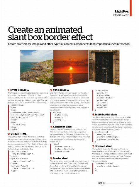
2. Visible HTML<br />
The visible content consists of a series of containers<br />
using the 'slant' class. You can place any content inside<br />
these containers. This example uses an individual image<br />
for each example container. The HTML is designed to be<br />
kept to a minimum, without any unnecessary elements<br />
for formatting or embedded styling.<br />
<br />
<br />
<br />
<br />
<br />
<br />
<br />
<br />
<br />
3. CSS initiation<br />
With the HTML now complete, create a new file called<br />
'styles.css'. The first definition in this file sets the HTML<br />
document and body container to display as a block with<br />
no margin or padding. This guarantees that the page will<br />
display without any visible border spacing. Optionally, you<br />
could add other properties, such as setting their<br />
min-height to 100%, meaning that the page is sized to fit<br />
the full screen.<br />
html,body{<br />
display: block;<br />
margin: 0;<br />
padding: 0;<br />
}<br />
4. Container class<br />
The slant container is identified using the 'slant' class.<br />
This element uses relative positioning, along with an<br />
inline-block display mode to allow it to flow as a normal<br />
text item while having sizing-related properties if required.<br />
Overflow is hidden to support the feature created in<br />
steps 5 and 6.<br />
.slant{<br />
position: relative;<br />
display: inline-block;<br />
overflow: hidden;<br />
}<br />
5. Border slant<br />
The slanted border feature is made from a box element<br />
overlaying the content container. This is achieved using<br />
the '::before' selector, which is used to define a virtual<br />
element inside CSS. This is set to be placed at the bottom<br />
of the slant container with a width and height that will<br />
cover enough space for the effect to work.<br />
.slant::before{<br />
content: "";<br />
display: block;<br />
position: absolute;<br />
bottom: -3em;<br />
left: -2em;<br />
width: 150%;<br />
height: 6em;<br />
}<br />
6. More border slant<br />
The border slant needs to match the page background<br />
colour for the effect to work. Additionally, the element<br />
needs to be rotated via the transform attribute so that it<br />
doesn’t appear as a straight line. Finally, a transition with a<br />
duration of one second is applied so that any changes to<br />
the rotation transform appear animated.<br />
.slant::before{<br />
background: #fff;<br />
transform: rotate(8deg);<br />
transition: transform 1s;<br />
}<br />
7. Hovered slant<br />
The rotation is required to change when the slant is<br />
being hovered. This step sets the rotation angle when<br />
this occurs. The changes that occur will appear animated<br />
due to the previous step’s transition attribute. Changing<br />
the -8 to another number will alter the angle that the<br />
slant rotates towards.<br />
.slant:hover::before{<br />
transform: rotate(-8deg);<br />
}<br />
***<br />
lightbox _________________________________________________21
 Change language