

Web_Designer_UK__May_2018

Create successful ePaper yourself
Turn your PDF publications into a flip-book with our unique Google optimized e-Paper software.
GET PRO DESIGN SKILLS<br />
6 STEPS TO MEANINGFUL<br />
TYPOGRAPHY<br />
1<br />
READ THE CONTENT<br />
Meaningful typography<br />
starts with one thing —<br />
the content. Typographers know<br />
this since they’ll always read the<br />
book before they start typesetting<br />
for it. Unfortunately, it<br />
seemsthatmanywebdesigners<br />
underestimate the importance of<br />
contentinawebdesignprocess.<br />
They will often find excuses in<br />
the fact that the website doesn’t<br />
existyetsothere’snocontentto<br />
work with. When that’s the case,<br />
use content that is similar. If<br />
you’re designing a website<br />
about finance and economics,<br />
for example, find an article<br />
about that and read it.<br />
2<br />
CHOOSE A TYPEFACE<br />
BASED ON CONTENT<br />
Now you have read the<br />
content, you’re ready to choose<br />
your main typeface. If a website<br />
isabouttechnology,butis<br />
expected to have medium to long<br />
articles,useatypefacethatlooks<br />
abitmodernbutiseasytoread.<br />
If it’s an art gallery portfolio, you<br />
can get away with something<br />
edgy.Don’tuseLoremIpsumas<br />
placeholder text — it’s a strange<br />
form of the Latin language that<br />
has nothing to do with your<br />
website. Use the content from<br />
Step 1, in the language that<br />
will be used, and then design<br />
around that.<br />
3<br />
START MOBILE-FIRST<br />
An important step is to<br />
design the best reading<br />
experience for the screen that’s<br />
hardest to design for — mobile.<br />
Mobile-first is a fundamentally<br />
different approach to web design<br />
where progressive enhancement<br />
is favourable to graceful<br />
degradation. Don’t design the<br />
best reading experience for<br />
desktopscreensandthenadapt<br />
for mobile or, even worse, forget<br />
about mobile altogether. Choose<br />
a combination of font size and<br />
line height that works best on<br />
smaller screens. Your starting<br />
pointshouldbetheagreed-on<br />
browser default of 16 pixels.<br />
GREAT EXAMPLES Matej Latin picks a selection of typography that works well<br />
4<br />
ADAPT FOR<br />
LARGE SCREENS<br />
Don’t let mobile-first<br />
turn into mobile-only. The tools<br />
forshapingthebestreading<br />
experiences for different screens<br />
areinplaceandtheyshouldbe<br />
used.Largerscreensareusually<br />
further away from reader’s eyes<br />
so the base font size needs to be<br />
larger.18pixelsiswidely<br />
considered a good starting point.<br />
Don’t forget to limit the width of<br />
paragraphs — recommended for<br />
best reading experiences is up to<br />
60charactersperline.Theline<br />
height needs to be looked at<br />
again — 1.4 or 1.5 times the font<br />
size is usually best.<br />
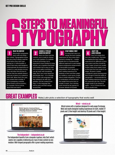
Wired — wired.co.uk<br />
Wired comes with a typeface designed for web usage (Exchange<br />
<strong>Web</strong>) and neatly designed reading experiences for both, mobile (17<br />
pixels and 1.3 line height) and desktop (19 pixels and 1.4 line height).<br />
The Independent — independent.co.uk<br />
The Independent benefits from a bespoke typeface, Indy Serif, which<br />
seems very capable at delivering any type of news content on any<br />
medium. Well-shaped paragraphs offer a great reading experience.<br />
46 _________________________________________________feature
 Change language