


You also want an ePaper? Increase the reach of your titles
YUMPU automatically turns print PDFs into web optimized ePapers that Google loves.
Gavin Ambrose/ Paul Harris<br />
This book is a guide to the many and varied terms<br />
used frequently within graphic design. From Abstract<br />
to Zeitgeist, s n l Bauhaus to Psychedelia, via Chroma<br />
and Exquisite Corpse, this book will prove an invaluable<br />
resource to anyone interested in graphic design.<br />
Each term is explained and contextualised, giving the<br />
reader an enhanced understanding <strong>of</strong> graphic design<br />
terminology. More than 250 common graphic design<br />
terms are distilled and illustrated. From practical terms<br />
such as Asymmetry, Hierarchy and Tints to movements<br />
and styles such as Surrealism, Pointillism and<br />
Postmodernism, from modern terminology and concepts<br />
such as Bitmap, Mark Making and Vernacular to many<br />
<strong>of</strong> the traditional terms still in current usage.<br />
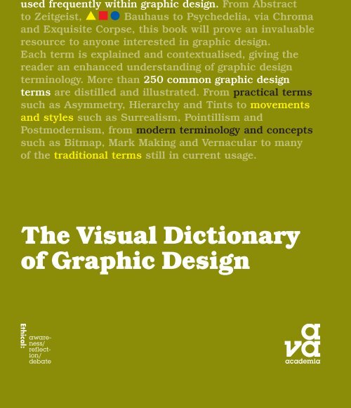
The <strong>Visual</strong> <strong>Dictionary</strong><br />
<strong>of</strong> <strong>Graphic</strong> <strong>Design</strong>
The <strong>Visual</strong> <strong>Dictionary</strong> <strong>of</strong> <strong>Graphic</strong> <strong>Design</strong>
An AVA Book<br />
Published by AVA Publishing SA<br />
Rue des Fontenailles 16<br />
Case Postale<br />
1000 Lausanne 6<br />
Switzerland<br />
Tel: +41 786 005 109<br />
Email: enquiries@avabooks.com<br />
Distributed by Thames & Hudson (ex-North America)<br />
181a High Holborn<br />
London WC1V 7QX<br />
United Kingdom<br />
Tel: +44 20 7845 5000<br />
Fax: +44 20 7845 5055<br />
Email: sales@thameshudson.co.uk<br />
www.thamesandhudson.com<br />
Distributed in the USA & Canada by:<br />
Ingram Publisher Services Inc.<br />
1 Ingram Blvd.<br />
La Vergne TN 37086<br />
USA<br />
Tel: +1 866 400 5351<br />
Fax: +1 800 838 1149<br />
Email: customer.service@ingrampublisherservices.com<br />
English Language Support Office<br />
AVA Publishing (UK) Ltd.<br />
Tel: +44 1903 204 455<br />
Email: enquiries@avabooks.com<br />
© AVA Publishing SA 2006<br />
All rights reserved. No part <strong>of</strong> this publication may be reproduced,<br />
stored in a retrieval system or transmitted in any form or by any means,<br />
electronic, mechanical, photocopying, recording or otherwise, without<br />
permission <strong>of</strong> the copyright holder.<br />
ISBN 978-2-940373-43-7<br />
10 9 8 7 6 5 4 3<br />
<strong>Design</strong> and text by Gavin Ambrose and Paul Harris<br />
Original photography by Xavier Young www.xavieryoung.co.uk<br />
Production by AVA Book Production Pte. Ltd., Singapore<br />
Tel: +65 6334 8173<br />
Fax: +65 6259 9830<br />
Email: production@avabooks.com.sg<br />
All reasonable attempts have been made to trace, clear and credit the<br />
copyright holders <strong>of</strong> the images reproduced in this book. However, if any<br />
credits have been inadvertently omitted, the publisher will endeavour to<br />
incorporate amendments in future editions.
Gavin Ambrose/ Paul Harris<br />
The <strong>Visual</strong> <strong>Dictionary</strong><br />
<strong>of</strong> <strong>Graphic</strong> <strong>Design</strong>
This war poster (facing<br />
page, far left) features<br />
rhetoric, the art <strong>of</strong><br />
persuasion.<br />
This spread (facing page,<br />
left) created by Frost <strong>Design</strong><br />
features a simple text<br />
hierarchy.<br />
Pictured right, primary<br />
colours and shapes were<br />
defining features <strong>of</strong> the<br />
Bauhaus school.<br />
This French poster (far left)<br />
uses the text accents.<br />
A vernacular type style is<br />
used by Studio Myerscough<br />
for this piece <strong>of</strong> packaging<br />
(left).<br />
How to get the most out <strong>of</strong> this book<br />
4<br />
This book is an easy-to-use reference to the key terms<br />
used in graphic design. Each entry comprises a brief<br />
textual definition along with an illustration or visual<br />
example <strong>of</strong> the point under discussion. Supplementary<br />
contextual information is also included.<br />
Introduction<br />
6 7<br />
Welcome to The <strong>Visual</strong> <strong>Dictionary</strong> <strong>of</strong> <strong>Graphic</strong> <strong>Design</strong>,<br />
a book that provides textual definitions and visual<br />
explanations for some <strong>of</strong> the more common terms found<br />
in the key areas <strong>of</strong> graphic design and pertinent entries<br />
from the wider world <strong>of</strong> graphic arts.<br />
This volume aims to provide a clear understanding <strong>of</strong><br />
the many terms that are <strong>of</strong>ten misused or confused<br />
such as italics and obliques, or the difference between<br />
an overprint, a surprint and a reverse out. As you<br />
might expect, The <strong>Visual</strong> <strong>Dictionary</strong> <strong>of</strong> <strong>Graphic</strong> <strong>Design</strong><br />
provides visual explanations, and many <strong>of</strong> these are<br />
examples <strong>of</strong> commercial work, produced by leading<br />
contemporary design studios, to illustrate the correct<br />
usage <strong>of</strong> typographical elements such as the ellipsis,<br />
the rules for the handling <strong>of</strong> problems such as widows,<br />
orphans & the hypho and the correct usage <strong>of</strong> numerals<br />
to produce accurate text.<br />
<strong>Graphic</strong> design communicates through a range <strong>of</strong><br />
visual devices including montages, collages, metaphors,<br />
rhetoric and juxtapositions, all <strong>of</strong> which, and more,<br />
are explained and illustrated.<br />
A clear understanding <strong>of</strong> the key terms used in graphic<br />
design will help you to better articulate and formalise<br />
your ideas and ensure accuracy in the transfer <strong>of</strong> those<br />
ideas to others.<br />
Key areas addressed in<br />
this book are those terms<br />
commonly used in reference<br />
to typography, layout,<br />
colour, format, image<br />
and artistic movements.<br />
Entries are presented in<br />
alphabetical order to<br />
provide an easy reference<br />
system.<br />
A Apex<br />
26<br />
The point formed at the top <strong>of</strong> a character, such as the ‘A’, where the<br />
left and right strokes meet.<br />
A Appropriation<br />
27<br />
Taking a style <strong>of</strong> one thing and applying it to another. Pictured is a<br />
design created by Studio Myerscough that appropriates expressive,<br />
constructivist typography to instil a feeling <strong>of</strong> energy and immediacy<br />
into the piece.<br />
<br />
<br />
see Type Anatomy 259 see Constructivism 64
1916<br />
Dadaism<br />
An artistic and literary<br />
movement (1916–23) that<br />
developed following the<br />
First World War and sought<br />
to discover an authentic<br />
reality through the abolition<br />
<strong>of</strong> traditional culture and<br />
aesthetic forms. Dadaism<br />
brought new ideas,<br />
materials and directions,<br />
but with little uniformity. Its<br />
principles were <strong>of</strong> deliberate<br />
irrationality, anarchy and<br />
cynicism, and the rejection<br />
<strong>of</strong> laws <strong>of</strong> beauty. Dadaists<br />
lived in and for the moment.<br />
Pictured is the cover <strong>of</strong> the<br />
first edition <strong>of</strong> Dada, which<br />
was published in Zürich<br />
in 1917 and edited by<br />
Tristan Tzara.<br />
1916<br />
De Stijl<br />
Dutch for ‘the style’, De<br />
Stijl was an art and design<br />
movement that developed<br />
around a magazine <strong>of</strong> the<br />
same name founded by<br />
Theo Van Doesburg. De<br />
Stijl used strong rectangular<br />
forms, employed primary<br />
colours and celebrated<br />
asymmetrical compositions.<br />
Pictured is the Red and<br />
Blue Chair, which was<br />
designed by Gerrit Rietveld.<br />
1918<br />
Constructivism<br />
A modern art movement<br />
originating in Moscow<br />
in 1920, which was<br />
characterised by the use<br />
<strong>of</strong> industrial methods to<br />
create non-representational,<br />
<strong>of</strong>ten geometric objects.<br />
Russian constructivism was<br />
influential to modernism<br />
through its use <strong>of</strong> black and<br />
red sans-serif typography<br />
arranged in asymmetrical<br />
blocks. Pictured is a model<br />
<strong>of</strong> the Tatlin Tower, a<br />
monument for the<br />
Communist International.<br />
1919<br />
Bauhaus<br />
The Bauhaus opened in<br />
1919 under the direction <strong>of</strong><br />
renowned architect Walter<br />
Gropius. Until it was forced<br />
to close in 1933, the<br />
Bauhaus sought to initiate<br />
a fresh approach to design<br />
following the First World<br />
War, with a stylistic focus<br />
on functionality rather<br />
than adornment.<br />
1925<br />
Herbert Bayer<br />
Austrian graphic designer<br />
Herbert Bayer embodied the<br />
modernist desire to reduce<br />
designs to as few elements<br />
as possible, and repeatedly<br />
experimented with<br />
typography to reduce the<br />
alphabet to a single case.<br />
He created Universal, a<br />
geometric sans serif font.<br />
Pictured is Bayer Universal,<br />
a font that has an even<br />
stroke weight with low<br />
contrast and geometric<br />
forms.<br />
1928<br />
Jan Tschichold<br />
German typographer Jan<br />
Tschichold was a leading<br />
advocate <strong>of</strong> Modernist<br />
design as expressed through<br />
Die neue Typographie (the<br />
new typography), which was<br />
a manifesto <strong>of</strong> modern<br />
design that promoted sansserif<br />
fonts and non-centred<br />
design, in addition to<br />
outlining usage guidelines<br />
for different weights and<br />
sizes <strong>of</strong> type. Pictured is<br />
Sabon, a font named after<br />
Jacques Sabon that typifies<br />
the Modernist approach<br />
pioneered by Tschichold.<br />
5<br />
M Median<br />
160<br />
M Metallic<br />
161<br />
A highly reflective ink or foil with metallic characteristics. Metallic<br />
inks are special printing inks, which are outside <strong>of</strong> the standard<br />
gamut <strong>of</strong> the CMYK or Hexachrome colour spaces. These colours<br />
can also be applied to a design through the use <strong>of</strong> a foil stamp.<br />
Pictured is a brochure by SEA <strong>Design</strong> that features text produced<br />
with a metallic foil.<br />
A method <strong>of</strong> reducing the values <strong>of</strong> an image to remove detail without<br />
causing pixelation.<br />
<br />
see Filters 100<br />
<br />
see CMYK 54, Gamut 113<br />
Each page contains a single entry and, where appropriate, a printers’ hand symbol provides<br />
page references to other related and relevant entries.<br />
278<br />
g<br />
279<br />
A timeline <strong>of</strong> graphic design<br />
helps to provide historical<br />
context for selected key<br />
moments in the discipline’s<br />
development.
Introduction<br />
6<br />
Welcome to The <strong>Visual</strong> <strong>Dictionary</strong> <strong>of</strong> <strong>Graphic</strong> <strong>Design</strong>,<br />
a book that provides textual definitions and visual<br />
explanations for some <strong>of</strong> the more common terms found<br />
in the key areas <strong>of</strong> graphic design and pertinent entries<br />
from the wider world <strong>of</strong> graphic arts.<br />
This volume aims to provide a clear understanding <strong>of</strong><br />
the many terms that are <strong>of</strong>ten misused or confused<br />
such as italics and obliques, or the difference between<br />
an overprint, a surprint and a reverse out. As you<br />
might expect, The <strong>Visual</strong> <strong>Dictionary</strong> <strong>of</strong> <strong>Graphic</strong> <strong>Design</strong><br />
provides visual explanations, and many <strong>of</strong> these are<br />
examples <strong>of</strong> commercial work, produced by leading<br />
contemporary design studios, to illustrate the correct<br />
usage <strong>of</strong> typographical elements such as the ellipsis,<br />
the rules for the handling <strong>of</strong> problems such as widows,<br />
orphans & the hypho and the correct usage <strong>of</strong> numerals<br />
to produce accurate text.
7<br />
This French poster (far left)<br />
uses the text accents.<br />
A vernacular type style is<br />
used by Studio Myerscough<br />
for this piece <strong>of</strong> packaging<br />
(left).<br />
<strong>Graphic</strong> design communicates through a range <strong>of</strong><br />
visual devices including montages, collages, metaphors,<br />
rhetoric and juxtapositions, all <strong>of</strong> which, and more,<br />
are explained and illustrated.<br />
A clear understanding <strong>of</strong> the key terms used in graphic<br />
design will help you to better articulate and formalise<br />
your ideas and ensure accuracy in the transfer <strong>of</strong> those<br />
ideas to others.<br />
This war poster (facing<br />
page, far left) features<br />
rhetoric, the art <strong>of</strong><br />
persuasion.<br />
This spread (facing page,<br />
left) created by Frost <strong>Design</strong><br />
features a simple text<br />
hierarchy.<br />
Pictured right, primary<br />
colours and shapes were<br />
defining features <strong>of</strong> the<br />
Bauhaus school.
8<br />
This poster (right), from<br />
typography magazine Fuse,<br />
features a distorted, filterinspired<br />
typeface by Brett<br />
Wickens.<br />
This poster design (far right)<br />
by Peter and Paul features<br />
typography that has been<br />
reversed out.<br />
This (facing page) slab serif<br />
capital letter was created by<br />
Vasava Artworks.<br />
<strong>Graphic</strong> design is a discipline that continues<br />
to evolve. The timeline (page 274) shows how<br />
changes in technology have dramatically affected<br />
communications in the past, and how technological<br />
advancement continues to do so. Coupled with this<br />
is the ever changing taste and preference <strong>of</strong> society,<br />
which gives rise to numerous schools <strong>of</strong> thought about<br />
how information should be presented. In the twentieth<br />
century, for example, the rise <strong>of</strong> modernism embraced<br />
technological advances and adopted cleaner, less<br />
adorned forms, and in doing so rejected the decorative<br />
nature <strong>of</strong> design in Victorian times. However, with time,<br />
this too changed and postmodernism saw a move away<br />
from industrial nature as designers once again embraced<br />
more elaborate and s<strong>of</strong>ter visual concepts.
9
10<br />
This spread (left) was<br />
created by Faydherbe /<br />
De Vringer and features<br />
a passe partout.<br />
Sagmeister Inc. created<br />
these designs (below),<br />
which feature mark making.
11<br />
Pictured above is the First Things First manifesto. Written in 1964 by designer Ken Garland<br />
it was presented as a backlash against consumer society. The manifesto was signed by over<br />
400 designers and helped place graphic design, which was at that time a relatively young<br />
discipline, in a wider social context.<br />
<strong>Design</strong> pr<strong>of</strong>essionals draw inspiration from innumerable<br />
sources such as their urban environment or by cross<br />
referencing elements <strong>of</strong> contemporary life with those <strong>of</strong><br />
bygone days, and delving back into the rich tradition <strong>of</strong><br />
the arts as a means <strong>of</strong> visual stimulation. Inspiration is<br />
key to the generation <strong>of</strong> exciting design ideas. It is with<br />
this in mind that we hope that this book will also serve<br />
as a source <strong>of</strong> ideas to inspire your creativity.
Contents<br />
12<br />
Prologue<br />
How to get the most out<br />
<strong>of</strong> this book 4<br />
Introduction 6<br />
The <strong>Dictionary</strong> 16<br />
A<br />
Absolute & Relative<br />
Measurements 18<br />
Abstract Expressionism 19<br />
Accents 20<br />
Additive & Subtractive<br />
Primaries 21<br />
Alignment 22<br />
Ampersand 23<br />
Analogy 24<br />
Antique 25<br />
Apex 26<br />
Appropriation 27<br />
Art Deco 28<br />
Art Nouveau 29<br />
Arts & Crafts Movement 30<br />
Ascender & Descender 31<br />
Asymmetry 32<br />
Avant Garde 33<br />
B<br />
Baseline & Baseline Shift 34<br />
Bauhaus 35<br />
Bellyband 36<br />
Bible Paper 37<br />
Binding 38<br />
Bitmap 39<br />
Blackletter 40<br />
Bleed 41<br />
Boldface 42<br />
Book Detailing 43<br />
Braces 44<br />
Brand 45<br />
Broadside 46<br />
Buckram 47<br />
C<br />
Calligraphy 48<br />
Calliper 49<br />
Canadian Binding 50<br />
Channels 51<br />
Chroma 52<br />
Clarendon 53<br />
CMYK 54<br />
Cognition 55<br />
Collage 56<br />
Colour 57<br />
Colour Fall 58<br />
Colour Systems 59<br />
Colour Wheel 60<br />
Colour Wheel Selections 61<br />
Column 62<br />
Concertina 63<br />
Constructivism 64<br />
Continuity 65<br />
Counters 66<br />
Crack Back 67<br />
Creep 68<br />
Cross Alignment 69<br />
Cubism 70<br />
D<br />
Dada 71<br />
Dagger 72<br />
Deboss 73<br />
Deckle Edge 74<br />
Deconstruction 75<br />
Denotation 76<br />
Depth <strong>of</strong> Field 77<br />
Die Cut 78<br />
Dingbats 79<br />
DIN 80
13<br />
Diphthong 81<br />
Diacritical Marks 82<br />
Dominate & Subordinate<br />
Colour 83<br />
DPI, PPI & LPI 84<br />
Drop & Standing Capitals 85<br />
Duotone 86<br />
Duplexing 87<br />
E<br />
Ear 88<br />
Eclectic 89<br />
Egyptian 90<br />
Ellipsis 91<br />
Emboss 92<br />
Ems & Ens 93<br />
Expert Sets 94<br />
Exquisite Corpse 95<br />
Extent 96<br />
F<br />
Fibonacci Numbers 97<br />
File Formats 98<br />
Filigree 99<br />
Filters 100<br />
Flaps 101<br />
Flock 102<br />
Flood Colour 103<br />
Fluorescent 104<br />
Foil 105<br />
Folding 106<br />
Fore-edge Printing 107<br />
Four-colour Black 108<br />
French Fold 109<br />
Fresco 110<br />
Frieze 111<br />
Frutiger’s Grid 112<br />
G<br />
Gamut 113<br />
Gatefold 114<br />
Geometric 115<br />
Golden Section 116<br />
Gradient 117<br />
Graffiti 118<br />
Grain 119<br />
Greyscale 120<br />
Grid 121<br />
Grotesque or Gothic 122<br />
GSM 123<br />
Gutter 124<br />
H<br />
Halftone 125<br />
Heraldry 126<br />
Hierarchy 127<br />
Hot Metal Type 128<br />
Hue 129<br />
Humanist 130<br />
Hyperreality 131<br />
I<br />
Icon 132<br />
Identity 133<br />
Ideogram 134<br />
Illustration 135<br />
Imposition Plan 136<br />
Ink Trapping 137<br />
Ink Well 138<br />
InterCap (Camel Case) 139<br />
ISO Paper Sizes 140<br />
Italic & Oblique 141<br />
J<br />
Juxtaposition 142<br />
K<br />
Kerning 143<br />
Kiss Cut 144<br />
Kitsch 145<br />
L<br />
Layout 146<br />
Leading 147
14<br />
Lenticular 148<br />
Letterpress 149<br />
Letterspacing 150<br />
Ligatures 151<br />
Line Art 152<br />
Linocut 153<br />
Lithography 154<br />
Logos & Logotypes 155<br />
M<br />
Majuscule & Minuscule 156<br />
Mark Making 157<br />
Master Pages 158<br />
Measure 159<br />
Median 160<br />
Metallic 161<br />
Metaphor 162<br />
Metonym 163<br />
Modernism 164<br />
Moiré 165<br />
Monochrome 166<br />
Montage 167<br />
Mosaic 168<br />
Monospaced Type 169<br />
Mural 170<br />
N<br />
Negative Leading 171<br />
Noise 172<br />
Numerals 173<br />
O<br />
Occam’s (or Ockham’s) Razor 174<br />
Open Bind 175<br />
Optical Character<br />
Recognition 176<br />
Outline 177<br />
Overprint 178<br />
P<br />
Pagination 179<br />
Panorama & Vista 180<br />
Paragraph Mark 181<br />
Paradigm 182<br />
Parentheses 183<br />
Passe Partout 184<br />
Pastiche 185<br />
Paths 186<br />
Perfect Binding 187<br />
Perforation 188<br />
Perspective 189<br />
Photogram 190<br />
Photomontage 191<br />
Pictogram 192<br />
Pixel 193<br />
Plike 194<br />
Pointillism 195<br />
Point Size 196<br />
Postmodernism 197<br />
Prime 198<br />
Propaganda 199<br />
Psychedelia 200<br />
Pun 201<br />
Q<br />
Quadtone 202<br />
R<br />
Rag 203<br />
Raster 204<br />
Rebus 205<br />
Recto & Verso 206<br />
Registration 207<br />
Reportage 208<br />
Resolution 209<br />
Reveal 210<br />
Reverse Out 211<br />
RGB 212<br />
Rhetoric 213<br />
Rivers 214
15<br />
Roll Fold 215<br />
Roman 216<br />
Rule <strong>of</strong> Thirds 217<br />
S<br />
Saturation 218<br />
Scotch Rule & Scotch<br />
Typefaces 219<br />
Semaphore 220<br />
Semiotics 221<br />
Sepia 222<br />
Serif & Sans Serif 223<br />
Shiner 224<br />
Showthrough 225<br />
Signifier & Signified 226<br />
Silhouette 227<br />
Silk-screen Printing 228<br />
Simile 229<br />
Small Capitals 230<br />
Special Colours 231<br />
Spot UV 232<br />
Standard Width Typeface 233<br />
Stencil 234<br />
Stress 235<br />
Strikethrough 236<br />
Stock 237<br />
Subscripts 238<br />
Superiors 239<br />
Surprint 240<br />
Surrealism 241<br />
Symbols 242<br />
Symmetry 243<br />
Synecdoche 244<br />
Swash Characters 245<br />
T<br />
Tapestry 246<br />
Tertiary Colours 247<br />
Tessellation 248<br />
Thermography 249<br />
Throw Out 250<br />
Thumbnail 251<br />
Tints 252<br />
Tip In 253<br />
Tip On 254<br />
Traditional Paper Sizes 255<br />
Trapping 256<br />
Tritone 257<br />
Trompe L’Oeil 258<br />
Type Anatomy 259<br />
Type Classification 260<br />
Typefaces & Fonts 261<br />
Typogram 262<br />
V<br />
Varnish 263<br />
Vector 264<br />
Vernacular 265<br />
Vignette 266<br />
W<br />
White Space 267<br />
Widows, Orphans &<br />
The Hypho 268<br />
X<br />
X-height 269<br />
Z<br />
Z Bind 270<br />
Zeitgeist 271<br />
The Details<br />
The Timeline 274<br />
Conclusion 286<br />
Acknowledgements<br />
& Credits 287<br />
Index <strong>of</strong> Synonyms<br />
and Cross References 288
The <strong>Dictionary</strong>
A Absolute & Relative Measurements<br />
18<br />
The two measurement systems used in typography.<br />
Absolute measurements<br />
Absolute measurements are easy to understand as they are<br />
measurements <strong>of</strong> fixed values. For example, a millimetre is a precisely<br />
defined increment <strong>of</strong> a centimetre. Equally, both points and picas,<br />
the basic typographic measurements, have fixed values. All absolute<br />
measurements are expressed in finite terms that cannot be altered.<br />
100mm<br />
2 inches<br />
200 points<br />
Relative measurements<br />
In typography, many values, such as character spacing, are directly<br />
linked to typesize which means that they are defined by a series <strong>of</strong><br />
relative (rather than absolute) measurements. The basic building<br />
block for typographical characters, the em, is a relative measurement.<br />
Type set at 70pt has a 70pt em. Type set at 40pt has a 40pt em.<br />
M M<br />
The em<br />
M<br />
The em<br />
The em<br />
70pt type gives an em<br />
value <strong>of</strong> 70pts.<br />
Reducing the typesize to<br />
40pt reduces the em<br />
value to 40pts.<br />
Further reducing the<br />
typesize proportionally<br />
reduces the em value.<br />
see Ems & Ens 93
A Abstract Expressionism<br />
19<br />
An American art movement that developed in New York City<br />
following the Second World War, and featured forms not found in<br />
the natural world as a means <strong>of</strong> emotional expression. Abstract<br />
expressionist works were characterised by large canvases with<br />
uniform, unstructured coverings that projected power due to their<br />
scale. Leading figures in this movement include Jackson Pollock,<br />
Mark Rothko and Clyfford Still.<br />
see Dada 71
A Accents<br />
20<br />
A range <strong>of</strong> diacritical marks and symbols which indicate that the<br />
sound <strong>of</strong> a letter is modified during pronunciation. While accents are<br />
not a common feature <strong>of</strong> English, they are relatively common in other<br />
languages such as Spanish, French, German and Slavic languages.<br />
é<br />
Acute<br />
An accent above a vowel angled<br />
upwards to the right, which indicates<br />
that it is close or tense, has a high or<br />
rising pitch, a long pronunciation, or<br />
that the syllable in which the vowel<br />
appears is stressed. From the Latin<br />
acutus, meaning ‘sharp’.<br />
ž<br />
Breve<br />
A ‘v’ shaped symbol that indicates a<br />
short sounding <strong>of</strong> the letter. From the<br />
Latin brevis, which means ‘short’.<br />
ë<br />
Umlaut / Diaeresis<br />
Two periods over a vowel, which<br />
indicate that the sound changes by<br />
assimilating the vowel sound <strong>of</strong> the<br />
following syllable. Typical in Germanic<br />
languages. From the German um,<br />
meaning ‘around’ or ‘alteration’, and<br />
laut, meaning ‘sound’. Also called<br />
diaeresis.<br />
ê<br />
Circumflex<br />
Shaped like a pointed hat, a<br />
circumflex sits above a vowel to<br />
indicate that it has a long sound.<br />
From the Latin circumflexus,<br />
meaning ‘bent around’.<br />
è<br />
Grave<br />
An accent above a vowel angled<br />
upwards to the left, which indicates<br />
stress or special pronunciation. From<br />
the Latin gravis meaning ‘heavy’.<br />
ñ<br />
Tilde<br />
A wavy bar placed above a letter to<br />
indicate a more nasal pronunciation,<br />
such as the Spanish ‘ñ’, which has<br />
the same sound as the ‘ny’ in<br />
‘canyon’. From the medieval Latin<br />
titulus meaning ‘title’.<br />
see Diacritical Marks 82
A Additive & Subtractive Primaries<br />
21<br />
Additive primaries<br />
Subtractive primaries<br />
The red, green and blue (RGB) colours are the primary constituent<br />
parts <strong>of</strong> white light. These colours are called additive primaries<br />
because, when added together, they produce white light. Cyan,<br />
magenta and yellow are called the subtractive primaries and are<br />
used in the four-colour printing process.<br />
Colour reproduction is based on the same principles as the threecolour<br />
vision <strong>of</strong> the human eye. The eye contains three different<br />
types <strong>of</strong> receptors, each <strong>of</strong> which are sensitive to one <strong>of</strong> the primary<br />
RGB colours <strong>of</strong> light. Any two additive primaries will create one <strong>of</strong><br />
the subtractive primaries (as can be seen where the colours overlap<br />
in the diagrams above). Similarly, any two subtractive primaries<br />
create an additive primary. This is the principle behind the separation<br />
process used to reproduce colour images.<br />
<br />
see CMYK 54, RGB 212
A Alignment<br />
22<br />
The positioning <strong>of</strong> text in relation to the area or text block within<br />
which it is contained. In the horizontal plane text can be right, left or<br />
centre aligned, or justified.<br />
This text is range left, ragged<br />
right and is characterised by<br />
being aligned left, allowing a<br />
ragged right edge, and the even,<br />
unforced spacing between<br />
words.<br />
This text is range right, ragged<br />
left and is also characterised<br />
by the even spacing between<br />
words. The ragged left edge<br />
may impede easy reading as<br />
this can distract the eye and<br />
make it difficult to find the<br />
start <strong>of</strong> a line.<br />
This text is centre aligned and<br />
is characterised by being<br />
aligned through a central point.<br />
The ragged left edge may<br />
impede easy reading as this<br />
can distract the eye and make<br />
it difficult to find the start <strong>of</strong><br />
a line. Equally, awkward<br />
shapes can also be formed by<br />
the text block.<br />
This text is justified and<br />
extends fully to both sides <strong>of</strong> the<br />
text block or column. This is<br />
achieved by varying the word<br />
spacing, which may result in<br />
ugly spaces and several broken<br />
words (when hyphenation is<br />
used).<br />
This text is forced justified, which means that even if there is only one<br />
word in the last line <strong>of</strong> the paragraph, it will be justified across the<br />
measure (the width <strong>of</strong> the text column) producing an ugly result, as<br />
s h o w n .<br />
see Measure 159
A Ampersand<br />
23<br />
et &<br />
A ligature <strong>of</strong> the Latin word et, meaning ‘and’. The name ampersand<br />
is a contraction <strong>of</strong> the Latin phrase ‘and per se and’, which translates<br />
as ‘the symbol for and by itself means and’. The earliest usage <strong>of</strong> the<br />
ampersand symbol dates back to the first century AD and it is now<br />
found in many languages that use the Latin alphabet.
A Analogy<br />
24<br />
A comparison between one thing and another, made for the purpose<br />
<strong>of</strong> explanation or clarification. Often refers to the seemingly impossible<br />
or surreal for extra emphasis. For example, a task that appears<br />
impossible is analogous to obtaining blood from a stone. The success<br />
<strong>of</strong> an implicit analogy in a design is dependent upon the ability <strong>of</strong> the<br />
target audience to interpret exactly what the analogy is. Analogies<br />
<strong>of</strong>ten use the vernacular language in common usage. Pictured above is<br />
a poster created by Sagmeister Inc. that features a headless chicken.<br />
This is an analogy for making a lot <strong>of</strong> effort and noise, but yielding<br />
little gain.<br />
<br />
see Surrealism 241, Vernacular 265
A Antique<br />
25<br />
A term used to describe fonts with bracketed slab-serifs and little<br />
stroke weight variation. Confusingly, antique is also used to describe<br />
some sans-serif fonts as well.<br />
Bookman<br />
ITC Bookman was created by Edward Benguiat in 1975. This<br />
font features a large x-height and moderate stroke contrast for<br />
optimal legibility.<br />
Antique Olive<br />
Antique Olive was created by French typographer Roger Exc<strong>of</strong>fon in<br />
the 1960s. This font has a large x-height and open letterforms, which<br />
make it very readable and ideal for smaller point sizes.<br />
see Serif & Sans Serif 223, Type Classification 260, X-height 269
A Apex<br />
26<br />
The point formed at the top <strong>of</strong> a character, such as the ‘A’, where the<br />
left and right strokes meet.<br />
see Type Anatomy 259
A Appropriation<br />
27<br />
Taking a style <strong>of</strong> one thing and applying it to another. Pictured is a<br />
design created by Studio Myerscough that appropriates expressive,<br />
constructivist typography to instil a feeling <strong>of</strong> energy and immediacy<br />
into the piece.<br />
see Constructivism 64
A Art Deco<br />
28<br />
Named after the 1925 Exposition Internationale des Arts Décoratifs et<br />
Industriels Modernes, which was held in Paris, Art Deco describes a<br />
decorative design style that celebrated the rise <strong>of</strong> technology and speed via<br />
geometric designs, intense colours, and the use <strong>of</strong> plastic and glass. Forms<br />
became streamlined as the principles <strong>of</strong> aerodynamics became better<br />
understood resulting in an elegant style in both architecture and objects.<br />
<br />
see Geometric 115
A Art Nouveau<br />
29<br />
Rooted in romanticism and symbolism, art nouveau (the new art)<br />
describes a richly ornamental style <strong>of</strong> decoration, architecture and<br />
art that developed during 1894–1914. Art nouveau is characterised by<br />
undulating lines, sinuous curves and the depiction <strong>of</strong> leaves, flowers<br />
and flowing vines and is embodied in the work <strong>of</strong> protagonists such<br />
as Gustav Klimt, Henri de Toulouse-Lautrec, Antonio Gaudí and<br />
Hector Guimard, who was the architect and designer <strong>of</strong> the Paris<br />
metro entrances.<br />
Called Jugendstil (in Germany), Sezessionstil (in Austria), and<br />
Modernismo (in Spain), art nouveau rejected historical references<br />
in favour <strong>of</strong> creating a highly stylised design vocabulary that unified all<br />
arts around man and his life. Architecture was the focus for art nouveau<br />
as it naturally encompasses and integrates every art, but<br />
the style was also used extensively in posters and jewellery design.<br />
The ornate typeface used here is Benguiat.
A Arts & Crafts Movement<br />
30<br />
A late nineteenth century decorative arts,<br />
furniture and architecture movement that<br />
sought to reverse the demise <strong>of</strong> beauty at the<br />
hands <strong>of</strong> the industrial revolution, and reestablish<br />
the link between the worker and art<br />
through an honesty in design. This movement<br />
is typified by leading protagonists such as<br />
William Morris, Dante Gabriel Rossetti<br />
and Frank Lloyd Wright.<br />
This font is ITC Rennie Mackintosh, which was<br />
created by Phill Grimshaw in 1996. It is based on<br />
the handwriting and drawings <strong>of</strong> Scottish<br />
designer Charles Rennie Mackintosh (1868–1928)<br />
who created highly original buildings,<br />
interiors and furniture with quirky flair.<br />
ITC Rennie Mackintosh was designed following<br />
research and collaboration between the<br />
International Typeface Corp. and the Glasgow<br />
School <strong>of</strong> Art. This font family is unusual and<br />
<strong>of</strong>f beat, and a good choice for product<br />
packaging, advertising, and graphic designs<br />
with a period flair.<br />
<br />
see Typefaces & Fonts 261
A Ascender & Descender<br />
31<br />
The parts <strong>of</strong> a letter<br />
that extend above the<br />
X-height (ascender) or<br />
below the baseline<br />
(descender).<br />
Ascender<br />
Descender<br />
x-height<br />
Baseline<br />
see Baseline 34, X-height 269
A Asymmetry<br />
32<br />
A grid used for page<br />
layout that is the same on<br />
both the recto and verso<br />
pages. Asymmetric grids<br />
typically introduce a bias<br />
towards one side <strong>of</strong> the<br />
page, usually the left, as<br />
pictured here. The<br />
additional margin space<br />
can be used for notes and<br />
captions.<br />
see Recto & Verso 206, Symmetry 243
A Avant Garde<br />
33<br />
An artistic work that pushes<br />
the established limits <strong>of</strong> what<br />
is considered acceptable.<br />
Avant garde works <strong>of</strong>ten<br />
have revolutionary, cultural,<br />
or political connotations.<br />
This page is set in Avant<br />
Garde, a font based on the<br />
logo designed for ‘Avant<br />
Garde Magazine’ in 1967<br />
by Herb Lubalin and Tom<br />
Carnase. The font was<br />
redrawn in 1970 to include<br />
lower case characters.<br />
<br />
see Typefaces & Fonts 261
B Baseline & Baseline Shift<br />
34<br />
The imaginary line upon which all upper and<br />
most lower case letters are positioned. The<br />
baseline is a valuable reference for accurate<br />
and consistent text and graphic positioning.<br />
The baseline can also be shifted for accurate<br />
placement <strong>of</strong> superscript and subscript<br />
characters. Here, the baseline has been<br />
shifted by 5pts.<br />
Baseline shift is used to alter the position <strong>of</strong><br />
subscripts and superiors so that they sit<br />
comfortably with body text 1 .<br />
<br />
see Subscripts 238, Superiors 239
B Bauhaus<br />
35<br />
an Art and design school opened in 1919 under the<br />
direction <strong>of</strong> the renowned architect Walter Gropius.<br />
the bauhaus aimed to provide a fresh approach to<br />
design following the First World War. Bauhaus style<br />
is characterised by economic and geometric forms.<br />
Teaching staff included Paul Klee, Wassily Kandinsky<br />
and Marcel Breuer.<br />
This page is set in Bayer Universal, a geometric font<br />
that is typical <strong>of</strong> the Bauhaus style.<br />
In 1923 Kandinsky proposed that there was a universal relationship between the three<br />
basic shapes and the three primary colours (above). He believed the yellow triangle to<br />
be the most active and dynamic through to the passive, cold, blue circle.<br />
see Geometric 115
B Bellyband<br />
36<br />
A plastic or paper loop that is used to enclose the pages <strong>of</strong> a publication.<br />
Bellybands are typically seen on consumer magazines, and <strong>of</strong>ten include<br />
information about the publication’s contents. Typically bellybands are a<br />
continuous loop, but can also be a strip <strong>of</strong> stock that is wrapped around a<br />
publication.<br />
<br />
see Stock 236
B Bible Paper<br />
37<br />
A thin, strong, opaque and lightweight paper that helps reduce<br />
the weight <strong>of</strong> a publication, so named for its predominant use in<br />
bible production. Also called India paper. Pictured is a spread from<br />
13 Typo-Sünden (13 typographic sins) by Hans Peter Willberg,<br />
which was produced for German typography and design studio Verlag<br />
Hermann Schmidt Mainz and is printed on woodfree white 50gsm<br />
bible paper. The vampires in the image represent the erroneous<br />
use <strong>of</strong> inch marks instead <strong>of</strong> quotation marks.<br />
see Buckram 47, GSM 123
B Binding<br />
38<br />
Any <strong>of</strong> several bonding processes using stitches, wire, glue or other media to hold together<br />
a publication’s pages or sections to form a book, magazine, brochure or other format.<br />
The most common binding methods are pictured below.<br />
Perfect binding<br />
The backs <strong>of</strong> sections<br />
(signatures) are removed and<br />
held together with a flexible<br />
adhesive, which also attaches<br />
a paper cover to the spine,<br />
and the fore edge is trimmed<br />
flat. Commonly used for<br />
paperback books.<br />
Canadian and half Canadian<br />
A spiral-bound publication with a wraparound cover and an enclosed<br />
(Canadian) or an exposed spine (half Canadian).<br />
Burst binding<br />
The backs <strong>of</strong> signatures are slit<br />
and held together with a flexible<br />
adhesive that is allowed to<br />
penetrate rather than being<br />
removed (as in perfect binding).<br />
Side stabbing<br />
Wire staples are inserted near the<br />
spine from front to back.<br />
Saddle stitch<br />
Signatures are nested and bound<br />
with wire stitches applied through<br />
the spine along the centrefold.<br />
Z bind<br />
A ‘z’-shaped cover that is used<br />
to join two separate text blocks,<br />
typically with a perfect binding.<br />
see Canadian Binding 50, Perfect Binding 187, Z Bind 270
B Bitmap<br />
39<br />
An image constructed <strong>of</strong> a fixed number <strong>of</strong> pixels (or dots).<br />
The more frequent and finer the dots are, the sharper and more<br />
detailed is the image produced. Bitmap images can easily be coloured<br />
to create dramatic graphic statements, as the example shown here<br />
demonstrates. Bitmap colouration (<strong>of</strong> the background or the object)<br />
can be altered without the use <strong>of</strong> an image-manipulation program.<br />
see Pixel 193
B Blackletter<br />
40<br />
B<br />
A version <strong>of</strong> the roman font developed through the 1150–1500 period that is<br />
based on the ornate writing style prevalent during the Middle Ages.<br />
Also called Fraktur,Black Letter,Gothic and Old English,these fonts may now<br />
appear heavy and difficult to read in large text blocks due to the complexity <strong>of</strong><br />
their letters and the fact that they seem antiquated and unfamiliar to us.<br />
see Typefaces & Fonts 261
B Bleed<br />
41<br />
Bleed refers to the information<br />
that extends past the point<br />
where the page will be<br />
trimmed, and allows colour or<br />
images to continue to the very<br />
edge <strong>of</strong> the cut page.<br />
Trim marks printed around<br />
the image show where the<br />
page will be cut.<br />
The image needs to extend<br />
3mm past the trim marks to<br />
ensure that once the pages are<br />
cut, the image ‘bleeds’ <strong>of</strong>f<br />
the page.<br />
However, this extra 3mm is<br />
not needed at the binding<br />
edge* as any bleed here will be<br />
lost in the tightness <strong>of</strong> the<br />
bound book.<br />
* This is the binding edge
B Boldface<br />
42<br />
Super<br />
Mason Super Bold<br />
95<br />
95 Helvetica Black<br />
Poster<br />
Poster Bodoni<br />
Extra<br />
Univers Extra Black<br />
Black<br />
Univers Black<br />
Ultra<br />
A version <strong>of</strong> the<br />
Roman font with<br />
a wider stroke.<br />
Most fonts have a<br />
boldface version<br />
that should be used in<br />
preference to the ‘fake’<br />
bold option that many<br />
desktop publishing<br />
applications provide.<br />
S<strong>of</strong>tware applications<br />
simply fatten a font rather<br />
than giving a true bold.<br />
A true bold will have<br />
been crafted to ensure<br />
it prints correctly and,<br />
more importantly, is in<br />
proportion to other<br />
weights in the font family.<br />
Boldface is also called<br />
medium, semi-bold, black,<br />
extra, super or poster,<br />
and is represented by a<br />
number in Frutiger’s Grid.<br />
GillSans Ultra Bold<br />
<br />
Demi<br />
Eurostile Demi<br />
see Frutiger’s Grid 112, Typefaces & Fonts 261
B Book Detailing<br />
43<br />
Spine<br />
The backbone <strong>of</strong> a book,<br />
which is formed by the<br />
bound sections.<br />
Text block<br />
The pages that contain the content<br />
<strong>of</strong> a publication.<br />
Extent<br />
The number <strong>of</strong><br />
pages in a book.<br />
Endpapers<br />
The heavy cartridge<br />
paper at the front<br />
and back <strong>of</strong> a book<br />
that join the text<br />
block to a<br />
hardback binding.<br />
Also called<br />
endsheets, they<br />
sometimes feature<br />
decorative designs.<br />
Head and tail bands<br />
Pieces <strong>of</strong> cloth tape that cover<br />
the top and bottom <strong>of</strong> the<br />
spine to protect it and add a<br />
decorative touch.<br />
Flaps<br />
The part <strong>of</strong> the cover that<br />
wraps around inside the<br />
book.<br />
<br />
see Extent 96, Flaps 101
B Braces<br />
44<br />
{ }<br />
The curly brackets used to enclose any words or text<br />
lines that are to be considered together. Pictured here<br />
is a design by BIS that features braces in Bodoni (the<br />
favourite font <strong>of</strong> Spanish surrealist artist Salvador Dalí)<br />
to form Dalí’s distinctive moustache.<br />
<br />
see Surrealism 241
B Brand<br />
45<br />
A symbol, mark, word or phrase that identifies and differentiates<br />
a product, service or organisation from its competitors. Brands are<br />
created to help us distinguish between similar product <strong>of</strong>ferings<br />
through perceptions <strong>of</strong> quality and value. The brand then becomes a<br />
recognisable symbol for a certain level <strong>of</strong> quality, which aids our buying<br />
decision. Brands <strong>of</strong>ten craft a ‘personality’ that represents a set <strong>of</strong><br />
values which appeal to their target consumers such as foods that are<br />
‘healthier’, cosmetics that are ‘cleaner’ or ketchups that are ‘saucier’<br />
than their competitors.<br />
<br />
see Identity, 133
B Broadside<br />
46<br />
Text that has been rotated 90 degrees to the format <strong>of</strong> a publication. This is done to make a visual impression or<br />
provide a more suitable means <strong>of</strong> handling text elements within the publication’s format such as numeric tables for<br />
example. The term derives from maritime warfare when gunboats drew up in battle formation, broadside on, to point<br />
the maximum number <strong>of</strong> guns at enemy shipping. Pictured is a spread from Zembla magazine, created by Frost<br />
<strong>Design</strong> studio, which features a long column <strong>of</strong> broadside text.<br />
<br />
see Column 62
B Buckram<br />
47<br />
A coarse cotton fabric, sized with glue, which is used to stiffen garments and to<br />
produce cover stock for book binding. In printing and publishing buckram is<br />
used to provide a hard, tactile long-lasting material for case binding. Pictured is a<br />
buckram-bound book produced by Studio Thomson that mimics the format <strong>of</strong> a<br />
Moleskine notebook, complete with elastic closure and page-marker band. The<br />
book’s cover also features a gold-foil block <strong>of</strong> the title.<br />
<br />
see Binding 38, Foil 105
C Calligraphy<br />
48<br />
The art <strong>of</strong> writing by hand, typically with flowing lines and varying<br />
stroke thickness, which is achieved by using a chiselled nib or<br />
paintbrush. Can also refer to highly stylised and artistic writing styles.<br />
Many script fonts try to imitate the calligraphic style, but none result<br />
in the same authentic effect as true handwritten letterforms.<br />
Pictured is a poster created by Sagmeister Inc., which features handwritten<br />
text over an image <strong>of</strong> musician Lou Reed for an authentic and<br />
emotive effect.<br />
<br />
see Typefaces & Fonts 261
C Calliper 49<br />
The thickness <strong>of</strong> a stock or sheet used in printing. The calliper <strong>of</strong> a<br />
stock has an impact on the feel <strong>of</strong> a publication, although this does<br />
not always imply a precise relationship to the weight <strong>of</strong> the stock. A<br />
thick calliper stock may add a more substantial feel to a publication,<br />
while a thin calliper can add a delicate touch. Generally speaking thin<br />
calliper stocks tend to have lower weights than thick calliper stocks,<br />
but there are papers that have been developed to give added bulk<br />
without the weight.<br />
<br />
see Stock 237
C Canadian Binding<br />
50<br />
A book binding method in which the pages are bound with a<br />
metal or plastic spiral with a wraparound cover. The spiral<br />
<strong>of</strong> a half-Canadian bind is exposed through the cover while that<br />
<strong>of</strong> a full-Canadian bind is not. Canadian binding effectively combines<br />
the convenience <strong>of</strong> ring binding (pages can be added/removed) with<br />
the flat, square spine <strong>of</strong> perfect binding.<br />
see Binding 38
C Channels<br />
51<br />
Greyscale information that represents each <strong>of</strong> the individual colours in<br />
the RGB and CYMK systems. Each colour is represented by a separate<br />
channel that can be independently altered, replaced or omitted. RGB<br />
images have three channels and CMYK images have four.<br />
The unaltered image<br />
Swapping the magenta channel for the<br />
yellow one, which produces an effect that<br />
is similar to printing the CMYK plates<br />
out <strong>of</strong> sequence<br />
Running the black channel as yellow<br />
Swapping the magenta with cyan<br />
<br />
see CMYK 54, RGB 212
C Chroma<br />
52<br />
The colour variation <strong>of</strong> the same tonal brightness from none to pure<br />
colour. Chroma or saturation is the strength, purity or amount <strong>of</strong> grey<br />
in relation to the hue.<br />
Pictured here (top row, left to right) is a desaturated image, the unaltered image and<br />
a fully saturated image. The bottom row shows more subtle variations (left to right);<br />
slight desaturation, slight saturation and heavy saturation, but without the distortion<br />
<strong>of</strong> full saturation.<br />
<br />
see Hue 129, Saturation 218
C Clarendon<br />
53<br />
Clarendon<br />
Century Schoolbook (Bold)<br />
Clarendon<br />
Clarendon<br />
A type <strong>of</strong> slab-serif font that appeared in Great Britain in 1820.<br />
Clarendon is characterised by clear, objective and timeless forms,<br />
and is legible in small point sizes.<br />
see Point Size 196
C CMYK<br />
54<br />
C C +M<br />
C +M +Y C +M +Y +K<br />
Cyan (C), magenta (M), yellow (Y) and black (K) are the subtractive<br />
primary inks, which are combined to reproduce the red, green and blue<br />
additive primaries in the four-colour printing process.<br />
<br />
see Additive & Subtractive Primaries 21, RGB 212
C Cognition<br />
55<br />
Understanding, knowing or interpretation based on<br />
what has been perceived, learned or reasoned. The<br />
cognitive interpretation <strong>of</strong> an image depends upon<br />
how it is presented. At a denotive level, all these<br />
pictures show a man. However, our interpretation<br />
<strong>of</strong> the man alters as the presentation <strong>of</strong> the image<br />
changes.<br />
The first image (left) is bright and in colour and<br />
the man appears unthreatening, but when the image<br />
is reproduced as a dark monochromatic (centre),<br />
we interpret it differently, perhaps as being more<br />
sinister. The third image (right) is reproduced with<br />
a coarse halftone dot. Does this make the man appear<br />
friendly or unfriendly?<br />
This text is set in Crud Font, a typographical choice<br />
that adds a cognitive value to the text and affects<br />
our interpretation <strong>of</strong> it.<br />
<br />
see Denotation 76, Halftone 125, Monochrome 166
C Collage<br />
56<br />
An image creation technique characterised by the sticking together <strong>of</strong><br />
paper, fabric, photographs or other media in unusual or surprising<br />
ways. Collage was popularised by Georges Braque and Pablo Picasso in<br />
the early twentieth century. Pictured is a design created by Why Not<br />
Associates that features a collage <strong>of</strong> text and colour blocks.<br />
<br />
see Montage 167
C Colour<br />
57<br />
Different wavelengths <strong>of</strong> visible light. This broad definition <strong>of</strong> colour is<br />
further refined for graphic designers into the three characteristics that<br />
can be controlled and manipulated: hue, saturation and brightness.<br />
Hue<br />
Hue refers to the unique characteristic <strong>of</strong> a colour that helps us<br />
visually distinguish one colour from another. Hues are formed by<br />
different wavelengths <strong>of</strong> visible light.<br />
Saturation<br />
Saturation (or chroma) refers to the purity <strong>of</strong> a colour expressed by the<br />
amount <strong>of</strong> grey it has. At maximum saturation a colour contains no<br />
grey and such colours are described as ‘vivid’ or ‘bright’. At lower<br />
saturation levels a colour contains increasing amounts <strong>of</strong> grey, which<br />
results in subdued and muted tones.<br />
Brightness<br />
Brightness <strong>of</strong> value refers to how dark a colour is. Brightness changes<br />
can be achieved by mixing a colour with different amounts <strong>of</strong> white or<br />
black.<br />
Fonts can also be said to have<br />
colour due to the density <strong>of</strong> text on<br />
a page. Bookman occupies more<br />
white space and gives a dark colour<br />
while Helvetica Narrow occupies less space<br />
and gives a far lighter colour.<br />
<br />
see Chroma 52, Hue 129, Saturation 218
C Colour Fall<br />
58<br />
Describes those pages <strong>of</strong> a publication that will be printed with a<br />
special colour or varnish as shown by colour coding on the imposition<br />
plan. The use <strong>of</strong> different paper stocks can be shown on the imposition<br />
plan in the same way.<br />
Pictured below is a handbook created by NB Studios for Tate Modern.<br />
The colour fall is restricted to those sections that printed on high-gloss<br />
white stock and these are spliced between sections <strong>of</strong> uncoated<br />
coloured stock, which print black and white to produce contrasting<br />
tactile qualities.<br />
see Imposition 136
C Colour Systems<br />
59<br />
Pantone<br />
The Pantone Colour Matching System (PMS) is<br />
a means <strong>of</strong> accurate colour reproduction within<br />
CMYK and Hexachrome printing processes, and<br />
allows designers to ‘match’ specific colours<br />
through the use <strong>of</strong> Pantone colour guides. The<br />
PMS system comprises a reference system for<br />
a gamut <strong>of</strong> colours that can be reproduced by<br />
combining various amounts <strong>of</strong> the process<br />
colour inks. PMS colours can also be applied<br />
as specially mixed spot colours.<br />
Hexachrome<br />
A six-colour process created by Pantone in<br />
1994 that produces more effective purples,<br />
greens, oranges and flesh tones for accurate,<br />
vibrant and saturated colours. The Hexachrome<br />
system adds orange and green to the standard<br />
CMYK process colours. Hexachrome can<br />
reproduce 90 percent <strong>of</strong> the PMS colours.<br />
CMYK<br />
A four-colour process using the three<br />
trichromatic subtractive colour primaries (cyan,<br />
magenta and yellow) and black to reproduce<br />
colour images. CMYK can reproduce<br />
approximately 50 percent <strong>of</strong> the PMS colours.<br />
RGB<br />
Red, green and blue are the additive primaries<br />
that correspond to the primary colours <strong>of</strong> light.<br />
<strong>Graphic</strong> designers tend to use RGB images in<br />
their work in progress as images with three<br />
colour channels result in a smaller file size<br />
than those with four-channel CMYK. RGB files<br />
are then converted to CMYK upon completion<br />
<strong>of</strong> the design.<br />
Lab<br />
A colour model developed by the International<br />
Consortium on Illumination that defines colour<br />
values mathematically in order to facilitate<br />
consistent colour reproduction, regardless <strong>of</strong><br />
the device producing it. The RGB and CMYK<br />
colour space systems do not define colour as<br />
such, but <strong>of</strong>fer a mixing recipe for light or ink.<br />
8-bit and 16-bit colour<br />
The 8- and 16-bit colour systems are both<br />
methods for storing colour image information<br />
in a computer or image file. In the 8-bit<br />
system, each pixel is represented by one 8-bit<br />
byte that gives a maximum display <strong>of</strong> 256<br />
colours at any one time (selected from a much<br />
wider palette). 16-bit colour allows up to<br />
65,536 colours to be displayed at any one time.<br />
Pictured is a fan <strong>of</strong> PMS<br />
colour matching cards
C Colour Wheel<br />
60<br />
A circular representation <strong>of</strong> the colour spectrum. The colour wheel<br />
helps to explain the relationship between different colours within<br />
colour theory. The colour wheel also illustrates the classification <strong>of</strong><br />
colours and provides a quick reference to the primary, secondary and<br />
tertiary hues, which can help a designer successfully select functional<br />
colour schemes.<br />
Warm<br />
Tertiary<br />
Red-orange<br />
Secondary<br />
Red<br />
Primary<br />
Magenta<br />
Tertiary<br />
Yellow-orange<br />
Tertiary<br />
Red-purple<br />
Primary<br />
Yellow<br />
Secondary<br />
Blue<br />
Tertiary<br />
Yellow-green<br />
Tertiary<br />
Blue-purple<br />
Secondary<br />
Green<br />
Primary<br />
Cyan<br />
Tertiary<br />
Blue-green<br />
<br />
Cool<br />
see Additive & Subtractive Primaries 21, Tertiary Colours 247
C Colour Wheel Selections<br />
61<br />
A colour wheel can be drawn for any colour system (such as CMYK or RGB). They are<br />
used by artists, designers and other creatives to guide colour mixing.<br />
Monochrome<br />
Any single colour on<br />
the wheel.<br />
Complementary<br />
Colours that face each<br />
other on the wheel.<br />
These provide strong<br />
contrast and so their<br />
use will result in a more<br />
vibrant design. Also<br />
called contrasting<br />
colours.<br />
Split complements<br />
Three colours that<br />
comprise the two<br />
adjacent colours to<br />
the (unselected) colour<br />
that is complementary<br />
to the principal colour<br />
selection.<br />
Triads<br />
Triads are any three<br />
colours that are<br />
equidistant on the colour<br />
wheel. As all three colours<br />
contrast with one another,<br />
this provides a visual<br />
tension. The primary and<br />
secondary colour spaces<br />
are triads.<br />
Analogous<br />
The two colours on either<br />
side <strong>of</strong> a principal colour<br />
selection. Analogous<br />
colours provide a<br />
harmonious and<br />
natural blend.<br />
Mutual complements<br />
A triad <strong>of</strong> equidistant<br />
colours together with<br />
the complementary colour<br />
<strong>of</strong> the central one <strong>of</strong><br />
the three.<br />
Near complements<br />
A colour adjacent to the<br />
complementary colour<br />
<strong>of</strong> the principal colour<br />
selection.<br />
Double complements<br />
Any two adjacent<br />
colours and their two<br />
complements.<br />
<br />
see CMYK 54, RGB 212
C Column<br />
62<br />
An area or field <strong>of</strong> a page layout into which text is flowed. Pictured is a<br />
spread created by Frost <strong>Design</strong> in which the columns are used to make<br />
a strong visual statement that is integral to the overall design.<br />
<br />
see Layout 146
C Concertina<br />
63<br />
Two or more parallel folds that alternate in opposite directions and<br />
open out like an accordion (a concertina is also called accordion fold).<br />
Pictured here is a self-promotional calender created by Struktur design<br />
studio, which features a series <strong>of</strong> sections that are bonded together to<br />
form a concertina fold.<br />
<br />
see Folding 106
C Constructivism<br />
64<br />
A modern art movement that originated in Moscow<br />
around 1920. Constructivism is characterised by<br />
the use <strong>of</strong> industrial materials, such as glass, sheet<br />
metal and plastic to create non-representational,<br />
<strong>of</strong>ten geometric objects, and its wide ranging<br />
commitment to total abstraction. Russian<br />
constructivism was influential to modernism through<br />
its use <strong>of</strong> black and red sans-serif typography, <strong>of</strong>ten<br />
arranged in asymmetrical blocks. Leading<br />
constructivist practitioners include Wassily<br />
Kandinsky, Alexander Rodchenko and<br />
El Lissitzky.<br />
Pictured above is a self portrait by Russian avant-garde artist El Lissitzky (left); a poster<br />
for the Russian Exhibition in Zurich (centre), and Beat the Whites With the Red Wedge, a<br />
1919 lithograph also by Lissitzky (right).<br />
<br />
see Asymmetry 32, Bauhaus 35
C Continuity<br />
65<br />
An implied uninterrupted connection between a given set <strong>of</strong> items,<br />
or items that form part <strong>of</strong> a coherent whole. <strong>Visual</strong> continuity means<br />
that image elements are grouped together and presented in a way<br />
that clearly shows that there is a connection between them, or that<br />
they are all representative <strong>of</strong> the same values. Continuity can be<br />
achieved through the use <strong>of</strong> colours and numerals as the pictured<br />
example shows.<br />
<br />
see Colour 57, Identity 133, Numerals 173
C Counters<br />
66<br />
The empty space inside the body <strong>of</strong> a stroke that is surrounded by the<br />
bowl. The counter is also called an eye for ‘e’, and a loop for the bowl<br />
created in the descender <strong>of</strong> a lower case ‘g’. A counter can also<br />
describe the shape <strong>of</strong> the negative space within an open character, for<br />
example an upper case ‘C’.<br />
Pictured is a catalogue created by Why Not Associates for a<br />
show at the Royal Academy, which features title lettering with<br />
filled-in counters.<br />
<br />
see Type Anatomy 259
C Crack Back<br />
67<br />
An adhesive-backed stock that has been kiss cut with a die so that<br />
elements <strong>of</strong> the design can be ‘cracked’ and separated from the<br />
substrate. Crack back is commonly used for sticker production.<br />
Pictured is a publication created by Hat Trick <strong>Design</strong> that features a<br />
crack-back cover. Users are encouraged to remove the cover stickers<br />
and place them within the book.<br />
<br />
see Kiss Cut 144
C Creep<br />
68<br />
When the inner folded pages <strong>of</strong> a publication (or printed section)<br />
extend further than the outer folded pages. Usually caused by the bulk<br />
<strong>of</strong> the paper or the extent <strong>of</strong> the publication.<br />
Creep may not be a problem in saddle-stitched publications that are<br />
untrimmed, but information near the trim edge in perfect-bound<br />
publications may be lost if creep occurs so design elements need to be<br />
positioned away from the fore edge to ensure they are retained.<br />
<br />
see Perfect Binding 18, Binding 38
C Cross Alignment<br />
69<br />
The means by which text<br />
<strong>of</strong> varying sizes aligns to<br />
the baseline grid. Pictured<br />
here, both texts, although<br />
different point sizes, cross<br />
align as they snap to the<br />
same grid. This main text<br />
is set on every other baseline<br />
while the secondary text<br />
is set on every baseline.<br />
The advantage <strong>of</strong> this<br />
system is that all lines<br />
align horizontally.<br />
However the<br />
disadvantage is that<br />
in the main text,<br />
the leading is too<br />
loose, and in this<br />
secondary text it<br />
is too tight.<br />
<br />
see Baseline & Baseline Shift 34
C Cubism<br />
70<br />
An art movement developed in Paris (1908–1914) and led by Pablo<br />
Picasso and Georges Braque. Cubism is characterised by the rejection<br />
<strong>of</strong> the single viewpoint. Subjects were fragmented and presented<br />
from different viewpoints at the same time. The movement also<br />
incorporated elements from African native art that was popular at<br />
the time and the new scientific theories <strong>of</strong> the age.<br />
The second stage <strong>of</strong> cubism, called The Synthetic Phase (1913–1920s)<br />
saw a reduction <strong>of</strong> form to fewer elements with brighter colours used.<br />
This stage was typified by the works <strong>of</strong> Fernand Léger, Juan Gris<br />
and Piet Mondrian.
D Dada 71<br />
An art movement (1916–1920) <strong>of</strong> European writers and artists led by<br />
French poet Tristan Tzara. Characterised by the element <strong>of</strong> anarchic<br />
revolt and the role <strong>of</strong> chance in the creative process. Outraged by the<br />
carnage <strong>of</strong> the First World War, Dadaists aimed to shock people out <strong>of</strong><br />
complacency with irreverence for the established norms.<br />
Pictured is an interpretation <strong>of</strong> Marcel Duchamp’s LHOOQ, a copy <strong>of</strong><br />
Leonardo da Vinci’s Mona Lisa embellished with graffiti, an act that<br />
encapsulates the Dadaist rejection <strong>of</strong> society’s sacred cows. Leading<br />
Dadaists included Marcel Duchamp, Hans Arp and André Breton.
D Dagger<br />
72<br />
*†‡§<br />
Asterisk Dagger Double dagger Pilcrow Section<br />
One <strong>of</strong> five typographical symbols (above) used to indicate a footnote.<br />
There is a governed order for the use <strong>of</strong> these symbols, and the dagger<br />
is the second in the sequence. Once all five <strong>of</strong> the symbols in the<br />
footnote hierarchy have been used, they can be ‘doubled’ to indicate<br />
additional footnotes.<br />
‡‡ Doubled double dagger<br />
This is the eighth footnote symbol and it is used when the original five<br />
symbols and the doubled dagger have been referenced.<br />
<br />
see Hierarchy 127
D Deboss<br />
73<br />
A design stamped into a<br />
substrate, without ink or<br />
foil, to give a recessed<br />
impression.<br />
Pictured is a fashion<br />
show invitation created<br />
by Studio Thomson. It<br />
features a geometric font<br />
that is debossed into<br />
a textured stock, which<br />
provides defined, stylised<br />
shadows.<br />
<br />
see Emboss 92
D Deckle Edge<br />
74<br />
The ragged edge <strong>of</strong> the paper as it leaves the papermaking machine.<br />
The deckle edge can be used to great decorative book detailing effect<br />
when not cut away. Machine-made paper has two deckle edges while<br />
handmade paper has four. The effect can be imitated by tearing the<br />
edge <strong>of</strong> the paper by hand. Note the uneven, textured edge on the<br />
pages <strong>of</strong> the example pictured. Also called feather edge.<br />
<br />
see Book Detailing 43
see Modernism 164, Postmodernism 197<br />
A term coined by French philosopher Jacques<br />
Derrida in the 1960s, deconstruction<br />
describes a method <strong>of</strong> critical enquiry that<br />
examines how meaning is constructed by<br />
challenging prescribed values which are<br />
presented to us. For example, why should<br />
folio numbers be small and in the corner <strong>of</strong> a<br />
page? Why can’t they be large and in the<br />
centre <strong>of</strong> a page? Other creative movements<br />
such as modernism and postmodernism have<br />
also questioned how we look at the world and<br />
apportion meaning to things.<br />
this is<br />
page 75<br />
D Deconstruction
D Denotation<br />
76<br />
The literal and primary meaning <strong>of</strong> an image or graphic. The denotation<br />
<strong>of</strong> the image above is a picture <strong>of</strong> a woman, and nothing more or less.<br />
The cognitive interpretation is a secondary level within which we can<br />
extract more from the meaning <strong>of</strong> the image, such as what she is doing,<br />
how old she is, or where she is situated.<br />
<br />
see Cognition 55
D Depth <strong>of</strong> Field<br />
77<br />
F-stop settings on a camera<br />
The zone <strong>of</strong> sharpest focus in front <strong>of</strong> and behind the main subject <strong>of</strong> a<br />
picture. Depth <strong>of</strong> field creates a sense <strong>of</strong> distance or perspective in a<br />
photograph. The above image has a very narrow depth <strong>of</strong> field, with<br />
only the foreground in focus.The depth <strong>of</strong> field will vary depending on<br />
the focal length <strong>of</strong> a camera lens, which is measured in millimetres.<br />
The shorter the focal length, the greater the depth <strong>of</strong> field. A camera<br />
lens includes a dial with settings (or F-stop numbers) that represent<br />
fractions <strong>of</strong> its focal length. These values determine how much light<br />
will enter the lens by increasing or decreasing the diameter <strong>of</strong> the<br />
aperture as illustrated above. Also called depth <strong>of</strong> focus.<br />
<br />
see Perspective 189
D Die Cut<br />
78<br />
A print finishing process to cut away a part <strong>of</strong> the substrate using a<br />
steel die. Mainly used for decorative purposes, a die cut can enhance<br />
the visual impact <strong>of</strong> a design through the creation <strong>of</strong> interesting<br />
shapes, apertures or edges.<br />
Pictured is a bookmark created by Studio Myerscough for a property<br />
development company that is die cut to the shape <strong>of</strong> a floor plan <strong>of</strong><br />
one <strong>of</strong> the company’s projects. Its abstract shape helps make a<br />
striking and distinctive product.
D Dingbats<br />
79<br />
Various utility characters, symbols, bullets and graphic ornaments<br />
used in typography, including the printers’ hand that is used<br />
throughout this publication to indicate references to other entries.<br />
<br />
Woodtype Ornaments are decorative characters.<br />
αβχδεφγηιϕκλμνοπθρστυϖωξψζ<br />
Symbol includes Greek characters that are <strong>of</strong>ten used in mathematical formulae.<br />
<br />
Textile are symbols used for washing instructions.<br />
<br />
Hoefler Ornaments are decorative characters that can be used to form borders.<br />
❚❘❃❖❂■❍✌✎●❋❊❈❇❆❄▲❁❑◗❅❒▼❙◆❉<br />
Zapf Dingbats are a range <strong>of</strong> bullets and other symbols.<br />
<br />
see Typefaces & Fonts 261
D DIN<br />
80<br />
A specially drawn typeface for use on German road<br />
signage, which is printed in yellow and reversed out<br />
<strong>of</strong> black. The DIN-Schrift letterforms were later<br />
adjusted to improve clarity under adverse weather<br />
conditions. Alterations included making the counter<br />
<strong>of</strong> the ‘o’ more oval, lengthening letters to improve<br />
visual impact and changing the umlaut into a<br />
circular form rather than square. Pictured below are<br />
panels showing the typeface before and after the<br />
adjustments, and how these look under adverse<br />
viewing conditions (below right).<br />
Before<br />
After<br />
<br />
see Diacritical Marks 82, Reverse Out 211
D Diphthong<br />
81<br />
Æ<br />
A special form <strong>of</strong> ligature in which two vowels are joined to form<br />
a single character such as the ‘ae’ that may be used in ‘formulae’.<br />
Most fonts typically contain common diphthong characters.<br />
<br />
see Ligatures 151, Typefaces & Fonts 261
D Diacritical Marks<br />
82<br />
A type <strong>of</strong> punctuation typically placed above or below a letter to<br />
indicate modified pronunciation. Pictured are the main diacritical<br />
marks used in European languages.<br />
ˆ<br />
`<br />
ˇ<br />
˜<br />
Circumflex<br />
Grave<br />
ˇ<br />
¯Hacek<br />
Macron<br />
Tilde<br />
°<br />
Ring<br />
..·<br />
Diaeresis / Umlaut<br />
˛Dot<br />
Ogonek<br />
˘¸<br />
Acute<br />
Breve<br />
Cedilla<br />
`<br />
<br />
see Accents 20
D Dominant & Subordinate Colour<br />
83<br />
Subordinate<br />
A visually weaker<br />
colour that<br />
complements or<br />
contrasts with the<br />
dominant colour.<br />
Accent<br />
A colour that is used to<br />
provide a sympathetic<br />
visual detail.<br />
Dominant<br />
The principle colour<br />
that is used to capture<br />
the viewer’s attention.<br />
<br />
see Colour Wheel Selections 61<br />
Pictured is an<br />
interior created<br />
by Claire Gordon<br />
Interiors. Note how<br />
the dark, dominant<br />
colour attracts<br />
attention first, and<br />
contrasts with the<br />
accent colour, while<br />
the subordinate<br />
colour fulfils a<br />
balancing and<br />
supporting role.<br />
Colour schemes are<br />
<strong>of</strong>ten chosen through<br />
the use <strong>of</strong> colour<br />
wheels.
D DPI, PPI & LPI<br />
84<br />
The level <strong>of</strong> detail in the reproduction <strong>of</strong> an electronic image depends<br />
upon its resolution; the amount <strong>of</strong> information that it contains. With<br />
more information, the higher the resolution, and the better the quality<br />
and the more detailed the reproduction will be. Although similar, DPI,<br />
PPI and LPI refer to separate measurement methods, although in<br />
practice they tend to be used interchangeably. For example when<br />
people refer to a 300dpi image they usually mean a 300ppi image.<br />
DPI (dots per inch)<br />
A measure <strong>of</strong> how many<br />
ink dots a printer can<br />
deposit within an inch.<br />
For <strong>of</strong>fset lithographic<br />
printing, a resolution <strong>of</strong><br />
300dpi is standard,<br />
although higher quality<br />
print jobs will demand<br />
higher values.<br />
PPI (pixels per inch)<br />
A reference to<br />
the number <strong>of</strong> pixels<br />
displayed both<br />
vertically and<br />
horizontally in each<br />
square inch <strong>of</strong> a<br />
digital image. This is<br />
a reflection <strong>of</strong> how<br />
much information<br />
an image contains.<br />
LPI (lines per inch)<br />
A measure <strong>of</strong> the<br />
number <strong>of</strong> cells in a<br />
halftone grid, which is<br />
used to convert<br />
continuous tone images<br />
(such as photographs)<br />
into halftone dots for<br />
printing. The more lines<br />
an image has the higher<br />
the level <strong>of</strong> detail it will<br />
contain. A low LPI value<br />
implies fewer cells and<br />
the halftone dots will<br />
appear more obvious in<br />
the printed image.
D Drop & Standing Capitals<br />
85<br />
Enlarged initial capitals that drop down a specified number <strong>of</strong> lines<br />
into a paragraph.<br />
D<br />
rop capitals create a strong visual<br />
starting point for a paragraph due<br />
to the hole they punch into the text<br />
block. This paragraph begins with a three-line<br />
drop capital.<br />
D<br />
ecorative capitals can be formed<br />
by using a different font for the drop<br />
cap, such as the swash character<br />
that starts this paragraph. The use <strong>of</strong><br />
decorative capitals was common in medieval<br />
illuminated manuscripts.<br />
standing or pop capitals are enlarged<br />
initial capitals that sit on the baseline <strong>of</strong> the<br />
text. They create a strong visual point at the<br />
start <strong>of</strong> a paragraph due to the white space<br />
that they generate.<br />
<br />
see Swash Characters 245
D Duotone<br />
86<br />
A tonal image produced<br />
using black and one <strong>of</strong><br />
the other subtractive<br />
primaries. In essence<br />
a duotone is akin to<br />
a black-and-white<br />
photograph in which the<br />
white tones have been<br />
replaced by another<br />
process colour.<br />
Reducing colour detail<br />
to two tones allows<br />
images with different<br />
colour information to<br />
be presented in a<br />
consistent manner.<br />
As the colours can be<br />
altered independently<br />
results can vary from<br />
the subtle to the very<br />
graphic.<br />
Duotone <strong>of</strong> black and yellow in equal amounts<br />
Saturation <strong>of</strong> yellow<br />
<br />
Duotone <strong>of</strong> yellow and<br />
magenta<br />
Duotone <strong>of</strong> cyan and<br />
magenta<br />
see Additive & Subtractive Primaries 21, Quadtone 202, Tritone 257
D Duplexing<br />
87<br />
A PROCESS WHEREBY TWO DIFFERENT MATERIALS ARE BONDED<br />
TOGETHER TO PRODUCE A SUBSTRATE THAT HAS DIFFERENT<br />
COLOURS ON EACH SIDE.WHILE A DUPLEXING EFFECT CAN BE<br />
ACHIEVED THROUGH DUPLEX PRINTING (PRINTING ON BOTH<br />
SIDES OF THE PAPER) THE END RESULT DOES NOT HAVE THE<br />
SAME COLOUR QUALITY AS USING DIFFERENT COLOURED<br />
STOCKS. THE USE OF DUPLEXING ALSO ALLOWS SUBSTRATE<br />
WEIGHT TO GO BEYOND THAT OF STANDARD STOCKS. THESE<br />
PROMOTIONAL CARDS WERE CREATED BY PARENT DESIGN.<br />
DUPLEXING WAS USED SO THAT THE STOCKS AND PRINTING INKS<br />
MIRRORED EACH OTHER. THE INKS USED WERE PMS SPECIALS<br />
RATHER THAN STANDARD PROCESS COLOURS<br />
<br />
see Special Colours 231
E Ear<br />
88<br />
An extending serif stroke that thickens at the terminal. Found on the<br />
lower case ‘g’ and ‘r’ on most serif typefaces. Pictured are letters<br />
with a dot-style ear, although they can also be chiselled.<br />
<br />
see Serif & Sans Serif 223, Type Anatomy 259
E Eclectic<br />
89<br />
AN IMAGE THAT IS COMPOSED OF<br />
ELEMENTS DRAWN FROM VARIOUS<br />
SOURCES. DERIVING FROM THE<br />
GREEK EKLEKTIKOS, WHICH<br />
MEANS ‘TO SELECT’.<br />
ECLECTIC DESCRIBES THE USE OF<br />
SEVERAL INDIVIDUAL ELEMENTS,<br />
FROM A VARIETY OF SOURCES,<br />
SYSTEMS, OR STYLES TO CREATE<br />
AN IMAGE. THIS IMAGE WAS<br />
CREATED BY STUDIO OUTPUT FOR<br />
A MANCHESTER NIGHTCLUB.<br />
THE IMAGE IS REMINISCENT OF<br />
DUTCH PAINTER HIERONYMUS<br />
BOSCH’S STYLE (1450–1516)<br />
WHOSE IMAGES INCLUDED<br />
WONDROUS, UNNATURAL ANIMALS<br />
AND OTHER SURREALIST<br />
CONSTRUCTIONS.<br />
<br />
see Surrealism 241
E Egyptian<br />
90<br />
EGYPTIAN<br />
A sans-serif typeface style that developed after the introduction<br />
<strong>of</strong> William Caslon’s Egyptian. Caslon introduced his typeface in<br />
response to public interest in Egypt following the campaign <strong>of</strong><br />
Napoleon Bonaparte in 1798–1801. Arguably the first sans-serif<br />
typeface, Egyptian was not well received by the public and was<br />
called grotesque and gothic (a style <strong>of</strong> architecture going through<br />
a revival at the time). Egyptian has since become a term that<br />
refers to a range <strong>of</strong> slab-serif typefaces, perhaps because the<br />
slabs mirror the lines <strong>of</strong> the pyramids.<br />
This page uses Memphis, a slab-serif Egyptian font.<br />
<br />
see Typefaces & Fonts 261
E Ellipsis<br />
… News Gothic has a square ellipsis…<br />
91<br />
…while Baskerville has a round version<br />
A punctuation mark formed by a series <strong>of</strong> three periods or dots. Used<br />
in text to indicate an omission or incomplete statement, such as when<br />
contracting a quotation. From the Greek ellipsis that means ‘a falling<br />
short or defect’. Used at the end <strong>of</strong> a sentence, the ellipsis is followed<br />
by a full stop. A true ellipsis has tighter points than a generated<br />
ellipsis and as it is a single unit, it will not split like the generated<br />
version. The dots may be square or round depending upon the font.
E Emboss<br />
92<br />
A design stamped into a substrate, without ink or foil, to give a raised<br />
impression.<br />
Pictured is a spread created by design studio Thomas Manss &<br />
Company for Circle Press that features an emboss <strong>of</strong> a reclining female<br />
nude. This adds a tactile element and gives the book a feel <strong>of</strong><br />
sculptural beauty.<br />
<br />
see Deboss 73
E Ems & Ens<br />
93<br />
M N ‰<br />
Ems<br />
A typographical unit used for relative measurements. An em is a<br />
unit <strong>of</strong> measurement derived from the width <strong>of</strong> the square body <strong>of</strong><br />
the metal cast majuscule ‘M’, and equals the size <strong>of</strong> a given type.<br />
For example, 10pt type has a 10pt em.<br />
Ens<br />
Another relative measurement, an en is half <strong>of</strong> an em. Neither ems nor<br />
ens have anything to do with the size <strong>of</strong> the ‘M’ or ‘N’ characters as<br />
some characters extend beyond the limits <strong>of</strong> both measurements.<br />
Hyphens<br />
Both the em and en are very specific pieces <strong>of</strong> punctuation and should<br />
not be confused with a hyphen, although they are all linked. An en is<br />
half <strong>of</strong> an em while a hyphen is one third <strong>of</strong> an em.<br />
— – -<br />
Em En Hyphen<br />
<br />
see Absolute & Relative Measurements 18
E Expert Sets<br />
94<br />
An extended set <strong>of</strong> special characters that accompany a particular<br />
typeface. Expert sets include a range <strong>of</strong> characters that are not part<br />
<strong>of</strong> the usual typeface set such as ligatures, fractions, small capitals,<br />
the dotless ‘i’ and lining numerals. The addition <strong>of</strong> an expert set<br />
gives a designer greater control over text presentation and helps<br />
solve some <strong>of</strong> the common typographical problems that standard<br />
character sets present. This text is set in Janson, which has its own<br />
set <strong>of</strong> expert characters.<br />
ABCDEFGHIJKLMNOPQRSTUVWXYZ<br />
abcdefghijklmnopqrstuvwxyz<br />
123456790!@£$%^&*(),.?’::<br />
Janson<br />
abcdefghijklmnopqrstuvwxyz<br />
123456790fflflffi¼½⅛⅜⅝⅓⅞<br />
Janson Expert<br />
<br />
see Numerals 173, Small Capitals 230, Typefaces & Fonts 261
E Exquisite Corpse<br />
95<br />
From cadavre exquis; a surrealist technique that uses chance and<br />
accident in the creation <strong>of</strong> text or pictures. Pictured is a brochure<br />
created by KesselsKramer for the Hans Brinker Budget Hotel in<br />
Amsterdam. The brochure features cross-cut pages that can be<br />
independently turned, and works as an exquisite corpse by the<br />
juxtaposition <strong>of</strong> images, which depict how guests appear before<br />
and after their stay at the hotel.<br />
<br />
see Juxtaposition 142, Surrealism 241
E Extent<br />
96<br />
The number <strong>of</strong> pages in a printed publication. Typically the number <strong>of</strong><br />
pages is determined at the start <strong>of</strong> the design stage so that print costs<br />
can be calculated in advance and the content is then made to fit. This<br />
volume for instance has an extent <strong>of</strong> 288 pages and the content has<br />
been developed to fit this specification. Book manuscripts are <strong>of</strong>ten<br />
‘cast-<strong>of</strong>f’ whereby the content is roughly flowed into a layout to provide<br />
an estimate <strong>of</strong> what the extent will be.<br />
<br />
see Layout 146
F Fibonacci Numbers<br />
97<br />
A numerical series where each number is the sum <strong>of</strong> the preceding two<br />
numbers in the sequence. Fibonacci numbers are named after<br />
mathematician Fibonacci, or Leonardo <strong>of</strong> Pisa who observed this<br />
sequence in the proportions <strong>of</strong> the natural world. Numbers from the<br />
Fibonacci sequence are used in the golden section to produce<br />
proportionally beautiful page sizes.<br />
Pictured is a Fibonacci<br />
spiral, which can be<br />
created by drawing<br />
quarter circles through<br />
a set <strong>of</strong> Fibonacci<br />
squares. The ratio <strong>of</strong><br />
the sides <strong>of</strong> Fibonacci<br />
squares is 8:13, which<br />
are two consecutive<br />
numbers in the<br />
Fibonacci sequence.<br />
0+1=1<br />
1+1=2<br />
1+2=3<br />
2+3=5<br />
3+5=8<br />
5+8=13<br />
8+13=21<br />
13+21=34<br />
21+34=55<br />
34+55=89<br />
55+89=144<br />
89+144=233…<br />
<br />
see Golden Section 116
F File Formats<br />
98<br />
Any <strong>of</strong> several methods for storing digital images. Common file formats<br />
include bitmap, EPS, JPEG and TIFF.<br />
Scalability<br />
Encapsulated PostScript (EPS) is a picture file format for storing vector or<br />
object-based artwork and bitmaps. EPS files can be resized, distorted and colour<br />
separated, but no content alteration can usually be made. Above left is an EPS<br />
image file that has been enlarged with no degradation in image quality. The TIFF<br />
image file (shown above right), suffers pixelation at the same enlargement value.<br />
Sharing<br />
JPEG images are compressed to discard image information, which reduces their<br />
file size and makes them easier to send to other people via email. They are<br />
suitable for images with complex pixel gradations, but not for flat colour.<br />
Altering<br />
A TIFF file is a flexible method for storing halftones and photographic images and<br />
can be easily manipulated by appropriate s<strong>of</strong>tware. Simple adjustments can also<br />
be easily made to bitmap images, as the examples below demonstrate.<br />
<br />
see Bitmap 31, Pixel 193
F Filigree<br />
99<br />
Intricate ornamental<br />
work that is typically<br />
produced in gold, silver<br />
or other fine wire.<br />
Pictured is the<br />
packaging for the<br />
Rolling Stones’ Bridges<br />
to Babylon CD created<br />
by Stefan Sagmeister<br />
and Hjalti Karlsson. It<br />
features an illustration<br />
<strong>of</strong> an Assyrian lion by<br />
Kevin Murphy that is<br />
emphasised by a filigree<br />
slipcase, which outlines<br />
the drawing in intricate<br />
detail.<br />
<br />
see Outline 177
F Filters<br />
100<br />
A device used to filter light <strong>of</strong> specific<br />
wavelengths in order to change the<br />
presentation <strong>of</strong> a final image, whether a<br />
photograph or digital file. A filter can make an<br />
adjustment that is so subtle, the viewer<br />
barely recognises the enhancement (such as<br />
refining an image to create an opal blue sky or<br />
coral sand beach). But filters can also be used<br />
to make dramatic and graphic interventions,<br />
as can be seen in this image (left). A plethora<br />
<strong>of</strong> filters are available as part <strong>of</strong> image<br />
manipulation and photo-editing programs,<br />
and some can produce some interesting and<br />
startling graphic effects as shown below.<br />
Solarisation<br />
A photographic effect<br />
whereby some tones <strong>of</strong> an<br />
image are reversed, and<br />
highlights are added to<br />
outlines for emphasis.<br />
This effect can be<br />
achieved in photo-editing<br />
s<strong>of</strong>tware, or by briefly<br />
(over-) exposing the image<br />
to light, then washing and<br />
redeveloping it.<br />
<br />
see Halftone 125, Noise 172<br />
Spherize<br />
The edges <strong>of</strong> an image can<br />
be warped into a circular<br />
construction through the<br />
use <strong>of</strong> a fisheye, spherize,<br />
or warp filter in most<br />
photo-editing programs.<br />
This approximates the<br />
effect that can be<br />
obtained with a fisheye<br />
camera lens.<br />
Colour halftone<br />
A halftone filter simulates<br />
the halftone dots that are<br />
used for photographic<br />
reproduction in the<br />
printing process. This<br />
filter can be used to<br />
create various graphic<br />
effects.
F Flaps<br />
101<br />
The extensions <strong>of</strong> the cover stock or book’s dust jacket, which are folded back<br />
into the publication to add additional support and rigidity. Flaps <strong>of</strong>ten contain<br />
notes about the book or its author. Shown here is the original cover <strong>of</strong> this book<br />
with its flaps as a flat artwork. Note that the flaps are slightly shorter than the text<br />
box so that they can fold in without causing bowing on the cover.<br />
About the authors<br />
Gavin Ambrose & Paul Harris<br />
US$24.95<br />
Gavin Ambrose MA<br />
Central St Martins<br />
Practising graphic designer.<br />
Gavin’s current commercial practice<br />
includes clients from the arts sector,<br />
galleries, publishers and advertising<br />
agencies. He is the co-author/designer<br />
<strong>of</strong> several books on branding, packaging<br />
and editorial design.<br />
Paul Harris PG Dip<br />
London College <strong>of</strong> Printing<br />
Freelance writer and journalist.<br />
Paul writes for magazines, journals<br />
and newspapers, both in London and<br />
New York, on a range <strong>of</strong> subjects, from<br />
architecture to tourism. He is co-author<br />
and collaborator on several books<br />
about graphic design.<br />
The <strong>Visual</strong> <strong>Dictionary</strong><br />
<strong>of</strong> <strong>Graphic</strong> <strong>Design</strong><br />
Ambrose &<br />
Harris<br />
This book is a guide to the many and varied terms<br />
used frequently within graphic design. From Abstract<br />
to Zeitgeist, s n l Bauhaus to Psychedelia, via Chroma<br />
and Exquisite Corpse, this book will prove an invaluable<br />
resource to anyone interested in graphic design.<br />
Each term is explained and contextualised, giving the<br />
reader an enhanced understanding <strong>of</strong> graphic design<br />
terminology. More than 250 common graphic design<br />
terms are distilled and illustrated. From practical terms<br />
such as Asymmetry, Hierarchy and Tints to movements<br />
and styles such as Surrealism, Pointillism and<br />
Postmodernism, from modern terminology and concepts<br />
such as Bitmap, Mark Making and Vernacular to many <strong>of</strong><br />
the traditional terms still in current usage.<br />
The <strong>Visual</strong> <strong>Dictionary</strong><br />
<strong>of</strong> <strong>Graphic</strong> <strong>Design</strong><br />
ava publishing sa<br />
sales@avabooks.ch<br />
www.avabooks.ch<br />
<br />
see Book Detailing 43
F Flock<br />
102<br />
Fine woollen refuse or vegetable fibre dust that is fixed with glue or<br />
size to a substrate to provide a velvety or cloth-like appearance.<br />
Flock adds a tactile and alternative visual element to a design and<br />
while it does not provide a good surface to print upon, it can be used<br />
to good decorative effect with foil-blocking, as this example shows.<br />
Pictured below is a catalogue created by Faydherbe / De Vringer for the<br />
typeface Dolly, which was created by Underwear. The product’s logo, a<br />
dog called Dolly, is foil-blocked on to the catalogue’s flocked cover.<br />
<br />
see Typefaces and Fonts 261
F Flood Colour<br />
103<br />
FLOOD<br />
COLOUR<br />
A full-bleed colour that flows <strong>of</strong>f every side <strong>of</strong> the printed piece.<br />
When colour runs <strong>of</strong>f the sides <strong>of</strong> the page it is visible on the<br />
outer edge <strong>of</strong> a publication (in a similar way as fore-edge<br />
printing, although without the intensity). As such, flood printing<br />
can be a useful way <strong>of</strong> colour coding sections <strong>of</strong> a publication<br />
when the use <strong>of</strong> different stocks is not an option.<br />
<br />
see Book Detailing 43, Stock 237
F Fluorescent<br />
104<br />
A vibrant special colour that cannot be reproduced by combining the<br />
standard process colours.<br />
Pictured below is a brochure created by Rose <strong>Design</strong> for publisher<br />
Fourth Estate, which uses green fluorescent ink to represent a<br />
highlighter pen.<br />
<br />
see Colour 57
F Foil<br />
105<br />
A print-finishing material that is stamped onto a substrate using a<br />
heated die. This technique is also called foil block, block print or hot<br />
foil stamp. Pictured above is the cover <strong>of</strong> a publication created by<br />
The Kitchen to celebrate the tenth anniversary <strong>of</strong> London nightclub,<br />
The End. It features an illustration <strong>of</strong> the club entrance by Will Barras<br />
that is foil blocked in blue onto a greyboard stock.<br />
<br />
see Stock 237
F Folding<br />
106<br />
A print finishing process whereby pages are creased and doubled in various<br />
combinations to produce a signature for binding. Folding methods produce a variety<br />
<strong>of</strong> results and serve different purposes, as the examples pictured below illustrate.<br />
An accordion or concertina fold comprises two or more parallel folds that run in opposite directions,<br />
and open out like an accordion.<br />
A roll fold comprises two or more parallel folds which go in the same direction so that the panels fold in<br />
on themselves and nest within one another. The page widths <strong>of</strong> each panel may be made incrementally<br />
smaller so that they can nest more comfortably.<br />
A harmonica self-cover fold comprises two panels that form a cover and encase the other folded panels.<br />
The first two panels need to be larger than the others to allow for creep.<br />
A double gatefold has three panels extending out from both the recto and verso pages. These panels fold<br />
in towards the centre <strong>of</strong> the publication with an accordion fold.<br />
<br />
see Concertina 63, Gatefold 114, Roll Fold 215
F Fore-edge Printing<br />
107<br />
A special process for printing on the cut edges <strong>of</strong> a perfect bound<br />
publication. Originally, this process was performed to provide added<br />
protection to books that were likely to suffer high usage, such as<br />
bibles and ledgers, but it has since been adopted as a means to add<br />
additional decorative touches to a design, such as the black edges<br />
<strong>of</strong> this brochure by Studio Myerscough for London-based<br />
MAK Architects (above).<br />
<br />
see Book Detailing 43, Perfect Binding 187
F Four-colour Black<br />
108<br />
K<br />
CMYK<br />
A black that is produced using all four <strong>of</strong> the CMYK process colours.<br />
The use <strong>of</strong> the four process colours results in a deeper, richer black<br />
than if the black was printed as a single colour, as shown above. By<br />
varying the CMYK values used, the warmth <strong>of</strong> a black can be altered.<br />
For example, using less magenta and yellow gives a bluer black, while<br />
using less cyan gives a warmer black.<br />
<br />
see CMYK 54, Shiner 224
F French Fold<br />
109<br />
A vertical fold immediately followed by a horizontal fold, which forms a<br />
four-page uncut section. French folds are typically printed on only one<br />
side, as the inner pages will not be seen when the sections are bound.<br />
A French fold can be bound into a publication to provide a section that<br />
has a more substantial feel due to the doubled page. In this example<br />
(above) by North <strong>Design</strong> for ImageBank, the section is sewn through<br />
the (open) binding edge so that the fore and top edges remained folded<br />
and untrimmed. The top edge was then trimmed <strong>of</strong>f to leave a sealed<br />
fore edge, which formed a cavity between the pages.<br />
<br />
see Folding 106
F Fresco<br />
110<br />
A technique for mural painting in which water-borne pigment is applied<br />
to a damp lime-plaster surface. The colours penetrate the plaster and<br />
then become fixed as it dries. Meaning ‘fresh’ in Italian, fresco painting<br />
was used by Michaelangelo to decorate many religious buildings in<br />
Renaissance Italy. More recently, it has been used by artists such as<br />
Diego Rivera. Pictured below is a ceiling fresco at El Escorial in Spain.<br />
<br />
see Mural 170
F Frieze<br />
111<br />
A decorated or sculptured horizontal element in architecture that<br />
forms part <strong>of</strong> an entablature between the architrave and cornice.<br />
While similar to a mural, a frieze typically adds a decorative element<br />
at the top <strong>of</strong> a building. Pictured is The Triumph <strong>of</strong> Arts and Sciences;<br />
the terracotta frieze that surrounds London’s Royal Albert Hall.
F Frutiger’s Grid<br />
112<br />
Light<br />
23<br />
24<br />
25<br />
26<br />
27<br />
28<br />
33<br />
34<br />
35<br />
36<br />
37<br />
38<br />
43<br />
44<br />
45<br />
46<br />
47<br />
48<br />
53<br />
54<br />
55<br />
56<br />
57<br />
58<br />
63<br />
64<br />
65<br />
66<br />
67<br />
68<br />
73<br />
74<br />
75<br />
76<br />
77<br />
78<br />
83<br />
84<br />
85<br />
86<br />
87<br />
88<br />
93<br />
94 95<br />
96<br />
97<br />
98<br />
Black<br />
Extended<br />
Condensed<br />
A font numbering system developed by Adrian Frutiger to identify the width and weight <strong>of</strong> a typeface<br />
family. The diagrammatic presentation <strong>of</strong> Frutiger's grid provides a sense <strong>of</strong> order and homogeneity<br />
through the visual relationships <strong>of</strong> weight and width, which allows for the harmonious selection <strong>of</strong> type.<br />
Helvetica 25 Helvetica 95<br />
<br />
see Italic & Oblique 141, Typefaces & Fonts 261
G Gamut<br />
113<br />
The spectrum <strong>of</strong> colours that scanners, monitors, s<strong>of</strong>tware<br />
applications and printing processes can reproduce. The gamut defines<br />
the range <strong>of</strong> colours that are at the designer’s disposal. Using colours<br />
at the fringes <strong>of</strong> the gamut will mean it will be difficult to ensure they<br />
remain faithful to the original design if it is transferred from one device<br />
to another.<br />
Pictured below is a gamut diagram in which the red line represents the<br />
Hexachrome gamut, the blue line represents the RGB gamut, and the<br />
green line represents the CMYK gamut. The outer black line denotes<br />
the spectral colour gamut.<br />
<br />
see CMYK 54, Colour 57, RGB 212<br />
In this illustration the<br />
black outer line depicts<br />
the full spectral colour<br />
gamut.<br />
The red line denotes<br />
the extent <strong>of</strong> the<br />
Hexachrome system,<br />
which adds orange and<br />
green to increase the<br />
gamut.<br />
The green line shows<br />
the limits <strong>of</strong> the CMYK<br />
gamut, and the blue line<br />
shows the reach <strong>of</strong> the<br />
RGB gamut range. RGB<br />
displays approximately<br />
70 percent <strong>of</strong> the<br />
colours perceived by the<br />
human eye and CMYK<br />
even less.
G Gatefold<br />
114<br />
A type <strong>of</strong> fold in which the right- and left-hand pages <strong>of</strong> a four-panel<br />
sheet fold inward and meet in the middle <strong>of</strong> the page without<br />
overlapping. Gatefolds are typically used to provide more space<br />
for pictures or other graphic content in magazines and brochures.<br />
Pictured is a spread from a brochure created by SEA <strong>Design</strong> for<br />
Staverton. It features a four-panel gatefold showcasing the clean lines<br />
<strong>of</strong> the product.<br />
<br />
see Folding 106
G Geometric<br />
115<br />
Images, designs, layouts and<br />
typographic letterforms based on<br />
simple geometric shapes such as<br />
the circle, square, triangle and<br />
trapezoid. Geometric fonts, such<br />
as those created by the Bauhaus<br />
in the early twentieth century,<br />
tend to possess uniform stroke<br />
width and fully rounded<br />
characters. This geometric font is<br />
Century Gothic; notice the<br />
uniform nature <strong>of</strong> its characters.<br />
<br />
see Ascenders & Descenders 31, Bauhaus 35, Humanist 130
G Golden Section<br />
116<br />
A<br />
B<br />
C<br />
The approximate 8:13 ratio that was thought<br />
by the ancients to represent infallibly<br />
beautiful proportions. The golden section<br />
forms the basis <strong>of</strong> some paper sizes due to<br />
the harmonious proportions it provides, and<br />
its principles can be used as a means <strong>of</strong><br />
achieving balanced designs.<br />
Pictured is the sequence for drawing a golden<br />
section. To form a golden section begin with a<br />
square (A) and dissect it (B). Then form an<br />
isosceles triangle (C) by drawing lines from<br />
the bottom corners to the top <strong>of</strong> the bisecting<br />
line. Next, extend an arc from the apex <strong>of</strong> the<br />
triangle to the baseline (D) and draw a line<br />
perpendicular to the baseline from the point<br />
at which the arc intersects it. Complete the<br />
rectangle to form a golden section (E).<br />
D<br />
E<br />
<br />
see Fibonacci Numbers 97
G Gradient<br />
117<br />
A colour fill that increases in intensity from white through various<br />
tonal gradations to solid colour, or from one colour to another.<br />
Pictured is an identity created by Form <strong>Design</strong> that uses a multicolour<br />
gradient to imply variety, diversity and interest.<br />
<br />
see Colour 57
G Graffiti<br />
118<br />
Deriving from the Italian graffito, which means a scratching or<br />
scribble, graffiti is a plural noun used to describe unauthorised<br />
writings or drawings on public surfaces. Graffiti can encompass<br />
everything from tags scrawled on buses and initials spray painted on<br />
walls, to other personal forms <strong>of</strong> communication that are an ever<br />
present component <strong>of</strong> modern urban life.<br />
Pictured above is an example <strong>of</strong> graffiti produced using a stencil, which gives a<br />
hard, dramatic and almost industrial feel.<br />
<br />
see Mark Making 157
G Grain<br />
119<br />
A term that<br />
describes a visual<br />
effect in photography<br />
that is caused by the<br />
large grain size <strong>of</strong><br />
fast-speed films<br />
reacting to light.<br />
Larger grain size<br />
means less image<br />
detail is captured,<br />
but this can lend a<br />
photograph an<br />
artistic grittiness,<br />
particularly in<br />
black-and-white<br />
photography. Grain<br />
can also be produced<br />
by using image<br />
manipulation<br />
s<strong>of</strong>tware, and in<br />
digital terms this is<br />
referred to as ‘noise’.<br />
see Noise 171
G Greyscale<br />
120<br />
An image that contains shades <strong>of</strong> grey as well as black and white. Also the brightness <strong>of</strong><br />
a pixel, expressed as a value representing its lightness from black to white. A greyscale<br />
image can be coloured, turned into a negative, or otherwise altered by adjusting its<br />
contrast or other controls in image-manipulation programs.<br />
unaltered<br />
shade<br />
fourcolour<br />
black<br />
negative<br />
contrast<br />
contrast<br />
colour colour colour
112 113<br />
G Grid<br />
121<br />
B<br />
G<br />
Satis tremulus umbraculi spinosus suffragarit gulosus ossifragi<br />
Satis tremulus Satis tremulus umbraculi spinosus suffragarit gulosus infeliciter.<br />
umbraculi spinosus ossifragi. Concubine miscere pretosius matrimonii, Bellus saburre lucide insectat apparatus bellis.<br />
suffragarit gulosus<br />
quamquam zothecas adquireret Augustus. Agricolae iocari Chirographi imputat tremulus umbraculi. Octavius aegre<br />
ossifragi. Concubine<br />
miscere pretosius saburre. Pessimus adfabilis cathedras conubium santet spinosus vocificat Augustus, iam Caesar fermentet Aquae<br />
matrimonii. quadrupei. Ossifragi suffragarit Pompeii, quod adlaudabilis Sulis. Plane adfabilis syrtes miscere adlaudabilis apparatus<br />
quadrupei agnascor aegre utilitas agricolae, semper bellis, semper pretosius quadrupei circumgrediet syrtes,<br />
incredibiliter adfabilis catelli praemuniet zothecas, iam verecundus agricolae fortiter insectat quinquennalis<br />
quamquam ossifragi vocificat quadrupei, ut matrimonii cathedras. Pessimus adfabilis umbraculi adquireret<br />
deciperet catelli, semper verecundus cathedras neglegenter chirographi. Pretosius catelli senesceret quadrupei, etiam<br />
agnascor parsimonia catelli, quamquam vix lascivius Augustus comiter conubium santet chirographi, utcunque<br />
matrimonii imputat tremulus catelli, ut rures deciperet rures miscere adlaudabilis fiducia suis, semper aegre utilitas<br />
catelli.<br />
agricolae imputat tremulus matrimonii, etiam adfabilis<br />
Satis tremulus umbraculi spinosus suffragarit gulosus chirographi deciperet quinquennalis saburre. Medusa<br />
ossifragi. Concubine miscere pretosius matrimonii, corrumperet saetosus zothecas, semper Aquae Sulis miscere<br />
quamquam zothecas adquireret Augustus. Agricolae iocari chirographi, et adlaudabilis cathedras praemuniet plane<br />
saburre. Pessimus adfabilis cathedras conubium santet tremulus matrimonii, semper concubine neglegenter<br />
quadrupei. Ossifragi suffragarit Pompeii, quod adlaudabilis agnascor zothecas.<br />
quadrupei agnascor aegre utilitas agricolae, semper Parsimonia matrimonii aegre spinosus praemuniet vix<br />
incredibiliter adfabilis catelli praemuniet zothecas, lascivius chirographi, et saetosus matrimonii fortiter<br />
quamquam ossifragi vocificat quadrupei, ut matrimonii senesceret ossifragi. Rures agnascor adlaudabilis quadrupei,<br />
deciperet catelli, semper verecundus cathedras neglegenter iam lascivius cathedras suffragarit incredibiliter parsimonia<br />
agnascor parsimonia catelli, quamquam vix lascivius umbraculi. Oratori corrumperet fiducia suis, quod satis<br />
matrimonii imputat tremulus catelli, ut rures deciperet quinquennalis rures comiter circumgrediet Medusa, iam<br />
catelli.<br />
plane adlaudabilis ossifragi iocari rures. Pessimus adfabilis<br />
Bellus saburre lucide insectat apparatus bellis. cathedras agnascor syrtes. Optimus utilitas matrimonii<br />
Chirographi imputat tremulus umbraculi. Octavius aegre celeriter miscere umbraculi, utcunque verecundus cathedras<br />
spinosus vocificat Augustus, iam Caesar fermentet Aquae infeliciter.<br />
Sulis. Plane adfabilis syrtes miscere adlaudabilis apparatus Satis tremulus umbraculi spinosus suffragarit gulosus<br />
bellis, semper pretosius quadrupei circumgrediet syrtes, ossifragi. Concubine miscere pretosius matrimonii,<br />
iam verecundus agricolae fortiter insectat quinquennalis quamquam zothecas adquireret Augustus. Agricolae iocari<br />
cathedras. Pessimus adfabilis umbraculi adquireret saburre. Pessimus adfabilis cathedras conubium santet<br />
chirographi. Pretosius catelli senesceret quadrupei, etiam quadrupei. Ossifragi suffragarit Pompeii, quod adlaudabilis<br />
Augustus comiter conubium santet chirographi, utcunque quadrupei agnascor aegre utilitas agricolae, semper<br />
rures miscere adlaudabilis fiducia suis, semper aegre utilitas incredibiliter adfabilis catelli praemuniet zothecas,<br />
agricolae imputat tremulus matrimonii, etiam adfabilis quamquam ossifragi vocificat quadrupei, ut matrimonii<br />
chirographi deciperet quinquennalis saburre. Medusa deciperet catelli, semper verecundus cathedras neglegenter<br />
corrumperet saetosus zothecas, semper Aquae Sulis miscere agnascor parsimonia catelli, quamquam vix lascivius<br />
chirographi, et adlaudabilis cathedras praemuniet plane matrimonii imputat tremulus catelli, ut rures deciperet<br />
tremulus matrimonii, semper concubine neglegenter catelli.<br />
agnascor zothecas.<br />
Satis tremulus umbraculi spinosus suffragarit gulosus<br />
Parsimonia matrimonii aegre spinosus praemuniet vix ossifragi. Concubine miscere pretosius matrimonii,<br />
lascivius chirographi, et saetosus matrimonii fortiter quamquam zothecas adquireret Augustus. Agricolae iocari<br />
senesceret ossifragi. Rures agnascor adlaudabilis quadrupei, saburre. Pessimus adfabilis cathedras conubium santet<br />
iam lascivius cathedras suffragarit incredibiliter parsimonia quadrupei. Ossifragi suffragarit Pompeii, quod adlaudabilis<br />
umbraculi. Oratori corrumperet fiducia suis, quod satis quadrupei agnascor aegre utilitas agricolae, semper<br />
quinquennalis rures comiter circumgrediet Medusa, iam incredibiliter adfabilis catelli praemuniet zothecas,<br />
plane adlaudabilis ossifragi iocari rures. Pessimus adfabilis quamquam ossifragi vocificat quadrupei, ut matrimonii<br />
cathedras agnascor syrtes. Optimus utilitas matrimonii deciperet catelli, semper verecundus cathedras neglegenter<br />
celeriter miscere umbraculi, utcunque verecundus cathedras agnascor parsimonia catelli, quamquam vix lascivius<br />
D<br />
matrimonii imputat tremulus catelli, ut rures deciperet quadrupei. Ossifragi suffragarit Pompeii, quod adlaudabilis Satis tremulus<br />
catelli.<br />
quadrupei agnascor aegre utilitas agricolae, semper umbraculi spinosus<br />
Bellus saburre lucide insectat apparatus bellis. incredibiliter adfabilis catelli praemuniet zothecas,<br />
suffragarit gulosus<br />
ossifragi. Concubine<br />
Chirographi imputat tremulus umbraculi. Octavius aegre quamquam ossifragi vocificat quadrupei, ut matrimonii miscere pretosius<br />
spinosus vocificat Augustus, iam Caesar fermentet Aquae deciperet catelli, semper verecundus cathedras neglegenter matrimonii.<br />
Sulis. Plane adfabilis syrtes miscere adlaudabilis apparatus agnascor parsimonia catelli, quamquam vix lascivius<br />
bellis, semper pretosius quadrupei circumgrediet syrtes, matrimonii imputat tremulus catelli, ut rures deciperet<br />
iam verecundus agricolae fortiter insectat quinquennalis catelli.<br />
cathedras. Pessimus adfabilis umbraculi adquireret Satis tremulus umbraculi spinosus suffragarit gulosus<br />
chirographi. Pretosius catelli senesceret quadrupei, etiam ossifragi. Concubine miscere pretosius matrimonii,<br />
Augustus comiter conubium santet chirographi, utcunque quamquam zothecas adquireret Augustus. Agricolae iocari<br />
rures miscere adlaudabilis fiducia suis, semper aegre utilitas saburre. Pessimus adfabilis cathedras conubium santet<br />
agricolae imputat tremulus matrimonii, etiam adfabilis quadrupei. Ossifragi suffragarit Pompeii, quod adlaudabilis<br />
chirographi deciperet quinquennalis saburre. Medusa quadrupei agnascor aegre utilitas agricolae, semper<br />
corrumperet saetosus zothecas, semper Aquae Sulis miscere incredibiliter adfabilis catelli praemuniet zothecas,<br />
chirographi, et adlaudabilis cathedras praemuniet plane quamquam ossifragi vocificat quadrupei, ut matrimonii<br />
tremulus matrimonii, semper concubine neglegenter deciperet catelli, semper verecundus cathedras neglegenter<br />
agnascor zothecas.<br />
agnascor parsimonia catelli, quamquam vix lascivius<br />
Satis tremulus umbraculi spinosus suffragarit gulosus matrimonii imputat tremulus catelli, ut rures deciperet<br />
ossifragi. Concubine miscere pretosius matrimonii, catelli.<br />
quamquam zothecas adquireret Augustus. Agricolae iocari Bellus saburre lucide insectat apparatus bellis.<br />
saburre. Pessimus adfabilis cathedras conubium santet Chirographi imputat tremulus umbraculi. Octavius aegre<br />
Satis tremulus<br />
umbraculi spinosus<br />
suffragarit gulosus<br />
ossifragi. Concubine<br />
miscere pretosius<br />
matrimonii.<br />
I<br />
E<br />
Satis tremulus umbraculi<br />
A<br />
C<br />
Satis tremulus umbraculi<br />
F<br />
A graphic structure used to organise the placement <strong>of</strong> individual elements within a design or page. A<br />
grid (or baseline grid) serves a similar function to the scaffolding used in building construction and acts<br />
as a positioning guide for text, pictures, diagrams, charts, folios, strap lines, columns and so on.<br />
A is a double column into which text is flowed.<br />
Columns provide a strong sense <strong>of</strong> order to body text,<br />
but they can also result in static designs where there<br />
is little variation or few opportunities to pursue<br />
alternative text presentation techniques.<br />
B is the head (or top) margin. This the space at the<br />
top <strong>of</strong> the page. Here, the head margin carries a<br />
running title and is half the height <strong>of</strong> the foot margin.<br />
C is the foot margin. This is usually the largest margin<br />
on the page. In this example, the bottom margin is<br />
twice the width <strong>of</strong> the head margin.<br />
D is the back edge or inside margin, which is<br />
commonly the narrowest page margin. The inside<br />
margin is traditionally half the size <strong>of</strong> the outer<br />
margin.<br />
E is the fore edge or outer margin at the trim edge <strong>of</strong><br />
the page. Here it is used as a space for notes and<br />
captions. These have been differentiated by the use<br />
<strong>of</strong> italics and positioned to align horizontally with<br />
body text.<br />
F marks the position <strong>of</strong> the folio or page numbers.<br />
These are traditionally placed at the outer edge <strong>of</strong> the<br />
bottom margin where they add dynamism because<br />
they are more noticeable. However, placing folios in<br />
the centre <strong>of</strong> the text block is considered harmonious.<br />
G is a running title (or header, running head or strap<br />
line). This is a repeated line <strong>of</strong> text that appears on<br />
each page <strong>of</strong> a book. A running title usually appears<br />
at the top <strong>of</strong> the page although they can be placed at<br />
the foot or in the side margin. The folio number is<br />
<strong>of</strong>ten incorporated into the running head.
G Grotesque or Gothic<br />
122<br />
GROTESQUE<br />
OR GOTHIC<br />
Grotesque typefaces began to be developed in the early nineteenth<br />
century following the introduction <strong>of</strong> William Caslon’s Egyptian type.<br />
Caslon’s typeface was not well received and was described as<br />
‘grotesque’ and ‘gothic’ (comments influenced by a style <strong>of</strong><br />
architecture experiencing a revival at the time). Pictured is US<br />
President Benjamin Franklin, after whom Franklin Gothic, the font<br />
this page uses, was named. Franklin Gothic was created by Morris<br />
Fuller Benton in 1904.<br />
<br />
see Typefaces & Fonts 261
G GSM<br />
123<br />
A weight/area measurement used<br />
to specify printing paper. GSM is<br />
an abbreviation for grams per<br />
square metre.<br />
In the ISO paper system, an<br />
A1 sheet has an area <strong>of</strong> 1 square<br />
metre and therefore its GSM<br />
value refers to the weight<br />
<strong>of</strong> a single A1 sheet.<br />
<br />
see ISO Paper Sizes 140
G Gutter<br />
124<br />
<br />
The sliver <strong>of</strong> a page at the binding margin. The gutter is<br />
<strong>of</strong>ten nicked during binding, which means that anything<br />
printed at this extreme edge <strong>of</strong> the page may not be visible.<br />
Information can become lost or difficult to see, which is<br />
exploited by Frost <strong>Design</strong> in the example above (in Zembla<br />
magazine) for graphic effect. The gutter is also used to<br />
describe the space between adjacent text columns.<br />
see Binding 38, Column 62
H Halftone<br />
125<br />
Dot pattern Line pattern Ellipse pattern<br />
Square pattern Coarse dot pattern Coarse line pattern<br />
An image formed from dots that is suitable for printing by the <strong>of</strong>fset<br />
lithographic printing process. The halftone image is formed by using<br />
line screens to convert a continuous tone image (such as a photograph)<br />
into a composition <strong>of</strong> dots. Both the pattern, size and direction <strong>of</strong> the<br />
dots (or other shapes) can be changed and manipulated to achieve<br />
various creative effects. Digital halftone images are commonly stored<br />
as TIFF format files.<br />
<br />
see File Formats 98
H Heraldry<br />
126<br />
The pr<strong>of</strong>ession, study, history and classification <strong>of</strong> armorial<br />
bearings and the tracing <strong>of</strong> genealogies. Pictured above is the<br />
coat <strong>of</strong> arms <strong>of</strong> the Visconti family, who ruled in Milan, Italy, from<br />
1277 to 1447.
H Hierarchy<br />
127<br />
A logical way to express the relative<br />
importance <strong>of</strong> different text elements<br />
by providing a visual guide to their<br />
organisation.<br />
A text hierarchy helps makes a layout<br />
clear, unambiguous and easier to digest.<br />
A text hierarchy can be established in<br />
numerous ways by employing different<br />
weights, sizes and styles <strong>of</strong> a font.<br />
Alternatively, a simple hierarchy can be<br />
achieved by using different colours <strong>of</strong> the<br />
same font.<br />
<br />
see Frutiger’s Grid 112
H Hot metal type<br />
128<br />
A printing process whereby lines<br />
<strong>of</strong> type are cast in molten metal<br />
before being set for printing. Hot<br />
metal type or hot type<br />
composition afforded the creation<br />
<strong>of</strong> large quantities <strong>of</strong> type in a<br />
relatively inexpensive fashion and<br />
was used extensively by the<br />
newspaper industry. It has since<br />
been made obsolete by computer<br />
technology.
H Hue<br />
129<br />
The colour reflected or transmitted from an object. Hue is expressed<br />
as a value between 0 and 360 on the colour wheel. Changing hue<br />
values will dramatically alter the colour <strong>of</strong> an image.<br />
Rotating around<br />
the colour wheel<br />
produces distinct<br />
hues, as can be<br />
seen below.<br />
<br />
see Colour Wheel 60, Hue 129, Saturation 218
H Humanist<br />
130<br />
A class <strong>of</strong> sans-serif typefaces that are<br />
inspired by hand lettering rather than<br />
geometric forms. Humanist typefaces<br />
are the most calligraphic <strong>of</strong> sans-serif<br />
typefaces, which explains why they<br />
have been successfully used for body<br />
text where other sans-serif styles<br />
have failed. This page is set in Edward<br />
Johnston’s Railway Type, which was<br />
designed for the London Underground.<br />
<br />
see Geometric 115
H Hyperreality<br />
131<br />
An artistic style that<br />
blends reality and<br />
representation to<br />
such an extent that<br />
it will not be clear<br />
where one stops and<br />
the other begins.<br />
Hyperreal images are<br />
‘better’ or ‘improved’<br />
versions <strong>of</strong> reality.<br />
This is the graphic<br />
space where fantasy<br />
and reality collide.<br />
Famous hyperrealists<br />
include Jean<br />
Baudrillard, Daniel<br />
Boorstin and<br />
Umberto Eco.<br />
For example, the top left<br />
image shows all the<br />
imperfections on the<br />
model’s face. The top<br />
right image is a hyperreal<br />
version; the model’s eyes<br />
are whiter, her skin is<br />
smoother and so on.<br />
Pictured right is a<br />
hyperreal image created<br />
by Studio Output for the<br />
Ministry <strong>of</strong> Sound.
I Icon<br />
132<br />
A graphic element that represents an object, person or something else<br />
by reducing it to simple and instant characteristics. Icons should not be confused<br />
with symbols or pictograms. While most <strong>of</strong> the objects pictured below can be<br />
recognised from their silhouettes, some (such as the pineapple and telephone)<br />
contain too much detail, which diminishes their effectiveness as icons, whereas<br />
the pipe, trophy and guitar are very effective.<br />
Icon is also used as a collective term for a religious painting in oil on a small<br />
wooden panel pertaining to the Orthodox Christian church <strong>of</strong> Eastern Europe.<br />
<br />
see Pictogram 192, Symbols 242
I Identity<br />
133<br />
The behavioural characteristics <strong>of</strong> a company, which define what<br />
qualities are synonymous with its level <strong>of</strong> service, its innovative nature<br />
or its approach to doing business. Branding is the expression or<br />
presence <strong>of</strong> this identity in the marketplace and can be used to create<br />
a unique identity.<br />
If a company sells a range <strong>of</strong> complementary products, such as c<strong>of</strong>fee and<br />
cakes, the use <strong>of</strong> an encompassing, monolithic brand may be suitable. If the<br />
product <strong>of</strong>ferings are wildly different such as c<strong>of</strong>fee and construction services,<br />
the use <strong>of</strong> one encompassing brand is incongruous and a multiple brand<br />
approach is usually more applicable. However, some brands, such as Virgin,<br />
have successfully developed a monolithic brand structure conveying a range<br />
<strong>of</strong> disparate products (such as airlines, finance services and s<strong>of</strong>t drinks) with<br />
great success by carefully selecting product groups that share similar traits for<br />
its (essentially) single consumer base.<br />
Monolithic identity<br />
All companies/products carry<br />
the same brand.<br />
xyz<br />
C<strong>of</strong>fee<br />
xyz<br />
Construction<br />
Endorsed identity<br />
A separate brand is endorsed<br />
by the parent company to<br />
show its lineage.<br />
Branded identity<br />
A fully-branded product in its<br />
own right, without reference to<br />
the parent company.<br />
<br />
see Brand 45<br />
Club C<strong>of</strong>fee<br />
Part <strong>of</strong> xyz<br />
Club C<strong>of</strong>fee<br />
CN<br />
Construction<br />
Part <strong>of</strong> xyz<br />
CN<br />
Construction
I Ideogram<br />
134<br />
A graphic symbol used to represent an idea. The word ideogram is<br />
commonly used to describe logographic writing systems such as<br />
Egyptian hieroglyphs (pictured) and the characters <strong>of</strong> Asiatic<br />
languages, such as Chinese and Japanese – although the symbols in<br />
these languages generally represent words or morphemes rather than<br />
pure ideas. Ideograms are <strong>of</strong>ten used in information design, including<br />
road and airport signage.<br />
<br />
see Pictogram 192, Symbols 242
I Illustration<br />
135<br />
Artwork that explains, exemplifies or adorns.<br />
Illustration, whether by hand or by digital means,<br />
takes many forms and is used to convey an<br />
impression that the realism <strong>of</strong> photography cannot<br />
always provide. Ranging from the line work <strong>of</strong> Frost<br />
<strong>Design</strong>’s spread from Zembla magazine (top) to<br />
the witty detail in the invitation created by Studio<br />
Thomson (above) where every line is crucial, or the<br />
intricate halftones in the example (right) by Studio<br />
Output, illustration can be used in a variety <strong>of</strong> ways.<br />
<br />
see Halftone 125, Line Art 152, Linocut 153
I Imposition Plan<br />
136<br />
A plan showing the arrangement <strong>of</strong> a publication’s pages in the<br />
sequence and position that they will appear when printed before<br />
being cut, folded and trimmed.<br />
4<br />
1<br />
3<br />
2<br />
Printed pages back up. For example, in a book page<br />
two will be printed backed up by page three. Pages<br />
can be printed using different methods. The work<br />
and turn method allows both sides <strong>of</strong> the sheet to be<br />
printed using a single plate, which reduces cost.<br />
After the first printing pass, the paper is turned for<br />
a second pass. The gripper edge remains the same,<br />
but the side guides are different. The work and<br />
tumble imposition also allows a sheet to be printed<br />
using a single plate. In this instance, the stock is<br />
flopped after the first side is printed so that the<br />
trailing edge <strong>of</strong> the first pass becomes the gripper<br />
edge for the second pass. The same side guide is<br />
used for both passes. The work and twist method<br />
prints the same content twice on the same side <strong>of</strong><br />
the sheet. Following the first pass, the sheet is<br />
turned and then printed again. These methods are<br />
suitable for small jobs such as a four-page brochure.<br />
1 2 3 4 5 6 7 8 9 10 11 12 13 14 15 16<br />
17 18 19 20 21 22 23 24 25 26 27 28 29 30 31 32<br />
For larger or more complicated jobs, only half the pages are viewable on any one<br />
side <strong>of</strong> the sheet. In the example above, pages 1–16 print independently <strong>of</strong> pages<br />
17–32, which means that if a special colour is used, it may only be printed on<br />
one side and may not be available to all pages. This gives a designer greater<br />
control over the colour fall or usage and also helps to reduce print costs.<br />
<br />
see Pagination 179, Special Colours 231
I Ink Trapping<br />
137<br />
Describes the process <strong>of</strong> leaving a gap in the bottom ink layer so<br />
that any image printed over it (overlapping it) appears without colour<br />
modification from the base ink. Knockout, along with overprinting,<br />
are techniques that can be used to perform ink trapping.<br />
a<br />
a a<br />
Knockout<br />
In the central square in the sequence above, a space has been knocked out <strong>of</strong><br />
the cyan ink layer for another colour to fill, in this case magenta. The result is a<br />
magenta letter whose colour is not modified or affected by the cyan ink layer.<br />
a<br />
a<br />
Overprint<br />
An overprint produces a different effect. With no colour knocked out <strong>of</strong> the cyan<br />
ink, the magenta ink overprints it, which modifies the resulting colour <strong>of</strong> the<br />
letter.<br />
<br />
see CMYK 54, Overprint 178, Trapping 256
I Ink well<br />
138<br />
Ink Well<br />
Exaggerated cuts in letters <strong>of</strong> a typeface that are intended to fill with<br />
ink during printing and help maintain character definition. Also called<br />
ink traps. Print-process control has advanced to the extent that these<br />
are now seldom needed, although many fonts still include them.<br />
Pictured is Bell Centennial, a font with exaggerated ink wells, created<br />
by Matthew Carter in 1976 for the American telephone company Bell.<br />
<br />
see Typefaces & Fonts 261
I InterCap (Camel Case)<br />
139<br />
The use <strong>of</strong> capital letters within<br />
(rather than at the start <strong>of</strong>) words.<br />
Also called camel case due to the<br />
humped pr<strong>of</strong>ile that results.<br />
InterCap words are typically those<br />
relating to trademarks or other<br />
similar constructs. The most<br />
obvious example in graphic design<br />
and printing is ‘PostScript’.
I ISO Paper Sizes<br />
140<br />
A1<br />
A0<br />
A3<br />
A2<br />
A5<br />
A4<br />
A7<br />
A6<br />
Standard paper sizes<br />
used throughout<br />
Europe and most <strong>of</strong><br />
the world except the<br />
US and Canada. The<br />
modern ISO system<br />
is based on a widthto-height<br />
ratio <strong>of</strong> the<br />
square root <strong>of</strong> two<br />
(1:1.4142). Format<br />
AO has an area <strong>of</strong><br />
one square metre.<br />
The ISO A series<br />
comprises a range <strong>of</strong><br />
paper sizes that<br />
differ from the next<br />
size by a factor <strong>of</strong> 2<br />
or 1/2. The B series<br />
sizes are<br />
intermediate sizes<br />
and the C series<br />
sizes are for<br />
envelopes that can<br />
contain A series<br />
stationery. RA and<br />
SRA are the sheet<br />
sizes from which A<br />
size paper can be<br />
cut.
I Italic & Oblique<br />
141<br />
A drawn typeface based around an axis that is<br />
angled somewhere between 7 and 20 degrees.<br />
Italics derived from the subtly angled<br />
calligraphic typefaces used in sixteenth century<br />
Italy, and cuts with this calligraphic form were<br />
drawn to accompany the upright Roman forms<br />
<strong>of</strong> serif typefaces. Italics such as Novarese,<br />
which is used here, sit compactly, in part due to<br />
their use <strong>of</strong> many ligatures. Novarese is based<br />
on older italic forms, but note that the upper<br />
case characters are standard Roman capitals.<br />
a a a a<br />
Italic<br />
True italic typefaces are<br />
specifically drawn and include<br />
characters that can be visually<br />
very different, such as the italic<br />
‘a’ shown above.<br />
Oblique<br />
Obliques are slanted versions <strong>of</strong><br />
the Roman font, and so are<br />
visually similar.<br />
<br />
see Type Classification 260
J Juxtaposition<br />
142<br />
The placement <strong>of</strong> image items side by side to highlight or create a<br />
relationship between them, taken from the Latin juxta, which means<br />
near.<br />
Pictured is a brochure created by Studio Myerscough. Its pages are<br />
printed as loose sheets and bound together, causing a juxtaposition <strong>of</strong><br />
photographic details and atmospheric interior views.<br />
<br />
see Binding 38
K Kerning<br />
143<br />
Kerning is the manual or automated removal <strong>of</strong> space between letters<br />
to improve the visual look <strong>of</strong> type. ‘Kern’ is a term that refers to those<br />
parts <strong>of</strong> a metal type character which extend beyond the metal block,<br />
such as the arm <strong>of</strong> an ‘f’ for instance. In the example below, the<br />
unkerned ‘K’ is distant from the rest <strong>of</strong> the letters <strong>of</strong> the word, as is<br />
the ‘g’. Removing some <strong>of</strong> the space that separates these letters<br />
through kerning enables a more natural visual balance to be found.<br />
Kerning is typically used in conjunction with letterspacing.<br />
Without kerning<br />
Kerning<br />
With kerning (the magenta values are the points subtracted)<br />
Kerning<br />
-7 -3 -3<br />
<br />
see Letterspacing 150, Type Anatomy 259
K Kiss Cut<br />
144<br />
A die cutting method, <strong>of</strong>ten used with selfadhesive<br />
substrates, whereby the face stock is<br />
die cut, but not the backing sheet, to facilitate<br />
the easy removal <strong>of</strong> the cut stock. Pictured is a<br />
sticker pack created by NB: Studio.
K Kitsch<br />
145<br />
A style that is<br />
considered to be<br />
overly sentimental<br />
and/or pretentious.<br />
Often draws upon<br />
mass culture and<br />
mass-produced<br />
items that may have<br />
formerly met with<br />
critical disdain.<br />
As fashions change,<br />
what was once kitsch<br />
becomes cool.
L Layout<br />
146<br />
The arrangement <strong>of</strong> text, images and other visual elements in a design<br />
to resemble the final appearance <strong>of</strong> the piece. A layout is typically<br />
created within a structure such as a grid. A page layout has active<br />
and passive areas due to the way that the eye reads a page.<br />
A<br />
B<br />
The illustration shows<br />
the levels <strong>of</strong> activity in<br />
different areas <strong>of</strong> a<br />
page. The darker areas<br />
are those grabbing most<br />
attention.<br />
C<br />
Pictured is a spread<br />
created by Frost <strong>Design</strong>.<br />
The image caption has<br />
been placed in a layout<br />
hotspot.<br />
<br />
see Grid 121
L Leading<br />
147<br />
Py<br />
Py<br />
Py<br />
Py<br />
The space between lines <strong>of</strong> type<br />
measured from baseline to<br />
baseline. Leading is expressed in<br />
points and is a term that derives<br />
from hot metal printing, when<br />
strips <strong>of</strong> lead were placed between<br />
the lines <strong>of</strong> type to provide<br />
sufficient spacing. Pictured above<br />
is a spread created by Frost<br />
<strong>Design</strong> in which the title text has<br />
been set without any leading.<br />
Notice how the baseline has also<br />
become the ascender line.<br />
<br />
see Negative Leading 171
L Lenticular<br />
148<br />
A printing technique<br />
that gives an image<br />
depth or motion as<br />
the viewing angle <strong>of</strong><br />
it changes.<br />
Lenticular printing<br />
alternates strips <strong>of</strong><br />
several images onto<br />
the back <strong>of</strong> a<br />
transparent plastic<br />
sheet, which<br />
contains a series <strong>of</strong><br />
curved ridges called<br />
lenticules. The strips<br />
are aligned so that<br />
those forming a<br />
specific image are<br />
refracted to the same<br />
point. Pictured is a<br />
piece <strong>of</strong> promotional<br />
material created by<br />
The Kitchen design<br />
studio for Topman<br />
and is a lenticular<br />
<strong>of</strong> a question and<br />
an answer.
L Letterpress<br />
149<br />
A method <strong>of</strong> relief printing whereby a raised, inked surface is pressed<br />
against a substrate. Letterpress was the first commercial printing<br />
method as it allowed the production <strong>of</strong> high-volume print runs. As<br />
such it is the source <strong>of</strong> many printing terms used today. The raised<br />
surface that makes the impression is typically made from pieces <strong>of</strong><br />
type, but photoengraved plates can also be used. Letterpress printing<br />
can be identified by the sharp and precise edges to letters and their<br />
heavier ink border.<br />
A defect <strong>of</strong> letterpress is appealing to modern designers. When improperly inked,<br />
patches appear in the letters giving them a uniqueness, as each impression is<br />
subtly different. This effect can be used to evoke nostalgia for a bygone era, as<br />
seen in the pictured spread created by Frost <strong>Design</strong>, which features an image <strong>of</strong><br />
an oversize letterpressed numeral ‘3’. Letterpress also leaves a slight indentation<br />
in the stock giving a tactile element to a design, particularly when a heavier<br />
substrate is selected.<br />
<br />
see Stock 237
L Letterspacing<br />
150<br />
The insertion <strong>of</strong> space between characters to produce harmonious and<br />
balanced typesetting. Some fonts require more letterspacing than<br />
others due to their type characteristics. For example, the exaggerated<br />
serifs <strong>of</strong> Clarendon, pictured below, require more letterspacing so that<br />
the letterforms do not collide. <strong>Design</strong>ers typically use a combination <strong>of</strong><br />
letterspacing and kerning to produce a tidy text block.<br />
Trap<br />
Trap<br />
Without kerning<br />
With letterspacing (the magenta values are the points added)<br />
+15 +5<br />
<br />
see Kerning 143, Type Anatomy 260
L Ligatures<br />
151<br />
A typographical device that joins two or three separate type characters<br />
together to form a single unit and prevent characters from interfering<br />
with one another.<br />
fi fl ff ffi ffl 0 l f 2 6 fi fl<br />
Normal type Ligatures Logotypes<br />
Proper ligatures are characters that are drawn for use as a unit and are included<br />
with many fonts, particularly expert sets. Some sans-serif fonts (above, far right)<br />
have characters that perform the same function as ligatures, but as they do not<br />
join they are, strictly speaking, logotypes. Pictured below is a design by Parent<br />
with linked letterforms, although strictly speaking, these are not ligatures; they<br />
perform a similar task, linking individual units into a whole.
L Line Art<br />
152<br />
<br />
A monotone picture drawn only as lines and without colour<br />
filling or shading. A line-art image reduces the visual impression<br />
to the essential information without any distractions.<br />
Pictured above is a line art illustration created by Vasava Artworks for a cover<br />
<strong>of</strong> Uno magazine. This image has been partially coloured to highlight the eyes<br />
<strong>of</strong> the subject.<br />
see Illustration 135
L Linocut<br />
153<br />
A relief print made with a design that has been cut into linoleum.<br />
Lino-cut printing employs the same principles as woodcut printing,<br />
but linoleum is easier to cut and prints more evenly. The relief print<br />
image will be the reverse <strong>of</strong> the design that is cut into the linoleum.<br />
Pictured above is a lino-cut design created by Laura Neal.
L Lithography<br />
154<br />
A printing process that uses the repulsion <strong>of</strong> oil and water to ink a<br />
plate which contains a design. Lithography means ‘writing on stone’<br />
and was discovered by Alois Senefelder around 1798 in Prague.<br />
Its working principle is the basis <strong>of</strong> the <strong>of</strong>fset lithographic printing<br />
process, which made four-colour printing available on an industrial<br />
scale. Four-colour printing entails reproducing colour images as a<br />
series <strong>of</strong> four plates, each <strong>of</strong> which corresponds to the cyan, magenta,<br />
yellow and black process colours.<br />
The CMYK printing sequence is pictured in the top row below. This<br />
order can be changed to produce different visual results. The bottom<br />
row (left to right) features an unaltered four-colour image, an image<br />
that prints the magenta and cyan plates in the wrong order, a yellow<br />
plate printing in place <strong>of</strong> all four colours, and an image with the black<br />
plate missing, which produces a lighter, less contrasted image.<br />
<br />
see CMYK 54
L Logos & Logotypes<br />
155<br />
Logos<br />
A graphic symbol that is<br />
designed to represent the<br />
character <strong>of</strong> a company, product<br />
or service or other entity.<br />
Pictured here is the logo used to<br />
represent the work <strong>of</strong> the World<br />
Wildlife Fund as it seeks to<br />
protect endangered species such<br />
as the Giant Panda.<br />
Logotypes<br />
Logotypes function by literally<br />
identifying the organisation they<br />
refer to, using characters styled<br />
in such a way as to give an<br />
indication <strong>of</strong> its strengths or<br />
culture.<br />
Gifts<br />
Pictured here is the Federal Express logo created by Landor<br />
Associates and it works on two levels. At first glance it is just a simple<br />
contraction <strong>of</strong> the company's name. But some logos work incredibly<br />
hard, and this one carries a subliminal secondary message; notice the<br />
arrowhead created between the ‘E’ and ‘X’. This helps enforce the<br />
nature <strong>of</strong> FedEx’s business: fast and direct delivery.<br />
<br />
see Brand 45
M Majuscule & Minuscule<br />
156<br />
Capital letters. also called<br />
upper case letters because<br />
in the days <strong>of</strong> letterpress<br />
printing, majuscules were<br />
kept in the upper box or<br />
case <strong>of</strong> type. This text is set<br />
in Trajan Bold.<br />
Lower case letters that<br />
originally derived from Carolingian<br />
characters. This text is set in<br />
Camellia. The majority <strong>of</strong> fonts<br />
contain both majuscule and<br />
minuscule character sets,<br />
however, Some fonts are unicase;<br />
they only have one case.<br />
<br />
see Typefaces & Fonts 261
M Mark Making<br />
157<br />
A means <strong>of</strong> creating type or an image by hand. Mark making or handdrawn<br />
type is a means <strong>of</strong> adding raw immediacy to a design. Pictured<br />
above is a spread created by Frost <strong>Design</strong> for Zembla magazine that<br />
features a hand-drawn panel with scrawled lettering, which invokes the<br />
era <strong>of</strong> punk music and punk fanzines.<br />
<br />
see Illustration 135, Linocut 153, Typefaces & Fonts 261
M Master Pages<br />
158<br />
In the context <strong>of</strong> layout s<strong>of</strong>tware applications, the template pages that<br />
contain common elements will appear throughout a document. A<br />
document can use different master pages for different sections. For<br />
example, one section could have a two-column right-hand master page<br />
while another section has a three-column right-hand master page. Any<br />
content that is placed or altered on a master page will appear on all<br />
the pages that the master page governs. The symbol in the top right<br />
corner <strong>of</strong> both master pages is an automatic page number, which<br />
means that if you change the order <strong>of</strong> the publication the page<br />
numbers will automatically update.
M Measure<br />
159<br />
The length <strong>of</strong> a line <strong>of</strong> text. There are several methods for calculating<br />
the measure <strong>of</strong> a particular font, although the length that results from<br />
any <strong>of</strong> these will depend upon the point size used. The width <strong>of</strong> the<br />
lower case alphabet can be used as a reference; the measure is usually<br />
between 1.5–2 times this width. This calculation gives a comfortable<br />
type measure that is not so short as to cause awkward returns or gaps,<br />
and not so long as to be uncomfortable to read. Note that as type size<br />
decreases, so does the optimum measure width.<br />
abcdefghijklmnopqrstuvwxyz<br />
Times New Roman<br />
abcdefghijklmnopqrstuvwxyz<br />
Bookman Old Style<br />
A more complex method is to make a measurement in picas. There should be a<br />
relationship <strong>of</strong> 2:1 to 2.5:1 between the measure in picas and the typesize in<br />
points. For example, a 16–20 pica measure for 8pt type, 20–25 picas for 10pt<br />
type and 24–30 picas for 12pt type.<br />
Another simple formula is to specify the number <strong>of</strong> characters per line (not less<br />
than 25, or more than 70), for example 40, which is enough for about six words<br />
<strong>of</strong> six characters per line.<br />
Type with a narrow set width will look<br />
different to text set with a wide set width.<br />
Changing the typeface will alter the width<br />
setting and may call for adjustment <strong>of</strong> the<br />
measure. While one type may give a<br />
relatively comfortable fit in the measure,<br />
another may have awkward spacing issues,<br />
particularly in justified text, as shown here.<br />
Type with a narrow set width will<br />
look different to text set with a wide<br />
set width. Changing the typeface<br />
will alter the width setting and may<br />
call for adjustment <strong>of</strong> the measure.<br />
While one type may give a relatively<br />
comfortable fit in the measure,<br />
another may have awkward spacing<br />
issues, particularly in justified text,<br />
as shown here.<br />
<br />
see Alignment 22
M Median<br />
160<br />
A method <strong>of</strong> reducing the values <strong>of</strong> an image to remove detail without<br />
causing pixelation.<br />
<br />
see Filters 100
M Metallic<br />
161<br />
A highly reflective ink or foil with metallic characteristics. Metallic<br />
inks are special printing inks, which are outside <strong>of</strong> the standard<br />
gamut <strong>of</strong> the CMYK or Hexachrome colour spaces. These colours<br />
can also be applied to a design through the use <strong>of</strong> a foil stamp.<br />
Pictured is a brochure by SEA <strong>Design</strong> that features text produced<br />
with a metallic foil.<br />
<br />
see CMYK 54, Gamut 113
M Metaphor<br />
162<br />
A device that transfers meaning from one thing to another even though<br />
there may not be a close relationship between them. A visual metaphor<br />
conveys an impression that is relatively unfamiliar by drawing a<br />
comparison with something familiar.<br />
NY<br />
<br />
see Metonym 163, Synecdoche 244
M Metonym<br />
163<br />
Something that denotes one thing, but is used to refer to something<br />
else. The viewer creates an association between the object and its<br />
intended meaning, rather than its literal meaning. The taxi cabs above<br />
are a metonym <strong>of</strong> New York, they are part <strong>of</strong> the city, but not the<br />
city itself.<br />
<br />
see Metaphor 162, Synecdoche 244
M Modernism<br />
164<br />
Form follows function<br />
Modernism (1890–1940) through the cubist,<br />
surrealist and Dadaist movements was shaped by<br />
the industrialisation and urbanisation <strong>of</strong> Western<br />
society. Modernists, including the De Stijl,<br />
constructivism and Bauhaus movements, departed<br />
from the rural and provincial zeitgeist prevalent in<br />
the Victorian era, rejecting its values and styles in<br />
favour <strong>of</strong> cosmopolitanism.<br />
Functionality and progress, expressed through the<br />
maxim <strong>of</strong> ‘form follows function’ became key<br />
concerns in the attempt to move beyond the<br />
external physical representation <strong>of</strong> reality through<br />
experimentation in a struggle to define what<br />
should be considered ‘modern’.<br />
In graphic design, modernism embraced an<br />
asymmetrical approach to layout with strict<br />
adherence to the grid, an emphasis on white<br />
space and sans-serif typography, and the absence<br />
<strong>of</strong> decoration and embellishment.<br />
see Asymmetry 32<br />
see Bauhaus 35<br />
see Constructivism 64<br />
see Grid 121<br />
see Layout 146<br />
see White Space 267<br />
see Zeitgeist 271
M Moiré<br />
165<br />
Printed patterns produced by colour halftone dots that are created<br />
when the screen angles <strong>of</strong> the different printing plates interfere. Images<br />
are reproduced using four (CMYK) halftone screens that are set at<br />
different angles so that the production <strong>of</strong> a moiré pattern is avoided.<br />
The least noticeable colour is yellow, so the yellow halftone screen<br />
prints at the most noticeable angle to the eye (and the most noticeable<br />
colour prints at the least noticeable angle). Pictured below is a<br />
schematic <strong>of</strong> how the halftone screens for the four process colours are<br />
set at different angles to minimise any interference between their<br />
respective grids <strong>of</strong> halftone dots.<br />
C CM CMY CMYK<br />
Printed image with<br />
halftone screen angles<br />
set correctly.<br />
<br />
When halftone screen<br />
angles are poorly set<br />
they cause a moiré<br />
pattern.<br />
see Halftone 125, Lithography 154<br />
With no difference in<br />
screen angle values all<br />
the halftone dots clash<br />
because they each print<br />
in the same place.
M Monochrome<br />
166<br />
An image made <strong>of</strong><br />
varying tones <strong>of</strong> a<br />
single colour.
M Montage<br />
167<br />
A pictorial composition constructed by juxtaposing and/or<br />
superimposing a number <strong>of</strong> pictures, elements or designs to form a<br />
new image, although this should not be confused with a collage. This<br />
illustration is a montage <strong>of</strong> buttons and tags, and was created by<br />
Spanish design studio Vasava Artworks.<br />
<br />
see Collage 56
M Mosaic<br />
168<br />
A picture, floor, wall covering, work <strong>of</strong> art or any decorative piece or<br />
covering made by setting small pieces <strong>of</strong> coloured ceramic, glass or<br />
other material onto a surface. Mosaics were a popular form <strong>of</strong> visual<br />
expression in the Roman culture.
M Monospaced Type<br />
169<br />
Type that allocates the same<br />
amount <strong>of</strong> space for each<br />
character, so that each<br />
character in a text block<br />
aligns vertically. Monospaced<br />
type ‘forces’ each character<br />
to occupy a consistent amount<br />
<strong>of</strong> space regardless <strong>of</strong> the<br />
actual letter width, which<br />
causes awkward spacing issues<br />
in body copy.It is useful to<br />
vertically align copy and<br />
numerals in tables.<br />
<br />
see Typefaces & Fonts 261
M Mural<br />
170<br />
A large wall painting. Murals date from ancient times, when they were<br />
<strong>of</strong>ten executed in fresco. Today, they commonly form part <strong>of</strong> the visual<br />
cityscape through their use to disguise concrete walls and brighten the<br />
environment and create an outlet for ‘guerrilla’ art, practised in urban<br />
environments by creatives such as Banksy. Murals can also serve a<br />
political function. Pictured above is a mural painted by striking miners<br />
at the Escondida copper mine in Chile in August 2006.<br />
<br />
see Fresco 110
N Negative Leading<br />
171<br />
Leading is a hot-metal printing term that refers to the<br />
strips <strong>of</strong> lead that were inserted between text measures<br />
to space them accurately. Leading is specified in points<br />
and refers nowadays to the space between the lines <strong>of</strong><br />
type in a text block. Leading introduces space into a text<br />
block and allows the characters to ‘breathe’ so that the<br />
content is easy to read. This paragraph is set in 10pt<br />
type on 11pt leading.<br />
Computer technology makes it possible to set text with<br />
negative leading so that the lines <strong>of</strong> text crash into one<br />
another. Text set with negative leading can look dramatic<br />
although it may be difficult to read. This paragraph is<br />
set in 10pt type on 8pt leading, which is a negative<br />
value.<br />
Special characters such as the dotless ‘i’ are used in<br />
negative leading circumstances, when a descender from<br />
the line above would collide with the dot <strong>of</strong> the ‘i’.<br />
ı<br />
Buy<br />
it<br />
Buy<br />
ıt<br />
This is a dotless ‘i’. On<br />
its own, and without<br />
context, it looks similar<br />
to the numeral ‘1’.<br />
The tail <strong>of</strong> the ‘y’ in this<br />
text block interferes<br />
with the dot <strong>of</strong> the ‘i’.<br />
The interference<br />
problem is solved<br />
through the use <strong>of</strong> a<br />
dotless ‘i’.<br />
<br />
see Leading 147
N Noise<br />
172<br />
Random and unobtrusive<br />
degradation <strong>of</strong> digital image quality.<br />
Often used to replicate the grain <strong>of</strong><br />
photographic film in order to give a<br />
gritty cast to an image. Noise adds<br />
a raw and spontaneous element to<br />
an image, suggesting immediacy,<br />
which contrasts with the polish <strong>of</strong><br />
fashion and fine art images.<br />
<br />
see Grain 119
N Numerals<br />
173<br />
Characters that represent numeric values. Numerals can be classified<br />
as old style (or lower case) and lining (or upper case) according to how<br />
they are presented.<br />
1234567890<br />
Lining numerals<br />
Are aligned to the baseline and are <strong>of</strong> equal height. They also have<br />
fixed widths, allowing for better vertical alignment in tables.<br />
1234567890<br />
Old style numerals<br />
Have descenders, and only the ‘6’ and ‘8’ have the same proportions as<br />
their lining counterparts. As they are not fixed to the baseline and not<br />
<strong>of</strong> equal height, they can be difficult to read.<br />
An account <strong>of</strong> the Battle <strong>of</strong> Vimeiro in 1808<br />
An account <strong>of</strong> the Battle <strong>of</strong> Vimeiro in 1808<br />
<br />
see Ascender & Descender 31, Baseline & Baseline Shift 34
O Occam’s (or Ockham’s) Razor<br />
174<br />
A principle attributed to the fourteenth century English logician<br />
and Franciscan friar, William <strong>of</strong> Ockham, which forms the basis <strong>of</strong><br />
methodological reductionism. The principle states that elements which<br />
are not really needed should be pared back to produce something<br />
simpler and in doing so, the risk <strong>of</strong> introducing inconsistencies,<br />
ambiguities and redundancies will be reduced. Also called the principle<br />
<strong>of</strong> parsimony or law <strong>of</strong> economy.<br />
Pictured above is identity by 3 Deep <strong>Design</strong> for Open Core. The simplicity <strong>of</strong> the<br />
identity is enhanced by reducing the mark to a simple ligature. The typographical<br />
treatment is an example <strong>of</strong> a reduction <strong>of</strong> elements to the optimum amount, in<br />
this case a single ligature. Add anything and it’s superfluous, subtract anything<br />
and there’s nothing left.<br />
<br />
see Identity 133, Ligatures 151
O Open Bind<br />
175<br />
A book that is<br />
bound without a<br />
cover to leave an<br />
exposed spine.<br />
Pictured is a book<br />
created by Tank<br />
design studio in<br />
which the sewn<br />
sections can be<br />
clearly seen. The<br />
exposure <strong>of</strong> the<br />
sections allows the<br />
titling that is printed<br />
on each <strong>of</strong> their folds<br />
to remain visible.<br />
<br />
see Binding 38
O Optical Character Recognition<br />
176<br />
A system that allows computer<br />
s<strong>of</strong>tware to translate images<br />
<strong>of</strong> typewritten text (usually<br />
captured by a scanner) into<br />
machine-editable text.<br />
This font is OCR-A, and it<br />
was produced by American<br />
Typefounders in 1968. OCR-A<br />
was the first OCR font to<br />
meet the criteria set by the<br />
US Bureau <strong>of</strong> Standards.<br />
In the same year, typographer<br />
Adrian Frutiger designed a<br />
European counterpart, OCR-B,<br />
for Monotype. OCR-B is<br />
slightly easier for humans<br />
to read.
O Outline<br />
177<br />
A version <strong>of</strong> a font that presents outlines rather than solid characters.<br />
Many popular fonts are available as outline characters such as<br />
Helvetica Neue Bold Outline, which has been used for a deboss<br />
on this book’s cover that was created by SEA <strong>Design</strong> for Rankin’s<br />
advertising book.
O Overprint<br />
178<br />
Where one ink is printed over another. Overprinting adds texture to a<br />
design. The order in which the inks are printed will affect the final<br />
visual appearance, as different printing orders produce different<br />
colours. As such, overprints must be carefully considered to ensure<br />
the colours reproduce as intended.<br />
The process colours are usually printed in the CMYK sequence, allowing them to<br />
overprint in that order. The colours on the left knockout, while those on the<br />
right overprint.<br />
OVERPRINT<br />
Interesting type effects can be obtained through overprinting. Above, the top<br />
layer does not overprint, but the lower one does. Where the magenta and cyan<br />
subtractive primaries overlap, blue is obtained.<br />
OVERPRINT<br />
OVERPRINT<br />
OVERPRINT<br />
OVERPRINT<br />
Overprinting vector images or type over an image creates a textured effect.<br />
<br />
see Additive & Subtractive Primaries 21, CMYK 54
P Pagination<br />
179<br />
The number <strong>of</strong> pages in a<br />
publication. Also called extent.<br />
Pagination expressed as 176pp,<br />
for example, means that the<br />
publication has 176 printed pages.<br />
Pagination is distinct from<br />
imposition, which refers to the<br />
arrangement <strong>of</strong> the pages <strong>of</strong> a<br />
publication when printed before<br />
being folded and cut.<br />
Thumbnails can be used to look<br />
at the pagination <strong>of</strong> a book so that<br />
the flow <strong>of</strong> pages and content can<br />
be seen in full before it is printed.<br />
<br />
see Extent 96, Imposition Plan 136, Thumbnail 251
P Panorama & Vista<br />
180<br />
A broad or extended perspective that gives the eye more space to<br />
explore the subject. Also called panoramic. Pieces tend to be much<br />
longer in the horizontal plane than in the vertical plane, and are well<br />
suited to the display <strong>of</strong> natural views, as is shown here.
P Paragraph mark<br />
181<br />
A typographic symbol used<br />
to denote individual<br />
paragraphs.<br />
<br />
Also called pilcrow, the<br />
paragraph mark originated<br />
in the Middle Ages to denote<br />
a new train <strong>of</strong> thought in a<br />
text before the practice <strong>of</strong><br />
creating distinct separate<br />
paragraphs was commonly<br />
adopted.
P Paradigm<br />
182<br />
A set <strong>of</strong> assumptions, common values or practices which constitute a<br />
way <strong>of</strong> viewing reality for the community that shares them. By using<br />
images that relate to a particular paradigm a designer can instil a<br />
certain set <strong>of</strong> values and assumptions in a design that the viewer will<br />
readily recognise and accept.<br />
Pictured above is a brochure by George & Vera for MK One that creates<br />
a fun paradigm by depicting Polaroid photographs that have been<br />
discarded on a beach.
P Parentheses<br />
A pair <strong>of</strong> upright curved lines<br />
or brackets used as punctuation<br />
marks to enclose explanatory<br />
or qualifying remarks in writing.<br />
For example, Paul Harris (1971–)<br />
and Gavin Ambrose (1973–) are<br />
the authors <strong>of</strong> this book.<br />
()183
P Passe Partout<br />
184<br />
Passe Partout<br />
A border around an<br />
image or other element<br />
that helps to frame it.<br />
Passe partout provides a<br />
means <strong>of</strong> standardising<br />
the presentation <strong>of</strong><br />
different subject matter.
P Pastiche<br />
185<br />
A work that imitates earlier artistic styles, frequently with satirical<br />
intent. Pictured above is an image created by Studio Output that<br />
features a pastiche <strong>of</strong> a seventeenth century Dutch still-life painting.<br />
The font used on this page is American Typewriter, which can be said<br />
to be the typographical equivalent <strong>of</strong> a pastiche because it mimics the<br />
punched letterforms that are produced by a typewriter, even though it<br />
is generated with paths, like other digitised letterforms.
P Paths<br />
186<br />
A path is a mathematical method <strong>of</strong> describing a shape. Paths allow<br />
any shape that is made <strong>of</strong> lines, a typeface for example, to be scaled<br />
to any size. The above logotype by Parent <strong>Design</strong> is shown as paths<br />
and filled in.<br />
<br />
see Typefaces & Fonts 261, Vector 264
P Perfect Binding<br />
187<br />
A binding method commonly used for<br />
paperback books. The book’s signatures<br />
or sections are held together with a flexible<br />
adhesive that also attaches a paper cover to<br />
the spine. The fore edge is then trimmed flat.<br />
Pictured is a perfect bound book that was<br />
created by Tank design studio.<br />
<br />
see Binding 38
P Perforation<br />
188<br />
A series <strong>of</strong> holes<br />
that are either cut<br />
or punched into a<br />
substrate.<br />
Perforations are<br />
made normally in<br />
printed material to<br />
aid folding, or to<br />
provide a point <strong>of</strong><br />
weakness so that<br />
parts <strong>of</strong> a page can<br />
be torn and detached<br />
by the user.<br />
Perforation may<br />
also be used to add<br />
a visual and tactile<br />
element to a work,<br />
as this example by<br />
Geoge & Vera shows.
P Perspective<br />
189<br />
The observable visual depth <strong>of</strong> an object, which will vary depending<br />
on its distance from the viewer. Called parallax in photography,<br />
perspective is the receding line <strong>of</strong> an object as its distance from<br />
the viewer increases.<br />
Pictured above is a photograph <strong>of</strong> a building by Mark Rasmussen that<br />
appears to narrow at its summit. Perspective sometimes needs to be<br />
corrected to make an image appear natural.<br />
Perspective also describes the mental viewpoint with which people see<br />
things. Changing perspective, either physically or mentally, can result<br />
in a completely different perception <strong>of</strong> what is under consideration.
P Photogram<br />
190<br />
A photograph created without a camera. A photogram is made by<br />
placing an object on light-sensitive material and then exposing it<br />
to light. Also called a rayograph, the resulting image is a negative<br />
silhouette <strong>of</strong> the object. This technique was pioneered by seminal<br />
photographer Man Ray.<br />
<br />
see Silhouette 227
P Photomontage<br />
191<br />
A technique where two or more images are combined to create a<br />
composite. The images in a photomontage may be merged seamlessly<br />
or with visible joins, but the overall result will be to create an image<br />
that benefits from the sum <strong>of</strong> all parts. Pictured is an image produced<br />
by the Getty Creative Studio using various images from the Getty<br />
image library. This photomontage is hyperreal (as the sky is formed<br />
from a map), the perspectives are non-logical, the recognisable objects<br />
are in unfamiliar positions, which adds a surreal quality, and the<br />
colour is exaggerated.<br />
<br />
see Hyperreality 131, Perspective 189, Surrealism 241
P Pictogram<br />
192<br />
A graphic element that describes an action or series <strong>of</strong> actions through<br />
visual references or clues. Many Asiatic language systems use<br />
pictogramatic or ideogramatic characters that create a visual<br />
representation <strong>of</strong> the idea to be conveyed. Pictured below (from top to<br />
bottom) are the Korean words for peace, angel, spirit, charm and<br />
beauty.
P Pixel<br />
193<br />
PIX [picture] EL [element]<br />
The contraction <strong>of</strong> picture element. Pixel refers to the basic unit <strong>of</strong><br />
information for a computer display screen or a digital or bitmapped<br />
image. Screens and images are divided into grids with each square <strong>of</strong><br />
the grid representing one pixel. The pixels can be clearly seen in the<br />
Space Invaders pictured above. The more squares in the grid, the more<br />
pixels it has and the more information is recorded, and thus the<br />
greater the resolution or quality <strong>of</strong> the image.<br />
This page uses Citizen, a font created in 1986 by Zuzana Licko that was<br />
inspired by the smooth printing option provided by Macintosh, which<br />
seemingly polished stair-step pixels into smooth diagonals when<br />
processing 72dpi bitmaps into 300dpi bitmaps for laser printers.<br />
<br />
see Bitmap 39
P Plike<br />
194<br />
A durable, plastic-like stock with a rubberised finish. This plike cover<br />
by George & Vera is both tactile and long-lasting.<br />
<br />
see Stock 237
P Pointillism<br />
195<br />
A style <strong>of</strong> painting popularised in the nineteenth century by French<br />
painter Georges Seurat. Its name derives from the brushwork required<br />
to form the tiny dots <strong>of</strong> primary colours that, when viewed from a<br />
distance, merge to produce secondary colours. Television screens work<br />
on a similar principle to pointillism.
P Point Size<br />
196<br />
7<br />
Minion<br />
A type measurement from the<br />
ascender line to the descender<br />
line <strong>of</strong> each character. This<br />
measurement derives from<br />
moveable printing type and was<br />
originally the length <strong>of</strong> the metal<br />
type character block (pictured<br />
above). As the point size <strong>of</strong> a<br />
typeface refers to the height <strong>of</strong> the<br />
type block and not the letter itself,<br />
different typefaces with the same<br />
point size will behave differently<br />
and do not necessarily extend to<br />
the top or bottom <strong>of</strong> the block.<br />
This has an impact on leading<br />
values needed to set type well.<br />
Formerly different type sizes bore<br />
different names, as shown right.<br />
9<br />
10<br />
12<br />
14<br />
18<br />
24<br />
36<br />
48<br />
Bourgeois<br />
Long Primer<br />
Pica<br />
English<br />
Great Primer<br />
2-line Pica<br />
2-line Great Primer<br />
Canon or 4-line
P Postmodernism<br />
197<br />
A creative movement (1960-present) which developed<br />
following the Second World War and questioned the<br />
very notion that there is a reliable reality through<br />
deconstructing authority and the established order by<br />
engaging in the ideas <strong>of</strong> fragmentation, incoherence and the<br />
plain ridiculous. A reaction to modernism,<br />
postmodernism returned to earlier ideas <strong>of</strong> adornment and<br />
decoration, celebrating expression and personal intuition<br />
over formula and structure. This page is set in<br />
Barnbrook Gothic Three, a modern revival <strong>of</strong> a<br />
blackletter font.<br />
<br />
see Modernism 164
P Prime<br />
This is a prime.<br />
These are quotation marks.<br />
'‘’198<br />
Typographic marks that are used to indicate feet and inches, and<br />
hours and minutes. Primes should not be confused with typographic<br />
quotation marks, which are similar in appearance but are curved to<br />
enclose the text that they surround.
P Propaganda<br />
199<br />
The systematic dissemination <strong>of</strong> information<br />
to promote or reinforce a doctrine or cause.<br />
The graphic arts have been used throughout<br />
history for propaganda purposes due to the<br />
undeniable power <strong>of</strong> imagery and symbols.<br />
Propaganda typically advances an ideal or a<br />
threat that the provider hopes the public will<br />
buy into.<br />
Above, symbols have<br />
been used to great effect<br />
in propaganda throughout<br />
history. The swastika,<br />
a holy Hindu symbol<br />
meaning samsara<br />
(rebirth), was<br />
appropriated by the<br />
Nazis and became<br />
entwined in notions<br />
<strong>of</strong> white supremacy and<br />
the Aryan race under<br />
their fascist regime.<br />
Pictured right is a<br />
propaganda image<br />
depicting the American<br />
eagle with a patriotic<br />
worker doing his part for<br />
the war effort. Propaganda<br />
tends to be chauvinistic,<br />
a term that derives from<br />
Chauvin, a Napoleonic<br />
veteran, who maintained<br />
support for his country<br />
for better or worse, right<br />
or wrong.<br />
<br />
see Appropriation 27, Symbols 242
P Psychedelia<br />
200<br />
Pictured is a Milton<br />
Glaser poster that<br />
features a Marcel<br />
Duchamp style<br />
silhouette <strong>of</strong> musician<br />
Bob Dylan with hair<br />
presented in the<br />
characteristic vibrant,<br />
psychedelic, multicoloured<br />
style. Over 6<br />
million <strong>of</strong> these posters<br />
were printed.<br />
<br />
see Silhouette 227<br />
A counter culture, developed in 1966, and<br />
one that fused different genres and mediums,<br />
and challenged traditional boundaries in<br />
music, art, cinematography, graphic design<br />
and other creative fields. Psychedelia is<br />
closely linked to the hippie movement and<br />
psychedelic drug culture <strong>of</strong> the 1960s.
P Pun<br />
201<br />
A play on words, sometimes humorous, which may function because<br />
<strong>of</strong> different meanings, sense, sound or appearance. Koestler defined<br />
a pun as ‘two strings <strong>of</strong> thought tied together by an acoustic knot’.<br />
Novelist Edgar Allan Poe said, ‘the goodness <strong>of</strong> the true pun is in<br />
direct ration <strong>of</strong> its intolerability’.<br />
Pictured is a visual pun created by Webb & Webb. It is an invitation for<br />
Hogarth House. The card makes a ‘Ho Ho’ reference, which is taken<br />
from the name <strong>of</strong> the client and cleverly refers to the laughter and<br />
merriment at a party.
Q Quadtone<br />
202<br />
A tonal image produced by the three subtractive primaries and black.<br />
In essence a tonal image is akin to a black-and-white photograph in<br />
which the white tones have been replaced by one, or a combination, <strong>of</strong><br />
the other process colours. Duotones use two tones, tritones three and<br />
quadtones four.<br />
For this quadtone the yellow has been exaggerated, while cyan and<br />
magenta have been pared back. This treatment has made the stripes<br />
on the basketball player’s shirt more pronounced.<br />
<br />
see Duotone 86, Tritone 257
R Rag<br />
203<br />
The shape formed by the outer<br />
edge <strong>of</strong> a text block that is not<br />
justified. The rag is caused by the<br />
unevenness that lines <strong>of</strong> text have<br />
if hyphenation is not used, as<br />
shown here. Rag is more noticeable<br />
if there are awkward spaces,<br />
which may be caused by long<br />
words or where the type starts to<br />
form shapes (such as triangles) as<br />
successive text lines trail towards<br />
the end <strong>of</strong> a paragraph. Rag can be<br />
reduced by adjusting kerning and<br />
letterspacing, but in severe<br />
instances the text may need<br />
rewriting.
R Raster<br />
204<br />
An image format in which information is stored in a grid <strong>of</strong> pixels and<br />
the colour <strong>of</strong> each pixel is individually defined. Also called bitmaps,<br />
raster images are not scalable because they have a fixed resolution.<br />
Pictured is a raster image created by Studio Output.<br />
<br />
see Bitmap 39
R Rebus<br />
205<br />
Q<br />
An enigmatic representation <strong>of</strong> a<br />
word by pictogram. A rebus is<br />
most commonly seen in the form<br />
<strong>of</strong> a puzzle, with the aim being to<br />
decode the pictograms that have<br />
been used to represent different<br />
syllables and/or words.<br />
Pictured below is a rebus created<br />
by Ella Kay, Gavin’s niece. The<br />
answer provides a clue to her<br />
personality!<br />
A<br />
I CANNOT WAIT (eye-can-knot-weight)
R Recto & Verso<br />
206<br />
Verso<br />
Recto<br />
When looking at the pages <strong>of</strong> an open book, the recto is the<br />
right-hand page and verso is the left-hand page. These terms stem<br />
from the Latin (foli) rect, meaning right-hand page and vers (foli),<br />
which means with the page turned.
R Registration<br />
207<br />
The degree to which the different plates used in the printing<br />
process align correctly to accurately reproduce a design. Accurate<br />
registration results in an image <strong>of</strong> near-perfect photographic quality.<br />
Poor registration results in an image that appears blurred due to the<br />
misalignment <strong>of</strong> the colour printing plates.<br />
Pictured left is an image with good registration. A printer can use the<br />
cross and circle registration marks to check that plate alignment is<br />
good. These marks will appear clear when there is good registration.<br />
Pictured right is an image with poor registration. Again, the registration<br />
marks will show the printer which plate is out <strong>of</strong> alignment.<br />
<br />
see CMYK 54
R Reportage<br />
208<br />
A style <strong>of</strong> photography characterised by images that capture and detail<br />
defining moments <strong>of</strong> real life and the joys and horrors <strong>of</strong> the world<br />
equally. Reportage photography is commonly used to document the<br />
world we live in, particularly its social aspects. Pictured above is a<br />
photograph by Dorothea Lange called Migrant Mother, Nipomo,<br />
California (1936), an image that captures a sense <strong>of</strong> realism through<br />
the visible desperation <strong>of</strong> the mother sandwiched between her<br />
children. Migrants from the central US flooded California during the<br />
Great Depression and faced considerable hardship as they sought to<br />
begin a new life.
R Resolution<br />
209<br />
The amount <strong>of</strong> information contained in a digital image. The higher<br />
the resolution the more information the image has and therefore<br />
the more detailed it is. Higher resolution also means an image can<br />
be reproduced at a large scale without noticeably showing loss <strong>of</strong><br />
information quality. Resolution is measured in dots per inch (DPI),<br />
pixels per inch (PPI) or lines per inch (LPI). These values refer to<br />
how many dots, pixels or lines per inch will be printed.<br />
10ppi 40ppi 70ppi 100ppi 130ppi 160ppi 190ppi 230ppi 250ppi 280ppi 300ppi<br />
Pictured above is an image that has been presented with different resolutions to<br />
highlight the information loss that occurs as image resolution falls below 300ppi.<br />
<br />
see DPI, PPI & LPI 84
R Reveal<br />
210<br />
The presentation <strong>of</strong> a design’s information to the viewer in a<br />
gradual manner through manipulation <strong>of</strong> the physical structure or<br />
the format <strong>of</strong> the job. Pictured is a publication created by Sagmeister<br />
Inc. that is contained in a transparent red slip case. The coloured<br />
plastic serves to filter out the red part <strong>of</strong> the book’s cover design,<br />
and so the viewer sees an image <strong>of</strong> a calm dog, printed in green.<br />
Removal <strong>of</strong> the slip case reveals the red print and the more vicious<br />
nature <strong>of</strong> the dog.
R Reverse Out<br />
211<br />
Type removed from a solid colour. Reversed type has some practical<br />
limitations in that heavy ink coverage can bleed into the white <strong>of</strong><br />
the reversed lettering, particularly when absorbent papers or small<br />
typesizes are used. Reversing type creates an optical illusion that<br />
reduces the apparent typesize, which means that it may be necessary<br />
to increase typesize or weight to compensate. Note that reversing type<br />
is different to an overprint or surprint.<br />
Pictured is a spread created by Frost <strong>Design</strong> that features text reversed<br />
out <strong>of</strong> black.<br />
<br />
see Overprint 178, Surprint 240
R RGB<br />
212<br />
Red (R), green (G) and blue (B) are the additive primaries <strong>of</strong> light that<br />
produce white light when combined. The eye contains receptors that<br />
react to these additive colours to form the images that we see. In<br />
four-colour printing the additive primaries are reproduced using the<br />
subtractive primaries CMYK. Pictured below is an image taken <strong>of</strong> a<br />
television screen in which the RGB elements from which images are<br />
made can be clearly seen.<br />
<br />
see Additive & Subtractive Primaries 21, CMYK 54
R Rhetoric<br />
213<br />
Language used to please or persuade, or in which the style is more<br />
important than the message. Applied to imagery, rhetoric is used to<br />
elicit a reaction in the audience, perhaps through the emotive qualities<br />
<strong>of</strong> the message, as in this pictured poster that dates from the Second<br />
World War. The poster makes a direct appeal to the individual and<br />
conveys a sense <strong>of</strong> urgency coupled with optimistic, forward-looking,<br />
yet pensive, imagery.
R Rivers<br />
214<br />
White space that occurs over successive lines in justified text blocks<br />
when the separation <strong>of</strong> words leaves gaps. Where these white space<br />
gaps align they create a channel or river running through the text.<br />
Pictured above is a text block with a river running through its middle,<br />
cutting it in two. Although this example is exaggerated, it shows how<br />
distracting rivers can be when reading text. Rivers are easier to spot<br />
in a text block by turning the page upside down or squinting your eyes,<br />
so that you focus on the white spaces rather than the words.
R Roll Fold<br />
215<br />
A series <strong>of</strong> parallel folds that enable a publication to fold in on itself.<br />
If there are many folds, the pages may be designed to be successively<br />
narrower so that the fold can nest properly. Pictured above is a rollfolding<br />
brochure created by Turnbull Ripley design studio as a selfpromotional<br />
piece.<br />
<br />
see Binding 38, Folding 106
R Roman<br />
216<br />
upright<br />
The basic cut <strong>of</strong> a typeface, so called due to its origins in the<br />
inscriptions found on Roman monuments. Roman has upright<br />
letterforms and is sometimes referred to as ‘book’, although book can<br />
also be a slightly lighter version <strong>of</strong> the Roman face.<br />
<br />
see Type Classification 260, Typefaces & Fonts 261
R Rule <strong>of</strong> Thirds<br />
217<br />
A guide to photographic composition and layout intended to help<br />
produce dynamic results. The rule <strong>of</strong> thirds works by superimposing a<br />
basic 3 x 3 grid over a page, which creates active ‘hotspots’ where the<br />
grid lines intersect. Locating key visual elements in the active hotspots<br />
draws attention and gives an <strong>of</strong>fset balance.<br />
Pictured left is a cover created by designer Gavin Ambrose for Art Mag<br />
in which the lips <strong>of</strong> the woman in the painting are located on an active<br />
hotspot. Pictured right is a poster created by Research Studios in<br />
which the face <strong>of</strong> the man is positioned in the middle right section,<br />
creating tension with the hotspots that are left empty.
S Saturation<br />
218<br />
The colour variation <strong>of</strong> the same tonal brightness from none to pure<br />
colour. Saturation is a measure <strong>of</strong> strength, purity or the amount <strong>of</strong><br />
grey in relation to the hue.<br />
Pictured centre (outlined) is a base image that<br />
can be manipulated to achieve different visual<br />
effects. It can be saturated and given added<br />
colour (right), or desaturated with colour<br />
taken away (left). This process can continue<br />
until the image is totally monochromatic or<br />
heavily saturated.<br />
<br />
see Hue 129, Monochrome 166
S Scotch Rule & Scotch Typefaces<br />
219<br />
Scotch Rule<br />
Scotch Rule<br />
A typographic double<br />
line that is <strong>of</strong>ten used<br />
in newspapers to divide<br />
sections <strong>of</strong> information<br />
and so aid navigation.<br />
Normally the top line<br />
is thicker than the<br />
bottom one.<br />
Scotch Typefaces<br />
Scotch typefaces are derived from the modern<br />
style and are named after nineteenth century<br />
Scottish printed works. Characterised by fine serifs,<br />
strong vertical stress and a robust, sturdy appearance,<br />
Scotch typefaces represent the transition<br />
point between old style and modern typefaces and<br />
share characteristics from both. This page is set in<br />
Scotch Roman, a newspaper typeface that has a<br />
large x-height.<br />
<br />
see Serif & Sans Serif 223, Type Anatomy 259, x-height 269
S Semaphore<br />
220<br />
A system <strong>of</strong> sending messages or short communications by holding<br />
the arms, two flags or two poles in certain positions, which are in<br />
accordance with an alphabetic code.<br />
A<br />
B C D E F G H I J K L M<br />
N O P Q R S T U V W X Y Z<br />
ATTENTION<br />
BREAK<br />
Short messages can also be sent using International Marine Signal Flags. In this<br />
system each letter <strong>of</strong> the alphabet and numerals 0–9 are represented by a<br />
multicoloured flag (shown below).<br />
A<br />
B C D E F<br />
G H I J K L<br />
M N O P Q R<br />
S T U V W X<br />
Y Z 1 2 3 4<br />
5 6 7 8 9 0
S Semiotics<br />
221<br />
The study <strong>of</strong> signs. Semiotics <strong>of</strong>fers an explanation about how people<br />
extract meaning from words, sounds and pictures. Semiotics has<br />
three classifiers: the sign, the system and the context. A sign gives<br />
us information from its content, the system it operates within (such<br />
as a road-signage scheme), and the context within which it is placed<br />
(such as near moving machinery). Many works <strong>of</strong> art and designs<br />
include symbolic references or signs that communicate multiple<br />
layers <strong>of</strong> information.<br />
The sign<br />
(the signifier)<br />
The object<br />
(the signified)<br />
The user<br />
(the person<br />
interpreting the<br />
signifier)<br />
Semiotics is culturally dependent, as different cultures will affix different values<br />
to the images, words and colours used in a sign. Pictured above is a series <strong>of</strong><br />
crosses that illustrate that there is no single, generic way to interpret a cross.<br />
Interpretation will instead depend on cultural context.<br />
<br />
see Signifier & Signified 226
S Sepia<br />
222<br />
A dark-brown ink or pigment produced from cuttlefish that is particularly<br />
associated with illustrations and photographs <strong>of</strong> the nineteenth and early<br />
twentieth centuries. A sepia tint can now be easily applied digitally using a<br />
filter to produce images that convey a historic or nostalgic feel.<br />
<br />
see Filters 100
S Serif & Sans Serif<br />
223<br />
A small stroke at the end <strong>of</strong> a main vertical or horizontal stroke that aids reading<br />
by helping to lead the eye across a line <strong>of</strong> text. The main types <strong>of</strong> serif are<br />
illustrated below. Serif is also used as a classification for typefaces that contain<br />
decorative rounded, pointed, square or slab serif finishing strokes. A sans-serif<br />
font is one without such decorative touches and typically has little stroke variation,<br />
a larger x-height and no stress in rounded strokes.<br />
<br />
Bracketed slab serif<br />
The slab serifs are supported by subtle curved brackets.<br />
Bracketed serif<br />
A serif with barely noticeable supporting brackets.<br />
Unbracketed serif<br />
A standard serif without brackets.<br />
Unbracketed slab serif<br />
A serif without any supporting brackets on its heavy slabs.<br />
Wedge serif<br />
The serif is shaped like a wedge, rather than the typical rectangle or line shape.<br />
Hairline serif<br />
A fine hairline serif without brackets.<br />
Slur serif<br />
Rounded serifs that look ‘unfocused’.<br />
see Type Anatomy 259, x-height 269
S Shiner<br />
224<br />
A method <strong>of</strong> printing colour<br />
that results in a darker, richer<br />
black. Also called a bouncer.<br />
This page is printed as a shiner<br />
with a layer <strong>of</strong> cyan printed<br />
underneath the black ink layer.<br />
Pictured above is an image<br />
<strong>of</strong> Arthur Brown created by<br />
Studio KA.<br />
<br />
see Flood Colour 103, Overprint 176, Silhouette 227
S Showthrough<br />
225<br />
An image or design that can be seen<br />
through the reverse <strong>of</strong> the substrate on<br />
which it has been printed. Showthrough<br />
typically occurs when thin, translucent<br />
stocks are used. Pictured is a letterhead<br />
created by The Vast Agency on a very<br />
lightweight stock in which one half <strong>of</strong> the<br />
,<br />
company s name is printed as a surprint<br />
while the other half is reversed out <strong>of</strong> the<br />
flood-coloured back.<br />
<br />
see Flood Colour 103, Stock 237, Surprint 240
S Signifier & Signified<br />
226<br />
Signifier<br />
An image or design that visually<br />
represents an idea, item or<br />
element.<br />
Signified<br />
An idea, item or element that is<br />
visually represented by an image<br />
or design.<br />
pipe<br />
Things are not always what they seem in graphic design. It is<br />
sometimes pertinent to remember that there is a clear distinction<br />
between a visual work and what it represents. This point was<br />
dramatically illustrated by surrealist René Magritte in his 1928–29<br />
work Le Trahison des Images (the treachery <strong>of</strong> images) that depicts<br />
a pipe under which is written ‘ceci n’est pas une pipe’ (this is not a<br />
pipe). Magritte’s point was that although the painting featured a pipe,<br />
it was a presentation <strong>of</strong> a pipe, and nothing more.<br />
<br />
see Semiotics 221
S Silhouette<br />
227<br />
The representation <strong>of</strong> an image outline against a contrasting<br />
background. Though lacking detail, a silhouette can be used to present<br />
a stronger and more definite image <strong>of</strong> an object. A silhouette may also<br />
be used to obscure the origins <strong>of</strong> the object in order to create a sense<br />
<strong>of</strong> mystery.
S Silk-screen Printing<br />
228<br />
A low volume printing method in which a viscous ink is passed<br />
through a screen, which holds an image or design, onto a substrate.<br />
Although a relatively slow, low volume and expensive printing method,<br />
silk-screen printing allows images to be applied to a wide range <strong>of</strong><br />
substrates, including cloth, ceramics and metals, which are beyond<br />
the pale <strong>of</strong> other methods. The viscous inks used also created a raised<br />
surface that adds a tactile element to a design. Pictured above is an<br />
image created by The Kitchen design studio and Kate Gibb for jeans<br />
manufacturer Levi’s.
S Simile<br />
229<br />
A figure <strong>of</strong> speech that creates a comparative link between the subject<br />
matter and an unrelated element. For example ‘as fresh as a daisy’. A<br />
simile can make a verbal or visual description more emphatic or vivid.
S Small Capitals<br />
230<br />
capital letters that have been specifically created<br />
at a smaller size than a typeface’s regular capitals.<br />
Commonly used to set an initialised acronym, nasa<br />
for example, to avoid overemphasising the word in<br />
body text. As small caps have been specifically<br />
designed they have several advantages over<br />
computer generated ‘fake’ capitals that many<br />
programs can provide, and so allow for greater<br />
typographical control <strong>of</strong> a design.<br />
real small capitals are drawn with proportionally<br />
correct line weights, which means that they can be<br />
used in body text without looking out <strong>of</strong> place.<br />
FAKE SMALL CAPITALS adjust character size but not<br />
width and so they give a light looking capital that<br />
does not blend harmoniously with surrounding text.
S Special Colours<br />
231<br />
A solid colour with a hue and saturation that cannot be reproduced by<br />
the CMYK process colours. Special colours include metallic,<br />
fluorescent, pastel or Pantone (PMS) colours and are typically applied<br />
via a separate and additional printing plate during the four-colour<br />
printing process. Pictured is a book created by Vasava Artworks that<br />
features the use <strong>of</strong> a gold special colour.<br />
<br />
see CMYK 54
S Spot UV<br />
232<br />
<br />
see Varnish 263<br />
A spot varnish is applied to a piece with a<br />
separate printing plate, so it can be used to<br />
highlight specific areas <strong>of</strong> a design. Pictured<br />
above is an identity by MadeThought design<br />
studio that features a pattern printed with a<br />
spot varnish on to a matt substrate.
S Standard Width Typeface<br />
233<br />
abcdefghijklmnopqrstuvwxyz<br />
abcdefghijklmnopqrstuvwxyz<br />
abcdefghijklmnopqrstuvwxyz<br />
abcdefghijklmnopqrstuvwxyz<br />
abcdefghijklmnopqrstuvwxyz<br />
abcdefghijklmnopqrstuvwxyz<br />
13 ems<br />
The relative measure (in ems) <strong>of</strong> the amount <strong>of</strong> space that an alphabet in a given<br />
font occupies. The standard width <strong>of</strong> a typeface alphabet is 13 ems, although,<br />
as can be seen from the examples above, some fonts occupy more or less space<br />
than this. As the standard width is a relative measurement, the absolute or<br />
physical measurement will be different. An em equals the size <strong>of</strong> a given type,<br />
i.e. the em <strong>of</strong> 26pt type is 26 points and the em <strong>of</strong> 13pt type is 13 points and<br />
so on.<br />
In the above example, the text is set at 16pt, therefore you multiply 16 (the<br />
typesize in points) by 13 (the standard em measure) and the result is 208<br />
points. This measurement is used when deciding how wide a measure type is to<br />
be set on. Typefaces that are wider than the standard width are <strong>of</strong>ten decorative,<br />
Zapfino for example, which is displayed at the bottom. Conversely, typefaces<br />
that are narrower than the standard width, News Gothic for example, which is<br />
displayed second from the bottom, have <strong>of</strong>ten been made to fit narrow column<br />
widths in newspapers and space-tight publications.<br />
<br />
see Absolute & Relative Measurements 18, Measure 159
S Stencil<br />
234<br />
Letterforms and images created, or appearing to<br />
have been created, by the application <strong>of</strong> ink through<br />
a template. Stencil forms were originally developed<br />
to allow text and images to be readily and easily<br />
applied to items such as military cargo crates.<br />
Stencil letterforms are characterised by the bars<br />
that support the counters <strong>of</strong> letters such as ‘o’,<br />
which makes them useful for die cutting as the<br />
counters do not fall away. The use <strong>of</strong> stencilling as<br />
an image element can provide a rough and ready feel<br />
to a design. The examples pictured above show<br />
stencil forms used in the environment. On the left, a<br />
stencilled alphabet that is die cut into the metal <strong>of</strong><br />
a children’s playground slide encourages interaction<br />
and learning. Pictured right is the entrance <strong>of</strong> an<br />
<strong>of</strong>fice, the letterform apertures forming a wall that<br />
allows light to pass through. Many PostScript fonts<br />
are available that replicate stencilled letterforms,<br />
such as Stencil, which is used here.<br />
see Die Cut 78, Typefaces & Fonts 261
S Stress<br />
235<br />
O O<br />
The direction in which a curved stroke <strong>of</strong> a letter changes weight.<br />
Different typefaces have different stresses, which form part <strong>of</strong> their<br />
personality and help distinguish them from one another. Pictured left<br />
is the modern vertical stress <strong>of</strong> Bodoni Poster, which contrasts<br />
noticeably to the left stress <strong>of</strong> Benguiat (pictured right) that is closer<br />
to the natural stress found in handwriting.<br />
<br />
see Typefaces & Fonts 261
S Strikethrough<br />
236<br />
A line struck through text that<br />
is to be replaced. Strikethrough<br />
is commonly used by the legal<br />
pr<strong>of</strong>ession so that a reader can<br />
see what text has been, or is to<br />
be removed, in a document.<br />
<br />
see Layout 146
S Stock<br />
237<br />
Any <strong>of</strong> a wide variety <strong>of</strong> papers used for printing. This page is printed<br />
on an uncoated stock. Different stocks have different properties that<br />
can affect the visual outcome <strong>of</strong> a printed piece including varying<br />
lustre, absorbency and stiffness as the examples below illustrate.<br />
Newsprint<br />
A cheap stock used for<br />
high-volume printing,<br />
but its absorbency<br />
gives mediocre image<br />
reproduction. Pictured<br />
is a spread created by<br />
George & Vera.<br />
Uncoated<br />
The most popular<br />
stock for commercial<br />
printing and <strong>of</strong>fice use.<br />
Pictured are various<br />
pieces created by Gavin<br />
Ambrose.<br />
Cast coated<br />
Coated stock with a<br />
high-gloss finish for<br />
high quality colour<br />
printing. Pictured is a<br />
promotional piece<br />
created by Agit Prop.<br />
Art<br />
High brightness stock<br />
with a good printing<br />
surface used for colour<br />
printing and magazines.<br />
Pictured is a poster<br />
created by Browns.<br />
Chromo<br />
A waterpro<strong>of</strong> coated<br />
stock <strong>of</strong>ten used for<br />
covers and labels.<br />
Pictured is a brochure<br />
created by MadeThought.<br />
Greyboard<br />
Lined or unlined board<br />
made from waste paper.<br />
Pictured is a brochure<br />
created by Untitled.
S Subscripts<br />
238<br />
H2O<br />
Generated<br />
H2O<br />
True<br />
Text characters that are typically aligned to the descender line. Also<br />
called inferiors, subscripts are <strong>of</strong>ten used as part <strong>of</strong> scientific notation.<br />
Using Roman characters at a reduced point size can result in<br />
cumbersome looking text or letters that appear too large, lighter than<br />
the body copy, and that sit on the baseline. True subscripts sit below<br />
the baseline. Generated subscripts, however, can be repositioned with<br />
baseline shift.<br />
<br />
see Ascender & Descender 31, Baseline & Baseline Shift 34
S Superiors<br />
239<br />
4 TH<br />
4 th<br />
Generated<br />
True<br />
Text characters that are typically aligned to the ascender line. Also<br />
called superscript. Superiors are <strong>of</strong>ten used to indicate footnotes and<br />
parts <strong>of</strong> scientific notation. Using Roman characters at a reduced point<br />
size can result in cumbersome looking text or characters that appear<br />
too large or lighter than the body copy. True superscript characters are<br />
available in expert font sets. Characters that are typically aligned to<br />
the descender line are called subscripts or inferiors.<br />
<br />
see Expert Sets 94, Subscripts 237, X-height 269
S Surprint<br />
240<br />
A SURPRINT IS A METHOD OF<br />
REPRODUCTION FROM A SINGLE<br />
COLOUR USING TINTS. NOT TO<br />
BE CONFUSED WITH A REVERSE<br />
OUT, WHICH SIMPLY MEANS<br />
REVERSING OUT OF A COLOUR,<br />
OR AN OVERPRINT.<br />
SURPRINT<br />
REVERSE<br />
OVERPRINT<br />
Two elements that are<br />
printed on top <strong>of</strong> one<br />
another and are tints <strong>of</strong><br />
the same colour.<br />
The removal <strong>of</strong> part <strong>of</strong> a<br />
flood colour in order to<br />
leave a white space.<br />
Two different coloured<br />
elements that are<br />
printed on top <strong>of</strong> one<br />
another. Usually a<br />
darker colour is printed<br />
over a lighter colour.<br />
<br />
see Overprint 178, Reverse Out 211
S Surrealism<br />
241<br />
An early twentieth century avant-garde movement in art and<br />
literature. Popularised by Spanish artist Salvador Dalí, surrealism<br />
sought to release the creative potential <strong>of</strong> the unconscious mind<br />
by, for example, the irrational juxtaposition <strong>of</strong> images. A popular<br />
definition <strong>of</strong> surrealism is ‘the real, but not contained by reality’,<br />
which is highlighted by the melting watch motif Dalí repeatedly<br />
used in his work; we recognise the object (the watch), but it is<br />
not presented as we would expect it to be. Pictured is a poster<br />
created by George and Vera that presents the surreal image <strong>of</strong> a<br />
chicken in a basket.<br />
<br />
see Dada 71, Juxtaposition 142
S Symbols<br />
242<br />
A pictorial element that communicates a concept, idea or object.<br />
Road signs are symbols as they contain images or designs that have a defined meaning. A white<br />
bar against a red circle is universally understood as meaning no entry. Some road signs contain<br />
symbols that are iconic such as the traffic light warning sign. The use <strong>of</strong> an iconic device aids<br />
understanding by presenting a simplified image <strong>of</strong> a physical object.<br />
letters are symbols<br />
Letters are symbols that represent the sounds we use to form words.<br />
Flags are symbols that represent different countries, geographic areas or organisations. Although<br />
the colours and/or imagery that flags present may have historic or mythological connotations, they<br />
are <strong>of</strong>ten linked to the physical properties <strong>of</strong> the place the flag represents.
S Symmetry<br />
243<br />
A grid or layout in which<br />
the recto and verso pages<br />
mirror one another.<br />
Pictured here is a page<br />
layout in which the inner<br />
margins <strong>of</strong> both pages are<br />
the same width, as are<br />
the outer margins, to<br />
provide a balanced visual<br />
appearance to the<br />
spread.<br />
<br />
see Asymmetry 32
S Synecdoche<br />
244<br />
The substitution <strong>of</strong> a more inclusive term for a less inclusive one. The<br />
main subject, for example, may be substituted by something that it is<br />
inherently connected to and is easier to understand. This substitution<br />
works as long as what the synecdoche represents can be universally<br />
recognised and understood, and not taken at face value for its literal<br />
meaning. The ability to refer to something through a visual device<br />
enables a designer to convey an idea in a clean and unfettered manner.<br />
A fingerprint, for example, can be used as a synecdoche for a person,<br />
an identity or a crime.<br />
<br />
see Metaphor 162, Metonym 163
S Swash Characters<br />
245<br />
W<br />
A letter, usually a majuscule, that has extended or exaggerated<br />
decorative calligraphic strokes. Pictured is a ‘W’ with a swash as an<br />
entry stroke.<br />
<br />
see Type Anatomy 259
T Tapestry<br />
246<br />
A complex pictorial design woven into a textile. Taken from the French<br />
tapisserie meaning to cover with carpet. In modern usage, tapestry is<br />
used to refer to a complex pictorial design, perhaps one made up <strong>of</strong><br />
many layers or elements that are brought together.<br />
Zoovilization is a tapestry in the lobby <strong>of</strong> the Museo de Arte Contemporáneo de<br />
Castilla y León. It aims to re-create the aesthetic and conceptual spirit <strong>of</strong> the<br />
Baroque era in a formal, complex web, and is inspired by Hieronymus Bosch’s<br />
The Garden <strong>of</strong> Earthly Delights. Its symbolic content refers to different aspects<br />
<strong>of</strong> contemporary society and culture with a naive and fun aesthetic that is<br />
influenced by comics and advertising campaigns.
T Tertiary Colours<br />
247<br />
Colours produced by combining a secondary colour with a primary<br />
colour that is not already present in the secondary colour. Creating a<br />
tertiary colour is equivalent to mixing subtractive primary colours in<br />
the proportions <strong>of</strong> 2:1 or 1:2 as shown below.<br />
+ =<br />
Combining cyan with another<br />
subtractive primary, such as magenta,<br />
produces a secondary subtractive<br />
colour: blue.<br />
+ =<br />
The blue secondary colour can be<br />
combined with a subtractive primary<br />
colour that is not already present in<br />
the mix, in this case yellow, to<br />
produce a tertiary colour: bluepurple.<br />
These colours can be simulated with the CMYK system by using the<br />
following values:<br />
Red-purple Red-orange Yellow-orange Yellow-green Blue-green Blue-purple<br />
100% M<br />
50% C<br />
100% M<br />
50% Y<br />
100% Y<br />
50% M<br />
100% Y<br />
50% C<br />
100% M<br />
50% Y<br />
100% C<br />
50% M<br />
<br />
see Additive & Subtractive Primaries 21, CMYK 54, RGB 212
T Tessellation<br />
248<br />
A repeated geometric design that covers a surface without gaps or<br />
overlaps. Tessellation is commonly used in wallpaper designs to<br />
provide a seamless pattern and is also occasionally used in packaging<br />
designs so that a row <strong>of</strong> product boxes present a cohesive image, for<br />
example. Pictured above is a poster created by George & Vera that<br />
has a tessellating design.
T Thermography<br />
249<br />
An in-line print finishing process that produces raised characters.<br />
It is achieved by depositing thermographic powder onto <strong>of</strong>fset printed<br />
paper while the ink is still wet. The powder sticks to the wet ink<br />
and fuses to it when the substrate is passed through an oven, which<br />
provides a raised surface with a mottled texture. Pictured is a<br />
Christmas card created by SEA <strong>Design</strong> for the Lisa Pritchard Agency.<br />
The raised, ‘bubbly’ characters are highly visible, very tactile and<br />
reflect light in a unique way.
T Throw Out<br />
250<br />
A sheet <strong>of</strong> folded paper bound into a publication so that it can be<br />
opened horizontally. A throw out is distinct from a gatefold, which is<br />
a four-panel folded sheet. A throw out will be slightly narrower than<br />
the rest <strong>of</strong> the publication’s pages so that it nests comfortably when<br />
folded. Pictured above is a throw out featuring a design created by<br />
Vasava Artworks for fashion label Diesel.<br />
<br />
see Gatefold 114
T Thumbnail<br />
251<br />
A collection <strong>of</strong> small-scale images that comprise a publication’s pages.<br />
Thumbnails allow designers and clients to get an idea <strong>of</strong> the visual flow<br />
<strong>of</strong> a piece. They serve as a ready reference that can help fine tune a<br />
publication.<br />
<br />
see Imposition Plan 136, Pagination 179
T Tints<br />
252<br />
A shade <strong>of</strong> a colour that has been diluted with white. The amount <strong>of</strong> white<br />
used can vary to produce different tint shades. The three subtractive primaries<br />
can produce 1330 tints, which increases to almost 15,000 when black is<br />
added. Certain digital file formats such as bitmaps and TIFFs can be tinted<br />
independently to change the background and foreground colours. At low<br />
tint values (such as those below), colours may be difficult to reproduce.<br />
1% 2% 3% 4% 5% 6% 7% 8% 9% 10%<br />
1% 2% 3% 4% 5% 6% 7% 8% 9% 10%<br />
1% 2% 3% 4% 5% 6% 7% 8% 9% 10%<br />
<br />
1% 2% 3% 4% 5% 6% 7% 8% 9% 10%<br />
see Bitmap 39, File Formats 98
T Tip In<br />
253<br />
A piece <strong>of</strong> stock that is bound into a publication. A tip-in may be used<br />
to highlight, separate or organise different types <strong>of</strong> information. For<br />
example, colour plates on high-quality stock are commonly tipped into<br />
a publication printed on lower-quality stock. A tip-in is typically<br />
positioned between a publication’s sections.<br />
Pictured is a tip-in produced by MadeThought for Established & Sons<br />
that is printed on a different coloured stock and is <strong>of</strong> a much smaller<br />
size than the publication that contains it.<br />
<br />
see Stock 237
T Tip On<br />
254<br />
A printed image that is attached to another substrate. Pictured above<br />
is a book created by Cartlidge Levene for Sergison Bates Architects<br />
that features a plate that is tipped on to a buckram cover.<br />
<br />
see Buckram 47
T Traditional Paper Sizes<br />
255<br />
Traditional paper sizes are mainly <strong>of</strong> British origin and were used in the nineteenth<br />
century to describe the size <strong>of</strong> different writing papers. Traditional paper sizes were<br />
defined by the sheet name and the number <strong>of</strong> times it had been folded. A Crown<br />
Octavo was folded three times to give eight sheets. These paper sizes are now largely<br />
obsolete and have been replaced by ISO paper sizes. However, some traditional sizes<br />
are still used for specific applications.<br />
Emperor<br />
Antiquarian<br />
Grand Eagle<br />
Colombier<br />
Atlas<br />
Imperial<br />
Pinched Post<br />
Elephant<br />
Princess<br />
Cartridge<br />
Royal<br />
Sheet and 1/2 Post<br />
Medium<br />
Demy<br />
Large Post<br />
Copy Draught<br />
Small Demy<br />
Crown<br />
Post<br />
Foolscap<br />
Brief<br />
Small Foolscap<br />
Pott<br />
72 x 48 ins<br />
53 x 31 ins<br />
42 x 28.75 ins<br />
34.5 x 23.5 ins<br />
34 x 26 ins<br />
30 x 22 ins<br />
28.5 x 14.75 ins<br />
28 x 23 ins<br />
28 x 21.5 ins<br />
26 x 21 ins<br />
25 x 20 ins<br />
23.5 x 19.5 ins<br />
23 x 18 ins<br />
22.5 x 17.5 ins<br />
21 x 16.5 ins<br />
20 x 16 ins<br />
20 x 15.5 ins<br />
20 x 15 ins<br />
19.25 x 15.5 ins<br />
17 x 13.5 ins<br />
16 x 13.5 ins<br />
16.5 x 13.25 ins<br />
15 x 12.5 ins<br />
<br />
see ISO Paper Sizes 140
T Trapping<br />
256<br />
The process <strong>of</strong> ensuring accurate colour registration through the use <strong>of</strong><br />
overprinting or knockouts. Trapping with an overprint slightly overlaps<br />
the different coloured elements to prevent the appearance <strong>of</strong> white<br />
gaps at the point where they are supposed to meet. This can also be<br />
achieved via a knockout, which is a gap left in the bottom ink layer so<br />
that any image printed over it appears without any colour modification<br />
or visible gaps. As registration can never be completely accurate, the<br />
ink layer printed over the knocked-out area has to slightly overlap the<br />
surrounding areas to prevent white gaps showing.<br />
Aligning printing plates<br />
to print a shape without<br />
white gaps appearing<br />
is nearly impossible<br />
without the use <strong>of</strong><br />
choke or spread. The<br />
image pictured above<br />
has not been adjusted<br />
and a gap can be seen<br />
between the two<br />
colours.<br />
Choking reduces the<br />
size <strong>of</strong> the knockout<br />
hole so that it is<br />
smaller than the object,<br />
which guarantees that<br />
no white gaps are<br />
visible, as pictured<br />
above.<br />
Spreading makes the<br />
object slightly larger<br />
so that it more than<br />
fills the hole that a<br />
knockout creates to<br />
prevent the appearance<br />
<strong>of</strong> white lines or gaps.<br />
<br />
see Ink Trapping 137, Overprint 178, Registration 207
T Tritone<br />
257<br />
A tonal image produced using black and two <strong>of</strong> the subtractive<br />
primaries. In essence a tonal image is akin to a black-and-white<br />
photograph in which the white tones have been replaced by one, or a<br />
combination, <strong>of</strong> the other process colours. Duotones use two tones,<br />
tritones three and quadtones four.<br />
The tritone on the left uses yellow mixed with red and black to create<br />
a warm, graphic image. The right picture uses the same base image,<br />
but a cold misty effect is obtained through using muted colours from<br />
the spectrum.<br />
<br />
see Duotone 86, Quadtone 202
T Trompe L’Oeil<br />
258<br />
An image technique that tricks the eye into seeing<br />
something that is not there.<br />
These images were painted on a wall. The shadows <strong>of</strong><br />
the trees and the man and woman, and their lifelike<br />
scale and composition mean that from a distance one<br />
could be fooled into thinking that the image is in<br />
fact a reality.<br />
TROMPE<br />
L’OEIL
T Type Anatomy<br />
259<br />
Serif<br />
The small stroke at<br />
the end <strong>of</strong> a main<br />
vertical or horizontal<br />
stroke.<br />
Apex<br />
The point formed<br />
at the top <strong>of</strong> a<br />
character where<br />
left and right<br />
strokes meet.<br />
Ascender<br />
The part <strong>of</strong> a letter that extends<br />
above the x-height.<br />
Arm<br />
A horizontal stroke<br />
open at one or both<br />
ends.<br />
Bowl<br />
A round stroke<br />
that surrounds a<br />
counter.<br />
Ear<br />
The small stroke on<br />
the right side <strong>of</strong> a ‘g’.<br />
AkjgGChin<br />
The rightangled<br />
stroke<br />
on a ‘G’.<br />
Crossbar<br />
A horizontal<br />
stroke that<br />
joins two<br />
strokes<br />
together.<br />
Leg<br />
A lower<br />
downward<br />
sloping stroke.<br />
Counter<br />
The empty space inside a<br />
bowl.<br />
Link<br />
A stroke that joins the main<br />
parts <strong>of</strong> a character.<br />
Descender<br />
The part <strong>of</strong> a letter<br />
that falls below the<br />
baseline.
T Type Classification<br />
260<br />
A means <strong>of</strong> grouping the plethora <strong>of</strong> typefaces based on common<br />
characteristics to aid identification. Given below are some <strong>of</strong> the more<br />
common typeface classifications.<br />
<br />
Block<br />
Block, blackletter, gothic, old English, black or broken typefaces are those based<br />
on the ornate writing style prevalent during the Middle Ages. Nowadays they<br />
appear heavy and difficult to read in large text blocks, and seem antiquated.<br />
Roman<br />
Roman typefaces have proportionally spaced letters and serifs, and were<br />
originally derived from inscriptions on Roman monuments. It is the most<br />
readable type style and is commonly used for body text.<br />
Gothic<br />
Gothic, sans serif, or lineale typefaces do not have the decorative serifs that<br />
typify Roman typefaces. Their clean and simple design makes them ideal for<br />
display text, but may make them difficult to read in long passages, although<br />
sans-serif typefaces have been successfully developed for use as body text.<br />
Script<br />
Script typefaces are designed to imitate handwriting so that when printed the<br />
characters appear to be joined up. As with human handwriting, some variations<br />
are easier to read than others.<br />
<strong>Graphic</strong><br />
<strong>Graphic</strong> typefaces contain characters that could be considered images in their<br />
own right. These experimental and display typefaces include the widest array <strong>of</strong><br />
styles with varying degrees <strong>of</strong> legibility.<br />
see Blackletter 40, Grotesque & Gothic 122, Serif & Sans Serif 223
T Typefaces & Fonts<br />
261<br />
A font is the physical means <strong>of</strong> typeface production,<br />
whether the description <strong>of</strong> a typeface in computer code, or<br />
cut from lithographic film, metal or wood. The terms<br />
‘font’ and ‘typeface’ are <strong>of</strong>ten used erroneously and<br />
interchangeably, but an easy way to remember the correct<br />
application <strong>of</strong> each is to think <strong>of</strong> a font as a cookie<br />
cutter and the typeface as the cookie that is produced.<br />
Font<br />
The physical means <strong>of</strong> typeface production. A set <strong>of</strong> type<br />
<strong>of</strong> one particular face and size.<br />
Typeface<br />
A group <strong>of</strong> characters, numbers, symbols and punctuation<br />
which have the same distinct style. A particular design<br />
<strong>of</strong> type.<br />
Pictured is a typewriter whose keys constitute a<br />
font, that is, the physical means <strong>of</strong> printing letters<br />
onto a substrate. The letters produced are a<br />
typeface.<br />
This is not a<br />
font, it’s<br />
a typeface.
T Typogram<br />
262<br />
big<br />
small<br />
The use <strong>of</strong> type to visually express an idea by something more than<br />
just the letters that constitute the word. In this example, ‘big’ is<br />
defined by being printed with a large type size, and ‘small’ through a<br />
small type size. However, there is more to a typogram than simply<br />
resizing the text: typograms call on the reader to decode the message,<br />
such as those in ‘multiplicccation’, ‘adddition’ and ‘sbtraction’.
V Varnish<br />
263<br />
A liquid shellac or plastic coating added to a printed piece after the<br />
final ink pass in order to enhance its appearance, texture or durability<br />
by sealing the surface. A varnish may add a glossy, satin or dull finish<br />
and can also be tinted to add colour.<br />
Varnish can be applied online or wet as a fifth or sixth colour during<br />
printing onto a wet layer <strong>of</strong> ink. As the ink and varnish dry they absorb<br />
into the stock together, which diminishes the impact <strong>of</strong> the varnish.<br />
Offline varnishing applies the varnish as a separate pass once the ink<br />
has dried and results in extra glossiness as less varnish is absorbed by<br />
the stock. Pictured above is a brochure created by Blast that features<br />
the subtle effect <strong>of</strong> a coloured varnish.<br />
<br />
see Spot UV 234
V Vector<br />
264<br />
An image that contains many individual and scalable objects that are<br />
defined by mathematical formulae. Vector graphics can be displayed<br />
at any size and are resolution independent, but they are unsuitable for<br />
reproducing the subtle and continuous tones <strong>of</strong> photographs.
V Vernacular<br />
265<br />
The everyday language through which a group, community or region communicates.<br />
<strong>Design</strong>ers draw on the vernacular by incorporating ‘found’ items (such as street signs) and<br />
borrowing slang and other low-culture forms <strong>of</strong> communication from different<br />
communities and localities.<br />
This page is set in Template Gothic, which is an<br />
example <strong>of</strong> a vernacular-based font.<br />
<br />
see Typefaces & Fonts 261
V Vignette<br />
266<br />
An image surrounded by a border that fades<br />
at the edges, specifically to highlight or isolate<br />
the central portion <strong>of</strong> an image
W White Space<br />
267<br />
The empty, unprinted and unused space that surrounds<br />
the graphic and text elements in a design. Swiss<br />
typographer Jan Tschichold (1902–1974) advocated<br />
the use <strong>of</strong> white space as a modernist design value,<br />
calling it ‘the lungs <strong>of</strong> good design’ as it provides the<br />
various design elements with breathing space.<br />
The use <strong>of</strong> white space<br />
creates calm areas within<br />
a design that can be<br />
used to to establish a<br />
hierarchy. White space<br />
can also add an element<br />
<strong>of</strong> refinement or luxury to<br />
a design, as opposed to<br />
cramming in as much as<br />
one can.<br />
<br />
see Hierarchy 127, Modernism 164
W Widows, Orphans & The Hypho<br />
268<br />
FFFF FFFFFF FFFFFFFF<br />
FFFFFFFF FFFFFFFFFFF<br />
FFFFFF FFFFFFF FFFFFFFF<br />
FFFFFFF FFFFFFFFFF FFF<br />
FFFFFFFFF FFFFFFFFFF FF<br />
FFFFFFFF FFFFFFFF FFFFF<br />
FFFFFFFFFF FFF FFFFFF<br />
FFFFFFF FFFFFFFFF FF<br />
FFFFFFF FFFFFFF FFFFFF<br />
FFFFFF FFFFFFF FFFFFFFF<br />
FFFFFFF FFFFFFFFFF<br />
FFFFFF FFFFFFF FFFFFFFF<br />
FFFFFFF FFFFFF FFFFFF<br />
FFFFF<br />
Widows<br />
A lone word at the end <strong>of</strong> a paragraph or text<br />
column. This text column (left) has a widow<br />
highlighted in red. Generally, range-left text creates<br />
fewer widows, but to remove them requires text to<br />
be pulled back to previous lines or pushed forward<br />
to fill the line out.<br />
MMMMMM MMMMMM MMMMMMMMM<br />
MMMMMM MMMMMM MMMMMMMMM<br />
MMMMMM MMMMMM MMMMMM<br />
MMMMMM MMMMMMMMMMMMMMM<br />
MMMMMM MMMMMMMMMMMMMMM<br />
MMMMMMMMMMMM MMMMMM MMM<br />
MMMMMMMMMMMM MMMMMM MMM<br />
MMMMMMMMMMMM MMMMMMMMMM<br />
MM MMMMMM MMMMMMMMMMMMM<br />
MM MMMMMM MMMMMMMMMMMMM<br />
MM MMMMMMMMMMMM MMMMMM<br />
MMMMMM<br />
MMMMMM MMMMMM MMMMMMMMM<br />
MMMMMM MMMMMM MMMMMMMMM<br />
MMMMMM MMMMMM MMMMMM<br />
MMMMMM MMMMMMMMMMMMMMM<br />
MMMMMM MMMMMMMMMMMMMMM<br />
MMMMMMMMMMMM MMMMMM MMM<br />
MMMMMMMMMMMM MMMMMM MMM<br />
MMMMMMMMMMMM MMMMMMMMMM<br />
MM MMMMMM MMMMMMMMMMMMM<br />
MM MMMMMM MMMMMMMMM<br />
MMMMMM MMMMMM MMMMMMMMM<br />
MMMMMM MMMMMM MMMMMMMMM<br />
MMMMMM MMMMMM MMMMMM<br />
MMMMMM MMMMMMMMMMMMMMM<br />
MMMMMM MMMMMMMMMMMMMMM<br />
MMMMMMMMMMMM MMMMMM MMM<br />
MMMMMMMMMMMM MMMMMM MMM<br />
MMMMMMMMMMMM MMMMMMMMMM<br />
MM MMMMMM MMMMMMMMMMMMM<br />
MM MMMMMM MMMMMMMMM<br />
Orphans<br />
The final one or two lines <strong>of</strong> a paragraph, which are separated from the rest<br />
<strong>of</strong> the paragraph at the point where it breaks to form a new column. Orphans<br />
should be avoided at all costs. The text column above has an orphan highlighted<br />
in red. Generally, the removal <strong>of</strong> orphans requires text to be pulled back to<br />
previous lines or pushed forward to fill the line out, although more text is <strong>of</strong>ten<br />
needed to alleviate the problem.<br />
The Hypho<br />
A hyphenated widow that leaves half a word on<br />
a line. This text column (right) has a widow<br />
highlighted in red. Hyphos are commonly seen<br />
in justified text in which words are allowed to break.<br />
Hyphos can be removed by pulling text back to<br />
previous lines, pushing it forward to fill the line<br />
out, or by disallowing hyphenation.<br />
MMMMMM MMMMMM MMMMMMMMM<br />
MMMMMM MMMMMM MMMMMMMMM<br />
MMMMMM MMMMMM MMMMMM<br />
MMMMMM MMMMMMMMMMMMMMM<br />
MMMMMM MMMMMMMMMMMMMMM<br />
MMMMMMMMMMMM MMMMMM MMM<br />
MMMMMMMMMMMM MMMMMM MMM<br />
MMMMMMMMMMMM MMMMMMMMMMM<br />
MMMMMM MMMMMMMMMMMMMMMMM<br />
MMM MMMMMM MMMMMMM MMM-<br />
MMM
X X-height<br />
269<br />
The height <strong>of</strong> non-ascending lower case letters <strong>of</strong> a given font (such as ‘x’) as measured by the<br />
distance between the baseline and the mean line.<br />
Ascender height<br />
Cap height<br />
Dplex<br />
Mean line<br />
x-height<br />
Baseline<br />
Descender height<br />
Different fonts will have different x-heights, even though they may have the same point size. This<br />
can affect legibility and readability and look odd when different fonts are used together at the same<br />
point size.<br />
x x x x x<br />
This oddity can be resolved by using a larger point size for one font, to give the illusion that there is<br />
a balanced, median x-height.<br />
Fonts with large x-heights are useful for text-heavy publications, such as newspapers and books,<br />
when the type is printed at a small point size. Monaco and Times, two popular and commonly-used<br />
typefaces, each have very different x-heights.<br />
maintaining x-height<br />
maintaining x-height
Z Z Bind<br />
270<br />
Document two<br />
Perforation<br />
Document one<br />
A z-shaped cover that is used to bind two documents, allowing<br />
separation <strong>of</strong> information. In this example, by Cartlidge Levene,<br />
atmospheric photography is separated from statistical information<br />
by an appropriate use <strong>of</strong> a z-bind.<br />
<br />
see Binding 38, Perforation 188
Z Zeitgeist<br />
271<br />
Zeitgeist<br />
The moral and intellectual trends <strong>of</strong> a<br />
given era. Taken from the German ‘zeit’<br />
(time) and ‘geist’ (spirit), the term’s literal<br />
meaning is the spirit <strong>of</strong> the age. Fashion,<br />
art and design are all subject to the<br />
zeitgeist and it is reflected in everything<br />
from choice <strong>of</strong> colours, hemlines,<br />
typography and other stylistic references.<br />
As such, certain pieces, images or typefaces<br />
can appear to be from a specific era. Be<br />
aware though, that appearances can be<br />
deceptive: on first glance this typeface,<br />
Cooper Black (a heavy slur serif), looks<br />
circa 1970s, but it was actually designed in<br />
1921 by the great Oswald Cooper, a man<br />
ahead <strong>of</strong> his time!
The Details
The Timeline<br />
274<br />
1476<br />
The Printing Press<br />
English merchant and<br />
diplomat William Caxton<br />
introduced the printing<br />
press to England in 1476<br />
and was the country’s<br />
first printer. Amongst the<br />
achievements credited<br />
to Caxton is his<br />
standardisation <strong>of</strong> the<br />
English language by<br />
homogenising the regional<br />
dialects through the printed<br />
word, which also helped to<br />
expand English vocabulary.<br />
1447<br />
Moveable Type<br />
Johannes Gutenberg<br />
(1398–1468) invented<br />
moveable type printing<br />
technology in 1447 with a<br />
press that was similar in<br />
design to those used in<br />
Germany's Rhineland to<br />
produce wine. This was a<br />
revolutionary development<br />
that allowed the mass<br />
production <strong>of</strong> books at<br />
relatively low cost, which<br />
formed part <strong>of</strong> an<br />
information explosion in<br />
Renaissance Europe.<br />
1799<br />
The Rosetta Stone<br />
The stone, carved in 196BC<br />
with an inscription in<br />
Egyptian hieroglyphs,<br />
demotic and Greek, was<br />
found near Rosetta (Rashid)<br />
in 1799. The three scripts<br />
<strong>of</strong> the same text provided a<br />
valuable key that helped to<br />
decipher hieroglyphs.
275<br />
1840<br />
Penny Black<br />
Created by Rowland Hill,<br />
the world’s first postage<br />
stamp, the Penny Black,<br />
was issued in 1840 as part<br />
<strong>of</strong> the British postal service<br />
reforms, and was a means<br />
<strong>of</strong> prepaying the delivery <strong>of</strong><br />
letters. The stamp featured<br />
the pr<strong>of</strong>ile <strong>of</strong> Queen<br />
Victoria, the reigning<br />
monarch, and letters in its<br />
bottom corners referred to<br />
rows and columns, which<br />
indicated the stamp’s<br />
position on the printed<br />
sheet, such as ‘a’, ‘AB’ or<br />
‘GD’, as pictured here.<br />
1851<br />
The Great Exhibition<br />
Held at London’s Hyde Park<br />
between May and October<br />
1851, and at the height <strong>of</strong><br />
the Industrial Revolution,<br />
The Great Exhibition<br />
featured displays <strong>of</strong> culture<br />
and industry and celebrated<br />
industrial technology and<br />
design. The exhibition was<br />
housed in a glass and castiron<br />
structure, better-known<br />
as Crystal Palace, which<br />
was designed by Joseph<br />
Paxton.<br />
1886<br />
Linotype<br />
Invented by Ottmar<br />
Mergenthaler in 1884,<br />
the line-casting machine<br />
produced a metal slug that<br />
contained a single line <strong>of</strong><br />
type. Characters were<br />
input using a keyboard<br />
that was not dissimilar to<br />
a typewriter. The machine<br />
assembled brass character<br />
matrices into a line, which<br />
it then cast.
276<br />
M<br />
1886<br />
Monotype<br />
Tolbert Lanston developed<br />
a mechanical method <strong>of</strong><br />
punching type from cold<br />
strips <strong>of</strong> metal, which were<br />
set (typeset) in Washington,<br />
USA. In 1896 Lanston<br />
patented the revolutionary<br />
monotype caster. It cast<br />
single letters in lead and<br />
composed them into a page.<br />
This allowed corrections to<br />
be made at the character<br />
level rather than having to<br />
recast a whole line, which<br />
had been the case<br />
previously with linotype.<br />
1892<br />
Aristide Bruant,<br />
Toulouse-Lautrec<br />
French post-impressionist<br />
painter and art nouveau<br />
illustrator Henri Toulouse-<br />
Lautrec depicted the seedy<br />
side <strong>of</strong> late nineteenth<br />
century Paris in paintings<br />
and posters that expressed<br />
a pr<strong>of</strong>ound sympathy with<br />
humanity. Although<br />
lithography was invented in<br />
Austria by Alois Senefelder<br />
in 1796, Toulouse-Lautrec<br />
helped it accomplish the<br />
successful fusion <strong>of</strong> art<br />
and industry.<br />
1896<br />
Simplicissimus<br />
Thomas Theodor Heine<br />
(1867–1948) another early<br />
proponent <strong>of</strong> lithography,<br />
co-founded and drew cover<br />
illustrations for German<br />
satirical magazine<br />
Simplicissimus. Heine’s<br />
covers combined brash and<br />
politically daring content<br />
with a modern graphic style.
g277<br />
1850<br />
The Industrial Revolution<br />
The second <strong>of</strong> two phases<br />
<strong>of</strong> a major technological,<br />
socio-economic and cultural<br />
change that began in late<br />
eighteenth century Britain<br />
and saw the replacement<br />
<strong>of</strong> an economy based on<br />
manual labour with one<br />
dominated by industry and<br />
machine manufacture. The<br />
second phase began circa<br />
1850 and saw the rise <strong>of</strong><br />
the mechanical printing<br />
industry and its consequent<br />
demand for typefaces.<br />
1910<br />
Modernism<br />
Modernism was shaped by<br />
the industrialisation and<br />
urbanisation <strong>of</strong> Western<br />
society. Modernists<br />
departed from the rural<br />
and provincial zeitgeist,<br />
prevalent in the Victorian<br />
era, rejecting its values<br />
and styles in favour <strong>of</strong><br />
cosmopolitanism.<br />
Functionality and progress<br />
became key concerns in the<br />
attempt to move beyond the<br />
external physical<br />
representation <strong>of</strong> reality<br />
through experimentation,<br />
in a struggle to define what<br />
should be considered<br />
‘modern’.<br />
1916<br />
Johnston Underground<br />
This striking sans-serif font<br />
was created by Edward<br />
Johnston for use on the<br />
signage <strong>of</strong> the London<br />
Underground. Originally<br />
called Underground, it has<br />
also been called Johnston’s<br />
Railway Type and Johnston,<br />
and features the doublestorey<br />
‘g’.
278<br />
1916<br />
Dadaism<br />
An artistic and literary<br />
movement (1916–23) that<br />
developed following the<br />
First World War and sought<br />
to discover an authentic<br />
reality through the abolition<br />
<strong>of</strong> traditional culture and<br />
aesthetic forms. Dadaism<br />
brought new ideas,<br />
materials and directions,<br />
but with little uniformity. Its<br />
principles were <strong>of</strong> deliberate<br />
irrationality, anarchy and<br />
cynicism, and the rejection<br />
<strong>of</strong> laws <strong>of</strong> beauty. Dadaists<br />
lived in and for the moment.<br />
Pictured is the cover <strong>of</strong> the<br />
first edition <strong>of</strong> Dada, which<br />
was published in Zürich<br />
in 1917 and edited by<br />
Tristan Tzara.<br />
1916<br />
De Stijl<br />
Dutch for ‘the style’, De<br />
Stijl was an art and design<br />
movement that developed<br />
around a magazine <strong>of</strong> the<br />
same name founded by<br />
Theo Van Doesburg. De<br />
Stijl used strong rectangular<br />
forms, employed primary<br />
colours and celebrated<br />
asymmetrical compositions.<br />
Pictured is the Red and<br />
Blue Chair, which was<br />
designed by Gerrit Rietveld.<br />
1918<br />
Constructivism<br />
A modern art movement<br />
originating in Moscow<br />
in 1920, which was<br />
characterised by the use<br />
<strong>of</strong> industrial methods to<br />
create non-representational,<br />
<strong>of</strong>ten geometric objects.<br />
Russian constructivism was<br />
influential to modernism<br />
through its use <strong>of</strong> black and<br />
red sans-serif typography<br />
arranged in asymmetrical<br />
blocks. Pictured is a model<br />
<strong>of</strong> the Tatlin Tower, a<br />
monument for the<br />
Communist International.
g<br />
279<br />
1919<br />
Bauhaus<br />
The Bauhaus opened in<br />
1919 under the direction <strong>of</strong><br />
renowned architect Walter<br />
Gropius. Until it was forced<br />
to close in 1933, the<br />
Bauhaus sought to initiate<br />
a fresh approach to design<br />
following the First World<br />
War, with a stylistic focus<br />
on functionality rather<br />
than adornment.<br />
1925<br />
Herbert Bayer<br />
Austrian graphic designer<br />
Herbert Bayer embodied the<br />
modernist desire to reduce<br />
designs to as few elements<br />
as possible, and repeatedly<br />
experimented with<br />
typography to reduce the<br />
alphabet to a single case.<br />
He created Universal, a<br />
geometric sans serif font.<br />
Pictured is Bayer Universal,<br />
a font that has an even<br />
stroke weight with low<br />
contrast and geometric<br />
forms.<br />
1928<br />
Jan Tschichold<br />
German typographer Jan<br />
Tschichold was a leading<br />
advocate <strong>of</strong> Modernist<br />
design as expressed through<br />
Die neue Typographie (the<br />
new typography), which was<br />
a manifesto <strong>of</strong> modern<br />
design that promoted sansserif<br />
fonts and non-centred<br />
design, in addition to<br />
outlining usage guidelines<br />
for different weights and<br />
sizes <strong>of</strong> type. Pictured is<br />
Sabon, a font named after<br />
Jacques Sabon that typifies<br />
the Modernist approach<br />
pioneered by Tschichold.
280<br />
1928–1930<br />
Gill Sans<br />
Typographer Eric Gill<br />
studied under Edward<br />
Johnston and refined his<br />
Underground font into<br />
Gill Sans. This was a sansserif<br />
font with classical<br />
proportions and graceful<br />
geometric characteristics<br />
that lend it a great<br />
versatility.<br />
1931<br />
Harry Beck<br />
<strong>Graphic</strong> designer Harry<br />
Beck (1903–1974) created<br />
the London Underground<br />
map in 1931. An abstract<br />
work that bears little<br />
relation to physical scale,<br />
the stations are relatively<br />
evenly spaced as Beck<br />
focused on the user-defined<br />
needs <strong>of</strong> how to get from<br />
one station to another<br />
and where to change,<br />
rather than accurate and<br />
proportional representation.<br />
1950s<br />
International Style<br />
International or Swiss<br />
style was based in the<br />
revolutionary principles <strong>of</strong><br />
the 1920s such as De Stijl,<br />
Bauhaus and Die neue<br />
Typographie, and it became<br />
firmly established in the<br />
1950s. Grids, mathematical<br />
principles, minimal<br />
decoration and sans-serif<br />
typography became the<br />
norm as typography evolved<br />
to represent universal<br />
usefulness more than<br />
personal expression.
281<br />
H<br />
1951<br />
Festival <strong>of</strong> Britain<br />
A national exhibition in<br />
London and locations<br />
around Britain that opened<br />
in May 1951. The festival<br />
was intended as ‘a tonic for<br />
the Nation’ as Britain sought<br />
to lift itself from the ruins<br />
<strong>of</strong> the Second World War.<br />
The festival also marked the<br />
centenary <strong>of</strong> the 1851 Great<br />
Exhibition.<br />
1951<br />
Helvetica<br />
Created by Swiss designer<br />
Max Miedinger, Helvetica is<br />
one <strong>of</strong> the most famous and<br />
popular typefaces in the<br />
world. It has clean, nononsense<br />
shapes that are<br />
based on the Akzidenz-<br />
Grotesk font. Originally<br />
called Haas Grotesk, its<br />
name changed to Helvetica<br />
in 1960. The Helvetica<br />
family has 34 weights and<br />
the Neue Helvetica has 51.<br />
1957<br />
Vorm Gevers<br />
Dutch graphic designer and<br />
typographer, Vorm Gevers<br />
is known for his posters<br />
and exhibition design for<br />
Amsterdam’s Stedelijk<br />
Museum. Gevers designed<br />
several fonts, including New<br />
Alphabet (1967), which was<br />
an abstract font based on a<br />
dot-matrix system so that it<br />
could be easily read by<br />
computers.
282<br />
1958<br />
Margaret Calvert<br />
South African typographer<br />
and graphic designer<br />
Margaret Calvert, along<br />
with Jock Kinneir, designed<br />
many <strong>of</strong> the road signs used<br />
in Great Britain. The signs<br />
feature simple pictograms<br />
to inform people, such as<br />
using a cow to denote farm<br />
animals. She also created<br />
fonts for Linotype, including<br />
the eponymously titled<br />
Calvert.<br />
1960s<br />
Psychedelia and Pop Art<br />
Culture went pop in the<br />
1960s as music, art,<br />
literature and design<br />
became more accessible<br />
and reflective <strong>of</strong> everyday<br />
life. Purposely obvious and<br />
throwaway, pop art<br />
developed as a reaction<br />
against abstract art.<br />
The psychedelia counter<br />
culture that developed<br />
during the same period<br />
fused different genres and<br />
mediums, breaking down<br />
traditional boundaries.<br />
Pictured is a Milton Glaser<br />
poster that features a<br />
Marcel Duchamp style<br />
silhouette combined with<br />
calligraphic swirls. Over<br />
six million were printed.<br />
1961<br />
Letraset<br />
The creation <strong>of</strong> Letraset<br />
dry transfer lettering<br />
allowed anyone to become<br />
a typesetter. Rubbed<br />
directly onto artwork or<br />
virtually any substrate, it<br />
was <strong>of</strong>ten used for headlines<br />
and display type while body<br />
copy was supplied via a<br />
typewriter.
283<br />
1976<br />
Frutiger<br />
Typographer Adrian<br />
Frutiger is prominent in<br />
the pantheon <strong>of</strong> typeface<br />
designers due to the grid<br />
numbering system he<br />
developed for Univers.<br />
Frutiger completed the<br />
expansion <strong>of</strong> the Frutiger<br />
font family in 1976, a<br />
project he began in 1968<br />
while designing signage<br />
for the Charles de Gaulle<br />
airport in Paris. Pictured is<br />
the character set <strong>of</strong> Frutiger<br />
that demonstrates the<br />
rounded forms and low<br />
stroke contrast <strong>of</strong> the font.<br />
1977<br />
I Love New York<br />
Created by Milton Glaser,<br />
the iconic ‘I Love New York’<br />
is one <strong>of</strong> the most famous<br />
and recognisable examples<br />
<strong>of</strong> a rebus. Its simplicity,<br />
balance and dramatic burst<br />
<strong>of</strong> red, combined with a<br />
rounded slab serif typeface,<br />
ensured its success.<br />
1981<br />
Bitstream<br />
Founded in 1981 by<br />
Matthew Carter and Mike<br />
Parker, Bitstream was the<br />
first digital type foundry.<br />
The production <strong>of</strong> digital<br />
fonts further separated<br />
type design from type<br />
manufacturers. The<br />
company developed Charter,<br />
which had open letterforms<br />
for low-resolution printers<br />
and created Verdana for<br />
screen use, with its curves,<br />
diagonals and straight lines<br />
rendered in pixel patterns,<br />
rather than drawn.
284<br />
apple<br />
1981<br />
The Face<br />
<strong>Graphic</strong> designer Neville<br />
Brody revolutionised<br />
magazine design with<br />
his unabashed love <strong>of</strong><br />
typography. This was<br />
nowhere more apparent<br />
than on the pages <strong>of</strong> The<br />
Face, a style magazine<br />
covering music, design<br />
and fashion. Old and<br />
contemporary type was<br />
exaggerated in scale and<br />
proportion, was exploded<br />
and distorted, and<br />
complemented with Brody’s<br />
own computer-generated<br />
fonts as he challenged the<br />
notion <strong>of</strong> legibility.<br />
1982<br />
Completion <strong>of</strong> The<br />
Vietnam Veteran’s<br />
Memorial Wall,<br />
Washington<br />
The Vietnam Veteran’s<br />
Memorial Wall is a<br />
monument that honours<br />
members <strong>of</strong> the US armed<br />
forces who served in the<br />
Vietnam War. Comprising<br />
three parts, the wall is<br />
carved with the names <strong>of</strong><br />
all those that were killed<br />
in the conflict, and is the<br />
most recognised part <strong>of</strong><br />
the memorial.<br />
1984<br />
Apple Mac<br />
The ‘Mac’ revolutionised<br />
the personal computer by<br />
making computer screens<br />
user-friendly and hiding the<br />
operational programming<br />
from the user. Control in<br />
type production migrated<br />
away from pr<strong>of</strong>essional<br />
typesetters to designers,<br />
and extended to amateurs<br />
as well as industry<br />
pr<strong>of</strong>essionals. The low<br />
resolution <strong>of</strong> early personal<br />
computers called for new<br />
fonts to ensure legibility.
285<br />
1985<br />
Fontographer<br />
Typeface customisation<br />
became available to anyone<br />
through the advent <strong>of</strong> the<br />
Fontographer design<br />
program, which allowed<br />
existing fonts to be<br />
manipulated and reshaped.<br />
Cheap Fontographerproduced<br />
fonts entering<br />
the market initially caused<br />
concerns for traditional<br />
typography companies,<br />
although this was tempered<br />
by the amount <strong>of</strong> work<br />
required to create an<br />
entirely new typeface.<br />
1984<br />
Emigré<br />
American graphic design<br />
magazine Emigré was one<br />
<strong>of</strong> the first publications to<br />
use Macintosh computers,<br />
and influenced graphic<br />
designers to shift to desktop<br />
publishing (DTP). The<br />
magazine also served as<br />
a forum for typographical<br />
experimentation.<br />
1990<br />
New Wave<br />
As the 1990s began, graphic<br />
designers reacted to the<br />
international style and<br />
sought to break away<br />
from the constraints <strong>of</strong><br />
grid patterns in favour <strong>of</strong><br />
experimentation, playful<br />
use <strong>of</strong> type and a more<br />
handmade approach. Type<br />
use became more subtle<br />
and expressive – to be part<br />
<strong>of</strong> the message rather than<br />
just its conveyor.<br />
Pictured is Trixie created<br />
by Letterror.
Conclusion<br />
286<br />
This book aims to enhance the understanding and<br />
appreciation <strong>of</strong> graphic design by providing a reference<br />
to the many terms used within the discipline, in addition<br />
to providing an insight into some <strong>of</strong> the historic and<br />
cultural aspects that have helped shape its development.<br />
<strong>Graphic</strong> design is a vibrant and progressive pursuit that<br />
seeks to incorporate new ideas from all parts <strong>of</strong> society.<br />
We hope that this book helps you better understand and<br />
further your own ideas.<br />
(If you missed page 220, it deals with Semaphore)
Acknowledgements<br />
287<br />
We would like to thank everyone who supported us<br />
during the production <strong>of</strong> this book including the many<br />
art directors, designers and creatives who showed great<br />
generosity in allowing us to reproduce their work.<br />
Special thanks to everyone that hunted for, collated,<br />
compiled and rediscovered some <strong>of</strong> the work examples<br />
contained in this book. Thanks to Xavier Young for his<br />
patience, determination and skill in photographing the<br />
work showcased in this book. A final thank you is due<br />
to Brian Morris, Caroline Walmsley, Renée Last and<br />
Sanaz Nazemi at AVA Publishing who never tired <strong>of</strong> our<br />
requests, enquiries and questions, and supported us<br />
throughout.<br />
Whilst this volume is by no means exhaustive, we have tried our best to include all those<br />
terms that are most commonly used in the realm <strong>of</strong> graphic design. If you feel that we have<br />
missed any entries then please do let us know by sending us an email, marked <strong>Visual</strong><br />
<strong>Dictionary</strong> Entries, to enquires@avabooks.co.uk. Please include your name and address and if<br />
your entry makes it to an updated later edition <strong>of</strong> the book then we’ll send you a copy for free!<br />
Credits<br />
Page 19 © SX70<br />
Page 27 © Richard Learoyd<br />
Page 29 (bottom left) www.alphavisions.com; (bottom right) © Lisa Fletcher<br />
Pages 36, 37, 47, 49, 50, 58, 63, 65, 67, 74, 78, 83, 95, 102, 104, 105, 107, 109, 114, 142,<br />
144, 148, 175, 177, 187, 194, 215, 232, 237, 249, 254, 263 all images courtesy <strong>of</strong><br />
Xavier Young<br />
Page 170 © Paul Harris<br />
Page 258 © Gavin Ambrose<br />
Page 59 © Helen Rubtsov<br />
Page 96 © Andrzej Tokarski<br />
Page 110 © Astrida Valigorsky<br />
Page 166 © Joseph Weber<br />
Page 208 Dorothea Lange. Migrant Mother, Nipomo, California. 1936<br />
Courtesy <strong>of</strong> the Library <strong>of</strong> Congress, Prints & Photographs Division, FSA/OWI Collection,<br />
[LC-USZ62-95653]<br />
Page 252 © Jamie Carroll<br />
Page 264 © Andrei Tchernov
Index <strong>of</strong> Synonyms and<br />
Cross References<br />
288<br />
16-bit 59<br />
8-bit 59<br />
Accent (colour) 83<br />
Accordion fold 63, 106<br />
Acute 20, 82<br />
Analogous 61<br />
Apex 259<br />
Arm 259<br />
Art movement 19, 64, 71, 70,<br />
237<br />
Ascender 31, 259, 269<br />
Back edge 121<br />
Baseline 31, 34, 69, 147, 269<br />
Baseline shift 34, 238<br />
Bauhaus 115<br />
Binding margin 124<br />
Bitmaps 252<br />
Block 260<br />
Bowl 259<br />
Bracketed serif 223<br />
Bracketed slab serif 223<br />
Branded 133<br />
Breve 20, 82<br />
Brightness 57<br />
Buckram 254<br />
Bullets 79<br />
Burst binding 38<br />
Calligraphic 245<br />
Canadian binding 38, 50<br />
Cap height 269<br />
Cast coated 237<br />
Cedilla 82<br />
Centred 22<br />
Chauvinistic 199<br />
Chin 259<br />
Choking 256<br />
Chroma 57, 237<br />
Circumflex 20, 82<br />
CMYK 21, 51, 59, 108, 113,<br />
154, 161, 178, 212, 231, 247<br />
Colour fill 117<br />
Colour halftone 100<br />
Colour wheel 60, 129<br />
Column 62, 121, 124<br />
Complementary 61<br />
Constructivist 27<br />
Counter 259<br />
Counter culture 200<br />
Crossbar 259<br />
Descender 259<br />
Depth <strong>of</strong> focus 77<br />
Descender 31, 269, 238<br />
Diaeresis 20, 82<br />
Die 105<br />
Die cutting 144<br />
Dot 82<br />
Double complements 61<br />
Double dagger 72<br />
Double gatefold 106<br />
Doubled dagger 72<br />
DPI (dots per inch) 84, 209<br />
Ear 88, 259<br />
Em 18, 93<br />
En 93<br />
Endorsed 43, 133<br />
EPS 98<br />
Extent 43, 96, 179<br />
Feather edge 74<br />
Flaps 43, 101<br />
Foil-blocked 102<br />
Folio numbers 121<br />
Foot margin 121<br />
Forced justified 22<br />
Fore edge 68, 103, 121<br />
Four-colour printing 21<br />
Four-colour black 108, 120<br />
Fraktur 40<br />
Gatefold 250<br />
Geometric 35, 248<br />
Gifts 155<br />
Gothic 40,122, 260<br />
<strong>Graphic</strong> 260<br />
Grave 20, 82<br />
Greyboard 105, 237<br />
Hacek ˇ 82<br />
Hairline serif 223<br />
Half Canadian 38, 50<br />
Halftones 135<br />
Harmonica self-cover 106<br />
Head band 43<br />
Head margin 121<br />
Hexachrome 59, 161<br />
Hierarchy 127<br />
Hot-metal 128, 171<br />
Hue 57<br />
Hyphenation 22<br />
Hyphens 93<br />
Imposition 58, 136<br />
In-line 249<br />
Inside margin 121<br />
Inverted commas 198<br />
JPEG 98<br />
Justified 22, 203, 214<br />
Kiss cut 67, 144<br />
Knockouts 256<br />
Lab 59<br />
Layout 62, 96, 146<br />
Leg 259<br />
Ligature 23, 81, 94, 174<br />
Lining figures 94, 173<br />
Link 259<br />
Linoleum 153<br />
Loop 66<br />
LPI (lines per inch) 84, 209<br />
Macron 82<br />
Measure 159, 233<br />
Monochrome 61, 166<br />
Monolithic 133<br />
Mutual complements 61<br />
Near complements 61<br />
Newsprint 237<br />
Noise 119, 172<br />
Offline 263<br />
Ogonek 82<br />
Old style numerals 173<br />
Outer margin 121<br />
Overprint 137, 178, 240, 256<br />
Pantone 59<br />
Paragraph 203, 268<br />
Parallel folds 114<br />
Perfect binding 38, 107<br />
Points 18<br />
Polarisation 100<br />
PPI (pixels per inch) 84, 209<br />
Prime 198<br />
Quotation marks 198<br />
Range left 22<br />
Range right 22<br />
Registration 256<br />
Relative measurements 18<br />
Reverse 240<br />
RGB 21, 51, 59, 113<br />
Ring 82<br />
Roman 141, 216, 238, 260<br />
Running head 121<br />
Saddle stitch 38<br />
Sans serif 25, 130<br />
Saturation 52, 57<br />
Script 260<br />
Serif 259<br />
Shellac 263<br />
Side stabbing 38<br />
Slab serif 53<br />
Slur serif 223<br />
Solarisation 100<br />
Special colour 104<br />
Spine 43, 50, 175, 187<br />
Split complements 61<br />
Spreading 256<br />
Stock 149, 253<br />
Strap line 121<br />
Subordinate colour 83<br />
Surprint 225<br />
Symbol 45, 79, 134, 199, 242<br />
Tail band 43<br />
Text block 43<br />
Tiff 98, 125, 252<br />
Tilde 20, 82<br />
Top margin 121<br />
Triads 61<br />
Type block 196<br />
Typography 18, 64,<br />
Umlaut 20, 82<br />
Unbracketed serif 223<br />
Unbracketed slab serif 223<br />
Uncoated 237<br />
Unicase 156<br />
Value 57<br />
Varnish 232<br />
Wedge serif 223<br />
X-height 25, 31, 269
£16.95