BRAND AND DESIGN GUIDELINE BOOK

Create successful ePaper yourself
Turn your PDF publications into a flip-book with our unique Google optimized e-Paper software.
<strong>DESIGN</strong><br />
<strong>GUIDELINE</strong>S<br />
2018<br />
<strong>BR<strong>AND</strong></strong>
TABLE OF<br />
CONTENTS<br />
00. INTRODUCTION<br />
00. CORPORATE LOGO <strong>AND</strong> CONSTRUCTION<br />
00. CORPORATE TYPOGRAPHY<br />
00. CORPORATE COLOR SYSTEM<br />
00. CORPORATE STATIONERY<br />
00. GRID SYSTEMS<br />
00. IMAGES <strong>AND</strong> BLENDING MODES<br />
00. ICONOGRAPHY<br />
00. CONTACT <strong>AND</strong> IMPRESS
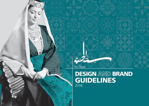
<strong>DESIGN</strong> <strong>AND</strong> <strong>BR<strong>AND</strong></strong> <strong>GUIDELINE</strong>S 2018 page 4<br />
CORPORATE<br />
LOGOTYPE<br />
OUR LOGO IS THE KEY BUILDING BLOCK OF OUR IDENTITY, THE<br />
LOGO IS A COMBINATION OF THE THE SYMBOL ITSELF <strong>AND</strong><br />
OUR COMPANY NAME - THEY HAVE A FIXED RELATIONSHIP<br />
THAT SHOULD NEVER BE CHANGED IN ANY WAY.<br />
The Sit El Hessen Logo comprises two elements, the logo symbol and logo<br />
type at the same time.<br />
The Logo Type has been carefully chosen and was customized by an arabic<br />
calligrapher for its vintage and yet refined, highly legible style.<br />
The corporate logo is presented through the use of colour as well as<br />
shape and form. The main corporate colour is Pantone 320U.
<strong>DESIGN</strong> <strong>AND</strong> <strong>BR<strong>AND</strong></strong> <strong>GUIDELINE</strong>S 2018 page 5<br />
FULL SIT EL HESSENLOGO<br />
FULL LOGOTYPE<br />
LOGO VERSIONS<br />
Logo Dark Version<br />
will be used when the backround color is light<br />
colored.<br />
Logo Light Version<br />
will be used when the backround color ist dark<br />
colored.
<strong>DESIGN</strong> <strong>AND</strong> <strong>BR<strong>AND</strong></strong> <strong>GUIDELINE</strong>S 2018 page 6<br />
LOGO CONSTRUCTION,<br />
CLEARSPACE <strong>AND</strong><br />
COMPUTATION<br />
IT IS IMPORTANT TO KEEP CORPORATE MARKS CLEAR OF ANY<br />
OTHER GRAPHIC ELEMENTS.<br />
To regulate this, an exclusion zone has been establis-hed around<br />
the corporate mark. This exclusion zone indicates the closest any<br />
other graphic element or message can be positioned in relation to<br />
the mark.of the the symbol itself and our company name — they<br />
have a fixed relationship that should never be changed in any way.
<strong>DESIGN</strong> <strong>AND</strong> <strong>BR<strong>AND</strong></strong> <strong>GUIDELINE</strong>S 2018 page 7<br />
FULL LOGOTYPE<br />
LOGO BACKGROUND<br />
When It’s white color background<br />
When It’s original color background When It’s dark color background When It’s Light color background<br />
Please read carefully the Do’s and Don’ts<br />
LOGO DO’S <strong>AND</strong><br />
DONT’S<br />
Do not place the logo on 2 lines<br />
Do not alter the logo type style<br />
Never change the proportions of the logo vertically or horizontally<br />
or alter the appearance in any way
<strong>DESIGN</strong> <strong>AND</strong> <strong>BR<strong>AND</strong></strong> <strong>GUIDELINE</strong>S 2018 page 8<br />
CORPORATE<br />
TYPOGRAPHY Frutiger LT Std<br />
THE CORPORATE FONTS <strong>AND</strong> TYPOGRAPHY<br />
Typography plays an important role in communicating an<br />
overall tone and quality. Careful use of typography reinforces<br />
our personality and ensures clarity and har-mony in all Sit El<br />
Hessen communications.<br />
We have selected Frutiger LT STD as english font, A Xt Zeina<br />
and Geeza Pro which helps inject energy and enthusiasm<br />
into the entire Sit El Hessen communications, as the primary<br />
and secondary corpo-rate typefaces.<br />
LIGHT<br />
A B C D E F G H I J K L M<br />
N O P Q R S T U V W X Y Z<br />
a b c d e f g h i j k l m<br />
n o p q r s t u v w x y z<br />
ROMAN<br />
A B C D E F G H I J K L M<br />
N O P Q R S T U V W X Y Z<br />
a b c d e f g h i j k l m<br />
n o p q r s t u v w x y z<br />
FIGURES<br />
0 1 2 3 4 5 6 7 8 9<br />
CHARACTERS<br />
! " # $ % & ' ( ) * + , / < > ; : = ©<br />
® Ω ˝ – ‚ • … @ ? ] [ \ .<br />
BOLD<br />
A B C D E F G H I J K L M<br />
N O P Q R S T U V W X Y Z<br />
a b c d e f g h i j k l m<br />
n o p q r s t u v w x y z
<strong>DESIGN</strong> <strong>AND</strong> <strong>BR<strong>AND</strong></strong> <strong>GUIDELINE</strong>S 2018 page 9<br />
CORPORATE<br />
TYPOGRAPHY<br />
A Xt Zeina<br />
Geeza Pro<br />
LIGHT<br />
FIGURES<br />
LIGHT<br />
CHARACTERS<br />
BOLD<br />
BOLD<br />
BOLD ITALIC<br />
FIGURES<br />
CHARACTERS
<strong>DESIGN</strong> <strong>AND</strong> <strong>BR<strong>AND</strong></strong> <strong>GUIDELINE</strong>S<br />
2018 page 10<br />
TYPO <strong>AND</strong> TEXT<br />
HIERARCHY<br />
HEADLINE<br />
Headline 1 ( 45 pt ) Headline 1 ( 60 pt )<br />
HEADLINE<br />
Headline 2 ( 33 pt ) Headline 2 ( 50 pt )<br />
HEADLINE<br />
Headline 3 ( 18 pt ) Headline 3 ( 40 pt )<br />
Headline 3 ( 12 pt ) HEADLINE<br />
Headline 3 ( 30 pt )<br />
Headline 4 ( 9 pt ) Headline 4 ( 20 pt )<br />
HEADLINE<br />
Headline 5 ( 8 pt ) HEADLINE<br />
Headline 5 ( 15 pt )<br />
عنوان<br />
عنوان<br />
عنوان<br />
عنوان<br />
عنوان<br />
عنوان<br />
Typographic hierarchy is another<br />
form of visual hierarchy. Typographic<br />
hierarchy presents lettering so that<br />
the most important words are<br />
displayed with the most impact<br />
so users can scan text for key<br />
information.<br />
Typographic hierarchy creates contrast<br />
between elements. There are a variety<br />
of ways you can create a sense of<br />
hierarchy. Here are some text of the<br />
most common techniques for Sit El<br />
Hessen layouts.<br />
Headline 6 ( 6 pt ) HEADLINE<br />
عنوان ) pt Headline 6 ( 10
<strong>DESIGN</strong> <strong>AND</strong> <strong>BR<strong>AND</strong></strong> <strong>GUIDELINE</strong>S 2018 page 11<br />
CORPORATE<br />
COLOR SYSTEM<br />
THE PRIMARY COLOR SYSTEM<br />
<strong>AND</strong> COLOR CODES<br />
Color plays an important role in the Sit El<br />
Hessen corporate identity program. The colors<br />
below are recommendations for various media.<br />
A palette of primary colors has been developed,<br />
which comprise the « One Voice » color scheme.<br />
Consistent use of these colors will contribute<br />
to the cohesive and harmonious Look of the<br />
Sit El Hessen brand identity across all relevant<br />
media. Check with your designer or printer<br />
when using the corporate colors that they<br />
will be always be consistent.<br />
PRIMARY COLOR<br />
AQUAMARINE<br />
COLOR CODES<br />
PANTONE : 320 U<br />
CMYK: 89.5 - 9 - 36 - 0.5<br />
RGB: 0 - 155 - 167<br />
WEB COLORS: #009aa7<br />
PRIMARY COLOR<br />
GREY<br />
COLOR CODES<br />
PANTONE : %75 OF BLACK<br />
CMYK: 0 - 0 - 0 - 75<br />
RGB: 99 - 99 - 98<br />
WEB COLORS: #636362