Understanding the Right Approach Towards Responsive Web Design
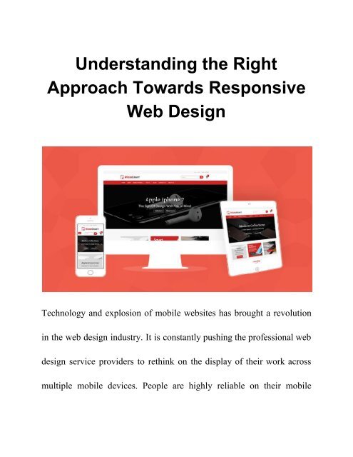
Responsive Web Design is the approach which allows a web design and its code to respond to the varying size of a device screen. Regardless of the device in use, the website can function in the similar manner. But a right approach towards RWD is vital. To Know More : https://www.biztechcs.com/blog
Responsive Web Design is the approach which allows a web design and its code to respond to the varying size of a device screen. Regardless of the device in use, the website can function in the similar manner. But a right approach towards RWD is vital.
To Know More : https://www.biztechcs.com/blog
You also want an ePaper? Increase the reach of your titles
YUMPU automatically turns print PDFs into web optimized ePapers that Google loves.
<strong>Understanding</strong> <strong>the</strong> <strong>Right</strong><br />
<strong>Approach</strong> <strong>Towards</strong> <strong>Responsive</strong><br />
<strong>Web</strong> <strong>Design</strong><br />
Technology and explosion of mobile websites has brought a revolution<br />
in <strong>the</strong> web design industry. It is constantly pushing <strong>the</strong> professional web<br />
design service providers to rethink on <strong>the</strong> display of <strong>the</strong>ir work across<br />
multiple mobile devices. People are highly reliable on <strong>the</strong>ir mobile
phones and tablets to surf through websites. This paves <strong>the</strong> way for<br />
responsive web design services.<br />
What is responsive web design?<br />
A website with responsive web design (RWD) is a site that is able<br />
to adapt to any screen resolution. Regardless of <strong>the</strong> device in use, <strong>the</strong><br />
website can function in <strong>the</strong> similar manner. The website automatically<br />
reformats to give <strong>the</strong> user a better experience. The user gets a<br />
well-deserved user experience and your site too becomes extensively<br />
useable. The days where a website had an exclusive design which would<br />
suit <strong>the</strong> desktop screen are over.<br />
In simple terms, an RWD is <strong>the</strong> approach which allows a web design<br />
and its code to respond to <strong>the</strong> varying size of a device screen. RWD<br />
exploits <strong>the</strong> fluid grids, flexible images and CSS styling. These works
toge<strong>the</strong>r to solidify <strong>the</strong> site design in accordance of <strong>the</strong> width of <strong>the</strong><br />
browser. This induces <strong>the</strong> responsiveness.<br />
What is <strong>the</strong> <strong>Right</strong> <strong>Approach</strong> towards <strong>Responsive</strong><br />
<strong>Web</strong> <strong>Design</strong>?<br />
The staggering use of mobile devices in <strong>the</strong> recent time has made it <strong>the</strong><br />
need of <strong>the</strong> hour to develop a RWD. Before choosing responsiveness in<br />
your web design, you must know <strong>the</strong> right approach towards it. Here are<br />
<strong>the</strong> few important points, which will guide you and help you in moving<br />
towards building an RWD.<br />
Navigation Needs Special Attention<br />
Your design is under certain limitations as you are also designing for<br />
smaller screens. You will have to simplify your navigational choices.<br />
You must also use icons which are in pair with text. Your design should<br />
have in-page links, collapsible menus and dropdown menus for letting
your users to go where <strong>the</strong>y want to go. In addition, make sure that you<br />
give visual access to <strong>the</strong> core pages.<br />
You might have space just for four or five core links. Utilize <strong>the</strong><br />
fruitfully. This affects not just <strong>the</strong> overall site’s navigation. But, it also<br />
affects <strong>the</strong> entire content strategy. Use <strong>the</strong> available space to allow <strong>the</strong><br />
people go where you want to direct <strong>the</strong>m.<br />
Stand Out Action Buttons<br />
The action buttons must pop out from <strong>the</strong> page both in color and style.<br />
The size and shape of <strong>the</strong> buttons have an equal importance as <strong>the</strong><br />
buttons. The circular and rectangular buttons are <strong>the</strong> easiest buttons to<br />
recognize. Too much creativity tends to create confusion among <strong>the</strong><br />
users. Moreover, <strong>the</strong> buttons ought to be finger friendly. Also make sure<br />
that on different devices <strong>the</strong> buttons and text links have a decent spacing<br />
in between <strong>the</strong>m.
Liquid Layouts<br />
Liquid layouts can accommodate any screen size. It makes no sense to<br />
design a particular look for iPhone and ano<strong>the</strong>r for android or one design<br />
for mobile phones and ano<strong>the</strong>r for tablets. Keep it liquid. You will not<br />
have to design an intermediate screen size resolution for any particular<br />
operating system, browser or device.<br />
Use Limited Words<br />
Desktops allow for more text. This is not always beneficial. You need to<br />
be very careful when you also design for mobile devices. Here your<br />
website will work within <strong>the</strong> limits of smaller screen. Use least number<br />
of words to convey your message. Every word should be moving your<br />
story ahead. You may not be able to use <strong>the</strong> same write ups from <strong>the</strong><br />
desktop site. It would need some editing.
Create Prototypes<br />
Creating prototypes and testing your content is extremely important. It<br />
allows you to know how to look and feel of your design is going to<br />
translate on different screen sizes. It allows you to know how well it<br />
functions. You should opt for a functional prototype on actual devices to<br />
ensure <strong>the</strong> website functions without any trouble. This would save you<br />
from any users complaining about a broken site.<br />
Use <strong>Responsive</strong> Images<br />
The images on your website should load quickly on every device. You<br />
should make sure that <strong>the</strong> images you use for smaller resolution not only<br />
scale virtually. But, <strong>the</strong>y should also scale in terms of size. Large size<br />
images can take a longer time to load on <strong>the</strong> smaller devices. <strong>Responsive</strong><br />
images on <strong>the</strong> o<strong>the</strong>r hand, offer a powerful and effective background.
Professional web design service providers can make <strong>the</strong><br />
responsive image designing very easy.


