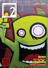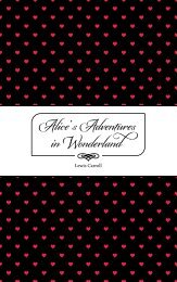
Typography Magazine Concept
Typography and Layout submission for the University of Canberra
Typography and Layout submission for the University of Canberra

You also want an ePaper? Increase the reach of your titles
YUMPU automatically turns print PDFs into web optimized ePapers that Google loves.
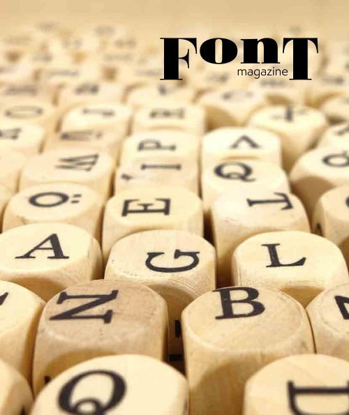
F on T<br />
magazine
CONTENTS<br />
01<br />
03<br />
05<br />
07<br />
09<br />
11<br />
A showcase & origins of the ampersand<br />
Vendetta character profile<br />
Semplicita character profile<br />
Colt character profile<br />
Baroque character profile<br />
Marcel character profile
13<br />
15<br />
17<br />
23<br />
27<br />
32<br />
Ink - our scribe<br />
Headway music festival poster<br />
Discovery by design - by zuzano licko<br />
Printing should be invisible - by beatrice ward<br />
Editorial: design rationale<br />
References
Font <strong>Magazine</strong><br />
Abril Fatface#*<br />
&<br />
type-together.com<br />
Adage Script JF #<br />
&<br />
jukeboxfonts.com<br />
The showcase<br />
Adobe Caslon Pro #<br />
& &<br />
adobe.com<br />
Alana #<br />
&<br />
lauraworthington.com<br />
Alegreya #*<br />
& &<br />
huertatipografica.com<br />
&<br />
Alize #<br />
&<br />
type-together.com<br />
Baroque Text JF #<br />
&<br />
jukeboxfonts.com<br />
Bickham Script Pro<br />
& &<br />
#<br />
adobe.com<br />
Blenny #<br />
&<br />
lauraworthington.com<br />
Bree #*<br />
&<br />
huertatipografica.com<br />
Coquette #*<br />
&<br />
type-together.com<br />
Futura PT #<br />
& &<br />
jukeboxfonts.com<br />
Givry #<br />
& &<br />
adobe.com<br />
Goldenbook #*<br />
&<br />
lauraworthington.com<br />
Grafolita Script #<br />
&<br />
huertatipografica.com<br />
HWT VanLanen #*<br />
&<br />
type-together.com<br />
Iskra #*<br />
& &<br />
jukeboxfonts.com<br />
Kings Caslon #<br />
&<br />
adobe.com<br />
Litania #*<br />
&<br />
lauraworthington.com<br />
Modesto Inlinefill #*<br />
&<br />
huertatipografica.com<br />
Modesto Text #*<br />
&<br />
type-together.com<br />
Museo #*<br />
&<br />
jukeboxfonts.com<br />
Origins #<br />
&<br />
adobe.com<br />
P22 Marcel Script #<br />
&<br />
lauraworthington.com<br />
Senator #*<br />
&<br />
huertatipografica.com<br />
Soleil #*<br />
& &<br />
type-together.com<br />
Texas Hero #<br />
& &<br />
jukeboxfonts.com<br />
Variex OT *<br />
& & &<br />
adobe.com<br />
Vendetta OT #*<br />
& &<br />
lauraworthington.com<br />
Viktor Script #*<br />
& &<br />
huertatipografica.com<br />
1<br />
# - denotes print applicable<br />
* - denotes screen applicable
Origin of the ampersand (&)?<br />
The origin of the ampersand can be<br />
traced back to the Latin word et, meaning<br />
‘and’. The E and the T that make up this<br />
word were occasionally written together to<br />
form a ligature (a character consisting of<br />
two or more joined letters). Writing the<br />
word this way saved the writer time, with<br />
one letter flowing seamlessly into the next<br />
– a form of cursive or joined up writing<br />
(English Oxford Dictionaries, 2017).<br />
Origin of the ampersand<br />
It’s impossible to say exactly when this<br />
symbol was first written down, but an<br />
early example has been found as graffiti<br />
on a wall in Pompeii, preserved by the<br />
eruption of Vesuvius in 79AD. It can be<br />
very difficult to trace the development of<br />
symbols over time, but with the ampersand<br />
the work has already been done for<br />
us, by one Jan Tschichold, a typographer<br />
born in Leipzip in 1902. Tschichold devoted<br />
an entire study to the development<br />
of the ampersand in his 1953 booklet The<br />
ampersand: its origin and development,<br />
where he collected hundreds of examples<br />
of the symbol throughout history,<br />
recording its development from the piece<br />
of ancient graffiti to the familiar ‘&’ used<br />
today. Within this collection are examples<br />
from the eighth century which are already<br />
recognizable as the modern ampersand<br />
(English Oxford Dictionaries, 2017).<br />
For such an ancient symbol, the name<br />
‘ampersand’ is surprisingly modern. First<br />
seen in the late 18th century, it comes<br />
from an alteration of and per se and (literally<br />
‘and (i.e. &) by itself makes the word<br />
and’), which was once chanted by schoolchildren<br />
as an aid to learning the sign<br />
(English Oxford Dictionaries, 2017).<br />
2
Font <strong>Magazine</strong><br />
I am a well attired 57 year old male that appreciates all the finery in life.<br />
Raised from a by gone era of remarkable wonder and innovation. Do not<br />
be fooled by my charming good looks, for as you get closer you will see my<br />
chiseled features that remind of a time that not all is as it seems.<br />
I like to think of myself as classical in nature, and bred from antiquity, I<br />
am fiercley traditional and immediately understood.<br />
Handsome with rugged good looks. Always needs to be looked at twice as<br />
it is familiar, but upon closer inspection remarkably unique.<br />
I love Italian fine dining and enjoy the occasional duel, horse riding,<br />
fencing and masquerade balls.<br />
3
V<br />
Vendetta<br />
Vendetta character profile<br />
4
Font <strong>Magazine</strong><br />
I am a 38 year old female from Paris. I have<br />
recently finished my studies and enjoy the jazz<br />
scene.<br />
I am balanced and elegant with fine femine<br />
curves. Do not take my soft curves to be a weakness<br />
because I can be sharp and dominant headline.<br />
Hailing from an art deco lineage I can move and<br />
keep pace with the times.<br />
5
S<br />
Semplicita<br />
Semplicita character profile<br />
6
I’m a 45 year old male from<br />
the mid-west of the good<br />
old us of A.<br />
Font <strong>Magazine</strong><br />
I enjoy cars, beer, hunting<br />
and football oh and women.<br />
I will round you up and<br />
shoot you down. I’ll be in a<br />
bar, in the workshop or at<br />
the football.<br />
I play well with others<br />
though you just need to<br />
get to know me in the right<br />
situation.<br />
7
COLT<br />
Colt character profile<br />
8
Font <strong>Magazine</strong><br />
Baroque<br />
9
Baroque character profile<br />
Thee is a well over 200 years old male. I done the likes of illumanated<br />
books and scriptures, have been known to wander the ye old inns as well as<br />
you may have seen my marks on many a old bottles of ale and wine.<br />
These times are too bright for me as I prefer to lurk in the darker areas of<br />
society now a days, but during the peak times I was to be seen everywhere<br />
and know by all.<br />
I have been alone for many a years now and my light does fade.<br />
10
Font <strong>Magazine</strong><br />
I am a 28 year old female. I’ m looking for a strong man that can sweep me off my feet and give me<br />
the best the world has to offer.<br />
I like to travel to exotic destinations either with friends or alone to enjoy the peace and tranquility. I<br />
won’ t say no to adventure and new experiences. My Mum is my best friend and Daddy is a close second.<br />
I love everything new but definately appreciate history and the adventures it had to offer, I was definately<br />
born in the wrong era.<br />
11
Marcel<br />
Marcel character profile<br />
12
Font <strong>Magazine</strong><br />
Born from ancient times and<br />
in very different worlds, ink was<br />
developed by the Chinese and<br />
Egyptians at round 2500 B.C.<br />
The greatest achievement<br />
of ink is its ability to record<br />
the passage of time, record<br />
thought, help invent words and<br />
language, and spread and share<br />
knowledge not only between<br />
people but between cultures.<br />
It is creative and can communicate<br />
stories from fact and fiction.<br />
It has been one very quiet<br />
companion to the human race<br />
that has been with us through<br />
our travels through history<br />
recording our triumphs and<br />
shortcomings.<br />
Inks early life began as a mix<br />
of lampblack, which is basically<br />
the carbon or soot residue left<br />
Ink<br />
Our Scribe<br />
from oil lamps, and glue or<br />
sap. Coloured ink was created<br />
by adding juices, plant matter,<br />
blood, crushed rocks, shellfish<br />
and tannin to ink to get its colour.<br />
Nowadays ink is a combination<br />
of pigments and solvents<br />
(VisualGraphic, 2013).<br />
Everywhere we look we see<br />
ink, without even realising it.<br />
It is in the papers we read, the<br />
magazines we buy and one of<br />
the first things we see in the<br />
morning on food packaging<br />
and morning routine products.<br />
It’s on the dash of the car, the<br />
public transport signage right<br />
through to the stationary used<br />
at work and the clothes you<br />
wear.<br />
Regardless of the fact that<br />
early inks were crude the idea<br />
13
A historic factoid - Ink<br />
that pushed the creation of ink<br />
was to make ink stand the test<br />
of time and make it enduring<br />
and it could create a permanent<br />
record of something.<br />
Ink and its production has<br />
always been to a certain extent<br />
problematic, it has always had<br />
issues regarding durability, it<br />
fades when exposed to sunlight<br />
and different types of paper absorb<br />
different amounts of ink<br />
(History of Ink and It's Development,<br />
2017).<br />
Between the eighth and the<br />
eleventh Century a chemical<br />
ink, iron gall ink developed<br />
from tannic acid and iron salt<br />
became a popular colorant<br />
bound by resin. To understand<br />
the chemical structure of ink it<br />
is necessary to understand the<br />
properties of the chemicals that<br />
have gone into ink production<br />
and why certain chemicals improve<br />
or debase its durability<br />
(History of Ink and It's Development,<br />
2017).<br />
Water based inks have humectants<br />
(a substance that<br />
absorbs or helps another substance<br />
retain moisture (Dictionary.com,<br />
2017)) added so<br />
that the resultant ink does not<br />
dry out too quickly. At the<br />
same time, the ink must have<br />
the correct consistency for its<br />
purpose and added biocides<br />
ensure the consistency. Sometimes<br />
a pH level is necessary<br />
and buffering additives stabilise<br />
the level. In today’s complex<br />
world, the ink must be compatible<br />
with the type of machinery<br />
using it. Inkjet printers have<br />
revolutionised the printing industry,<br />
but the printing heads<br />
are so sensitive several different<br />
types of ink have developed for<br />
them (History of Ink and It's<br />
Development, 2017).<br />
Inkjet ink does not use dyes<br />
as the colorant but pigments.<br />
despite the early problems with<br />
inkjet ink the process has now<br />
been improved so that colours<br />
do not fade and lose their brilliance<br />
outdoors in bright natural<br />
light. This development<br />
itself has revolutionised many<br />
aspects of the printing business<br />
not the least of which is in the<br />
sign industry (History of Ink<br />
and It's Development, 2017).<br />
14
01 AUGUST 2017<br />
EBB & FLOW<br />
THIRSTY MERC<br />
DAWN THEORY<br />
SOMETHING LIKE THIS<br />
SOUTHWELL PARK<br />
LYNEHAM<br />
15
GOLD COIN DONATION<br />
part of the BANG ON FESTIVAL<br />
Organised by the Canberra’s Drummers Union<br />
sponsored by the University of Canberra<br />
16
Font <strong>Magazine</strong><br />
Discovery by<br />
Design<br />
by Zuzana Licko<br />
"...Can new design – like new science – discover<br />
phenomena that already exist in the fabric of<br />
typographic possibility? If so, who owns discovery?"<br />
– Ellen Lupton, The 100 Show. The sixteenth Annual of the American Center for Design.<br />
Although science and design<br />
are both based upon experimental<br />
investigation, the comparison is not<br />
altogether straightforward; science<br />
investigates naturally occurring<br />
phenomena, while design investigates<br />
culturally created phenomena. But<br />
if such a parallel is to be made, then<br />
we might replace a falling tree by a<br />
17<br />
typographic possibility and thereby<br />
ask the question "Does a typographic<br />
phenomenon exist if no one recognizes<br />
it?"<br />
Potentially, if every graphic and<br />
typographic possibility already exists,<br />
and each is waiting to be discovered,<br />
then we need only create an appropriate<br />
context in order to bring life to any<br />
of them.<br />
For example, consider the 26 letters<br />
in our alphabet and how they are combined<br />
to form words. There is a finite<br />
number of combinations, or words, if<br />
we limit ourselves to words of a certain<br />
length; say, five letters. Then, for<br />
the ease of pronunciation, let's omit<br />
all words that contain a string of three
18<br />
Discovery by design
Font <strong>Magazine</strong><br />
or more consecutive consonants. Even<br />
with these restraints to give some<br />
"meaning" within our understanding<br />
of words, there will be many words<br />
that will have no meaning to us. Does<br />
this mean that these are not words?<br />
Does a sequence of letters not form<br />
a word when we do not recognize its<br />
meaning?<br />
It is important to note here, that the<br />
meanings of words are not intrinsic to<br />
the words themselves; the meanings<br />
are arbitrary, since the same word may<br />
have different meanings in different<br />
languages. In fact, the entire concept<br />
of using 26 letters is an arbitrary one.<br />
We could just as well have used 20<br />
letters, or 30 letters, or thousands of<br />
ideograms like the Oriental cultures.<br />
Although these systems of communication<br />
and meanings are arbitrary,<br />
once they are established, they serve as<br />
the foundation for the creation of new<br />
meanings, and therefore do not appear<br />
to be as arbitrary as they really are.<br />
As another example, consider the<br />
grid of a computer video display, or<br />
that of a laser printer rasterizer; each<br />
point on the grid can be on or off;<br />
black or white. Given a fixed resolution,<br />
again, there is a finite number<br />
of combinations that these on/off<br />
sequences will compose. If a computer<br />
is programmed to run through all of<br />
the possible combinations, some will<br />
appear to us as pure gibberish, while<br />
others will be recognized as something<br />
that we already know or might be<br />
interested in getting to know better.<br />
Even though all these compositions<br />
are randomly generated, only those<br />
few that fit into our preconceived<br />
19
Discovery by Design<br />
notions of context will have meaning.<br />
Therefore, it is the meaning, and not<br />
the form itself that has been created.<br />
New design is the creation of new<br />
meanings; that is, new contexts for<br />
typographic possibilities. However,<br />
must be linked to existing ones.<br />
Even that design which "pushes the<br />
envelope" must build upon existing<br />
preconceptions. For unless a critical<br />
portion is understandable, the entire<br />
piece will be dismissed as complete<br />
nonsense.On the other hand, if no<br />
portion of the design is new, then it<br />
will appear so uninteresting that it<br />
might result in boredom and therefore<br />
be equally dismissed. Intriguing<br />
consumers with just the right amount<br />
of unrecognizable information spurs<br />
their interest. By initiating these<br />
changes of meaning, design educates<br />
the consumer to the changes in culture.<br />
Thus, design is a very powerful<br />
component in controlling our collective<br />
consciousness. However, design<br />
is also a subconscious process, and it<br />
is therefore nearly impossible for a designer<br />
to intentionally alter a specific<br />
cultural concept.<br />
This process of reassimilation and<br />
adding or changing of meaning with<br />
each step creates an environment in<br />
our popular culture that is conducive<br />
to the assimilation of particular ideas.<br />
As this environment changes, it<br />
makes certain ideas ripe, or "ready to<br />
be liked."<br />
In this manner, meanings change,<br />
and over time great shifts take place.<br />
Since the creation of new meanings<br />
usually results in the replacement,<br />
displacement or change of older<br />
meanings, we may also wonder if some<br />
meanings become obsolete. We may<br />
ask, "Does obsolescence exist in design,<br />
and can we plan obsolescence?"<br />
It is possible to engineer the components<br />
of a car or refrigerator to<br />
break down after a certain duration<br />
of use, thereby defining the product's<br />
obsolescence. But is it possible to do<br />
this with a design style, typeface, or<br />
typographic form? Unlike industrial<br />
products that have a physical life, the<br />
lifespan of a typographic possibility<br />
is purely conceptual. Designs become<br />
obsolete as they are consumed by our<br />
20
Font <strong>Magazine</strong><br />
culture, and subsequently forgotten in<br />
favor of other ones. Yet what was obsolete<br />
years ago is often revived from<br />
obsolescence to be reassimilated or expanded<br />
upon as appropriate to fit into<br />
new cultural meanings. This process<br />
repeats itself again and again, making<br />
obsolescence a temporary state in the<br />
world of design possibilities.<br />
Because this ongoing change is<br />
affected by many different forces from<br />
numerous directions, it is impossible to<br />
predict what will happen next, or even<br />
how long-or short-lived any particular<br />
design idea might be. Since the life,<br />
or lives, of a design idea are dictated<br />
by its appropriateness for currently<br />
accepted ideas, it would be impossible<br />
to specifically plan the longevity of a<br />
design without also controlling these<br />
forces of style.<br />
This evolution of meanings is also<br />
unpredictable over time. Some meanings<br />
change very quickly, like the<br />
second hand on a stopwatch; others<br />
change so slowly that we don't even<br />
see them change, like the hour hand<br />
on a grandfather clock. These slow<br />
changing ideas are seen as timeless,<br />
while those that change quickly are<br />
perceived as being timely. The words<br />
"timeless" and "timely" often have very<br />
strong negative or positive connotations,<br />
although neither is good nor<br />
bad, per se. The value of either of these<br />
qualities lies in the appropriateness of<br />
use, and appropriateness is usually<br />
a question of efficient use of design<br />
resources, or financial viability.<br />
21<br />
For example, if it costs millions to<br />
change the signage in an airport or<br />
subway system, then a timeless design<br />
is appropriate. However, if a design<br />
can be changed every time it appears<br />
on, say, an interactive television platform,<br />
and especially if such change<br />
will stimulate interest and add levels<br />
of meaning to the audience, then a<br />
timely design would be appropriate.<br />
However, more often than not, it is<br />
timelessness that is seen as most valuable.<br />
Timeless creations are seen as<br />
the result of the process of refinement,<br />
and give us the impression that we are<br />
always working towards an ultimate<br />
goal of perfection, independent of the<br />
whims of fashion. This may appear so
ecause history is told as a logical and<br />
progressive development. However,<br />
histories are composed in hindsight;<br />
actual events do not occur with such<br />
20/20 vision. For example, once we<br />
identify a design idea as being fully<br />
developed, historians then work to<br />
explain its development by referring<br />
to the appropriate chain of events.<br />
However, this process also involves<br />
the filtering out of inappropriate<br />
events; events that nonetheless occupy<br />
the same time line. The inevitability<br />
of design ideas is therefore never so<br />
apparent when we're standing on the<br />
other end of the time line.<br />
Although each development can<br />
be explained as an outcome of any<br />
number of preceding factors, this does<br />
not mean that any particular course of<br />
development is therefore inevitable.<br />
The sometimes arbitrary choices that<br />
are made along every step subsequently<br />
become a foundation for future<br />
developments, but there are usually<br />
many parallel, equally viable paths not<br />
taken.<br />
So, who owns these design discoveries,<br />
if we are facilitating their existence<br />
through the appropriate contexts? It<br />
may be true that all designs exist in<br />
the fabric of typographic possibility.<br />
However, since not all possibilities can<br />
exist at the same time, there must be<br />
some way to intelligently choose possibilities<br />
that will have meaning; that<br />
intelligent force comes from designers.<br />
The discovery of a design possibility<br />
is therefore largely a matter of the<br />
designer being in the right place at the<br />
right time. However, it is the designer's<br />
ability to recognize the opportunity,<br />
the talent to apply the idea to a<br />
specific creative work, the willingness<br />
to sometimes go out on a limb, and<br />
the perseverance to convince others<br />
that the idea has validity, that deserves<br />
claim to ownership. Because, in the<br />
end, it is the expertise to communicate<br />
new ideas to others that gives credibility<br />
to the designer's existence.<br />
Discovery by Design<br />
22
Printing should<br />
Font <strong>Magazine</strong><br />
be invisible<br />
by Beatrice Ward<br />
Imagine that you have before you a<br />
flagon of wine. You may choose your<br />
own favourite vintage for this imaginary<br />
demonstration, so that it be a deep shimmering<br />
crimson in colour. You have two<br />
goblets before you. One is of solid gold,<br />
wrought in the most exquisite patterns.<br />
The other is of crystal-clear glass, thin<br />
as a bubble, and as transparent. Pour<br />
and drink; and according to your choice<br />
of goblet, I shall know whether or not<br />
you are a connoisseur of wine. For if you<br />
have no feelings about wine one way or<br />
the other, you will want the sensation of<br />
drinking the stuff out of a vessel that may<br />
have cost thousands of pounds; but if you<br />
are a member of that vanishing tribe, the<br />
amateurs of fine vintages, you will choose<br />
the crystal, because everything about it is<br />
calculated to reveal rather than hide the<br />
beautiful thing which it was meant to<br />
contain.<br />
Bear with me in this long-winded and<br />
fragrant metaphor; for you will find that<br />
almost all the virtues of the perfect wineglass<br />
have a parallel in typography. There<br />
is the long, thin stem that obviates fingerprints<br />
on the bowl. Why? Because no<br />
cloud must come between your eyes and<br />
the fiery heart of the liquid. Are not the<br />
margins on book pages similarly meant<br />
to obviate the necessity of fingering the<br />
type-page? Again: the glass is colourless<br />
or at the most only faintly tinged in the<br />
23<br />
bowl, because the connoisseur judges wine<br />
partly by its colour and is impatient of anything<br />
that alters it. There are a thousand<br />
mannerisms in typography that are as<br />
impudent and arbitrary as putting port<br />
in tumblers of red or green glass! When a<br />
goblet has a base that looks too small for<br />
security, it does not matter how cleverly it<br />
is weighted; you feel nervous lest it should<br />
tip over. There are ways of setting lines of<br />
type which may work well enough, and yet<br />
keep the reader subconsciously worried by<br />
the fear of “doubling” lines, reading three<br />
words as one, and so forth.<br />
Now the man who first chose glass<br />
instead of clay or metal to hold his wine<br />
was a “modernist” in the sense in which<br />
I am going to use that term. That is,<br />
the first thing he asked of his particular<br />
object was not “How should it look?” but<br />
“What must it do?” and to that extent all<br />
good typography is modernist. Wine is<br />
so strange and potent a thing that it has<br />
been used in the central ritual of religion<br />
in one place and time, and attacked by a<br />
virago with a hatchet in another. There is<br />
only one thing in the world that is capable<br />
of stirring and altering men’s minds to<br />
the same extent, and that is the coherent<br />
expression of thought. That is man’s chief<br />
miracle, unique to man. There is no “explanation”<br />
whatever of the fact that I can<br />
make arbitrary sounds which will lead a<br />
total stranger to think my own thought. It<br />
is sheer magic that I should<br />
be able to hold a one-sided conversation<br />
by means of black marks on paper with<br />
an unknown person half-way across the
Printing should be invisible<br />
world. Talking, broadcasting, writing,<br />
and printing are all quite literally forms of<br />
thought transference, and it is the ability<br />
and eagerness to transfer and receive the<br />
contents of the mind that is almost alone<br />
responsible for human civilization.<br />
If you agree with this, you will agree<br />
with my one main idea, i.e. that the most<br />
important thing about printing is that<br />
it conveys thought, ideas, images, from<br />
one mind to other minds. This statement<br />
is what you might call the front door of<br />
the science of typography. Within lie<br />
hundreds of rooms; but unless you start by<br />
assuming that printing is meant to convey<br />
specific and coherent ideas, it is very<br />
easy to find yourself in the wrong house<br />
altogether.<br />
Before asking what this statement leads<br />
to, let us see what it does not necessarily<br />
lead to. If books are printed in order to be<br />
read, we must distinguish readability from<br />
what the optician would call legibility. A<br />
page set in 14-pt Bold Sans is, according<br />
to the laboratory tests, more “legible”<br />
than one set in 11-pt Baskerville. A public<br />
speaker is more “audible” in that sense<br />
when he bellows. But a good speaking<br />
voice is one which is inaudible as a voice.<br />
It is the transparent goblet again! I need<br />
not warn you that if you begin listening<br />
to the inflections and speaking rhythms<br />
of a voice from a platform, you are falling<br />
asleep. When you listen to a song in a language<br />
you do not understand, part of your<br />
mind actually does fall asleep, leaving<br />
your quite separate aesthetic sensibilities<br />
to enjoy themselves unimpeded by your<br />
reasoning faculties. The fine arts do that;<br />
but that is not the purpose of printing.<br />
Type well used is invisible as type, just as<br />
the perfect talking voice is the unnoticed<br />
vehicle for the transmission of words,<br />
ideas.<br />
We may say, therefore, that printing<br />
may be delightful for many reasons, but<br />
that it is important, first and foremost, as<br />
a means of doing something. That is why<br />
it is mischievous to call any printed piece<br />
a work of art, especially fine art: because<br />
that would imply that its first purpose<br />
was to exist as an expression of beauty<br />
for its own sake and for the delectation<br />
of the senses. Calligraphy can almost be<br />
considered a fine art nowadays, because<br />
its primary economic and educational<br />
purpose has been taken away; but printing<br />
24
Font <strong>Magazine</strong><br />
in English will not qualify as an art until<br />
the present English language no longer<br />
conveys ideas to future generations, and<br />
until printing itself hands its usefulness to<br />
some yet unimagined successor.<br />
There is no end to the maze of practices<br />
in typography, and this idea of printing<br />
as a conveyor is, at least in the minds of<br />
all the great typographers with whom I<br />
have had the privilege of talking, the one<br />
clue that can guide you through the maze.<br />
Without this essential humility of mind,<br />
I have seen ardent designers go more<br />
hopelessly wrong, make more ludicrous<br />
mistakes out of an excessive enthusiasm,<br />
than I could have thought possible. And<br />
with this clue, this purposiveness in the<br />
back of your mind, it is possible to do<br />
the most unheard-of things, and find<br />
that they justify you triumphantly. It is<br />
not a waste of time to go to the simple<br />
fundamentals and reason from them. In<br />
the flurry of your individual problems, I<br />
think you will not mind spending half an<br />
hour on one broad and simple set of ideas<br />
involving abstract principles.<br />
I once was talking to a man who designed<br />
a very pleasing advertising type<br />
which undoubtedly all of you have used.<br />
I said something about what artists think<br />
about a certain problem, and he replied<br />
with a beautiful gesture: “Ah, madam,<br />
we artists do not think — we feel!” That<br />
same day I quoted that remark to another<br />
designer of my acquaintance, and he,<br />
being less poetically inclined, murmured:<br />
“I’m not feeling very well today, I think!”<br />
He was right, he did think; he was the<br />
thinking sort; and that is why he is not<br />
so good a painter, and to my mind ten<br />
times better as a typographer and type<br />
designer than the man who instinctively<br />
avoided anything as coherent as a reason. I<br />
always suspect the typographic enthusiast<br />
who takes a printed page from a book and<br />
frames it to hang on the wall, for I believe<br />
that in order to gratify a sensory delight<br />
he has mutilated something infinitely<br />
more important. I remember that T.M.<br />
Cleland, the famous American typographer,<br />
once showed me a very beautiful<br />
layout for a Cadillac booklet involving<br />
decorations in colour. He did not have the<br />
actual text to work with in drawing up his<br />
specimen pages, so he had set the lines in<br />
Latin. This was not only for the reason<br />
that you will all think of; if you have seen<br />
the old typefoundries’ famous Quousque<br />
Tandem copy (i.e. that Latin has few descenders<br />
and thus gives a remarkably even<br />
line). No, he told me that originally he had<br />
set up the dullest “wording” that he could<br />
find (I dare say it was from Hansard), and<br />
yet he discovered that the man to whom<br />
he submitted it would start reading and<br />
making comments on the text. I made<br />
some remark on the mentality of Boards<br />
of Directors, but Mr Cleland said, “No:<br />
you’re wrong; if the reader had not been<br />
practically forced to read — if he had not<br />
seen those words suddenly imbued with<br />
glamour and significance — then the<br />
25
"The book typographer has the job<br />
of erecting a window between the<br />
reader inside the room and that<br />
landscape which is the author’s<br />
words."<br />
layout would have been a failure. Setting<br />
it in Italian or Latin is only an easy way<br />
of saying ‘This is not the text as it will<br />
appear.’”<br />
Let me start my specific conclusions<br />
with book typography, because that contains<br />
all the fundamentals, and then go on<br />
to a few points about advertising.<br />
The book typographer has the job of<br />
erecting a window between the reader<br />
inside the room and that landscape<br />
which is the author’s words. He may put<br />
up a stained-glass window of marvellous<br />
beauty, but a failure as a window; that is,<br />
he may use some rich superb type like text<br />
gothic that is something to be looked at,<br />
not through. Or he may work in what I<br />
call transparent or invisible typography. I<br />
have a book at home, of which I have no<br />
visual recollection whatever as far as its<br />
typography goes; when I think of it, all<br />
I see is the Three Musketeers and their<br />
comrades swaggering up and down the<br />
streets of Paris. The third type of window<br />
is one in which the glass is broken<br />
into relatively small leaded panes; and<br />
this corresponds to what is called “fine<br />
printing” today, in that you are at least<br />
conscious that there is a window there,<br />
and that someone has enjoyed building<br />
it. That is not objectionable, because of<br />
a very important fact which has to do<br />
with the psychology of the subconscious<br />
mind. That is that the mental eye focuses<br />
through type and not upon it. The type<br />
which, through any arbitrary warping of<br />
design or excess of “colour,” gets in the way<br />
of the mental picture to be conveyed, is a<br />
bad type. Our subconsciousness is always<br />
afraid of blunders (which illogical setting,<br />
tight spacing and too-wide unleaded lines<br />
can trick us into), of boredom, and of<br />
officiousness. The running headline that<br />
keeps shouting at us, the line that looks<br />
like one long word, the capitals jammed<br />
together without hair-spaces — these<br />
mean subconscious squinting and loss of<br />
mental focus.<br />
And if what I have said is true of book<br />
printing, even of the most exquisite limited<br />
editions, it is fifty times more obvious<br />
in advertising, where the one and only<br />
justification for the purchase of space is<br />
that you are conveying a message — that<br />
you are implanting a desire, straight into<br />
the mind of the reader. It is tragically easy<br />
to throw away half the reader-interest of<br />
an advertisement by setting the simple<br />
and compelling argument in a face which<br />
is uncomfortably alien to the classic<br />
reasonableness of the book-face. Get<br />
attention as you will by your headline,<br />
and make any pretty type pictures you<br />
like if you are sure that the copy is useless<br />
as a means of selling goods; but if you are<br />
happy enough to have really good copy to<br />
work with, I beg you to remember that<br />
thousands of people pay hard-earned<br />
money for the privilege of reading quietly<br />
set book-pages, and that only your wildest<br />
ingenuity can stop people from reading a<br />
really interesting text.<br />
Printing demands a humility of mind,<br />
for the lack of which many of the fine<br />
arts are even now floundering in self-conscious<br />
and maudlin experiments. There<br />
is nothing simple or dull in achieving<br />
the transparent page. Vulgar ostentation<br />
is twice as easy as discipline. When you<br />
realise that ugly typography never effaces<br />
itself; you will be able to capture beauty as<br />
the wise men capture happiness by aiming<br />
at something else. The ‘stunt typographer’<br />
learns the fickleness of rich men who hate<br />
to read. Not for them are long breaths held<br />
over serif and kern, they will not appreciate<br />
your splitting of hair- spaces. Nobody<br />
(save the other craftsmen) will appreciate<br />
half your skill. But you may spend endless<br />
years of happy experiment in devising that<br />
crystalline goblet which is worthy to hold<br />
the vintage of the human mind.<br />
26<br />
Printing should be invisible
Font <strong>Magazine</strong><br />
Editorial:<br />
Design Rationale<br />
by Shane Jenkins<br />
Design is a process by which<br />
typography, imagery and colour<br />
are combined to visually convey a<br />
message or purpose, to tell a story, to<br />
advertise and to emphasise meaning<br />
through several mediums such as<br />
print, web, mobile or motion. Design<br />
through visual communication can<br />
evoke emotions and sway behaviours<br />
of individuals or groups from wide<br />
and varied demographics. By understanding<br />
targeted groups, designers<br />
can create more targeted campaigns.<br />
Ultimately, design is very subjective<br />
and will not attract 100 per cent<br />
approval from any targeted audience,<br />
which I believe is a good thing. It<br />
would be frightfully boring if we all<br />
were predictable and approving of the<br />
same content and designs.<br />
Task<br />
Create a magazine publication<br />
highlighting several weeks’ assignment<br />
work for <strong>Typography</strong> and<br />
Layout unit.<br />
Target Audience<br />
I am targeting the 18-year-old and<br />
above designer demographic (both<br />
male and female). I designed the<br />
magazine for this audience (beginner<br />
through to highly-experienced<br />
designers) to generate discussion on<br />
27
Editorial: Design Rationale<br />
design choices. Due to vastly different<br />
professional and life experience levels<br />
across my audience, the feedback I<br />
could receive would be wildly varied,<br />
which is exciting.<br />
Topic<br />
I have chosen to create a magazine<br />
utilising classic serif and sans serif<br />
fonts that portrays both style and<br />
sophistication, while maintaining a<br />
modern edge. I have a love of photography,<br />
so I have also used large<br />
imagery and solid colours along with<br />
occasional overlays to subtly break up<br />
page styling without intrusion into<br />
the article.<br />
Research<br />
I have chosen a sans serif typeface<br />
in the form of Simplicita to portray<br />
elegance and style with a sense of<br />
modernism. It portrays an adulthood<br />
inviting new artists to the world of<br />
design, and is welcoming to ‘familiar<br />
faces’. I have kept with clean lines<br />
and colours which makes it mature<br />
without being too old, though it does<br />
move the target away from the younger<br />
teens as it does not have a playful<br />
grungy undertone.<br />
I have also chosen a decorative font<br />
called Blenny. This is a large thick and<br />
playful font to contrast Semplicita but<br />
28
Font <strong>Magazine</strong><br />
29<br />
it does feel as though it is from the<br />
same era. It tones down the magazine<br />
and does not make it overly serious,<br />
appealing to a younger audience.<br />
Adobe Caslon,a serif font has been<br />
chosen for the majority of the body<br />
text throughout the magazine to keep<br />
consistency, and it makes reading of<br />
the magazine easier.<br />
I have used photographs to engage<br />
the reader with the topic. Sometimes<br />
a message can be hidden in an image.<br />
I envisaged the magazine to be glossy<br />
and attractive, and a product that<br />
people would be drawn towards. It is<br />
the type of magazine that could stay<br />
on a coffee table for an indefinite period<br />
of time, and no matter the year or<br />
season it would still appear relevant.<br />
Consequently, I aimed for large double<br />
page-spread imagery that related<br />
to the article. The photography I have<br />
used will make people linger, not only<br />
reading the words of the article, but<br />
investigating the photographs themselves.<br />
As such, I hope the content,<br />
layout and typography will generate<br />
further conversation, either about the<br />
topic or picture itself, and consideration<br />
to the choices I applied.<br />
For the article on ampersands, I<br />
used large fonts of differing sizes and<br />
families to break up the background<br />
and further advertise the many and<br />
differing ampersands to make it<br />
reinforce the topic. To break the<br />
monochromatic article, I felt punching<br />
a solid colour would do this, and<br />
yellow the brightest of colours in the<br />
spectrum really grabs attention. It<br />
is reported that yellow is the most<br />
noticeable to the human eye and it<br />
means happiness and optimism and<br />
signifies communication, intellect<br />
and imagination (Color Psychology,<br />
2017). So, if someone decides to flick<br />
through the pages it will more likely<br />
be the yellow page that most people<br />
will notice and decide to stop on the<br />
page with the sudden dramatic punch<br />
of colour and investigate the contents.
I have utilised a similar strategy<br />
with the colour blue further into the<br />
magazine. To add another element to<br />
the page I used a solid colour overlay,<br />
though it was a subtler addition. This<br />
blue influences and appears to change<br />
the colour of the grey background to<br />
a darker shade of the blue. It changes<br />
the properties of the article entirely<br />
and no longer feels grey. Blue is one<br />
of the most popular colours and psychologically<br />
it suggests peace, clarity,<br />
and serenity. It is also considered a<br />
cold colour; therefore it helps slow<br />
the heart rate and breathing, and is a<br />
great colour to aid in meditation. Blue<br />
is also associated with intelligence<br />
(Color Psychology, 2017). I feel this<br />
combination works well by hopefully<br />
portraying intellect and elegance with<br />
the calming influence of the blue.<br />
I was also cognisant of not continually<br />
using repeated background<br />
colours or image types throughout<br />
the magazine. For my article entitled<br />
Printing Should be Invisible, I used a<br />
dark grey background for two double<br />
page spreads. This dark colour has<br />
a sense of elegance, sophistication<br />
and maturity. Grey also invokes<br />
a feeling of intellect and modesty<br />
(Color Psychology, 2017). Over all,<br />
the article has a dark and deep feel<br />
with contrasting white text. Again, I<br />
wanted large imagery to engage and<br />
maintain interest in the reader, but I<br />
also felt it was the inverse of the black<br />
and white page.<br />
Throughout the magazine, I have<br />
tried to break some articles up to<br />
flow across a double page spread to<br />
incorporate large imagery with small<br />
interest pieces to guide readers across<br />
a page and continue the article. I<br />
employed the same reasoning behind<br />
the use of colour on the page to instil<br />
a sense of maturity and elegance to<br />
the page.<br />
Columns have been closely restricted<br />
to 30 plus characters in width to<br />
assist with readability. If the line is<br />
too long or too short this can make<br />
the article difficult to read. According<br />
to (Nikola, 2013), “[t]oo wide columns<br />
will be harder for the eye to follow and<br />
the reader will get lost in them more<br />
easily. Too narrow columns can cause<br />
the structure of the text to break up<br />
and annoy the reader because he will<br />
have to constantly skip from one row<br />
to another. Both of these problems<br />
reduce readability.”<br />
I investigated other design magazines<br />
such as desktop (desktop - The<br />
culture of design, 2017), novum (novum<br />
- world of graphic design, 2017)<br />
and idpure (IDPURE - the swiss<br />
magazine of visual creation - graphic<br />
design/typography, 2017). There was<br />
commonality with the publications<br />
despite being from around the world,<br />
and that was big colour and big imagery<br />
due to the fact that the majority<br />
of the content is about showcasing.<br />
A 12 by 12 grid system was used to<br />
provide consistent sizing and rhythm<br />
to the structure of the pages, and<br />
aided in the placement of content and<br />
imagery. I have also utilised a 12pt<br />
baseline grid generally using between<br />
a 9 and 12pt font size for the body<br />
text. Article titles and other details<br />
have been sized as required.<br />
Conclusion<br />
I wanted this magazine to be a<br />
magazine that can stand the test of<br />
time: using fonts and photography<br />
that are visually appealing, classic, yet<br />
modern. I wanted it to stand up and<br />
speak to new and veteran designers,<br />
and engage or evoke a conversation<br />
whether it be positive or negative. The<br />
use of colour and photography was<br />
deliberate; designed to evoke emotion<br />
from my readers, and to draw them in<br />
to the articles. Importantly, the magazine<br />
was designed to be a talk piece.<br />
30<br />
Editorial: Design Rationale
Font <strong>Magazine</strong><br />
31
References<br />
References<br />
English Oxford Dictionaries. (2017, February 17). What is the origin of the<br />
ampersand (&)? Retrieved from English Oxford Living Dictionaries: https://<br />
en.oxforddictionaries.com/explore/origin-of-ampersand<br />
Dictionary.com. (2017, March 30). humectant. Retrieved from Dictionary.com:<br />
http://www.dictionary.com/browse/humectant<br />
History of Ink and It's Development. (2017, March 9). Retrieved from The Real<br />
Colour Wheel: http://www.realcolorwheel.com/ink.htm<br />
VisualGraphic. (2013, March 18). the History of Ink. Retrieved from Visually:<br />
http://visual.ly/history-ink<br />
Color Psychology. (2017, March 29). Blue - Blue color psychology and meaning.<br />
Retrieved from Color Psychology - The Psychology of Colors and Their<br />
Meanings: https://www.colorpsychology.org/blue/<br />
Color Psychology. (2017, March 29). Gray - Gray color psychology and meaning.<br />
Retrieved from Color Psychology - The Psychology of Colors and Their<br />
Meanings: https://www.colorpsychology.org/gray/<br />
Color Psychology. (2017, March 29). Yellow - Yellow color psychology and<br />
meaning. Retrieved from Color Psychology - The Psychology of Colors and<br />
Their Meanings: https://www.colorpsychology.org/yellow/<br />
desktop - The culture of design. (2017, March 29). Retrieved from desktop:<br />
https://desktopmag.com.au<br />
IDPURE - the swiss magazine of visual creation - graphic design/typography.<br />
(2017, March 29). Retrieved from IDPURE: http://www.idpure.ch<br />
Nikola. (2013, July 19). Columns pt. 2: Line lengths and column width.<br />
Retrieved from <strong>Magazine</strong> Designing: http://www.magazinedesigning.com/<br />
columns-pt-2-line-lengths-and-column-width/<br />
novum - world of graphic design. (2017, March 29). Retrieved from novum:<br />
http://novum.graphics<br />
All photographs used within this publication fall under the Creative<br />
Commons CC0 licence. That means all photographs are free from copyright<br />
law, can be used for any legal purpose and may be copied, modified and<br />
distributed even for commercial purposes without asking permission.<br />
32