NZPhotographer Issue 18, April 2019
As of December 2022, NZPhotographer magazine is only available when you purchase an annual or monthly subscription via the NZP website. Find out more: www.nzphotographer.nz
As of December 2022, NZPhotographer magazine is only available when you purchase an annual or monthly subscription via the NZP website. Find out more: www.nzphotographer.nz

You also want an ePaper? Increase the reach of your titles
YUMPU automatically turns print PDFs into web optimized ePapers that Google loves.
POSSIBLE<br />
IMPROVEMENTS<br />
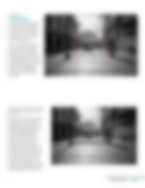
The first thing that catches<br />
my eye right away about<br />
this photo is the mistake of<br />
not using the rule of thirds<br />
properly or not using it at<br />
all. Let's take a look at the<br />
photo explanation:<br />
We should always aim to<br />
put our objects on vertical<br />
lines or on the meeting<br />
points where vertical and<br />
horizontal lines meet (this is<br />
for smaller objects). For this<br />
particular photo, we should<br />
be putting the ends of the<br />
side by side buildings on<br />
each of the vertical lines<br />
to make it more visually<br />
pleasing.<br />
Another pretty significant thing<br />
to improve in this photo is the<br />
asymmetry.<br />
As we can see from the photo<br />
explanation, we should base<br />
our symmetry around the<br />
imagined line that is set in the<br />
middle of the gap between<br />
the two parallel buildings.<br />
What does that mean? It<br />
means that this line should<br />
go through the center of<br />
our scene, slicing it into two<br />
identical halves. We should<br />
always tend to recreate what<br />
is on the left side of the line on<br />
the right side too. Of course,<br />
this is only applicable if the<br />
scene is set up to allow us to<br />
do that but this photo with the<br />
two parallel buildings of similar<br />
sizes is the perfect occasion.<br />
<strong>April</strong> <strong>2019</strong><br />
11