Viva Brighton Issue #78 August 2019

You also want an ePaper? Increase the reach of your titles
YUMPU automatically turns print PDFs into web optimized ePapers that Google loves.
CURATOR’S CITY<br />
...............................<br />
to see how Spence embraced the challenge of<br />
creating a smaller and more intimate church<br />
interior, while adhering to his guiding principle<br />
of powerful simplicity.<br />
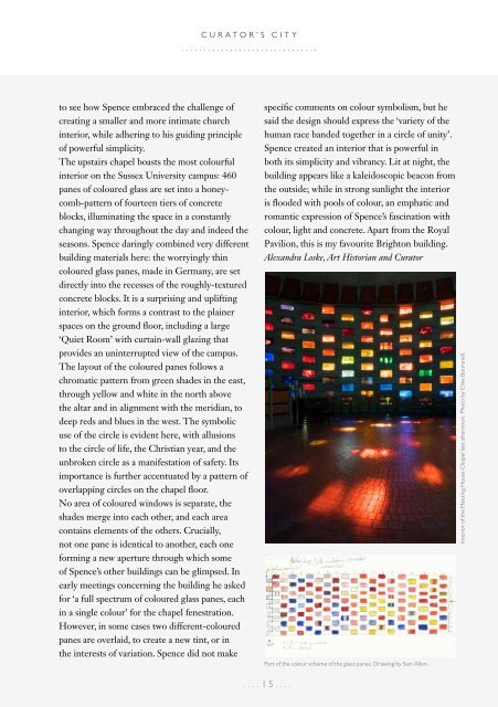
The upstairs chapel boasts the most colourful<br />
interior on the Sussex University campus: 460<br />
panes of coloured glass are set into a honeycomb-pattern<br />
of fourteen tiers of concrete<br />
blocks, illuminating the space in a constantly<br />
changing way throughout the day and indeed the<br />
seasons. Spence daringly combined very different<br />
building materials here: the worryingly thin<br />
coloured glass panes, made in Germany, are set<br />
directly into the recesses of the roughly-textured<br />
concrete blocks. It is a surprising and uplifting<br />
interior, which forms a contrast to the plainer<br />
spaces on the ground floor, including a large<br />
‘Quiet Room’ with curtain-wall glazing that<br />
provides an uninterrupted view of the campus.<br />
The layout of the coloured panes follows a<br />
chromatic pattern from green shades in the east,<br />
through yellow and white in the north above<br />
the altar and in alignment with the meridian, to<br />
deep reds and blues in the west. The symbolic<br />
use of the circle is evident here, with allusions<br />
to the circle of life, the Christian year, and the<br />
unbroken circle as a manifestation of safety. Its<br />
importance is further accentuated by a pattern of<br />
overlapping circles on the chapel floor.<br />
No area of coloured windows is separate, the<br />
shades merge into each other, and each area<br />
contains elements of the others. Crucially,<br />
not one pane is identical to another, each one<br />
forming a new aperture through which some<br />
of Spence’s other buildings can be glimpsed. In<br />
early meetings concerning the building he asked<br />
for ‘a full spectrum of coloured glass panes, each<br />
in a single colour’ for the chapel fenestration.<br />
However, in some cases two different-coloured<br />
panes are overlaid, to create a new tint, or in<br />
the interests of variation. Spence did not make<br />
specific comments on colour symbolism, but he<br />
said the design should express the ‘variety of the<br />
human race banded together in a circle of unity’.<br />
Spence created an interior that is powerful in<br />
both its simplicity and vibrancy. Lit at night, the<br />
building appears like a kaleidoscopic beacon from<br />
the outside; while in strong sunlight the interior<br />
is flooded with pools of colour, an emphatic and<br />
romantic expression of Spence’s fascination with<br />
colour, light and concrete. Apart from the Royal<br />
Pavilion, this is my favourite <strong>Brighton</strong> building.<br />
Alexandra Loske, Art Historian and Curator<br />
Part of the colour scheme of the glass panes. Drawing by Sam Allen.<br />
Interior of the Meeting House Chapel late afternoon. Photo by Clive Boursnell.<br />
....15....