Handbük

Create successful ePaper yourself
Turn your PDF publications into a flip-book with our unique Google optimized e-Paper software.
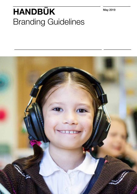
HANDBÜK<br />
Branding Guidelines<br />
May 2019
HANDBÜK<br />
Branding Guidelines<br />
3<br />
Contents<br />
Keywords<br />
Moodboard<br />
Colors<br />
Logos<br />
Corporate typefaces<br />
Visuals<br />
Social profiles<br />
Social posts<br />
Business card<br />
How to use the logo<br />
Logo exclusion zone<br />
Logo misuse<br />
6<br />
8<br />
10<br />
12<br />
16<br />
18<br />
22<br />
24<br />
26<br />
28<br />
30<br />
31
<strong>Handbük</strong><br />
<strong>Handbük</strong> provides a tactile solution for students with communication challenges in an educative<br />
environment with an optimistic voice. Helping them feel understood, valued and included in a community<br />
that gives a voice to misunderstood individuals.
HANDBÜK<br />
Branding Guidelines<br />
Keywords<br />
6 HANDBÜK<br />
Keywords<br />
7<br />
Branding Guidelines<br />
Tactile<br />
Inclusive<br />
Professional<br />
Observant<br />
Resourceful<br />
Optimistic<br />
Empowering Communication<br />
Balanced<br />
Respected<br />
Understood<br />
Self-reliant<br />
Dedicated<br />
Cohesive<br />
Considerate<br />
Passionate<br />
Bridging the autistic community<br />
Empathetic<br />
Communicative<br />
Valued<br />
Imaginative
HANDBÜK<br />
Branding Guidelines<br />
Moodboard 8 HANDBÜK<br />
Moodboard<br />
9<br />
Branding Guidelines
HANDBÜK<br />
Branding Guidelines<br />
Primary colors<br />
10 HANDBÜK<br />
Secondary colors<br />
11<br />
Branding Guidelines<br />
Primary Yellow<br />
#FFC205<br />
R 255 G 194 B 5<br />
C 0 M 25 Y 100 K 0<br />
Turquoise<br />
#7BE7C6<br />
R 123 G 231 B 198<br />
C 50 M 0 Y 40 K 0<br />
White<br />
#FFFFFF<br />
R 255 G 255 B 255<br />
C 0 M 0 Y 0 K 0<br />
Purple<br />
#380D94<br />
R 56 G 13 B 148<br />
C 100 M 100 Y 0 K 0
HANDBÜK<br />
Branding Guidelines<br />
Logo<br />
12
HANDBÜK<br />
Branding Guidelines<br />
Logo<br />
14
HANDBÜK<br />
Branding Guidelines<br />
Corporate typefaces<br />
16 Corporate typefaces<br />
Titolo Pagina<br />
17<br />
Futura Bold<br />
32pt<br />
NEVER GIVE UP ON A DREAM JUST<br />
BECAUSE OF THE TIME IT WILL TAKE<br />
TO ACCOMPLISH IT. THE TIME WILL<br />
PASS ANY WAY.<br />
Baskerville Regular<br />
10pt<br />
Suspendisse pulvinar volutpat lacus ac tincidunt. Pellentesque<br />
accumsan pharetra augue in egestas. Fusce eget tortor bibendum,<br />
venenatis nibh vitae, dapibus magna. Nam non lacus interdum<br />
dolor varius condimentum. Aliquam ullamcorper, diam id<br />
volutpat eleifend, lectus lorem placerat ipsum, non dictum ante<br />
velit vel ante. Donec accumsan nunc ac velit vulputate,<br />
vel dapibus nisi egestas.<br />
Donec viverra gravida augue. Sed id leo fermentum,<br />
condimentum mi sed, maximus mauris. Ut ac porttitor leo.<br />
Morbi sodales posuere nunc, nec ornare lacus placerat eu. Ut<br />
nec dignissim turpis. Maecenas eu mi in orci fringilla ultricies sit<br />
amet eu ex. Mauris auctor sagittis porttitor.<br />
ABCDEFGHIJKLMNOPQRSTUVWXYZ&<br />
abcdefghijklmnopqrstuvwxyz<br />
fifl1234567890<br />
$£.‚’‘–:;!?”“<br />
ABCDEFGHIJKLMNOPQRSTUVWXYZ&<br />
Baskerville Regular<br />
Baskerville Semibold<br />
abcdefghijklmnopqrstuvwxyz<br />
fifl1234567890<br />
$£.‚’‘–:;!?”“<br />
Baskerville Typeface<br />
Baskerville was developed in the 18th century by John Baskerville<br />
(1706–1775) and its clear, sharp image set it apart from others of<br />
its time. John Baskerville was a major figure in the improvement of<br />
print technique and typography and his work influenced the work<br />
of such famous designers as Didot in France and Bodoni in Italy.<br />
The fonts of John Baskerville were composed of more contrasting<br />
elements than any print characters that had been designed before.<br />
They needed finer paper and printing ink in order to display and<br />
highlight their details. Baskerville can often still be found in use in<br />
books and magazines.<br />
ABCDEFGHIJKLMNOPQRSTUV<br />
WXYZ1234567890<br />
$£.‚’‘–:;!?”“<br />
Futura Bold
AT THE END OF<br />
THE DAY, WE DON’T<br />
DREAM OUR LIVES...<br />
WE LIVE THEM.<br />
ANTHONY IANNI<br />
WWW.HANDBUK.COM
ANYONE WHO STOPS LEARNING IS OLD,<br />
WHETHER AT TWENTY OR EIGHTY.<br />
HENRY FORD<br />
WWW.HANDBUK.COM
HANDBÜK<br />
Branding Guidelines<br />
Facebook page<br />
22 HANDBÜK<br />
Instagram page<br />
23<br />
Branding Guidelines
HANDBÜK<br />
Branding Guidelines<br />
Social post<br />
24 HANDBÜK<br />
Social post<br />
25<br />
Branding Guidelines
HANDBÜK<br />
Branding Guidelines<br />
Business card<br />
26 HANDBÜK<br />
Business card<br />
27<br />
Branding Guidelines
HANDBÜK<br />
Branding Guidelines<br />
How to use the logo<br />
28 HANDBÜK<br />
How to use the logo<br />
29<br />
Branding Guidelines<br />
RGB Logo<br />
Use the logo in RGB for<br />
digital contexts:<br />
- Web<br />
- Mobile<br />
Logo<br />
Background Relation<br />
Use the logo in white<br />
when placed over a<br />
dark background, and in<br />
black when placed over a<br />
bright background<br />
It’s important to have as<br />
much contrast as possible<br />
CMYK Logo<br />
Use the logo in CMYK for<br />
print contexts:<br />
- Posters<br />
- Flyers<br />
- Cards<br />
Do not use the logo in<br />
colors which are not<br />
corporate
HANDBÜK<br />
Branding Guidelines<br />
Exclusion zone<br />
30 HANDBÜK<br />
Misuse of the logo<br />
31<br />
Branding Guidelines<br />
Do not use colored background as part of the logo<br />
Do not change the color of the logo<br />
No image or text closer than<br />
the outside rectangle<br />
Do not transform the logo<br />
Do not change the orientation of the logo<br />
Exclustion zone<br />
To ensure the logos are free to breathe, a clear area<br />
must be maintained around it at all times.<br />
No typography or imagery or other visual information<br />
should appear within this zone.<br />
Do not rearrange any proportion of the logo<br />
Do not outline the logo
33