

Racine Brand Identity Manual
- No tags were found...

You also want an ePaper? Increase the reach of your titles
YUMPU automatically turns print PDFs into web optimized ePapers that Google loves.
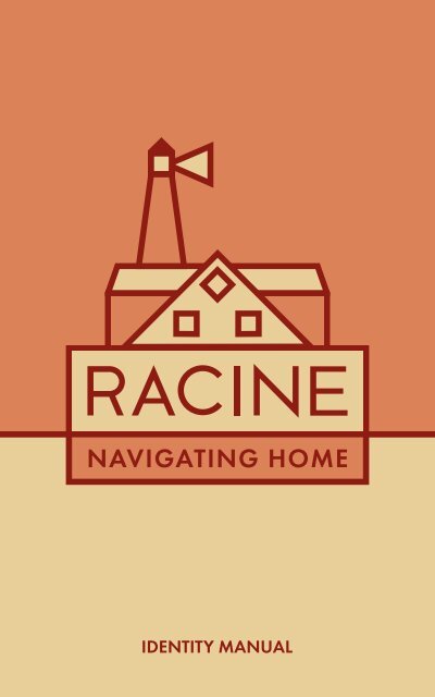
NAVIGATING HOME<br />
IDENTITY MANUAL<br />
1
CONTENTS<br />
Brief<br />
Problem Statement<br />
Existing Place <strong>Brand</strong>s<br />
Semiotic Research<br />
Iterations and Evaluation<br />
Slogan<br />
Typography<br />
Color Palette<br />
Proper Usage<br />
Improper Usage<br />
Application<br />
4<br />
5<br />
6-7<br />
8-13<br />
14-19<br />
20-21<br />
22<br />
23<br />
24-29<br />
30-31<br />
32-38<br />
2<br />
3
DEVELOP A BRAND<br />
TO REPRESENT<br />
YOUR HOME TOWN<br />
PROBLEM STATEMENT<br />
<strong>Racine</strong>, Wisconsin is a lakeside southeastern Wisconsin city with a population<br />
of about 80,000 people.<br />
While the city has many distinctive features—it’s one of North America’s<br />
cleanest beaches at North Beach, it is home to three works of architecture<br />
by Frank Lloyd Wright and it distributes nationally-renowned Danish<br />
pastries called kringle—its “Real <strong>Racine</strong>” brand blends in with many<br />
other Wisconsin lakeside towns and cities. The current mark doesn’t<br />
introduce the city beyond some waves, and the city’s slogan does not<br />
pair with the mark.<br />
With this project, I aim to rebrand <strong>Racine</strong> with a mark that honors its<br />
heritage and its modern progress and relevance. <strong>Racine</strong> is full of history<br />
yet progressing forward, it is a warm light alongside the blue of Lake<br />
Michigan, and it is a home to many as well as a beacon to those looking<br />
to return, or move here for new opportunities.<br />
Emphasizing and balancing these qualities in the mark and brand, I aim to<br />
establish a brand that will resonate with Racinians as well as attracting<br />
tourism and new community members to call <strong>Racine</strong> home.<br />
5
EXISTING PLACE BRANDS<br />
RACINE<br />
As <strong>Racine</strong>’s closest<br />
and most comparable neighbor<br />
with a population of just under<br />
100,000, Kenosha has many<br />
similar qualities to <strong>Racine</strong>,<br />
making it more important to<br />
differentiate the two.<br />
LACROSSE<br />
With a population of 50,000,<br />
La Crosse is notable<br />
in Wisconsin for its collegiate<br />
population and position on<br />
the border of Minnesota.<br />
Its mark and brand<br />
are more traditional.<br />
KENOSHA<br />
As <strong>Racine</strong>’s closest<br />
and most comparable neighbor<br />
with a population of just under<br />
100,000, Kenosha has many<br />
similar qualities to <strong>Racine</strong>,<br />
making it more important<br />
to differentiate the two.<br />
MILWAUKEE<br />
While Milwaukee is significantly<br />
larger in size than <strong>Racine</strong>,<br />
its vicinity to <strong>Racine</strong> is significant.<br />
With a population of 600,000,<br />
it is a larger city but tourists<br />
and potential homeowners<br />
could look to <strong>Racine</strong><br />
for a smaller feel/charm.<br />
EAU CLAIRE<br />
While Eau Claire’s population<br />
is smaller than <strong>Racine</strong>’s at 70,000,<br />
Eau Claire attracts a young adult<br />
crowd at its annual music festival.<br />
Its mark is accordingly<br />
playful and bright.<br />
OSHKOSH<br />
OshKosh has a population<br />
of 66,000 and is another<br />
university city in Wisconsin.<br />
It has branded itself as<br />
“Wisconsin’s Event City”.<br />
6<br />
7
SEMIOTIC RESEARCH<br />
SEMANTIC ICON INDEX SYMBOL SEMANTIC ICON INDEX SYMBOL<br />
French<br />
Relating to<br />
France, its<br />
people or<br />
heritage.<br />
Language<br />
Settlement<br />
Heritage<br />
Origin<br />
Origin<br />
Suburban<br />
Pertaining<br />
to; inhabiting<br />
a suburb or<br />
suburbs of a<br />
small town<br />
Outer City<br />
Surrounding<br />
Separate<br />
Space<br />
Surrounding<br />
Diverse<br />
Different<br />
social, cultural,<br />
economic<br />
groups<br />
Differing<br />
Mix<br />
Assorted<br />
Multitude<br />
Mixed<br />
Active<br />
Engaged in<br />
action and energetic<br />
work<br />
Energetic<br />
Action<br />
Lively<br />
Eventful<br />
Eventful<br />
Lakeside<br />
Located next<br />
to a Great<br />
Lake<br />
Beach<br />
Coast<br />
Lakefront<br />
Waves<br />
Sand<br />
Waves<br />
Predictable<br />
Expected,<br />
especially on<br />
basis of previous<br />
behavior<br />
Expected<br />
Repeated<br />
Ordinary<br />
Foreseen<br />
Anticipated<br />
Expected<br />
Midwestern<br />
Relating to<br />
the Midwes;<br />
sterotypes of<br />
the Midwest<br />
Midwest<br />
Kind<br />
Ope<br />
Don’t Ya Know<br />
Ope<br />
Welcoming<br />
A greeting<br />
with kindness<br />
or reception<br />
Accessible<br />
Approachable<br />
Open door<br />
Come-in<br />
Approachable<br />
Urban<br />
Designating<br />
a city<br />
Downtown<br />
Inner City<br />
Public<br />
Buildings<br />
Populated<br />
Downtown<br />
Artistic<br />
Having<br />
aesthetic<br />
considerations<br />
Creative<br />
Aesthetic<br />
Decorative<br />
Tasteful<br />
Creative<br />
8<br />
9
SEMIOTIC RESEARCH<br />
SYNTACTIC ICON INDEX SYMBOL SYNTACTIC ICON INDEX SYMBOL<br />
Uptown<br />
Upper part of<br />
a city—<br />
characterized<br />
as stylish<br />
or artistic.<br />
Murals<br />
Redefined<br />
Colorful<br />
Returned<br />
Murals<br />
Lake Michigan<br />
Third-largest<br />
of the<br />
Great Lakes<br />
in North<br />
America<br />
Body<br />
Water<br />
Fresh<br />
Great Lake<br />
Fresh Water<br />
Lighthouse<br />
Structure with<br />
bright light<br />
for guidance<br />
of ships<br />
Guidance<br />
Light<br />
Monument<br />
Project<br />
Signify<br />
Signify<br />
City<br />
A large or<br />
important<br />
town; type of<br />
municipality<br />
Large<br />
Important<br />
Municipal<br />
Urban<br />
Urban<br />
Kewpee’s<br />
Diner in<br />
business since<br />
the 1920’s,<br />
offering burgers,<br />
shakes<br />
Burgers<br />
Baby dolls<br />
Tile<br />
Pink<br />
Vintage<br />
Baby Dolls<br />
Kringle<br />
A Scandanavian<br />
pastry,<br />
a Nordic<br />
sweet variety<br />
of pretzel<br />
O&H Bakery<br />
Tradition<br />
Pastry<br />
Heritage<br />
Hygge<br />
O&H Bakery<br />
Frank Lloyd<br />
Wright<br />
American<br />
architect and<br />
designer,<br />
born in<br />
Wisconsin<br />
American<br />
Prairie<br />
Organic<br />
Wisconsinite<br />
Prairie<br />
North Beach<br />
Fifty acres of<br />
beach<br />
on the <strong>Racine</strong><br />
lakefront<br />
Fresh water<br />
Clean<br />
Oasis<br />
Family-friendly<br />
Blue<br />
Clean<br />
<strong>Racine</strong> Art<br />
Museum<br />
Museum Craft<br />
holding nation’s Modern<br />
largest contemporary<br />
Clay<br />
3D<br />
craft collection Contemporary<br />
10<br />
Craft<br />
River Bend<br />
Nature<br />
preserve in<br />
Caledonia,<br />
within <strong>Racine</strong><br />
11<br />
Trees<br />
River<br />
Peace<br />
Trail<br />
Trail
SEMIOTIC RESEARCH<br />
PRAGMATIC ICON INDEX SYMBOL PRAGMATIC ICON INDEX SYMBOL<br />
Root<br />
To implant<br />
or establish<br />
deeply;<br />
“racine” in<br />
French<br />
Plant<br />
Stay<br />
Lodge<br />
Engrain<br />
Grow<br />
Grow<br />
Leave<br />
To go out<br />
or away from<br />
Exit<br />
Go away<br />
Depart<br />
Abandon<br />
Quit<br />
Abandon<br />
Sail<br />
To move<br />
along or travel<br />
over water<br />
Navigate<br />
Drift<br />
Float<br />
Embark<br />
Embark<br />
Retain<br />
To continue<br />
to keep<br />
possession of<br />
Keep<br />
Continue<br />
Maintain<br />
Stay<br />
Stay<br />
Hike<br />
To walk or<br />
march a<br />
distance for<br />
pleasure<br />
Walk<br />
March<br />
Explore<br />
Engage<br />
Immerse<br />
Explore<br />
Engage<br />
To cause to<br />
approach,<br />
adhere<br />
or unite<br />
Catch<br />
Fascinate<br />
Attract<br />
Participate<br />
Preoccupy<br />
Participate<br />
Support<br />
To sustain<br />
or withstand;<br />
serve as<br />
foundation<br />
Contribute<br />
Sustain<br />
Reinforce<br />
Ground<br />
Sustain<br />
Swim<br />
To move in<br />
water using<br />
limbs, fins, tail<br />
or other<br />
Movement<br />
Waves<br />
Float<br />
Drift<br />
Float<br />
Shop<br />
To visit shops<br />
and stores<br />
to purchase<br />
or examine<br />
goods<br />
Buy<br />
Purchase<br />
Market<br />
Contribute<br />
Contribute<br />
Highlight<br />
To emphasize<br />
or make<br />
prominent<br />
Feature<br />
Focus<br />
Emphasize<br />
Feature<br />
12<br />
13
ITERATIONS<br />
SPROUT<br />
The Sprout iteration<br />
stems from the concept<br />
that “racine” translates to “root”<br />
in French, and the sprout<br />
resembles an ‘r’. The idea looked<br />
too cliché in the end.<br />
WAVES #2<br />
Here, I decided to simplify<br />
the Waves iteration with only<br />
one wave below the baseline.<br />
FRANK LLOYD WRIGHT<br />
This idea is based on<br />
the SC Johnson Tower<br />
designed by Frank Lloyd Wright<br />
in <strong>Racine</strong>. I liked the idea of<br />
incorporating the building<br />
and upward movement.<br />
The concept did not translate.<br />
WAVES #3<br />
I explored a change in typeface,<br />
and further developed the wave<br />
approach. The main problem<br />
with this iteration<br />
is how the ‘i’ looks like a ‘j’.<br />
WAVES #1<br />
This Waves concept is based on<br />
how the Root River in <strong>Racine</strong><br />
flows into Lake Michigan.<br />
racine<br />
LIGHTHOUSE #1<br />
I aimed to create<br />
a modern take on a lighthouse,<br />
using geometric shapes and<br />
typography, as well as<br />
noticeable negative space.<br />
14<br />
15
ITERATIONS<br />
LIGHTHOUSE #2<br />
In this iteration,<br />
I simplified the base of the lighthouse,<br />
while keeping the modern<br />
feel and negative space.<br />
I switched to an uppercase<br />
lettermark for more impact.<br />
LIGHTHOUSE #4<br />
In the process of adding color,<br />
I inverted elements of the mark<br />
to discover how well its inverse<br />
might scale and function.<br />
Scaling became an issue<br />
with this version.<br />
RACINE<br />
LIGHTHOUSE #3<br />
I closed the extra negative space<br />
in the mark to give it a “home”.<br />
I also began developing a custom<br />
lettermark typeface,<br />
inspired by Futura and Averta.<br />
LIGHTHOUSE #5<br />
Minus a few tweaks, I arrived at<br />
a mark containing a system of<br />
connected shapes and strokes.<br />
16<br />
17
BLACK AND WHITE<br />
COLOR<br />
3” IN HEIGHT 3” IN HEIGHT<br />
0.75” IN HEIGHT 0.75” IN HEIGHT<br />
18<br />
19
SLOGAN<br />
NAVIGATING HOME<br />
“Home” is a less definitive term than it once was. In branding my hometown,<br />
I looked to create a mark rooted in <strong>Racine</strong>’s heritage and sense of<br />
home, while channeling a modern and progressive feel. While navigation<br />
takes you somewhere new, it can also often lead you home.<br />
SLOGAN ITERATIONS<br />
Lighting a Path Forward<br />
Illuminating What’s Next<br />
Heritage and Progress<br />
Building Upward and Onward<br />
Navigating Home to Progress<br />
SLOGAN APPLICATION<br />
The slogan can be paired<br />
with the entire mark<br />
or only the rectangle filled with<br />
“RACINE”. It cannot be detached<br />
from the mark completely.<br />
NAVIGATING HOME<br />
SLOGAN APPLICATION EXAMPLE<br />
20<br />
21
TYPOGRAPHY<br />
COLOR PALETTE<br />
CUSTOM TYPE<br />
The custom lettermark developed for “<strong>Racine</strong>” is inspired by Futura and<br />
Averta typefaces, as well as the elements in the mark.<br />
FUTURA PT DEMI<br />
Aa Bb Cc Dd Ee Ff Gg Hh Ii Jj<br />
Kk Ll Mm Nn Oo Pp Qq Rr Ss<br />
Tt Uu Vv Ww Xx Yy Zz 1 2 3<br />
4 5 6 7 8 9 ! ? / $ # & *<br />
GILL SANS REGULAR<br />
Aa Bb Cc Dd Ee Ff Gg Hh Ii Jj Kk<br />
Ll Mm Nn Oo Pp Qq Rr Ss Tt Uu<br />
Vv Ww Xx Yy Zz 1 2 3 4 5 6 7 8<br />
9 ! ? / $ # & *<br />
MAROON<br />
Use for headlines and<br />
subheaders, outlines<br />
#8f1c12<br />
CMYK 27, 98, 100, 29<br />
RGB 143, 28, 18<br />
PMS 187 C<br />
SALMON<br />
Use for illustration or<br />
background color<br />
#db8259<br />
CMYK 11,58, 70, 1<br />
RGB 219, 130, 89<br />
PMS 2024 C<br />
Futura PT Demi is used<br />
in the headlines and subheaders<br />
in the brand. It is always uppercase<br />
and maroon (or occasionally<br />
tan on a maroon background).<br />
Gill Sans Regular is used<br />
in the body text in the brand,<br />
in black (or occasionally tan on a<br />
maroon background).<br />
BLACK<br />
Use for body text<br />
#000000<br />
CMYK 100, 100, 100, 100<br />
RGB 0, 0, 0<br />
PMS C<br />
SAND<br />
Use in illustrations or on<br />
maroon background<br />
#e8cf99<br />
CMYK 9, 16, 45, 0<br />
RGB 232, 207, 153<br />
PMS 155 C<br />
22<br />
23
PROPER USAGE<br />
LOGO IN COLOR<br />
For use when it is the second<br />
use on an application or when a<br />
smaller/simpler look is needed<br />
MARK IN COLOR<br />
Primary Use<br />
MARK IN BLACK AND WHITE<br />
NAVIGATING HOME<br />
MARK AND SLOGAN<br />
IN COLOR<br />
LOGO IN BLACK AND WHITE<br />
24<br />
25
PROPER USAGE<br />
NAVIGATING HOME<br />
PROPER SPACING MARK<br />
Spacing should be the size of<br />
the “Navigating Home”<br />
slogan Box on all sides of<br />
the mark in its different forms.<br />
PROPER SPACING MARK<br />
AND SLOGAN<br />
PROPER SPACING LOGO<br />
26<br />
27
PROPER USAGE<br />
NAVIGATING HOME<br />
LANDSCAPE MARK<br />
The spacing around the mark may<br />
be infringed upon by a landscape<br />
horizon line, as depicted above.<br />
ILLUSTRATIVE APPLICATION<br />
The portion of the mark above the<br />
logo may be used illustratively in<br />
applications like shown above.<br />
28<br />
29
IMPROPER USAGE<br />
DO NOT DISTORT OR TILT<br />
DO NOT APPLY A GRADIENT<br />
OR DROP SHADOW<br />
DO NOT CHANGE COLOR<br />
OR FILL<br />
DO NOT CHANGE<br />
PROPORTIONS<br />
30<br />
31
APPLICATION<br />
City Hall<br />
730 Washington Ave.<br />
<strong>Racine</strong>, WI 53403<br />
(262) 636-9101<br />
City Hall<br />
730 Washington Ave.<br />
<strong>Racine</strong>, WI 53403<br />
(262) 636-9101<br />
May 4, 2020<br />
<strong>Racine</strong> City Council<br />
555 Kennedy Dr.<br />
<strong>Racine</strong>, WI 53406<br />
Dear City Council,<br />
NAVIGATING HOME<br />
As you know, <strong>Racine</strong>, Wisconsin is a lakeside southeastern Wisconsin city with a population of about 80,000 people.<br />
While the city has many distinctive features—it’s one of North America’s cleanest beaches at North Beach, it is home to three works<br />
of architecture by Frank Lloyd Wright and it distributes nationally-renowned Danish pastries called kringle—its “Real <strong>Racine</strong>” brand<br />
blends in with many other Wisconsin lakeside towns and cities. The current mark doesn’t introduce the city beyond some waves, and<br />
the city’s slogan does not pair with the mark.<br />
With this project, I aim to rebrand <strong>Racine</strong> with a mark that honors its heritage and its modern progress and relevance. <strong>Racine</strong> is full of<br />
history yet progressing forward, it is a warm light alongside the blue of Lake Michigan, and it is a home to many as well as a beacon to<br />
those looking to return, or move here for new opportunities.<br />
BUSINESS CARD<br />
2” X 3.5”<br />
Emphasizing and balancing these qualities in the mark and brand, I aim to establish a brand that will resonate with Racinians as well as<br />
attracting tourism and new community members to call <strong>Racine</strong> home. I hope that you will see this brand manual as the first step in a<br />
collaboration between us to redefine the reflection of what this city might mean to its inhabitants and potential visitors. A clear and cohesive<br />
brand identity can have real economic and social impact on a city. With the goal of making <strong>Racine</strong> a more desirable place to be for<br />
its own inhabitants and visitors like, I hope you will take careful consideration to the proposal of the Navigating Home brand for <strong>Racine</strong>.<br />
Thank you for your consideration, and please contact me to coordinate next steps. I look forward to working with you!<br />
Regards,<br />
Nicole Shields<br />
BUSINESS ENVELOPE<br />
4.25” X 9.25”<br />
NAVIGATING HOME<br />
LETTERHEAD<br />
8.5” X 11”<br />
32<br />
33
APPLICATION<br />
City Hall<br />
730 Washington Ave.<br />
<strong>Racine</strong>, WI 53403<br />
(262) 636-9101<br />
BUSINESS ENVELOPE<br />
9.25” X 4.25”<br />
WEBSITE HOMEPAGE<br />
APP HOMESCREEN<br />
SNAPCHAT FILTER<br />
34<br />
35
APPLICATION<br />
MUG<br />
TOTE<br />
T-SHIRT AND CREWNECK<br />
36<br />
37
APPLICATION<br />
SHOPPING BAG<br />
LAMP POST BANNER<br />
38<br />
39
City Hall<br />
730 Washington Ave.<br />
<strong>Racine</strong>, WI 53403<br />
(262) 636-9101<br />
40


