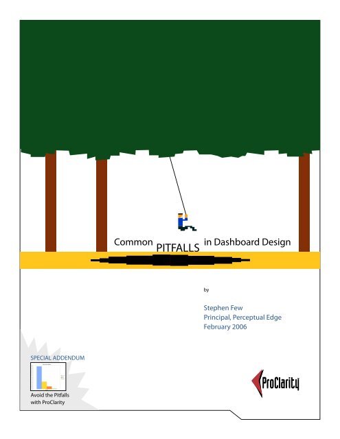
Common Pitfalls in Dashboard Design - Perceptual Edge
Common Pitfalls in Dashboard Design - Perceptual Edge
Common Pitfalls in Dashboard Design - Perceptual Edge

You also want an ePaper? Increase the reach of your titles
YUMPU automatically turns print PDFs into web optimized ePapers that Google loves.
SPECIAL ADDENDUM<br />
Avoid the <strong>Pitfalls</strong><br />
with ProClarity<br />
EMBARKING ON A<br />
NEW JOURNEY<br />
<strong>Common</strong> <strong>in</strong> <strong>Dashboard</strong> <strong>Design</strong><br />
PITFALLS<br />
by<br />
Stephen Few<br />
Pr<strong>in</strong>cipal, <strong>Perceptual</strong> <strong>Edge</strong><br />
February 2006
TABLE OF CONTENTS<br />
This white paper is for <strong>in</strong>formational purposes only. PROCLARITY MAKES NO WARRANTIES, EXPRESS OR IMPLIED, IN THIS<br />
DOCUMENT. It may not be duplicated, reproduced, or transmitted <strong>in</strong> whole or <strong>in</strong> part without the express permission of the<br />
ProClarity Corporation, 500 South 10th Street, Boise, Idaho 83702. For more <strong>in</strong>formation, contact ProClarity: <strong>in</strong>fo@proclarity.<br />
com; Phone: 208-343-1630. All rights reserved. All op<strong>in</strong>ions and estimates here<strong>in</strong> constitute our judgment as of this date and<br />
are subject to change without notice.<br />
© 2005 ProClarity Corporation. All rights reserved. No portion of this report may be reproduced or stored <strong>in</strong> any form without prior written permission.<br />
Executive Summary ......................................................................................................1<br />
Introduction ....................................................................................................................2<br />
What Is a <strong>Dashboard</strong>? ..................................................................................................2<br />
What Is So Hard about <strong>Design</strong><strong>in</strong>g <strong>Dashboard</strong>s? ................................................2<br />
13 <strong>Common</strong> <strong>Pitfalls</strong> <strong>in</strong> <strong>Dashboard</strong> <strong>Design</strong> ...........................................................3<br />
Pitfall #1: Exceed<strong>in</strong>g the Boundaries of a S<strong>in</strong>gle Screen ............................4<br />
Pitfall #2: Supply<strong>in</strong>g Inadequate Context for the Data ...............................5<br />
Pitfall #3: Display<strong>in</strong>g Excessive Detail or Precision .......................................5<br />
Pitfall #4: Express<strong>in</strong>g Measures Indirectly .......................................................6<br />
Pitfall #5: Choos<strong>in</strong>g Inappropriate Media of Display ...................................8<br />
Pitfall #6: Introduc<strong>in</strong>g Mean<strong>in</strong>gless Variety ....................................................9<br />
Pitfall #7: Us<strong>in</strong>g Poorly <strong>Design</strong>ed Display Media ..........................................9<br />
Pitfall #8: Encod<strong>in</strong>g Quantitative Data Inaccurately ................................. 10<br />
Pitfall #9: Arrang<strong>in</strong>g the Data Poorly .............................................................. 11<br />
Pitfall #10: Ineffectively Highlight<strong>in</strong>g What’s Important ......................... 12<br />
Pitfall #11: Clutter<strong>in</strong>g the Screen with Useless Decoration .................... 12<br />
Pitfall #12: Misus<strong>in</strong>g or Overus<strong>in</strong>g Color ....................................................... 13<br />
Pitfall #13: <strong>Design</strong><strong>in</strong>g an Unappeal<strong>in</strong>g Visual Display ............................. 14<br />
The Key to <strong>Dashboard</strong> Effectiveness ................................................................... 15<br />
About the Author ....................................................................................................... 16<br />
Addendum from ProClarity Corporation<br />
Avoid the <strong>Common</strong> <strong>Pitfalls</strong> of <strong>Dashboard</strong> <strong>Design</strong> with ProClarity ........... 17<br />
Avoid Pitfall #1 with ProClarity Custom Templates ................................... 17<br />
Avoid Pitfall #4 with ProClarity KPI <strong>Design</strong>er .............................................. 19<br />
Avoid Pitfall #5 with ProClarity Charts and Formatt<strong>in</strong>g Options ......... 25<br />
Avoid Pitfall #8 (Encod<strong>in</strong>g Quantitative Data Inaccurately) with<br />
ProClarity Chart Properties ................................................................................ 26<br />
Summary .................................................................................................................. 28<br />
www.proclarity.com
EXECUTIVE SUMMARY<br />
<strong>Dashboard</strong>s have become a popular means to deliver important <strong>in</strong>formation at a glance, but this potential is rarely realized.<br />
Even the best dashboard software <strong>in</strong> the world will not produce a useful dashboard if it doesn’t <strong>in</strong>corporate effective visual<br />
design. Any dashboard that fails to deliver the <strong>in</strong>formation that people need clearly and quickly will never be used, no matter<br />
how cute its gauges, meters, and traffic lights. Effective dashboards are the product of <strong>in</strong>formed visual design.<br />
Based on his new book, Information <strong>Dashboard</strong> <strong>Design</strong>: The Effective Visual Display of Data, Stephen Few will lead you through<br />
a quick tour of the 13 most common pitfalls <strong>in</strong> the visual design of dashboards. Know<strong>in</strong>g what doesn’t work will help you<br />
avoid the problems that resign most dashboards to the trash heap.<br />
You Will Learn:<br />
• What dashboards are, what they should do, and why they’re important<br />
• The primary goals and challenges of dashboard design<br />
• The 13 most common mistakes <strong>in</strong> the visual design of dashboards<br />
• The importance of design<strong>in</strong>g dashboards that are aligned with the way people see and th<strong>in</strong>k<br />
ProClarity sponsored this white paper to help people better understand the concept of a bus<strong>in</strong>ess <strong>in</strong>telligence dashboard<br />
and how to effectively present quantitative <strong>in</strong>formation <strong>in</strong> general or while us<strong>in</strong>g ProClarity bus<strong>in</strong>ess <strong>in</strong>telligence solutions.<br />
© 2005 <strong>Perceptual</strong> <strong>Edge</strong><br />
1
INTRODUCTION<br />
Despite their tremendous popularity and potential, many and perhaps most dashboard implementations fail miserably. A<br />
dashboard’s entire purpose is to communicate important <strong>in</strong>formation clearly, accurately, and efficiently, but most dashboards<br />
say too little, and what they do say requires far too much effort to discern. This is a failure more of design than technology.<br />
Fundamentally, it is a failure of visual design.<br />
Brows<strong>in</strong>g the many examples of dashboards that can be found on the Internet, especially on the sites of companies that<br />
market dashboard software, you will f<strong>in</strong>d a bevy of flashy displays show<strong>in</strong>g off cute gauges, meters, and traffic lights, but<br />
rarely will you f<strong>in</strong>d dashboards that really communicate. The reason examples like this dom<strong>in</strong>ate is simple: flash sells. But<br />
does it work? The first day that you put a dashboard of this type <strong>in</strong> front of real bus<strong>in</strong>ess people, they’ll “ooooo and ahhhhhh,”<br />
delighted by its video-gamish appeal, but by the end of the week its superficial luster will fade and they’ll stop look<strong>in</strong>g at it<br />
altogether if it fails to give them the <strong>in</strong>formation they need <strong>in</strong> a manner that is clear, accurate, and easy to monitor at a glance.<br />
In my work as an <strong>in</strong>formation design consultant, teacher, and writer, I’ve focused a great deal on dashboards <strong>in</strong> the last two<br />
years. In the course of this work, I’ve identified a list of the 13 most common pitfalls <strong>in</strong> the visual design of dashboards that<br />
you should avoid if you want yours to communicate effectively. Before we launch <strong>in</strong>to this, however, let’s get our term<strong>in</strong>ology<br />
straight.<br />
WHAT IS A DASHBOARD?<br />
I began work<strong>in</strong>g with what we today call dashboards long before we started call<strong>in</strong>g them by this name. About two years ago,<br />
I decided to pay special attention to the unique opportunities that dashboards provide for bus<strong>in</strong>ess communication and the<br />
unique challenges that they present <strong>in</strong> visual <strong>in</strong>formation design. I became frustrated immediately however, by the fact that a<br />
great deal was be<strong>in</strong>g said about them—especially a great deal of market<strong>in</strong>g hype—but no one was actually say<strong>in</strong>g what they<br />
were. It’s easy to claim that you have the best dashboard software when you haven’t bothered to def<strong>in</strong>e what a dashboard<br />
is. I decided that a good work<strong>in</strong>g def<strong>in</strong>ition was needed, so I did some research and spent many hours th<strong>in</strong>k<strong>in</strong>g about it, and<br />
then offered one of my own that was orig<strong>in</strong>ally published <strong>in</strong> the March 2004 edition of Intelligent Enterprise magaz<strong>in</strong>e <strong>in</strong> an<br />
article entitled “<strong>Dashboard</strong> Confusion.” Here it is:<br />
© 2005 <strong>Perceptual</strong> <strong>Edge</strong><br />
A dashboard is a visual display of the most important <strong>in</strong>formation needed to achieve one or more objectives,<br />
consolidated and arranged on a s<strong>in</strong>gle screen so the <strong>in</strong>formation can be monitored at a glance.<br />
I’ve attempted to provide a def<strong>in</strong>ition that dist<strong>in</strong>guishes dashboards from other displays that also comb<strong>in</strong>e multiple pieces<br />
of <strong>in</strong>formation on a computer screen, as well as one that does not too narrowly limit the <strong>in</strong>formation that can be displayed or<br />
the view<strong>in</strong>g audience it can serve.<br />
<strong>Dashboard</strong>s consolidate onto a s<strong>in</strong>gle screen the sometimes disparate <strong>in</strong>formation that someone needs to monitor to do a<br />
job. This s<strong>in</strong>gle-screen display need not be comprehensive <strong>in</strong> and of itself, but it must provide the overview that is needed<br />
to know when action is required, and ideally should provide an easy gateway to any additional <strong>in</strong>formation that is needed<br />
to determ<strong>in</strong>e the precise action that is appropriate. <strong>Dashboard</strong>s tend to be highly visual (that is, graphical) <strong>in</strong> the way they<br />
present <strong>in</strong>formation, not because it is cute or enterta<strong>in</strong><strong>in</strong>g, but because when presented properly, pictures of data can be<br />
scanned and understood much faster than the same data presented as text.<br />
WHAT IS SO HARD ABOUT DESIGNING DASHBOARDS?<br />
I spend a great deal of my time teach<strong>in</strong>g people how to communicate quantitative bus<strong>in</strong>ess data effectively <strong>in</strong> the form<br />
of graphs—a skill set that is not common, despite the huge production of graphs <strong>in</strong> bus<strong>in</strong>ess today. The type of graphical<br />
communication that is typically required <strong>in</strong> bus<strong>in</strong>ess is not difficult to learn how to do, but it doesn’t come naturally.<br />
<strong>Design</strong><strong>in</strong>g <strong>in</strong>dividual graphs is simple compared to design<strong>in</strong>g entire dashboards. Try<strong>in</strong>g to get all that <strong>in</strong>formation on a s<strong>in</strong>gle<br />
screen <strong>in</strong> a way that doesn’t end up look<strong>in</strong>g like a cluttered mess isn’t easy. If you th<strong>in</strong>k it is, chances are you haven’t actually<br />
tried to do it.<br />
2
<strong>Dashboard</strong>s that communicate clearly, accurately, and efficiently are the result of careful and <strong>in</strong>formed visual design. Given<br />
the purpose that dashboards serve, as def<strong>in</strong>ed above, they must be designed to support the follow<strong>in</strong>g process of visual<br />
monitor<strong>in</strong>g:<br />
1. See the big picture.<br />
2. Focus <strong>in</strong> on the specific items of <strong>in</strong>formation that need attention.<br />
3. Quickly drill <strong>in</strong>to additional <strong>in</strong>formation that is needed to take action.<br />
Step #3 can be supported through convenient l<strong>in</strong>ks to additional <strong>in</strong>formation, but steps #1 and #2 require visual design<br />
that allows viewers to scan a great deal of <strong>in</strong>formation quickly to get an overview, easily recognize those items that demand<br />
attention, and then get enough <strong>in</strong>formation about those items to assess the potential need for a response. To achieve this<br />
end, it helps to recognize and avoid the common mistakes <strong>in</strong> dashboard design that often get <strong>in</strong> the way.<br />
13 COMMON PITFALLS IN DASHBOARD DESIGN<br />
© 2005 <strong>Perceptual</strong> <strong>Edge</strong><br />
Figure 1: The greatest challenge of dashboard design <strong>in</strong>volves squeez<strong>in</strong>g all of that<br />
Know<strong>in</strong>g what to avoid isn’t everyth<strong>in</strong>g, but it’s a good start. Here’s a list of the 13 mistakes that I’ll describe <strong>in</strong> detail:<br />
1. Exceed<strong>in</strong>g the boundaries of a s<strong>in</strong>gle screen<br />
2. Supply<strong>in</strong>g <strong>in</strong>adequate context for the data<br />
3. Display<strong>in</strong>g excessive detail or precision<br />
4. Express<strong>in</strong>g measures <strong>in</strong>directly<br />
5. Choos<strong>in</strong>g <strong>in</strong>appropriate media of display<br />
6. Introduc<strong>in</strong>g mean<strong>in</strong>gless variety<br />
7. Us<strong>in</strong>g poorly designed display media<br />
8. Encod<strong>in</strong>g quantitative data <strong>in</strong>accurately<br />
9. Arrang<strong>in</strong>g the data poorly<br />
10. Ineffectively highlight<strong>in</strong>g what’s important<br />
11. Clutter<strong>in</strong>g the screen with useless decoration<br />
12. Misus<strong>in</strong>g or overus<strong>in</strong>g color<br />
13. <strong>Design</strong><strong>in</strong>g an unappeal<strong>in</strong>g visual display<br />
<strong>in</strong>formation on a s<strong>in</strong>gle screen <strong>in</strong> a way that doesn’t result <strong>in</strong> a cluttered mess.<br />
Let’s dive <strong>in</strong>. Every one of these pitfalls is illustrated with an example from an actual dashboard that I found on the Web site of<br />
a software vendor, with the one exception of pitfall #4.<br />
3
PITFALL #1: EXCEEDING THE BOUNDARIES OF A SINGLE SCREEN<br />
Someth<strong>in</strong>g powerful happens when <strong>in</strong>formation is seen together, at the same time. Not only does this provide convenience<br />
for viewers and save them valuable time, it also pa<strong>in</strong>ts a complete picture that can br<strong>in</strong>g to light important connections that<br />
might not be visible otherwise. Someth<strong>in</strong>g critical is sacrificed when the viewer must lose sight of some data <strong>in</strong> order to scroll<br />
down or over, or move from screen to screen to see the rest. Part of the problem is that we can only hold a few chunks of<br />
<strong>in</strong>formation at a time <strong>in</strong> short-term memory. Rely<strong>in</strong>g on the m<strong>in</strong>d’s eye to reta<strong>in</strong> a visualization that is no longer visible is a<br />
limited venture. One of the great benefits of a dashboard is the simultaneity of vision, the ability to see everyth<strong>in</strong>g you need<br />
at once.<br />
Besides design<strong>in</strong>g a dashboard that requires scroll<strong>in</strong>g around to see everyth<strong>in</strong>g, data is often fragmented <strong>in</strong>to separate<br />
screens. The dashboard below fragments the data that a sales executive might need to monitor <strong>in</strong>to t<strong>in</strong>y slices selected<br />
through the use of radio buttons or list boxes. For <strong>in</strong>stance, to see the seven major metrics that are displayed <strong>in</strong> the upper left<br />
corner of the screen, the viewer must select and view them separate, never together. The same is true for product revenue,<br />
regional revenue, etc. With this design, the viewer can never compare the performance of products or regions, which is a<br />
common need. Splitt<strong>in</strong>g the big picture <strong>in</strong>to a series of separate small pictures is a mistake when see<strong>in</strong>g the big picture is<br />
worthwhile.<br />
© 2005 <strong>Perceptual</strong> <strong>Edge</strong><br />
Figure 2: This sales dashboard fragments the data <strong>in</strong>to many slices by requir<strong>in</strong>g the viewer to<br />
select <strong>in</strong>dividual pieces without any means to see the whole.<br />
4
PITFALL #2: SUPPLYING INADEQUATE CONTEXT FOR THE DATA<br />
As a means to monitor what’s go<strong>in</strong>g on <strong>in</strong> the bus<strong>in</strong>ess, dashboards are usually populated predom<strong>in</strong>antly with quantitative<br />
measures of what’s currently go<strong>in</strong>g on. Measures of what’s go<strong>in</strong>g on <strong>in</strong> the bus<strong>in</strong>ess, however, rarely do well as a solo act;<br />
they need a good support<strong>in</strong>g cast to get their message across. To state that quarter-to-date sales total $736,502 without any<br />
context means little. Compared to what? Is this good or bad? How good or bad? Are we on track? Is this better than before?<br />
The right context for the key measures makes the difference between numbers that just sit there on the screen and those<br />
that enlighten and <strong>in</strong>spire action.<br />
Measures of what’s currently go<strong>in</strong>g can be enriched by provid<strong>in</strong>g one or more comparative measures, such as a target or<br />
some history, as well as a quick visual means for assess<strong>in</strong>g the measure’s qualitative state (for example, good, satisfactory, or<br />
bad).<br />
As an example, the gauge below could have easily <strong>in</strong>corporated useful context, but it falls far short of its potential. Other than<br />
estimat<strong>in</strong>g that net <strong>in</strong>come is around $3.5 million, this gauge tells us noth<strong>in</strong>g.<br />
A quantitative scale on a graph, such as the one suggested by the tick marks around this gauge, are meant to help us<br />
<strong>in</strong>terpret the measure, but it can only do so effectively if the scale is labeled with numbers. Beg<strong>in</strong>n<strong>in</strong>g from the lower left<br />
where the beg<strong>in</strong>n<strong>in</strong>g of this scale is labeled $2M, can you figure out what each of the major tick marks represents? I can’t. Is<br />
this amount of <strong>in</strong>come good? A great deal of space is used by these gauges to tell us far too little. Much richer <strong>in</strong>formation<br />
can be displayed <strong>in</strong> a way that need not overwhelm the viewer with much, but just enough to make the data mean<strong>in</strong>gful.<br />
PITFALL #3: DISPLAYING EXCESSIVE DETAIL OR PRECISION<br />
© 2005 <strong>Perceptual</strong> <strong>Edge</strong><br />
Figure 3: Typical dashboard display media often provide little<br />
if any useful context for the measures that they present.<br />
To support the purpose of rapid monitor<strong>in</strong>g, dashboards should never display <strong>in</strong>formation that is more detailed or precise<br />
than necessary. To do so would force the viewer to process levels of data that are irrelevant to the task at hand. Too much<br />
detail or measures that are expressed too precisely (for example, $3,848,305.93 rather than $3,848,306 or perhaps even<br />
$3.8M) just slow them down without benefit.<br />
Exam<strong>in</strong>e the two sections <strong>in</strong> the example below that I’ve enclosed <strong>in</strong> red rectangles. The lower right section displays from four<br />
to ten decimal digits for each measure, which might be useful <strong>in</strong> some contexts, but doubtfully on a dashboard. The upper<br />
highlighted section displays time down to the level of seconds, which seems excessive <strong>in</strong> this context. With a dashboard,<br />
every unnecessary piece of <strong>in</strong>formation results <strong>in</strong> wasted time, which is <strong>in</strong>tolerable when time is def<strong>in</strong>itely of the essence.<br />
5
PITFALL #4: EXPRESSING MEASURES INDIRECTLY<br />
© 2005 <strong>Perceptual</strong> <strong>Edge</strong><br />
Figure 4: This dashboard displays levels of detail and precision that are excessive.<br />
To express measures appropriately, you must understand exactly what viewers need to see and how they plan to use the<br />
<strong>in</strong>formation. For a measure to be mean<strong>in</strong>gful, viewers must know what is be<strong>in</strong>g measured and the units <strong>in</strong> which the measure<br />
is be<strong>in</strong>g expressed. A measure is poorly expressed if it fails to directly, clearly, and efficiently communicate the mean<strong>in</strong>g that<br />
the dashboard viewer must discern. If the dashboard viewer only needs to know by how much actual revenue differs from<br />
budgeted revenue, rather than display<strong>in</strong>g the actual revenue amount of $76,934 and the budgeted revenue amount of<br />
$85,000 and leav<strong>in</strong>g it to the viewer to calculate the difference, why not display the variance amount directly? Also, <strong>in</strong> many<br />
cases, rather than display<strong>in</strong>g the variance amount as -$8,066, for <strong>in</strong>stance, it would be more direct to simply express the<br />
variance as a percentage, such as -10%. A percentage more clearly focuses attention on the variance itself, rather than the raw<br />
difference (such as <strong>in</strong> dollars).<br />
Percentages also make it easier to compare the variances of multiple items when their actual values differ significantly <strong>in</strong><br />
scale, such as the variances of actual from budgeted expenses for several departments, each with it own budget. A small<br />
department’s over-budget amount of $5,000 could be more troubl<strong>in</strong>g than a large department’s over-budget amount of<br />
$50,000, but this might only be obvious if the variance were expressed as a percentage.<br />
The variance graph below illustrates this po<strong>in</strong>t. Even though its purpose is to display the degree to which actual revenue<br />
varies from planned revenue, you must work harder than necessary to discern this <strong>in</strong>formation.<br />
6
© 2005 <strong>Perceptual</strong> <strong>Edge</strong><br />
Figure 5: This graph failes to express the variance amount directly.<br />
The variance could, however, be displayed more directly and vividly by encod<strong>in</strong>g budgeted revenue as a reference l<strong>in</strong>e of 0%<br />
and the variance as a l<strong>in</strong>e that meanders above and below budget, expressed <strong>in</strong> units of positive and negative percentages.<br />
Figure 6: This graph directly expresses the variance between actual<br />
and budgeted revenue, mak<strong>in</strong>g it much easier to see and evaluate.<br />
7
PITFALL #5: CHOOSING INAPPROPRIATE MEDIA OF DISPLAY<br />
This is one of the most common design mistakes that I encounter, not just on dashboards, but <strong>in</strong> all forms of data<br />
presentation. Us<strong>in</strong>g a graph when a table of numbers would work better and vice versa is a frequent mistake, but what is<br />
more common and egregious is use of the wrong type of graph for the data and its message.<br />
Without the value labels on the pie chart below, which was excerpted from a dashboard, you would only be able to<br />
discern that opportunities rated as “Fair” represent the largest group, those rated as “Field Sales – Very High” represent a<br />
m<strong>in</strong>iscule group, and the other rat<strong>in</strong>gs are roughly the equal <strong>in</strong> size. If you must read the numbers to determ<strong>in</strong>e how the<br />
slices of a pie chart relate to one another, you might as well use a table <strong>in</strong>stead. We use graphs when the picture itself<br />
reveals someth<strong>in</strong>g important that couldn’t be communicated as well be a table of numbers. The slices of this pie cannot<br />
be <strong>in</strong>terpreted <strong>in</strong> a useful way without read<strong>in</strong>g the associated numbers, so what use is the picture?<br />
© 2005 <strong>Perceptual</strong> <strong>Edge</strong><br />
Figure 7: A pie chart often does a poor job of show<strong>in</strong>g how<br />
<strong>in</strong>dividual items relate to one another and the whole.<br />
The bar graph below, however, tells the same story as the pie chart above, but does so clearly, because it is a better<br />
medium of display for this <strong>in</strong>formation.<br />
Figure 8: This bar graph is the appropriate choice for quickly communicat<strong>in</strong>g the relationship<br />
between these <strong>in</strong>dividual items as they relate to one another and the whole.<br />
8
PITFALL #6: INTRODUCING MEANINGLESS VARIETY<br />
This mistake is closely tied to the one we just exam<strong>in</strong>ed. I’ve found that people often hesitate to use the same medium of<br />
display (bar chart, etc.) multiple times on a dashboard out of what I assume is a sense that viewers will get bored with the<br />
sameness. Variety might be the spice of life, but if it is <strong>in</strong>troduced on a dashboard for its own sake, the display suffers. You<br />
should always select the means of display that works best, even if that results <strong>in</strong> a dashboard that is filled with noth<strong>in</strong>g but<br />
multiple <strong>in</strong>stances of the same type of graph. If you are giv<strong>in</strong>g viewers the <strong>in</strong>formation that they desperately need to do their<br />
jobs, the data won’t bore them if it’s all displayed <strong>in</strong> the same way, but they will def<strong>in</strong>itely get aggravated if you force them<br />
to work harder than necessary to get the <strong>in</strong>formation that they need due to unnecessary variety. In fact, consistency <strong>in</strong> the<br />
means of display whenever appropriate allows viewers to use the same perceptual strategy for <strong>in</strong>terpret<strong>in</strong>g the data, which<br />
saves them time and energy. The dashboard below illustrates variety gone amok.<br />
© 2005 <strong>Perceptual</strong> <strong>Edge</strong><br />
Figure 9: The display media on this dashboard appear to have been chosen for the sake of variety<br />
rather than based on clear choices of the most appropriate medium for each type of data.<br />
PITFALL #7: USING POORLY DESIGNED DISPLAY MEDIA<br />
Once you’ve chosen the right means to display the <strong>in</strong>formation and its message, you must also design the components of<br />
that display to communicate clearly and efficiently, without any distraction.<br />
The graph below illustrates several design problems to h<strong>in</strong>der communication:<br />
• The bars’ colors are distract<strong>in</strong>gly bright.<br />
• The 3-D effect makes the bars hard to read.<br />
• The purpose of the graph is to compare actual to budgeted revenue for each of the four regions, but someth<strong>in</strong>g<br />
about its design makes this difficult. Given its purpose, the bars for actual and budgeted revenues for each region<br />
should have been placed next to one another to make it easier to compare them.<br />
Simple design mistakes like this can significantly underm<strong>in</strong>e the success of a dashboard.<br />
9
PITFALL #8: ENCODING QUANTITATIVE DATA INACCURATELY<br />
© 2005 <strong>Perceptual</strong> <strong>Edge</strong><br />
Figure 10: This graph, taken from a dashboard, illustrates<br />
several problems <strong>in</strong> design that h<strong>in</strong>der communication.<br />
When you use a graph to communicate quantitative data, the values are encoded <strong>in</strong> the form of visual objects, such as the<br />
bars on the graph below. These visual objects should accurately encode the values so you can compare them to one another<br />
as a means to compare the values and understand the relationships.<br />
Sometimes graphical representations of quantitative data are actually mis-designed <strong>in</strong> ways that <strong>in</strong>accurately display the<br />
quantities. The quantitative scale along the vertical axis was improperly set for a graph that encodes data <strong>in</strong> the form of bars.<br />
The length of a bar represents its quantitative value. The bars that represent revenue and costs for the month of January<br />
suggest that revenue was about four times costs. An exam<strong>in</strong>ation of the scale, however, reveals the error of this natural<br />
assumption: revenue is actually less than double the costs.<br />
Figure 11: The heights of the bars <strong>in</strong> this graph do not<br />
accurately encode the values they represent.<br />
10
PITFALL #: ARRANGING THE DATA POORLY<br />
When design<strong>in</strong>g a dashboard, you cannot put the pieces of <strong>in</strong>formation together <strong>in</strong> any old way that they seem to fit. If a<br />
dashboard isn’t organized with appropriate placement of <strong>in</strong>formation based on importance and desired view<strong>in</strong>g sequence,<br />
along with visual design that segregates data <strong>in</strong>to mean<strong>in</strong>gful groups without fragment<strong>in</strong>g it <strong>in</strong>to a confus<strong>in</strong>g labyr<strong>in</strong>th, the<br />
result is a cluttered mess. The goal is not simply to make the dashboard look good, but to arrange the data <strong>in</strong> a manner that<br />
fits the way it’s used. The most important data ought to be prom<strong>in</strong>ent. Data that requires immediate attention ought to stand<br />
out. Data that should be compared ought to be arranged and visually designed to encourage comparisons.<br />
Notice on the dashboard below that the most prom<strong>in</strong>ent position—the top left—is used to display the vendor’s logo and<br />
navigational controls. What a waste of prime real estate! As you scan down the screen, the next <strong>in</strong>formation you see is a meter<br />
that presents the average order size. It’s possible that average order size might be someone’s primary <strong>in</strong>terest, but unlikely<br />
that out of all the <strong>in</strong>formation that appears on this dashboard, this is the most important. Notice also that the l<strong>in</strong>e graph <strong>in</strong><br />
the top center position displays the historical trend of order size, which logically relates to the average order size data that<br />
appears <strong>in</strong> the meter on the left, so why isn’t it next to the meter so their relationship can be easily seen? This dashboard lacks<br />
an appropriate visual balance based on the nature and importance of the data.<br />
© 2005 <strong>Perceptual</strong> <strong>Edge</strong><br />
Figure 12: This dashboard exhibits organization that is haphazard and ill suited to its use.<br />
11
PITFALL #10: INEFFECTIVELY HIGHLIGHTING WHAT’S IMPORTANT<br />
Take a look at the dashboard below to see what catches your eye.<br />
© 2005 <strong>Perceptual</strong> <strong>Edge</strong><br />
Figure 13: With everyth<strong>in</strong>g visually prom<strong>in</strong>ent, this dashboard gives your eyes no clue where to focus.<br />
If you’re like me, because everyth<strong>in</strong>g <strong>in</strong> this dashboard is visually prom<strong>in</strong>ent and vy<strong>in</strong>g for your attention, noth<strong>in</strong>g <strong>in</strong><br />
particular grabs your attention. When this happens the dashboard has failed. You should be able to look at a dashboard and<br />
have your eyes immediately drawn to the <strong>in</strong>formation that is most important. When everyth<strong>in</strong>g is visually prom<strong>in</strong>ent, noth<strong>in</strong>g<br />
stands out. All of the data displayed on a dashboard ought to be important, but not all data are equally important. When you<br />
are monitor<strong>in</strong>g the bus<strong>in</strong>ess, your eyes must be drawn to those items that most need your attention right now.<br />
The logo and navigation controls (the buttons on the left) are prom<strong>in</strong>ent, both as a result of their position on the screen and<br />
the use of strong borders, but they aren’t data and should therefore be subdued. Then there are the graphs, where the data<br />
resides, but all the data is equally bold and colorful, leav<strong>in</strong>g us with a wash of sameness and no clue where to focus.<br />
PITFALL #11: CLUTTERING THE SCREEN WITH USELESS DECORATION<br />
Due to their visual nature, dashboards tend to get dressed up by their designers <strong>in</strong> silly ways. I say “silly” because the<br />
decoration that f<strong>in</strong>ds it way onto many dashboards, often to make it look like someth<strong>in</strong>g it isn’t (such as an automobile<br />
dashboard), becomes an absurd distraction from the task at hand. <strong>Dashboard</strong>s found on vendor Web sites are especially<br />
prone to this error. I get the impression that vendors either hope that we’ll be impressed by their artistry or assume that the<br />
decorative flourishes are necessary to keep us enterta<strong>in</strong>ed. I assure you, however, that even people who enjoy the decoration<br />
upon first sight will grow weary of it <strong>in</strong> a short time.<br />
The makers of the dashboard below did an exceptional job of mak<strong>in</strong>g it look like an electronic control panel. If the purpose<br />
were to tra<strong>in</strong> people <strong>in</strong> the use of an actual control board by simulat<strong>in</strong>g its use, then this would be great, but that isn’t the<br />
purpose of a dashboard. Notice the vertically-oriented meters <strong>in</strong> the center that are designed to look like LED (light-emitt<strong>in</strong>g<br />
diode) displays and the time period selector that looks like a manual switch. Graphics dedicated to this end are pure<br />
decoration, visual content that the viewer must process to get to the data.<br />
12
PITFALL #12: MISUSING OR OVERUSING COLOR<br />
© 2005 <strong>Perceptual</strong> <strong>Edge</strong><br />
Figure 14: This dashboard suffers from useless decoration; visual<br />
flourishes that serve merely to distract for its actual purpose.<br />
Color can be used <strong>in</strong> powerful ways to highlight data, encode data, or create a relationship between <strong>in</strong>dividual items on a<br />
dashboard, but it is commonly over-used and misused. Color choices must made thoughtfully, based on an understand<strong>in</strong>g<br />
of how people perceive color and the significance of color differences. Some colors are hot and demand our attention while<br />
others are cooler and less visible. When any color appears as a contrast to the norm, our eyes pay attention and our bra<strong>in</strong>s<br />
attempt to assign mean<strong>in</strong>g to that difference. When colors <strong>in</strong> two different displays are the same we are tempted to relate<br />
them to one another. We merrily assume that we can use colors like red, yellow and green to assign important mean<strong>in</strong>gs to<br />
data, but <strong>in</strong> do<strong>in</strong>g so we exclude the 10% of males and 1% of females who are color bl<strong>in</strong>d.<br />
A common problem is the use of too many colors, especially bright colors. Because dashboards are often densely packed<br />
with <strong>in</strong>formation, the visual content must be kept as simple as possible. The use of too many colors can be visually assault<strong>in</strong>g.<br />
When overused, color loses its power to highlight what’s most important.<br />
The graph below, taken from a dashboard, misuses color <strong>in</strong> several ways but there is one problem that stands out as most<br />
egregious. What is the mean<strong>in</strong>g of the separate color for each bar? The correct answer is that the colors mean noth<strong>in</strong>g. There<br />
is no reason to assign different colors to the bars for they are already labeled along the Y axis. Nevertheless, time is wasted<br />
as our bra<strong>in</strong>s—whether consciously or unconsciously—search for the nonexistent mean<strong>in</strong>g of these differences. It is best to<br />
keep colors subdued and neutral, except when you are us<strong>in</strong>g color to highlight someth<strong>in</strong>g as especially important.<br />
13
© 2005 <strong>Perceptual</strong> <strong>Edge</strong><br />
Figure 15: This graph illustrates a gratuitous use of color.<br />
PITFALL #13: DESIGNING AN UNAPPEALING VISUAL DISPLAY<br />
Not be<strong>in</strong>g one to m<strong>in</strong>ce words for the sake of propriety, let me say that some dashboards are just pla<strong>in</strong> ugly. When we see<br />
them we’re <strong>in</strong>cl<strong>in</strong>ed to avert our eyes. Hardly the reaction you want from a screen that is supposed to regularly supply people<br />
with important <strong>in</strong>formation. You might have assumed from my earlier warn<strong>in</strong>g aga<strong>in</strong>st decoration that I have no concern for<br />
dashboard aesthetics, but that is not the case. When a dashboard is unattractive—unpleasant to look at—the viewer is put <strong>in</strong><br />
a frame of m<strong>in</strong>d that is not conducive to its effective use. I’m not advocat<strong>in</strong>g that we add touches to make dashboards pretty,<br />
but rather that we attractively display the data itself without add<strong>in</strong>g anyth<strong>in</strong>g whatsoever. There is a difference.<br />
It appears that the person who created the dashboard below made an attempt to make it look nice, but just didn’t have the<br />
visual design skills necessary to succeed. In an effort to fill up the space, some sections such as the graph at the bottom right<br />
were simply stretched. Although shades of graph can be used effectively as the background color of graphs, this particular<br />
shade is too dark. The image that appears under the title “Manufactur<strong>in</strong>g” is clearly an attempt to redeem the dreary<br />
dashboard with a splash of decoration, but even it is rather ugly.<br />
Figure 16: This dashboard, despite the efforts of its designer, is just pla<strong>in</strong> ugly.<br />
14
THE KEY TO DASHBOARD EFFECTIVENESS<br />
Visual communication is only effective when it is aligned with the way people see and th<strong>in</strong>k. Put differently, to work<br />
effectively, we must primarily understand people, not computers. Bus<strong>in</strong>ess <strong>in</strong>telligence can only be achieved by apply<strong>in</strong>g<br />
technology to the needs of bus<strong>in</strong>ess <strong>in</strong> ways that engage and stimulate the most valuable resource of the bus<strong>in</strong>ess: human<br />
<strong>in</strong>telligence.<br />
Henry David Thoreau once penned the same word three times <strong>in</strong> succession to emphasize an important quality of life that<br />
applies to design as well: “Simplify, simplify, simplify!” I don’t always get it right, but I strive to live my life and to design all<br />
forms of communication accord<strong>in</strong>g to Thoreau’s sage advice to keep th<strong>in</strong>gs simple. Elegance <strong>in</strong> communication is often<br />
achieved through simplicity of design. Too often we smear a thick layer of gaudy makeup over data <strong>in</strong> an effort to impress or<br />
enterta<strong>in</strong>, rather than to communicate the truth of the matter <strong>in</strong> the clearest possible way. When design<strong>in</strong>g dashboards, you<br />
must <strong>in</strong>clude only the <strong>in</strong>formation that you absolutely need, you must condense it <strong>in</strong> ways that don’t decrease its mean<strong>in</strong>g,<br />
and you must display it us<strong>in</strong>g visual display mechanisms that can be easily read and understood, even when quite small.<br />
Keep these pr<strong>in</strong>ciples <strong>in</strong> m<strong>in</strong>d and you’ll be off to a good start.<br />
Note: The content of this white paper is based on a chapter <strong>in</strong> the new book Information <strong>Dashboard</strong> <strong>Design</strong>: The Effective Visual<br />
Communication of Data, Stephen Few, O’Reilly Media, 2006. Whereas this white paper features pitfalls to be avoided, the book<br />
goes on to expla<strong>in</strong> what can be done to design dashboards that communicate <strong>in</strong>formation clearly and at a glance.<br />
© 2005 <strong>Perceptual</strong> <strong>Edge</strong><br />
15
© 2005 <strong>Perceptual</strong> <strong>Edge</strong><br />
ABOUT THE AUTHOR<br />
Stephen Few has 24 years of experience as an IT <strong>in</strong>novator,<br />
consultant, and educator, specializ<strong>in</strong>g <strong>in</strong> bus<strong>in</strong>ess<br />
<strong>in</strong>telligence and <strong>in</strong>formation design. Today, as pr<strong>in</strong>cipal<br />
of the consultancy <strong>Perceptual</strong> <strong>Edge</strong>, he focuses on data<br />
visualization for the effective analysis and communication<br />
of quantitative bus<strong>in</strong>ess <strong>in</strong>formation. He writes the monthly<br />
data visualization column <strong>in</strong> DM Review, speaks frequently<br />
at conferences like those offered by The Data Warehous<strong>in</strong>g<br />
Institute (TDWI) and DCI, and teaches <strong>in</strong> the MBA program<br />
at the University of California <strong>in</strong> Berkeley. He is also the<br />
author of the books Show Me the Numbers: <strong>Design</strong><strong>in</strong>g Tables<br />
and Graphs to Enlighten and Information <strong>Dashboard</strong> <strong>Design</strong>:<br />
The Effectual Visual Display of Data. More <strong>in</strong>formation about<br />
his current work can be found at www.perceptualedge.com.<br />
16
PROCLARITY ADDENDUM: AVOID THE COMMON PITFALLS OF DASHBOARD DESIGN WITH PROCLARITY ANALYTICS 6<br />
In his white paper, “<strong>Common</strong> <strong>Pitfalls</strong> <strong>in</strong> <strong>Dashboard</strong> <strong>Design</strong>,” Stephen Few leads the reader through the 13 most common<br />
pitfalls <strong>in</strong> the visual design of dashboards. Know<strong>in</strong>g these pitfalls and how to avoid them is one step <strong>in</strong> the process of<br />
design<strong>in</strong>g effective dashboards. Hav<strong>in</strong>g the tools that enable a dashboard designer to apply lessons learned from these<br />
pitfalls is another important element <strong>in</strong> dashboard design. The ProClarity <strong>Dashboard</strong> provides the features and the flexibility<br />
that allow for effective visual design. As you will see <strong>in</strong> the follow<strong>in</strong>g examples, ProClarity Analytics 6 can enable dashboard<br />
designers to avoid some of the most common pitfalls <strong>in</strong> dashboard design.<br />
AVOID PITFALL #1 (EXCEEDING THE BOUNDARIES OF A SINGLE SCREEN) WITH PROCLARITY CUSTOM TEMPLATES<br />
In his white paper, Stephen Few cautions that a dashboard should not exceed the boundary of a s<strong>in</strong>gle screen. This is because<br />
the dashboard needs to pa<strong>in</strong>t a complete picture that br<strong>in</strong>gs to light important connections that might not be visible if users<br />
have to scroll down. ProClarity dashboards offer the ability for users to create custom, fixed-size dashboard templates. This<br />
allows dashboard authors to create dashboard pages to fit a given screen resolution, guarantee<strong>in</strong>g that dashboards will not<br />
exceed the boundaries of a s<strong>in</strong>gle screen.<br />
<strong>Design</strong> for the Appropriate Screen Resolution<br />
ProClarity dashboard templates are fixed <strong>in</strong> size and specified <strong>in</strong> pixels. Before start<strong>in</strong>g on dashboard design, you should have<br />
a good feel for your users’ screen resolution sett<strong>in</strong>gs. If your organization has standardized on a s<strong>in</strong>gle screen resolution, you<br />
can easily create dashboard templates that will work well for that resolution.<br />
However, many organizations have a wide variety of screen resolutions to take <strong>in</strong>to consideration. Some departments may<br />
have large, high-resolution workstation monitors while the remote employees may have laptops with significantly smaller,<br />
lower resolution screens. In this case, you should design templates for the lowest resolution to ensure that the dashboard will<br />
be displayed properly on all computer screens. Or, you can design your dashboard templates for one particular resolution<br />
and advise the end users on the proper resolution to use to best view the dashboard.<br />
Create Custom Templates<br />
Before discuss<strong>in</strong>g custom templates, we should first understand the structure of a ProClarity dashboard. ProClarity<br />
dashboards consist of pages, groups, and views, as shown <strong>in</strong> Figure A-1. The page boundary is shown <strong>in</strong> blue, and additional<br />
pages are represented by tabs across the top of the dashboard. The displayed page consists of two groups, as shown <strong>in</strong> red.<br />
The top group, or Group 1, consists of three views. The bottom group, or Group 2, consists of a s<strong>in</strong>gle view. View boundaries<br />
are shown <strong>in</strong> green.<br />
Figure A-1: ProClarity <strong>Dashboard</strong>s consists of pages, groups, and views.<br />
© 2005 ProClarity Corporation. All rights reserved. No portion of this report may be reproduced or stored <strong>in</strong> any form without prior written permission. 17 www.proclarity.com
<strong>Dashboard</strong> authors can create custom, fixed-size templates for pages and groups. <strong>Dashboard</strong> templates are managed <strong>in</strong> the<br />
<strong>Dashboard</strong> Studio. To launch the <strong>Dashboard</strong> Studio, click on the “<strong>Dashboard</strong> Studio” l<strong>in</strong>k <strong>in</strong> the dashboard toolbar, as shown<br />
<strong>in</strong> Figure A-2.<br />
Figure A-2: The <strong>Dashboard</strong> Studio may be launched from the ProClarity <strong>Dashboard</strong>.<br />
In the <strong>Dashboard</strong> Studio, select Templates from the Tools menu to launch the Template Manager as shown <strong>in</strong> Figure A-3.<br />
Figure A-3: The <strong>Dashboard</strong> Studio <strong>in</strong>cludes a Template Manager.<br />
A sample page template is shown <strong>in</strong> Figure A-4. The page templates establish how the groups are displayed on the page.<br />
Each gray box <strong>in</strong> the “Layout” pane represents a group.<br />
Figure A-4: The designer may select an exist<strong>in</strong>g group template, edit a group template, or create a new group template.<br />
<strong>Dashboard</strong> authors can select an exist<strong>in</strong>g page template, edit an exist<strong>in</strong>g template, or create a new template. The page<br />
template editor shown <strong>in</strong> Figure A-5 allows dashboard designers to specify how the groups will be arranged on the page.<br />
Note that there are no pixel sizes shown <strong>in</strong> the page template; pixel sizes are specified on a view-by-view basis <strong>in</strong> the group<br />
templates.<br />
© 2005 ProClarity Corporation. All rights reserved. No portion of this report may be reproduced or stored <strong>in</strong> any form without prior written permission. 18 www.proclarity.com
Figure A-5: The page template editor allows the designer to select how groups are arranged on the screen.<br />
A sample group template is shown <strong>in</strong> Figure A-6. The group template displayed <strong>in</strong> the Layout pane consists of two stacked<br />
views. The view width and height (<strong>in</strong> pixels) are shown for each group. In this case, each view is 800 pixels wide and 280 pixels<br />
high. One might th<strong>in</strong>k that a dashboard page with the layout shown <strong>in</strong> Figure A-6 would be suitable for 800 by 600 screen<br />
resolution, but this is not the case! The screen real estate required by the Web browser and the dashboard toolbar must be<br />
taken <strong>in</strong>to account. This particular dashboard page would likely require a screen resolution of 1280 by 1024 to safely display<br />
without scroll bars. Some experimentation will be required to figure out how to account for the extra pixel space required by<br />
your organization’s standard configuration of Internet Explorer.<br />
Figure A-6: A sample group template show<strong>in</strong>g view width and height (<strong>in</strong> pixels) for each group.<br />
AVOID PITFALL #4 (EXPRESSING MEASURES INDIRECTLY) WITH PROCLARITY KPI DESIGNER<br />
In his description of Pitfall #4, Few states, “A measure is poorly expressed if it fails to directly, clearly, and efficiently<br />
communicate the mean<strong>in</strong>g that the dashboard viewer must discern.” To design effective dashboard visualizations, the<br />
dashboard designer should know exactly what the users need to see and how they <strong>in</strong>tend to use the <strong>in</strong>formation.<br />
Example: Budget Variance<br />
Consider Few’s example of a chart that is <strong>in</strong>tended to convey the variance between budget and actual amounts, as shown <strong>in</strong><br />
Figure A-7. Recall that what the users really need to know is how far above or below the budget they are. With the l<strong>in</strong>e chart<br />
<strong>in</strong> Figure A-7, it is relatively difficult to determ<strong>in</strong>e how far the actual values are above or below budget.<br />
© 2005 ProClarity Corporation. All rights reserved. No portion of this report may be reproduced or stored <strong>in</strong> any form without prior written permission. 19 www.proclarity.com
Figure A-7: This l<strong>in</strong>e chart makes it difficult to determ<strong>in</strong>e the relationship between budget and actual.<br />
To determ<strong>in</strong>e budget variance, users must:<br />
• Refer to the legend to f<strong>in</strong>d out which series shows actual and which shows budget<br />
• Read the left axis to f<strong>in</strong>d out the approximate value of each series<br />
• Subtract the two values to get the absolute difference<br />
• Divide the absolute difference from budget to get a rough idea of the variance percentage<br />
The budget variance is better expressed directly as a percentage. Now consider the l<strong>in</strong>e chart <strong>in</strong> Figure A-8. This l<strong>in</strong>e chart has<br />
a s<strong>in</strong>gle data series that represents percentage variance from budget. This chart makes it very clear how far actual values are<br />
above or below budget, and it elim<strong>in</strong>ates the manual calculations that the chart <strong>in</strong> Figure A-7 requires.<br />
Figure A-8: This budget variance l<strong>in</strong>e chart clearly displays the relationship between actual and budget.<br />
© 2005 ProClarity Corporation. All rights reserved. No portion of this report may be reproduced or stored <strong>in</strong> any form without prior written permission. 20 www.proclarity.com
The variance calculation <strong>in</strong> Figure A-8 was creat<strong>in</strong>g us<strong>in</strong>g the ProClarity KPI <strong>Design</strong>er. The KPI <strong>Design</strong>er simplifies the process<br />
of creat<strong>in</strong>g calculated measures, such as Percent Variance, by walk<strong>in</strong>g the user through the setup with a wizard that creates<br />
the calculation.<br />
ProClarity KPI <strong>Design</strong>er<br />
The KPI <strong>Design</strong>er is launched with<strong>in</strong> the ProClarity Professional client by click<strong>in</strong>g on the KPI <strong>Design</strong>er toolbar button as shown<br />
<strong>in</strong> Figure A-9.<br />
Figure A-9: The ProClarity KPI <strong>Design</strong>er is launched from the ProClarity Professional client.<br />
The KPI <strong>Design</strong>er wizard starts with a welcome screen, followed by a list of KPI templates. The template we used to create<br />
the variance calculation is called “Percent Markup,” as shown <strong>in</strong> Figure A-10. A help l<strong>in</strong>k (“How can I use this KPI?”) is provided<br />
for each KPI to expla<strong>in</strong> the formula and how it may be used. The formula for the budget variance is quite simple: ([Actual]<br />
– [Budget]) / [Budget].<br />
Figure A-10: ProClarity KPI templates <strong>in</strong>clude the template used for budget variance.<br />
NOTE: ProClarity KPIs are based on XML templates, so they are extensible. The “Percent Markup” template may be renamed<br />
“Variance %” and the wizard screens modified, if desired. Please refer to the ProClarity SDK for more <strong>in</strong>formation.<br />
© 2005 ProClarity Corporation. All rights reserved. No portion of this report may be reproduced or stored <strong>in</strong> any form without prior written permission. 21 www.proclarity.com
The KPI <strong>Design</strong>er wizard walks users through select<strong>in</strong>g which measure <strong>in</strong> the OLAP cube represents actual amount and which<br />
measure represents budget. Figure A-11 shows how we selected the actual amount measure to represent revenue <strong>in</strong> our KPI.<br />
Figure A-11: The KPI <strong>Design</strong>er wizard makes it easy to select the measure that represents revenue.<br />
Recall that our KPI formula uses a budget amount. Figure A-12 shows how we selected the budget measure to represent this<br />
value.<br />
Figure A-12: The KPI <strong>Design</strong>er allows us to select the budget measure to represent the budgeted amount.<br />
Now that we have selected a KPI template and the measures to represent the values <strong>in</strong> the KPI formula, we need to name the<br />
KPI, determ<strong>in</strong>e the display format, and save it, as shown <strong>in</strong> Figure A-13.<br />
© 2005 ProClarity Corporation. All rights reserved. No portion of this report may be reproduced or stored <strong>in</strong> any form without prior written permission. 22 www.proclarity.com
Figure A-13: As a last step, the KPI <strong>Design</strong>er wizard prompts users to name, format, and save the KPI.<br />
Once complete, a new KPI can be used to create a chart such as the budget variance chart shown <strong>in</strong> Figure A-14.<br />
Figure A-14: This budget variance chart clearly displays the relationship between actual and budget.<br />
When Magnitude is Important<br />
The magnitude of the actual and budget amounts may be important. For example, a 10% variance above budget may not be<br />
significant if the actual amount is only $1,000. But it may be very significant if the actual amount is $1,000,000. In this case,<br />
two stacked l<strong>in</strong>e charts may be used to display both the variance percentage and variance amount as shown <strong>in</strong> Figure A-15.<br />
Here, the variance is shown as a percentage <strong>in</strong> the upper chart, and <strong>in</strong> dollar amounts <strong>in</strong> the lower chart.<br />
© 2005 ProClarity Corporation. All rights reserved. No portion of this report may be reproduced or stored <strong>in</strong> any form without prior written permission. 23 www.proclarity.com
Figure A-15: Stacked charts may be used to display both percentage and amount variance.<br />
Chart Selection and Formatt<strong>in</strong>g<br />
Stephen Few asserts that several common pitfalls <strong>in</strong> dashboard design may be avoided with proper chart selection and<br />
formatt<strong>in</strong>g. Two such pitfalls are:<br />
• Pitfall #5: Inappropriate Media of Display – select<strong>in</strong>g the wrong type of graph for the data and its message<br />
• Pitfall #8: Encod<strong>in</strong>g quantitative data <strong>in</strong>accurately – graphical representations of data that <strong>in</strong>accurately displays the<br />
quantity<br />
ProClarity <strong>in</strong>cludes a wide array of bus<strong>in</strong>ess charts and formatt<strong>in</strong>g options that allow the dashboard designer to select the<br />
right chart for the right job. The next section will give a brief <strong>in</strong>troduction on how to apply chart formatt<strong>in</strong>g with ProClarity to<br />
avoid some of the pitfalls described above.<br />
AVOID PITFALL #5 (INAPPROPRIATE MEDIA OF DISPLAY) WITH PROCLARITY CHARTS AND FORMATTING OPTIONS<br />
Know<strong>in</strong>g which graph type to apply to a particular dataset that best communicates the <strong>in</strong>tended message is a skill that does<br />
not come naturally to many people. Volumes have been written by experts such as Stephen Few to help dashboard designers<br />
learn this skill.<br />
ProClarity offers the standard bus<strong>in</strong>ess charts and subsequent formatt<strong>in</strong>g options needed to use appropriate graph and chart<br />
types to convey <strong>in</strong>formation. As shown <strong>in</strong> Figure A-16, a pie chart can be used to display sales amount broken out by state.<br />
However, depend<strong>in</strong>g on what needs to be conveyed, this may not be the best chart type to display sales comparisons.<br />
© 2005 ProClarity Corporation. All rights reserved. No portion of this report may be reproduced or stored <strong>in</strong> any form without prior written permission. 24 www.proclarity.com
Figure A-16: This pie chart is likely not the best graph to show the relationships between the data series.<br />
Assum<strong>in</strong>g that the relationship between the data values for each state is important, a better chart type to use is a horizontal<br />
bar chart, as shown <strong>in</strong> Figure A-17. This particular chart makes it easy to see both how the states compare with each other<br />
and sales amounts.<br />
Figure A-17: A horizontal bar chart communicates the relationships between data series more clearly and effectively.<br />
Available Chart Types<br />
ProClarity <strong>in</strong>cludes a variety of standard bus<strong>in</strong>ess charts from which to choose, <strong>in</strong>clud<strong>in</strong>g:<br />
• Area<br />
• Bar (vertical and horizontal)<br />
• L<strong>in</strong>e<br />
• Po<strong>in</strong>t<br />
• Pie<br />
© 2005 ProClarity Corporation. All rights reserved. No portion of this report may be reproduced or stored <strong>in</strong> any form without prior written permission. 25 www.proclarity.com
Chart types may be specified from various menus <strong>in</strong> the ProClarity Professional client. By right-click<strong>in</strong>g on a ProClarity chart,<br />
users can launch the Chart Properties dialog box shown <strong>in</strong> Figure A-18. In addition to allow<strong>in</strong>g users to select chart types, the<br />
Chart Properties dialog box conta<strong>in</strong>s many useful formatt<strong>in</strong>g options, some of which we will apply to avoid another common<br />
pitfall.<br />
Figure A-18: The Chart Properties dialog box allows users to adjust chart types to suit their needs.<br />
AVOID PITFALL #8 (ENCODING QUANTITATIVE DATA INACCURATELY) WITH PROCLARITY CHART PROPERTIES<br />
Visual data should be encoded to accurately reflect the values and relationships of visual objects. Data can be misrepresented<br />
by the scal<strong>in</strong>g and alignment of the axes that represent the values. To illustrate this, an example from Few’s white paper is<br />
replicated <strong>in</strong> ProClarity and shown <strong>in</strong> Figure A-19.<br />
Figure A-19: Scal<strong>in</strong>g and alignment sett<strong>in</strong>gs cause this bar chart to <strong>in</strong>accurately represent the relationship between sales and cost.<br />
In the bar chart shown <strong>in</strong> Figure A-19, the left axis represents the magnitude of the sales and cost measures. The relationship<br />
between sales and cost should be obvious from the relative size of the bars, but this is not the case. For example, the pair of<br />
bars for Dec-01 (far right side of the chart) seem to <strong>in</strong>dicate that sales (<strong>in</strong> blue) is nearly double that of cost (yellow). However,<br />
the actual values are roughly $11M and $9M, a difference of less than 20%. The alignment of the left axis is the problem here.<br />
Instead of start<strong>in</strong>g with zero, it starts with $5M.<br />
© 2005 ProClarity Corporation. All rights reserved. No portion of this report may be reproduced or stored <strong>in</strong> any form without prior written permission. 26 www.proclarity.com
To correctly align the left axis, open the Chart Properties dialog box by right-click<strong>in</strong>g on the chart. Select “Left Axis” <strong>in</strong> the left<br />
pane of the dialog box and then select the “Left Axis Scal<strong>in</strong>g” tab as shown <strong>in</strong> Figure A-20. The “automatic” scal<strong>in</strong>g property<br />
will select the appropriate axis scal<strong>in</strong>g <strong>in</strong> most cases.<br />
Figure A-20: Select “Automatic” axis scal<strong>in</strong>g to properly align the left axis.<br />
By apply<strong>in</strong>g the automatic scal<strong>in</strong>g property to the chart, we get a more accurate representation of the <strong>in</strong>formation, as shown<br />
<strong>in</strong> Figure A-21.<br />
Figure A-21: The left axis <strong>in</strong> this chart starts at zero and more accurately shows the relationship between sales and cost.<br />
If more f<strong>in</strong>e-gra<strong>in</strong>ed control is needed, m<strong>in</strong>imum and maximum axis values may be selected. Use with caution! Select<strong>in</strong>g<br />
manual axis limits is a recipe for creat<strong>in</strong>g mislead<strong>in</strong>g charts, as the manual sett<strong>in</strong>g will not readjust as data values are<br />
changed. Select<strong>in</strong>g the automatic scal<strong>in</strong>g is the best way to ensure proper axis alignment.<br />
© 2005 ProClarity Corporation. All rights reserved. No portion of this report may be reproduced or stored <strong>in</strong> any form without prior written permission. 27 www.proclarity.com
SUMMARY<br />
<strong>Design</strong><strong>in</strong>g effective dashboards requires an understand<strong>in</strong>g of effective visual design. Furthermore, dashboard software<br />
should enable designers to create highly effective dashboards by provid<strong>in</strong>g the features and flexibility that allow designers<br />
to apply lessons learned <strong>in</strong> effective visual design. ProClarity Analytics 6 may by used to help apply those lessons and avoid<br />
some of the most common pitfalls <strong>in</strong> dashboard design.<br />
For more <strong>in</strong>formation on ProClarity Analytics 6, and how to use ProClarity to create highly effective dashboards, please visit<br />
the follow<strong>in</strong>g resources.<br />
• Analytic <strong>Dashboard</strong>s Toolkit available at the ProClarity BI Resource Center:<br />
http://www.proclarity.com/sqlserver2005/ toolkit_analytic_dashboards.asp<br />
• Courses available through ProClarity University: http://www.proclarity.com/tra<strong>in</strong><strong>in</strong>g/<br />
• Information about ProClarity <strong>Dashboard</strong> Server: http://www.proclarity.com/products/dashboards.asp<br />
© 2005 ProClarity Corporation. All rights reserved. No portion of this report may be reproduced or stored <strong>in</strong> any form without prior written permission. 28 www.proclarity.com
PROCLARITY CORPORATION<br />
Americas Headquarters<br />
500 South 10th Street<br />
Boise, ID 83702<br />
T 208.344.1630<br />
F 208.343.6128<br />
EMEA Headquarters<br />
De Waterman 7-b<br />
5215 MX ‘s-Hertogenbosch<br />
The Netherlands<br />
T +31 (73) 681.0800<br />
F +31 (73) 681.0801<br />
For More Information<br />
T 208.344.1630<br />
F 208.343.6128<br />
E-mail: <strong>in</strong>fo@proclarity.com<br />
Web site: www.proclarity.com<br />
ProClarity is a lead<strong>in</strong>g provider of bus<strong>in</strong>ess <strong>in</strong>telligence<br />
(BI) software that empowers users to visualize and explore<br />
multi-dimensional data, perform root-cause analysis of<br />
bus<strong>in</strong>ess <strong>in</strong>formation and monitor organizational<br />
performance. ProClarity leverages the power of the Microsoft<br />
bus<strong>in</strong>ess <strong>in</strong>telligence platform to provide end-to-end,<br />
enterprise-class report<strong>in</strong>g and analytics solutions with<br />
multiple deployment options that enable<br />
organizations to make faster, smarter decisions.<br />
Headquartered <strong>in</strong> Boise, Idaho, ProClarity has regional sales<br />
and services offices throughout North America, Europe and<br />
Asia-Pacific. Founded <strong>in</strong> 1995, ProClarity supports more<br />
than 2,000 customers globally <strong>in</strong>clud<strong>in</strong>g AT&T,<br />
Barnes & Noble, Ericsson, Hewlett-Packard, The Home<br />
Depot, Pennzoil-Quaker State, Reckitt Benckiser, Roche,<br />
Siemens, USDA, Verizon and Wells Fargo.<br />
© 2005 ProClarity Corporation. All rights reserved. No portion of this report may be reproduced or stored <strong>in</strong> any form without prior written permission.<br />
www.proclarity.com