Lighting the Acting Areas - AudioMaster
Lighting the Acting Areas - AudioMaster
Lighting the Acting Areas - AudioMaster

You also want an ePaper? Increase the reach of your titles
YUMPU automatically turns print PDFs into web optimized ePapers that Google loves.
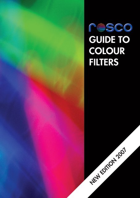
NEW EDITION 2007
2<br />
As a producer of colour filters for <strong>the</strong> Performing Arts, Rosco has focused on <strong>the</strong> science of colour for nearly 100 years. But<br />
stage lighting is an art, not a science. The people who use Rosco filters are artists who qualify light and manipulate <strong>the</strong><br />
spectrum to enhance stage pictures, dealing with colour, contrast, perception and <strong>the</strong> creation of an emotional climate. This<br />
guide was developed with two objectives, firstly to offer some recommendations for filter colour selection and secondly to<br />
provide some technical background of colour filter technology.<br />
Most of <strong>the</strong> colours in <strong>the</strong> Rosco range have been created by and for designers over <strong>the</strong> years to achieve specific effects<br />
and <strong>the</strong> ranges are extensive. A virtually unlimited palette can be achieved by additive mixing using multiple sources and<br />
<strong>the</strong> new wider range of Rosco filters. Apart from <strong>the</strong> obvious “cooler” and “warmer” variation of colour through <strong>the</strong> dimmer<br />
setting, most filter colours have warmer and cooler filters of similar hue listed in <strong>the</strong> Application pages.<br />
The range of colours from Rosco continue to evolve, designers will innovate and new artistic needs will emerge and be met.<br />
USING THIS GUIDE<br />
This guide was developed to provide designers with suggestions<br />
on how specific Rosco colours might be used for lighting <strong>the</strong><br />
stage. We have grouped <strong>the</strong> colours to some commonly<br />
accepted categories.<br />
<strong>Lighting</strong> <strong>the</strong> <strong>Acting</strong> <strong>Areas</strong> <strong>the</strong>se are divided among Warm,<br />
Cool and Neutral groups for lighting acting areas. These<br />
colour distinctions help to establish <strong>the</strong> mood, emotion, time<br />
and place. The colours included generally flattering to skin<br />
tones and enhance scenery and costumes.<br />
Accent <strong>Lighting</strong> is also divided between Warm and Cool.<br />
These slightly more saturated colours may be used to shape<br />
and define an object or person. Typically, accent lighting is<br />
focused from side or back positions or, on occasion, as down<br />
light.<br />
Natural Light on stage usually comes in one of four variants:<br />
warm sunlight, cool daylight, moonlight and cyclorama wash<br />
lighting used to create <strong>the</strong> illusion of a sky/horizon line. This<br />
section of <strong>the</strong> guide makes recommendations for choosing<br />
colours appropriate to each of <strong>the</strong>se applications. Here you<br />
will find suggestions that render both true, natural lighting and<br />
strong, stylized sky lighting. Your design and <strong>the</strong> needs of <strong>the</strong><br />
play will determine which is <strong>the</strong> right choice for you.<br />
Special Effects lighting encompasses a broad category. Listed<br />
in this section are strong, stylized colours that can be used to<br />
create dramatic lighting effects from fire and rain to surreal,<br />
ominous atmospheres. Again, <strong>the</strong> choice of colour is purely<br />
personal and determined by <strong>the</strong> needs of <strong>the</strong> overall design.<br />
Choices are not immutable. As Tharon Musser has said,<br />
“ If a colour doesn’t<br />
look right on stage,<br />
just change it. ”<br />
|<br />
ROSCO FILTER RANGES FOR THIS GUIDE<br />
Supergel: <strong>the</strong> premier colour range of high temperature resistant filters<br />
and diffusion.<br />
The range of colours evolved mostly by dialogue with designers<br />
world-wide, and offer fresh alternatives to <strong>the</strong> old world Cinemoid<br />
derived colours.<br />
E-Colour+: a comprehensive range of filters in one swatchbook, with<br />
colour filters for <strong>the</strong> lighting designer with notation originated for<br />
Cinemoid. The correction filters, numbered 2 – 300 were primarily for<br />
photography film and television, but some are used by designers for <strong>the</strong><br />
colour character, and are listed in <strong>the</strong> tables in <strong>the</strong> Guide.<br />
Roscolux: has been <strong>the</strong> colour of designer choice for 30 years in <strong>the</strong><br />
U.S and is available in Europe and includes many new colours, including<br />
<strong>the</strong> Academy Award winning range of CalColor primaries, secondaries<br />
and diluted paler colours.<br />
SOME CONTRIBUTORS TO THIS GUIDE<br />
Richard Pilbrow<br />
Widely regarded as <strong>the</strong> dean of lighting designers for both London and<br />
Broadway, he also headed Theatre Projects consultants. He has<br />
authored two much acclaimed books on stage lighting.<br />
Jennifer Tipton<br />
Jennifer Tipton’s many awards for lighting in dance, <strong>the</strong>atre and opera<br />
include two Tonys, two Bessies, two American <strong>the</strong>atre Wing awards, two<br />
Obies and two Drama Desk Awards. A veteran teacher at <strong>the</strong> Yale<br />
University School of Drama, she has influenced a generation of lighting<br />
designers.<br />
Ken Billington<br />
He has designed <strong>the</strong> lighting for over 50 Broadway productions and<br />
garnered six Tony nominations in <strong>the</strong> process. The long term Principal<br />
<strong>Lighting</strong> Designer for New York’s Radio City Music Hall, he has worked<br />
extensively in television and architectural design.<br />
Donald Holder<br />
Donald Holder’s brilliant lighting design for <strong>the</strong> Broadway production of<br />
“The Lion King” earned him <strong>the</strong> triple crown of <strong>the</strong>atrical awards. The<br />
Tony Award, <strong>the</strong> Drama Desk Award and <strong>the</strong> Outer Critics Circle Award.
Designers on Colour<br />
Colour has been an important component of stage lighting since <strong>the</strong> days of candles and silk. We reproduce here<br />
comments on <strong>the</strong> subject from <strong>the</strong> published works of some leading lighting designers:<br />
Gilbert V. Hemsley, Jr.<br />
“I think one of <strong>the</strong> greatest joys of lighting design is communicating to<br />
an audience how you, as a designer, feel about and understand<br />
color. Walking out from a darkened <strong>the</strong>atre on a sunny Spring<br />
afternoon and feeling my response to <strong>the</strong> warm sunshine, <strong>the</strong><br />
Supergel 64 of <strong>the</strong> blue sky and <strong>the</strong> light green shadows of <strong>the</strong> new<br />
leaves makes my head spin with <strong>the</strong> realization that I can translate my<br />
color excitement to a production of ‘You Can’t Take It With You’. I<br />
can make an audience see and feel <strong>the</strong> excitement of a beautiful<br />
Spring afternoon when <strong>the</strong> curtain goes up in a darkened <strong>the</strong>atre.<br />
It may sound strange, but I carry a color swatchbook around in my<br />
head. As I see, feel, and respond to color and color combinations in<br />
<strong>the</strong> real world, I make mental notes of <strong>the</strong> colors I see and my<br />
responses to <strong>the</strong>m. I have a storehouse of emotional and rational<br />
responses and <strong>the</strong> colours that go with <strong>the</strong>m.<br />
In learning to be artists as lighting designers it is exhilarating to have<br />
a full personal response to color and color combinations in <strong>the</strong> real<br />
world and <strong>the</strong>n communicate <strong>the</strong>m to <strong>the</strong> real audiences of <strong>the</strong> <strong>the</strong>atre<br />
world."<br />
Francis Reid<br />
“My filter philosophy is simple. Colour can support and enhance <strong>the</strong><br />
work of actors, <strong>the</strong>ir clo<strong>the</strong>s and <strong>the</strong>ir scenic environment. When<br />
using filters, I may be removing some parts of <strong>the</strong> light but I am<br />
enhancing those that remain. I am aware that my audience, like<br />
myself, watch a lot of television so I must light to produce much more<br />
natural skin tones that I did thirty years ago. My colour ambience<br />
now has to surround <strong>the</strong> actor, tinting <strong>the</strong> environment, particularly <strong>the</strong><br />
airspace that <strong>the</strong> light passes through and <strong>the</strong> floor that it hits, while<br />
leaving <strong>the</strong> face and <strong>the</strong> costume as naturally coloured as possible -<br />
usually with Supergel 351. The practicalities of my approach are<br />
based simply upon <strong>the</strong> realisation that if I take <strong>the</strong> spectrum apart with<br />
filters, <strong>the</strong>n I can put that spectrum toge<strong>the</strong>r again by superimposing<br />
<strong>the</strong> filtered light beams. It is a gloriously unscientific process; not so<br />
much a rule-of-thumb as one of crossed fingers. And trusting my<br />
eyes.”<br />
Nigel Morgan<br />
“Out of all <strong>the</strong> parameters that <strong>the</strong> lighting designer sets when<br />
composing a composition, colour is <strong>the</strong> one most likely to get an<br />
immediate reaction from o<strong>the</strong>r members of <strong>the</strong> team. Given <strong>the</strong><br />
number of colour tones available, making <strong>the</strong> right choice isn’t always<br />
easy. That is why it is so important to experiment with lighting models,<br />
colour and fabric samples - and to share <strong>the</strong> discoveries you make<br />
with <strong>the</strong> rest of <strong>the</strong> creative team. Where else can you ‘rehearse’<br />
your lighting? In <strong>the</strong> model room you can find just <strong>the</strong> right tone,<br />
combined with <strong>the</strong> right intensity and source position, mix <strong>the</strong> right<br />
blend with o<strong>the</strong>r lights.”<br />
Richard Pilbrow<br />
“Fractured white light reveals colour. Part of <strong>the</strong> magic of stage<br />
lighting is taking complex multi-directional palettes of colour and<br />
re-combining <strong>the</strong>m into lucid, dramatic light for <strong>the</strong> stage.<br />
When I began lighting, only about fifty shades of Cinemoid were<br />
available. I often used <strong>the</strong>m two or three to a frame seeking new<br />
possibilities. Then I discovered <strong>the</strong> Rosco range and first brought this<br />
wonderful range to Britain. Now <strong>the</strong> possibilities are almost limitless.<br />
Colour brings life, texture and vibrancy to <strong>the</strong> stage. I love it!”<br />
Jennifer Tipton<br />
“The use of color is key to a lighting designer’s craft. I am constantly<br />
reminded as I watch <strong>the</strong> light change from <strong>the</strong> brilliance of a sunny<br />
morning to <strong>the</strong> early dusk of a winter afternoon, how much color <strong>the</strong>re<br />
is in natural so-called ‘white light’ and how much variety in color can<br />
be made by simply brightening and dimming a light. It is a<br />
wonderfully juicy thing to ‘paint’ with colored light – to use light<br />
expressionistically – to make <strong>the</strong> audience feel <strong>the</strong> scream, live <strong>the</strong><br />
blues or dance with danger. Or to paint with colored light can<br />
simply be about <strong>the</strong> beauty of juxtaposing one color next to ano<strong>the</strong>r<br />
and being able to change it from one moment to <strong>the</strong> next for purely<br />
compositional reasons. But I am also madly in love with <strong>the</strong> ravishing<br />
light that can be made from <strong>the</strong> use of <strong>the</strong> very limited range of colors<br />
– lavender, blue and clear – that makes <strong>the</strong> skin glow no matter what<br />
color <strong>the</strong> skin may be.”<br />
David Belasco<br />
“The greatest part of my success in <strong>the</strong> <strong>the</strong>atre I attribute to my feeling<br />
for colors, translated into effects of light.” (1919)<br />
The late Gilbert V. Hemsley, Jr. said that<br />
“I carry a color swatchbook<br />
around in my head ”<br />
An example of his brilliant application of colour is shown in <strong>the</strong> photo on <strong>the</strong> left.<br />
| 3
4<br />
Understanding The Spectrum and SED Curves<br />
Visible light is <strong>the</strong> small part of <strong>the</strong> spectrum of electromagnetic<br />
radiation between approximately 400 and 700 Nanometers. Each<br />
wavelength has a “spectral signature”, or colour, ranging from violet<br />
at 400 through indigo, blue, green, yellow and orange to red at<br />
700. The combination of <strong>the</strong>se coloured wavelengths creates white<br />
light. Coloured light can be described as <strong>the</strong> presence of certain<br />
wavelengths and <strong>the</strong> absence of o<strong>the</strong>rs.<br />
A colour filter functions by selectively transmitting or blocking<br />
(absorbing) spectral elements of a beam of white light emanating from<br />
a light source. For example, a Supergel 27 Medium Red filter will<br />
allow red light frequencies to pass through and absorb blue and<br />
green. Of <strong>the</strong> radiant energy which is blocked, by far <strong>the</strong> largest<br />
part is absorbed by <strong>the</strong> filter as heat. This is why heat stability is a<br />
significant consideration in filter design. The heat created by <strong>the</strong><br />
absorption of energy leads to degradation of <strong>the</strong> filter.<br />
<strong>Lighting</strong> designers mix or blend colours through an additive or<br />
subtractive process. Blending light beams of different colours on a<br />
surface is an additive process. Creating a coloured beam by filtering<br />
white light is a subtractive process – <strong>the</strong> desired colour is transmitted<br />
while <strong>the</strong> o<strong>the</strong>r wavelengths are absorbed (or “subtracted”).<br />
A Spectral Energy Distribution (SED) curve is a graph of <strong>the</strong><br />
transmission of energy plotted by wavelength. These curves are<br />
included in <strong>the</strong> swatchbooks of Rosco filters. In Fig. 1, <strong>the</strong> curve for<br />
Supergel 27 shows that frequencies above 620 nM will pass through<br />
<strong>the</strong> filter at varying percentages, while <strong>the</strong> wavelengths below will<br />
not. With this information, you can predict what colour <strong>the</strong> filter will<br />
render.<br />
Designers on Colour<br />
Traditionally, correcting <strong>the</strong> colour temperature of various lamps has<br />
been a chore left to architectural lighting designers or cinematographers,<br />
but <strong>the</strong> wide range of light sources used in modern <strong>the</strong>atrical lighting<br />
has changed this. Rosco offers filters for balancing different lamp<br />
types.<br />
<strong>Lighting</strong> a scene with both a 4000°K Metal Halide lamp and also a<br />
3200°K incandescent lamp will result in ei<strong>the</strong>r <strong>the</strong> Metal Halide<br />
appearing very blue, or <strong>the</strong> incandescent very red, depending on <strong>the</strong><br />
overall balance of light on stage. To correct for this, ei<strong>the</strong>r raise <strong>the</strong><br />
colour temperature of <strong>the</strong> incandescent to 4000°K using 202 (1/2<br />
CT Blue) or lower <strong>the</strong> Metal Halide to 3200°K with 206 (1/4 CT<br />
Orange).<br />
For more information on colour correction filters, see <strong>the</strong> Rosco<br />
publication “Filter Facts” or visit <strong>the</strong> website.<br />
|<br />
WARM FILTERS<br />
Fig.3<br />
As a reference, <strong>the</strong> peak intensity for violet is 440, blue 480, green<br />
520, yellow 570 and red, 650.<br />
Most Rosco colours are blends so <strong>the</strong> curve will have multiple peaks.<br />
The graph for Supergel 54 Lavender for example, shows a high<br />
component of both violet and red. (Fig. 2)<br />
Supergel No.27 Med Red<br />
Fig.1<br />
Supergel No.54 Special Lavender<br />
Fig.4<br />
Fig.2<br />
It is important to remember that filtration is a subtractive process filters<br />
can only transmit or block frequencies of light, not add <strong>the</strong>m to a<br />
source. This is significant when using lamps that are deficient in<br />
particular wavelengths.<br />
Although many lamp types seem attractive because <strong>the</strong>y offer <strong>the</strong><br />
economy of long life, <strong>the</strong>y have a limited spectrum. A typical metal<br />
halide source, (Fig. 3) for example, has very little energy in <strong>the</strong> red<br />
end of <strong>the</strong> spectrum. Note that even <strong>the</strong> most common <strong>the</strong>atrical<br />
source, <strong>the</strong> tungsten-halogen or incandescent lamp (Fig. 4) although<br />
rich in red/yellow, is deficient in blue/green. These characteristics of<br />
sources and filters are most obvious when one becomes familiar with<br />
<strong>the</strong> relevant SED curves.
Manufacturing High Temperature Colour Filter<br />
A colour filter combines light refracting elements, normally organic dyes, which are suspended in or coated on a transparent base. Rosco began<br />
producing gelatin filters in 1910, but since <strong>the</strong> 1950s, colour filters have been fabricated on plastic bases. Polycarbonate, <strong>the</strong> base used for <strong>the</strong><br />
Supergel range, is <strong>the</strong> most durable of <strong>the</strong> polymers currently utilized.<br />
There are three methods currently employed to integrate dyes with polymer bases in order to create colour filters. The products are described as:<br />
• Surface Coated<br />
• Deep Dyed<br />
• Body Coloured<br />
Surface Coated Polyester - (Rosco E-Colour+, Lee Filter)<br />
Optically clear polyester film (PET) is coated with a flame retardant and dye solution on one or two<br />
sides to a precisely controlled thickness. The carrier solvent is baked off leaving a stable coating<br />
bonded to <strong>the</strong> substrate. Advanced dye technology gives good resistance to dye fade in hot lights.<br />
Deep-Dyed Polyester - (Roscolux, Cinegel and GAM Filter)<br />
Like surface coated PET, deep dyed film begins with a roll of clear polyester. The film is passed<br />
through a bath of heated solvent suffused with dye. The solvent causes <strong>the</strong> PET film to swell<br />
expanding <strong>the</strong> polymer structure of <strong>the</strong> film and allowing <strong>the</strong> dye molecules to penetrate <strong>the</strong> surface.<br />
The film is <strong>the</strong>n washed and <strong>the</strong> polymer contracts to its normal form, trapping <strong>the</strong> dye molecules<br />
below <strong>the</strong> surface.<br />
Deep-dyed filters tend to be slightly more resistant to fading than surface coated filters.<br />
Body-Coloured Polycarbonate - (Supergel)<br />
In a body-coloured colour filter like Supergel <strong>the</strong> colour is inherent within <strong>the</strong> plastic substrate.<br />
Powdered resin and dye is mixed under intense pressure and heat of over 300°C and <strong>the</strong> mixture is<br />
extruded through a die to form a coloured core of film. In Rosco’s co-extrusion process fur<strong>the</strong>r<br />
extruders seal this core in between two more layers of clear polycarbonate. This locked-in colour,<br />
combined with <strong>the</strong> high temperature resistant polycarbonate gives very high heat withstand to colour<br />
filter even in very hot lighting instruments.<br />
It is possible to coat polycarbonate film, but <strong>the</strong> Rosco system eliminates ‘stress’ orientation which may<br />
occur in coated filter – which means in hot spotlights and scrollers if <strong>the</strong> filter buckles or shrinks <strong>the</strong>re<br />
are serious problems; indeed scrollers should be fitted with Supergel colour, for safety’s sake.<br />
Flame Retardance in Colour Filters<br />
All Rosco colour filters comply with current regulations for flame retardance, in <strong>the</strong> UK, this is:<br />
BS3944 pt1: 1992.<br />
Supergel, by virtue of <strong>the</strong> polycarbonate base and state-of-<strong>the</strong>-art technology, also is certificated:<br />
France M1<br />
Germany B1 (DIN 4102-01)<br />
Austria MA39<br />
Italy C1 and<br />
Shown here is a cross section of co-extruded Rosco Supergel filter<br />
Spain M2.<br />
photographed through an electron microscope. Note <strong>the</strong> discrete clear<br />
layers on <strong>the</strong> top and bottom sealing in <strong>the</strong> colour core.<br />
| 5
6<br />
<strong>Lighting</strong> <strong>the</strong> <strong>Acting</strong> <strong>Areas</strong> - filters for warm acting areas<br />
Stage lighting is an art, not a science. We show here, as suggestions, some widely used applications for specific Rosco<br />
colours. Supergel and E-Colour+ and Roscolux numbers on <strong>the</strong> same line across <strong>the</strong> columns are close or similar colours.<br />
Your design and <strong>the</strong> needs of <strong>the</strong> production should determine <strong>the</strong> right colour choices for you.<br />
Note: The colour bands are intended as a guide only as matching printed colours with filter colours is not possible. For a true representation please contact Rosco or your local<br />
dealer for a swatchbook.<br />
SUPERGEL E-COLOUR+ ROSCOLUX APPLICATIONS<br />
302 Pale Bastard Amber Very pale warm white. Perfect for enhancing<br />
<strong>the</strong> HPL lamp in a Source 4.<br />
01 Light Bastard Amber 176 Loving Amber Enhances fair skin tones.<br />
Suggests strong sunlight.<br />
02 Bastard Amber 162 Bastard Amber 02 Bastard Amber Good where a tint of colour is needed.<br />
Excellent for natural skin tones.<br />
03 Dark Bastard Amber 108 English Rose Most saturated Bastard Amber.<br />
303 Warm Peach 109 Light Salmon Strong Amber with undertones of pink.<br />
Useful for warm sunrises and sunsets.<br />
04 Medium Bastard Amber 004 Medium Bastard Amber Especially useful when cross lit with a cool<br />
colour. Excellent for natural sunlight.<br />
304 Pale Apricot 152 Pale Gold A peach amber.<br />
More yellow than 305.<br />
05 Rose Tint A clean pale pink; useful as a “blush” for skin<br />
tones.<br />
305 Rose Gold 154 Pale Rose A pale blush amber for skin tones and<br />
backlight.<br />
06 No Color Straw Slightly off-white.<br />
Good for interiors.<br />
07 Pale Yellow 007 Pale Yellow Double saturation of 06.<br />
08 Pale Gold Warmer Straw.<br />
Flattering to skintones.<br />
223 Eighth CT Orange 3410 Roscosun 1/8 CTO Nominal Daylight to 5200°K.<br />
Pale Amber.<br />
206 Quarter CT Orange 3409 Roscosun 1/4 CTO Nominal Daylight<br />
to 4600°K<br />
205 Half CT Orange 3408 Roscosun 1/2 CTO Nominal Daylight<br />
to 3800°K<br />
285 Threequarter CT Orange 3411 Roscosun 3/4 CTO Nominal Daylight<br />
to 3500°K. Nice strong Amber.<br />
204 Full CT Orange 3407 Roscosun CTO Nominal Daylight<br />
to 3200°K. Dominant Amber.<br />
444 Eighth CT Straw 3444 Eighth Straw Pale Sepia.<br />
443 Quarter CT Straw 3443 Quarter Straw Light Sepia.<br />
442 Half CT Straw 3442 Half Straw Medium Sepia.<br />
441 Full CT Straw 3441 Full Straw Full Sepia.<br />
4515 CC15 Yellow Very pale yellow. Interior lighting to create<br />
industrial mood.<br />
4530 CC30 Yellow Medium yellow with green tone: bright<br />
sunlight accents.<br />
4560 CC60 Yellow Strong Yellow with green tone:<br />
deep sunlight.<br />
4590 CC90 Yellow Very strong yellow with no red accents.<br />
09 Pale Amber Gold 009 Pale Amber Gold Deep straw. Good for late afternoon sun<br />
sets or firelight.<br />
15 Deep Straw 015 Deep Straw Warm golden amber with some green.<br />
Useful for special effects – candlelight, firelight.<br />
| WARM FILTERS<br />
cont...
<strong>Lighting</strong> <strong>the</strong> <strong>Acting</strong> <strong>Areas</strong> - filters for warm acting areas<br />
SUPERGEL E-COLOUR+ ROSCOLUX APPLICATIONS<br />
16 Light Amber Excellent area light. Safe for most light<br />
skintones.<br />
316 Gallo Gold Pale reddish gold. Good for sunrise or sunset.<br />
Flattering naturalistic backlight colour.<br />
5017 Light Flame 17 Light Flame Heavier pink-amber tint. Useful for dance.<br />
Especially useful when balanced with a cool colour.<br />
317 Apricot 147 Apricot A rosy amber which produces a romantic<br />
sunset colour.<br />
134 Golden Amber Glowing Amber. Late afternoon sunlight<br />
transition.<br />
318 Mayan Sun 5318 Mayan Sun 318 Mayun Sun A medium salmon colour which evokes feeling<br />
of a tropical island. A good sunset colour.<br />
325 Henna Sky Toasted red -amber colour, useful as a<br />
dramatic cyc.<br />
4615 CC15 Red Very pale red. Subtle warming on skin tones.<br />
Warmer than Sgel 05.<br />
4630 CC30 Red Double 4615. Pale red with peach tones. Nice<br />
on skin when paired with a cooler cross light.<br />
30 Light Salmon Pink Excellent for general area washes. Gives<br />
overall warming effect to skin tones.<br />
153 Pale Salmon Good for flesh tones<br />
A pale pink.<br />
109 Light Salmon General wash for warm acting areas,<br />
warmer than107.<br />
31 Salmon Pink 107 Light Rose General wash.<br />
Good for follow spots.<br />
166 Pale Red Deep salmon pink warm accents for LE and<br />
musicals.<br />
331 Shell Pink 107 Light Rose Beautiful blush pink,<br />
good on fair skintones.<br />
33 No Color Pink 33 No Color Pink A pale almost colourless pink.<br />
333 Blush Pink A tint excellent for most skin tones.<br />
34 Flesh Pink Good for musicals: creates a happy<br />
atmosphere.<br />
4815 CC15 Pink Excellent on all skin tones.<br />
Slightly cooler than 33.<br />
4830 CC 30 Pink Double 4815. Pretty pink. Slightly less blue<br />
than 38. Nice for musicals and “happy” lighting.<br />
35 Light Pink Slightly deeper than Sgel 33 but with less<br />
violet.<br />
36 Medium Pink 192 Flesh Pink Good for general washes and cross<br />
lighting.<br />
336 Billington Pink Similar uses to 337 but deeper saturation.<br />
337 True Pink A cool pink excellent for washes and general<br />
illumination. A good follow spot colour.<br />
37 Pale Rose Pink Blue pink: use in general washes and<br />
toning.<br />
38 Light Rose 110 Middle Rose Bluish pink for general washes and toning.<br />
“ In A Streetcar Named Desire, Tennessee Williams describes <strong>the</strong> poker scene as having ‘<strong>the</strong> lurid nocturnal<br />
brilliance’ of Van Gogh’s painting of a billiard-parlor at night. Supergel 11 in a soft down light, Supergel 09<br />
from high backs, and Supergel 365 with templates helped me paint Van Gogh’s work in light. ”<br />
Kevin Rigdon<br />
WARM FILTERS | 7
8<br />
<strong>Lighting</strong> <strong>the</strong> <strong>Acting</strong> <strong>Areas</strong> - filters for cool acting areas<br />
SUPERGEL E-COLOUR+ ROSCOLUX APPLICATIONS<br />
3318 Tough1/8 Minusgreen Very light magenta correction. Removes<br />
slight green casts from HPL lamps.<br />
249 Quarter Minus Green 3314 Tough1/4 Minusgreen Pale magenta correction. Nice tone on skin<br />
without adding colour.<br />
248 Half Minus Green 3313 Tough1/2 Minusgreen Light magenta brightens blues and pinks:<br />
warmer than lavender.<br />
247 Minus Green 3308 Tough Minusgreen Nice pale lavender: good as part of a cool<br />
or warm crosslight.<br />
4715 CC 15 Magenta Pale magenta, cooler than 3318: useful on<br />
many skintones.<br />
4730 CC 30 Magenta Double 4715: medium cool magenta. Nice<br />
fill without adding colour.<br />
4215 CC 15 Blue Very pale blue tint with a hint of red. Nice<br />
no-colour definition when crossed with 51.<br />
4230 CC 30 Blue Double 4215. Pale blue with a reddish<br />
cast.<br />
4260 CC 60 Blue Double 4230. Medium blue with red tones.<br />
Nice cool crosslight on most skin tones.<br />
218 Eighth CT Blue 3216 Eighth Blue Boosts tungsten 3200°K sources<br />
by 200°K.<br />
373 Theatre Booster 3 203 Quarter CT Blue 3208 Quarter Blue Quarter blue for cooling incandescent lights.<br />
Cool crisp “white light”.<br />
372 Theatre Booster 2 202 Half CT Blue 3204 Half Blue Half blue for cooling incandescent lights<br />
towards daylight. Clean with no red.<br />
371 Theatre Booster 1 201 CT Blue 3202 Full Blue Full blue for cooling incandescent lights to<br />
daylight. Clean with no red.<br />
200 Double CT Blue 3220 Double Blue Double 201, boosts tungsten 3200°K<br />
sources to north sky daylight.<br />
60 No Color Blue Helps maintain white light are low on<br />
dimmer. Good for cool area light.<br />
360 Clearwater Slightest blue tint. Excellent for eliminating<br />
amber shift when lights are low on dimmer.<br />
61 Mist Blue 061 Mist Blue Excellent for general area washes. Very<br />
light cool tint of blue.<br />
62 Booster Blue Helps maintain white light when dimmer is<br />
at low intensity.<br />
63 Pale Blue 63 Pale Blue Good for creating an overcast look and<br />
feeling.<br />
66 Cool Blue 117 Steel Blue A pale green shade of blue; good for area of<br />
general washes. Creates an icy feeling on stage.<br />
363 Aquamarine A pale blue-green colour. Can be used for<br />
area lighting. A soft backlight colour.<br />
361 Hemsley Blue A sharp cold Blue that stays clean when<br />
dimmed, a good wash colour.<br />
362 Tipton Blue Soft green blue: good for cool area lighting<br />
and for shift <strong>the</strong> amber of lights low on dimmer.<br />
64 Light Steel Blue 174 Dark Steel Blue Useful for beams of realistic moonlight.<br />
364 Blue Bell Clean light red blue. Creates naturalistic<br />
daylight fill colour.<br />
65 Daylight Blue 196 True Blue Useful for achieving depressed moods and<br />
dull skies.<br />
365 Tharon Delft Blue Clean blue but with more red than 364:<br />
good for area light.<br />
67 Light Sky Blue 352 Glacier Blue Excellent sky colour. Useful for cyc and<br />
border lights.<br />
118 Light Blue Skylight, and cool for accents and acting<br />
areas.<br />
368 Winkler Blue A silvery blue, used for front light and<br />
moonlight.<br />
| COOL FILTERS<br />
cont...
<strong>Lighting</strong> <strong>the</strong> <strong>Acting</strong> <strong>Areas</strong> - filters for cool acting areas<br />
SUPERGEL E-COLOUR+ ROSCOLUX APPLICATIONS<br />
70 Nile Blue 140 Summer Blue Useful for very light midday skies.<br />
71 Sea Blue 172 Lagoon Blue Occasionally used for general cool tint and<br />
non-realistic washes.<br />
72 Azure blue 144 No Color Blue A clean slightly green blue. Good moonlight<br />
fill.<br />
5376 Bermuda Blue 376 Bermuda Blue Good moonlight, soothing green blue, good<br />
tropical sky.<br />
© Fabio Donato<br />
I Promessi Spossi. “ In this scene of <strong>the</strong> musical <strong>the</strong> boat was in constant motion on a revolve. I had to<br />
maintain visibility while sustaining <strong>the</strong> illuson of distance on Lake Como. The sun, a light box which<br />
eventually sets and gives way to a romantic evening, was a combination of 134 and 147 E-Colour+. I love 147<br />
because it doesn’t distort <strong>the</strong> colours of costumes. Since <strong>the</strong> show had 26 scenes, I used scrollers for every-<br />
thing front, side and backlighting. The lake is a combination of 132, 141 and <strong>the</strong> new 5436 E-Colour+ and<br />
<strong>the</strong> rising fog helped sustain <strong>the</strong> impression of water. Since I was a painter I am fascinated by colour and<br />
always experiment with new colours in scrollers. Even if I don’t use <strong>the</strong>m, I have to know what <strong>the</strong>y do. ”<br />
Patrick Latronica<br />
COOL FILTERS | 9
10<br />
<strong>Lighting</strong> <strong>the</strong> <strong>Acting</strong> <strong>Areas</strong> - filters for neutral acting areas<br />
SUPERGEL E-COLOUR+ ROSCOLUX APPLICATIONS<br />
249 Quarter Minus Green<br />
3318 Tough1/8 Minusgreen Very light magenta correction. Removes<br />
slight green casts from HPL lamps.<br />
3314 Tough1/4 Minusgreen Pale magenta correction. Nice tone on skin<br />
without adding colour.<br />
248 Half Minus Green 3313 Tough1/2 Minusgreen Light magenta brightens blues and pinks:<br />
warmer than lavender.<br />
247 Minus Green 3308 Tough Minusgreen Nice pale lavender: good as part of a cool<br />
or warm crosslight.<br />
341 Plum A soft red and muted blue combination for<br />
period sets.<br />
4730 CC 30 Magenta Double 4715. Medium cool magenta.<br />
Nice fill light without adding warmth.<br />
51 Surprise Pink Touch of colour when white light is<br />
undesirable.<br />
351 Lavender Mist 003 Lavender Tint Pale, no-colour lavender. Nice cool white<br />
light.<br />
52 Light Lavender 052 Light Lavender Excellent for general area or border light<br />
washes. It is a basic followspot colour.<br />
53 Pale Lavender 053 Pale Lavender Use when a touch of colour is needed.<br />
353 Lilly Lavender 137 Special Lavender Nice cool lavender. Slightly warmer than<br />
Supergel 55.<br />
54 Special Lavender Same as 53, but warmer.<br />
4915 CC 15 Lavender Pale no colour lavender. Slightly cooler than 351.<br />
Tones without adding colour.<br />
4930 CC 30 Lavender Double 4915. Excellent cool on skin tones.<br />
Nice warm tones during night-time.<br />
4960 CC 60 Lavender Double 4930. Rich comfortable lavender.<br />
Complements darker skin tones.<br />
55 Lilac 137 Special Lavender Same as 53, but cooler.<br />
355 Pale Violet 142 Pale Violet Cool lavender - acts as a neutral in a three<br />
colour area lighting system.<br />
56 Gypsy Lavender 180 Dark Lavender Highly saturated, good for side and<br />
backlighting a non-realistic effect.<br />
356 Middle Lavender A lavender halfway between 52 and 57 in<br />
hue and value. Useful for side-lighting.<br />
170 Deep Lavender Night scene lighting a hint more pink than<br />
356.<br />
57 Lavender 194 Surprise Pink Gives good visibility without destroying night<br />
illusions.<br />
357 Royal Lavender 180 Dark Lavender A rich lavender which will enhance blue and<br />
red costumes and scenic pieces.<br />
58 Deep Lavender 058 Deep Lavender Excellent back light.<br />
Enhances dimensionality.<br />
359 Medium Violet A lavender with a strong blue component,<br />
ideal for backlighting.<br />
377 Iris Purple Deep Blue with red accents, dark night-time<br />
atmosphere.<br />
156 Chocolate 99 Chocolate Warms light and reduces intensity, good for<br />
darker skin tones.<br />
184 Cosmetic Peach<br />
185 Cosmetic burgundy<br />
186 Cosmetic Silver Rose A series of<br />
187 Cosmetic Rouge slightly diffuse pale tints that<br />
188 Cosmetic Highlight complement skin tones<br />
189 Cosmetic Silver Moss or key lighting.<br />
190 Cosmetic Emerald<br />
191 Cosmetic Aqua Blue<br />
| NEUTRAL FILTERS
Using Sidelights, Downlights & Backlights for Accents - filters for warm accents<br />
SUPERGEL E-COLOUR+ ROSCOLUX APPLICATIONS<br />
310 Daffodil A soft medium yellow: can be used for creating<br />
effects like early morning sunlight.<br />
4590 CC 90 Yellow Saturated pure yellow. Enhances greens in<br />
sets and costumes.<br />
10 Medium Yellow 010 Medium Yellow Clean bright yellow. Good for special effects<br />
and accents. Unflattering in acting areas.<br />
100 Spring Yellow Sunlight wash with green component,<br />
unflattering for skin tones.<br />
12 Straw Good for special effects accents. Use with<br />
caution on skin tones.<br />
11 Light Straw 102 Light Amber Warm pale yellow. Useful for fire effects.<br />
Can be used for area lighting.<br />
312 Canary 01 Yellow Warmer than 10. A bright, vibrant yellow that<br />
evokes “exotic” sunlight. Use with caution on skin.<br />
313 Light Relief Yellow Vibrant warm Yellow, More red than 312<br />
without <strong>the</strong> green cast.<br />
14 Medium Straw 104 Deep Amber Pale amber, useful for sunlight and firelight<br />
accents.<br />
15 Deep Straw 015 Deep Straw Warm amber, good for special effects, as 14.<br />
Tends to depress colour pigment values.<br />
316 Gallo Gold Pale reddish gold. Good for sunrise or<br />
sunset, flattering backlight colour.<br />
5018 Flame 18 Flame Pinkish amber. Creates afternoon sunset or<br />
sunrise.<br />
318 Mayan Sun 5318 Mayan Sun 318 Mayan Sun A medium salmon colour which evokes feelings<br />
of a tropical island. A good sunset colour.<br />
20 Medium Amber 020 Medium Amber Afternoon sunlight, evokes feelings of<br />
autumn, lamplight and candlelight.<br />
017 Surprise Peach Warm skin tones and mood light.<br />
21 Golden Amber 021 Gold Amber Useful as amber cyc light, late sunsets, and<br />
firelight.<br />
5321 Soft Golden Amber 321 Soft Golden Amber Good autumn colour, good sun transition<br />
colour through white and yellow to amber.<br />
2002 Storaro Orange Flattering firelight.<br />
23 Orange Provides a romantic sunlight through<br />
windows for evening effects.<br />
4815 CC 15 Pink A very pale pink.<br />
4830 CC 30 Pink Medium pink makes a nice side light accent.<br />
Adds a splash of pink without being too obvious.<br />
4860 CC 60 Pink Double 4830. Rich pink accent. Excellent<br />
in follow-spots.<br />
4890 CC 90 Pink 4830 + 4860. Deep rich pink. Lighter than<br />
332. Romantic backlight or accent colour.<br />
331 Shell Pink 107 Light Rose Beautiful blush pink, good on fair skin tones.<br />
32 Medium Salmon Pink Deepest of <strong>the</strong> salmon pinks.<br />
332 Cherry Rose A tropical pink that is good for musicals or<br />
concert lighting. A good back light colour.<br />
4660 CC 60 Red Double 4630. Medium red with pale salmon<br />
accents. Romantic subtle back or side lighting.<br />
4690 CC 90 Red 4660 + 4630. Strong salmon red. Deeper<br />
and more orange than 32. Beautiful backlight.<br />
5489 Sunset Pink 4760 CC 60 Magenta Double 4730. Strong pink/magenta.<br />
Interesting side light with slight bluish cast.<br />
cont...<br />
WARM ACCENT FILTERS | 11
12<br />
Using Sidelights, Downlights & Backlights for Accents - filters for warm accents<br />
SUPERGEL E-COLOUR+ ROSCOLUX APPLICATIONS<br />
339 Broadway Pink 128 Bright Pink A deep, saturated pink created for musicals and<br />
“specials”. Excellent for down and backlighting.<br />
39 Skelton Exotic Sangria A sultry, deep purple. Good for musicals or<br />
concert lighting. Excellent special effects colour.<br />
40 Light Salmon 008 Dark Salmon Similar uses to 23 but a bluer colour.<br />
344 Follies Pink Vibrant, almost fluorescent pink with a cool component.<br />
Special effects colour in Broadway musicals.<br />
47 Light Rose Purple 345 Fuchsia Pink Good for eerie or dramatic effects. Beautiful<br />
backlight colour.<br />
347 Belladonna Rose Saturated deep Magenta with hint of purple.<br />
Good effects filter for dance.<br />
48 Rose Purple Pale evening colour. Excellent for backlight.<br />
348 Purple Jazz 345 Fuchsia Pink A dusky Purple. Good for simulating purple<br />
neon or old night club atmosphere.<br />
49 Medium Purple 126 Mauve Darkest of <strong>the</strong> magenta purple range.<br />
349 Fisher Fuchsia A medium fuchsia good for special effects.<br />
An interesting backlight or accent colour.<br />
50 Mauve 127 Smokey Pink Subdued sunset effect. Useful in backlights.<br />
To create seedy atmosphere.<br />
358 Rose Indigo A warm, red purple good for accents,<br />
specials, and backlight.<br />
96 Lime To simulate “unnatural” sunlight before and<br />
after a rainstorm or tornado.<br />
“ Colour brings life, texture and vibrancy to <strong>the</strong> stage ” - <strong>the</strong> Award winning<br />
design for <strong>the</strong> Broadway revival of Showboat illustrates this vividly.<br />
| WARM ACCENT FILTERS<br />
Richard Pilbrow<br />
“ In this production of Richard III, <strong>the</strong> court of King Edward stands above<br />
Richard, backlit from below with Supergel 11 Light Straw. The court is<br />
silhouetted against a fiery, bloody sky, created using a mixture of Supergel 21<br />
Golden Amber and Supergel 24 Scarlet. ”<br />
Donald Holder
Using Sidelights, Downlights & Backlights for Accents - filters for cool accents<br />
SUPERGEL E-COLOUR+ ROSCOLUX APPLICATIONS<br />
247 Minus Green 3308 Tough Minusgreen Cool pale lavender for beautiful, subtle<br />
backlighting.<br />
4930 CC 30 Lavender Double 4915. Clean medium lavender.<br />
Soft accent lighting.<br />
5499 Hyacinth 4990 CC 90 Lavender 4960 + 4930. Dynamic, lush backlight.<br />
More red than 357.<br />
5426 Blueberry Blue 4260 CC 60 Blue Double 4230. Good for accents and back<br />
lighting, especially dance. Slightly red.<br />
367 Slate Blue 161 Slate Blue Clean medium blue. Good for sky colour or<br />
moonlight.<br />
68 Parry Sky Blue 068 Sky Blue Excellent for early morning sky tones.<br />
Popular among designers for cyc and borders.<br />
69 Brilliant Blue 183 Moonlight Blue Used for dramatic moonlight effects.<br />
73 Peacock blue 354 Special Steel Blue Good for fantasy, moonlight and water<br />
effects.<br />
74 Night Blue 363 Special Medium Blue Popular as a backlight or sidelight in contrast<br />
to area light.<br />
5376 Bermuda Blue 376 Bermuda Blue Good moonlight, soothing green blue, good<br />
tropical sky. More blue than 76.<br />
77 Green Blue Useful for romantic moonlight.<br />
2007 Storaro Blue Rich deep indigo blue, slightly redder than<br />
81.<br />
80 Primary Blue 119 Dark Blue Primary blue. For use with three colour light<br />
primary system in cyc lighting.<br />
81 Urban Blue 075 Evening Blue Very cold brittle feeling.<br />
82 Surprise Blue Deep rich blue with slight amount of red.<br />
382 Congo Blue 181 Congo Blue The most saturated blue. Good for dark night skies.<br />
Great colour for rock and roll concert lighting.<br />
84 Zephyr Blue Lovely contrast to pale blues; adds coldness<br />
to shadows.<br />
85 Deep Blue 085 Deeper Blue Deeply saturated blue with a hint of red.<br />
385 Royal Blue A very low transmission deeply saturated blue<br />
that shifts towards purple when dimmed.<br />
76 Light Green Blue Distinctive greenish blue.<br />
86 Pea Green 121 Leaf Green Good for dense foliage and woodland<br />
effects.<br />
89 Moss Green 122 Fern Green Useful for mood, mystery and toning.<br />
389 Chroma Green A brilliant cyc lighting colour, good for<br />
chroma-keying effects in television production.<br />
395 Teal Green 325 Mallard Green Good as a mystical special effects colour.<br />
Interesting side or backlight colour in concert lighting.<br />
Gli Olimpiadi “ This Pergolesi opera was given an abstract setting with only <strong>the</strong> presence of specific<br />
props and set pieces, a volleyball net, bicycle etc. to suggest a modern gymnasium. Since none of <strong>the</strong><br />
electric pipes were masked and many of <strong>the</strong>m moved I treated <strong>the</strong> lights as gym apparatus. I based <strong>the</strong><br />
lighting on <strong>the</strong> cold, detached but sensual television commercials that I had seen in India with a lot of<br />
green. Green is a colour that I love and try to use in almost every production. In this scene <strong>the</strong> set<br />
becomes a prison with an ominous shadow on <strong>the</strong> large net. The visible low side-lighting is a mixture of<br />
213 and 245, corrections and cosmetic colors 190 and 191 were used for <strong>the</strong> back-lighting. The cyc<br />
was 219 and 174. The front light was open white and 187, cosmetic rouge which did not distort <strong>the</strong><br />
17th century costumes and maintained <strong>the</strong> formalism of <strong>the</strong> rest of <strong>the</strong> lighting. ”<br />
Patrick Latronica<br />
© Chico de Luigi<br />
COOL ACCENT FILTERS | 13
14<br />
Simulating Natural Light - filters to re-create sunlight<br />
SUPERGEL E-COLOUR+ ROSCOLUX APPLICATIONS<br />
01 Light Bastard Amber 176 Loving Amber Enhances fair skin tones. Suggests strong<br />
sunlight.<br />
303 Warm Peach 109 Light Salmon Strong Amber with undertones of pink.<br />
Useful for warm sunrise and sunsets.<br />
04 Medium Bastard Amber 004 Medium Bastard Amber Especially useful when cross lit with a cool<br />
colour. Excellent for natural sunlight.<br />
285 Three Quarter Orange 3411 Roscosun 3/4 CTO Rich amber, good for strong morning<br />
sunlight.<br />
4530 CC 30 Yellow Double 4515. Medium yellow with green tone.<br />
Bright sunlight accents. Not flattering on skin.<br />
4560 CC 60 Yellow Double 4530. Strong yellow with green tone.<br />
Deep sunlight rays.<br />
4590 CC 90 Yellow 4530 + 4560. Very strong sunlight with no<br />
red accents.<br />
09 Pale Amber Gold 009 Pale Amber Gold Deep straw.<br />
Good for late afternoon sunsets.<br />
10 Medium Yellow 010 Medium Yellow Yellow with green. Good for special effects.<br />
Unflattering in acting areas.<br />
310 Daffodil A soft medium yellow. Can be used for<br />
creating early morning sunlight.<br />
11 Light Straw 102 Light Amber Pale yellow with slight red content. Useful for<br />
candle effects. Can be used for area lighting.<br />
12 Straw Greener yellow than 10. Special effects and<br />
accents. Use with caution on skin tones.<br />
2003 Storaro Yellow Deep yellow with amber tones. Strong late<br />
day sunlight, flattering on skin.<br />
103 Straw Flatters flesh tones, warm winter effect and<br />
area lighting.<br />
13 Straw Tint 013 Straw Tint Much less green than in o<strong>the</strong>r straws. Warm<br />
sunlight glow when contrasted with ambers and blues.<br />
313 Light Relief Yellow Vibrant warm yellow. More red than 312<br />
without <strong>the</strong> green cast.<br />
14 Medium Straw 104 Deep Amber Pale amber, higher red content than 312.<br />
Sunlight, accents, caution to skin tones.<br />
317 Apricot A rosy amber. Produces romantic sunlight<br />
effects. Useful as sidelight or back light colour.<br />
316 Gallo Gold Pale reddish gold, good for sunrise and<br />
sunset. A flattering backlight colour.<br />
18 Flame Warm pinkish amber. Afternoon sunset, a<br />
good sidelight.<br />
5018 Flame Warm pinkish amber. Afternoon sunset.<br />
Good sidelight.<br />
318 Mayan Sun 5318 Mayan Sun 318 Mayun Sun A medium salmon colour which evokes feelings<br />
of a tropical island. A good sunset colour.<br />
20 Medium Amber 020 Medium Amber Afternoon sunlight. Lamplight and candlelight.<br />
Tends to depress colour pigment values.<br />
21 Golden Amber 021 Gold Amber Useful for amber cyc light and late sunsets.<br />
5321 Soft Golden Amber 321 Soft Golder Amber Amber with some green content. A good sunlight<br />
transition colour for progression to amber.<br />
2002 Storaro Orange Rich amber with pink tones. Afternoon<br />
sunlight into sunset.<br />
23 Orange 158 Deep Orange Provides a romantic sunlight through<br />
windows for evening effects.<br />
25 Orange Red 025 Sunrise Red Good for firelight or special effects.<br />
| RE-CREATE SUNLIGHT FILTERS<br />
325 Henna Sky Toasted red amber colour. Useful in creating<br />
setting sun or as a dramatic cyc.<br />
cont...
Simulating Natural Light - filters to re-create sunlight<br />
SUPERGEL E-COLOUR+ ROSCOLUX APPLICATIONS<br />
4630 CC 30 Red Double 4615. Warm sunlight at dusk.<br />
331 Shell Pink 107 Light Rose Beautiful blush pink, good on fair skin tones.<br />
332 Cherry Rose 148 Bright Rose A tropical pink that is good for musicals or<br />
concert lighting. A good backlight colour.<br />
337 True Pink 039 Pink Carnation A component of early morning sunrise.<br />
96 Lime To simulate “unnatural” sunlight before and<br />
after a rainstorm or tornado.<br />
“ Here’s a hot morning on Catfish Row. I wanted <strong>the</strong> lighting to almost make you see <strong>the</strong> sweat! I used<br />
Supergel 23 and 00 clear on <strong>the</strong> cyc; it mixed well with <strong>the</strong> colours used in painting <strong>the</strong> drop. The<br />
backlight is E-Colour+ 5017, used here on 5K fresnels, for directional colour on a large wash. Area lights<br />
were Supergel 60. ”<br />
Ken Billington<br />
RE-CREATE SUNLIGHT FILTERS | 15
16<br />
Simulating Natural Light - filters to re-create skylight<br />
SUPERGEL E-COLOUR+ ROSCOLUX APPLICATIONS<br />
4730 CC 30 Magenta Double 4715. Medium pink. Adds colour<br />
to sunset skies.<br />
4760 CC 60 Magenta Double 4730. Excellent for use in night-time<br />
settings. Mystical moonlight.<br />
57 Lavender 194 Surprise Pink Excellent backlight. Gives good visibility<br />
without destroying night illusions.<br />
58 Deep Lavender 058 Lavender Enhances dimensionality.<br />
| RE-CREATE SKYLIGHT FILTERS<br />
5423 Barely Blue 4230 CC 30 Blue Double 4215. Interesting industrial sky.<br />
Overcast, slightly grey daylight.<br />
200 Double CT Blue 3220 Daffodil Blue Bright night-time area light. Crisp moonlight.<br />
361 Hemsley Blue A sharp cold blue that stays clean when<br />
dimmed.<br />
64 Light Steel Blue 174 Dark Steel Blue Useful for beams of realistic moonlight.<br />
365 Tharon Delft Blue Clean blue with some red, good for area<br />
lighting.<br />
65 Daylight Blue 196 True Blue Useful for achieving depressed mood and<br />
dull skies.<br />
366 Jordon Blue A crisp light blue with a hint of green.<br />
Flattering on dark skin tones.<br />
67 Light Sky Blue 165 Daylight Blue Excellent sky colour.<br />
Useful for cyc and border<br />
68 Parry Sky Blue 068 Sky Blue Excellent for early morning sky tones.<br />
Popular among designers for cyc and borders.<br />
368 Winkler Blue A silvery blue, used for front light and moonlight.<br />
69 Brilliant Blue 183 Moonlight Blue Used for dramatic moonlight effects.<br />
70 Nile Blue Used for very light midday skies.<br />
Occasionally used for general cool tint.<br />
370 Italian Blue 131 Marine Blue Good to create eerie and mysterious effects.<br />
Good for night-time water effects.<br />
71 Sea Blue 172 Lagoon Blue Occasionally used for cool tints and<br />
non-realistic area lighting.<br />
72 Azure Blue 144 No Colour Blue A clean slightly green blue. Good moonlight<br />
fill.<br />
5431 White Cap 4315 CC 15 Cyan Very pale blue green. Interesting industrial<br />
daytime skies. Use with caution on skin tones.<br />
5433 Surf Blue 4330 CC 30 Cyan Double 4315. Slightly greener than<br />
“normal” daylight. Uncomfortable skylight.<br />
5436 Capri Blue 4360 CC 60 Cyan Double 4330. Strong eerie daylight.<br />
Simulates fluorescent and industrial light sources.<br />
73 Peacock Blue 115 Peacock Blue Good for fantasy, moonlight and water<br />
effects.<br />
74 Night Blue 363 Special Medium Blue Fantasy moonlight. Crisp and beautiful.<br />
5376 Bermuda Blue 379 Bermuda Blue Good moonlight, soothing green blue, good<br />
tropical sky.<br />
78 Trudy blue 366 Cornflower A rich clean red blue that warms to lavender<br />
when dimmed.<br />
5378 Twilight Blue 378 Alice Blue Moody, cloudy blue with lavender undertones.<br />
Urban night skies and ominous, mystical moonlight.<br />
81 Urban Blue 075 Evening Blue Very cold brittle feeling.<br />
82 Surprise Blue Deep rich blue with slight amount of red.<br />
cont...
Simulating Natural Light - filters to re-create skylight<br />
SUPERGEL E-COLOUR+ ROSCOLUX APPLICATIONS<br />
383 Sapphire blue 120 Deep Blue A deep romantic blue on <strong>the</strong> red side.<br />
84 Zephyr Blue A true blue with excellent punch or bright<br />
skies.<br />
385 Royal Blue Excellent for non-realistic backgrounds, but<br />
very low transmission.<br />
“ It’s evening on Catfish Row and I wanted a clear, clean light, but one that said ‘night’ and illuminated <strong>the</strong><br />
gamblers. I used Supergel 83 to make <strong>the</strong> people and <strong>the</strong> scenery pop. It mixes well with <strong>the</strong> o<strong>the</strong>r colors I<br />
used, including Supergel 33 (at 75%) for that warm, sunset glow and Supergel 372 in <strong>the</strong> area lights on<br />
<strong>the</strong> faces. ”<br />
Ken Billington<br />
RE-CREATE SKYLIGHT FILTERS | 17
18<br />
Simulating Natural Light - filters to re-create cyc/sky<br />
SUPERGEL E-COLOUR+ ROSCOLUX APPLICATIONS<br />
002 Rose Pink A good colour for side-lighting, or as a<br />
component of a cyc sunrise.<br />
21 Golden Amber 021 Gold Amber Useful as amber cyc light and late sunsets.<br />
22 Deep Amber 022 Dark Amber Very useful as a backlight. Dramatic specials<br />
and firelight.<br />
26 Light Red 026 Bright Red Vibrant red. Good alternative primary.<br />
27 Medium Red 027 Medium Red Good red primary for use with three-colour<br />
light primary systems in cyclorama lighting.<br />
359 Medium Violet Midnight and moonlight illusions. Good for<br />
evening cyc wash accents, good in backgrounds.<br />
357 Royal Lavender 343 Special Medium Lavender Excellent for night-time scenes. Rich and<br />
vivid saturated lavender.<br />
2008 Storaro Indigo Cold blue cyc colour with strong lavender<br />
cast.<br />
5429 Lapis Blue 4290 CC 90 Blue 4260 + 4230. Deep red blue. Enhances deep<br />
blues in costumes and scenery. Vibrant backlight.<br />
361 Hemsley Blue A sharp cold blue that stays clean when<br />
dimmed.<br />
377 Iris Purple Deep Blue with red accents. Dark night-time<br />
atmosphere.<br />
64 Light Steel Blue 174 Dark Steel Blue Useful for beams of realistic moonlight.<br />
65 Daylight Blue 196 True Blue Useful for achieving depressed moods and dull<br />
skies.<br />
366 Jordan Blue A crisp light Blue with hint of green.<br />
Flattering on skin tones.<br />
67 Light Steel blue 352 Glacier Blue Excellent sky colour. Useful for cyc and<br />
border.<br />
367 Slate Blue 161 Slate Blue Clean medium blue. Good for sky colour or<br />
moonlight.<br />
143 Pale Navy Blue Romantic moonlight and cool “specials”.<br />
68 Parry Sky Blue 068 Sky Blue Excellent for early morning sky tones.<br />
Popular among designers for cyc and borders.<br />
368 Winkler Blue A silvery blue, used for front light and<br />
moonlight.<br />
69 Brilliant Blue 183 Moonlight Blue Useful for dramatic moonlight effects.<br />
369 Tahitian Blue 118 Light Blue Medium bright blue with some green. Cool<br />
water effects colour.<br />
73 Peacock Blue 115 Peacock Blue Good for fantasy, moonlight and water<br />
effects.<br />
374 Sea Green 115 Peacock Blue Teal Blue-Green. Great for enhancing water scenes<br />
or deep sea environments. Greener than S73.<br />
75 Twilight Blue Rich Blue with slight green accent.<br />
Dramatic, mystical night-times.<br />
375 Cerulean Blue A crisp clean blue-green. Useful as a water<br />
effect or a sidelight for dance.<br />
76 Light Green Blue Distinctive greenish blue. Useful for<br />
romantic moonlight.<br />
5376 Bermuda Blue 376 Bermuda Blue Good moonlight, soothing green blue, good<br />
tropical sky.<br />
5077 Green Blue 77 Green Blue Deep rich blue moonlight. Won’t shift red when<br />
taken down on dimmer. Nice for colour mixing.<br />
2007 Storaro Blue Deep blue, fantasy moonlight or cyc colour.<br />
| RE-CREATE CYC/SKY FILTERS<br />
cont...
Simulating Natural Light - filters to re-create cyc/sky<br />
SUPERGEL E-COLOUR+ ROSCOLUX APPLICATIONS<br />
80 Primary Blue 119 Dark Blue Primary blue. For use with three colour light<br />
primary system in cyc lighting.<br />
5207 Lyric Blue Deep blue, fantasy moonlight or cyc colour.<br />
81 Urban Blue 075 Evening Blue Very cold, hard, brittle feeling.<br />
382 Congo Blue 181 Congo Blue The most saturated blue. Good for dark night skies.<br />
Great colour for rock and roll concert lighting.<br />
385 Royal Blue Excellent for non-realistic backgrounds, but<br />
very low transmission.<br />
89 Moss Green 122 Fern Green Useful for mood and mystery lighting and<br />
efficient cyc component.<br />
124 Dark Green Useful for backlighting and a darker green<br />
cyc component.<br />
“ Shabatai, an original rock musical in New York shimmered in a world of mysticism and divinity. Low<br />
scrollers on ACL’s gave broad walls of deeply coloured light in glossy blues and intense lavenders. The gel<br />
strings included Supergel 74, 56 and 70 which painted <strong>the</strong> actors and costumes with deep, rich bases against<br />
which <strong>the</strong> crisp practicals and keylights set off <strong>the</strong>ir faces and hands. ”<br />
David Taylor.<br />
RE-CREATE CYC/SKY FILTERS | 19
20<br />
Filters for Special Effects<br />
SUPERGEL E-COLOUR+ ROSCOLUX APPLICATIONS<br />
00 Clear 130 Clear 00 Clear A durable, heat resistant polycarbonate film (00)<br />
used in <strong>the</strong> preparation of colour scrollers.<br />
10 Medium Yellow 010 Medium Yellow Yellow with green. Good for special effects.<br />
Unflattering in acting areas.<br />
11 Light Straw 102 Light Amber Pale yellow with slight red content. Useful for<br />
candle effects. Can be used for area lighting.<br />
2003 Storaro Yellow Rich saturated yellow/amber: good for<br />
sculpting and defining shapes.<br />
13 Straw Tint 013 Straw Tint Suggests warm glow of candlelight, sunset<br />
or interior lighting.<br />
19 Fire 019 Fire Strong red amber. Excellent for fire effects.<br />
21 Golden Amber 021 Gold Amber Useful as amber cyc light and late sunsets.<br />
22 Deep Amber 135 Deep Golden Amber or Very useful as a backlight.<br />
022 Dark Amber Dramatic specials.<br />
24 Scarlet 024 Scarlet Very deep amber. Red with a touch of blue.<br />
324 Gypsy Red 024 Scarlet Pretty soft red. Flattering orange-red effects<br />
colour.<br />
25 Orange Red 025 Sunset Red Use when red with higher yellow content is<br />
needed.<br />
4690 CC 90 Red 4660 + 4630. Excellent for fire effects.<br />
26 Light Red 026 Bright Red Vibrant, red. Good alternate primary.<br />
27 Medium Red 027 Medium Red Good red primary for use with three-colour<br />
light primary systems in cyclorama.<br />
5201 New Schubert Pink 4790 CC 90 Magenta 4760 + 4730. Good choice for CYM<br />
colour mixing created for colour spots.<br />
39 Skelton Exotic Sangria A sultry, deep purple. Good for musicals or<br />
concert lighting. Excellent special effects colour.<br />
339 Broadway Pink 128 Bright Pink A deep, saturated pink created for musicals and<br />
“specials”. Excellent for backlighting.<br />
5041 Salmon 41 Salmon Light orange with high blue content.<br />
| SPECIAL EFFECTS FILTERS<br />
5042 Deep Salmon 42 Deep Salmon More red than 342.<br />
342 Rose Pink 332 Special Rose Pink Extremely intense, hot pink. Produces strong<br />
washes of colour for concert and dance.<br />
43 Deep Pink 328 Follies Pink Rich, hot pink. “Electric” in effect with rich<br />
saturation.<br />
343 Neon Pink A bright, dark pink excellent for musicals or<br />
rock and roll concert lighting.<br />
344 Follies Pink Vibrant, almost fluorescent pink with a cool component.<br />
Special effects colour in Broadway musicals.<br />
45 Rose Use of scenery and background effects.<br />
Adds tone and modelling to scenery.<br />
113 Magenta Intense pink, with hint of blue – strong<br />
washes for concert and dance.<br />
46 Magenta 046 Dark Magenta Similar uses as 45 where more saturation is<br />
needed.<br />
148 Bright Rose Strong wash for dance and musicals, strong<br />
hot pink.<br />
346 Tropical Magenta Deep saturated magenta. Good for concert<br />
lighting and wherever strong colour is desired.<br />
347 Belladonna Rose Saturated deep Magenta with hint of purple.<br />
Good effects filter for dance.<br />
cont...
Filters for Special Effects<br />
SUPERGEL E-COLOUR+ ROSCOLUX APPLICATIONS<br />
48 Rose Purple Pale evening colour. Excellent for backlight.<br />
348 Purple Jazz 345 Fuchsia Pink A dusky Purple. Good for simulating purple<br />
neon or old night club atmosphere.<br />
49 Medium Purple 126 Mauve Darkest of magenta purple range.<br />
349 Fisher Fuchsia A medium fuchsia good for special effects.<br />
An interesting backlight or accent colour.<br />
4990 CC 90 Lavender 4960 + 4930. Dynamic, lush accents.<br />
Creates rich deep colour effects.<br />
358 Rose Indigo Warm, saturated red purple which recalls <strong>the</strong><br />
“Jazz Age” and for “blues” and musicals.<br />
5209 Dewberry 2009 Storaro Violet Deep reddish purple. Good as a saturated<br />
special accent.<br />
2008 Storaro Indigo Deep icy blue with violet undertones.<br />
Moonlight illusions<br />
59 Indigo 5059 Indigo 59 Indigo A highly saturated purple-blue – <strong>the</strong> original<br />
Congo Blue.<br />
359 Medium Violet Good for midnight and moonlight illusions.<br />
Useful for evening cyc wash.<br />
377 Iris Purple Deep Blue with red accents.<br />
Dark night-time atmosphere.<br />
361 Hemsley Blue A sharp cold blue that stays clean when<br />
dimmed.<br />
071 Tokyo Blue Cyc work, deep hue with a hint of green.<br />
368 Winker Blue A silvery blue, used for front light and<br />
moonlight.<br />
370 Italian Blue 131 Marine Blue Good to create eerie, mysterious effects.<br />
4330 CC 30 Cyan Double 4315. Excellent as light reflected off water.<br />
Slight green is useful for neutralizing red in blue tones.<br />
4360 CC 60 Cyan Double 4330. Greenish daylight. Good for<br />
simulating <strong>the</strong> glow of television screens.<br />
5439 Riviera Blue 4390 CC 90 Cyan 4360 + 4330. Strong cyan. Fantasy water<br />
scenes.<br />
374 Sea Green 115 Peacock Blue Teal blue-green. Great for enhancing water scenes<br />
or deep sea environments. Greener than S73.<br />
375 Cerulean Blue Distinctive greenish blue. Useful as a water<br />
effect or sidelight for dance.<br />
76 Light Green blue Distinctive greenish blue. Useful for romantic<br />
moonlight.<br />
5077 Green Blue 77 Green Blue Rich blue, good for creating “fictional”<br />
night-time lighting, film-noir moonlight.<br />
5205 Turquoise 92 Turquoise Will produce an “after image” of its<br />
complementary colour red.<br />
79 Bright Blue 079 Just Blue Cool clear bright blue.<br />
80 Primary Blue 132 Medium blue Primary blue. For use with three colour light<br />
primary system in cyc lighting.<br />
83 Medium Blue Good for non-realistic night skies.<br />
198 Palace Blue Romantic evening with hint of red, low<br />
transmission.<br />
384 Midnight Blue 120 Deep Blue Clean intense Red-Blue. Deeper than<br />
Sgel 83 with a little more red.<br />
86 Pea Green 088 Lime Green Good for dense foliage and woodland<br />
effects.<br />
cont...<br />
SPECIAL EFFECTS FILTERS | 21
22<br />
Filters for Special Effects<br />
SUPERGEL E-COLOUR+ ROSCOLUX APPLICATIONS<br />
386 Leaf Green 87 Pale Yellow Green Sunny spring mornings.<br />
| SPECIAL EFFECTS FILTERS<br />
4490 CC 90 Green 4460 + 4430. Bright saturated clean<br />
green.<br />
4460 CC 60 Green Clean green, rich foliage and woodlands.<br />
4430 CC 30 Green Double 4415. Golden green wash. Good<br />
for exterior landscaping.<br />
4415 CC 15 Green Pale balanced green without yellow tones.<br />
3317 Tough 1/8 Plusgreen Very pale green correction, neutralises<br />
magenta.<br />
88 Light Green Very pale green, good combined with 89 for<br />
leaf breakups.<br />
246 Quarter Plus Green 3316 Tough 1/4 Plusgreen Pale green correction. Helps incandescent sources<br />
simulate <strong>the</strong> green cast of fluorescent lamps.<br />
245 Half Plus Green 3315 Tough 1/2 Plusgreen Pale green correction. Unnatural sunlight.<br />
Bright and uncomfortable.<br />
244 Plus Green 3304 Tough Plusgreen Correction to balance daylight sources with<br />
fluorescents. Sickly on skin tones.<br />
388 Gaslight Green 138 Pale Green A yellow-green to reproduce colour of gas lighting.<br />
Good for period pieces, e.g. La Boheme.<br />
89 Moss Green 089 Moss Green Useful for mood, mystery and toning.<br />
389 Chroma Green A brilliant cyc lighting colour, good for<br />
chroma-keying effects in television production.<br />
2004 Storaro Green Strong dominant green, less yellow than 90.<br />
“Christmas tree” green.<br />
90 Dark Yellow Green 090 Dark Yellow Green Alternative primary where higher transmission<br />
is desired.<br />
91 Primary Green Primary green for three colour primary<br />
system.<br />
92 Turquoise Good for creating a mood of mystery and<br />
toning scenery spattered in blues.<br />
392 Pacific Green Nice medium blue green. Pretty aquamarine<br />
on HMI and discharge sources.<br />
93 Blue Green 322 Soft Green A strong cyan, lighter than 95. Beautiful when<br />
contrasted with lavenders and purples.<br />
393 Emerald Green 323 Jade Perfect Rich Green without yellow or blue<br />
undertones. Flattering and pretty.<br />
94 Kelly Green Fantasy and unrealistic effects. Unflattering<br />
on skin tones.<br />
5077 Green Blue 77 Green Blue Striking with complementary pinks as a<br />
modelling colour.<br />
95 Medium Blue Green 116 Medium Blue Green Used on foliage in moonlight areas of for creating<br />
a mood of mystery. Good for toning scenery.<br />
395 Teal Green 325 Mallard Green Good as a mystical special effects colour.<br />
Interesting side or backlight colour in concert lighting.<br />
397 Pale Grey The lightest grey to reduce intensity without<br />
colour change.<br />
209 .3 Neutral Density 97 Light Grey Neutral grey to reduce intensity without<br />
colour change.<br />
398 Neutral Grey 98 Medium Grey The densest of <strong>the</strong> neutral greys with no<br />
colour change.<br />
156 Chocolate 99 Chocolate Warms light and reduces intensity.<br />
207 CTO + .3ND 3405 Roscosun 85N.3 Light chocalate, reducing intensity.<br />
208 CTO + .6ND 3406 Roscosun 85N.6 A darker still chocolate.
Supergel Diffusion<br />
SUPERGEL APPLICATIONS<br />
100 Frost Medium diffusion, a matte frost effect<br />
101 Light Frost Similar to above, but lighter diffusion and lower<br />
light loss.<br />
104 Tough Silk Spreads <strong>the</strong> light in one direction only and can be<br />
rotated in <strong>the</strong> colour frame to shape <strong>the</strong> beam.<br />
160 Light Tough Silk Retains <strong>the</strong> spreading quality of 104, but with less<br />
light loss.<br />
113 Matte Tough Silk Combines <strong>the</strong> frost effect of 100 and 104 in one<br />
filter.<br />
114 Hamburg Frost A very slight diffusion with high transmission. Ideal<br />
for softening hard edged spots, minimising edge<br />
colour fringing and eliminating a centre hotspot.<br />
119 Light Hamburg Frost A lighter version of 114, higher transmission and<br />
less effect on <strong>the</strong> edge.<br />
132 Quarter Hamburg Frost This holds focus while fractionally softening <strong>the</strong><br />
beam with <strong>the</strong> mearest hint of diffusion.<br />
140 Subtle Hamburg Frost Light edge-softening high transmission diffusion.<br />
Between S119 and 132 in density.<br />
120 Red Diffusion A family of 3 diffusers that combine<br />
121 Blue Diffusion 100 Frost with primaries 26, 79 and 90<br />
122 Green Diffusion respectively.<br />
124 Red Cyc Silk A family of four diffusers that combine a primary<br />
125 Blue Cyce Silk and an Amber 21 and 104 Tough Silk. They<br />
126 Green Cyc Silk permit orientation in cycs to reduce scalloping<br />
127 Amber Cyc Silk effect on a high cyc and improve coverage on a<br />
4 circuit cyclight.<br />
David Taylor’s lighting design shows Supergel Diffusion in use. Seen here in conjunction with Rosco<br />
fog to define light. The Hamburg Frost series of 114, 119 and 132 have become <strong>the</strong> industry<br />
standard for improving luminaire beam quality and controlling edge definition.<br />
Undiffused Beam Pattern.<br />
100 Frost - Medium Diffusion.<br />
101 Light Frost - lighter than 100.<br />
104 Tough Silk - spreads <strong>the</strong> light.<br />
The Supergel Diffusion<br />
range breaks new creative<br />
ground for designers: it<br />
qualifies light from luminaires,<br />
in combination with<br />
Supergel colours or alone.<br />
There is no colour shift from<br />
any of <strong>the</strong> diffusers, and <strong>the</strong>y<br />
are all Flame Retardant.<br />
SUPERGEL DIFFUSION | 23
24<br />
Permacolor Dichroics and How They Work<br />
In a conventional colour filter, white light is passed through <strong>the</strong> medium,<br />
which absorbs certain wavelengths of light, filtering <strong>the</strong>m out of <strong>the</strong><br />
composite white light. The rest of <strong>the</strong> spectrum passes through <strong>the</strong> filter,<br />
thus creating <strong>the</strong> desired colour.<br />
A dichroic colour filter works differently. Instead of absorbing <strong>the</strong><br />
unwanted portions of <strong>the</strong> spectrum, dichroic filters reflect <strong>the</strong>m, acting<br />
as a very specialized mirror, but still passing <strong>the</strong> appropriate coloured<br />
light.<br />
The technology behind dichroic filters was developed well over a<br />
hundred years ago. Using vacuum deposition, thin layers of<br />
transparent dielectric materials (typically titanium dioxide and silicon<br />
dioxide) are deposited onto a low expansion glass substrate (typically<br />
borosilicate). As light crosses <strong>the</strong> boundary from one layer of one of<br />
<strong>the</strong>se materials to ano<strong>the</strong>r, a little bit of light is reflected. Dichroic filters<br />
are made of many layers – a green filter can have more than 50 – so<br />
<strong>the</strong>re is a lot of light reflected back and forth between <strong>the</strong> boundaries<br />
of <strong>the</strong> layers, which sets up patterns of constructive and destructive<br />
interference. That is, if light of a particular wavelength is reflected back<br />
over itself so that <strong>the</strong> peaks of <strong>the</strong> waves line up with <strong>the</strong> troughs, <strong>the</strong><br />
waves cancel each o<strong>the</strong>r. On <strong>the</strong> o<strong>the</strong>r hand, if <strong>the</strong> peaks line up with<br />
<strong>the</strong> peaks, <strong>the</strong> waves reinforce each o<strong>the</strong>r. By carefully designing<br />
combinations of different thicknesses of layers and thus manipulating <strong>the</strong><br />
path lengths that <strong>the</strong> internally reflected light must travel, it is possible to<br />
create a filter that lets certain portions of <strong>the</strong> spectrum pass through and<br />
that reflects o<strong>the</strong>r parts of <strong>the</strong> spectrum.<br />
The effect of a dichroic filter is highly dependent on <strong>the</strong> angle at which<br />
<strong>the</strong> light strikes <strong>the</strong> filter. One result of this multi-layer filtering method is<br />
that <strong>the</strong> filtering action is dependent on <strong>the</strong> length of <strong>the</strong> path <strong>the</strong> light<br />
takes through <strong>the</strong> filter. If <strong>the</strong> light strikes <strong>the</strong> filter straight on, which is<br />
<strong>the</strong> way most dichroic filters are designed to be used, <strong>the</strong> light that<br />
passes through is <strong>the</strong> intended colour. However, if <strong>the</strong> light strikes <strong>the</strong><br />
filter at an angle, <strong>the</strong> path length is changed, and <strong>the</strong> colour of <strong>the</strong> light<br />
transmitted is different. Light passing through <strong>the</strong> filter greater than 20°<br />
off normal incidence will be shifted away from <strong>the</strong> desired colour<br />
noticeably. This produces a coloured fringe or halo at <strong>the</strong> edge of <strong>the</strong><br />
beam when used on lights with a beam spread greater than 40°. The<br />
wider <strong>the</strong> spread, <strong>the</strong> more obvious this colour shift. While not<br />
possible in all instruments, <strong>the</strong> solution is to filter <strong>the</strong> light while<br />
<strong>the</strong> rays are essentially parallel, before <strong>the</strong>y pass through<br />
any type of spread lens. In <strong>the</strong> case of an ellipsoidal<br />
reflection spotlight, this can be accomplished by<br />
placing <strong>the</strong> filter in <strong>the</strong> gate of <strong>the</strong> instrument.<br />
In a PAR with interchangeable lenses,<br />
<strong>the</strong> filter should be located inside of<br />
<strong>the</strong> spread lens. Instruments<br />
using reflectors to create a<br />
wide spread are not<br />
appropriate for use<br />
with dichroic filters<br />
unless a rainbow<br />
effect is desired.<br />
| PERMACOLOR DICHROIC<br />
Dichroic filters offer several benefits over plastic filters. Most obviously,<br />
a dichroic filter can withstand continuous exposure to high temperature<br />
lighting instruments without fading or degrading. Borosilicate glass is<br />
rated for peak temperatures as high as 450° C. The coating itself can<br />
withstand continuous temperatures as high 225° C.<br />
An additional benefit of filters that use selective reflection of specific<br />
wavelengths of light is very pure and saturated colours. A dichroic<br />
filter in a deep saturated blue may transmit as much as 40% more blue<br />
light than an absorptive filter of a comparable colour. This increased<br />
output may mean fewer luminaires are required in certain situations.<br />
Dichroic filters offer lighting designers an excellent solution to many<br />
design problems. They offer higher colour transmission, can withstand<br />
extremely high temperatures and can preserve <strong>the</strong> integrity of a design<br />
over a long run with little maintenance. However, <strong>the</strong>y require more<br />
planning during <strong>the</strong> specification process. Using <strong>the</strong> resources of both<br />
<strong>the</strong> luminaire manufacturer and <strong>the</strong> filter suppliers, <strong>the</strong>se minor hurdles<br />
can be overcome and <strong>the</strong> full benefits of this filter technology can be<br />
realized.<br />
MAGENTA COLOUR FILTERS<br />
WHITE LIGHT (RGB)<br />
WHITE LIGHT (RGB)<br />
WHITE LIGHT (RGB)<br />
WHITE LIGHT (RGB)<br />
TRADITIONAL MAGENTA FILTER<br />
ABSORBS GREEN LIGHT<br />
TRADITIONAL MAGENTA FILTER<br />
ABSORBS GREEN LIGHT<br />
MAGENTA<br />
LIGHT<br />
MAGENTA<br />
LIGHT<br />
MAGENTA<br />
LIGHT<br />
MAGENTA<br />
LIGHT<br />
DICHROIC MAGENTA FILTER<br />
REFLECTS GREEN LIGHT<br />
DICHROIC MAGENTA FILTER<br />
REFLECTS GREEN LIGHT<br />
Fig.1<br />
Fig.2<br />
In Fig.1, a conventional glass or plastic filter absorbs <strong>the</strong> green light,<br />
allowing <strong>the</strong> red and blue (magenta) light to pass through.<br />
Fig.2 shows how a dichroic filter reflects <strong>the</strong> green light ra<strong>the</strong>r than<br />
absorbing it while transmitting <strong>the</strong> red and blue light.
Permacolor Dichroics Filters<br />
USING DICHROIC FILTERS<br />
Gallegos <strong>Lighting</strong> added magic to this Legoland <strong>the</strong>me park with Permacolor dichroics.<br />
Photo by Gallegos <strong>Lighting</strong>.<br />
Given <strong>the</strong>se unique characteristics, <strong>the</strong> specification and installation of dichroic filters requires some special care and attention.<br />
• Ensure that <strong>the</strong> lighting instrument in question does not have a beam spread wider than 40° or colour fringing may result.<br />
• Determine whe<strong>the</strong>r <strong>the</strong> maximum temperature of <strong>the</strong> lighting instrument exceeds <strong>the</strong> rating on <strong>the</strong> coating or <strong>the</strong> glass. Does <strong>the</strong><br />
instrument create hot spots? Borosilicate glass has excellent <strong>the</strong>rmal properties, but is rated for maximum hot spotting of 90° C/sq. cm.<br />
• How will <strong>the</strong> filter install in <strong>the</strong> luminaire? While traditional <strong>the</strong> atrical instruments have built-in accommodations for colour filters,<br />
many architectural lights do not. If <strong>the</strong> luminaire has a wide beam spread, can <strong>the</strong> filter be installed before <strong>the</strong> spread lens to<br />
avoid fringing? Is <strong>the</strong>re a layer of safety glass installed by <strong>the</strong> luminaire manufacturer? Dichroic filters should never be used to<br />
replace <strong>the</strong> safety glass.<br />
• Install <strong>the</strong> filter with <strong>the</strong> coated side towards <strong>the</strong> lamp. Since dichroic coatings reflect unwanted wavelengths, <strong>the</strong> only energy that<br />
actually passes through <strong>the</strong> glass is <strong>the</strong> desired portion of <strong>the</strong> spectrum. Therefore very little energy is absorbed as heat. However, if<br />
<strong>the</strong> filter is installed with <strong>the</strong> coated side away from <strong>the</strong> lamp, <strong>the</strong> entire light output of <strong>the</strong> lamp must pass through <strong>the</strong> glass before<br />
<strong>the</strong> unwanted energy is reflected back. The glass <strong>the</strong>n absorbs a great deal of heat energy, since light is actually passing through<br />
<strong>the</strong> glass twice.<br />
• While dichroic filters can be used in wet environments, <strong>the</strong> coatings are porous and will absorb moisture. When this occurs, <strong>the</strong> film<br />
swells and causes a colour shift. As <strong>the</strong> coating heats up and <strong>the</strong> moisture evaporates out of <strong>the</strong> coating, <strong>the</strong> film will shrink back<br />
down to <strong>the</strong> correct thickness and <strong>the</strong> colour will shift back accordingly.<br />
• Glass breaks. Ensure that <strong>the</strong> application and installation take safety into consideration.<br />
Dichroic filters are durable glass colour filters<br />
that transmit only certain wavelengths of light,<br />
reflecting <strong>the</strong> rest of <strong>the</strong> spectrum, ra<strong>the</strong>r than<br />
absorbing it. Since virtually no energy is<br />
absorbed by <strong>the</strong> filter, light transmission is<br />
significantly higher than traditional plastic gels<br />
and will never burn out or fade.<br />
Rosco Permacolor filters are made with <strong>the</strong><br />
highest quality coatings, designed not to fade or<br />
shift colour. In addition, Rosco’s sophisticated<br />
manufacturing process allows for precise colour<br />
consistency batch to batch to a degree that is<br />
unprecedented in o<strong>the</strong>r dichroic coatings.<br />
PERMACOLOR DICHROIC | 25
26<br />
Permacolor Dichroics Filters<br />
Sample kits Rosco Permacolor dichroic filters.<br />
Available from Rosco.<br />
Simply By O<strong>the</strong>rs chose Permacolor dichroics for this permanent installation<br />
at Strike Long Island, with Rosco gobos for <strong>the</strong> added stunning effects.<br />
Photo by Simply By O<strong>the</strong>rs. Owner, Strike Holdings LLC.<br />
| PERMACOLOR DICHROIC<br />
PERMACOLOR SUPERGEL E-COLOUR+ ROSCOLUX<br />
31002 Bastard Amber 154<br />
31018 Amber Blush 4630<br />
43409 1/4CTO 3409<br />
43408 1/2CTO 3408<br />
43407 CTO 3102<br />
31012 Bright Straw 2003<br />
31013 Goldenrod 441<br />
35200 Yellow 104<br />
35401 Amber 015<br />
35600 Med Orange 158<br />
35900 Orange 135<br />
36100 Flame Red 026<br />
36500 Primary Red 27<br />
31033 Light Pink 3318<br />
31337 Pale Pink 336<br />
34758 Medium Pink 44<br />
34630 Hot Pink 39<br />
34763 Deep Magenta 346<br />
34640 Vivid Magenta 349<br />
34965 Lavendar 2009<br />
31048 Purple Fusion 58<br />
31054 Lavender Accent 55<br />
31055 Lilac 202<br />
31062 Booster Blue 363<br />
31065 Mediterranean Blue 69<br />
43208 1/4 CTB 218<br />
43204 1/2 CTB 203<br />
43202 CTB 201<br />
35700 Sea Blue 354<br />
35590 Cyan 118<br />
35400 Sky Blue 141<br />
35100 Lt Blue Green 79<br />
31080 Primary Blue 80<br />
34600 Med Red Blue 385<br />
34200 Deep Purple<br />
33650 Woods Glass<br />
181<br />
31073 Peacock Blue 4390<br />
34853 Turquoise 94<br />
31086 Industrial Green 121<br />
34959 Lt Yellow Green 089<br />
35156 Fern Green 389<br />
35055 Primary Green 124<br />
43026 White Diffusion<br />
38000 IR/UV Filter<br />
34000 UV Blocker<br />
3027<br />
The Permacolor swatchbook, providing Roscolux matches to <strong>the</strong><br />
Permacolor standard and architectural series, is available free from<br />
any Rosco office.
Permacolor Dichroics Filters - Specialized Filters<br />
UV FILTERS<br />
CORRECTION FILTERS<br />
Cinedichro Correction Filters are engineered to provide true, accurate<br />
colour correction, precisely matching industry standards for balancing <strong>the</strong><br />
Kelvin temperatures among disparate light sources.<br />
Paul Gregory of Focus <strong>Lighting</strong> enhanced <strong>the</strong> aes<strong>the</strong>tic colour of <strong>the</strong>se varying light sources while at <strong>the</strong><br />
same time balancing <strong>the</strong> differing Kelvin temperatures at this high-fashion Carlos Miele retail store.<br />
Architecture by Asymptote.<br />
Rosco offers a UV blocking filter in both Permacolor dichroic glass and plastic. The<br />
Permacolor UV Blocking filter reflects both near and far ultraviolet energy as far out<br />
as 250 nm.<br />
IR/UV REFLECTOR (Hot Mirror)<br />
Also available in Permacolor glass is an IR/UV filter (hot mirror), a clear filter<br />
which passes visible light while reflecting both <strong>the</strong> infrared and near UV energy.<br />
This filter is widely used in museum and architectural applications.<br />
IR/UV filter protects valuable paintings<br />
from unwanted IR and UV energy.<br />
PERMACOLOR DICHROIC | 27
28<br />
GOBOS<br />
Herrick Goldman brought this gala function at <strong>the</strong> Boston Public library to life with rich colours<br />
from <strong>the</strong> Permacolor Dichroic range. The ceiling light globes were enhanced by projected Gobos.<br />
Photo by Jeffrey Mayes.<br />
STANDARD STEEL GOBOS<br />
Signature Series <br />
DHA 709G/Rosco49709<br />
Silly Cones<br />
| GOBOS<br />
ColorWaves <br />
33001<br />
Waves - Red<br />
Colorizers <br />
5004<br />
Blue and Lavender<br />
Gobos are used everywhere in modern lighting<br />
to create shapes, shadows and textures. Many<br />
designers use gobos to sculpt <strong>the</strong> light in an<br />
environment or on an object. The range of<br />
standard gobos, well over 1,500 designs, can<br />
be seen on Rosco’s website or Gobo Catalogue.<br />
In addition, Rosco offers custom gobos,<br />
fabricated in steel or glass to your design, and<br />
manufactured in our London and Texas facilities.<br />
All DHA|Rosco standard gobos are precision etched onto hard rolled stainless steel to fit most mainstream lanterns, follow spots and moving<br />
lights. All catalogue designs are available as standard in any size subject only to <strong>the</strong> physical attributes of <strong>the</strong> image. Certain fine designs<br />
cannot be reproduced in smaller sizes.<br />
It is also worth noting that some luminaires cannot resolve <strong>the</strong> full image diameter and most of <strong>the</strong> popular lanterns have a number of alternative<br />
holders to facilitate <strong>the</strong> use of different size gobos. If a gobo is being purchased for use in an existing holder it is important to check that <strong>the</strong><br />
gobo and holder are compatible and that <strong>the</strong> full image size can be projected.<br />
It is DHA|Rosco’s policy to maintain stock of all catalogue designs in <strong>the</strong> most popular sizes, allowing <strong>the</strong> majority of orders to be despatched by<br />
return. With <strong>the</strong> increased range, however, <strong>the</strong>re may be occasions on which we are out of stock of a particular design or a particular size, but<br />
rest assured that we will always aim to meet your deadline.<br />
STANDARD GLASS GOBOS<br />
To complement <strong>the</strong>ir range of steel gobos DHA|Rosco also produces a range of glass gobos available to special order in sizes to fit most<br />
mainstream profile lanterns and moving lights. Unlike metal, glass has <strong>the</strong> advantage of being able to hold very intricate images and thus allows<br />
<strong>the</strong> projection of extremely fine detail and tonal images from suitable profile spotlights.<br />
Each of <strong>the</strong> original images in our Glass Signature Series toge<strong>the</strong>r with Colorwaves , Colorizers , Prismatics and Image Glass , has been<br />
designed for use in moving lights and standard profiles and complements our existing range of metal designs. All <strong>the</strong> images have been<br />
designed, projected, assessed and reworked to achieve <strong>the</strong> perfect contrast and balance of tonal shade to solid block. See <strong>the</strong> DHA|Rosco<br />
Gobo Catalogue for a complete selection of <strong>the</strong>se gobos or visit our website.<br />
Types of glass gobos:<br />
Prismatics <br />
3801<br />
Kaleidoscope<br />
Image Glass <br />
3617<br />
Hammered
CUSTOM GOBOS<br />
Metal -<br />
Glass -<br />
Metal gobos are usually etched on hard rolled stainless steel for a clean-etched, high quality image. DHA|Rosco also<br />
manufactures custom gobos in alternative metals (eg. aluminium or phosphor bronze), to any size, and makes gobo wheels suitable for<br />
most available moving lights.<br />
DHA|Rosco custom metal gobos are produced to <strong>the</strong> highest quality on <strong>the</strong> most suitable material for <strong>the</strong> purpose. This can vary between<br />
lighting fixtures and your customer service consultant will advise you if any special metals or finishes are recommended.<br />
Black & White - Over <strong>the</strong> years <strong>the</strong> optics of many luminaires have greatly improved, whilst heat output has dropped, making it<br />
possible to use high resolution glass gobos with photographic, half tone or intricate images in spite of <strong>the</strong> heat generated by <strong>the</strong> lantern.<br />
As a result it is possible to project designs where light surrounds dark 'island areas' without <strong>the</strong> 'tagging' required on metal gobos.<br />
DHA|Rosco black & white glass gobos are produced on fused silica for maximum temperature tolerance. High resolution, 3560dpi as<br />
standard, with a half tone ruling of 400lpi.<br />
Colour - Dichroic glass gobos are ideal for coloured artworks ranging from simple line art to full colour photographic images.<br />
Multi-coloured graphic style images, such as logos, can be produced from a range of dichroic colours to match <strong>the</strong> original artwork as<br />
closely as possible.<br />
For less complex line artworks, with just one or two colours, we will almost certainly opt for a laser ablation technique, producing crisp<br />
images on saturated colours chosen from <strong>the</strong> wide range of standard Rosco dichroic filters. However, if your image contains a range of<br />
colours or tones a chemical etching process will provide an almost perfect reproduction of your image or logo.<br />
Full colour dichroic images, such as complex logos or photographs will be split into yellow, magenta, cyan and black layers, in <strong>the</strong> same<br />
way images are split for printing. They will <strong>the</strong>n be reproduced via chemical etching, onto 4 separate pieces of glass and precision<br />
assembled in perfect registration.<br />
The designers at Simply By O<strong>the</strong>rs used gobos to mark <strong>the</strong> lane numbers<br />
at this 300 San Jose AMF Bowling Center. This clever method to draw<br />
attention to an area is flexible and cost effective. A rippling water<br />
effect is added to <strong>the</strong> side walls with <strong>the</strong> X-Effects projector.<br />
Photo by Simply By O<strong>the</strong>rs.<br />
Examples of Custom Gobos:<br />
METAL BLACK & WHITE ONE COLOUR<br />
TWO COLOUR THREE COLOUR<br />
FULL COLOUR<br />
GOBOS | 29
30<br />
iPRO IMAGE PROJECTOR<br />
EDDY AWARD<br />
Product of <strong>the</strong> Year<br />
<strong>Lighting</strong> 2001<br />
| iPRO IMAGE PROJECTOR<br />
ABTT AWARD<br />
Product of <strong>the</strong> Year<br />
Widget Category<br />
2002<br />
No. 265 25100 0240 iPro Image Projector<br />
CUSTOM iPRO SLIDE<br />
LDI AWARD<br />
Product of <strong>the</strong> Year<br />
Scenic Effects 2001<br />
Virtually any design you can create on your computer can be made into a Custom iPro<br />
Slide in just one day. Using Adobe Photoshop or similar software, prepare your design<br />
and send it to Rosco. Within 24 hours, your finished assembled iPro slide will be on<br />
its way back to you. For complete details and instructions on preparing artwork and<br />
ordering Custom iPro Slides, see our website at:<br />
www.rosco.com/uk/gobocatalog/imagepro.html<br />
No. 265 27000 0860 Custom iPro Slide<br />
Rosco’s iPro Image Projector offers users a<br />
remarkable, inexpensive solution for projecting<br />
custom, full colour images – that have been<br />
printed from an ink jet printer!<br />
The iPro fits as an accessory into <strong>the</strong> iris slot of<br />
a typical ETC Source Four, Altman Shakespeare,<br />
Strand SL or Selecon Pacific light fixture. Fitted<br />
with an iPro Slide, <strong>the</strong> iPro delivers bright, crisp<br />
projected images that will last between 25 and<br />
100 hours, perfect for a wide range of<br />
applications. Use it for <strong>the</strong>atrical productions<br />
where budget is a primary concern to create<br />
scenic elements, slide projections, and special<br />
lighting effects; for trade shows and industrials to<br />
project corporate logos, museum signage, exhibit<br />
identification or any type of changeable<br />
backgrounds; or in film and television projecting<br />
backgrounds, special effects compositions,<br />
multi coloured cookies or photorealistic<br />
settings. Projecting <strong>the</strong> right image has never<br />
been easier, faster or more affordable.
iPRO SLIDE FILM<br />
Developed expressly for use with <strong>the</strong> Rosco iPro, iPro Slide Film has<br />
been formulated from <strong>the</strong> ground up to produce <strong>the</strong> highest quality iPro<br />
Slide possible. Projections created with this unique coated film will<br />
render vivid colours, smooth blends and razor sharp images that far<br />
surpass what can be achieved using commercial transparency film.<br />
No. 265 27995 A410 iPro Slide Film—10 sheet pack (A4 Size)<br />
No. 265 27995 A425 iPro Slide Film - 25 sheet pack (A4 Size)<br />
iPRO ONE-TIME SLIDE MOUNT<br />
For <strong>the</strong> unapologetic do-it-yourself technician, Rosco offers <strong>the</strong> iPro<br />
One-Time Slide Kit. This kit contains <strong>the</strong> slide mount and protective<br />
film necessary to make an effective iPro Slide. Using your own<br />
transparency film and your own printer to create <strong>the</strong> image, you can<br />
<strong>the</strong>n assemble a finished iPro Slide. The Slide Kit is good for one<br />
slide only and is not designed to be re-used for multiple images.<br />
Transparency film not included.<br />
No. 265 27999 0860 iPro Slide Mount<br />
Examples of library images...<br />
iPRO PRINTING PACK<br />
No. 265 27985 A410 iPro Printing Pack —<br />
10 sheets iPro Slide Film +<br />
10 iPro Slide Mount<br />
iPRO SLIDE LIBRARY<br />
Choose any image from <strong>the</strong> Rosco iPro Slide Library for use in<br />
your iPro.<br />
Designed specifically for <strong>the</strong> iPro , Rosco offers images in a wide<br />
range of categories that are certain to suit your needs for most<br />
<strong>the</strong>atrical productions and live entertainment events. Fast<br />
turnaround makes <strong>the</strong> iPro Slide Library ideally suited for most<br />
designers. To see <strong>the</strong> designs, browse <strong>the</strong> CD catalogue included<br />
with each iPro or visit <strong>the</strong> Rosco website:<br />
www.rosco.com/uk/gobocatalog/imagepro/library/catalog.html<br />
iPRO IMAGE PROJECTOR | 31
Roscolab Ltd<br />
German Office:<br />
Görlitzer Str.2, D-33758 Schloss Holte-Stukenbrock<br />
Tel: +49 (0)5207 995989 Fax: +49 (0)5207 925 989<br />
Ne<strong>the</strong>rlands Office:<br />
Claus Sluterweg 125/1b, 2012 WS Haarlem<br />
Tel: +31 (0)23 5288 257 Fax: +31 (0)23 5286 754<br />
Italian Office:<br />
Via Verdi N.4. 50122 Firenze<br />
Tel: +39 055 243131 Fax: +39 055 0517394<br />
Rosco Ibérica:<br />
C/Oro 76 Polígono Industrial Sur, 28770 Colmenar Viejo<br />
Madrid. Tel: +34 918 473 900 Fax: +34 918 463 634<br />
Rosco Laboratories Inc:<br />
52 Harbor View Avenue, Stamford, CT 06902, USA<br />
Tel: +1 203 708 8900 Fax: +1 203 708 8919<br />
1265 Los Angeles Street, Glendale, CA 91204<br />
Tel: +1 818 543 6700 Fax: +1 818 662 9470<br />
Rosco Laboratories Ltd:<br />
1241 Denison St. No.44, Markham, Ontario L3R 4B4, Canada<br />
Tel: +1 905 475 1400 Fax: +1 905 475 3351<br />
Unit 107, 3855 Henning Drive, Burnaby, Vancouver V5C 6N3, Canada<br />
Tel: +1 604 298 7350 Fax: +1 604 298 7360<br />
Rosco do Brasil Ltda<br />
Rue Antônio De Barros, 827, 03401-000 São Paulo-SP, Brasil<br />
Tel: +55 11 6198 2865 Fax: +55 11 6198 0193<br />
Rosco Australia Pty Ltd:<br />
42 Sawyer Lane, Artarmon 2064, New South Wales, Australia<br />
Tel: +61 2 9906 6262 Fax: +61 2 9906 3430