Cornell Law School Visual Style Guide
Cornell Law School Visual Style Guide
Cornell Law School Visual Style Guide

You also want an ePaper? Increase the reach of your titles
YUMPU automatically turns print PDFs into web optimized ePapers that Google loves.
<strong>Style</strong><br />
GUIDE
Introduction<br />
Our visual style is a key part<br />
of the power we have to effectively<br />
communicate who we are.<br />
Elements of our visual style: our logo, colors, typefaces,<br />
graphics, photographs and they way in which they are used,<br />
become the face we show the world. Utilizing these elements<br />
in a high quality way (both from an aesthetic and production<br />
standpoint) reinforces to the viewer our standards and<br />
professionalism. Presenting them in a consistent way builds<br />
our personality and recognizability.<br />
Our goal is to present an appealing style that both describes<br />
and distinguishes us—that represents <strong>Cornell</strong> <strong>Law</strong> <strong>School</strong>’s<br />
traditional roots and its contemporary, forward-thinking<br />
edge as well.<br />
This style guide outline the basic visual building blocks we<br />
use—our visual elements—and also show examples of how<br />
these elements come together in our communications.<br />
<strong>Cornell</strong> <strong>Law</strong> <strong>School</strong> style guide | our visual elements | 2<br />
CONTENTS<br />
our visual elements<br />
Our Signature 3-4<br />
Our Font Palette 5<br />
Our Color Palette 6<br />
Our Secondary Graphics 7<br />
Our Photography <strong>Style</strong> 8<br />
Our Illustration <strong>Style</strong> 9<br />
how we put it together<br />
Gallery of Examples 10-17
Our Signature<br />
OUR INSPIRATION<br />
OUR OFFICIAL SIGNATURE<br />
Our official signature combines the<br />
<strong>Cornell</strong> University insignia and type with<br />
the law school’s tagline.<br />
The signature must always be used as<br />
shown. Do not make any alterations.<br />
Andrew D. White, Founder of <strong>Cornell</strong> <strong>Law</strong> <strong>School</strong> in 1887 said:<br />
<strong>Cornell</strong> <strong>Law</strong> <strong>School</strong> style guide | our visual elements | 3<br />
“Our aim should be to keep its instruction strong,<br />
its standards, high, and so to send out a fair<br />
number of well-trained, large-minded, morallybased<br />
lawyers in the best sense.”
Our Signature<br />
SIGNATURE COLORS<br />
The only colors acceptable for the<br />
signature are:<br />
n black with PMS 187 red<br />
only in the breakdown shown<br />
n all PMS 187 red<br />
n all black<br />
n all white<br />
SIMPLE VERSION<br />
If the signature will be used at a small size, or will be printed in a technique<br />
that might result in filling-in (such as silkscreen or foil stamping) use the<br />
official “simple” version, where the detail has been simplified in the insignia.<br />
The simple signature may be used in all the colors listed above.<br />
<strong>Cornell</strong> <strong>Law</strong> <strong>School</strong> style guide | our visual elements | 4
Our Font Palette<br />
MAIN FONTS<br />
The Palatino and Fruitger typeface families (above) offer classic forms<br />
beyond trend, an appealing contrast when paired together, and a high<br />
degree of usefulness with multiple weights and styles.<br />
ACCENT FONTS<br />
<strong>Cornell</strong> <strong>Law</strong> <strong>School</strong> style guide | our visual elements | 5<br />
AaAa<br />
Palatino Small Caps Palatino Bold<br />
Frutiger 45 Light<br />
Frutiger 75 Black<br />
Palatino Light<br />
Palatino Bold Italic<br />
Frutiger 46 Light Italic Frutiger 76 Black Italic<br />
Palatino Light Italic<br />
Palatino Black<br />
Frutiger 55 Roman Frutiger 95 Ultra Black<br />
Palatino Roman<br />
Palatino Black Italic<br />
Frutiger 56 Roman Italic<br />
Palatino Roman Italic<br />
Frutiger 65 Bold<br />
Palatino Medium<br />
Frutiger 66 Bold Italic<br />
Palatino Medium Italic<br />
Celestia and Voluta (right) can be used occasionally and sparingly to offer<br />
antiqued texture or stylistic emphasis.<br />
AaAa<br />
Celestia Voluta
Our Color Palette<br />
MAIN COLORS<br />
A useful palette of neutral and brighter<br />
hues designed to work well with <strong>Cornell</strong><br />
red and each other. Use consistently by<br />
specifying their inks or ink builds through<br />
the Pantone system.<br />
COLORS CLOSE IN RANGE<br />
These colors may also be adjusted for needed contrast by<br />
proportionally lightening or darkening CMYK or RGB values, or by<br />
using colors occurring on the same Pantone sheet, which results<br />
in more options that maintain the basic hue and saturation.<br />
PMS 187<br />
<strong>Cornell</strong> <strong>Law</strong> <strong>School</strong> style guide | our visual elements | 6<br />
PMS 7528<br />
PMS 7503<br />
PMS 7531<br />
PMS 158<br />
PMS 458<br />
PMS 7458<br />
PMS 5473<br />
PMS 159<br />
PMS 384<br />
PMS 542<br />
PMS 5473<br />
PMS 188<br />
PMS 582<br />
PMS 7455<br />
PMS 462
Our Secondary Graphics<br />
PEACE TOWER<br />
A contemporary rendering of the<br />
law school’s tower can be used as<br />
main art or a small graphic accent<br />
on many communications. The<br />
tower is a symbol of solidity and<br />
tradition, but also aspiration. The<br />
graphic can distinguish our school<br />
from others on campus and evoke<br />
nostalgia to alumni.<br />
STRIPES<br />
Stripe patterns made from our<br />
color palette evoke an Ivy League<br />
feel and add vibrancy to communications<br />
whether used in a small<br />
strip or larger panel.<br />
LAURELS<br />
<strong>Cornell</strong> <strong>Law</strong> <strong>School</strong> style guide | our visual elements | 7<br />
We have created these secondary graphics to be another design tool, easily and economically used to help distinguish and style communications<br />
and build our visual personality.<br />
Another graphic used by the law<br />
school is a contemporary rendering<br />
of the classic symbol of higher<br />
learning and achievement: laurels.<br />
Our laurels can be made into a<br />
tonal pattern as shown in the<br />
border above, as whimsical sprigs<br />
of upward growth or classic text<br />
ornament.<br />
STONEWORK<br />
A contemporary pattern inspired<br />
by the distinctive stonework on<br />
our buildings can be used as<br />
background or accent graphics.
Our Photography <strong>Style</strong><br />
The photography style we use is positive in<br />
mood and straight-forward and natural in<br />
style, such as shown in these examples (right).<br />
We use stock photography for some projects,<br />
such as a still life to illustrate a conceptual<br />
meaning, or of scenery outside of Ithaca. But<br />
we never use stock photography to represent<br />
people at <strong>Cornell</strong>.<br />
<strong>Cornell</strong> <strong>Law</strong> <strong>School</strong> style guide | our visual elements | 8
Our Illustration <strong>Style</strong><br />
Classic, engraving-style illustrations are<br />
also part of our style. We have commissioned<br />
a small but growing collection<br />
(right) of these iconic illustrations for use in<br />
our communications when appropriate.<br />
We also suppliment these with the use of<br />
antique engravings (examples below) found<br />
in stock art books or stock agencies.<br />
<strong>Cornell</strong> <strong>Law</strong> <strong>School</strong> style guide | our visual elements | 9
Gallery of Examples<br />
HOW WE PUT IT TOGETHER<br />
BN_<strong>Cornell</strong>_Schwab_BC.ai 3/7/08 11:37:18 AM<br />
The following pages show actual <strong>Cornell</strong> <strong>Law</strong> <strong>School</strong> projects.<br />
Notice how our visual elements (signature, fonts, colors and<br />
graphic and photographic art) are used again and again across<br />
our communications to create a consistent personality. And even<br />
as they use the same basic elements, great variety is still possible<br />
—for example to express distinction between events or to<br />
illustrate a specific concept for an article.<br />
BN_<strong>Cornell</strong>_Schwab_BC.ai 3/7/08 3:36:35 PM<br />
<strong>Cornell</strong> <strong>Law</strong> <strong>School</strong> style guide | how we put it together | 10<br />
www.lawschool.cornell.edu<br />
<strong>Cornell</strong> <strong>Law</strong> <strong>School</strong> Directory 2006 ~ 2007
Gallery of Examples<br />
On general items for the law school,<br />
the <strong>Cornell</strong> red is prominent, with other<br />
colors from the palette as accent.<br />
<strong>Cornell</strong> <strong>Law</strong> <strong>School</strong> style guide | how we put it together | 11<br />
The cover (right) uses an accent<br />
font in a the subtle tone-on-tone<br />
treatment.<br />
“Our aim should be to keep<br />
its instruction strong,<br />
its standards high, and so<br />
to send out a fair number<br />
W E I N V I T E Y O U T O B E C O M E<br />
of well-trained, large-<br />
A L A W Y E R I N T H E B E S T S E N S E<br />
minded, morally based<br />
lawyers in the best sense.”<br />
~ A. D. White, <strong>Cornell</strong> University’s �rst President
Gallery of Examples<br />
B E R G E R I N T E R N A T I O N A L S P E A K E R S E R I E S<br />
www.lawschool.cornell.edu<br />
” CHICKENS AND JONGWE COME<br />
HOME TO ROOST: ZIMBABWE'S<br />
CURRENT REALITIES AND THEIR<br />
HISTORICAL ROOTS”<br />
R E G I N A L D A U S T I N<br />
Professor, University College London<br />
Reginald Austin, a citizen of Zimbabwe, has practiced law there since<br />
1959. Educated at the University of Capetown (B.A., LL.B.) and<br />
University College London (LL.M.), he has taught at University College<br />
London, the University of Zimbabwe (where he was the dean of the law<br />
faculty from 1982--1992), and various visiting professorships. He has<br />
held many consultancies with the UN, the ILO, UNESCO, and the World<br />
Council of Churches, in the fields of democratic governance, and<br />
peacekeeping/elections. He has been responsible for directing and<br />
implementing elections in the Solomon Islands (2005-06), Afghanistan<br />
(2003-04), South Africa (1994), Cambodia (1992-93) and Zimbabwe (1982-88).<br />
Wednesday, September 20, 2006 at 4:15pm<br />
Room 227<br />
Working with our established visual elements makes creating frequently needed<br />
basic communications fast and easy.<br />
<strong>Cornell</strong> <strong>Law</strong> <strong>School</strong> style guide | how we put it together | 12
Gallery of Examples<br />
Even editorial design for Forum magazine makes use of our fonts, colors and graphics in its basic<br />
structure, along with specific conceptual illustration and photography to illustrate articles.<br />
<strong>Cornell</strong> <strong>Law</strong> <strong>School</strong> style guide | how we put it together | 13
Gallery of Examples<br />
Examples of our online communications expressing<br />
the law school personality.<br />
<strong>Cornell</strong> <strong>Law</strong> <strong>School</strong> style guide | how we put it together | 14
Gallery of Examples<br />
The two examples here show how<br />
secondary graphics can be incorporated<br />
into event-specific concepts: with the<br />
laurels becoming multi-colored for<br />
diversity and the stripes becoming part<br />
of a medal for awards for public service.<br />
The banners use type, color and<br />
secondary graphics in combination<br />
with subject-specific photography.<br />
<strong>Cornell</strong> <strong>Law</strong> <strong>School</strong> style guide | how we put it together | 15
Gallery of Examples<br />
<strong>Cornell</strong> <strong>Law</strong> <strong>School</strong> style guide | how we put it together | 16<br />
This notecard series, poster, magazine advertisement all use our illustration style of engravings, both those created<br />
for us and from found sources.
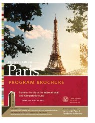
Gallery of Examples<br />
Here the visual elements are used in a similar way across a series<br />
of program-specific brochures (above). Extra secondary graphics<br />
were created for two of these programs (left and center) and used<br />
in a similar way to the laurels (far right).<br />
Using different colors from the palette for each postcard within a<br />
direct-mail series (right) creates variety.<br />
<strong>Cornell</strong> <strong>Law</strong> <strong>School</strong> style guide | how we put it together | 17