

download PDF - Laurel Saville
download PDF - Laurel Saville
download PDF - Laurel Saville

Create successful ePaper yourself
Turn your PDF publications into a flip-book with our unique Google optimized e-Paper software.
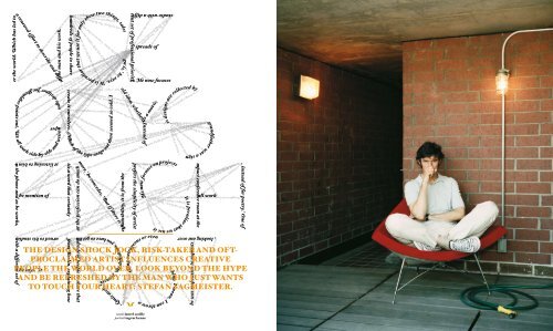
the design shock jock, risk-taker and oftproclaimed<br />
artist influences creative<br />
people the world over. look beyond the hype<br />
and be refreshed by the man who just wants<br />
to touch your heart: stefan sagmeister.<br />
words laurel saville<br />
portrait ingvar kenne
116<br />
STeFAN SAGMeISTeR HAS BeeN CALLeD “HOT”,<br />
“CRAzY”, “BeYOND THe BOuNDARIeS”, “FuLL OF<br />
BOLLOCkS” AND, MORe COMMONLY, “ONe OF THe<br />
MOST INFLueNTIAL DeSIGNeRS IN THe WORLD”.<br />
However, on a sunny afternoon in his compact<br />
conference room at the top of a red-stepped, spiral<br />
staircase near the trendy Meatpacking District of<br />
New York City, he shrugs off such terminology.<br />
What animates his conversation is talk of making<br />
things. At the mention of engineering – which he<br />
studied in high school – he talks at length about<br />
his respect for engineers as unsung heroes who are<br />
“creative at the very meaning of the word, in that<br />
there’s actual creation going on.” Bring up<br />
typography – which, in his work, is made from<br />
materials as various as sausages, straw, or most<br />
famously, cuts in his own skin – and his thoughts<br />
turn to uncovering the person behind the forms.<br />
“I was never that interested in picking the right<br />
typeface,” he says. “It seemed a tedious exercise.<br />
When we needed something that was beyond the<br />
general form, I felt the need to create it ourselves.<br />
Much of the type usage out there seemed so cold.<br />
I felt that the audience outside the design industry<br />
wouldn’t even know a person was behind it.” In<br />
fact, Sagmeister is famous – or perhaps notorious<br />
– for making it clear exactly who is behind his<br />
work by featuring his own scantily clad body in<br />
memorable posters. Yet for him, there is nothing<br />
outrageous or even self-aggrandising about this<br />
approach. “It’s actually quite logical,” he says. “In<br />
all those pieces, the project was about myself. So<br />
using a picture of me in a lecture by me is the most<br />
conservative possibility that will work.”<br />
For Sagmeister, design must make a direct,<br />
immediate, and logical connection. He started out<br />
wanting to make album covers for his favourite<br />
bands – which he did, for Lou Reed, The Rolling<br />
Stones, David Byrne, and Talking Heads. He even<br />
picked up a Grammy Award along the way. But the<br />
deeper desire was to make connections. “One of<br />
the reasons I became a designer was a fascination<br />
with mass communication,” he says. He has no<br />
interest in being a ‘designers’ designer’, comparing<br />
that approach to the attitude of some directors he<br />
worked with who were contemptuous of the people<br />
in their theatres. “They didn’t really care for the<br />
audience; they cared for newness,” Sagmeister<br />
says. “At 19, I admired that. But then I began to<br />
realise that they only directed for their friends,<br />
and that seemed morally reprehensible. If that’s<br />
your role, there’s no need to do it for an audience.<br />
Do it in your living room.”<br />
talk the talk<br />
In contrast, Sagmeister’s designs have appeared on<br />
billboards, magazines, books and galleries all over<br />
the world, which has led to a renewed effort to<br />
describe and define the man and his work. Nancy<br />
Spector, chief curator at the Guggenheim Museum,<br />
calls his output “design masquerading as art”.<br />
Designer Debbie Millman says, “Sagmeister is<br />
letting the world know that graphic designers are<br />
indeed artists.” Graphic designer Steven Heller<br />
splits the difference and refers to him as an “artist/<br />
designer”. Sagmeister prefers the simplicity of<br />
artist Donald Judd’s phrase, “Design has to work;<br />
art doesn’t” and uses it as a standard to judge what<br />
he does. “I first define what the design has to do,<br />
and then I test if it does that,” he says. “When<br />
functionality declines and becomes unimportant,<br />
then it morphs from design to art.”<br />
clockwise from left Things To Do, Sagmeister’s invitation card for the AIGA Atlanta lecture in 1999.<br />
> Sagmeister and co-worker Matthias Ernstberger on a poster for an exhibition in Zurich. The suits the two<br />
are v wearing represent the number of appearances each of the Sagmeister design pieces have made in<br />
magazines and catalogues. The Lou Reed poster has put in 101 appearances, which is why it is the largest;<br />
the smallest is the Anni Kuan brochure, with only seven appearances. > The infamous poster for Sagmeister’s<br />
lecture AIGA Detroit in 1999. The text was carved into Sagmeister’s skin by one of his interns with an Xacto<br />
knife in a visual interpretation of the pain that seems to accompany most of his design projects. Says<br />
Sagmeister of the process, “Yes, it did hurt real bad.” > For a design lecture called Fresh Dialogue, two<br />
tongues wrestling was a perfect image. However, because human tongues aren’t quite long enough for what<br />
Sagmeister had in mind, photographer Tom Schierlitz used two fresh cows’ tongues from a local butcher. The<br />
resultant image was a little too phallic for comfort for some of the commissioning AIGA members. > Never<br />
one to shy away from putting his body on the line, this poster for Sagmeister’s design exhibitions in Tokyo and<br />
Osaka shows the artist in a before-and-after scenario. In this case, Sagmeister is shown with the food items he<br />
consumed in the week between the shots and the 25lb (11kg) he gained on top of his previous 178lb (80kg).<br />
I M A G E S c O u R T E S Y S T E FA N S A G M E I S T E R
118<br />
cI MR AE GD EI T S Mc E O up LR ET AE S EY<br />
S T E FA N S A G M E I S T E R<br />
clockwise from left The Deitch gallery in New York routinely decorates its facade to reflect the art showing<br />
within. For Sagmeister’s Things I Have Learned in My Life So Far interactive exhibition, which showed in<br />
January and February of this year, one of his giant white monkeys from Everybody Always Thinks They Are<br />
Right sat on the gallery roof, regally ignoring patrons. > While it makes an (appropriate) appearance in Things<br />
I Have Learned in My Life So Far, Everything I Do Always Comes Back To Me was originally commissioned<br />
by Austrian magazine .copy. Sagmeister was asked to design the six double page spreads that open each<br />
section of the magazine. With no further briefing for the commission, he took a phrase from his diary and,<br />
using found materials, transformed it into a six-part collage. > After the project for .copy, Sagmeister was<br />
offered a commission with similar freedom: five blank billboards in Seine-Saint-Denis, a suburb of paris.<br />
The brief: “We have billboards; do something.” Sagmeister and right-hand man Matthias Ernstberger<br />
flew to Tucson, Arizona to create the images, letting the desert landscape generate the typographic<br />
forms, and created Trying To Look Good Limits My Life. The five billboards were displayed in a park<br />
like a giant five-part greeting card.
selling visions<br />
He also recognises that design has to sell. “My<br />
parents were salespeople and proud of it,” he<br />
points out. “Great salesmanship is inherent in all<br />
aspects of life.” He specifically admires the<br />
salesmanship required to get a big, bold idea,<br />
whether it’s a movie, television show, or the<br />
St. Louis arch, executed. “You have to get hundreds<br />
of people to share that vision,” he explains. “even<br />
people that might want to change that vision into<br />
something much more mediocre.” However, he<br />
also realises that design, as an industry, has the<br />
potential to move beyond gross commercialism. “I<br />
know that the profession can do much more,” he<br />
concedes. “But if there is a responsibility, it is from<br />
the individual designer. It’s responsibility as a<br />
person. But no more than a streetsweeper or a<br />
mayor. The designer doesn’t have a special<br />
responsibility, any more than a restaurateur does,<br />
to do good work and be a good person.”<br />
For his part, Sagmeister is continually looking<br />
for ways to express his own sense of responsibility<br />
to the larger world. “Considering what a rich<br />
language design is,” he says, “it is peculiar that we<br />
use it for only these two things, sales and<br />
promotion. Wouldn’t it be strange if we used only<br />
French for this, for example, instead of for poetry.”<br />
One of his riskiest ways to step beyond these<br />
limits involved taking an entire year off from<br />
design in 2002. He returned to his studio with a<br />
different set of professional priorities. He still<br />
takes on projects for music and corporate clients,<br />
but also for artistic and socially responsible<br />
organisations. These interests are not new to him.<br />
120<br />
For someone with the reputation of a design shock<br />
jock, look beyond the hype and you find someone<br />
who is surprisingly gentle in person and in his<br />
interests. This is a man who teaches a class on<br />
using design to touch the heart. He gives extensive<br />
thanks to his colleagues, heroes, collaborators,<br />
and friends – three spreads of tiny type worth – in<br />
his latest book. He speaks frankly about striving<br />
for happiness, being good, helping others and<br />
loving his girlfriend well. He even credits much of<br />
his success to being a good boy who got positive<br />
press early on simply because he was responsive to<br />
requests from the media; as a former magazine art<br />
director, he was sympathetic to their needs.<br />
Instead of chasing the money machine, as he<br />
refers to it, he has kept his studio very small; just<br />
four people working cheek-by-jowl in a spare, unwalled,<br />
window-lined space, looking out over the<br />
rooftops above 14th Street and beyond. And he is<br />
generous with whatever wisdom he has acquired in<br />
the process. Not only is his latest book called<br />
Things I Have Learned in My Life So Far, but he is<br />
collegial and collaborative in his work. Studio<br />
designer Joe Shouldice points out, “We all work<br />
side-by-side and we’re super collaborative in<br />
everything. I mean, I can throw a paperclip and<br />
hit Stefan, so just listening to him on the phone<br />
and as he works, I’ve learned so much about every<br />
aspect of design.”<br />
And even without chasing the big corporate<br />
dollars, Sagmeister has found some impressive<br />
financial and professional rewards. His current<br />
client roster not only includes The Azuero earth<br />
project, Levis, TrueMajority, Museum Plaza,<br />
Columbia university and universal Music, but he<br />
is regularly paid to do whatever he wants in<br />
magazines and on billboards. He currently has<br />
“about ten times the amount of work offered than<br />
we can possibly take on.” His year off was met with<br />
an outpouring of new commissions, and he plans<br />
to shut the studio again in 2009. He has two books<br />
out and another in development. His designs are<br />
collected by major museums. He is widely soughtafter<br />
as a public speaker, everywhere from design<br />
schools to the TeD conference. He is a lecturer at<br />
the School of Visual Arts and has held chairs and<br />
professorships at the Cooper union and the<br />
university of Arts in Berlin, among other places.<br />
And instead of being a young designer plotting<br />
ways to get the attention of his design hero, Tibor<br />
kalman (founding editor of Colors magazine, with<br />
whom Sagmeister worked at the beginning of his<br />
career), now he’s got designers happily waiting<br />
three years to start a coveted internship at his<br />
studio. “It sounds cheesy,” says Richard The, a<br />
staff member from Berlin, explaining how he came<br />
to work with Sagmeister, “but I took his course<br />
about how to touch someone’s heart with design,<br />
and compared to what we were doing in digital<br />
design, this was super refreshing.”<br />
Refreshing. It’s a word that certainly applies to<br />
the surprises to be discovered not only in the<br />
work, but also the man.<br />
Things I Have Learned in My Life So Far,<br />
by Stefan Sagmeister, Steven Heller, Daniel Nettle,<br />
Nancy Spector, is published by Abrams and distributed<br />
in Australia by Thames and Hudson.<br />
clockwise from left Things I Have Learned In My Life So Far, rather than being a single volume, consists of<br />
15 booklets inside a slipcase. Each features a pattern or image on the cover, and the slipcase itself features a<br />
die-cut image of Sagmeister’s face, so you can see the patterns through it. Of its contents, Sagmeister rather<br />
self-deprecatingly says, “Astonishingly, I have only learned twenty or so things in my life so far.” The maxims<br />
themselves were constructed of found objects or computer graphics or inflatable monkeys and appeared all<br />
around the world before coming together in one volume. > For the anniversary poster for Design Austria,<br />
the banality of a (mismatched) pair of brown socks is interrupted by an intricate die-cut of a variety of tiny<br />
sausages. > True Majority, a group of American business leaders led by Ben cohen, tries to convince the uS<br />
government to adopt policies designed to prevent another 9/11. One of these is to cut the pentagon budget<br />
by 15 per cent, moving the money across to the education sector. The pig mobile, designed by Sagmeister,<br />
drives around the country trying to drum up support. The sizes of the pigs refer to the difference between<br />
the pentagon budget and government spending on education and foreign aid. > In 2004, Neenah paper<br />
commissioned limited edition posters which were then auctioned, raising $uS14,000 for the Books for Kids<br />
Foundation. Sagmeister’s punctuation mark was the apostrophe – whose job it is to eliminate letters.<br />
I M A G E S c O u R T E S Y S T E FA N S A G M E I S T E R<br />
������������������������������������������������������������������������������������������������������������������������������������������������������������<br />
�
122<br />
When asked to design the cover for an issue of<br />
Esquire Japan, and promised complete freedom,<br />
Sagmeister produced this image (featuring himself<br />
and Ernstberger). upon submission of the image,<br />
however, the team was informed that the it had been<br />
rejected on the grounds that “‘Street piss’ is a crime<br />
in Japan, and it is against the moral,” and “It looks<br />
that piss targets the car, and when reader turns the<br />
cover, Nissan car appears.” All was not lost, however;<br />
Esquire was very apologetic and ran it as an inside<br />
cover, and the image later appeared on the cover of<br />
Belgian magazine DAMn (issue 5).<br />
c R E D I T M E p L E A S E