

download PDF - Laurel Saville
download PDF - Laurel Saville
download PDF - Laurel Saville

You also want an ePaper? Increase the reach of your titles
YUMPU automatically turns print PDFs into web optimized ePapers that Google loves.
116<br />
STeFAN SAGMeISTeR HAS BeeN CALLeD “HOT”,<br />
“CRAzY”, “BeYOND THe BOuNDARIeS”, “FuLL OF<br />
BOLLOCkS” AND, MORe COMMONLY, “ONe OF THe<br />
MOST INFLueNTIAL DeSIGNeRS IN THe WORLD”.<br />
However, on a sunny afternoon in his compact<br />
conference room at the top of a red-stepped, spiral<br />
staircase near the trendy Meatpacking District of<br />
New York City, he shrugs off such terminology.<br />
What animates his conversation is talk of making<br />
things. At the mention of engineering – which he<br />
studied in high school – he talks at length about<br />
his respect for engineers as unsung heroes who are<br />
“creative at the very meaning of the word, in that<br />
there’s actual creation going on.” Bring up<br />
typography – which, in his work, is made from<br />
materials as various as sausages, straw, or most<br />
famously, cuts in his own skin – and his thoughts<br />
turn to uncovering the person behind the forms.<br />
“I was never that interested in picking the right<br />
typeface,” he says. “It seemed a tedious exercise.<br />
When we needed something that was beyond the<br />
general form, I felt the need to create it ourselves.<br />
Much of the type usage out there seemed so cold.<br />
I felt that the audience outside the design industry<br />
wouldn’t even know a person was behind it.” In<br />
fact, Sagmeister is famous – or perhaps notorious<br />
– for making it clear exactly who is behind his<br />
work by featuring his own scantily clad body in<br />
memorable posters. Yet for him, there is nothing<br />
outrageous or even self-aggrandising about this<br />
approach. “It’s actually quite logical,” he says. “In<br />
all those pieces, the project was about myself. So<br />
using a picture of me in a lecture by me is the most<br />
conservative possibility that will work.”<br />
For Sagmeister, design must make a direct,<br />
immediate, and logical connection. He started out<br />
wanting to make album covers for his favourite<br />
bands – which he did, for Lou Reed, The Rolling<br />
Stones, David Byrne, and Talking Heads. He even<br />
picked up a Grammy Award along the way. But the<br />
deeper desire was to make connections. “One of<br />
the reasons I became a designer was a fascination<br />
with mass communication,” he says. He has no<br />
interest in being a ‘designers’ designer’, comparing<br />
that approach to the attitude of some directors he<br />
worked with who were contemptuous of the people<br />
in their theatres. “They didn’t really care for the<br />
audience; they cared for newness,” Sagmeister<br />
says. “At 19, I admired that. But then I began to<br />
realise that they only directed for their friends,<br />
and that seemed morally reprehensible. If that’s<br />
your role, there’s no need to do it for an audience.<br />
Do it in your living room.”<br />
talk the talk<br />
In contrast, Sagmeister’s designs have appeared on<br />
billboards, magazines, books and galleries all over<br />
the world, which has led to a renewed effort to<br />
describe and define the man and his work. Nancy<br />
Spector, chief curator at the Guggenheim Museum,<br />
calls his output “design masquerading as art”.<br />
Designer Debbie Millman says, “Sagmeister is<br />
letting the world know that graphic designers are<br />
indeed artists.” Graphic designer Steven Heller<br />
splits the difference and refers to him as an “artist/<br />
designer”. Sagmeister prefers the simplicity of<br />
artist Donald Judd’s phrase, “Design has to work;<br />
art doesn’t” and uses it as a standard to judge what<br />
he does. “I first define what the design has to do,<br />
and then I test if it does that,” he says. “When<br />
functionality declines and becomes unimportant,<br />
then it morphs from design to art.”<br />
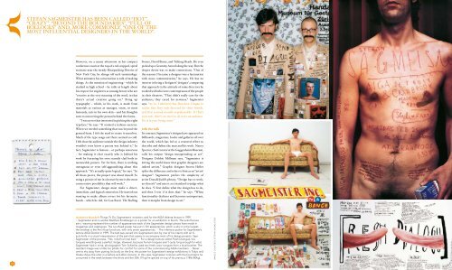
clockwise from left Things To Do, Sagmeister’s invitation card for the AIGA Atlanta lecture in 1999.<br />
> Sagmeister and co-worker Matthias Ernstberger on a poster for an exhibition in Zurich. The suits the two<br />
are v wearing represent the number of appearances each of the Sagmeister design pieces have made in<br />
magazines and catalogues. The Lou Reed poster has put in 101 appearances, which is why it is the largest;<br />
the smallest is the Anni Kuan brochure, with only seven appearances. > The infamous poster for Sagmeister’s<br />
lecture AIGA Detroit in 1999. The text was carved into Sagmeister’s skin by one of his interns with an Xacto<br />
knife in a visual interpretation of the pain that seems to accompany most of his design projects. Says<br />
Sagmeister of the process, “Yes, it did hurt real bad.” > For a design lecture called Fresh Dialogue, two<br />
tongues wrestling was a perfect image. However, because human tongues aren’t quite long enough for what<br />
Sagmeister had in mind, photographer Tom Schierlitz used two fresh cows’ tongues from a local butcher. The<br />
resultant image was a little too phallic for comfort for some of the commissioning AIGA members. > Never<br />
one to shy away from putting his body on the line, this poster for Sagmeister’s design exhibitions in Tokyo and<br />
Osaka shows the artist in a before-and-after scenario. In this case, Sagmeister is shown with the food items he<br />
consumed in the week between the shots and the 25lb (11kg) he gained on top of his previous 178lb (80kg).<br />
I M A G E S c O u R T E S Y S T E FA N S A G M E I S T E R