SCOTT WILLIAMS - TwoMorrows
SCOTT WILLIAMS - TwoMorrows
SCOTT WILLIAMS - TwoMorrows
You also want an ePaper? Increase the reach of your titles
YUMPU automatically turns print PDFs into web optimized ePapers that Google loves.
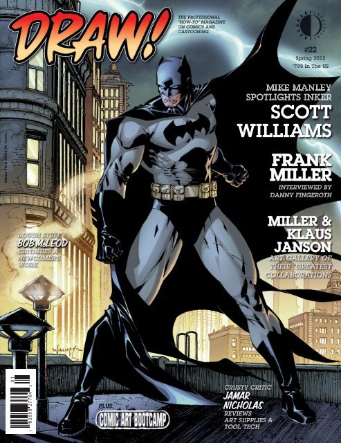
Batman TM & ©2012 DC Comics.<br />
0 1<br />
BOB McLEOD<br />
1 82658 27764 2<br />
PLUS:<br />
<strong>SCOTT</strong><br />
<strong>WILLIAMS</strong><br />
JAMAR<br />
NICHOLAS<br />
FRANK<br />
MILLER<br />
MILLER &<br />
KLAUS<br />
JANSON
SPRING 2012<br />
VOL. 1, NO. 22<br />
Editor-in-Chief • Michael Manley<br />
Designer • Eric Nolen-Weathington<br />
Publisher • John Morrow<br />
Logo Design • John Costanza<br />
Proofreader • Eric Nolen-Weathington<br />
Front Cover Illustration • Scott<br />
Williams<br />
DRAW! Spring 2012, Vol. 1, No. 22 was produced<br />
by Action Planet, Inc. and<br />
published by <strong>TwoMorrows</strong> Publishing. Michael<br />
Manley, Editor, John Morrow, Publisher. Editorial<br />
Address: DRAW! Magazine, c/o Michael Manley, 430<br />
Spruce Ave., Upper Darby, PA 19082. Subscription<br />
Address: <strong>TwoMorrows</strong> Publishing, 10407<br />
Bedfordtown Dr., Raleigh, NC 27614.<br />
DRAW! and its logo are trademarks of Action Planet,<br />
Inc. All contributions herein are copyright 2012 by<br />
their respective contributors.<br />
Action Planet, Inc. and <strong>TwoMorrows</strong> Publishing<br />
accept no responsibility for unsolicited submissions.<br />
All artwork herein is copyright the year of production,<br />
its creator (if work-for-hire, the entity which contracted<br />
said artwork); the characters featured in said artwork<br />
are trademarks or registered trademarks of<br />
their respective owners; and said artwork or other<br />
trademarked material is printed in these pages with<br />
the consent of the copyright holder and/or for journalistic,<br />
educational and historical purposes with no<br />
infringement intended or implied.<br />
This entire issue is ©2012 Action Planet Inc. and<br />
<strong>TwoMorrows</strong> Publishing and may not be reprinted or<br />
retransmitted without written permission of the copyright<br />
holders. ISSN 1932-6882. Printed in Canada.<br />
FIRST PRINTING.<br />
If you’re viewing a Digital<br />
Edition of this publication,<br />
PLEASE READ THIS:<br />
This is copyrighted material, NOT intended<br />
for downloading anywhere except our<br />
website. If you downloaded it from another<br />
website or torrent, go ahead and read it,<br />
and if you decide to keep it, DO THE<br />
RIGHT THING and buy a legal download,<br />
or a printed copy (which entitles you to the<br />
free Digital Edition) at our website or your<br />
local comic book shop. Otherwise, DELETE<br />
IT FROM YOUR COMPUTER and DO<br />
NOT SHARE IT WITH FRIENDS OR<br />
POST IT ANYWHERE. If you enjoy our<br />
publications enough to download them,<br />
please pay for them so we can keep<br />
producing ones like this. Our digital<br />
editions should ONLY be downloaded at<br />
www.twomorrows.com<br />
3<br />
34<br />
42<br />
58<br />
72<br />
THE PROFESSIONAL<br />
“HOW-TO” MAGAZINE ON<br />
COMICS & CARTOONING<br />
WWW.DRAW-MAGAZINE.BLOGSPOT.COM<br />
75<br />
<strong>SCOTT</strong> <strong>WILLIAMS</strong><br />
Mike Manley interviews the influential inker,<br />
and Scott goes step by step through his process<br />
COMIC ART BOOTCAMP<br />
“Illustration”<br />
by Mike Manley<br />
FRANK MILLER<br />
Danny Fingeroth interviews<br />
the industry Legend<br />
CONTENTS<br />
MILLER/JANSON<br />
An art gallery featuring one of the<br />
greatest collaborations in comics’ history<br />
THE CRUSTY CRITIC<br />
Jamar Nicholas reviews the tools of the trade.<br />
This month: Ink.<br />
ROUGH CRITIQUE<br />
Bob McLeod gives practical advice<br />
and tips on how to improve your work
PUNISHER AND © MARVEL CHARACTERS, INC.<br />
Interview conducted by Mike Manley<br />
and transcribed by Steven Tice<br />
In recent times there has been quite a lot of talk about<br />
the state and future of comic art and the comic book<br />
inker. Will comics still be inked in a traditional way, or<br />
will everything go digital, the penciler tweaking things<br />
in Photoshop and thus not needing an inker? A huge<br />
ground shift has happened in the craft of comics in<br />
many areas; the digital wave has hit every aspect,<br />
from production to the way pencilers and inkers<br />
work together. Now pages don’t always physically<br />
leave the penciler to be inked as they have for<br />
decades. Instead pages are often sent via email.<br />
Long gone are the days of pages sent only via<br />
FedEx or the mail.<br />
The rise of the inker in the ’60s at the Big<br />
Two, Marvel and DC, really developed and<br />
enshrined inkers who set house styles for each<br />
company, chiefly Joe Sinnott at Marvel and<br />
Murphy Anderson followed by Dick Giordano<br />
at DC. Over the next two decades the role of<br />
the inker grew even more important in the production<br />
of comic book art, the next generation of<br />
inker being trained at times by or being assistants<br />
of the previous generation. The ’80s and ’90s saw the<br />
coming of superstar inkers like Terry Austin, Joe<br />
Rubinstein, and Klaus Janson, to just name a few, and pencilers<br />
actually vied to have specific inkers on their work.<br />
The style of comic art also changed, becoming slicker and<br />
even more detailed.<br />
In the late ’80s Scott Williams began his rise to the<br />
top of the inking profession with his work teamed with<br />
penciler Jim Lee. Williams continued to gain popularity<br />
and influence to become perhaps the most important and<br />
dominant inker style-wise of the ’90s, thanks to his work on<br />
X-Men. Williams became even more influential when the<br />
top Marvel artists bolted to form Image Comics, which<br />
became the dominate publisher in terms of artistic style.<br />
DRAW! Magazine editor, Mike Manley, caught up<br />
with the always-in-demand Scott Williams to talk about the<br />
profession of inking, past, present, and future.<br />
DRAW! • SPRING 2012 3
(above) A double-page spread from Uncanny X-Men #267, early in Jim Lee and Scott’s collaboration as the title’s art team. Courtesy of Heritage Auctions.<br />
(next page) This cover for Conan #220 marks the third published appearance of the team of Jim Lee and Scott Williams. Courtesy of Heritage Auctions.<br />
X-MEN AND ALL RELATED CHARACTERS AND © MARVEL CHARACTERS, INC. CONAN AND © CONAN PROPERTIES INTERNATIONAL, LLC.<br />
DRAW!: So what are you working on today?<br />
<strong>SCOTT</strong> <strong>WILLIAMS</strong>: I am working on Justice League over Jim<br />
Lee.<br />
DRAW!: Is that going to be an ongoing series, or are you just<br />
doing a couple of issues?<br />
SW: Have you followed any of the news about the DC relaunch?<br />
DRAW!: Yeah, but I’m not up on the specifics of each title.<br />
SW: Got it. Yes, Jim Lee, Geoff Johns, and I are doing a Justice<br />
League re-launch. It’s part of the big new push from DC in 2011.<br />
They are really trying to do some different things, and it should<br />
be cool.<br />
DRAW!: So how long have you been working with Jim, now?<br />
About 20 years, right?<br />
SW: Yeah. We started off on a couple issues of Punisher War<br />
Journal, whenever that was; it must have been the late ’80s. And<br />
then we did a few fill-ins of Uncanny X-Men, again, probably<br />
right around 1990, and then right after that we got a regular<br />
X-Men gig. So, you’re talking over 20 years at this point.<br />
4 DRAW! • SPRING 2012<br />
However, I wasn’t working with Jim exclusively during all those<br />
years by any stretch.<br />
DRAW!: Right, there were a bunch of other artists you worked<br />
with, but he is probably your longest collaboration—<br />
SW: Oh, without a doubt. And, clearly, he’s the elephant in the<br />
room from the standpoint of, y’know, there hasn’t been anybody<br />
bigger than Jim over the course of the last 20 years, so he’s definitely<br />
the guy that I’m most known for, without a doubt.<br />
DRAW!: What would you say, if anything, is the difference<br />
between inking Jim now and inking Jim then?<br />
SW: I think that there is definitely a difference. And I don’t<br />
know how much of it is a function of the way he draws versus a<br />
function of the way that I ink. And, also, just the natural progression<br />
that an artist goes through, some of it calculated, some<br />
of it just organic. People go through transitions where what was<br />
important in the past changes, and what’s important now<br />
evolves.<br />
DRAW!: So what are the differences of importance now?
(above) A panel from Uncanny X-Men #277,<br />
from the creative team of Jim Lee and Scott Williams.<br />
(next page) Jim Lee left Uncanny X-Men for the new spin-off<br />
series, X-Men, which Scott inked. But Scott also continued as<br />
inker for Uncanny over Lee’s replacement, John Romita, Jr.<br />
BISHOP, GAMBIT, WOLVERINE AND © MARVEL CHARACTERS, INC.<br />
10 DRAW! • SPRING 2012<br />
SW: Right, and I think that’s why I gravitated toward Klaus, and still do,<br />
because what he would do is he would have those really bold, brush-chunky,<br />
think strokes, à la old school, whether it was Sinnott or what have you, but then<br />
he would mix in a lot fine line pen lines. He had both, and I still to this day do<br />
both. I really shoot for a very bold, lay it down with one stroke, almost Japanese<br />
brush inking style, and then, next to it, sort of have some fine line rendering,<br />
perhaps, or fine detail, and I like the mix. I like the mishmash of thin and thick,<br />
light and dark. To me, the stuff that bores me is when everything is the same,<br />
when all the line weights are the same and everything has the same texture.<br />
Now, I can easily contradict myself on that. It doesn’t hold true 100% of the<br />
time. There have been times where guys like Kevin Nowlan will go in with,<br />
basically, spotted blacks, and then a very dead weight line, sort of like his Alex-<br />
Tothian masterpiece, that Batman/Manbat Secret Origins story. And then he<br />
would mix things up a little bit by adding some zip-a-tone, perhaps, but for the<br />
most part it wasn’t a huge variation in line weight. So I understand that there are<br />
exceptions to every rule, but, as a rule, I’ve always gravitated towards guys that<br />
had a real wide variety and range of lines all sitting right next to each other on<br />
the same page. It may not necessarily always read immediately and instantly, but<br />
it appeals to my particular sensibilities. An emphasis on varied and lively lines.<br />
DRAW!: When you were coming up, did you study formally? How did you<br />
pick up the techniques?<br />
SW: I got a degree in Fine Art Drawing and Painting from the University of<br />
Hawaii, which is where I grew up. It was a way to learn how to draw, as I never<br />
had any intention of getting into comics as an inker per se. I was looking to get<br />
into comics as an artist. I knew from a very young age that I wanted to be into<br />
comics. But at the start of my career, inking just sort of fell into my lap. There<br />
was an opportunity to do it before a serious penciling gig appeared. I took the<br />
opportunity to get my foot in the door, and just sort of stuck. Inking has its own<br />
challenges, but it doesn’t start with the most fundamental challenge, which is<br />
starting with a blank sheet of paper. But I don’t think I got into it because it<br />
was easier. I got into it due to opportunity and a particular aptitude, and it was<br />
a logical and productive way for me to best utilize my talents. And the fact that<br />
I seem to be lucky enough to keep getting paired up with quality artists with<br />
each successive gig helped a lot. If I somehow had just been unfortunate<br />
enough to work with pencilers whose drawing skills or sensibilities didn’t<br />
match with my own, I think it really would have pushed me much more<br />
towards penciling. I sort of had it in the back of my mind that the inking was<br />
a temporary gig, and eventually I’d just keep learning the ropes and would<br />
eventually start penciling full-time. I just kept getting better and better opportunities<br />
as an inker, and being a full-time penciler did not materialize.<br />
TOOLS<br />
DRAW!: How did you pick up which tools to use? Which tools did you use<br />
then?<br />
SW: Well, at some point I became exposed to the How to Draw Comics the<br />
Marvel Way book by Stan Lee and John Buscema. There weren’t a lot of text<br />
books on making comics, and this book might not have been the perfect learning<br />
tool for an up-and-coming inker, but it did provide a peek behind the curtain.<br />
DRAW!: Though it was pretty light on inking.<br />
SW: Right. There wasn’t a lot there, but it gave you some fundamentals. I<br />
mean, it showed you the crow quill, it showed you what a brush was, it showed<br />
you how to rule a line, it showed you the different highlighted textures and sensibilities<br />
to inking. I never thought inking was particularly complicated. It’s<br />
certainly difficult to master, and it takes a certain craft and facility and, yes,<br />
talent to manipulate the tools, and there’s a lot of trial and error, but, obviously,<br />
once you get certain tool fundaments, like which tools to use—don’t use a<br />
ball-point pen, and, generally, don’t use Rapidographs. I mean, shoot, you can
use a rusty nail if you want, if it’ll give you the line that you want,<br />
but generally there’re a few certai n tools that you can use that’ll<br />
put you on the right path.<br />
DRAW!: I believe Terry Austin used to ink everything with a<br />
Rapidograph when he was starting.<br />
SW: Yeah, I know, so that’s why I’m saying every rule has an<br />
exception, and inking is no different. But the point is that, really,<br />
once you kind of understand which tools to use, then it really<br />
comes back down to your drawing skills, your drawing sensibilities,<br />
and practice, and trial and error. I think the drawing skills are<br />
first and foremost, by far. I think even an artist who has a scratchy,<br />
ugly line, if his drawing is sound, I’ll like it. It doesn’t have to be a<br />
clean, slick, polished line, Of course not having a nice line might<br />
hinder your acceptance in being hired by a given editor, that’s true,<br />
but in terms of appeal to me and putting you on the right path, the<br />
quality of the line is not the important part. The solidity of the<br />
drawing and the understanding of fundamentals is the most important<br />
part. And that’s what I’ve always focused on.<br />
DRAW!: Oh, I 100% agree, because, basically, all of the best<br />
inkers were guys who drew well, and maybe they weren’t all as<br />
dynamic as a Buscema or Kirby in the old days, but they knew<br />
how to draw a hand, they knew how to draw faces, so they didn’t<br />
destroy shapes, form, they didn’t flatten out somebody’s features.<br />
12 DRAW! • SPRING 2012<br />
SW: Yeah, and that still holds true today. And there are inkers<br />
whose work has a nice line who I, frankly, am not particularly<br />
impressed with, because I sort of sense that they’re at the mercy<br />
of the penciler. They can’t fill in the gaps. They can’t interpret. If<br />
you give them a nice, completed pencil line, then they’ll be able<br />
to pull something out, but if you give them anything that’s vague,<br />
or anything that requires a certain level of drafting skill, that’s<br />
where, I think, their limitations begin to show.<br />
DRAW!: Have you changed your tools from the beginning to<br />
now? What are the tools of your trade?<br />
SW: Well, I started off—again, I think it may be counterintuitive—I<br />
thought learning how to ink with a brush would be<br />
easier than learning how to ink with a quill, so I started off inking<br />
with a brush. Or at least having more success with the brush.<br />
Finding a good brush is much harder now, but back then it was<br />
the old Winsor & Newton Series 7s.<br />
DRAW!: They kind of suck, now, though.<br />
SW: Yeah, they really do. Brushes in general suck now. Finding<br />
quality material, be it brushes or pens or paper, is a serious problem<br />
right now. It concerns me a great deal.<br />
DRAW!: You know which ones I like right now? I don’t know if<br />
you guys have a Dick Blick near you, but I’ve been using the
STEP BY STEP—DARK KNIGHT: To the left and right,<br />
you can see various stages of Scott’s inking over<br />
David Finch’s pencils for a splash page from Dark<br />
Knight #2. He starts with Batman’s face and arm,<br />
then proceeds to block in the figure. Notice that leaves<br />
the small details (Batman’s utility belt, the cracks in<br />
the floor tiles, the texture of the stairs) for last.<br />
BATMAN AND © DC COMICS.<br />
Dick Blick Series #4, and they’re actually<br />
better than—<br />
SW: Raphael’s?<br />
DRAW!: No, they have a store brand.<br />
Even with the real expensive brands, it<br />
really depends upon the brush you get,<br />
because the quality is all over the place.<br />
SW: Oh, without a doubt. That’s why I<br />
was saying that finding quality materials is<br />
tough right now.<br />
DRAW!: But the Blick brushes are cheap<br />
and decent.<br />
SW: I abandoned the Winsor & Newton<br />
Series 7s years and years and years ago and<br />
found that the Raphael 8404, the 8408,<br />
were great. But even in the early days,<br />
you’d only get a certain percentage of them<br />
that were serviceable. If you bought ten at<br />
a time, maybe seven or eight of them would<br />
be real solid. Now if I get ten, depending<br />
on which batch I get them from, they may<br />
all blow. I can’t use any of them. Or maybe<br />
only two or three are any good, and when<br />
you’re talking brushes that are 20 bucks a<br />
pop, there’s a realization that you’re just<br />
sort of spitting into the wind.<br />
DRAW!: That’s why I was saying I was<br />
using those Dick Blick Studio brushes,<br />
because I found those to be....<br />
SW: Consistent quality?<br />
DRAW!: Yeah! I mean, I like them. You<br />
have to pick them—you know, spit test<br />
them in the store—but I find they do well.<br />
For the money, if you blow through one a week or month, what<br />
the heck. It’s, like, eight bucks or something like that. So, I take<br />
it you were using, what, a crow quill pen?<br />
SW: Yeah, yeah. Getting back to the question, I started off doing<br />
more brushwork and then realized that, just to get some versatile<br />
lines and some different types of lines, I had to figure out how to<br />
use the crow quill, and that takes a little longer getting used to,<br />
understanding the angle that you have to hold the sucker at. And<br />
I had to figure out why, when you buy them by the gross, or by<br />
the box, or whatever, some of them are split down the middle, and<br />
sometimes the tong isn’t split down the middle. You pull out one<br />
pen nib and it makes a reasonably decent line, then you pull the<br />
next one in the box, and it either won’t make a line or it makes a<br />
crappy line or digs into the paper or you have wash the oil off. You<br />
know, all the little tricks of the trade that you start figuring out.<br />
DRAW!: Or they explode on you when you’re inking. [laughs]<br />
SW: They explode. Especially when you’re in a groove, when<br />
you get a really nice one and the metal gives a little bit, it’s nice,<br />
and you’re just ripping along and making big, fat lines as well as<br />
thin, little fine lines, and then they just blow up, and you hope to<br />
God a piece doesn’t fly into your eye or whatnot. Yeah, I’ve had<br />
multiple exploding episodes.<br />
So I started off my career doing a lot of brushwork, but very<br />
quickly went into probably an 80/20 split, with crow quill being 80<br />
and the brush being 20. I usually used a Hunt 102, and then a little<br />
DRAW! • SPRING 2012 13
(left) STEP BY STEP—DARK KNIGHT: Scott’s final inks for the David Finch-penciled Dark Knight #2 splash page.<br />
(above) STEP BY STEP—JUSTICE LEAGUE: Jim Lee’s pencils for the cover of Justice League #1, along with the start of Scott’s inking.<br />
ALL CHARACTERS AND © DC COMICS<br />
bit later on the Gillott 850 and the 659, and used those through the<br />
bulk of the X-Men years and the early WildC.A.T.s and Image type<br />
stuff, and then eventually coming back to the 102. However, I<br />
almost completely dropped all my pen work in favor of a brush<br />
when I started my DC work and “Hush” in particular. It sort of<br />
reintroduced my love affair with brush inking and opened the door<br />
to a fresh look at my work. More experimentation, though not<br />
without a cost. A lot of the “Hush” stuff, which by all reasonable<br />
measures should have been inked with a crow quill or some other<br />
fine line tool, was brushwork and was done so because I had rediscovered<br />
this old, great toy, and probably gave me carpal tunnel or<br />
nerve damage or whatever, because it was just insane some of the<br />
stuff I was trying to do with a brush. Types of things that didn’t<br />
really lend itself to brush. It was a challenge that I really wanted to<br />
attempt at that point in my career—a different look in my work, a<br />
more organic look, or a little more fluid look, but still recognizable<br />
as my work—and doing it with the brush just blew through that<br />
creative door. As a result I’m now mostly a brush guy again.<br />
Although, having said that, a lot of the stuff I’m doing on<br />
Justice League right now is back to quill. Part of that it is because<br />
I kind of get bored a little bit too easily. I kind of get with a tool,<br />
or get with an approach, for a period of time, and then I get bored<br />
with it and just want to change things up for reasons that only,<br />
probably, my shrink would be able to tell you. I don’t know why<br />
exactly it is. I think everybody gets bored doing the same thing,<br />
and there’s a certain tactile quality to inking, and I think after I<br />
while I just get bored with that same feel, that same motion, and<br />
the sameness of the line. Then the pages start to blur from one to<br />
the next a little bit, I realize I’m using the same techniques and the<br />
same tools over and over and over again, and it creates a sameness<br />
that I think, “Well, if I’m bored, then the people who are reading<br />
the stuff are probably bored, too, at least the ones that are tuned in<br />
to something as subtle as the ink line.” So I kind of start changing<br />
things up. Now I’m at a point where I flip it on and off like a<br />
switch, back and forth, back and forth. I used to feel very—I think<br />
inkers in general have a bit of an anal retentive quality in that I felt<br />
like if I inked Batman’s cape with a brush, I had to be consistent<br />
throughout, and there had to be a consistency in the visual language<br />
of the ink line. There is a logic to that thinking. But now<br />
I’m like, no. One page I’ll do it in brush, the next page I’ll do it<br />
with a pen, and the variation in line and line quality—if it doesn’t<br />
make sense in a logical way, I don’t care. [laughter]<br />
DRAW!: So today what are you using, a 102?<br />
SW: Today I’m just using a 102, yeah. And in an hour, I’ll bust<br />
out the brush again. Very consistent, yes?<br />
DRAW! • SPRING 2012 15
STEP BY STEP—JUSTICE<br />
LEAGUE: A detail shot of<br />
Scott’s initial inking (previous<br />
page) for the cover of Justice<br />
League #1 shows him starting<br />
with the foreground figures.<br />
With each stage he works<br />
farther back, spotting blacks<br />
as he goes, though he does<br />
not usually complete each<br />
figure before moving on to<br />
the next. With Batman<br />
(right) he only leaves the<br />
larger black areas of his<br />
pants and cape.<br />
ALL CHARACTERS AND © DC<br />
COMICS<br />
DRAW! • SPRING 2012 17
DRAW!: Every inker has their bucket list—the people that you<br />
wish you could have inked, but who have passed on into the<br />
Great Art House in the sky. And now you’re inking Neal Adams,<br />
though I assume by now you’re probably done with inking Neal<br />
Adams on the Batman: Odyssey.<br />
SW: Yeah, that was a big one I got to cross off the bucket list.<br />
DRAW!: So who are the top five pencilers that you haven’t<br />
inked, that you would love to ink?<br />
SW: Most of them are probably still around, though they are<br />
guys who usually ink their own work. I’ve never inked a Frank<br />
Miller job, would love to. Probably not a surprise knowing what<br />
big Klaus guy I was, but having said that, there are a lot of Frank<br />
Miller jobs of Frank inking himself that I like even better than<br />
what Klaus was doing. A little bit of apples and oranges. I think<br />
the line that Frank used over the years was a lot different than the<br />
line that Klaus used. I thought that Klaus, as an inker, did a<br />
remarkable job of interpreting Frank during the period of time<br />
that they worked together. Having said that, I thought Frank’s line<br />
on a lot of the work he did was great, where he was experimenting<br />
through Ronin, and through the Elektra graphic novel, and<br />
even from 300, on The Dark Knight Returns, and some of the<br />
covers that he did for Lone Wolf and Cub. A lot of that stuff is<br />
very appealing. I always thought that I was so tuned into that<br />
stuff that I could do a good job on Frank. Whether he would<br />
agree, or anyone else would agree, is subject for debate, and<br />
something that is open for interpretation. And, actually, a couple<br />
years ago I did a Frank Miller piece in a sketchbook that was a<br />
Dark Knight Batman and Robin statue sketch that he did mid- to<br />
late ’80s. I inked that in a much sleeker line than maybe I would<br />
have if I’d have been actually inking a gig for Frank. If he said,<br />
“Scott, I’m doing such-and-such. I’d like you to ink me. Show me<br />
what you would do,” I don’t think I would have done it in the<br />
slicker style that I did the Dark Knight piece. But that was for a<br />
different audience and with a different sensibility. But that was a<br />
lot of fun to do. And so he would be one of those guys.<br />
I would love to have a chance to work on Mike Mignola’s<br />
stuff, but, again, he inks his own work. Let’s see.... There are certain<br />
guys I would never in a million years ink. I would never ink<br />
Kevin Nowlan, and he would never have me. I would never ink<br />
Bernie Wrightson. These are some of my favorite artists, but I<br />
would just ruin them. There are certain guys that just have their<br />
own line and their own sensibility. At one point, when I was<br />
doing that sketchbook of inking different artists in different<br />
styles, there were certain guys that I thought that I could handle,<br />
and certain guys that I thought would be almost impossible to<br />
handle. The Wrightsons of the world, he’s got such a line that I<br />
just can’t imagine—I could do no justice to it. There would be<br />
nothing on the horizon but failure trying to approach something<br />
like that. I just think guys like Wrightson, or guys like Nowlan,<br />
who have such a distinctive style, I just don’t see any upside to<br />
doing any of that stuff.<br />
I’m trying to think if there’s anybody else. Yeah, I really wish<br />
John Buscema was still around. I think I could do some interesting<br />
stuff with John. I wouldn’t be scared of it, because I think his<br />
style lends itself to a lot of different approaches.<br />
DRAW!: Yeah, I still wish he was around, too. I was always very<br />
envious that Jerry Ordway got to ink him. He’s one of the guys I<br />
26 DRAW! • SPRING 2012<br />
(above and next page) Neal Adams’ pencils and Scott Williams’ inks<br />
for Batman: Odyssey #4, page 10.<br />
BATMAN AND © DC COMICS.<br />
would have loved to ink. It’s like, when I got to ink Steve Ditko<br />
on that one Marvel job, I felt like, “I’m a real cartoonist now! I’m<br />
a real inker now!”<br />
SW: Yeah! And, one way or another, I mean, I’ve inked a lot of<br />
guys that I’m not particularly recognized for, but I’ve gotten to<br />
do something with them. I think everybody from Jack Kirby, to<br />
Simonson, to John Byrne, to Michael Golden, to Rick Leonardi,<br />
to Todd McFarlane, and Barry Windsor-Smith, and now Neal<br />
Adams.... There are a lot of guys that I’ve inked professionally—<br />
DRAW!: Did you ever ink Gene Colan?<br />
SW: No, I’ve never inked Gene Colan. He would be hard. He<br />
would be hard. Trying to interpret the grays and graduated tones?<br />
I would be better suited for it now than I was years ago, without<br />
a doubt, but I think he would be hard. I think I could do something<br />
that might work, but that’s tough.<br />
DRAW!: Because Janson did a good job on him.<br />
SW: Yeah, Klaus did a good job. I think the only guy that I’ve<br />
ever seen Klaus do that probably wasn’t appropriate was when he<br />
inked John Byrne. And the inks were actually beautiful. They
were beautiful inks, but they were too heavy-handed; they took<br />
away from John Byrne’s aesthetic on those Avengers issues to the<br />
extent that they were distracting. I think that was the only time<br />
I’ve seen Klaus ink somebody where I thought, “Beautiful<br />
linework, but not appropriate.”<br />
DRAW!: It’s funny, because the only John Byrne art that I own,<br />
I have a couple pages that Klaus inked probably over Byrne’s<br />
looser, breakdown pencils on Wolverine. And that only because it<br />
had a lot of great, interesting texture.<br />
SW: Oh, like I said, the ink line itself, and the textures and everything<br />
that he brings to the page is gorgeous. But there are cer-<br />
tain—I mean, it’s part of the reason why<br />
I would never ink a Wrightson or a<br />
Kevin Nowlan. There’s a certain purity<br />
there. It’s especially true where artists<br />
ink their own work and are best known<br />
for having their own work inked by<br />
themselves. There’s a certain style, a<br />
sensibility and aesthetic, that the pencil<br />
artist brings to his own inks that, for me,<br />
just are cemented as the standard, and<br />
any deviation from a secondary ink artist<br />
is just off-putting. Just wrong. And it’s<br />
almost pointless, because your hand<br />
doesn’t work that way, and your mind<br />
doesn’t work that same way, as an inker<br />
coming in from the outside, to do justice<br />
to it. John Byrne definitely has benefited<br />
from a lot of different inkers, but you<br />
do have to have a certain stylistic aesthetic<br />
that works, and I think Klaus is a<br />
guy who has a certain style aesthetic that<br />
doesn’t necessarily work on John Byrne,<br />
but for 99% of the other pencils out<br />
there, it works just fine.<br />
NEAL ADAMS<br />
DRAW!: So how was it inking Neal<br />
Adams?<br />
SW: It was excruciating. It was excruciating<br />
in a wonderful sort of way. What I<br />
didn’t realize when I started the gig,<br />
though, was that we were working at<br />
cross-purposes. And by that I mean,<br />
Neal was really thinking—and rightly<br />
so—in very contemporary terms. He<br />
draws the way that he draws now, and he<br />
inks the way that he inks now, and he<br />
likes both those approaches. When I was<br />
looking at his pencils, I’m thinking,<br />
“Okay, how can I translate this in ink<br />
into Neal circa 1971?” I have a huge<br />
Neal Adams art collection, and I pulled<br />
out all of his artwork and just started<br />
looking at his Green Lanterns, his<br />
Batmans, his “Deadmans,” and his<br />
Avengers, and most of the stuff he inked<br />
himself—not so much the stuff that Dick<br />
Giordano inked, or the stuff that Tom Palmer inked. Not that they<br />
didn’t do a great job, but I was trying to get more of the soul of<br />
what Neal was doing and sort of that pure Neal line. And I was<br />
inking everything in an energetic, spontaneous, but very reinedin<br />
style, and very delicate lines, but, again, with a confidence and<br />
a cocksureness that I think Neal had back then. Today, Neal’s line<br />
is much different, and I don’t even know how he would describe<br />
it. I’m not quite sure how I would describe it. But it’s a much different<br />
line, and I think when he saw what I was doing, I’m not<br />
sure it went down right. I think he felt it was so different than<br />
what he’s doing now that he changed a lot of it after the fact—<br />
changed it digitally. He didn’t change any originals. I sent him<br />
DRAW! • SPRING 2012 27
34 DRAW! • SPRING 2012
(above) N.C. Wyeth provided covers and illustrations for<br />
many classic children’s novels.<br />
(right) Norman Rockwell’s paintings graced many a cover of<br />
The Saturday Evening Post.<br />
(below) James Bama is best known for his Doc Savage book<br />
covers.<br />
DOC SAVAGE AND © CONDE NAST.<br />
This time out with “Comic Book Bootcamp” we are going<br />
to delve into the emerald realm of Sherwood Forest and<br />
the world of illustration. In the last year I have had the<br />
opportunity to illustrate two book covers featuring Robin Hood<br />
for the fine folks at Airship 27. I have always<br />
loved illustration, specifically the golden age<br />
of American Illustration. Norman Rockwell,<br />
Dean Cornwell, and N.C. Wyeth are three of<br />
my favorite artists in any field. I have always<br />
thought of illustration as a sister field for<br />
comic artists and cartoonists to work in, and in<br />
fact many of the best and most famous cartoonists<br />
moved into illustration from comics,<br />
like Frank Frazetta, Mort Künstler, and Frank<br />
Godwin (Connie, Rusty Riley) to name just a<br />
few. Hal Foster of Prince Valiant fame started<br />
as an illustrator and moved into comic strips,<br />
first with Tarzan and then with his most<br />
famous creation, Prince Valiant.<br />
Foster employed the same skills he used<br />
in doing realistic and researched illustrations<br />
for magazines like Popular Mechanics and<br />
brought them to bear in the comic strips, ushering<br />
in a sense of realism and believability<br />
and setting a level of craftsmanship to which other cartoonists<br />
and illustrators strived. In the ’50s, when the comics industry<br />
went through its first big downturn, many cartoonists left comics<br />
for the much more lucrative field of illustration. Some, like<br />
Frazetta, never came back. Frazetta himself went on to great<br />
fame and fortune as a fantasy and paperback cover artist.<br />
As a teenager I used to haunt many local used bookstores<br />
on the search for his paperback covers, and along the way I discovered<br />
a lot of great illustrators, from John<br />
Berkey to Frank McCarthy and James Bama.<br />
I collected old Saturday Evening Post magazines<br />
for covers by Norman Rockwell and<br />
illustrations by many artists of the golden<br />
age of illustration, such as Dean Cornwell,<br />
Mead Schaeffer, Albert Dorne, and more.<br />
All throughout my career as a comic guy, I<br />
have continued my interest and passion for<br />
illustration.<br />
A little over a year ago I met Ron Fortier<br />
via Facebook after he left a nice comment on<br />
one of my fine art paintings I had posted. In<br />
short order this lead to Ron offering me an<br />
opportunity to illustrate a cover for one of<br />
Airship 27 and Cornerstone Publishing’s<br />
upcoming books, Robin Hood: King of<br />
Sherwood, by I.A. Watson, a new book telling<br />
the stories of Robin Hood.<br />
In this article I will focus mainly on the<br />
second of the two book covers I painted for the series. The first<br />
cover of the series garnered me the Pulp Factory “Best Cover”<br />
Award. When Ron emailed me about the second book in the<br />
series I was pumped to get started on it.<br />
DRAW! • SPRING 2012 35
For the first cover in the series I talked to Ron and Art<br />
Director Rob Davis. I set about doing some sketches and came<br />
up with a final sketch, which I submitted.<br />
Next I set about gathering my reference for the illustration,<br />
and this led me to employ one of my best friends and fellow student<br />
and studio mate at school, Will Sentman. It just happened to<br />
be my luck that Will looked the part of a young Robin and had<br />
the costume, as he is a Ren Faire fan, and had a bow and arrow<br />
to boot.<br />
I set up a photo shoot in my living room, and Will posed as<br />
close as he could to my sketch. My idea was to use the pictures<br />
I shot for the lighting and details I wanted in the final illustration,<br />
but I did not want the photos to be something that I was a<br />
slave to. I wanted to use the photo merely as a tool to aid me in<br />
details and lighting. I looked to artists like N.C. Wyeth, who did<br />
employ some photography, but was not in any way a slave to<br />
them. In fact, Wyeth was a big influence on me in doing both of<br />
these covers.<br />
USING PHOTO REFERENCE<br />
On the second cover of the series, Robin Hood: Arrow of<br />
Justice, I again employed Will and also my friend Alina Osipov<br />
as Maid Marian. This time I did the photo shoot at the<br />
Pennsylvania Academy of the Fine Arts, where we all attend.<br />
The action on the second cover takes place as Robin and<br />
36 DRAW! • SPRING 2012<br />
(above) Mike’s submitted rough sketch and finished painting for the cover of Robin Hood: King of Sherwood.<br />
(next page) Photo reference shot by Mike for the cover of Robin Hood: Arrow of Justice.<br />
© MIkE MANLEy<br />
Marian break into the castle, and I figured the school would be<br />
the perfect backdrop and stage. It was a pretty hot day for us as<br />
I tried a lot of different set-ups with both Will and Alina. I had<br />
in my mind what I wanted to do for the cover this time, so I<br />
went about placing Will and Alina in a variety of poses and<br />
angles knowing that I would probably not use any one picture,<br />
but choose parts of many.<br />
I shot many photos that day and later spent a good bit of time<br />
sorting them down to a useful handful. I then sat down and did<br />
my sketch. I referenced the photos, but ultimately ended up not<br />
using much from the ones I shot of Alina. I was not happy with<br />
the poses of the figure, but they were great for her hair and face.<br />
Once I was happy with the sketch, I submitted it to Rob and Ron<br />
for approval.<br />
In the end I only took parts of the photos and made up most<br />
of the figure of Maid Marian, as I was just not happy with any of<br />
the photos I shot. I should also mention that I never use the color<br />
from the photos I shoot, but rather the values, and I also bracket<br />
the exposures and then adjust them in Photoshop to capture<br />
details. There is a great recent book called Norman Rockwell:<br />
Behind the Camera, by Ron Schick, which details Rockwell’s<br />
process and how he used photography. It’s a fantastic book and one<br />
I highly recommend not only as a Rockwell fan, but also for its<br />
detailing of how to use photography as an aid, not a straightjacket.<br />
Once the sketch was approved, I moved into production.
Hardboiled Hero<br />
FRANK MILLER<br />
Interview conducted via phone<br />
by Danny Fingeroth<br />
transcribed by Steven Tice<br />
and copyedited by Danny Fingeroth<br />
and Frank Miller<br />
42 DRAW! • SPRING 2012<br />
(above) Miller’s cover<br />
contribution to ’Mazing Man #12.<br />
(righ) Prelims and final art from<br />
Frank’s “Sin City” book The Big Fat Kill #2.<br />
BATMAN AND ROBIN,<br />
’MAzING MAN AND © DC COMICS.<br />
SIN CITy AND © fRANk MILLER.<br />
SPOTLIGHT
F RANK MILLER changed the way comics are done, starting with Daredevil and<br />
moving on to re-envision Batman in The Dark Knight Returns. Other triumphs for the<br />
writer-artist included Martha Washington, 300, and, of course, Sin City, which was turned<br />
into a sleeper-hit movie which he co-directed. Frank also wrote and directed The Spirit,<br />
based on Will Eisner’s classic character. His recent work includes Holy Terror, and the<br />
upcoming sequel to 300, Xerxes.<br />
I spoke with Frank via phone on March 11, 2010, and he answered some follow-up<br />
questions via email in November, 2011.<br />
DANNY FINGEROTH: Did you always want to write your own comics,<br />
Frank? You came to Marvel drawing other people’s stuff. Was writing always<br />
your ambition?<br />
FRANK MILLER: It always was, because I always saw the two crafts as one<br />
thing. I grew up drawing my comics on a piece of typing paper folded in half,<br />
showing my mom and saying, “I’m doing this for the rest of my life!”<br />
DF: What did she say when you said that?<br />
FM: She said, and I quote, “You can do anything if you set your mind to it.”<br />
DF: Who are your influences in writing and art? Who got you excited about<br />
wanting to do comics professionally?<br />
FM: Well, the first two would be a guy by the name of Curt Swan, and then<br />
Jim Shooter. I grew up reading superheroes. Later I fell in love with the work<br />
of Steve Ditko and Stan Lee, and Jack Kirby and Stan Lee. Then years and<br />
years went by, and I discovered Will Eisner and fell madly in love with his<br />
combination of words and pictures.<br />
DF: Where did you discover him, in the Warren Spirit reprints?<br />
FM: Yup! I was bicycling, as I always did, from Montpelier, Vermont, to<br />
Barre, Vermont, two towns that are very close together, and came across this<br />
oversized, weird-looking comic book and thought, “Who is this new guy?<br />
He’s amazing!” Then, of course, I saw the copyright and it said “1942.”<br />
DF: Had you read the Jules Feiffer’s The Great Comic Book Heroes, which<br />
introduced Eisner to a new generation?<br />
FM: I had read the Feiffer book and seen Steranko’s Eisner tribute in his<br />
History of Comics, but it wasn’t until I sat down and read the Spirit story<br />
“Sand Serif ” that I realized what Eisner really did.<br />
DF: What was it about that story that got to you?<br />
FM: It broke my heart. It showed me that comic books could break my heart.<br />
Beyond showing guys walking in shadows along waterfronts and all that wonderful<br />
imagery, it showed a hero facing a moral challenge, and addressing it.<br />
DF: A deeper moral challenge than the Marvel heroes of the day were facing?<br />
FM: I thought so, because he had that classic line, which I kept in the Spirit<br />
movie, “I’ve got to find Sand Serif and bring her in.” Which I, of course, stole<br />
when I did Elektra. I just changed the lingo. I had Daredevil say, “I’ve got to<br />
find Elektra and bring her to justice.” But, come on, it was a cold rip-off.<br />
DF: It would be like Superman saying, “I’ve got to find Lois Lane and bring<br />
her in.”<br />
FM: Yeah. And I think we all have a Sand Serif back there somewhere.<br />
DF: At least one.<br />
FM: Well, yeah. If we’re lucky, it’s more than one. But there’s always that one.<br />
It’s your Bobby McGee. It’s the one you’ll never forget.<br />
(above) Frank’s poster art for The Spirit.<br />
(below) Frank Miller’s Daredevil via Will Eisner.<br />
THE SPIRIT AND © THE WILL EISNER ESTATE.<br />
DAREDEVIL AND © MARVEL CHARACTERS, INC.<br />
DRAW! • SPRING 2012 43
Some of Frank’s earliest work for Marvel included this 1980 cover for Marvel Spotlight vol.2, #5 (left) inked by Bob Wiacek<br />
and a 1980 “Captain Marvel” story in Marvel Spotlight vol. 2, #8 (right) inked by Bruce Patterson.<br />
CAPTAIN MARVEL, DRAGON LORD AND © MARVEL CHARACTERS, INC.<br />
DF: Most people’s first memory of your work is on Daredevil.<br />
But where did you first break in?<br />
FM: There’s no way to explain this without prefacing it. I bothered<br />
Neal Adams a lot, and he kept on letting me come to his studio.<br />
And he hated my work.<br />
DF: Why did he hate it?<br />
FM: He just told me it was terrible. And I went on from him to<br />
Joe Orlando at DC Comics, who also hated my work, and<br />
various other people who hated my work. And eventually I<br />
showed something to Neal that impressed him enough where he<br />
said, “The guy can’t draw, we all know that. But his storytelling<br />
is budding.” He gave me my first job at Gold Key Comics doing<br />
Twilight Zone. I did a few Twilight Zones, and then I got down to<br />
DC Comics, and eventually Paul Levitz offered me Claw the<br />
Unconquered. And I went to Jim Shooter and I said, “I’d rather<br />
do something for Marvel. Can you guarantee me regular work?”<br />
And he said, “I can only make you a personal promise. You will<br />
work regularly here.” So I got to draw things like “Captain<br />
Marvel” and so on. And then I had the utter audacity to request<br />
Daredevil. Gene Colan had just quit, and Frank Robbins had<br />
taken it over, but it was an issue-by-issue thing. And I applied for<br />
the job and got it.<br />
44 DRAW! • SPRING 2012<br />
DF: Did you go to art school?<br />
FM: No. I only learned by practicing at home, ripping off everybody<br />
from Barry Smith to Neal Adams, and then learning directly<br />
from masters like Al Williamson and Neal Adams.<br />
DF: From copying their work, you mean?<br />
FM: No, I mean from invading their studios. [laughter] And having<br />
them show me how bad my work was.<br />
DF: What made you think you could just go knock on their<br />
doors? Was it naiveté?<br />
FM: It was a combination of naiveté, and also—Danny, I got<br />
fired off every job I ever had. I couldn’t make it as a truck driver.<br />
I couldn’t make it as a bus driver. I couldn’t make it as a janitor.<br />
For me, it was do or die.<br />
DF: Did you have art teachers in high school who encouraged<br />
you?<br />
FM: Yeah. I had one art teacher in particular, Bruce Brooks, who<br />
was a wonderful teacher, and he encouraged me. And I had a brilliant<br />
teacher, Jeff Danziger, who’s actually now a renowned cartoonist,<br />
who encouraged me to write. He said that my talents<br />
were more in the writing sector. Now he and I are good friends,
and we’re both almost the same age. But when he was in<br />
his 20s, he thought I’d make a better writer than an artist.<br />
DF: Did you write as a teenager?<br />
FM: Oh, yeah, yeah. I wrote all my own stuff. Who<br />
else was going to do it?<br />
DF: I mean did you write prose—short stories, or<br />
detective fiction, anything like that?<br />
FM: Yes, I did. I did it very badly.<br />
DF: Has that material ever been published anywhere?<br />
FM: If it had been, I wouldn’t tell you.<br />
DF: So Shooter gives you the shot on Daredevil. I<br />
guess technically the editor was Al Milgrom?<br />
FM: That was Al Milgrom. I worked with Al Milgrom<br />
and Jo Duffy.<br />
DF: Klaus Janson had been inking it before, and so<br />
that’s how you two first got paired up?<br />
FM: Yes. And I called up Klaus and begged him to<br />
stay on the book because I knew somebody had to<br />
soften the rough edges and make sense out of my pencils,<br />
and he did a beautiful job. I think Klaus and I had<br />
kind of a magical collaboration, because he would<br />
take my stuff and he would really take the rough edges<br />
off it, and really pull out what was inside it, meanwhile<br />
adding that snap and confidence to the ink line,<br />
so that we developed a style that was ours. It wasn’t<br />
either of ours, and I really felt that we had a rapport<br />
that was pretty amazing considering we almost never<br />
socialized.<br />
DF: Klaus brought a visual continuity from the previous<br />
Daredevil days to your first run on the book,<br />
and made it a seamless transition.<br />
FM: I thought he and Gil Kane were<br />
astonishing together on the book, and I<br />
was out to imitate that a lot at the beginning.<br />
And, of course, there<br />
was the Eisner influence.<br />
DF: As with every artist, those<br />
influences are there, but you’ve<br />
synthesized them.<br />
FM: Well, it’s all mixed in with a<br />
country kid new to New York and<br />
falling in love with it.<br />
(top and far right) The cover (inked by<br />
Joe Rubinstein) and opening splash page art<br />
(inked by Klaus Janson and courtesy<br />
of www.ha.com) of Frank’s first issue<br />
as the penciler for Daredevil.<br />
(right) Frank’s cover art for Daredevil<br />
Visionaries: Frank Miller, vol. 1, which<br />
collects the first issues of Frank’s run.<br />
DAREDEVIL AND © MARVEL CHARACTERS, INC.<br />
DRAW! • SPRING 2012 45
Frank’s preliminary layout sketch for a scene in Sin City: Big Fat Kill #1,<br />
along with the finished panels. As you can see, Frank decided to place a<br />
larger establishing shot at the top of the page. He then swapped the<br />
first two panels of his layout in order to better establish just who is<br />
looking into the rearview mirror. The third panel, which was pushed to<br />
the top of the next page, he turned into a silhouette, which heightens<br />
the look of concern on Dwight’s face.<br />
SIN CITy AND © fRANk MILLER.<br />
girls and sharp cars and guys in trench coats. I was first introduced<br />
to the 300 story when I was about seven years old, and<br />
there was a clunky old Universal movie called The 300 Spartans<br />
that I spent too much of my adult life thinking how much I wanted<br />
to adapt the story, until finally I turned somewhere around 40<br />
and I said, “I’d better do this thing with 300 while I can.” That has<br />
led to a much greater exploration of the Greek material, and a<br />
much greater realization of how important it is, how compelling<br />
it is, how moral it is.<br />
DF: With the story arc “Born Again,” you came back to<br />
Daredevil after doing the landmark Batman stuff. Why did you<br />
come back, and what was different about the character when you<br />
returned to him?<br />
FM: Well, I got offered the job, and the story presented itself. I had<br />
just moved to California and it was much more expensive than I<br />
52 DRAW! • SPRING 2012<br />
thought it would be, and so I was in financial straits, and there’s a<br />
sense, when you’re all of a sudden in financial trouble, of your<br />
whole world falling apart, and I thought, why not put Matt through<br />
that? And from that came the business of bringing in Karen Page<br />
vastly transformed, and the Kingpin discovering Daredevil’s secret<br />
identity and dismantling his life. So it was kind of like vanity, but<br />
it was also a way for me to break the character down to his absolute<br />
core and get rid of all the stuff I didn’t like about him. One of the<br />
reasons that I kept him out of his costume so much in the series<br />
was that I wanted him to come back fresh and new.<br />
DF: What made you decide to just write it, and not draw it?<br />
FM: David Mazzucchelli was available, and I was really, really<br />
busy. It was the same time I was doing Dark Knight, and Elektra:<br />
Assassin, and God knows what else. And I thought that it’d be<br />
really fun to see it through somebody else’s eyes.
FRANK MILLER/<br />
KLAUS JANSON<br />
THE TITANIC TEAM-UP<br />
A gallery of one of the greatest<br />
collaborations in comics’ history
66 DRAW! • SPRING 2012<br />
(above and next page) Frank’s breakdowns and Klaus’ finished inks for Daredevil #190, page 12.<br />
ALL CHARACTERS AND © MARVEL CHARACTERS, INC.
DRAW! • SPRING 2012 67
Salutations once again! It is I, your humble recorder of the rolling ruler,<br />
the artistic surveyor of supplies, the Crusty Critic, here again to help<br />
you navigate through the sometimes daunting but always fun world of finding<br />
great art supplies to help you get through<br />
another comic book assignment.<br />
What we all want from our art supplies is<br />
great quality, great price (if you can get it),<br />
and great quantity! The worst thing in the<br />
world is to be in the middle of a deadline tornado<br />
and to run out of that one thing you need<br />
to get to the finish line—be it a special brush,<br />
that paper that feels just right as your pencil<br />
slides across it, or, in this case, the fuel that<br />
great comic pages are powered by: ink! I’ve<br />
said this before in previous columns, and it<br />
should go without saying, though I’m saying it<br />
anyway—YMMV. Your Mileage May Vary<br />
with whatever art supplies you find and use.<br />
Something that I thought was awful you may<br />
love, but my hope is that you may discover<br />
something new from my research.<br />
INK<br />
Every comic book artist has in their arsenal a<br />
shelf or drawer full of ink for finishing comic<br />
pages. While a majority of younger cartoonists<br />
have found their way with disposable<br />
markers and technical pens like Microns or<br />
even the brilliant Eberhard & Faber PITT<br />
series pens, there’s always the need for a real,<br />
old-school, tried and true bottle of ink. But<br />
which one?<br />
Since you are readers in good standing of DRAW! magazine, you<br />
already know that, as a professional, the only ink you should be using should<br />
be permanent India ink. This is the most important rule to keep in mind as<br />
72 DRAW! • SPRING 2012<br />
you shop for a brand, as inks that do not mention permanency will come<br />
back to haunt you, fading or bleeding, as non-permanent inks are not created<br />
to stand the tests of time. You want to approach all of your art as something<br />
that needs to be archived, so make sure<br />
you check your labels.<br />
Some newer ink brands may not say that<br />
they are “India” brands of ink, such as the new<br />
FW Acrylic Artist’s Ink, but just keep scanning<br />
the label, as it should let you know if the ink is<br />
water-resistant. That’s the deal-breaker.<br />
For this article, I have called forth aid from<br />
my good friends at Allegheny Art Company in<br />
Pennsylvania, my local store and my first and<br />
last stop for shoring up lots of test inks.<br />
Allegheny has a great selection, is well-lit,<br />
cheery, and has a great staff that knows their<br />
stuff. If I can help it, I will give my business to<br />
the small art shops whenever I can—sometimes<br />
hanging out in the shop and talking about art for<br />
an hour with the staff is worth it. If I tried that at<br />
the big-box places, I’m certain the constable<br />
would be called on to rid this Crusty Critic from<br />
their establishments.<br />
The Crusty Critic will review each ink for<br />
this article on a five-beret scale under these<br />
parameters:<br />
QUALITY: Is it a well-made product?<br />
DARKNESS: How the ink lays down on the<br />
page—darkness is key for this Crusty Critic.<br />
CONSISTENCY: Was the ink like water or<br />
slick and squiddy?<br />
PRODUCT SIZE: We all want to stretch<br />
our dollar. Product size factors in on the score.<br />
I have also included a test swatch where I show the way our inks lay<br />
down on paper.
O<br />
n these pages each issue, I show a sample page sent to me<br />
by a young artist struggling to break into comics and I try<br />
to offer as much constructive advice as I possibly can to get him<br />
or her up to the next level and hopefully closer to getting work<br />
with the major publishers. We all need to be able to accept criticism<br />
if we hope to improve, and we should be our own toughest<br />
critic, so nothing anyone else might say will be any worse than<br />
our own self-criticism.<br />
This time, we have a page drawn by Stuart Roddy, who’s<br />
been studying at the Joe Kubert School, so I think they’ve<br />
already critiqued this page, and I’m following in their wake. He’s<br />
very graciously and courageously allowed me to share this critique<br />
with all of you. I can see a lot of progress comparing this most<br />
recent page to the other samples Stuart sent me of his earlier<br />
work. But whatever good advice they no doubt gave him at<br />
Kubert, I can still see a lot of room for<br />
even further improvement.<br />
I do think Stuart definitely shows<br />
some real talent, and he’s working hard<br />
and doing a lot of things well. Just the fact<br />
that he’s studying at the Joe Kubert<br />
School and also submitting his work to me<br />
shows how serious he is about improving<br />
his art and getting into comics. It takes<br />
that kind of 110% commitment to make it<br />
to the pro level. I like his sense of drama,<br />
and his subtle details and interesting lighting. His art is fun to look<br />
at, which is one of the main things you want from a comic artist.<br />
But his storytelling and design have some problems. As a<br />
reader of this page, I’m confused about some things, and you<br />
don’t want the reader to be confused. The primary thing in all<br />
areas of creating comics, whether it’s writing, penciling, inking,<br />
lettering, or coloring, should be clarity. As with many beginning<br />
artists, it’s the basic fundamentals Stuart needs to work on most.<br />
Before you get to all that interesting surface detail, you need to<br />
lay a solid foundation to build on. Too many beginners can’t wait<br />
to get to the rendering at the end, so they rush the underlying<br />
structure at the beginning, and don’t put enough thought or effort<br />
“If you don’t start out well,<br />
all the fancy rendering in the<br />
world can’t fix bad proportions<br />
or positioning. If you<br />
do start out well, everything<br />
after that is just a matter of<br />
refining and polishing.”<br />
Constructive<br />
analysis and<br />
criticism of a<br />
newcomer’s work<br />
by<br />
BOB MCLEOD<br />
into it. I know I was definitely that way, and I still have to fight<br />
the urge to get to what I consider the “fun stuff,” which for me is<br />
definitely not the layout. But it has to be done well, because it’s<br />
one of the most important steps.<br />
I tell my students that each minute you work on a drawing is<br />
less important than the one before it, and that includes the very<br />
first minute. In fact, in many cases the first few seconds will<br />
determine how well the drawing comes out in the end, even if<br />
that’s many hours of effort later. That’s because if you’re drawing<br />
in a productive way, roughing in the entire drawing, you need to<br />
quickly establish the basic positions and proportions in those first<br />
few seconds. If you don’t start out well, all the fancy rendering in<br />
the world can’t fix bad proportions or positioning. If you do start<br />
out well, everything after that is just a matter of refining and polishing.<br />
So the thinking you do before you ever make a mark with<br />
the pencil can actually be more important<br />
than how well you draw. You have to put<br />
that mark in the right place before you<br />
worry about making it a pretty mark.<br />
All representational art starts out as<br />
abstract design, and the stronger the<br />
design, the better the art. So on a page of<br />
comic art, you first of all have several<br />
vital decisions to make: how many panels<br />
are you going to use, what shape are they<br />
going to be, where are they going to be,<br />
and how big are they going to be? That’s a lot of very important<br />
thinking, but it’s just basic graphic design combined with visual<br />
storytelling. Stuart’s design of the panel shapes, placement, and<br />
size appears good at first glance, but it can be better.<br />
First, he has the spaceship crashing in a nice three-panel<br />
sequence, so that’s an excellent start. This crash could of course<br />
be shown much bigger and more dramatically. A spaceship crash<br />
landing on an alien plant and the crew setting out to investigate<br />
is a very dramatic situation, and it could easily take up an entire<br />
page. But for the purpose of this sample page, it’s really just a<br />
set-up for the subsequent scenes, so these three panels are just<br />
right for that.<br />
DRAW! • SPRING 2012 75
Next, mainly just for variety, but also for the page design, he<br />
has two “inset” panels (so named because they’re set into other<br />
panels). The first is a close-up introducing us to the characters,<br />
so that we care more what happens to them next, which is another<br />
smart storytelling move. It’s usually good in any case to have<br />
a mix of close-ups, long shots, etc., just for variety, whether it<br />
serves the story or not. However, these look squeezed by that<br />
thick, black panel border, as if he barely managed to get them<br />
into the picture. Which he did, because his inset panels are so<br />
small!<br />
The next panel is a long shot, which is also a good choice,<br />
showing (I think) water rushing at them from behind, but it’s way<br />
too small and cluttered. It’s a panoramic establishing shot the size<br />
76 DRAW! • SPRING 2012<br />
Joe Kubert School student Stuart Roddy’s pencil sample.<br />
© STUART RODDY<br />
IF YOU ENJOYED THIS PREVIEW,<br />
CLICK THE LINK TO ORDER THIS<br />
ISSUE IN PRINT OR DIGITAL FORMAT!<br />
DRAW! #22<br />
Interview with inker <strong>SCOTT</strong> <strong>WILLIAMS</strong> from his days at Marvel<br />
and Image to his work with JIM LEE, FRANK MILLER interview,<br />
plus MILLER and KLAUS JANSON show their working processes.<br />
Also, MIKE MANLEY and BRET BLEVINS’ “Comic Art Boot-<br />
camp”, a “Rough Critique” of a newcomer’s work by BOB<br />
of a postage stamp. Remember that your page is going to get<br />
McLEOD, art supply reviews by “Crusty Critic” JAMAR<br />
reduced in size when NICHOLAS, printed and more! in a comic, so anything small on<br />
your original art is going to (84-page be 1/3 magazine smaller with COLOR) in the $7.95comic!<br />
And the<br />
(Digital Edition) $2.95<br />
thing is, these two panels http://twomorrows.com/index.php?main_page=product_info&products_id=1006<br />
didn’t even need to be so small,<br />
because there’s plenty of room around and above them.<br />
Finally, he’s got the big money shot, with the monster rising<br />
up out of the water, so he’s wisely given that a nice, big panel...<br />
except that his inset panels are covering up a third of it, including<br />
part of the monster’s threatening claws, which are too important<br />
to mess with. Focal points like claws, heads, hands, feet, etc.,<br />
need to be carefully placed so that they’re unobstructed. So those<br />
inset panels need to be enlarged and raised up away from the<br />
monster.


