KEYMILE Corporate Design Manual
KEYMILE Corporate Design Manual
KEYMILE Corporate Design Manual
- TAGS
- keymile
- manual
- www.keymile.com

Create successful ePaper yourself
Turn your PDF publications into a flip-book with our unique Google optimized e-Paper software.
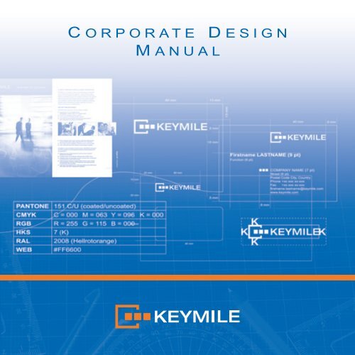
C ORPORATE D ESIGN<br />
M ANUAL
2<br />
INTRODUCTION<br />
CORPORATE DESIGN<br />
What does that mean?<br />
English technical terms often cause<br />
problems for non-native speakers:<br />
Do we need a »<strong>Corporate</strong> <strong>Design</strong>« or<br />
a »<strong>Corporate</strong> Identity«? And what is<br />
the difference anyway?<br />
<strong>Corporate</strong> Identity (CI) describes the<br />
entire company identity or personality.<br />
It is composed from different<br />
elements:<br />
■ <strong>Corporate</strong> <strong>Design</strong> (CD)<br />
incorporates the visual appearance<br />
of a company and consequently<br />
guarantees for optical<br />
recognizability. Components are<br />
the logo, the company colour and<br />
font and the design pattern.<br />
■ <strong>Corporate</strong> Communication (CC)<br />
comprises all communication<br />
instruments and measures to<br />
present the company and its<br />
performances to the relevant target<br />
groups.<br />
■ <strong>Corporate</strong> Behaviour (CB)<br />
comprises the exposure of every<br />
individual (employee and<br />
employer) to its environment.
INTRODUCTION<br />
These elements live on by the<br />
employees, the company’s products<br />
and the multitude of communication.<br />
The following specification of the<br />
<strong>Corporate</strong> <strong>Design</strong> of <strong>KEYMILE</strong><br />
guarantees for an image that is<br />
internationally homogeneous and<br />
thus makes our company distinctly<br />
recognizable to the exterior.<br />
Only by adhering to these guidelines<br />
we achieve the best possible<br />
recognition of <strong>KEYMILE</strong>.<br />
In spite of these guidelines there<br />
should be enough room for textual<br />
and creative margins. Your feedback<br />
is important and very welcome.<br />
You can contribute essentially to<br />
optimize the <strong>Corporate</strong> <strong>Design</strong> and<br />
make this important project a success.<br />
Please direct your suggestions and<br />
questions directly to the <strong>Corporate</strong><br />
Marketing.<br />
FEEDBACK DESIRED<br />
3
4<br />
LOGO<br />
STANDARD VERSION<br />
Logo as picture/word label<br />
The <strong>KEYMILE</strong> logo is the figurehead<br />
and business card of our company<br />
and thus it is an important component<br />
of the <strong>Corporate</strong> <strong>Design</strong>.<br />
The logo is a designed picture/word<br />
label. It is easy to percept visually.<br />
The <strong>KEYMILE</strong> logo is registered and<br />
thus protected against misuse.<br />
The principle is: The logo may only<br />
be applied in the standard form<br />
shown above. Please take care that<br />
its minimum size must be at least<br />
40 mm width to grant legibility. As a<br />
guideline for the application of logos<br />
on documents 60 mm is a valid size<br />
(corresponds to the size on printed<br />
documents).
LOGO<br />
For widths below 20 mm only use the<br />
word without picture label (KEYvisual).<br />
40 mm 20 mm<br />
To ensure that the logo comes into its<br />
own leave enough space around it.<br />
As rule of thumb: The distance<br />
between the logo and all surrounding<br />
objects has to be least as large as<br />
the size of K from the <strong>KEYMILE</strong><br />
signature.<br />
The logo has to be placed on all<br />
printed matters in the right area of the<br />
document (above and below).<br />
EXCEPTIONS<br />
Application of the logo with<br />
width below 40 mm<br />
LOGO PLACEMENT<br />
Let some free space<br />
5
6<br />
LOGO<br />
FORM & PROPORTION<br />
No alienation<br />
Compressions, distensions and other<br />
deformations are not allowed. The<br />
default proportions have to be kept all<br />
the time (apply proportional scaling).<br />
The <strong>KEYMILE</strong> logo may be used<br />
without exception only in the defined<br />
colours and the shapes defined in this<br />
document.<br />
If the logo appears on a dark<br />
background is should be set in<br />
negative. On a black background<br />
the picture can be set in the colour<br />
orange and the letters in the colour<br />
white.<br />
In general, take care there is always<br />
sufficient high contrast to reach a<br />
good legibility.
FIGURATIVE MARK<br />
The KEYvisual may get disassembled<br />
and be used as decorative element.<br />
The KEYvisual should only be used<br />
moderately (e. g. in the background).<br />
The graphical bracket – KEYhead –<br />
may be used to enclose headlines.<br />
The squares – KEYsquares – can be<br />
used together or individually e. g. for<br />
enumerations.<br />
The elements of the KEYvisual may<br />
only be used in the defined CD<br />
colours orange, black, white or grey.<br />
In general we recommend to apply<br />
the design elements in an unobtrusive<br />
way.<br />
Numeration Text<br />
Numeration Text<br />
Numeration Text<br />
7
8<br />
COLOURS<br />
COLOUR DEFINITION<br />
Primary<br />
Colours<br />
Pantone 151<br />
CMYK 0/63/96/0<br />
RGB 115/255/0<br />
HKS 7 (K) 90%<br />
RAL 2008<br />
WEB #FF7300<br />
Secondary<br />
Colours<br />
CMYK 100/60/0/0<br />
RGB 0/71/152<br />
WEB #004798<br />
The colour application of the house<br />
colour Pantone 151 and black is<br />
always the ideal application.<br />
100 % 90 % 80 % 70 % 60 % 50 % 40 % 30 % 20 % 10 %<br />
For the four-colour print process<br />
according to Euro scale (CMYK)<br />
the orange tone composes from the<br />
values 63 % magenta and 96 %<br />
yellow. The grey scale for the b/w<br />
conversion is 35 % black. If possible<br />
the true colour Pantone 151 should<br />
be employed as fifth colour for fourcolour<br />
print.<br />
The secondary colour for<br />
backgrounds is a blue from the Euro<br />
scale (CMYK = 100/60/0/0).
TYPOGRAPHY<br />
As a self-contained graphical element<br />
the font type Helvetica New Extended<br />
was selected for the <strong>KEYMILE</strong> logo.<br />
In text formatted with Arial the word<br />
<strong>KEYMILE</strong> has to be written always<br />
in capitals. The font width has to be<br />
scaled to 120 %.<br />
100 % 120 %<br />
<strong>KEYMILE</strong> is female and singular<br />
For availability reasons and due to its<br />
application ability the standard font<br />
type Arial is employed exclusively.<br />
Exception: The marketing uses the<br />
font Avenir for printed media.<br />
NOTATION<br />
<strong>KEYMILE</strong> in running text<br />
GENDER<br />
CORRESPONDENCE<br />
Arial regular<br />
ABCDEFGHIJKLMNOPQRSTUVWXYZ<br />
abcdefghijklmnopqrstuvwxyz<br />
9
10<br />
TYPOGRAPHY<br />
TYPE SIZE<br />
Pay attention to legibility<br />
TEXT STYLE<br />
Left-aligned ragged margin<br />
HEADLINE<br />
Arial regular in capitals<br />
Font width: 120 %<br />
Recommended sizes: 18 - 24 points<br />
Recommended colours: black/white<br />
TITLE<br />
Arial bold in capitals<br />
Font width: 120 %<br />
Recommended sizes: 14 - 18 points<br />
Recommended colours: orange/white<br />
Continuous text<br />
Arial regular<br />
Font width: 120 %<br />
Recommended sizes: 9 - 14 points<br />
Recommended colours: black/white<br />
Select the font size big enough to<br />
always grant good legibility of the text.<br />
We recommend Arial 10 points for<br />
business correspondence.<br />
For larger text quantities we<br />
recommend a moderate left-aligned<br />
ragged margin with hyphenation.<br />
Grouped style may be used only by<br />
the way of exception.<br />
Line Spacing depends on the font<br />
size. The standard value is the font<br />
size plus 25 %.
5 mm<br />
13 mm<br />
4 mm<br />
PRINTED MATTER<br />
Obligatory design guidelines are<br />
applicable for printed documents as<br />
stationery, business cards, envelopes<br />
etc. This also leads to a worldwide<br />
recognizability of <strong>KEYMILE</strong>.<br />
Business cards have to be printed<br />
preferably with the 2c true colour<br />
mode. Business cards are ordered<br />
exclusively via the Marketing<br />
department in Hanover. Please<br />
pay attention to the correspondent<br />
guidelines on the KEYnet.<br />
Firstname LASTNAME (9 pt)<br />
Academic Degree (6 pt)<br />
Function (6 pt)<br />
8 mm<br />
40 mm<br />
COMPANY NAME (7 pt)<br />
Street (6 pt)<br />
Postal Code City, Country<br />
Phone +xx xxx xx-xxx<br />
Fax +xx xxx xx-xxx<br />
Mobile +xx xxx xx-xxx<br />
firstname.lastname@keymile.com<br />
www.keymile.com<br />
8 mm<br />
BUSINESS CARDS<br />
2c print<br />
Size: 85 x 55 mm<br />
Paper: 300 g (offset)<br />
11
12<br />
PRINTED MATTER<br />
STATIONERY<br />
2c print<br />
Size: DIN A4 (297 x 210 mm)<br />
Paper: 90 g (Hartpost/offset)<br />
25 mm<br />
There is stationary with the current<br />
<strong>KEYMILE</strong> logo. Corresponding Word<br />
templates with and without logo,<br />
different languages and <strong>KEYMILE</strong><br />
sites can be found in the KEYnet<br />
(Process landscape/information).<br />
Word templates can also directly be<br />
opened in the program.<br />
60 mm 13 mm<br />
13 mm
10 mm<br />
32 mm<br />
45 mm<br />
PRINTED MATTER<br />
20 mm 60 mm<br />
90 mm<br />
Envelopes are also printed in 2c true<br />
colour mode, preferably.<br />
Due to the postage area at the top<br />
right corner and the mandatory<br />
reading area in the whole lower part<br />
the logo must be placed exceptionally<br />
at the top left.<br />
ENVELOPES<br />
2c print<br />
Size: DIN C6 (229 x 324 mm)<br />
DIN C5 (162 x 229 mm)<br />
DIN C6/5 (114 x 229 mm)<br />
Paper: 90 g (Hartpost/offset)<br />
13
14<br />
APPLICATION EXAMPLES<br />
COLOUR SPACES<br />
EXAMPLES<br />
Cover pages, 5c print<br />
For further applications of the<br />
company appearance different<br />
percent scales of the basic colours<br />
and possible combinations are<br />
provided.<br />
Some application examples shall<br />
support the creative sense for<br />
realisation.<br />
<strong>KEYMILE</strong> logo and CD manual is also<br />
available in the <strong>KEYMILE</strong> web pages<br />
(About <strong>KEYMILE</strong>/Media Centre/<br />
Logos).
APPLICATION EXAMPLES<br />
Hints:<br />
■ Use large area images consistently<br />
■ Employ vertical and horizontal<br />
bars – this produces contrast and<br />
helps to create a graphical<br />
structure<br />
■ Select your images from the topics<br />
human being, communication and<br />
speed<br />
EXAMPLES<br />
Inner face, 5c print<br />
15
Contact:<br />
<strong>KEYMILE</strong> GmbH<br />
Wohlenbergstrasse 3<br />
30179 Hanover, Germany<br />
info@keymile.com<br />
2011-12-31