


Create successful ePaper yourself
Turn your PDF publications into a flip-book with our unique Google optimized e-Paper software.
January LIVING SPACE<br />
CONTRASTS<br />
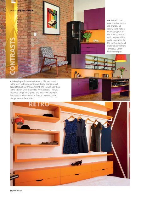
• • In the kitchen<br />
area, the vivid purple,<br />
red-orange and<br />
yellow combination<br />
that was typical of<br />
the 1970s contrasts<br />
with the pure white<br />
walls. Inspiration for<br />
the shelf colours and<br />
materials came from<br />
Tomado, a Dutch<br />
kitchen designer.<br />
• In keeping with the retro theme, bold tones prevail<br />
in the main bedroom, particularly bright orange, which<br />
occurs throughout the apartment. The shelves, like those<br />
in the kitchen, were inspired by 1970s designs. The wallmounted<br />
lamps are originals and date from the 1950s.<br />
Purchased in a flea market in France, they match the<br />
orange tone of the shelves.<br />
78 | AIRBALTIC.COM