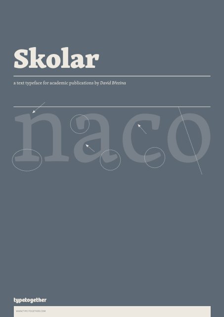
a text typeface for academic publications by David ... - Type Together
a text typeface for academic publications by David ... - Type Together
a text typeface for academic publications by David ... - Type Together

Create successful ePaper yourself
Turn your PDF publications into a flip-book with our unique Google optimized e-Paper software.
Skolar<br />
naco<br />
a <strong>text</strong> <strong>typeface</strong> <strong>for</strong> <strong>academic</strong> <strong>publications</strong> <strong>by</strong> <strong>David</strong> Březina<br />
www.type-together.com
ABCDEFGHIJKLM<br />
NOPQRSTUVWXY<br />
ZÆǾŒÞck<br />
skolar regular, 60/78pt<br />
abcdefghijklmnopq<br />
rstuvwxyzßæąĸłø<br />
abcdefghijklmno<br />
pqrstvwxyzŒŞ30€<br />
{[(*&‡,:@?!§«»-)]}<br />
€£$¥0123456789⁴⁄⁵℗<br />
‰0123456789€012⁴<br />
www.type-together.com
skolar description<br />
a <strong>text</strong> face <strong>for</strong> <strong>academic</strong> use<br />
Skolar is a <strong>text</strong> serif which has been<br />
originally designed with scholarly and<br />
multilingual <strong>publications</strong> in mind. e<br />
<strong>typeface</strong> maintains its credibility while<br />
incorporating a subtle personal style, neither<br />
neutral nor conspicuous. Prominent<br />
serifs and low-contrast modulation add<br />
to its robustness, and together with a<br />
relatively large x-height, they improve<br />
the <strong>typeface</strong> readability at small sizes.<br />
e Skolar family of 10 styles and a large<br />
character set is flexible enough <strong>for</strong> complex<br />
<strong>text</strong> settings and editorial work. It<br />
becomes distinctive in bigger sizes, thus<br />
fitting corporate design demands.<br />
Some practical solutions have been<br />
introduced: e capitals are rather low<br />
in comparison to the ascenders to give<br />
the <strong>typeface</strong> an even <strong>text</strong>ure and more<br />
space <strong>for</strong> capital diacritical marks. e<br />
structure is strictly conventional, but the<br />
stroke modulation stylistically reflects<br />
contemporary serif faces. e italic has a<br />
shallow angle and large counters <strong>for</strong> better<br />
readability in small print. It is easily<br />
recognized but not ostentatious; it<br />
blends well with the uprights. Semibold<br />
is weighted to emphasize <strong>text</strong> blocks,<br />
where Bold is intended <strong>for</strong> word clusters.<br />
e family includes a complex set of<br />
smart arrows which can be easily keyed<br />
and combined in infinite ways using<br />
opentype features.<br />
Skolar has already received international<br />
recognition at the ed-Awards<br />
competition 2008 and was selected as<br />
one of the best <strong>typeface</strong>s of 2008 <strong>by</strong> i love<br />
typography. e Cyrillic was awarded<br />
a Special Diploma at the international<br />
type design competition Modern Cyrillic<br />
2009 and won the first prize in the<br />
Cyrillic <strong>text</strong> type category at Granshan<br />
2009.<br />
skolar update 2.5<br />
Skolar fonts in our library have been updated<br />
to the most recent version (2.5). This<br />
version includes extended language support<br />
and kerning and in the PE version<br />
a vast amount of Latin transliterations.<br />
Skolar now supports over 162 languages<br />
(90 in Latin, 41 in Cyrillic, Greek, and ca.<br />
30 via transliterations) and includes more<br />
than 2600 glyphs in each weight.<br />
details:<br />
Skolar Pro and Skolar PE now include<br />
capital <strong>for</strong>m of German ß. The small cap<br />
version is also included.<br />
Skolar Cyrillic and Skolar PE now also<br />
supports Bashkir, Chuvash, Ossetic, and<br />
Komi. That makes <strong>for</strong> more than 41 languages<br />
altogether.<br />
Skolar PE got better and more consistent<br />
linguistic extension. It now supports<br />
more than 30 languages via various<br />
standardised Latin transliterations<br />
(aka romanizations). Namely Arabic,<br />
Chinese (Pinyin), contemporary<br />
Indian languages, Pali, and Sanskrit<br />
are supported in all weights and italics in<br />
lowercase, uppercase, even in small caps!<br />
Some of these transliterations make<br />
use of the automatic accent/mark positioning<br />
(in PE version only) so users can<br />
key base characters and combining marks<br />
afterwards and the font will combine<br />
them properly. Please note that this<br />
Open<strong>Type</strong>® feature is supported in InDe-<br />
German: Großmann □ GROẞMANN □ großmann<br />
Arabic: Ḫalīfah qaṣr □ ḪALĪFAH QAṢR □ Ḫalīfah qaṣr<br />
Bashkir: бесәйҙәр □ БЕСӘЙҘӘР □ бесәйҙәр<br />
Chuvash: вун ҫичӗ vunşicӗ □ ВУН ҪИЧӖ VUNŞICӖ □ вун ҫичӗ vunŞicӗ<br />
Pāḷi: cakkasamārūḷha □ CAKKASAMĀRŪḶHA □ cakkasamārūḷha<br />
Pinyin: zhōng guó, bĭ mò □ ZHŌNG GUÓ, BĬ MÒ □ zhōng guó, bĭ mò<br />
www.type-together.com<br />
sign CS3 and higher, Flash Player 10, MS<br />
Word 2012, Mellel 2.2–2.7, and XeTeX.<br />
All Skolar fonts now include improved<br />
kerning, particularly kerning of punctuation<br />
(period, apostrophe, …). Note that<br />
<strong>for</strong> this reason the <strong>text</strong> originally set<br />
in some older version can reflow when<br />
reset in the updated version. There<strong>for</strong>e,<br />
we recommend to keep backup<br />
copies of the old versions.<br />
Most <strong>Type</strong><strong>Together</strong> fonts support Latin<br />
standard character set now <strong>for</strong>mally<br />
support over 90 languages. Frankly, this<br />
is not due to the increased number of<br />
glyphs, but thanks to a better language<br />
research conducted recently in order to<br />
provide precise in<strong>for</strong>mation about our<br />
fonts. Similarly, fonts with extended<br />
Cyrillic support now support more than<br />
41 languages.<br />
Transliterations supported in Skolar<br />
PE: Arabic (DMG, ISO 233, ISO/R 233, UN,<br />
EI), Amharic, Burmese, Greek, Chinese<br />
(Pinyin), Contemporary Indian languages<br />
(Hunterian transliteration, National<br />
Library at Kolkata, UN), Japanese (Modified<br />
Hepburn, Kunrei), Kazakh, Khmer,<br />
Korean (McCune Reischauer, National<br />
standard), Kyrgyz, Laotian, Macedonian,<br />
Mongolian, Nepali, Pali (Rhys <strong>David</strong>s<br />
system), Russian, Sanskrit (IAST), Tajik,<br />
Ukrainian, Urdu, Uzbek, …<br />
Unless stated otherwise, the transliterations<br />
are based on UN and/or nationally<br />
9/11 pt (body<strong>text</strong>), 11/11 pt (title)<br />
Saṃskṛtā: Pāṇini, Aṣṭādhyāyī □ PĀṆINI, AṢṬĀDHYĀYĪ □ pāṇini, aṣṭādhyāyī
intellect<br />
Las ediciónes de lujo, con cuidado<br />
Academic<br />
I can see many things far off<br />
calligraphy<br />
„beruška 1973-85“<br />
⇒sign⇐<br />
•high x-height•low contrast•serif•<br />
perpendicular<br />
www.type-together.com
10/12 pt (hungarian)<br />
Klubunk idén is szeretne támogatni<br />
két tehetséges magyar zongoraművészt<br />
a tcu/cliburn zongoraversenyen<br />
való részvételre. 21 országból<br />
89 jelentkező közül Polgar Éva és<br />
Fazekas Edi a válogató versenyek után<br />
bejutottak a végső <strong>for</strong>dulóba, ami itt<br />
lesz Fort Worthben. Ungar Tamás<br />
teljes ösztöndíjat ajánlott föl nekik. A<br />
részvételi díj $1,100 fejenként. Ehhez<br />
szeretnénk erőnkhöz mérten hozzájárulni,<br />
amihez nagykelkű támogatásokat<br />
kérném. Bővebb felvilágosítás a<br />
művészekről a Fesztivál web oldalán<br />
található: www.pianotexas.org.<br />
8/10 pt (czech)<br />
Národní divadlo zaalo s vydáváním cd v roce<br />
2002, po nástupu nového ředitele Daniela<br />
Dvořáka, který do funkce šéfa opery přizval<br />
svého dřívějšího kolegu ze Státní opery Praha<br />
Jiřího Nekvasila. První vydanou operou <strong>by</strong>l<br />
Mozartův Don Giovanni, vyšly i živé nahrávky<br />
Zprávy pro akademii Jana Klusáka, Smolkovo<br />
Nagano a další.<br />
Zatím poslední je komplet s nahrávkou<br />
mimořádného provedení Prstenu Nibelungova<br />
od Richarda Wagnera, které vzbudilo velkou<br />
pozornost na scéně před 2 lety. “cd slouží jako<br />
dokumentace, propagace opery Národního divadla,<br />
je k dispozici knihovnám...” říká Jiří Nekvasil. V<br />
průběhu pěti let se objevovala i díla eských<br />
autorů, například Dvořákův Čert a Káa.<br />
“V souasné době ty nahrávací spolenosti,<br />
které to kdysi dělaly, jako třeba Supraphon,<br />
které nahrávaly a dokumentovaly celou jednu<br />
generaci, dnes asi z finanních důvodů opery<br />
netoí. Je to idea, která nás napadla už v našem<br />
působení ve Státní opeře, že v době, kdy zachytit<br />
hlas a umělecký výkon je technicky poměrně<br />
jednoduché, tu celá generace zůstane nezdokumentovaná.<br />
Nic po ní nezůstane.<br />
11/13 pt (polish)<br />
Posłowie z komisji edukacji chcą<br />
tworzyć przy uniwersytetach<br />
publicznych szkoły dla wybitnie<br />
zdolnych uczniów. Ale czy młodzież<br />
powinna <strong>by</strong>ć selekcjonowana, a<br />
zdolne dzieci trafiać do elitarnych<br />
szkół? – To najlepsze rozwiązanie,<br />
uważa prof. Wiesława Limont,<br />
pedagog z Uniwersytetu Mikołaja<br />
Kopernika w Toruniu, przy którym<br />
taka szkoła już istnieje. – W zwykłych<br />
klasach dzieci o ponadprzeciętnych<br />
uzdolnieniach osiągają<br />
słabe wyniki.<br />
Nie rozwijają skrzydeł i zniechęcają<br />
się do nauki. Pomysł budzi<br />
jednak kontrowersje. Psycholog<br />
społeczny prof.<br />
www.type-together.com<br />
12/15 pt (english)<br />
Skolar is a <strong>text</strong> serif, originally designed with scholarly and multilingual<br />
<strong>publications</strong> in mind. e <strong>typeface</strong> maintains its credibility<br />
while incorporating a subtle personal style, neither neutral<br />
nor conspicuous.<br />
Prominent serifs and low-contrast modulation add to its robustness,<br />
and, together with a relatively large x-height, improves<br />
the <strong>typeface</strong>’s readability in small sizes. is 6-style family with<br />
a large character set is flexible enough <strong>for</strong> complex <strong>text</strong> settings<br />
and editorial work. It also becomes distinctive in bigger sizes, fitting<br />
the demands of corporate design. e structure of the <strong>typeface</strong><br />
is rather conventional, but the stroke-modulation stylistically<br />
reflects contemporary serif <strong>typeface</strong>s. e italic has a shallow<br />
angle and large counters <strong>for</strong> better readability in small print. It<br />
is easily recognized but not ostentatious, blending well with the<br />
upright styles. e family includes a complex set of useful arrows<br />
which can be easily keyed and infinitely combined using opentype<br />
features.<br />
11/14 pt (english)<br />
Skolar Cyrillic has been designed as a close complement to Latin with the consultancy<br />
from experienced designer Alexandra Korolkova. The font supports<br />
32 languages using the Cyrillic script, including the majority of the Slavic<br />
languages and many Asian non-Slavic languages. It also supports Additionally,<br />
Skolar features Serbian italic and Bulgarian stylistic alternates.<br />
The most recent addition to the family is Greek, thus allowing <strong>for</strong> complete<br />
pan-European language support within a single family. It was developed<br />
with the assistance from professional consultants Irene Vlachou and Gerry<br />
Leonidas. It is a contemporary adaptation of the old-style Greek <strong>typeface</strong>s<br />
often used in <strong>academic</strong> works which are typical <strong>for</strong> their fluidity and liveliness<br />
caused <strong>by</strong> varying stress. The result is a working contemporary family with the<br />
charm of old times. It includes monotonic as well as polytonic Greek, ligatures<br />
and small caps.<br />
14/17 pt (spanish)<br />
El surcoreano Hahn Bin que debutará en el Carnegie<br />
Hall en octubre olvidó su violín de medio millón de<br />
dólares en un taxi de Nueva York pero lo recuperó<br />
horas después, in<strong>for</strong>mó la prensa este martes. El instrumento,<br />
un Pressenda fabricado hace 184 años, fue<br />
olvidado el lunes en el asiento trasero del taxi por el<br />
violinista, indicó el New York Post.
диакритика<br />
e word »biodynamic« does not mean a damn thing.<br />
αφρική<br />
ἔρως – ἥρως<br />
třistatřicettři stříbrných stříkaček<br />
Ευκλείδης<br />
български тип<br />
необратимый процесс<br />
www.type-together.com
12/14 pt (russian)<br />
Проблема диакритических<br />
знаков в том, что неясно, как<br />
дизайнеру, не сильно знакомому<br />
с данным языком, оценить<br />
результат. Стоит также отметить,<br />
что для одних и тех же<br />
знаков ожидаемый результат<br />
может отличаться в зависимости<br />
от языка или географического<br />
региона. Современные<br />
крупные изготовители шрифтов<br />
создают почти идентичные наборы<br />
диакритических знаков<br />
для всех создаваемых шрифтов.<br />
Это сомнительное поточное<br />
производство ведёт к ошибкам<br />
в дизайне и ещё больше запутывает<br />
ситуацию. С другой стороны<br />
существуют традиционные<br />
правила для создания корректных<br />
диакритических знаков.<br />
Такая диакритика обеспечивает<br />
лучшую читабельность текста<br />
и эстетическую привлекательность<br />
для носителей языка.<br />
Проблема диакритических<br />
знаков в том, что неясно, как<br />
дизайнеру, не сильно знакомому<br />
с данным языком, оценить<br />
результат.<br />
10/12 pt (russian)<br />
Проблема диакритических знаков в<br />
том, что неясно, как дизайнеру, не<br />
сильно знакомому с данным языком,<br />
оценить результат. Стоит также<br />
отметить, что для одних и тех же<br />
знаков ожидаемый результат может<br />
отличаться в зависимости от языка<br />
или географического региона. Современные<br />
крупные изготовители<br />
шрифтов создают почти идентичные<br />
наборы диакритических знаков для<br />
всех создаваемых шрифтов.<br />
Это сомнительное поточное<br />
производство ведёт к ошибкам в<br />
дизайне и ещё больше запутывает<br />
ситуацию. С другой стороны<br />
существуют традиционные<br />
правила для создания корректных<br />
диакритических знаков.<br />
Такая диакритика обеспечивает<br />
лучшую читабельность текста<br />
и эстетическую привлекательность<br />
для носителей языка.<br />
www.type-together.com<br />
17/17 & 11/17 & 14/17 pt (monotonic greek)<br />
Παρέμβαση Παπανδρέου ενόψει ρύθμισης<br />
Εμφανίστηκε αποφασισμένος για άνοιγμα των κλειστών επαγγελμάτων<br />
«Δεδομένη» χαρακτήρισε χθες ο πρωθυπουργός την απόφασή<br />
του να ανοίξουν όλα τα κλειστά επαγγέλματα τη<br />
νέα χρονιά, επιδιώκοντας εμφανώς να στείλει ένα μήνυμα<br />
σε όσους αντιδρούν ότι η κυβέρνηση δεν προτίθεται να<br />
υποχωρήσει στο παραμικρό από τις δεσμεύσεις της. «Οι<br />
μεταρρυθμίσεις μας σε ορισμένες περιπτώσεις ξεβολεύουν,<br />
θίγουν επί χρόνια εδραιωμένα συμφέροντα ολίγων<br />
σε βάρος ολόκληρης της κοινωνίας, όπως είναι τα κλειστά<br />
επαγγέλματα όπου η απόφασή μας είναι δεδομένη» τόνι-<br />
9/11 & 11/14.5 pt (russian)<br />
Лев Николаевич Толстой: «Анна Каренина»<br />
Все смешалось в доме Облонских. Жена узнала, что муж был в связи<br />
с бывшею в их доме француженкою-гувернанткой, и объявила мужу, что<br />
не может жить с ним в одном доме. Положение это продолжалось<br />
уже третий день и мучительно чувствовалось и самими супругами,<br />
и всеми членами семьи, и домочадцами. Все члены семьи и домочадцы<br />
чувствовали, что нет смысла в их сожительстве и что на<br />
каждом постоялом дворе случайно сошедшиеся люди более связаны<br />
между собой, чем они, члены семьи и домочадцы Облонских.<br />
Жена не выходила из своих комнат, мужа третий день не было<br />
дома. Дети бегали по всему дому, как потерянные; англичанка поссорилась<br />
с экономкой и написала записку приятельнице,<br />
13/17 & 8/11 pt (polytonic greek)<br />
Τὰ ρόδα τῆς αὐγῆς ἐφυλλορροοῦσαν κ’ ἐκοκκίνιζαν αἱ παρειαὶ<br />
τῆς Ἀρχόντως, ἢ ἐκοκκίνιζαν μόναι των εἰς τὴν θέαν τοῦ<br />
Γιωργῆ; Αὐτος ἦτο χλωμός, μαραμμένος, ἀδρανής.<br />
Τί νὰ σκεφθῇ! Τί νὰ εἲπῇ; Πῶς ν’ αρθρώσῃ λόγον; Ἢθελε, κατὰ τὸ<br />
ᾆσμα, «ν’ ἀρχίσῃ νὰ πῇ τὰ πάθη του τραγούδια». Σῦρε νὰ πῄς τῆς<br />
μάννας σου νὰ κάμῃ κι ἄλλη γέννα.<br />
Ἀλέξανδρος Παπαδιαμάντης.<br />
Νὰ εἶχεν ὁ ἔρωτας σαΐτες!
skolar font styles & scripts<br />
Skolar ©Ha6 Skolar ©Ha6<br />
light light italic<br />
Skolar ©ha6 Skolar ©ha6<br />
regular regular italic<br />
Skolar ©ha6 Skolar ©ha6<br />
semibold semibold italic<br />
Skolar ©Ha6 Skolar ©Ha6<br />
bold bold italic<br />
Skolar ©Ha6 Skolar ©Ha6<br />
extrabold extrabold italic<br />
Сколар &№3 Сколар &№3<br />
cyrillic regular cyrillic italic<br />
Сколар &№3 Сколар &№3<br />
cyrillic semibold cyrillic semibold italic<br />
Сколар &№3 Сколар &№3<br />
cyrillic bold cyrillic bold italic<br />
Σκόλαρ 12345 Σκόλαρ 12345<br />
greek regular greek regular italic<br />
Σκόλαρ 12345 Σκόλαρ 12345<br />
greek semibold greek semibold italic<br />
Σκόλαρ 12345 Σκόλαρ 12345<br />
greek bold greek bold italic<br />
www.type-together.com
skolar opentype features*<br />
small caps<br />
all small caps<br />
all caps<br />
ligatures<br />
discretionary ligatures<br />
proportional figures<br />
tabular figures & slashed zero<br />
numerator / denominator<br />
fractions<br />
superior / inferior<br />
ordinals<br />
bullets (ornaments)<br />
not descending j (stylistic set 1)<br />
alternate k r (stylistic set 2)<br />
alternate a and g (stylistic set 3)<br />
alternate ampersand (stylistic set 4)<br />
alternate @ (stylistic set 5)<br />
german ss (stylistic set 13)<br />
* Not all features are available in all versions.<br />
www.type-together.com<br />
1234 charming creatures 1234 charming creatures<br />
(abc} n*/ d&e 567890€£ (abc} n*/ d&e 567890€£<br />
RADIOLARIANS ? radiolarians ?<br />
¿para <strong>text</strong>o?<br />
¿PARA TEXTO?<br />
1708 a–b [ende] 1708 A–B [ENDE]<br />
aufbau, fjord, affiliate aufbau, fjord, affiliate<br />
häckeln, strong, Then häckeln, strong, en<br />
0123456789£$¢€¥ƒ¤ 0123456789£$¢€¥ƒ¤<br />
00123456789£$¢€¥ƒ¤ 00123456789£$¢€¥ƒ¤<br />
0123456789/0123456789 0123456789/0123456789<br />
1/2 3/4 1/6 5/7 2/9 1⁄2 3⁄4 1⁄6 5⁄7 2⁄9<br />
H2O xb8 y3+5 aIndex H2O xb8 y3+⁵ aIndex<br />
1st 2th 3rd Mlle 2ieme 1st 2th 3rd Mlle 2ieme<br />
• •BCDEFGHIJKLMNOPQRSTUVWXYZ<br />
Jordan TIJDSCHRIFT Jordan TIJDSCHRIFT<br />
Karlova Řepa ЖУК Karlova Řepa ЖУК<br />
dragon dragon dragon dragon<br />
H&M c&a M&S H&M c&a M&S<br />
info@tt.com info@tt.com<br />
Haußmann haußmann
skolar opentype features*<br />
arrows & arrowheads (stylistic set 6)<br />
Comma is a separator used to limit the substitution<br />
chain in ambiguous cases.<br />
* Not all features are available in all versions.<br />
www.type-together.com<br />
<br />
<br />
v-^ ^-v -^ -v<br />
<br />
=/=> ><br />
<br />
--->:::><br />
--...->:><br />
^|-....--|^<br />
^|----v|-<br />
^|----,v|-<br />
<br />
<br />
v-^ v-^ -^ -v<br />
<br />
=/=> ><br />
<br />
--->:::><br />
--...->:><br />
^|-....--|^<br />
^|----v|-<br />
^|----,
skolar opentype features*<br />
latin language features<br />
turkish/azeri/crimean tatar<br />
romanian/moldavian<br />
cyrillic language features<br />
serbian/macedonian <strong>for</strong>ms<br />
serbian/macedonian <strong>for</strong>ms (+ sha<br />
alternate), stylistic 8, italic only<br />
bulgarian stylistic alternates<br />
(stylistic 9)<br />
greek polytonic language features<br />
alternate <strong>for</strong>m of iota with<br />
dialytika (stylistic 10)<br />
polytonic greek prosgegrammeni<br />
alternative <strong>for</strong>ms (stylistic 11)<br />
polytonic greek smallcaps with all<br />
accents maintained (stylistic 12)<br />
automatic composition &<br />
positioning of accented characters<br />
(any combining accent in the font<br />
with any latin letter (default: pan-<br />
European version only)<br />
* Not all features are available in all versions.<br />
www.type-together.com<br />
findik, findik findik, findik<br />
mulţumesc, mulţumesc mulţumesc, MULȚUMESC<br />
бгдптш бгдптш<br />
бгдптш бгдптш<br />
ДЖЛвгджзийклптцчшщю ДЖЛвгджзийклптцчшщю<br />
ДЖЛвджзклю ДЖЛвгджзийклптцчшщю<br />
ΝΕΡΑΙΔΑ νεράιδά ΝΕΡΑΙΔΑ νεράιδά<br />
ῇδε ῇδε<br />
ὦ γῆς παλαιὸν ἄργος ὦ γῆς πάλάιὸν ἄργος<br />
m+̣ ṃ<br />
a+ ̈ + ́ ä́<br />
ъ+ ̏ ъ̏<br />
k+ ̑ k̑
skolar character set*, uprights<br />
A B C D E F G H I J J K K L M N O P Q R S T U<br />
V W X Y Z a b c d e f g h i j k l m n o p q r s<br />
t u v w x y z a g a b c d e f g h i j k l m<br />
n o p q r s t u v w x y z & & * , - <br />
. : ; ? ! ¿ @ @ ( ) [ ] { } \ / | ^ §<br />
℗ « » ’ “ ‡ – <br />
& & - ? / © <br />
̈ ́ <br />
<br />
Ā <br />
Æ Č É <br />
Ī Ĭ <br />
Ò Ó Ō Ǿ Œ Ř Ř Ş <br />
Ț Ū <br />
Þ á ā ä ą æ é <br />
ě í ī ĭ i <br />
ł ò ó ō ö ő ø <br />
ř š ş ß ţ ţ ū ü ů ű <br />
ý ž ĸ fb ff fi fj fl <br />
ffi st ck tt <br />
ā <br />
ī ĭ i <br />
ò ó ō <br />
Œ Ş <br />
ū 0 1 2 3 4<br />
5 6 7 8 9 0 $ € ¢ £ ¥ ƒ ¤ 0 1 2 3 4 5 6 7 8 9 <br />
$ € ¢ £ ¥ ƒ ¤ 0 1 2 3 4 5 6 7 8 9 $ € ¢ £ ¥ ƒ<br />
¤ 0 1 2 3 4 5 6 7 8 9 0 $ € ¢ £ ¥ ƒ ¤ <br />
6 ‰ + <br />
= < > 0 1 2 3<br />
⁴ ⁵ + a <br />
<br />
<br />
2 8 b <br />
<br />
H O <br />
d e h i l<br />
* Not all features are available in all versions.<br />
www.type-together.com
skolar character set*, uprights<br />
m r s t 0 1 2 3 4 5 6 7 8 9<br />
0 1 2 3 4 5 6 7 8 9 <br />
• B C D E F G H I<br />
J K L M N O P Q R S T U V W X Y Z <br />
-|v -|^ v|- ^|- /- \- -\ -/ <br />
=v v=^ .v ^.v - : = . ,<br />
<br />
Б В Д Е Ж И Й К Л Н П Р С Т У<br />
Ч Э <br />
Ә <br />
Ҙ Ҫ Ӗ Д Ж Л а б в г д е ж<br />
з и й к л м н о п р с т у ф х ц ч ш щ ъ ы ь э ю<br />
я ё <br />
ә ҙ ҫ ӗ в г д<br />
ж з и й к л п т ц ч ш щ ю № <br />
б в е и й н р с у <br />
ч <br />
ә <br />
ҙ ҫ ӗ <br />
<br />
<br />
<br />
<br />
<br />
<br />
Α Γ Δ Ε Ν Ο<br />
Π Ρ Σ Τ Ι Ι α β γ δ ε<br />
ζ η θ ι κ λ μ ν ξ ο π ρ ς σ τ υ φ χ ω ά έ ή ί<br />
ό ύ ώ γγ λλ ά γ<br />
δ ε ι λ ν ο π ρ ς <br />
ι ι Ἀ <br />
<br />
ῇ ῇ <br />
<br />
<br />
* Not all features are available in all versions.<br />
www.type-together.com
skolar character set*, uprights<br />
ἀ ἄ ὰ<br />
ἐ <br />
ἢ ἦ ὴ ῆ ἰ <br />
ἱ ὶ ὸ <br />
ὐ ῦ ὦ <br />
ἄ <br />
<br />
ῆ <br />
<br />
ὸ <br />
ὦ <br />
<br />
<br />
<br />
<br />
<br />
<br />
<br />
<br />
<br />
<br />
<br />
̑ ̏ <br />
Ḫ Ḷ <br />
Ṇ Ṣ ẞ Ṭ<br />
<br />
ä́ <br />
<br />
k̑ ḷ ṃ ṇ<br />
<br />
ṣ ṭ <br />
<br />
ъ̏ <br />
Ḫ ḷ ṇ<br />
ṣ ß ṭ <br />
<br />
* Not all features are available in all versions.<br />
www.type-together.com
skolar character set*, italics<br />
A B C D E G I L M N P R S W<br />
a b c d e f g h i j k l m n o p r s t u<br />
v w x y z a g c d <br />
& & , - . : ;<br />
! <br />
« » ’ “ ” <br />
<br />
<br />
<br />
<br />
<br />
<br />
<br />
<br />
á ā <br />
<br />
í <br />
ř <br />
<br />
ž fl ft <br />
Th <br />
<br />
<br />
<br />
<br />
0 1 2 3 4 5 8 <br />
3 <br />
<br />
<br />
<br />
<br />
<br />
<br />
<br />
<br />
<br />
<br />
* Not all features are available in all versions.<br />
www.type-together.com
skolar character set*, italics<br />
<br />
<br />
<br />
<br />
<br />
<br />
<br />
<br />
В Д Ж Л<br />
Н О П С Т <br />
<br />
Д Ж Л а б в<br />
г д е ж з и й к л м н о п р с т у ф х ц ч ш щ ъ<br />
ы ь ю я <br />
б<br />
г д п т ш в д ж з к л ю № <br />
<br />
<br />
<br />
<br />
<br />
<br />
<br />
<br />
<br />
<br />
Δ Ε Π Σ Τ <br />
α γ δ ε η θ ι κ<br />
λ μ ν ο π ρ ς σ τ υ φ χ ω ά έ ί ό ύ <br />
ώ γγ λλ <br />
<br />
<br />
Ἢ <br />
<br />
<br />
<br />
* Not all features are available in all versions.<br />
www.type-together.com
skolar character set*, italics<br />
ἀ ἄ ὰ <br />
ᾆ <br />
ῆ ῃ ῄ ῇ ἲ <br />
ὸ <br />
ῦ ῶ <br />
<br />
<br />
<br />
<br />
<br />
<br />
<br />
<br />
<br />
<br />
<br />
<br />
<br />
<br />
<br />
<br />
<br />
<br />
<br />
<br />
<br />
<br />
<br />
<br />
ḷ ṃ <br />
ṛ <br />
<br />
<br />
<br />
<br />
ǘ ǚ ǜ ẏ ȳ ỵ ỹ ẓ<br />
ə ȝ ʒ ǯ<br />
* Not all features are available in all versions.<br />
www.type-together.com
skolar 2.5 update<br />
Skolar fonts in our library have been updated to the<br />
most recent version (2.5). This version includes extended<br />
language support and kerning and in the<br />
PE version a vast amount of Latin transliterations.<br />
Skolar now supports over 162 languages (90 in<br />
Latin, 41 in Cyrillic, Greek, and ca. 30 via transliterations)<br />
and includes more than 2600 glyphs in each<br />
weight.<br />
details:<br />
Skolar Pro and Skolar PE now include capital <strong>for</strong>m of<br />
German ß. The small cap version is also included.<br />
Skolar Cyrillic and Skolar PE now also supports<br />
Bashkir, Chuvash, Ossetic, and Komi. That makes <strong>for</strong><br />
more than 41 languages altogether.<br />
Skolar PE got better and more consistent linguistic<br />
extension. It now supports more than 30 languages<br />
via various standardised Latin transliterations<br />
(aka romanizations). Namely Arabic, Chinese<br />
(Pinyin), contemporary Indian languages, Pali,<br />
and Sanskrit are supported in all weights and italics<br />
in lowercase, uppercase, even in small caps!<br />
Some of these transliterations make use of the<br />
automatic accent/mark positioning (in PE version<br />
only) so users can key base characters and combining<br />
marks afterwards and the font will combine them<br />
properly. Please note that this Open<strong>Type</strong>® feature is<br />
supported in InDesign CS3 and higher, Flash Player<br />
10, MS Word 2012, Mellel 2.2–2.7, and XeTeX.<br />
German: Großmann □ GROẞMANN □ großmann<br />
Arabic: Ḫalīfah qaṣr □ ḪALĪFAH QAṢR □ Ḫalīfah qaṣr<br />
Bashkir: бесәйҙәр □ БЕСӘЙҘӘР □ бесәйҙәр<br />
www.type-together.com<br />
All Skolar fonts now include improved kerning,<br />
particularly kerning of punctuation (period,<br />
apostrophe, …). Note that <strong>for</strong> this reason the <strong>text</strong><br />
originally set in some older version can reflow<br />
when reset in the updated version. There<strong>for</strong>e, we<br />
recommend to keep backup copies of the old versions.<br />
Most <strong>Type</strong><strong>Together</strong> fonts support Latin standard<br />
character set now <strong>for</strong>mally support over 90 languages.<br />
Frankly, this is not due to the increased number<br />
of glyphs, but thanks to a better language research<br />
conducted recently in order to provide precise in<strong>for</strong>mation<br />
about our fonts. Similarly, fonts with extended<br />
Cyrillic support now support more than 41<br />
languages.<br />
Transliterations supported in Skolar PE:<br />
Arabic (DMG, ISO 233, ISO/R 233, UN, EI), Amharic,<br />
Burmese, Greek, Chinese (Pinyin), Contemporary<br />
Indian languages (Hunterian transliteration, National<br />
Library at Kolkata, UN), Japanese (Modified<br />
Hepburn, Kunrei), Kazakh, Khmer, Korean (McCune<br />
Reischauer, National standard), Kyrgyz, Laotian,<br />
Macedonian, Mongolian, Nepali, Pali (Rhys <strong>David</strong>s<br />
system), Russian, Sanskrit (IAST), Tajik, Ukrainian,<br />
Urdu, Uzbek, …<br />
Unless stated otherwise, the transliterations are based<br />
on UN and/or nationally approved systems.<br />
Chuvash: вун ҫичӗ vunşicӗ □ ВУН ҪИЧӖ VUNŞICӖ □ вун ҫичӗ vunŞicӗ<br />
Pāḷi: cakkasamārūḷha □ CAKKASAMĀRŪḶHA □ cakkasamārūḷha<br />
Pinyin: zhōng guó, bĭ mò □ ZHŌNG GUÓ, BĬ MÒ □ zhōng guó, bĭ mò<br />
Saṃskṛtā: Pāṇini, Aṣṭādhyāyī □ PĀṆINI, AṢṬĀDHYĀYĪ □ pāṇini, aṣṭādhyāyī
Skolar, <strong>Type</strong> Design: <strong>David</strong> Březina<br />
www.type-together.com/skolar<br />
the designer<br />
<strong>David</strong> Březina is a Czech type designer and<br />
typographer, writer, lecturer, and the impresario<br />
of <strong>Type</strong>Talks. He got Masters degrees<br />
in In<strong>for</strong>matics (Masaryk University, Brno) and<br />
<strong>Type</strong>face Design (University of Reading, UK).<br />
From 2004 to 2007 he also ran his own design<br />
studio, with projects in graphic, web, and<br />
interface design. He has been working as an<br />
associate with Tiro <strong>Type</strong>works and giving various<br />
type workshops around Europe.<br />
His interest in the world’s writing systems<br />
and multilingual <strong>typeface</strong> design and typography<br />
manifests in the award-winning, multiscript<br />
<strong>typeface</strong> family Skolar. He has designed<br />
<strong>typeface</strong>s <strong>for</strong> Cyrillic, Greek, Gujarati,<br />
Devanagari, and various extensions of Latin.<br />
typetogether<br />
Veronika Burian and José Scaglione launched<br />
the independent type foundry <strong>Type</strong><strong>Together</strong><br />
(tt <strong>for</strong> short) in 2006. Their main interest is<br />
finding innovative and stylish solutions to old<br />
problems <strong>for</strong> the professional market of <strong>text</strong><br />
<strong>typeface</strong>s, with a focus on editorial use. This is<br />
where the greatest challenges are faced: creating<br />
<strong>typeface</strong>s that per<strong>for</strong>m well in continuous<br />
reading, that also have a high degree of<br />
personality.<br />
In addition to <strong>Type</strong><strong>Together</strong>’s high quality<br />
library of retail fonts, tt also provides custom<br />
modifications and specially tailored <strong>typeface</strong>s;<br />
these can serve as vital elements of a<br />
company’s visual identity, <strong>by</strong> communicating<br />
a unique feel. Custom <strong>typeface</strong> projects<br />
are developed from solid foundations, based<br />
on the client’s brief, targeted research and<br />
the open dialogue between all parties.<br />
A big advantage of being a small and specialized<br />
company is that this allows <strong>for</strong> closer,<br />
and more direct, collaboration with clients;<br />
this is often necessary to accomplish their<br />
goals, and respond quickly to their needs.<br />
The quality of <strong>Type</strong><strong>Together</strong>’s work has<br />
already been recognized in several international<br />
competitions, including tdc and<br />
ed-awards.<br />
copyright ©2012 type together, all rights reserved<br />
language support<br />
Available versions<br />
Latin<br />
(90+ languages)<br />
Cyrillic<br />
(41+ languages) Greek<br />
Polytonic<br />
Greek<br />
Linguistic<br />
extension<br />
(30+ languages)<br />
Typographic<br />
niceties*<br />
Skolar ○ ○<br />
Skolar Cyrillic ○ ○<br />
Skolar Greek ○ ○<br />
Skolar PE ○ ○ ○ ○ ○ ○<br />
* typographic niceties (included with fonts as marked above):<br />
discretionary ligatures, small caps (all scripts), 5 sets of figures (old-style, lining, tabular<br />
old-style, tabular lining, small-cap), fractions, superiors & inferiors (all scripts), ordinals<br />
(all scripts), ornaments, arrows, alternate characters. Standard features (kerning, ligatures,<br />
old-style figures) are included in all fonts. As a bonus the PE version includes, besides wider<br />
character set, the automatic accent placement feature (see feature descriptions).<br />
supported languages (latin):<br />
Afar, Afrikaans, Albanian, Asturian, Basque, Belarusian, Bosnian, Breton, Catalan, Chamorro,<br />
Chichewa, Cornish, Crimean Tatar, Croatian, Czech, Danish, Dutch, English, Esperanto,<br />
Estonian, Faroese, Finnish, French, Frisian, Friulian, Gaelic (Irish), Gaelic (Scottish), Galician,<br />
German, Greenlandic, Hawaiian, Hungarian, Icelandic, Ido, Indonesian, Interlingua, Italian,<br />
Karelian, Kashubian, Kiribati, Kurdish, Ladin, Latin, Latvian, Lithuanian, Luxembourgian,<br />
Malay, Maltese, Maori, Northern Sotho, Norwegian (Bokmål), Norwegian (Nynorsk), Occitan,<br />
Palauan, Polish, Portuguese, Rarotongan , Romani, Romanian, Romansh, Sami (Inari), Sami<br />
(Lule), Sami (Northern), Sami (Southern), Samoan, Sango, Serbian, Shona, Slovak, Slovenian,<br />
Sorbian (Lower), Sorbian (Upper), Spanish (Castillian), Swahili, Swati, Swedish, Tagalog<br />
(Filipino), Tahitian, Tetum, Tokelauan, Tsonga, Tswana, Turkish, Turkmen, Veps, Wallisian,<br />
Walloon, Welsh, Wolof, Yapese, …<br />
supported languages (cyrillic):<br />
Abaza, Adyghian, Avar, Bashkir, Belorussian, Bosnian, Bulgarian, Buryat, Chechen, Chuvash,<br />
Dargin, Dungan, Erzyan, Ingush, Kabardian, Kalmyk, Kara-Kalpak*, Kazakh, Komi, Komi-<br />
Permyak, Kumyk, Kyrgyz, Lakh, Lezgian, Macedonian, Moksha, Mongolian, Montenegrin,<br />
Nanai, Nogay, Ossetic, Russian, Rusyn, Serbian, Tabasaran, Tajik, Tatar, Turkmen*, Tuvan,<br />
Ukrainian, Uzbek, …<br />
*) These languages switched from Cyrillic to Latin recently.<br />
some of the latin transliterations included in pe version:<br />
Arabic (DMG, ISO 233, ISO/R 233, UN, EI), Amharic, Burmese, Greek, Chinese (Pinyin),<br />
Contemporary Indian languages (Hunterian transliteration, National Library at Kolkata, UN),<br />
Japanese (Modified Hepburn, Kunrei), Kazakh, Khmer, Korean (McCune Reischauer, National<br />
standard), Kyrgyz, Laotian, Macedonian, Mongolian, Nepali, Pali (Rhys <strong>David</strong>s system),<br />
Russian, Sanskrit (IAST), Tajik, Ukrainian, Urdu, Uzbek, …