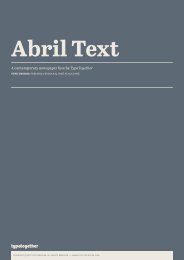
A poetically joyful text typeface by Eduardo Berliner for TypeTogether
A poetically joyful text typeface by Eduardo Berliner for TypeTogether
A poetically joyful text typeface by Eduardo Berliner for TypeTogether

You also want an ePaper? Increase the reach of your titles
YUMPU automatically turns print PDFs into web optimized ePapers that Google loves.
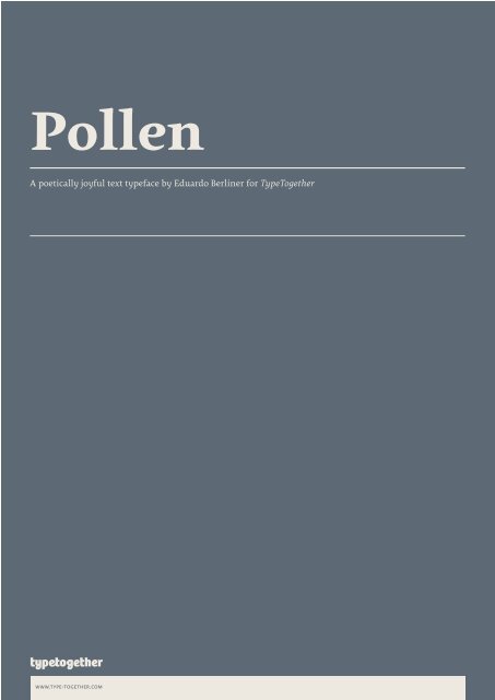
Pollen<br />
A <strong>poetically</strong> <strong>joyful</strong> <strong>text</strong> <strong>typeface</strong> <strong>by</strong> <strong>Eduardo</strong> <strong>Berliner</strong> <strong>for</strong> <strong>TypeTogether</strong><br />
www.type-together.com
ABCDEFGHIJKLM<br />
NOPQRSTUVWXY<br />
ZÆĄĦǾŢ0<br />
pollen regular, 73/78pt<br />
abcdefghijklmnopq<br />
rstuvwxyzßæðůšchþ<br />
abcdefghijklmno<br />
pqrstuvwxyzŒ&Ł<br />
{[(*&&,:@?!§«»-)]}<br />
€£$¥01234567891<br />
‰01234567890123<br />
www.type-together.com
aeo<br />
Humanist axis, sublte curves, modulated stem and calligraphically inspired terminals<br />
10/12 pt (body<strong>text</strong>), 12/12 pt (title)<br />
a poetic <strong>text</strong> <strong>typeface</strong><br />
Calligraphy, be it done with the broadedge<br />
pen, brush, or other tools, has<br />
been fundamental in the development<br />
of Pollen. Its influence is clearly visible<br />
in the construction of the top serifs<br />
contrasting the curved bottom serifs<br />
and the fluid aspect of terminals and<br />
tails, such as on “g” and “r”. The shapes<br />
of the diagonal letters are based on<br />
a less <strong>for</strong>mal calligraphic model, but<br />
still uses the broad edge pen. — The<br />
letters were then subject to a further<br />
process of pencil drawing and digital<br />
re-interpretation, which gave them the<br />
final shape.<br />
The designs of “e” and “c” are derived<br />
from drawings made with only one<br />
continuous line, with the pencil always<br />
touching the paper. The letters “g” and<br />
“y” express the intention to bring in<strong>for</strong>mal<br />
elements to a <strong>typeface</strong> intended <strong>for</strong><br />
long <strong>text</strong> reading, usually characteristic<br />
of casual writing, .<br />
Pollen consists of 3 basic styles with<br />
an extended opentype pro character<br />
set and large language support, perfectly<br />
serving the most common typographic<br />
needs.<br />
designer<br />
<strong>Eduardo</strong> <strong>Berliner</strong> is a graduate in<br />
graphic design in Brazil and obtained<br />
his Master of Arts in Type Design from<br />
University of Reading, UK.<br />
Currently he is working as an independent<br />
artist and graphic designer.<br />
In 2004, he developed an introductory<br />
course in typography <strong>for</strong> the Catholic<br />
University of Rio de Janeiro, which<br />
www.type-together.com<br />
was fully adopted. <strong>Eduardo</strong> has subsequently<br />
worked as a lecturer at the<br />
same university.<br />
Recently, <strong>Eduardo</strong> created, in collaboration<br />
with designer Cadu, the<br />
graphic structure <strong>for</strong> the newspaper<br />
“museumuseu”, a project conceived <strong>by</strong><br />
the Brazilian artist Mabe Bethonico. It<br />
was exhibited in the 27th Bienal de São<br />
Paulo.<br />
Additionally, the first version of<br />
<strong>Eduardo</strong>’s <strong>typeface</strong> “Pollen”, was shown<br />
in the catalogue of the dobra (Brésil,<br />
une nouvelle génération de designers-<br />
France 2004) exhibition.<br />
He has also been engaged in the<br />
design of motifs <strong>for</strong> various fashion<br />
clothing brands in Brazil.<br />
<strong>Eduardo</strong>’s work has been published<br />
in books and magazines worldwide,<br />
including Brazil Inspired, Étapes, Type<br />
One, Typosphere and Type Culture.<br />
typetogether<br />
Veronika Burian and José Scaglione met<br />
at the University of Reading whilst<br />
completing their MAs in Type Design,<br />
launching the independent type foundry<br />
<strong>TypeTogether</strong> (tt <strong>for</strong> short) in 2006.<br />
TT developed out of the desire to publish<br />
high quality <strong>typeface</strong>s and work on<br />
new type projects together (hence the<br />
name). The foundry provides common<br />
grounds <strong>for</strong> intense cooperation with<br />
other type designers, creating an interesting<br />
and diverse plat<strong>for</strong>m.<br />
<strong>TypeTogether</strong>’s main interest is finding<br />
innovative and stylish solutions to<br />
old problems <strong>for</strong> the professional market<br />
of <strong>text</strong> <strong>typeface</strong>s, with a focus on<br />
editorial use. This is where the greatest<br />
challenges are faced: creating <strong>typeface</strong>s<br />
that per<strong>for</strong>m well in continuous reading,<br />
that also have a high degree of<br />
personality.<br />
The aesthetic and functional efficiency<br />
of tt’s fonts are accompained<br />
<strong>by</strong> excellence in technical per<strong>for</strong>mance.<br />
This is achieved using the latest font<br />
software, creating cross-plat<strong>for</strong>m Opentype<br />
fonts with extended character sets<br />
including: broader language support<br />
and all kinds of typographic refinements,<br />
such as small caps, ligatures and<br />
multiple numeral sets.<br />
In addition to <strong>TypeTogether</strong>’s high<br />
quality library of retail fonts, tt also<br />
provides custom modifications and specially<br />
tailored <strong>typeface</strong>s; these can serve<br />
as vital elements of a company’s visual<br />
identity, <strong>by</strong> communicating a unique<br />
feel. Custom <strong>typeface</strong> projects are developed<br />
from solid foundations, based on<br />
the client’s brief, targeted research and<br />
the open dialogue between all parties.<br />
A big advantage of being a small and<br />
specialized company is that this allows<br />
<strong>for</strong> closer, and more direct, collaboration<br />
with clients; this is often necessary<br />
to accomplish their goals, and respond<br />
quickly to their needs.<br />
The quality of <strong>TypeTogether</strong>’s work<br />
has already been recognized in several<br />
international competitions, including<br />
tdc and ed-Awards.
Bariloche<br />
Há 50 anos, no dia 25 de Outubro de 1958, o jornal «Notícias da Amadora»<br />
1Poetry reading<br />
ein aigraf<br />
Písmař<br />
Japón presenta el robot enfermero<br />
The Nation’s Unemployment Outlook is devastating<br />
prêt parce qu’il est trop gros<br />
£36.98?!<br />
2Legion Of Terra-Cotta Mouseketeers Found Beneath Disney World3<br />
www.type-together.com
10/12 pt (hungarian)<br />
Klubunk idén is szeretne támogatni két<br />
tehetséges magyar zongoraművészt a<br />
tcu/cliburn zongoraversenyen való<br />
részvételre. 21 országból 89 jelentkező<br />
közül Polgar Éva és Fazekas Edi a válogató<br />
versenyek után bejutottak a végső<br />
<strong>for</strong>dulóba, ami itt lesz Fort Worthben.<br />
Ungar Tamás teljes ösztöndíjat ajánlott<br />
föl nekik. A részvételi díj $1,100<br />
fejenként. Ehhez szeretnénk erőnkhöz<br />
mérten hozzájárulni, amihez nagykelkű<br />
támogatásokat kérném. Bővebb felvilágosítás<br />
a művészekről a Fesztivál web<br />
8/10 pt (czech)<br />
Národní divadlo začalo s vydáváním cd v<br />
roce 2002, po nástupu nového ředitele Daniela<br />
Dvořáka, který do funkce šéfa opery přizval svého<br />
dřívějšího kolegu ze Státní opery Praha Jiřího<br />
Nekvasila. První vydanou operou <strong>by</strong>l Mozartův<br />
Don Giovanni, vyšly i živé nahrávky Zprávy pro<br />
akademii Jana Klusáka, Smolkovo Nagano a další.<br />
Zatím poslední je komplet s nahrávkou<br />
mimořádného provedení Prstenu Nibelungova<br />
od Richarda Wagnera, které vzbudilo velkou<br />
pozornost na scéně před 2 lety. “cd slouží jako<br />
dokumentace, propagace opery Národního divadla,<br />
je k dispozici knihovnám...” říká Jiří Nekvasil. V<br />
průběhu pěti let se objevovala i díla českých autorů,<br />
například Dvořákův Čert a Káča.<br />
“V současné době ty nahrávací společnosti,<br />
které to kdysi dělaly, jako třeba Supraphon, které<br />
nahrávaly a dokumentovaly celou jednu generaci,<br />
dnes asi z finančních důvodů opery netočí. Je to<br />
idea, která nás napadla už v našem působení ve<br />
Státní opeře, že v době, kdy zachytit hlas a umělecký<br />
výkon je technicky poměrně jednoduché,<br />
tu celá generace zůstane nezdokumentovaná. Nic<br />
po ní nezůstane. A já si myslím, v současnosti<br />
existuje v Národním celá řada zajímavých pěvců,<br />
11/13 pt (polish)<br />
Posłowie z komisji edukacji chcą tworzyć<br />
przy uniwersytetach publicznych<br />
szkoły dla wybitnie zdolnych<br />
uczniów. Ale czy młodzież powinna<br />
<strong>by</strong>ć selekcjonowana, a zdolne<br />
dzieci trafiać do elitarnych szkół?<br />
– To najlepsze rozwiązanie, uważa<br />
prof. Wiesława Limont, pedagog z<br />
Uniwersytetu Mikołaja Kopernika w<br />
Toruniu, przy którym taka szkoła już<br />
istnieje. – W zwykłych klasach dzieci<br />
o ponadprzeciętnych uzdolnieniach<br />
osiągają słabe wyniki.<br />
Nie rozwijają skrzydeł i zniechęcają<br />
się do nauki. Pomysł budzi jednak<br />
kontrowersje. Psycholog społeczny<br />
prof. Wiesław Łukaszewski: –Dziecko<br />
potrzebuje różnorodnych bodźców,<br />
nie tylko tych intelektualnych.<br />
Takie szkoły działały w Związku<br />
www.type-together.com<br />
12/14 pt (english)<br />
Calligraphy, be it done with the broad-edge pen, brush, or other<br />
tools, has been fundamental in the development of Pollen. Its influence<br />
is clearly visible in the construction of the top serifs contrasting<br />
the curved bottom serifs and the fluid aspect of terminals and tails,<br />
such as on “g” and “r”. The shapes of the diagonal letters are based<br />
on a less <strong>for</strong>mal calligraphic model, but still uses the broad edge pen.<br />
— The letters were then subject to a further process of pencil drawing<br />
and digital re-interpretation, which gave them the final shape.<br />
The designs of “e” and “c” are derived from drawings made with<br />
only one continuous line, with the pencil always touching the paper.<br />
The letters “g” and “y” express the intention to bring in<strong>for</strong>mal elements<br />
to a <strong>typeface</strong> intended <strong>for</strong> long <strong>text</strong> reading, usually characteristic<br />
of casual writing, .<br />
Pollen consists of 3 basic styles with an extended opentype pro<br />
character set and large language support, perfectly serving the most<br />
common typographic needs.<br />
12/14 pt (english)<br />
Calligraphy, be it done with the broad-edge pen, brush, or other tools,<br />
has been fundamental in the development of Pollen. Its influence<br />
is clearly visible in the construction of the top serifs contrasting the<br />
curved bottom serifs and the fluid aspect of terminals and tails, such<br />
as on “g” and “r”. The shapes of the diagonal letters are based on a less<br />
<strong>for</strong>mal calligraphic model, but still uses the broad edge pen. — The letters<br />
were then subject to a further process of pencil drawing and digital<br />
re-interpretation, which gave them the final shape.<br />
The designs of “e” and “c” are derived from drawings made with only<br />
one continuous line, with the pencil always touching the paper. The letters<br />
“g” and “y” express the intention to bring in<strong>for</strong>mal elements to a<br />
<strong>typeface</strong> intended <strong>for</strong> long <strong>text</strong> reading, usually characteristic of casual<br />
writing, .<br />
Pollen consists of 3 basic styles with an extended opentype pro character<br />
set and large language support, perfectly serving the most common<br />
typographic needs.<br />
14/17 pt (spanish)<br />
El surcoreano Hahn Bin que debutará en el carnegie<br />
ha en octubre olvidó su violín de medio millón<br />
de dólares en un taxi de Nueva York pero lo recuperó<br />
horas después, in<strong>for</strong>mó la prensa este martes. El instrumento,<br />
un Pressenda fabricado hace 184 años, fue<br />
olvidado el lunes en el asiento trasero del taxi por el<br />
violinista, indicó el New York Post.
pollen font styles<br />
Pollen &123<br />
regular<br />
Pollen &123<br />
regular italic<br />
Pollen &123<br />
bold<br />
www.type-together.com
pollen opentype features*<br />
small caps<br />
all small caps<br />
all caps<br />
ligatures<br />
discretionary ligatures<br />
proportional figures<br />
tabular figures & slashed zero<br />
numerator / denominator<br />
arbitrary fractions<br />
superior / inferior<br />
ordinals<br />
historical <strong>for</strong>m (long s)<br />
arrows & ornaments (stylistic set 1)<br />
bullets (stylistic set 2)<br />
arrows (stylistic set 3)<br />
turkish/azeri/crimean tatar<br />
romanian/moldavian<br />
* Not all features are available in all versions.<br />
www.type-together.com<br />
1234 charming creatures 1234 charming creatures<br />
(abc} n*/ d&e 567890€£ (abc} n*/ d&e 567890€£<br />
RADIOLARIANS 02 ? radiolarians 02 ?<br />
¿para <strong>text</strong>o?<br />
¿PARA TEXTO?<br />
1708% a–b [ende] 1708% A–B [ENDE]<br />
aufbau, fjord, affiliate aufbau, fjord, affiliate<br />
häckeln, strong, Then häckeln, strong, Then<br />
0123456789£$¢€¥ƒ¤ 0123456789£$¢€¥ƒ¤<br />
00123456789£$¢€¥ƒ¤ 00123456789£$¢€¥ƒ¤<br />
0123456789/0123456789 0123456789/0123456789<br />
1/2 3/4 1/6 5/7 2/9 1/2 3/4 1/6 5/7 2/9 34/670<br />
H2O xb8 y3+5 aIndex H2O xb8 y3+5 aIndex<br />
1st 2th 3rd Mlle 2ieme 1st 2th 3rd Mlle 2ieme<br />
Lost paradise Loſt paradiſe<br />
abcdefgh 123456789 abcdefgh 123456019<br />
abcdefghi abcdefghi<br />
-> ->
pollen character set*, uprights<br />
& & * , - . : ; ? ! ¿ @ A B C D<br />
E F G H I J K L M N O P Q R S T U V W X Y Z a b<br />
c d e f g h i j k l m n o p q r s t u v w x y z<br />
[ ] ( ) { } / ^ 0 1 2 3 4 5 6 7 8 9 $<br />
€ ¢ £ ¥ ƒ ¤ § « » ’ “ ” <br />
<br />
Ǿ ß á ã<br />
ä æ é í ð ó ö <br />
ü ý þ Ą Č č <br />
ě Ħ <br />
i <br />
ő <br />
ř š Ţ ţ Ț ț <br />
ů ű <br />
ž ſ fi fb ft fj ffi st ch ck<br />
Th ‰ % / 0 1 2 3<br />
5 + a <br />
2 <br />
8 b <br />
0 1 2 3 4 5 6 7 8 9 <br />
d e h i l m r<br />
s t 0 1 2 3 4 5 6 7 8 9 <br />
<br />
< > + <br />
c a d b<br />
e g h f d c a b f e g h 1 2 3 4 5 6 0 1 9 i 0 1<br />
2 3 4 5 6 7 8 9 $ € ¢ £ ¥ ƒ % 0 0 1 2 3 4 5<br />
6 7 8 9 $ € ¢ £ ¥ ƒ 0 0 1 2 3 4 5 6 7 8 9 $ €<br />
¢ £ ¥ ƒ a b c d e f g h i j k l m n o p q r s<br />
t u v w x y z <br />
<br />
i <br />
<br />
Ł Œ ? <br />
& ( } ’ * / 0 1 2 3 4 5 6<br />
7 8 9 € £ <br />
<br />
* Not all features are available in all versions.<br />
www.type-together.com
pollen character set*, italics<br />
& , - . : ? A B C<br />
D E F G H I J K L M N O P R S T U V W Z a<br />
b c d e f g h i j k l m n o p r s t u v w x y<br />
z 0 1 2 3 5 8 9<br />
« » ’ “ ” <br />
<br />
á <br />
é í ó <br />
ą ć <br />
ę <br />
<br />
Ł ł <br />
ř <br />
ź <br />
ż ž <br />
tt <br />
<br />
<br />
<br />
<br />
<br />
<br />
<br />
<br />
<br />
2 3 <br />
<br />
<br />
b c d e f m n o p r<br />
t y <br />
<br />
<br />
<br />
<br />
<br />
<br />
<br />
* Not all features are available in all versions.<br />
www.type-together.com
Type Design <strong>Eduardo</strong> <strong>Berliner</strong><br />
www.type-together.com<br />
copyright ©2011 type together, all rights reserved