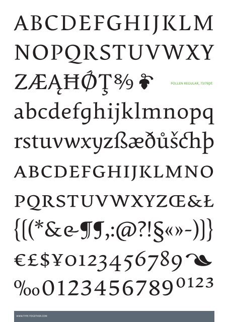
ABCDEFGHIJKLM NOPQRSTUVWXY ZÆĄĦǾŢ0 pollen regular, 73/78pt abcdefghijklmnopq rstuvwxyzßæðůšchþ abcdefghijklmno pqrstuvwxyzŒ&Ł {[(*&&,:@?!§«»-)]} €£$¥01234567891 ‰01234567890123 www.type-together.com
aeo Humanist axis, sublte curves, modulated stem and calligraphically inspired terminals 10/12 pt (body<strong>text</strong>), 12/12 pt (title) a poetic <strong>text</strong> <strong>typeface</strong> Calligraphy, be it done with the broadedge pen, brush, or other tools, has been fundamental in the development of Pollen. Its influence is clearly visible in the construction of the top serifs contrasting the curved bottom serifs and the fluid aspect of terminals and tails, such as on “g” and “r”. The shapes of the diagonal letters are based on a less <strong>for</strong>mal calligraphic model, but still uses the broad edge pen. — The letters were then subject to a further process of pencil drawing and digital re-interpretation, which gave them the final shape. The designs of “e” and “c” are derived from drawings made with only one continuous line, with the pencil always touching the paper. The letters “g” and “y” express the intention to bring in<strong>for</strong>mal elements to a <strong>typeface</strong> intended <strong>for</strong> long <strong>text</strong> reading, usually characteristic of casual writing, . Pollen consists of 3 basic styles with an extended opentype pro character set and large language support, perfectly serving the most common typographic needs. designer <strong>Eduardo</strong> <strong>Berliner</strong> is a graduate in graphic design in Brazil and obtained his Master of Arts in Type Design from University of Reading, UK. Currently he is working as an independent artist and graphic designer. In 2004, he developed an introductory course in typography <strong>for</strong> the Catholic University of Rio de Janeiro, which www.type-together.com was fully adopted. <strong>Eduardo</strong> has subsequently worked as a lecturer at the same university. Recently, <strong>Eduardo</strong> created, in collaboration with designer Cadu, the graphic structure <strong>for</strong> the newspaper “museumuseu”, a project conceived <strong>by</strong> the Brazilian artist Mabe Bethonico. It was exhibited in the 27th Bienal de São Paulo. Additionally, the first version of <strong>Eduardo</strong>’s <strong>typeface</strong> “Pollen”, was shown in the catalogue of the dobra (Brésil, une nouvelle génération de designers- France 2004) exhibition. He has also been engaged in the design of motifs <strong>for</strong> various fashion clothing brands in Brazil. <strong>Eduardo</strong>’s work has been published in books and magazines worldwide, including Brazil Inspired, Étapes, Type One, Typosphere and Type Culture. typetogether Veronika Burian and José Scaglione met at the University of Reading whilst completing their MAs in Type Design, launching the independent type foundry <strong>TypeTogether</strong> (tt <strong>for</strong> short) in 2006. TT developed out of the desire to publish high quality <strong>typeface</strong>s and work on new type projects together (hence the name). The foundry provides common grounds <strong>for</strong> intense cooperation with other type designers, creating an interesting and diverse plat<strong>for</strong>m. <strong>TypeTogether</strong>’s main interest is finding innovative and stylish solutions to old problems <strong>for</strong> the professional market of <strong>text</strong> <strong>typeface</strong>s, with a focus on editorial use. This is where the greatest challenges are faced: creating <strong>typeface</strong>s that per<strong>for</strong>m well in continuous reading, that also have a high degree of personality. The aesthetic and functional efficiency of tt’s fonts are accompained <strong>by</strong> excellence in technical per<strong>for</strong>mance. This is achieved using the latest font software, creating cross-plat<strong>for</strong>m Opentype fonts with extended character sets including: broader language support and all kinds of typographic refinements, such as small caps, ligatures and multiple numeral sets. In addition to <strong>TypeTogether</strong>’s high quality library of retail fonts, tt also provides custom modifications and specially tailored <strong>typeface</strong>s; these can serve as vital elements of a company’s visual identity, <strong>by</strong> communicating a unique feel. Custom <strong>typeface</strong> projects are developed from solid foundations, based on the client’s brief, targeted research and the open dialogue between all parties. A big advantage of being a small and specialized company is that this allows <strong>for</strong> closer, and more direct, collaboration with clients; this is often necessary to accomplish their goals, and respond quickly to their needs. The quality of <strong>TypeTogether</strong>’s work has already been recognized in several international competitions, including tdc and ed-Awards.