You also want an ePaper? Increase the reach of your titles
YUMPU automatically turns print PDFs into web optimized ePapers that Google loves.
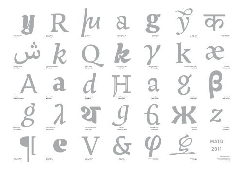
Artigo Black Italic<br />
Joana Correia<br />
Bubblegum Arabic<br />
Ferran Milan<br />
Naej Regular<br />
Blondina Elms Pastel<br />
Chepman Italic<br />
Rob McKaughan<br />
Modern 7 Regular<br />
Adrien Vasquez<br />
Marco Roman<br />
Toshi Omagari<br />
The Herald Italic Grade 3<br />
Pria Adireddi<br />
Saja Book Bold<br />
Aaron Bell<br />
Intone Upright Italic<br />
Eleni Beveratou<br />
Eczar Black<br />
Vaibhav Singh<br />
Emrys Italic<br />
Ben Jones<br />
Eskorte Regular<br />
Elena Schneider<br />
Bubblegum Italic<br />
Ferran Milan<br />
Eczar Devanagari Black<br />
Vaibhav Singh<br />
Modern 7 Regular<br />
Adrien Vasquez<br />
Foxhill Stylistic Set<br />
Hanna Donker<br />
Arlecchino Black Italic<br />
Luisa Baeta<br />
Foxhill Titling Capitals<br />
Hanna Donker<br />
Naej Italic<br />
Blondina Elms Pastel<br />
Marco Sans<br />
Toshi Omagari<br />
Cassiope Bold<br />
Marion Delsuc<br />
Chepman Greek Italic<br />
Rob McKaughan<br />
Lemona Regular<br />
Julián Moncada<br />
Eskorte Armenian<br />
Elena Schneider<br />
Arlecchino Greek Italic<br />
Luisa Baeta<br />
Clint Italic<br />
Bianca Berning<br />
The Herald Regular Grade 3<br />
Pria Adireddi<br />
Intone Regular<br />
Eleni Beveratou<br />
Emrys Black<br />
Ben Jones<br />
Saja Book Italic<br />
Aaron Bell<br />
<strong><strong>MA</strong>TD</strong><br />
<strong>2011</strong><br />
Artigo Devanagari<br />
Joana Correia<br />
Clint Regular<br />
Bianca Berning<br />
Lemona Bold<br />
Julián Moncada<br />
Cassiope Italic<br />
Marion Delsuc<br />
<strong>MA</strong> <strong>Typeface</strong> <strong>Design</strong><br />
at the University of Reading<br />
www.typefacedesign.org
Ben Jones • www.protimient.com<br />
Emrys is an extremely versatile, prominently modulated sans-serif<br />
type family for multiple scripts.<br />
Luisa Baeta • luisabaeta@gmail.com<br />
Arlecchino has playful and quick gestural qualities that translate to<br />
very different but cohesive styles, in both Latin and Greek scripts.<br />
Vaibhav Singh • errorsinc@gmail.com<br />
Eczar was designed with an intent to bring liveliness and vigour to academic<br />
books with a focus on Devanagari-Latin multi-script typography.<br />
Adrian Vasquez • www.adrienvasquez.co.uk<br />
Modern 7 is an interpretation of the style introduced by the Didot dynasty,<br />
intended for – but not restricted to – literary prose.<br />
Eleni Beveratou • www.elenibeveratou.com<br />
Intone is a serif typeface for poetry collections that includes a regular,<br />
bold, upright italic and italic version for both Latin and Greek scripts.<br />
Julián Moncada • jmoncada86@yahoo.com<br />
Lemona is a typeface for literature, an experiment exploring<br />
conventions in the weight distribution and proportions of traditional<br />
typography.<br />
Rob McKaughan • www.robmckaughan.com<br />
Chepman is a news typeface designed to work both in print and on<br />
screen, providing an excellent reading experience with a friendly,<br />
approachable feel.<br />
Ferran Milan • polytonic3@gmail.com<br />
Bubblegum is a typeface for books, catalogs and small publications,<br />
bilingual – Latin and Arabic. It covers all the needs for book design<br />
with a wide range of weights.<br />
Joana Correia • www.joanamcorreia.com<br />
Artigo is a typeface designed for lifestyle magazines. The design of all<br />
scripts explores a connection between handwriting and typography.<br />
Hanna Donker • www.hannadonker.nl<br />
Foxhill is a typeface especially designed to work in small sizes<br />
such as bilingual religious texts. It includes polytonic Greek and<br />
a blackletter inspired-stylistic set designed for headings.<br />
Marion Delsuc • marion.delsuc@gmail.com<br />
Cassiope is a theatre bookface. It is dark, delicate and small with open<br />
counters to ensure legibility, and a stylish italic quickly distinguishable.<br />
Aaron Bell • http://sajafont.com<br />
<strong>Design</strong>ed for Korean and Latin multi-script magazine situations, Saja<br />
offers two text weights – one dark and one light for regional preference.<br />
Blondina Elms Pastel • www.atelierelms.com<br />
Naej is legible, fun and inviting with a touch of elegance. Organic<br />
rather than mechanical, this typeface displays a humanist axis,<br />
modulated stroke and open forms.<br />
Bianca Berning • clint@krautundruebe.de<br />
Clint is a multi-script typeface designed to perform well in poems,<br />
lyrics, dramatic texts, short stories, screenplays & fairy tales.<br />
Elena Schneider • www.elefont.de<br />
Eskorte is a seriously reliable corporate typeface family. Diversity<br />
in style allows uniqueness while simultaneously covering legibility.<br />
Toshi Omagari • tosche@mac.com<br />
Marco is a superfamily typeface designed for multilingual publication. It<br />
contains Roman and Sans in Latin, Greek, Cyrillic, and vertical Mongolian.<br />
Pria Adireddi • pria.adireddi@gmail.com<br />
The Herald type family is intended as a specific text typeface with<br />
support for Latin script. Additionally Tranquebar is an experimental<br />
Tamil type-design.


