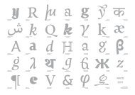
Intone - MA Typeface Design
Intone - MA Typeface Design
Intone - MA Typeface Design

Create successful ePaper yourself
Turn your PDF publications into a flip-book with our unique Google optimized e-Paper software.
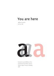
Reflection on practise<br />
Eleni Beveratou<br />
<strong>Intone</strong><br />
Say or recite with little rise and fall of the pitch of the voice.<br />
*Essay submitted in partial fulfilment of the requirements for the <strong>MA</strong> in <strong>Typeface</strong> <strong>Design</strong>, University<br />
of Reading Department of Typography and Graphic Communication, June 2011<br />
1
List of contents<br />
Introduction p. 3<br />
1. <strong>Intone</strong>, a collage of inspiration and knowledge<br />
1.1 Reading: A source of knowledge p. 4<br />
1.2 Several sources of inspiration for my typeface p. 4<br />
1.3 Defining the brief p. 5<br />
2. A vicious circle: De-sign, De-cide, De-sign<br />
2.1 Starting with the Roman p. 6<br />
2.2 Starting with the Upright Italic p. 6<br />
2.3 Starting with Greek: Italic and Roman p. 8<br />
2.4 Waking up with a new idea for an Italic p. 8<br />
2.5 New decisions, new conclusions new mix and matching of features:<br />
A process that never ends p. 10<br />
3. Towards uniformity, clarity and extension<br />
3.1 My characters are dancing to all directions<br />
3.1.1 Creating a consistent Regular p. 10<br />
3.1.2 Creating a consistent Upright Italic p. 11<br />
3.1.3 Extending the Italic, creating an inconsistent Greek Italic p. 11<br />
3.2 Family uniformity<br />
3.2.1 Similar features p. 11<br />
3.2.2 Justified irregularities regarding weight distribution for the Greek p. 12<br />
3.2.3 Spacing and kerning p. 12<br />
3.3 Extension of the character set<br />
3.3.1 Diacritics and numerals p. 12<br />
3.3.2 Special features for the Greek Italic p. 13<br />
Conclusion p. 14<br />
2
Introduction:<br />
You are about to read through my experience regarding the development of the <strong>Intone</strong><br />
typeface during this year in the M.A. in typedesign, at the University of Reading. The<br />
outcome of a learning process is always positive, considering that one comes out of it<br />
stronger and with new ideas. However, the road through it contains a mixture of feelings<br />
and battles with oneself in order to achieve the desired result.<br />
The first part of this essay deals with how I became enthusiastic about creating this typeface<br />
and describes the setting of the brief. The second part explains the design process; how<br />
it started, the decisions that were taken and how the interpolation of a whole family and the<br />
extension of the typeface into the Greek family was a key factor for changes. The third part<br />
explains how all of the above were wrapped up, cleaned and organized in such a way as to<br />
create uniformity and an extended typeface.<br />
3
From top to bottom and right<br />
to left:<br />
1. Hendrik de Roo’s typeface<br />
Egmont cursive in Jan Visser<br />
Fluitekruid, Verzen<br />
2. Hendrik de Roo’s typeface<br />
Erasmus in Margot Vos (1923),<br />
De nieuwe lent’, Em Qyerido,<br />
Amsterdam<br />
3. Greek matrices from the Plantin<br />
Moretus museum<br />
4. Pierre Didot typeface Didot<br />
Elder (1819) redeveloped by<br />
Francois Rappo<br />
1. <strong>Intone</strong>, a collage of inspiration and knowledge<br />
1.1 Reading: A source of knowledge<br />
This past year in Reading has been a constant exploration of different ideas and points of<br />
view regarding type. Being exposed to different people, different historical resources and<br />
different imagery, I managed to create a solid baggage that helped me understand what type<br />
is all about. The interesting part about this baggage is that everyone has it, but it is not the<br />
same for any of us. It is even built from the same pieces, but each one of us has<br />
assembled a different puzzle, depending on his personal background and expectations<br />
from the course.<br />
1.2 Several sources of inspiration for my typeface<br />
At the beginning of the year, I formulated a brief stating that the process of typedesign<br />
could not escape conventional methods. This has been a great struggle for me, due to the<br />
excitement I felt from acquiring so much knowledge here, in Reading. Trying to be exciting<br />
within convention was a process that I could not follow. After reading Gerard Unger’s book,<br />
“While we are reading”, it became clear to me that my situation was not a personal failure<br />
but merely the consequence of a conventional typeface.<br />
When it comes to typedesign, convention is the enemy of creativity. Therefore, I decided<br />
to put this project temporarily in a drawer and start anew, with a more creative one. Four<br />
items that drew my attention were the crucial elements that led me to this decision. The<br />
first two are two poetry books that came into my possession. Both were typeset with Sjoerk<br />
Hendrik de Roos’s typefaces, Egmont cursive and Erasmus. I found the small details (like<br />
the serifs on the ascenders of the l, h, k, b and d in Egmont) of each letter to be very fascinating.<br />
They made each character unique while, simultaneously, they created an interesting<br />
pattern on the paper.<br />
The third element was discovered during our trip to the Plantin Moretus museum. A “g”<br />
that looked different from all the others caught my attention immediately. It was the “g”<br />
from the Didot typefamily. Was it a mistake? It was almost standing out of the text but, at<br />
the same time, was blending in a very harmonious way with the rest of the letters.<br />
The last decisive detail was the discovery of some Greek punches that did not look like<br />
Greek at all. Being Greek, my fellow students were asking me what these letters were. I felt<br />
incapable of giving an accurate answer because these ligatures where completely different<br />
from the commonly known modern letterforms.<br />
After these discoveries I had enough food for thought and the design process that will be<br />
analyzed in this essay was happily starting once again.<br />
4
1.3. Defining the brief<br />
The aim of my M.A. project was to design a typeface that would capture details from the<br />
process of writing with tools. It would be a typeface mainly for poetry books, since short<br />
lines allow for more freedom to differentiate each letter and make it unique within the character<br />
set. The typeface would cover both Latin and Greek and could be used for bilingual<br />
publications.<br />
Regarding Greek, my goal was to create a script that would match the Latin in colour and<br />
would be free of the “latinized flair” that most of the available Greek typefaces have. Handwriting<br />
is never completely consistent, this is why the typeface family is composed of a<br />
regular, an upright italic and a cursive italic, each granting a different feel and meaning to<br />
the text.<br />
5
Negative Remarks:<br />
1. Very accentuated serifs.<br />
2. “N” and “h” too pointy compared<br />
to “d” and “o” which are<br />
too round.<br />
3. Restart.<br />
4. “E” looks weird but I don’t<br />
know why yet.<br />
5. “G” is interesting but doesn’t<br />
really fit the rest.<br />
6. It is a bit too bold and I would<br />
like something slightly more<br />
refined.<br />
Positive remarks:<br />
1. I like the top serif on the “d” and<br />
the “n”; they have a strong deep<br />
cut. I like also the right part of the<br />
ascender of the “d” that leans to<br />
the right translating the movement<br />
of the pen.<br />
2. The serif on the “h” has<br />
something but maybe it is a bit<br />
excessive for the regular. I will try<br />
to imply it on the italic.<br />
Negative Remarks:<br />
1. What happened to the top serif<br />
of the “h”?<br />
2. Contrast is better on the sketch.<br />
3. The outstrokes look better on<br />
the sketch.<br />
4. The serifs don’t fit. They seem<br />
as if someone forced them.<br />
5. The form of the stem doesn’t fit<br />
the ascenders.<br />
Positive remarks:<br />
1. The sketch is better.<br />
2. The stem has something<br />
interesting.<br />
2. A vicious circle: De-sign, De-cide, De-sign<br />
2.1 Starting with the Roman<br />
Imaginary scissors and glue were the main tools for this introductory process. To set the<br />
style of the typeface a lot of fast decisions had to be made. I started writing “adhesion” with<br />
my pen and ink; I picked the one that looked interesting and started designing from there.<br />
I felt that scanning it and digitalizing it while being really faithful to the trace of the ink<br />
would prove interesting; it did. However, the result was far from being typographical and<br />
uniform.<br />
Later, I started sorting out the features. Some had to stay, some had to go and others would<br />
best fit the Italic. The result was already more typographical, but very inconsistent. The<br />
“n” was angular whereas the “b” and “o” were too rounded. The bottom serifs were more<br />
prominent than poetry would require. There were many issues to be addressed. That is why<br />
I decided to put my Roman, that was still influenced from the previous brief, aside and get<br />
back to it later with a clear mind.<br />
adhesiong<br />
2.2 Starting with the Upright Italic<br />
2.2 Starting with the Upright Italic<br />
I particularly liked the feeling Upright Italics gave to the paper, so I decided to try it out. I<br />
thought that the world in itself was hiding something; “up” and “right”. So I started designing<br />
my Italics by always keeping the right side of the letter completely vertical and slanting<br />
only its left side. This seemed to work out for the letters that started on the baseline and did<br />
not surpass the x-height, but it was problematic regarding the ascenders and descenders.<br />
For the serifs on the ascenders, I decided to employ an element that came up from draw-<br />
6<br />
he
Negative Remarks:<br />
1. the joins are a bit black<br />
Positive remarks:<br />
1. the roughness of the upstroke<br />
gives a lot more character to the<br />
letter<br />
2. the problem with the thin<br />
ascender and descenders is solved<br />
3. the serif on the p corresponds<br />
better to the overall lettershape.<br />
4. the ellimination of the serif was<br />
a positive idea.<br />
ing the Roman but didn’t quite fit with it (the serif on the “h”). Despite my efforts, bottom<br />
serifs looked out of place so I decided not to implement them. Thus, I developed a Mix<br />
Serif Italic, featuring serifs only on the top parts of the letters. A second look at the initial<br />
sketches made me realize that some worth-keeping features had disappeared during the<br />
“first sorting”.<br />
Comparisons between my sketch and the first digital version of the typeface, as well as the<br />
first conclusion drawn from my work led me to better shaped forms. My initial aim was to<br />
create an impression of the letters being created with one single stroke. Based on the trails<br />
of my pen, I lowered the junctions and rounded the bottom of the stem. I also made the<br />
endstroke thinner and longer, creating the feeling of a faster movement<br />
of the pen.<br />
The real problem, however, was that of a very thin ascender and a descender that lacked<br />
grace. Wanting to abide by my rule (a vertical stroke on one side), I experimented in order<br />
to get rid of that very thin ending. I figured I should break the stroke in half. I also decided<br />
to keep the straight stroke on the left for the top half and on the right for the bottom half of<br />
the long stems. This formed a very interesting corner that I implemented on the bowls of<br />
the letter. This was achieved by accentuating the thin parts, sharpening the instrokes and<br />
“breaking” the outstroke.<br />
h h<br />
p<br />
Before pAfter<br />
Before<br />
n n<br />
Before<br />
After<br />
After<br />
7
Manutius Greek<br />
Negative Remarks:<br />
1. The Regular Greek is way too<br />
playful.<br />
2. The Italic rho and epsilon are<br />
too round for the style of the<br />
typeface.<br />
Positive remarks:<br />
1. The descender of the “m” has<br />
something intresting that I should<br />
try to apply to my Latin.<br />
2. On the Italic, letters like eta,<br />
mu and alpha resemble the Latin<br />
version.<br />
3. The weight on the vertical axis<br />
gives a better impression of the<br />
Greek letterform.<br />
2.3 Starting with greek both italic and roman<br />
As stated in my brief, I had a very precise idea of the look I wanted my Greek to have. I drew<br />
my inspiration from these old Greek manuscripts, leading me into switching my tool to the<br />
ottoman pen. Despite the change, the result was still either too wooden or too handwritten.<br />
My exposure to the currently available Greek typefaces aiming to look like Latin didn’t<br />
offer any help. I couldn’t find a balance between “wooden” and handwritten and, most<br />
importantly, I couldn’t decide which features to borrow from the Latin, in order to maintain<br />
coherence. Since my Roman design was not set, it would be difficult to make decisions<br />
regarding the Greek. It lead me, however, in discovering new features that could also be<br />
implemented in the Roman. So, I turned to my Greek Italic.<br />
Truth be told, Greek is a script allowing a lot of freedom of shapes. It is harder, though,<br />
to create a uniform pattern compared to the Latin. Greek Italic is closer to the nature of<br />
the Greek script than the Upright, which was developed for typographic use. It was easier<br />
to borrow shapes from the Latin, when creating the Greek Italic, as the modularity of the<br />
stroke was very fitting. <strong>Design</strong>ing the Greek and having to deal with round shapes and big<br />
counters made me realize: Despite Latin Italic being angunlar, shapes with big counters or<br />
some others (e.g. “o”, “v”, “w”) would not match the rest of the typeface due to being less<br />
angular.<br />
2.4 Waking up with a new idea for an Italic<br />
Gerry recommended that I should work on one more Italic. I also realized that just an Upright<br />
Italic cannot fully replace an Italic. Therefore, I started creating an Italic that would<br />
have a cursive feel (like writing with a pen). The letters would not touch, as to create a more<br />
typographic look. Starting points were the very low junctions (that in a second staged were<br />
also applied to my Roman and Upright Italic) and strong serifs that almost touch, trans-<br />
8<br />
ηρεμια<br />
ηρεμα
Old Greek Family letters<br />
Negative Remarks:<br />
1. Serifs on the “m”, “n” and “h”<br />
create a line that negatively affects<br />
legibility.<br />
2. The junctions are too low.<br />
Positive Remarks<br />
2. On the Greek Italic, some letters<br />
(e.g. sigma, final sigma) have<br />
loops making them too busy or<br />
unreadable.<br />
3. Some letters (e.g.”t”) look<br />
squeezed.<br />
lating into a fast movement of the pen. Inspiration was drawn from the way children are<br />
taught to write calligraphy.<br />
For the Greek, I wanted to keep the feeling given by old Greek matrices (shown in the first<br />
part). While doing research, I came up with some old family letters that resembled the old<br />
Greek. Legibility was debatable, but it proved to be a good starting concept.<br />
9
For the top image<br />
Negative Remarks:<br />
1. The break of the stem creates a<br />
typeface than leans to the left.<br />
2. The instroke of “a” doesn’t fit<br />
with the rest.<br />
3. “a”, “d”, “e”, “s” and “g” need<br />
to follow the inclination of the<br />
upstroke of the “n”.<br />
4. The bottom serif of the “d”<br />
makes the letter too dark.<br />
5. The junctions are too high.<br />
6. The pattern need less contrast<br />
7. “z” has too many features.<br />
8. “g” is too complicated.<br />
2.5 New decisions, new conclusions new mix and matching of features:<br />
A process that never ends<br />
The character set was there. I had to expand it, but the base was solid. In an imaginary world<br />
all I would have to do was press the “perfection” button and that would be it. But in our real<br />
world this was only the beginning of new problems and challenges. I soon realized (as you<br />
can see in the footnote of each drawing) that my character sets lacked uniformity. As Gerry<br />
would say: “You are not going to like what I’m about to tell you, but it seems as if you were<br />
designing every character in a different day with a different mood”. I wanted my characters<br />
to be unique, but I had gone overboard. As Mathew Carter would say: “the aim is not a group<br />
of beautiful letters, but a beautiful group of letters, is what is essential for legibility”. That<br />
served as my motto for the following steps.<br />
3. Towards uniformity, clarity and extension<br />
3.1 My characters are dancing to all directions<br />
3.1.1 Creating a consistent Regular<br />
adzesiong<br />
adzesiong<br />
final form of adhesion<br />
One of the problems I encountered was that my Regular text was “dancing” too much. Each<br />
character had too much of a personality, disrupting the flow of reading by creating a messy<br />
pattern. In addition, the Regular, Italic and Greek looked like separate typefaces. With a<br />
closer look I realized that this was due to some characters lacking common features.<br />
However, I had to make the horizontal alignment work before anything else. Once the<br />
letters would work next to each other, I started modifying the spacing. It was then that I<br />
comprehended how important spacing is; it would clearly demonstrate the problems.<br />
Zooming out from micro-typographical details enabled me to better understand the problem.<br />
I decided to introduce the strong diagonal allure to all of my characters and to distort<br />
the weight in the same manner for all of them. Moreover, I added more corners to my inner<br />
curves to make some characters match (e.g. “o”, “n”).<br />
The creation of the Capitals and the Small caps was a straightforward process, although I<br />
spent some time on the letters “E”, “F”, “L” and “T” before coming up with a solution for the<br />
serifs on the horizontal stems. Afterwards, I developed the Bold. It was spaced tighter than<br />
the Regular to ensure homogeny between the counters and the space among the letters.<br />
After fixing the Greek Upright Italic I worked on my Regular Greek, making sure that they<br />
are more distinct. I rounded the outstrokes and sharpened the instrokes to better resemble<br />
the Latin.<br />
10
3.1.2 Create a consistant upright italic<br />
The upright latin lowercase italic had found its way with constant but small changes mainly<br />
on fi nding the right way to slant each character as the rounds and the ascenders and descenders<br />
so that they look as if they are inclined on the same way. Reguarding my greek I<br />
used the conclusions I had drawn from the previous stage in order to add more modulation<br />
on the curve and borrow even more features from the regular. What I found very diffi cult<br />
this time was the capitals. Having a lowercase with a nice transcription of the writting fl ow<br />
the uppercase was jumping out of the text. Ellimination once more of the serifs an paying<br />
more attention to the modulation of the stems was the key to solve the problem. Overall<br />
the upright italic is spaced rather tightly so that it becomes more easily distinc when side by<br />
side with the regular.<br />
3.1.3 Extending the italic, create an unconsistant greek italic.<br />
By now it was clear to me that serifs and a cursive letterforms were a poor combination,<br />
especially when the typeface is developed for text sizes. Therefore, I limited the pronounced<br />
and horizontal serifs in letters like “u”, and “n”. I raised the junctions for a better<br />
curve modulation and extended my character set with capitals. Through a quick look of<br />
handwritten letters, I concluded that the capitals can be really crazy considering that they<br />
will always be typeset in combination with lowercase characters. So I decided to borrow<br />
features from Greek, French and German script capitals. <strong>Intone</strong> proved to be a typeface demanding<br />
variations and contextual alternates, which is something I am looking forward to<br />
work on in the future.<br />
Developing the Greek was the most pleasant part of my work so far. It was very interesting<br />
to discover new ways of writing a letter without compromising legibility. At fi rst, I tried<br />
to stay faithful to the grid and keep it as a text typeface. However, letters with prominent<br />
ascenders and descenders seemed a bit “squeezed”. Gerry made the same observation and<br />
advised me to get out of the grid and not to be afraid of "going crazy". This proved to work<br />
and each letter had its suitable space. A few letters were overlapping, though, so I created<br />
some open type features with contextual alternates and ligatures, in order to explore<br />
possible solutions.<br />
3.2 Family uniformity<br />
3.2.1 Similar features<br />
adzesiong<br />
adzesiong<br />
adzesiong<br />
11
3.2.2 Justified irregularities regarding weight distribution for the Greek<br />
Originally, the Greek script has a switch on the weight of the lines. Unlike most modern<br />
Greek typefaces available today, the ones I created feature heavier lines on the top and bottom<br />
part, rather than on the sides, in order to create an old-fashioned Greek typeface that<br />
communicates the handwritten character and “sits” better on the page.<br />
3.2.3 Spacing and kerning<br />
The more you space, the more you need to space! It became clear to me that the overall<br />
texture of the text gets better with spacing. However, some details become more prominent,<br />
demanding adjustments to the spacing or the design of the letterform itself. At the<br />
end I only applied basic kerning between capital and lowercase letters and a few lowercase<br />
combinations, in both Latin and Greek as detailed kerning should only be done when the<br />
typeface is totally adjusted.<br />
3.3 Extention of the character set<br />
3.3.1. Diacritics and numerals<br />
àáâãäåăāą<br />
ἀἁἂἃἄἅἆἇ<br />
ἈἉἊἋἌἎ<br />
1234567890<br />
In a somewhat final stage, I added diacritics, old style numbers, and polytonic Greek characters<br />
to my typeface. For now, only the old style numbers are developed, because they are<br />
better fit for poetry collections. The addition of polytonic Greek was mandatory for Greek<br />
poems. This revealed several issues that helped me understand how to properly space them<br />
and how to carefully distinct diacritics and punctuation. All of the diacritics are strong, thus<br />
emphasizing the intonation of each word.<br />
12
3.3.2 Special features for the greek italic.<br />
Considering that the Greek is based on handwritten forms, there was room for open type<br />
features in the <strong>Intone</strong> Italic. Some of them were purely personal choices (e.g. initial and<br />
final forms) and others were required in order to support some character combinations.<br />
Examples of liguatures (black symbolizes when the open type features are enabled):<br />
γγγγ στστ ντντ<br />
Examples of contextual forms:<br />
επι επι<br />
ένω ένω<br />
έλλα έλλα<br />
φλ φ λ<br />
ετ ετ<br />
Examples of contextual forms:<br />
άρτα ιόνια<br />
13
Conclusion<br />
I was taught that “conclusion” is the part where you summarize and wrap up your work,<br />
adding a small sentence in the end that gives an opening towards new ideas. Well, this is the<br />
first time that I consciously don’t want to do this. This past year in Reading was consistently<br />
providing me with new ideas and the more I learned, the more I realized that typedesign is an<br />
intricate process; it cannot be wrapped up unless there is a deadline or client waiting for it.<br />
The more I work, the more I discover obvious mistakes. This makes me happy, because now<br />
I can actually see what I wouldn’t even notice in the beginning. I am happy to put my work<br />
aside for two months and get back to it in September, with fresh ideas and without stress.<br />
What I would like to do is fix the mistakes, clean it up, space it better, get rid of features that<br />
I cannot make up my mind about at the moment, extend the character set of each style. I<br />
am glad that I joined this Master’s program and I am looking forward to further develop the<br />
skill I acquired here in Reading, in the sphere of a real world.<br />
14