Intone - MA Typeface Design
Intone - MA Typeface Design
Intone - MA Typeface Design

You also want an ePaper? Increase the reach of your titles
YUMPU automatically turns print PDFs into web optimized ePapers that Google loves.
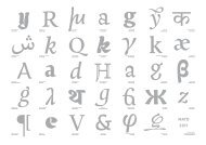
Manutius Greek<br />
Negative Remarks:<br />
1. The Regular Greek is way too<br />
playful.<br />
2. The Italic rho and epsilon are<br />
too round for the style of the<br />
typeface.<br />
Positive remarks:<br />
1. The descender of the “m” has<br />
something intresting that I should<br />
try to apply to my Latin.<br />
2. On the Italic, letters like eta,<br />
mu and alpha resemble the Latin<br />
version.<br />
3. The weight on the vertical axis<br />
gives a better impression of the<br />
Greek letterform.<br />
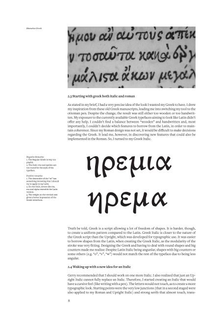
2.3 Starting with greek both italic and roman<br />
As stated in my brief, I had a very precise idea of the look I wanted my Greek to have. I drew<br />
my inspiration from these old Greek manuscripts, leading me into switching my tool to the<br />
ottoman pen. Despite the change, the result was still either too wooden or too handwritten.<br />
My exposure to the currently available Greek typefaces aiming to look like Latin didn’t<br />
offer any help. I couldn’t find a balance between “wooden” and handwritten and, most<br />
importantly, I couldn’t decide which features to borrow from the Latin, in order to maintain<br />
coherence. Since my Roman design was not set, it would be difficult to make decisions<br />
regarding the Greek. It lead me, however, in discovering new features that could also be<br />
implemented in the Roman. So, I turned to my Greek Italic.<br />
Truth be told, Greek is a script allowing a lot of freedom of shapes. It is harder, though,<br />
to create a uniform pattern compared to the Latin. Greek Italic is closer to the nature of<br />
the Greek script than the Upright, which was developed for typographic use. It was easier<br />
to borrow shapes from the Latin, when creating the Greek Italic, as the modularity of the<br />
stroke was very fitting. <strong>Design</strong>ing the Greek and having to deal with round shapes and big<br />
counters made me realize: Despite Latin Italic being angunlar, shapes with big counters or<br />
some others (e.g. “o”, “v”, “w”) would not match the rest of the typeface due to being less<br />
angular.<br />
2.4 Waking up with a new idea for an Italic<br />
Gerry recommended that I should work on one more Italic. I also realized that just an Upright<br />
Italic cannot fully replace an Italic. Therefore, I started creating an Italic that would<br />
have a cursive feel (like writing with a pen). The letters would not touch, as to create a more<br />
typographic look. Starting points were the very low junctions (that in a second staged were<br />
also applied to my Roman and Upright Italic) and strong serifs that almost touch, trans-<br />
8<br />
ηρεμια<br />
ηρεμα